


Do you want to know how to turn a good design into something spectacular? Use balance in design. It is one of the most crucial elements of art that works wonders in graphic design. If you want your marketing materials and visual assets to go from ho-hum to wow, follow the tips we list here.
What is Balance in Design?
The basic principles of good design are the following:
- Balance
- Emphasis
- Movement
- Pattern
- Repetition
- Proportion
- Rhythm
- Variety
- Unity
All of these are equally important, but as you can notice, the first on the list is balance, proving its significance. This article will focus on balance in design and give examples that you can get inspiration from.
What exactly is balance in design? It is the careful distribution of visual weight in your website design, logos, blog images, and many other design assets. Balance has to be visible in your images, colors, texture, and space to give it stability and order.
It is what gives design life, excitement, and appeal. These are the precise attributes to get the attention of clients and customers and differentiate your brand from the rest.
The examples below of balance in design will explain its meaning better:
Sherlock Holmes Movie Poster

This movie poster for Sherlock Holmes is a perfect example of symmetrical balance. This type of balance places elements in an even and orderly fashion. The ones on this poster are evenly divided into both sides, creating what is commonly known as formal balance.
HubSpot Website

Balance in design doesn’t always mean having equal parts horizontally, vertically, or radially. Another type of balance is asymmetrical, which means having balance without symmetry. This is the opposite of symmetrical balance and is also known as informal balance. The Hubspot website effectively shows this through the use of illustration and text.
Starbucks Logo

The world’s largest coffee franchise has one of the most iconic logos you can find. It’s because of its vertical plane of symmetry that gives it balance throughout. The human eyes typically seek order and stability in any image we look at. This Starbucks logo has these two characteristics aside from its many other appealing elements.
Apple iPhone 12 Website

Apple doesn’t fall short in design and balance, and its page for the Apple iPhone 12 is no exception. It is a beautiful example of reflectional symmetry. The iPhones are placed equally on the screen while the text on top is on even lengths on both sides. Reflection symmetry is where one half of the image reflects the other half. It is also known as the line or mirror symmetry.
Evian Print Ad

You can have balance in design by using colors, as can be seen in this Evian print ad. Not only is this an excellent example of a symmetrically balanced design, but it is also a good representation of having balance by color. The incredible blending of dark colors with lighter ones emphasizes the brand name and makes it stand out.
Chanel Logo
The Chanel logo seems plain and simple, yet it has balance, repetition, unity, and exquisite beauty. The logo has overlapping letters C to signify the initials of the logo designer herself, Coco Chanel. The formula of using a variety of design principles makes it a compelling and iconic logo.
Home Sociētē Website
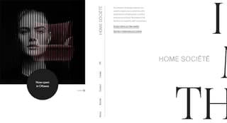
Home furniture and accessories company Home Sociētē has a website that’s the epitome of asymmetric balance. On the left side are images, while on the right side are texts of varying sizes and font styles. The horizontal scroll is an example of balance throughout, giving the viewers a design that’s pleasing to the eyes and exciting to the senses.
British Petroleum Logo

In radial balance, the elements are arranged around a point that radiates from the center. This is evident in the British Petroleum logo. Not all balances can be seen on the left and right or up and down. Balance in design can also be seen in elements that are grouped around a central point.
Netflix Newsletter

Balance in design can be achieved in different ways, one is to use shape or form. In this newsletter example from Netflix, balance was created using a plain, flat field with a complex composition of images and texts. The details on the right appear in harmony with the almost empty area on the opposite side.
Heinz Digital Ad
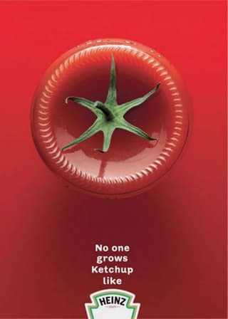
Heinz is a master when it comes to placing balance in their designs. The example below is that of the bottom of a catsup bottle with the stem of a tomato. This is just one of their many ads that play with either the bottle or the tomato itself. It’s a go-to if you want to understand balance in design well.
Oral-B Poster
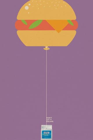
Another way to give balance to your designs is through the use of value. In this poster from Oral-B, the area of high value (the burger part) creates balance with the area of low value (the dental floss part). It is also a great example of symmetrical balance, making this ad simple yet impactful.
Rodionov & Sons Website
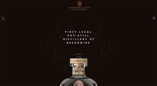
Another excellent example of reflection symmetry is the website of Russian distillery company Rodionov & Sons. When you land on the page, you’ll be greeted by the top of a bottle with fancy swirls animating around it. Once you scroll down, you’ll find the page brimming with symmetrical balance.
Harry Potter Movie Poster

The fight between good and evil is shown in perfect balance in the Harry Potter and the Deathly Hallows: Part 2 movie poster. The weight is distributed equally, leaving us with the impression that the ending can bring either victory or tragedy (for the non-readers of the book, at least).
Penji-Designed Business Card
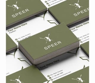
Symmetrical balance is the most common type of balance. This can sometimes border on being uninteresting, but with the right designer, it can be eye-catching. Designing a business card poses this challenge because of the limited space, but this previous work from Penji shows balance can do wonders for small spaces, too.
The Atlantic Website
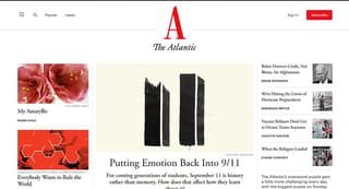
The opposite of having a balanced design is another type of balance called off-balance (also known as discordant). This is a tricky one, as it’s a beautiful mix of chaos and order. The Atlantic’s website is an excellent example of this. It seems to be lacking in the balance department and, at the same time giving off an appealing look.
Nike Logo
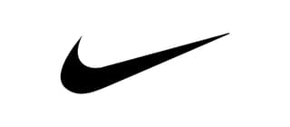
Don’t be fooled by the Nike logo’s simplicity, as it’s designed with balance, movement, and rhythm. The perfect formula for a logo design that’s destined to become an icon. Asymmetrical balance is what you should use if you want to incorporate tension and movement in your designs.
Mountain Dew Billboard

Texture can also add balance to your designs. Creating an area in your design with intricate details creates balance if you place it alongside a flat and not textured region. This billboard from Mountain Dew explains it best.
Jacqueline Cochran Cosmetics Ad
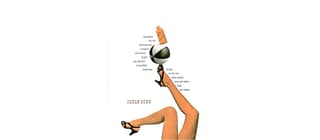
American pilot Jacqueline Cochran was the star of this cosmetic ad designed by no less than the graphic design legend himself, Paul Rand. This ad literally and figuratively has balance. From the choice of images to the text layout, it is functional while appealing to the senses.
Spotify Ad

In 2019, Spotify released a series of ads on multiple platforms, mainly on billboards and outdoor advertising. This is an excellent example of using white space to achieve balance in design. Space does two things: it connects and separates elements in design, as this ad capably shows.
I.D. Sarrieri Instagram Ad
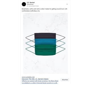
White space, texture, contrasting colors, and symmetrical balance complete this social media ad from I.D. Sarrieri. The design is simple but eye-catching. The choice of colors gives it a vibrant feel instead of the sad and grim emotions we usually associate masks with. The space and texture around it balance the urgency of the pandemic while making a fashionable statement with the products.
A Minor Fall Book Cover
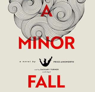
Balance in design doesn’t always mean having all the elements in the center. You can have it flushed to the left or right, or in the case of the A Minor Fall book cover of the author Price Ainsworth, at the top. Arranging texts, images, and other assets in a structure of rows or columns gives them order and balance.
Archer Farms Coffee Package Design
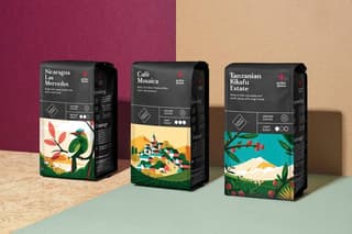
A simple and easy way to achieve balance in design is to use positioning. The principle is to place a large element on one side and balance it out by placing smaller objects, such as texts, on the opposite side. This packaging design from Archer Farms shows you how.
Cadbury Ad
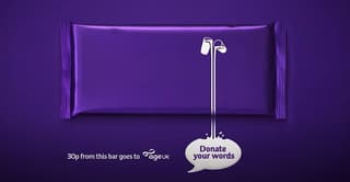
Another excellent example of an off-balance or discordant balance design is this one from Cadbury. The chocolate company created this campaign for charity, and this type of balance in design is the most ideal for this kind of ad. An off-balance design suggests motion and action. It is intended for use if you want viewers to feel uncomfortable or to make them pause and ponder.
Touché Amoré Album Cover

At first glance, there’s nothing much to see in this Is Survived By album cover by Touché Amoré, a post-hardcore band from California. But if you look closely, it is a great study for creating balance in design. The smudge on the left side depicts the members of the band. On the right side is a blur of what seems to be a cityscape. Both elements complement each other to bring balance to the design.
Pinterest Home Page

There is a type of balance that not many graphic designers use as the result can sometimes be seen as a hot mess. Mosaic or crystallographic balance is also called “organized chaos.” The idea is to have no single element made to stand out more than the rest, which is more than suitable for Pinterest. It has no vertical alignment, but its horizontal alignment and the uniform size of the images balance it out.
What are the Different Types of Balance in Design?

Balance in design comes in three main types. They are the following:
Symmetrical

This type of balance in design refers to the composition or layout where the elements are arranged evenly. Symmetrical balance is when both sides of a central line or axis are identical. This creates a sense of equilibrium and stability in your design. Below are the main characteristics of a symmetrical balance:
Mirrored: this is when the elements on one side of a design are the mirror images of those on the opposite side. If you were to cut the layout in half, the two sides would match exactly.
Ordered: this type of balance has an organized and formal look. This is what we typically see in traditional and classic design styles.
Stability: using balance in design gives it a stable and harmonious appearance. It is easy to understand and aesthetically pleasing.
Common elements: a symmetrical design uses common elements such as geometric shapes, evenly-spaced patterns, and identical objects placed on both sides to have balance.
Examples of symmetrical designs are corporate logos such as those of Chanel and Starbucks.
Asymmetrical

Also called informal balance, asymmetrical balance in design refers to the elements in a layout or composition arranged without mirroring or strict symmetry. You’ll find balance in the elements’ visual weight and placement. The following are its primary characteristics:
Uneven distribution: this involves an uneven distribution of the elements but would still convey a visually-balanced appearance.
Weight: factors such as size, texture, contrast, and color influence the balance in design. Light ones balance heavy elements or dark colors.
Dynamic: asymmetrical designs have dynamic, complex, and exciting appeals to them. This is the perfect balance to have if you want to achieve movement and energy.
Creative freedom: an asymmetrical balance lets you enjoy more creative freedom, versatility, and flexibility in your design.
Organic: an asymmetrical balance provides an organic and natural feel. This is the balance we often find in nature.
Great examples of asymmetrical designs are those we see that have a massive object on one side with smaller text on the other. The Home Sociētē Website on this list perfectly illustrates an asymmetrical balance in design.
Radial

Also known as circular balance, radial balance is where elements radiate outward from a central point in the design. This point acts as the focal point where the elements are arranged in a symmetrical way. It has the following characteristics:
Circles and rings: these shapes are the most typical feature of radial balance.
Repetition: elements are repeated, scaled, or modified as they radiate from the design’s center. This is what gives it a sense of rhythm and gradation.
Found in nature: radial balance is commonly found in nature, such as flowers, ripples, or tree rings. This gives your design a natural touch that is pleasing to the eyes.
Some designs with radial balance are clock faces, sunbursts, and mandalas. On this list, you’ll see it in the British Petroleum logo.
Practical Tips to Achieve Balance in Design

If you’re looking to achieve balance in design, you need to consider the following:
Visual weight: learn the concept of visual weight. This is how much a design element draws the viewers’ attention. Balance heavy elements with light ones to get equilibrium. You can achieve balance by placing a huge image on the left and putting the text or smaller graphics on the other side.
Contrast: use contrasting elements to achieve balance in design. Use light colors to balance out the dark, bold fonts to thin ones, rough texture against softer ones, and so on.
White space: use white or negative space more often. This helps achieve balance by giving the design elements room to breathe. It also creates separation and is excellent in leading the viewers’ eye where you want them.
Hierarchy: ensure that the information you add to your composition uses hierarchy. This will guide the viewers’ eyes from the most crucial info to the least. Use different colors and font sizes for emphasis while keeping a good balance in your design.
The rule of thirds: divide your layout in three ways horizontally and vertically. Place your key features along these lines or at the intersections. This creates a visually appealing and balanced composition.
Final Thoughts
There are times when we look at a design and think something’s off, but we can’t put our finger on it. Most likely, the design doesn’t have balance. Balance in design gives it order and structure. So for your designs to be effective, make sure that it has balance.
Penji’s graphic designers understand balance in design, you don’t have to worry about doing it yourself. Watch our demo video here or sign up today to get them started on your designs.


