
Getting visual assets for your business doesn’t mean creating whatever comes to mind and then hoping for the best. There are graphic design rules one must follow to craft effective visuals. This is why working with the right graphic design service matters most. A mismatched partnership can lead to mediocre designs that won’t help your brand. Here’s what you need to know:
1. Contrast
Contrast is a crucial principle in art and design. It means having two elements of the design shown in opposite ways. Long and short, dark and light, rough and smooth. Contrast is what creates a focal point as it helps draw the eyes to what’s essential.
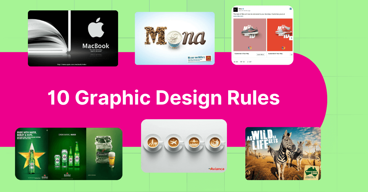
This example from Apple’s MacBook shows us the excellent use of contrast in its design. It only uses black and white, but the overall design is so robust, the addition of color may have made it less impactful.
Get a Design Team for a Fraction of the Cost
Get all the designs you need every month


2. Hierarchy

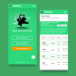
Hierarchy is arranging your images, texts, and other design components in order of importance. Establishing a purposeful hierarchy in your projects allows you to emphasize what matters the most in your design. It draws the viewer’s eyes to what you want them to notice first.
Australia Zoo released this ad, and it is a perfect example of showing hierarchy in the design. The first thing you’ll notice upon looking at is the words As Wild As Life Gets, then your attention will focus on the animals, then down to the logo at the bottom right corner.
3. Typography
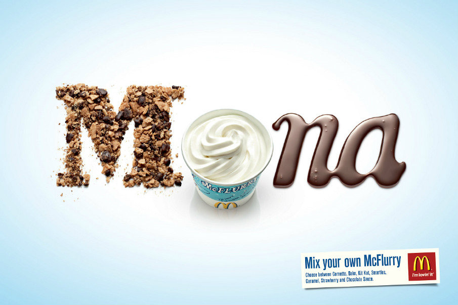
Rarely will you see an ad or a design that only has images or photographs in them. To convey your message clearly, you need text to do it. And it isn’t as simple as choosing a font that looks good. It has to be legible to get your message across. Use different font types for a heading, subheading, and others. A golden rule is not to use more than three at a time to avoid confusion.
This ad for McDonald’s McFlurry is beautifully done using images and only a handful of font types. It makes your mouth water with its readability and clarity. Seeing this makes you want to go out and grab one!
4. Color
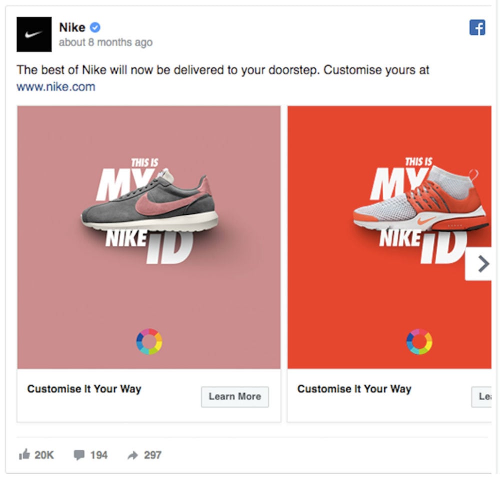
Some ads look good in black and white, but that alone wouldn’t work. Color is around us, and we need it to make things look amazing. Use color sparingly in your designs. Avoid light and light, or color combinations that can sting the eyes.
Get inspired by these Facebook ads from Nike. The colors they used look appealing and eye-catching. Remember, you don’t have to use too many colors to grab attention. As always, less is more.
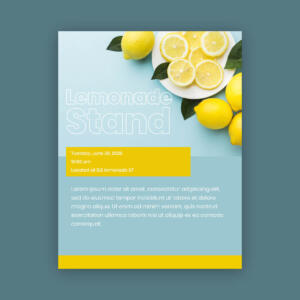
5. Space
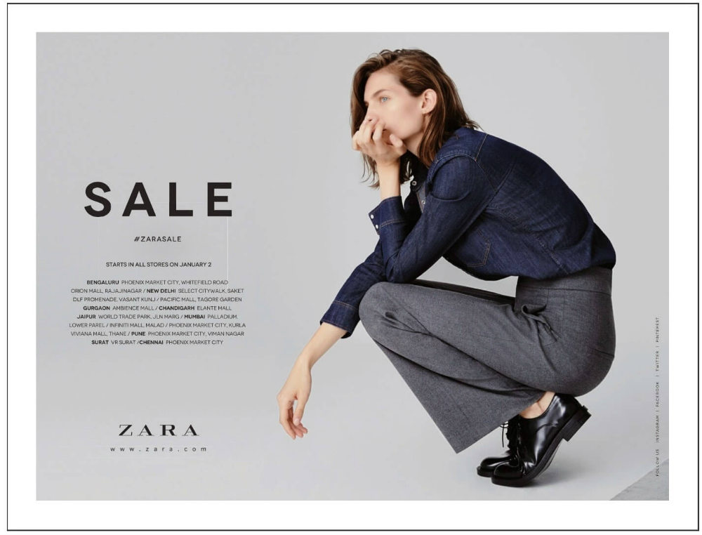
Another good rule to keep in mind is the use of white space in your designs. Any unnecessary elements have no place in your design. They just clutter and make it look crowded. These spaces, whether white or negative space, bring the reader’s focus on what’s essential in your message.
Zara perfectly captures the viewers’ attention to the model in this ad with white space all around it. And with the word SALE emblazoned on the top part, the effect is impressive.
6. Balance
An organized design makes for coherence. A design that has balance creates harmony and stability as opposed to one that’s confusing and chaotic. Even distribution and spacing allow for a professional and polished look on your designs.
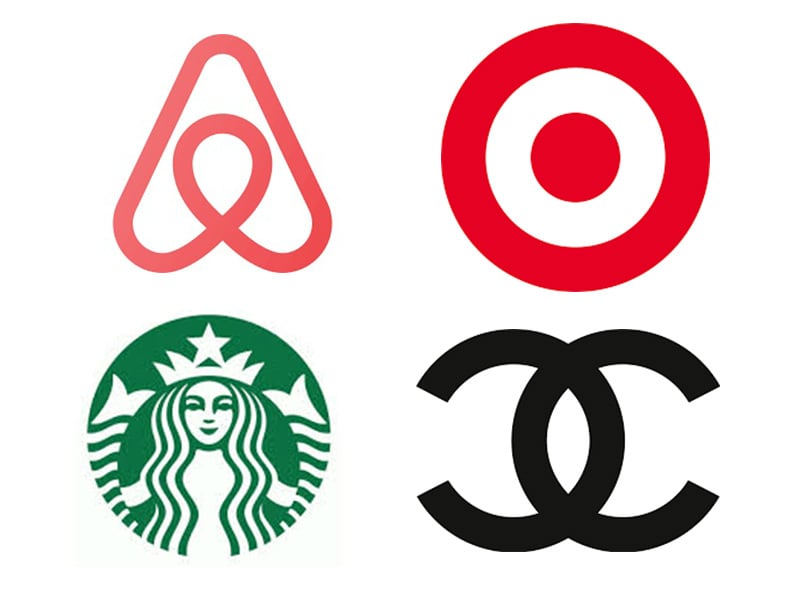
To show you an example of the right balance in design, take a look at these logos from Chanel, Starbucks, Airbnb, and Target. They’re some of the most famous logos all over the world, and their designs are inspiring.
7. Proximity
This graphic design rule is an excellent way to create a connection between related or similar elements. It adds value to your design by using these simple design tips. while those unrelated should be kept apart from each other.
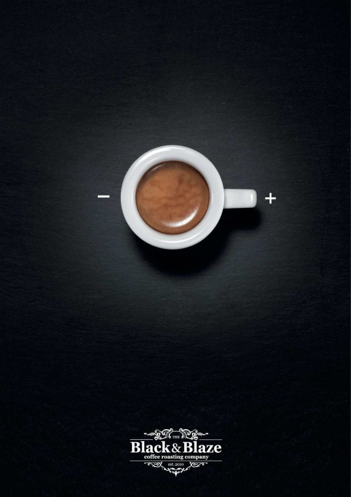
This Black&Blaze is a superb example of creating proximity in design. The coffee cup is grouped with the on and off words, similar to a switch. Meanwhile, the logo and details are arranged far down the layout.
8. Consistency
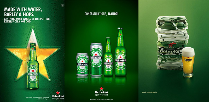
Heineken is consistent in all their ads. They use their color in every one of them so that once you see it, you’ll instantly know it’s from them. Being consistent in your design means having the same design elements, such as color or fonts. This is for your target audience to recognize you, whether they’re on your website or looking at your billboard.
9. Alignment
One of the golden rules of graphic design is using alignment. Organization and order are of high importance, especially when, but not limited to, placing texts. Randomly doing so will result in disorder and clutter, which can make your viewers turn their attention elsewhere.
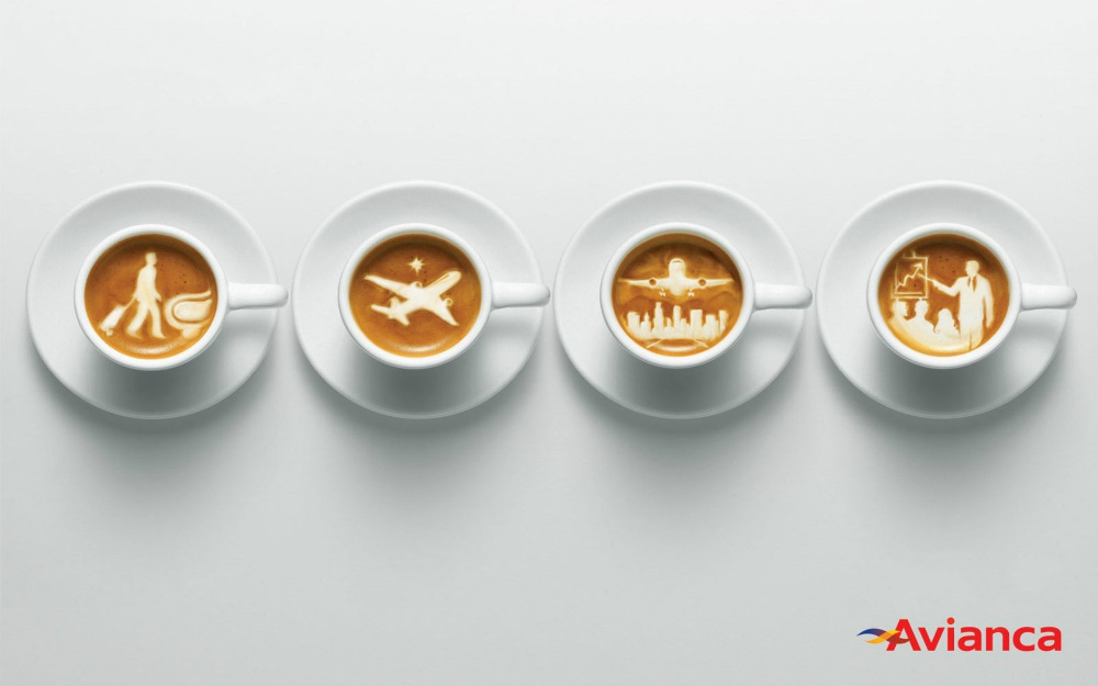
In this example from Avianca, the coffee cups are aligned in a straight line to send the message of travel. From a man pulling his luggage to an airborne plane to the same guy in a meeting. Traveling with the comfort of having his favorite beverage.
10. Repetition
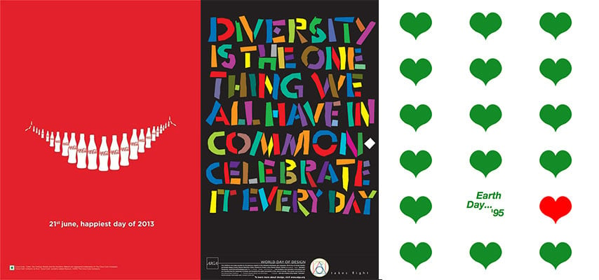
Repetition or using a pattern is one of the most fundamental graphic design rules. This is an element used multiple times throughout the design to add consistency and unity. It can be regular or irregular, anything to create a pattern that brings interest to the design.
These examples from Coca-Cola, Aiga, and World Earth Day show exactly how repetition equals excellent graphic design. The repetitive elements bring consistency and harmony to the design.
The Role of Graphic Design in Business
More than aesthetics, graphic design is a strategic tool that you can use to communicate, build your brand identity, and influence consumer behavior. When done right, it enhances your brand’s credibility, fosters trust, and helps you stand out in a vastly competitive market. Your customers will get a good perception of your brand through expertly crafted logos, websites, social media graphics, and advertisements, among others. This is why following the essential rules of graphic design is a must.
The Key Elements of Graphic Design
Aside from the graphic design rules mentioned above, the following are vital factors you need to keep in mind:
- Imagery: The images you use on all your platforms should be in high-quality format. From images to icons, these add to your brand’s visual appeal, reinforcing brand messaging.
- Layout and Composition: How the design elements are arranged affects readability and user experience. In addition, a balanced layout guides your viewers’ eyes to ensure that your key messages stand out.
- White Space: Also known as negative space, this design element improves readability and creates a clean, professional look.
Why a Brand Consultant Matters in Graphic Design
A significant part of owning and managing a business is understanding how to handle various aspects of it. However, you will rarely find an entrepreneur who knows how to craft effective branding. This is where a brand consultant comes in. They will ensure that every visual asset you get will align with your brand strategy.
Furthermore, they go beyond striving for aesthetics; they focus on consistency, tone, positioning, and audience perception. They shine in bridging the gap between creative visuals and strategic messaging. This ensures that your designs align with and drive business goals.
In short, a brand consultant helps you define your brand’s mission, values, and voice, giving you a competitive edge. They ensure that your visuals align with your brand’s tone, while also understanding your audience’s needs and your competitors’ positioning. And of course, you’re following the most essential graphic design rules.
How to Choose the Right Brand Consultant for Your Business
To find a brand consultant that fits right with your brand, consider the following:
- Industry Experience: Look for those who are experienced in your industry or a portfolio that showcases diversity and versatility.
- Strategic Thinking: Find a brand consultant who has strong analytical skills to be able to connect design choices with business outcomes.
- Collaborative Mindset: A good brand consultant should be able to communicate and collaborate with your marketing and graphic design team.
- Proven Track Record: Review previous work, case studies, testimonials, or client references to gauge their work.
Final Thoughts
While following these rules of graphic design is the responsibility of your designer or graphic design service, business owners would do well to have a good understanding of them. This ensures you’re getting your money’s worth when paying for design. To simplify the process, it’s best to work with a reliable design partner like Penji. Our team of professional designers understands graphic design rules, and with our unlimited graphic design services, you’re sure to get what you pay for.
Watch our demo video here to know more about what we do, or better yet, send in your first design request by clicking on this link.
Extend Your Creative Team the Affordable Way
Try unlimited graphic design & see how easy your design process can be


About the author

Celeste Zosimo
Celeste is a former traditional animator and now an SEO content writer specializing in graphic design and marketing topics. When she's not writing or ranking her articles, she's being bossed around by her cat and two dogs.
Table of Contents
- 1. Contrast
- 2. Hierarchy
- 3. Typography
- 4. Color
- 5. Space
- 6. Balance
- 7. Proximity
- 8. Consistency
- 9. Alignment
- 10. Repetition
- The Role of Graphic Design in Business
- The Key Elements of Graphic Design
- Why a Brand Consultant Matters in Graphic Design
- How to Choose the Right Brand Consultant for Your Business
- Final Thoughts


