


For the uninitiated, creating graphic design is just using free software and putting together fonts and icons. The reality is it is more complex than that. To create a design that’s aesthetically pleasing, you need to follow design principles that will deliver your message. Here’s a simple guide to these design principles and how you can use them effectively:
What are Design Principles, and How Do They Impact Visuals?
Design principles are the foundation of good visual design. They provide guidelines for creating aesthetically pleasing visuals, effective and consistent with brand identity. Understanding and applying these principles allows you to create visuals that grab attention, communicate messages effectively, and convey desired emotions.
The 7 Most Influential Design Principles for Eye-Catching Visuals
The number of design principles can vary depending on the source and context. However, several commonly recognized principles are widely used in the design industry. Below are the most influential design principles that will help you create stunning visuals:
1. Balance

A fundamental design principle, balance, is about creating visual equilibrium and harmony in composition. When a design is balanced, it feels stable and polished. There are two types of balance: symmetrical and asymmetrical. Symmetrical balance creates a sense of formality and order by dividing a composition into equal parts on either side of a central axis.
On the other hand, asymmetrical balance is about creating a sense of movement and dynamism by arranging elements of different sizes, shapes, and colors to complement each other.
To achieve balance, designers can use various techniques such as a grid system, color, or adjusting the size and placement of elements. A well-balanced design helps guide the viewer’s eye, creates a sense of flow, and makes your composition look polished and professional.
2. Contrast
Another important design principle is contrast. It involves creating visual interest and emphasis through the juxtaposition of different elements. You can achieve contrast through differences in color, shape, size, texture, or other visual properties.
Contrast can draw the viewer’s eye to specific areas of composition and create a sense of hierarchy. For example, contrasting colors or typography can make certain elements stand out and grab attention. It can also be used to develop a sense of depth or dimensionality in a design.
There are different types of contrast that you can use, including high contrast, low contrast, and complementary contrast. High contrast involves using very different elements, while low contrast involves more subtle differences. Complementary contrast consists of using colors opposite each other on the color wheel to create a bold and dynamic effect.
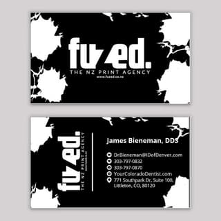
3. Emphasis

This design principle involves highlighting specific elements in a composition to make them more visually prominent and impactful. Emphasis is like using a spotlight to draw attention to a particular stage area in a play. You can use various techniques to create emphasis, such as color, size, typography, placement, or texture.
When you emphasize some aspects of your design, you guide the viewer’s attention and create a sense of hierarchy within the composition. In this example from one of Penji’s previous works, the book title is emphasized the white background against the black space it is placed on.
Emphasis can also be used to convey a specific message or mood. For instance, a website selling luxury watches could use an elegant and sophisticated font style to emphasize the quality and exclusivity of its products.
4. Harmony
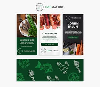
Another crucial design principle, harmony, is about creating a sense of unity and coherence within a composition. Imagine putting together a puzzle where all the pieces fit perfectly to create a complete and harmonious picture. You can achieve harmony by using elements that complement and reinforce each other, such as color, shape, texture, and pattern.
Using consistent visual language can help you create a cohesive and unified design that feels balanced and pleasing to the eye. In this brand guideline we made for one of our clients, you’ll notice the same green color on the logo used throughout the pages. It also uses a consistent font style and layout, creating a unified look and feel.
Harmony can also be achieved through negative space or empty areas around and between elements. Negative space can create a sense of balance and clarity within a composition, allowing the viewer’s eye to rest and focus on the critical aspects.
5. Proportion
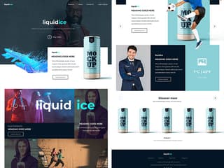
To create a sense of balance and harmony between the different elements in a composition, you need to understand proportion. Think of it as a recipe where you need the right proportions of ingredients to create a delicious dish. You can do this by using different sizes, shapes, or placement of elements in relation to each other.
In this website design, also from one of our talented web designers, you’ll see the proportional spacing between text and images. This helps create a sense of balance and harmony within the layout. This design principle is also helpful when designing logos, as using the right proportions of the different elements can create a balanced and visually pleasing design.
Proportion can also create emphasis and draw attention to specific elements. Using a larger or smaller proportion of an element in relation to the rest of the composition allows you to create a focal point and guide the viewer’s attention.
6. Rhythm

To give a sense of flow and movement to your designs, you need to include rhythm. It’s like a dance, where the different elements in the design move together in a coordinated and harmonious way. This results in visual interest and excitement that attracts viewers’ attention.
You can have rhythm in your design using repetition, variation, or progression of elements such as color, shape, or texture. One common technique is to use a grid system to establish a consistent layout for visual details. This helps create a sense of order and repetition that can be pleasing to the eye.
But rhythm in design isn’t just about repetition – it’s also about variation. Just as a good melody might include variations on a theme, a good design can include variations on a visual element. This can help create interest and movement in the design and prevent it from feeling too monotonous.
7. Unity
To help you create a cohesive and harmonious design that feels like it all belongs together, you need to incorporate unity in it. When a design is unified, each element feels part of a larger whole, and nothing seems out of place or discordant.
Achieving unity in design can include using the same color palette, typography, and graphic elements. Using consistent visual elements allows the design to feel more cohesive and unified. A grid system, repetition, and white or negative space can help you create unity in your designs.
Final Thoughts
Creating visually appealing and effective designs takes time, expertise, and experience. Business owners can take the easy route when DIYing designs without learning about design principles. This guide will help you create design assets that clearly express your message.
A better and easier way is to work with Penji for all your graphic design needs. Our designers know these design principles by heart and can create them for you. Click on this link to get your designs now!


