
Do you want to know if your website UX design is effective? What are the ways to check if your consumers are having a great time using your website or your app? What are the points you have to evaluate?
You see, it’s easy for us to be biased when it comes to our company’s website UX design. But if you want to improve your sales, then leaving your preferences behind and knowing what your consumers want is the best way to go.
For instance, many of our clients at Penji turn to us for expert UX design. Our professional UX designers know just what to do to create visuals that enrich the visitor’s experience and make boost your brand reputation.
According to Impact, almost 80% of online users will search for a new website if they don’t like what the see on the first one. That’s just the visual appeal. How much more if we talk about the overall user experience? The percentage will surely get higher.
Ways to Test Your Website UX

There are multiple ways to evaluate the user experience of your website or app. We are sharing with you the most efficient ones so you can already start revamping and redesigning.
Open Your Line for Customer Feedback
First of all, consumers are now are more vocal. If they love something, they will rave about it. If they find a new feature a bit off, they will say something about it too. And you should use this to your advantage.
Whenever you are making changes to your website UX design, always involve your users. Ask them about their feedback. Encourage them to provide details. You might not agree with what they say. But at the end of the day, they are your users and they are the ones who will bring your business more income.
You can get customer feedback from different platforms. You can get it via phone call, email, or even from social media. What’s important is that you take note of their ideas and use them when redesigning your website.
Assess the Visitor’s Activities on Your Website
It’s crucial that you know on which pages your users spend most of their time. But of course, you have to check which ones are not being utilized. You can use heatmaps to identify which buttons are commonly clicked, and which ones are ignored. The reasons vary such as the placement of your buttons or a weak call-to-action. Here are the best tools to help you.
- Crazy Egg
- Smartlook
- LiveSession
- Hotjar
- Zarget
You might need to pay for the advanced features, but considering the competition in terms of website UX design, getting tools is actually an investment. Check out our portfolio to see samples of our website designs that convert.
Monitor the Time Your User Spends on Filling Up Forms
There are tools that can help you track the time that your visitor spends in completing an online form. Truth be told, online forms are probably the least favorite part of any online user. If it’s too long, it can be overwhelming. This can eventually turn off a potential lead. Do not let that happen by knowing ‘what is too much’. Perhaps there are some categories that you can omit.
Asses Your Customer’s Questions
This might not be the most obvious way to test your website UX design, but if you pay attention to your customer’s questions, it can help you big time. What do we mean by this?
Say, for example, most of your online visitors asked about how to purchase from your website. That means your checkout process might not be clear. Let’s have another example. What if a significant number of your leads inquired about a product description. Maybe the texts aren’t visible or the drop-down arrow isn’t working.
You have to take note of these common questions. Most likely, the problem is not with the users, but with your website design.
Have a Group to Test Your Website UX Design
And most importantly, you need to have a group that will constantly use your website or app. This doesn’t necessarily mean someone from your company. In fact, we recommend that you work with your actual consumers. Provide questions which they need to complete after the testing phase. That way, you can easily track which pages need improvements.
Companies Using Great Website UX Design
We listed five companies that have used a great website UX design to their advantage. Perhaps, you can get inspiration and ideas from these.
Paypal
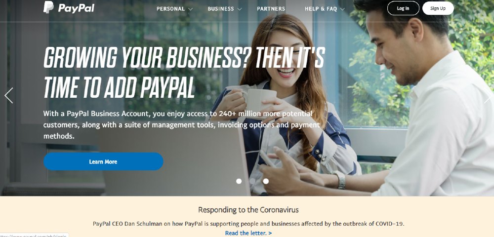
Millions of people use Paypal to transfer and receive money. And this is not surprising because their website and app are easy to use. Setting an account is a breeze as well. You just need an email, then sign up, link your bank account, and you are ready to roll. Since we are talking about money, they highlight the safety and security features of their website.
Mailchimp
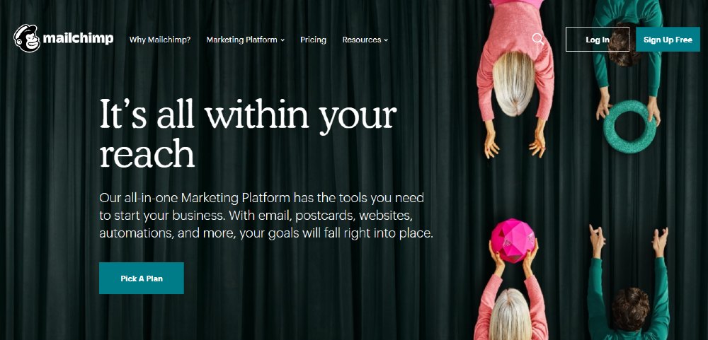
We also included Mailchimp on our list because it provides a unique experience to its users. Their ‘mascot’ adds humor to their website and it boosts that fun when browsing through their pages. They call it the ‘humanization of technology’. It’s a good idea so you can avoid a boring design that can affect the overall experience of your visitors.
Yelp
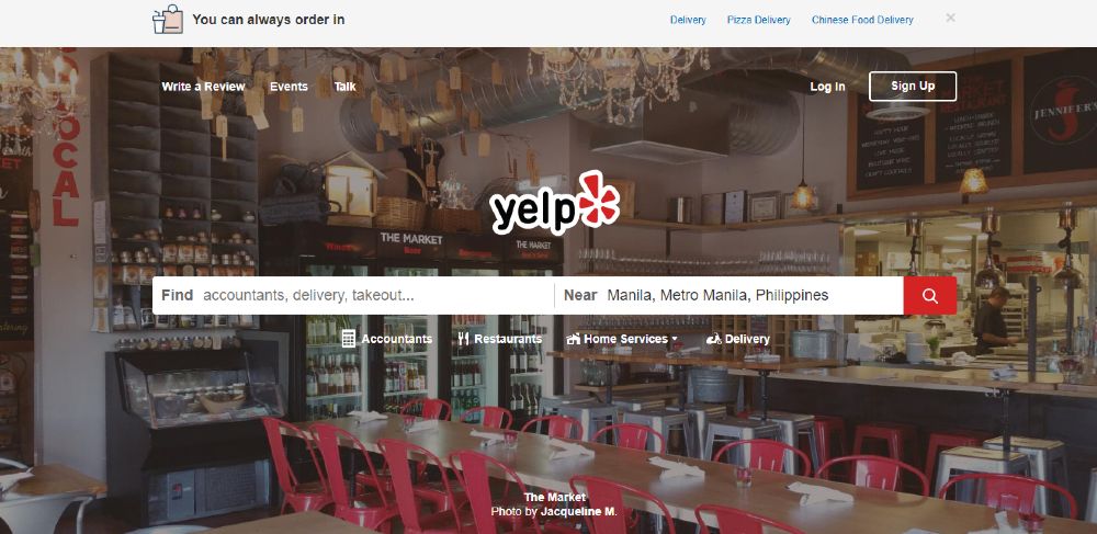
What we love about Yelp is its straightforward design. The majority of the people who use Yelp are looking for instant information. Their design certainly addresses that. The same concept can be found on most travel websites as well.
Zalora
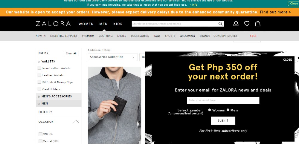
Zalora is also a good example of a company that uses a compelling UX design. You can easily filter items and see their price right away. This can help the buyer in making an instant decision. Also, they use pop-up coupons and that can influence the user to purchase right away. However, you have to be careful in using pop-ups as it can get annoying when overdone.
Viber
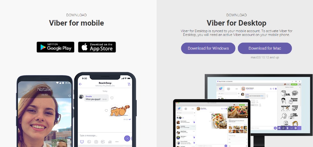
In terms of a messaging website and app, Viber is one of the best in the market. You can quickly sync contacts and find people. The stickers are actually a great touch!
Requesting a Website Design From Penji
As seen from the examples above, coming up with a website design that fosters the best interactions may not be that simple. Mere creativity isn’t enough; the designer should have enough professional experience to know exactly what works for different industries.
Luckily, we have the top 2 percent of designers who can be of service to you. In addition to that, our system makes it super easy for our clients to request designs from us in three easy steps:
1. Create the Project
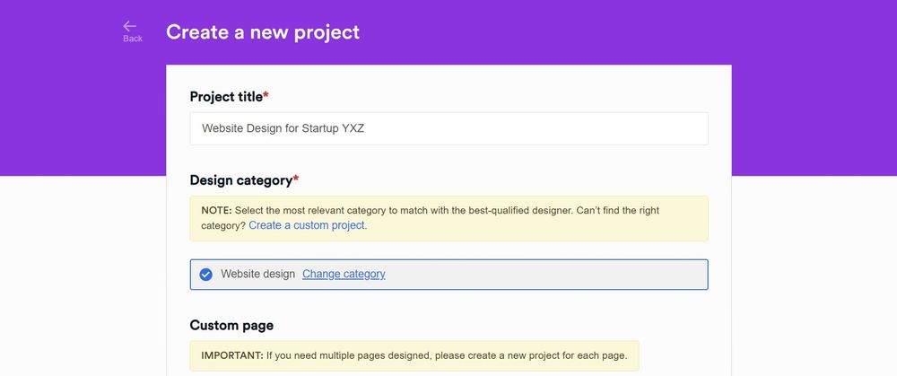
In the Penji dashboard, click New Project. Type in the title of the project and select from the categories. If the project that you need isn’t included in the list, you can select Custom Project. In the description box, put in as many details as you can about the project you need. Once done, click Create Project. It will be assigned to a designer who’ll get in touch with you if anything needs to be clarified.
PRO TIP: Communication is key when it comes to requesting designs. To make sure that the designer gets the look you want, take the time to include links to image pegs. It’s also best to attach links to your website and to include info such as color palettes and other branding assets.
2. Review and Revise
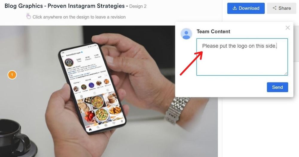
Within 24 to 48 hours, the designer will get back to you with a draft. To view, click on the file within the thread. If you need anything revised, simply click on that part and type in your comments. The design will be returned to the designer for revision and will be re-submitted to you within 24 to 48 hours.
3. Download
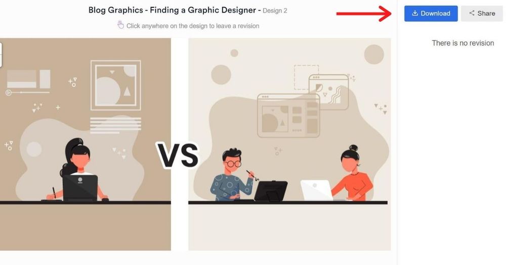
Once you’re 100 percent happy with the design, click the Download button and it will automatically be saved to your computer.
Conclusion
We already know that a website isn’t just about using the best images or providing unique features. As always, we value functionality above aesthetics. It’s common to have shortcomings at the early stages of your website UX. And that is why you need to conduct regular testing and to get tools that can help you with it. Otherwise, you will lose a significant portion of your business.
Sign up with Penji and see what a great website UX design can do to boost your lead generation and sales rate!
About the author

Barbara Anne Isla
BA Isla is a Content Writer and also an Events Host. She left the corporate world to do what she loves and to spend more time with her amazing kids. She hopes to bring valuable change to society with her words.


