There’s this interesting overlap between business logos and sports team logos. They both share some common elements, like simplicity, clever use of negative space, and captivating color schemes, among other things. But you know what sets sports logos apart? They have this special quality called dynamism. It’s like they capture the energy and excitement of the game, making them truly unique.
Sports teams should represent the team’s vigor, history, culture, and identity through their sports team logo. For instance, typography is slightly nuanced when it comes to sports logos. Most sports team logos have weighty and bolder fonts to symbolize the team’s strength and zeal.
Need an awesome logo for your brand? Check out Penji for unlimited graphic design services or one-off logo designs.
If you want more real-life examples for inspiration, we’ve picked the top 15 best sports logos worldwide.
1. Boston Celtics
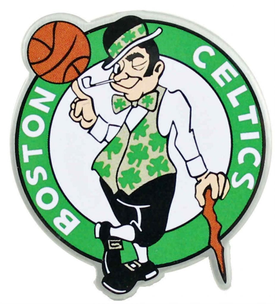
The Irish origins of Boston are depicted on the Boston Celtics logo. And Zang Auerbach didn’t fail to proudly incorporate this when he designed the logo in the 1950s. The color green, together with Shamrock symbols, also dominates the logo to represent Irish descent.
2. New York Knicks
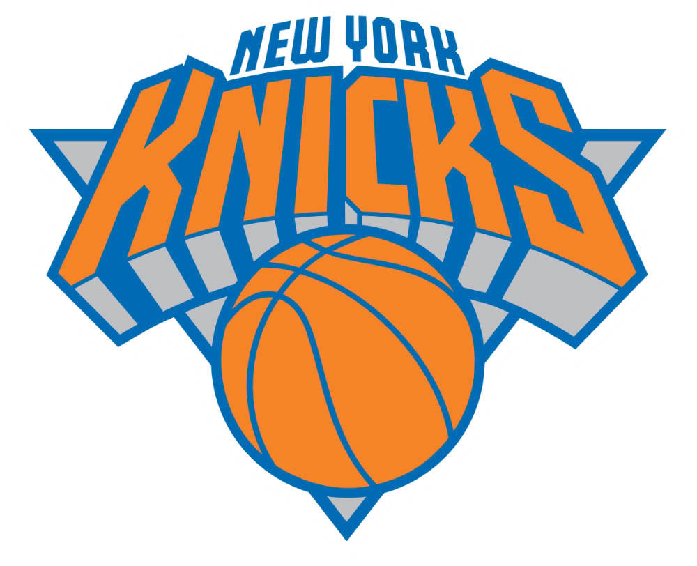
Micheal Doret is a New Yorker who helped pull off the New York Knicks logo. This is one of the most recognizable sports team logos in the world because of its dynamic stature. The logo is reminiscent of a superhero’s emblem usually plastered on the superhero’s chest area’s uniform. And true enough, this is what the makers want the fans to feel — New York Knicks being the superhero when it comes to basketball.
3. Atlanta Hawks
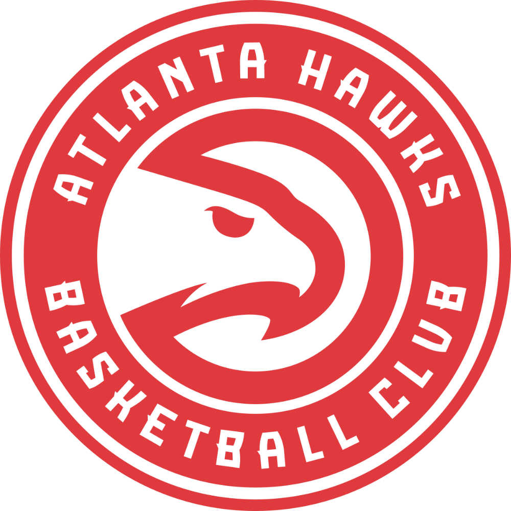
The Atlanta Hawks believes in inclusivity to be a successful franchise. And that’s the reason why they added the text “Atlanta Hawks Basketball Club” to its logo. If you notice, the symbol of the Hawk, enclosed in a semi-circle, looks like Pac-Man. This symbolism is due to the record-hitting sales for the Pac-Man gear during one season.
4. Calgary Flames

The smooth transformation from the flames to the letter ‘C’ is commendable. The designer Patricia Redditt carefully chose the flames to represent a town that was once burned down from a Civil War. Additionally, Calgary’s oil industry is also another reason why the flames will always be a suitable representation of this cosmopolitan city in Alberta.
5. Golden State Warriors
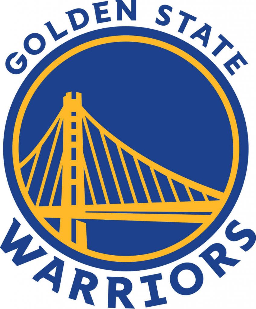
The Golden State Warriors sports logo is rich with history. The bridge embodies the Bay Bridge covering the entire San Francisco Bay in California. Without the text, a Golden State Warriors fan will instantly recognize the logo. Lastly, the contrast between the yellow and the blue background makes the bridge more meaningful.
6. New York Giants
The transition of the New York Giants logo since the early 70s carries decades-long controversies. It started with the New York acronym “NY,” which was then changed to “GIANTS.” This change was due to the team moving from New York to New Jersey. However, in the year 2000, the designer reverted it to the acronym. This time in lowercase and a more modern red and blue color palettes.
7. Philadelphia Flyers
Designer Sam Ciccone relied on a more stylized wing-like icon to represent the Philadelphia Flyers. Although this ice hockey team is based in Philadelphia, research says the wings and color schemes on the logo don’t have anything to do with the city. However, the wing creates the notion of the letter ‘P’ springing into action.
8. Boston Red Sox
Any baseball enthusiast would recognize this Boston Red Sox logo even from a mile away! The iconic “red socks” or “stockings” is the primary element of this logo since 1931. In 1908, it was John Irving Taylor who formulated the team’s name. While the significant red socks underwent several variations in one century, they are still the best symbols to epitomize the team’s success over the years.
9. Manchester United
If not for the football symbols on both sides, you’d think the Manchester United logo is an embassy’s emblem of sorts. But there is a striking connection between the Manchester United and Manchester Army Consulate. The coat of arms is actually inspired by the latter’s emblem. Likewise, the ship on top also illustrates that Manchester is the leading port community in England.
10. Real Madrid
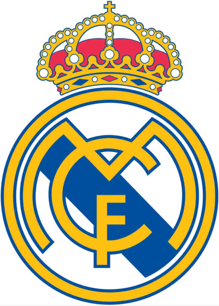
The different elements of this football team’s logo from Madrid convey essential messages. The crown epitomizes the Castile region. Additionally, the initials “MCF” are strewn across the crest, which stands for Real Madrid Club de Fútbol. The different colors exemplify different things as well — gold for rich tradition, blue for excellence, and red for passion and valor.
11. Los Angeles Dodgers
Los Angeles Dodgers’ logo has undergone variations since the team’s inception in 1899. Today, the logo is cleaner and holds a more contemporary appeal. The basketball with the lines sprouting from it is also more defined. Overall, the script typography, coupled with the icon, works like a charm.
12. Milwaukee Bucks
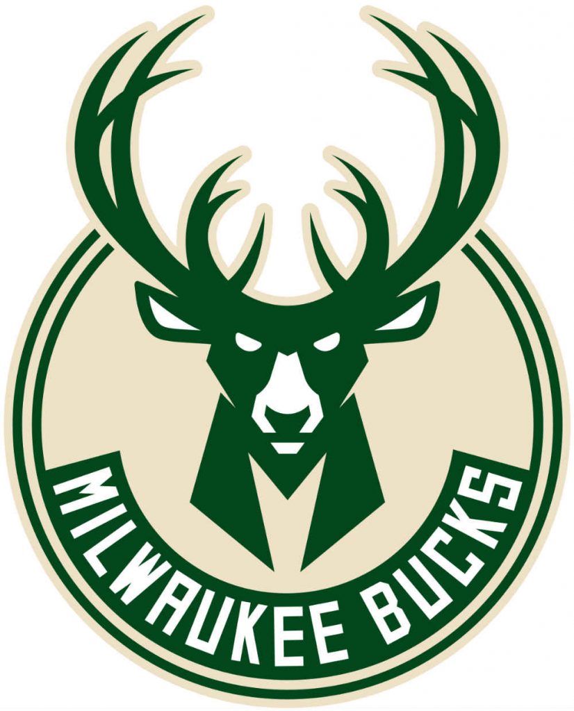
Everything about the Milwaukee Bucks logo screams dynamism, strength, and vitality. The buck is the primary element of the team’s logo, designed by Michael Weinstein. However, just by look at the buck’s eyes, you can associate determination and unity with the team. The notable elements are also hidden symbols like the basketball in between the antlers. Plus, the edgy letter, ‘M,’ that stands for Milwaukee, which connects to the buck’s body.
13. Liverpool
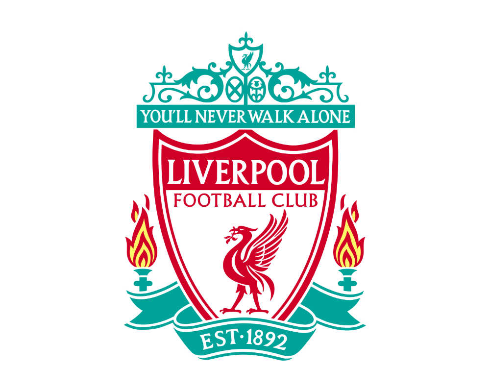
Liverpool logo’s varying colors of teal, red, and yellow all go together cohesively. This football club’s logo is inspired by Liverpool’s coat of arms. Moreover, the liver bird, which is a symbol of Liverpool, is akin to the club’s rich culture.
14. Philadelphia Eagles
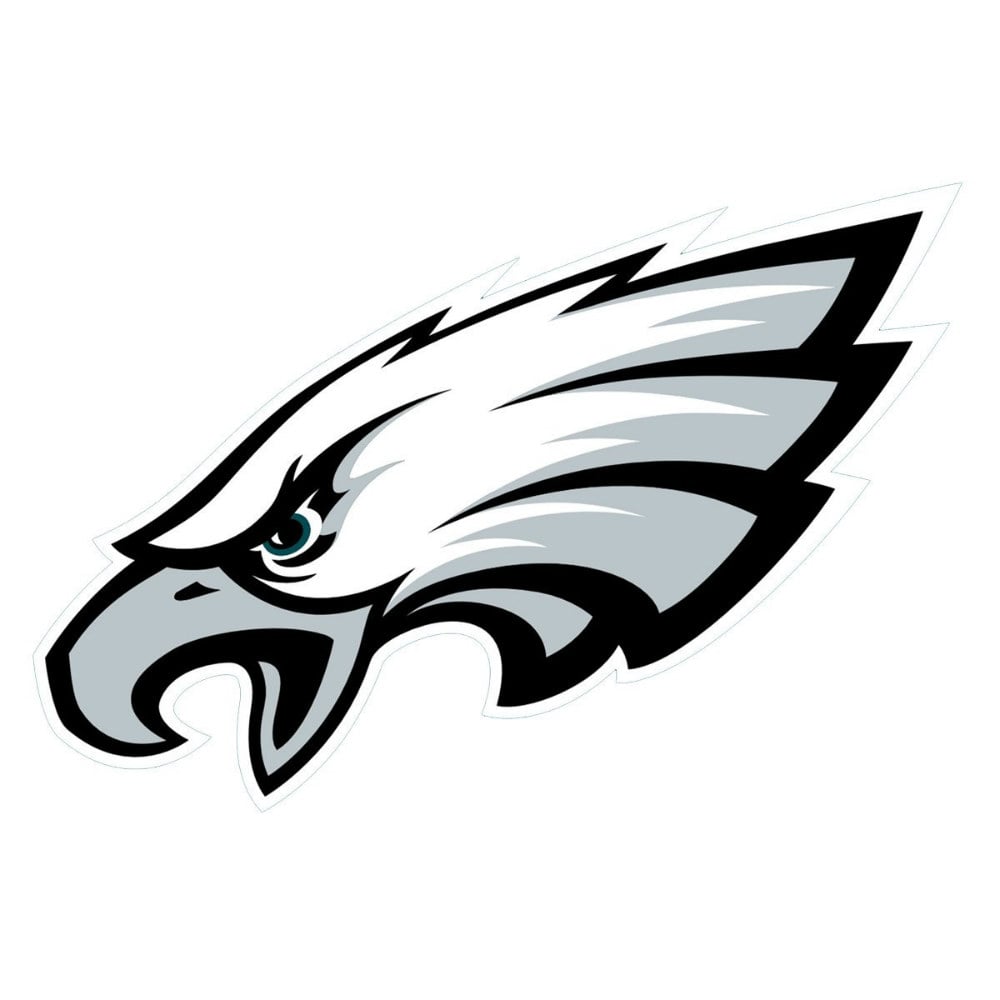
The eagle icon on the Philadelphia Eagles’ logo embodies excellence, determination, and history. The eagle is from an economic reform during the Great Depression in the 1930s. Overall, this logo bears memorability, which makes it one of the most popular sports team logos of all time.
15. New York Mets
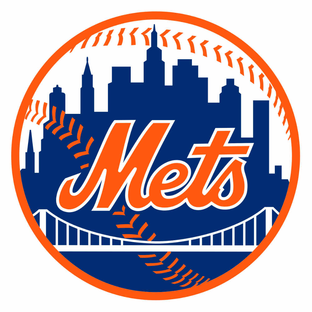
A rich history unfolds when you scrutinize the New York Mets logo up close. Designed by Ray Gatto in 1961, the logo is symbolic of the five boroughs that connect New Yorkers. Let’s start with the tall building on the right, which is the United Nations Headquarters. Then there’s the Empire State Building in the middle. On the left side is the tallest skyscraper in Brooklyn, the Williamsburg Savings Bank. Lastly, the white bridge signifies the unity of New York’s five boroughs.
Conclusion
Sports team logos should be unique and recognizable even from a distance. This is one way to make a particular connection with a team’s fans. Although a sports logo is not primarily for marketing purposes, it still contributes to what makes sports teams legendary. Sign up now, and get unlimited graphic design services or one-off logo designs.
About the author
Table of Contents
- 1. Boston Celtics
- 2. New York Knicks
- 3. Atlanta Hawks
- 4. Calgary Flames
- 5. Golden State Warriors
- 6. New York Giants
- 7. Philadelphia Flyers
- 8. Boston Red Sox
- 9. Manchester United
- 10. Real Madrid
- 11. Los Angeles Dodgers
- 12. Milwaukee Bucks
- 13. Liverpool
- 14. Philadelphia Eagles
- 15. New York Mets
- Conclusion


