

Consumers often consider brand names a defining factor of their style and lifestyle. This is why brandishing their favorite couturier’s name on their clothing has been somewhat of the norm. Here are twenty famous apparel brands logos and tips you can follow for inspiration.
Table of Contents
- Know Your Target Audience
- Create a Culture
- Add Negative Space
- Pick the Right Colors
- Choose a Unique Typeface
- Incorporate Storytelling and Brand Identity
- Flaunt Your Style
- Go for Timelessness
- Try Extreme Minimalism
- Be Playful
- Convey Motion
- Get Inspiration from Other Eras and Design Types
- Bring an Experience to Life
- Make a Designation Official
- Show What Your Brand Represents
- Go for Abstract Designs
- Include a Tagline
- Make It Legible
- Keep It Symmetrical
- Create Contrast
- Why You Should Hire Professionals Instead of DIYing Logos
- Where to Find an Apparel Brand Logo Designer?
1. Know Your Target Audience
Every industry is different. The fashion industry caters to various types of audiences. Know your target market before creating your logo. No matter what clothing brand logo ideas you have, they should resonate with your audience at first glance. This mutual relation can be from a simple symbol on the logo, typography, or even the colors.
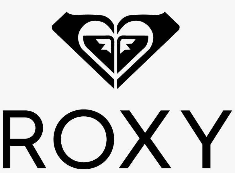
Roxy adds a feminine touch to its logo to cater to female audiences. But it’s not just an ordinary heart, they’re two Quicksilver logos turned to their sides. The brand creates a distinction from its parent company yet still marks familiarity for recognition.
[in_content_ads gallery=”logos” logo=”on” title=”Need graphic design help?” subtitle=”Try Penji’s Unlimited Graphic Design and get all your branding, digital, print, and UXUI designs done in one place.” btntext=”Watch Quick Demo” btnlink=”https://penji.co/view-a-demo-video/”]
2. Create a Culture
![]()
![]()
Culture is essential in fashion. One may not be able to relate to how another person dresses. Take, for example, the different styles of wedding dresses in different countries. While India has the most intricate and colorful wedding dresses, these may not be acceptable in Western weddings as white is the conventional wedding dress color.
The same goes for clothing brand logos. You want to create a culture for your brand and apparel line. Either you’re selling to an audience with hype-beast lifestyles like Supreme or young professionals like Uniqlo. Notice that the nuances in both logo designs define who each brand’s target audience is.
3. Add Negative Space
![]()
Negative space, also known as white space, is a space that doesn’t contain any designs. This is also important when creating your clothing brand logo because it gives your brand a little depth especially when there’s a hidden image from the negative space. Another reason to use negative space is to emphasize symbols and texts, making texts more legible and symbols more evident.
One example is Chanel’s striking logo boasting two interlocking C’s and a bold typeface. Even with different elements, the negative space in between the C’s relaxes your eyes making everything aesthetically pleasing.
Working with graphic designers to create visually interesting negative spaces is crucial. They know how to use this sparingly, so your clothing logo looks coherent. If you need brand designers, work with Penji’s professional team for your clothing brand’s logo.
4. Pick the Right Colors
One of the things you should consider about clothing brand logo ideas is color psychology. Graphic or logo designers are well-trained when it comes to choosing the right color schemes. Can you imagine using dominant black and grey colors for a kid’s clothing brand?
Children’s brands are supposed to be fun and lively, so vibrant colors are expected. In a nutshell, colors are vital when creating your clothing brand logos because they pack a punch into your target audience.
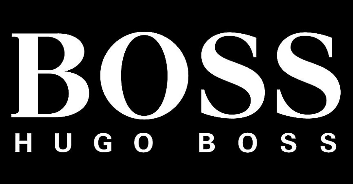
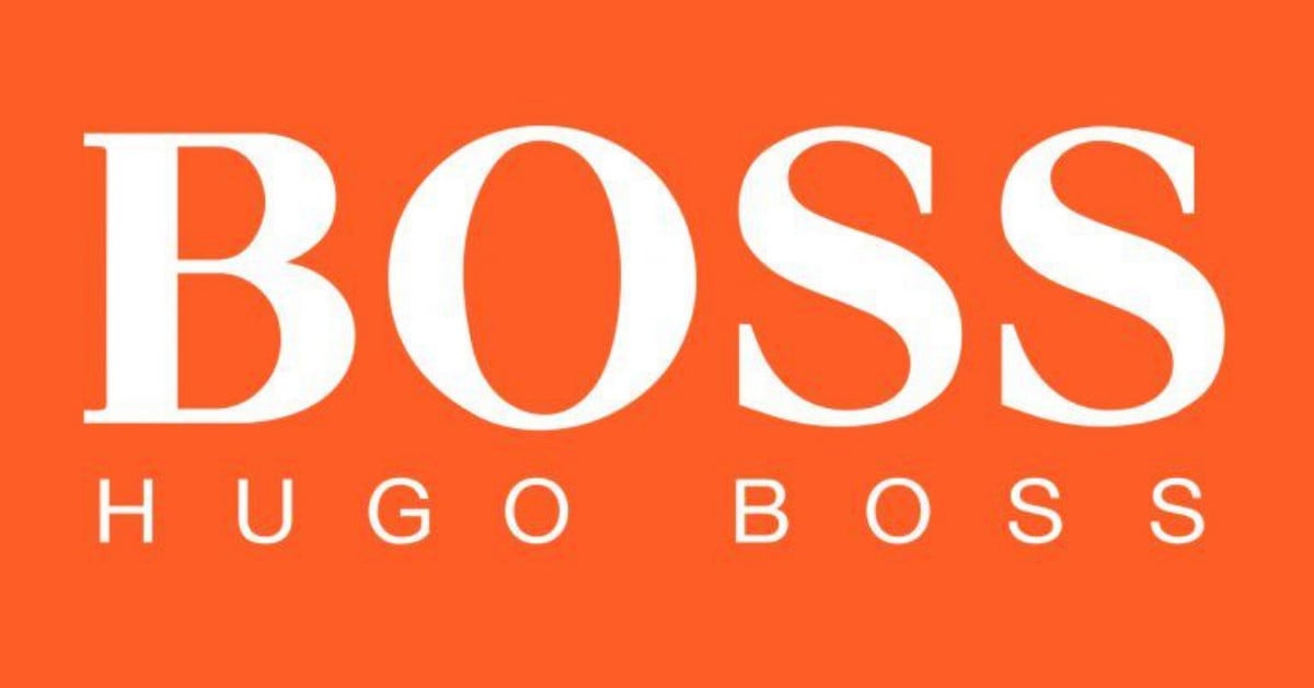
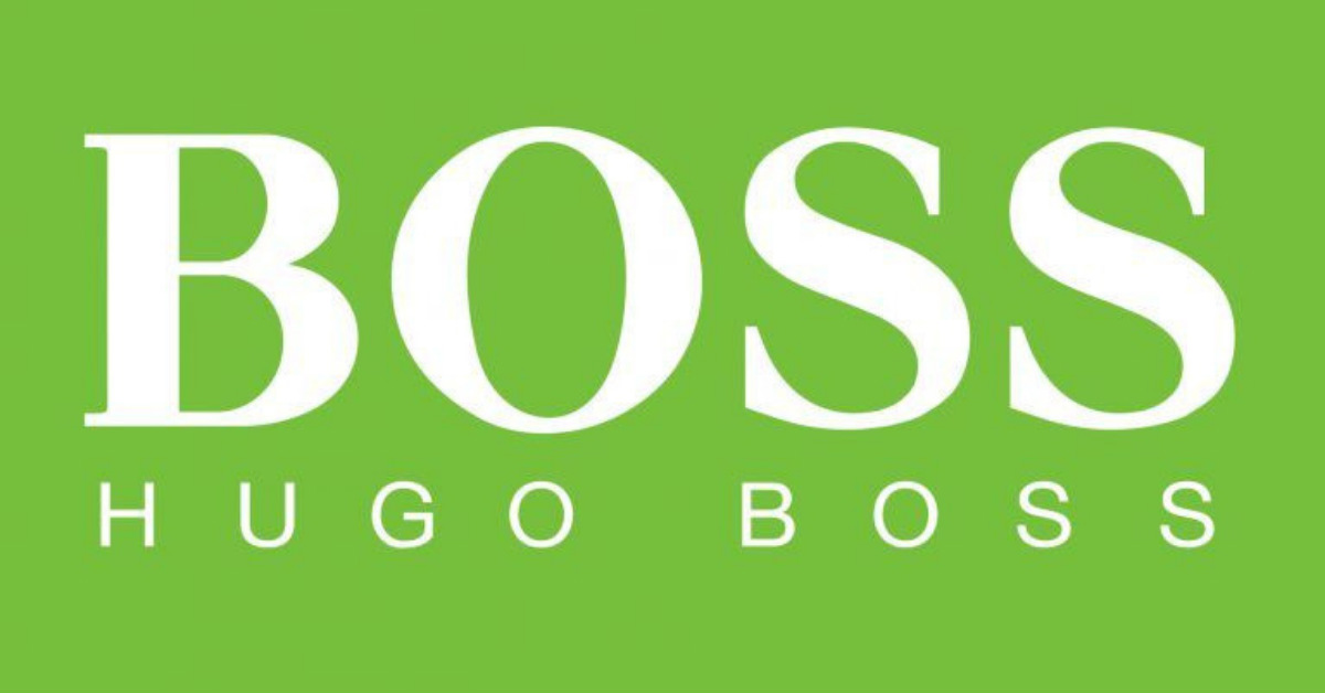
We especially like how Hugo Boss made a distinction for three of their apparel subdivisions. Even with the same typeface, the message completely changes with these three distinctions. They have a Boss Black line for business wear, Boss Orange for more hip and creative casual wear, and Boss Green (Boss Sport) for their activewear.
5. Choose a Unique Typeface
![]()
There are four primary classifications of the typeface families. They are Serifs, Sans-serifs, Script, and Decorative categories. Serif fonts have a more formal and classic appeal while sans-serif tends to pack a more modern look with a focus on simplicity. Decorative fonts are unique and playful and add personality to your clothing brand, while script fonts emanate elegance and class.
You want to choose a font that expresses what your branding is. On top of that, instead of selecting the common typefaces, make yours unique, so you stand out, especially from an oversaturated industry.
Hollister’s target market falls between the age range of 18 to 34. Their logo conveys just that. It signifies professionalism and happiness. Looking at it can instantly bring you to a white sandy beach somewhere with a cocktail in tow.
6. Incorporate Storytelling and Brand Identity
![]()
Every logo must tell a brand’s story. Aside from shopping with their eyes, people also shop with their emotions. Sometimes, a compelling brand history can be a huge factor in a buyer’s decision. And what better way to tell your story than to put it in your logo?
Am I the only one who thinks that the clothing brand Superdry is of Japanese origin because it has Japanese characters and the word ‘Superdry’ is linked to Asahi beer? If not, great to know I’m not alone!
The Japanese characters have a lot to do with how the brand came to life. Two English men were brainstorming at a bar in Tokyo. While gathering packaging ideas from different shops, they realized that every brand claimed how ‘super’ amazing it was. So they got their inspiration from this and put in the Japanese characters ‘kyokudo kanso’ which means extreme aridity and ‘shinasai’ which means do it.
To sum up, Superdry is a brand headquartered in Cheltenham, UK. And these Japanese characters strike up conversations about why these Japanese characters are chosen to represent the brand. You can’t help but Google the story behind the whole design!
7. Flaunt Your Style
One of the most important things people look for when choosing the clothes they’ll wear is style. And as we all know, your logo is the face of your brand. If you want to tell people you’re the most stylish, your logo has to be oozing with it.
Burberry‘s logo features an equestrian holding a shield that clearly symbolizes purity, grandeur, authority, and of course, style. The brand has been around since 1856 and has become one of the most iconic in the industry. Recently, its logo has seen an overhaul that features the letters T and B for its founder’s initials, Thomas Burberry.
As part of their design thinking marketing strategy, the change was prompted to boost decreasing sales. The logo, however, is still charged with luxury and style as seen on their products. You can see it sprawled on a number of their items such as hoodies and shoes.
8. Go for Timelessness
Medusa was a famous but fearsome character in Greek mythology. She was known to make people fall in love with her without ever going back. Gianni Versace chose her for his clothing line’s logo as he claims that he wanted his products to have the same effect on their customers.
It is with vanity that Medusa did what she did, the same way that clothing brands like Versace consider vanity to sell their items. Design-wise, this is a logo that’s replete with uniqueness and appeal. Coming from ancient Greece, it depicts vitality and elegance that break the barriers of time.
Its simplicity and lack of colors mean it can be incorporated into all their clothes and accessories without clashing with the items’ color schemes.
9. Try Extreme Minimalism
This fast-paced world thrives on quick and easily digestible information. Consumers abandon your brand if it brings slight confusion. This is why the previous ornate logos have evolved into extreme minimalism. And the trend is catching on.
Diane von Furstenberg‘s logo used to be her initials and now designers gave it a new look. The new logo has a fresh appearance but still retained its luxuriousness. This brand has made its clothes synonymous with style and elegance that it only needs sans serif font in its logo to convey its message.
10. Be Playful
Anyone who calls themselves a fashionista knows what Comme Des Garçons Play is. It is a line of clothes aiming to blur gender norms and is known for its abstract and uber-artistic designs. The logo, a heart with eyes, is one that is light, fun, and playful, perfectly suited to the brand.
Mostly targeting young adults, the brand is effective in making a connection with its audience. The clothing line is heavily driven by graphic design which spills over to all its marketing strategies, including its logo. It is simplistic, candid, and fits the company superbly.
11. Convey Motion
Sportswear brands like Nike and Adidas have memorable and recognizable logos. But what makes Nike different from Adidas is how the logo seems to show fluidity and motion. It was what Phil Knight intended when he asked Carolyn Davidson to create the logo. But Nike isn’t the only sportswear brand that has this logo design concept.
Puma also has a logo that conveys motion without making the logo animated. As you can see, the puma looks like it’s jumping. It suggests a more positive connotation for active customers considering it’s a sportswear brand.
There’s also one high-fashion brand that used “motion” in their logo before they rebranded. Burberry’s previous logo had an equestrian knight carrying a flag. Written there was “Prorsum,” which meant forwards. Plus, the knight logo even showed he was in motion as he charged forward.
12. Get Inspiration from Other Eras and Design Types
It can become challenging to be “original” when designing a logo. But it doesn’t have to hinder how you could create a unique, custom logo. At first glance, this logo from Tory Burch may not look like much. However, Tory Burch, the designer, envisioned her logo from David Hicks’s interior design style in the 60s and 70s.
She even mentioned in her interview on CBS This Morning that designers had lined up over 200 designs. Upon seeing this logo, it was an “emotional” thing, and she knew right off the bat that it was the logo that would represent her fashion brand. In fact, it was the only one she liked.
13. Bring an Experience to Life
If you’re having difficulty finding inspiration to create your logo, here’s how Lanvin used an experience (and a photo) to create their logo. The logo design for Lanvin has a woman and a child dancing. It holds meaning and significance because that was inspired by a photo of Jeanne Lanvin and Marie Blanche, her daughter. Plus, the logo pays homage to Lanvin and how she started this fashion brand, designing clothes for her daughter.
Illustrations can convey your brand’s history and story in visually colorful and eye-catching ways. Interested in fashion illustrations? Penji creates unlimited unique custom illustrations for any clothing brand!
14. Make a Designation Official
Clothing brands can become the leading choice of many celebrities or well-known figures. Prada takes it to the next level by solidifying its luxury status by adding the House of Savoy coat of arms to its logo. In 1919, they were the official supplier to the Italian royal household. Even if the royal household no longer exists, the coat of arms remains a symbol of how they started. Plus, even if they dropped the rope and coat of arms on their current logo, it is still one of the most iconic clothing brand logos of all time.
15. Show What Your Brand Represents
Logos need to be relevant, memorable, timeless, and unique. But most importantly, logos need to show what their brand represents. You might wonder what the symbol means on Columbia‘s logo. It’s called “The Bug,” which is a textile weave pattern and have used this as their official logo since 1978.
Eventually, someone brought up how the logo resembles a notable notorious symbol associated with World War II. Columbia had to clarify that it wasn’t inspired by it in any way, shape, or form, and the logo signified they value quality and functionality.
16. Go for Abstract Designs
While many experts would tell you to make your logo depict your products or services, sometimes it’s good to be unique without being cliche. One of the goals of creating a unique logo is to differentiate yourself from the competition. You want your logo to convey your brand identity and branding while also being distinct. Imagine if all shoe companies used a shoe design for their logo, and you went the other route. Your logo would be the most memorable because it’s different.
You want to create a logo that customers will remember and relate to. Your logo design must also reflect your brand’s personality and messaging. And this is why hiring professionals is always a better solution to logo design than DIYing. You can try an abstract logo design that still resembles what your brand sells or offers.
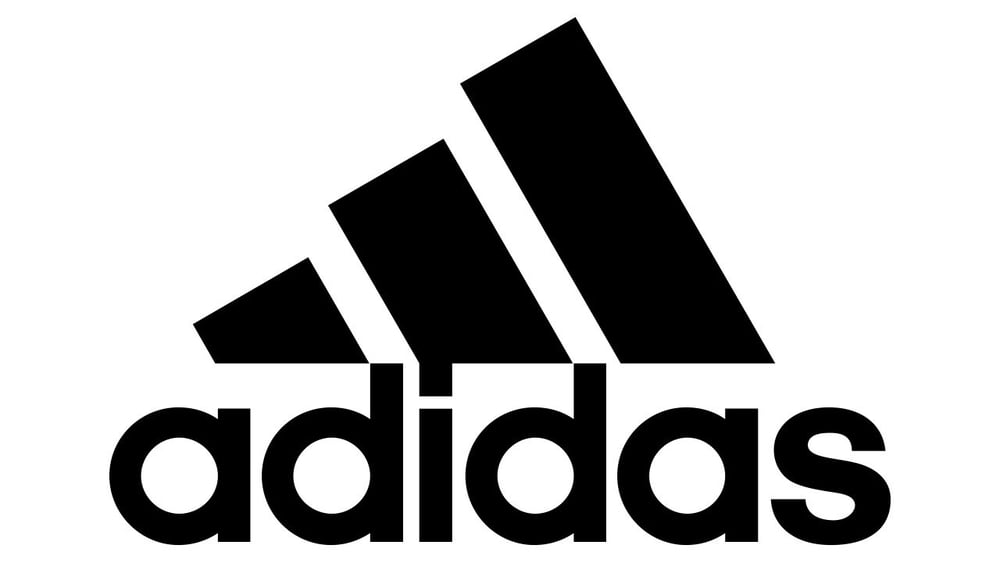
Adidas, for one, is an example of an abstract logo design. The three lines or stripes on the logo seemingly look like a shoe. However, these stripes represent the three landmasses the company sells its products to: Asia, Europe, and North America.
Another tip is to avoid going for a literal logo design. Apple’s logo isn’t abstract, but its uniqueness and relevance make it timeless. Instead of using technology-related icons or images, the brand chooses an apple and a tagline, “Think Different.”
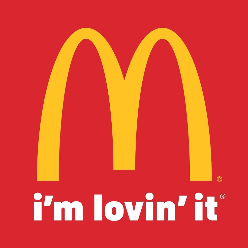
17. Include a Tagline
Taglines can further convey the message and solidify your brand values. It lets customers know what your brand has to offer and what to expect from your products or services. Thinking of a compelling tagline that gives a positive association with your company can also strengthen your brand.
Ensure that your tagline complements the logo design so both elements elicit the emotions you want customers to feel. Keep your taglines brief and catchy. It must be able to add to the value you promise to customers, just like the McDonald’s tagline “I’m lovin’ it.” It describes how people feel about McDonald’s, showing that simple pleasures sometimes involve eating at McDonald’s.
As for a clothing brand logo example, take a leaf from Nike’s logo. The brand complements the logo with the tagline, “Just do it.”
18. Make It Legible
Your company logo must be readable even from five feet away. Choose a font that resonates with your target audience. Avoid decorative fonts as much as possible, as they’re tricky on different mediums, like business cards or websites. Your logo must be scalable and still look good even when resized to a smaller size.
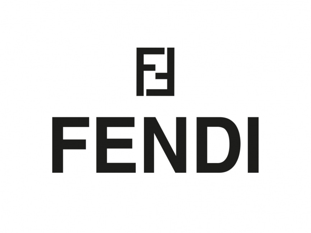
A quintessential example of a perfect typographical logo is Fendi. The luxurious clothing brand Fendi dons a simple sans serif font for its logo. It resembles the straightforward and uncomplicated Helvetica Pro font. This font choice is perfect for an upscale modern brand like Fendi. More importantly, the typographical logo is also readable even from a few feet away.
19. Keep It Symmetrical
Although asymmetry also works in logo design, considering balance is another way to keep all elements equal. When everything is in proportion, your logo design will look visually appealing as the viewers’ eyes focus on the entire ensemble instead of one component. Considering symmetry in logo design will leave a good and lasting first impression of your brand. Moreover, symmetrical clothing brand logos will look good on shirts and other online and print materials.
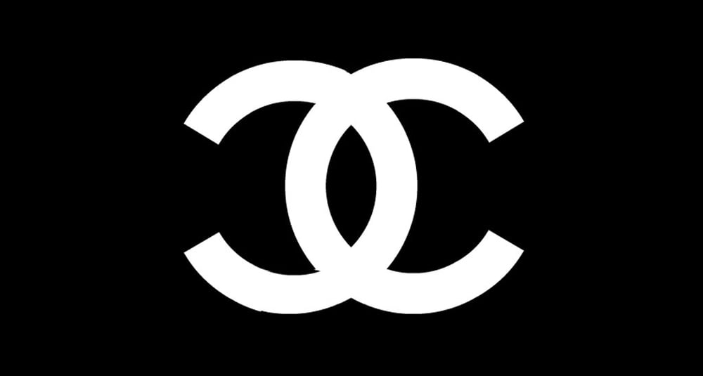
An example would be Chanel’s logo. As you can see, the letter C interlinks with each other and displays a balanced composition. The overall logo design is pleasing to the eyes and doesn’t distract the viewers away from it. Both the letters also get the same amount of attention from viewers.
20. Create Contrast
You want to keep everything equal so that every design element will shine. When designing for symmetry, it’s also vital to consider contrast to ignite visual interest. Creating contrast, such as differentiating colors or fonts, is a way to make each design element pop. This can help emphasize each component of the clothing brand logo.
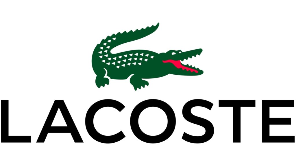
Imagine a logo with multiple design elements with one color and typeface. Your logo will look plain and dull! Contrast also controls what you want the viewer to see first. This logo from Lacoste is the best example of contrast that draws the eyes in. The green crocodile stands out from the black text. The red crocodile tongue also keeps the croc alive and active.
Why You Should Hire Professionals Instead of DIYing Logos
While these clothing brand logo ideas are easy to digest and may sound like it’s doable, putting everything together is not an easy feat. Doing the logo designs yourself or trying out those online logo generators might stretch a couple of dollars. However, cheap designs result in a cheap outcome. Aside from the fact that these online generators don’t focus on personalization, you are also at risk of trademark infringement.
Where to Find an Apparel Brand Logo Designer?
Here are the top three places to find the right apparel brand logo designer:
- Freelance Platforms: These offer a wide array of freelance logo designers specializing in apparel brands. You can browse portfolios, compare pricing, and hire a designer who fits your brand’s vision and budget.
- Design Agencies: These companies offer various graphic design services, including logo design. They have teams of designers with experience in a variety of specializations.
- Social Media and Design Communities: Websites such as Dribbble, Behance, and Instagram are great places for these designers to showcase their work. You can find logo design experts on these platforms, or you may opt to join Facebook groups to find the apparel brand logo designer that aligns with your requirements.
Another factor to consider is not hiring a professional graphic designer or logo designer to skimp on a few bucks. Even though you think your creative eye might cut the mustard, experts know better. Penji’s team of experts can help you design a clothing brand logo with ease. Here’s a 15 percent discount to get you started. Before that, view a video demo to see how Penji would be the right fit for your business!
Solve Your Design Dilemma for Good
Try Penji risk-free for 30 days & get unlimited apparel brand logo designs


About the author

Table of Contents
- 1. Know Your Target Audience
- 2. Create a Culture
- 3. Add Negative Space
- 4. Pick the Right Colors
- 5. Choose a Unique Typeface
- 6. Incorporate Storytelling and Brand Identity
- 7. Flaunt Your Style
- 8. Go for Timelessness
- 9. Try Extreme Minimalism
- 10. Be Playful
- 11. Convey Motion
- 12. Get Inspiration from Other Eras and Design Types
- 13. Bring an Experience to Life
- 14. Make a Designation Official
- 15. Show What Your Brand Represents
- 16. Go for Abstract Designs
- 17. Include a Tagline
- 18. Make It Legible
- 19. Keep It Symmetrical
- 20. Create Contrast
- Why You Should Hire Professionals Instead of DIYing Logos
- Where to Find an Apparel Brand Logo Designer?


