

The advent of remote work has paved the way for the creation of a variety of tools and resources, including cloud-based services. It has made team collaboration seamless and more efficient with its amazing possibilities for virtual interactions. If you’re thinking of creating your own cloud-based software, you need a memorable and unique logo to complement it. Here are 15 of the best cloud-based services logos for inspiration.
Key takeaways:
- What are Cloud-Based Services?
- 7 Key Elements of Excellent Cloud-Based Services Logos
- 10 Cloud-Based Services Logo Examples
- Where to Get Quality Cloud-Based Services Logos
What are Cloud-Based Services?
Let’s dissect the internet babble and speak in layman’s terms. Cloud or cloud computing, means being able to store, access, and sync files and programs over the internet. In the past, people used their hard drives to store their data, and access programs called local computing.
When you say cloud computing, storing and accessing data and programs will not involve your hard drive. Instead, you do everything over the extensive network of the world wide web. Also, cloud computing will not use any hardware linked to a network or local servers, for that matter. So what makes a good cloud computing logo?
Some cloud-based services logos integrate a cloud symbol. The cloud symbol dates back to 1994 when it represented internet network engineering. Servers, data, and connections were all linked by white cumulus clouds. And now, a cloud is more than just a metaphorical symbol of the internet. It has become an infrastructure for big and small businesses.
[in_content_ads gallery=”logos” logo=”on” title=”Need graphic design help?” subtitle=”Try Penji’s Unlimited Graphic Design and get all your branding, digital, print, and UXUI designs done in one place.” btntext=”Learn More” btnlink=”https://penji.co”]
7 Key Elements in Excellent Cloud-Based Services Logos
You can choose between a myriad of services left and right, but there are cloud-based service logo designs that are a crowd-puller. The perfect use of typography, shapes, layout, and even colors will impact how users choose an app or service.
Here are seven logo design elements to think about when creating your cloud logo:
- Simple
- Memorable
- Relevant
- Timeless
- High-quality typography
- Appropriate colors
- Scalable/Versatile
10 Cloud-Based Services Logo Examples
Here are 10 of the most famous cloud-based services logos that stand out.
1. Microsoft Office 365
Everybody knows the go-to Microsoft office tools like Word, Excel, and PowerPoint. It now has a cloud version called Microsoft Office 365. Microsoft Office logos go a long way. They just recently revamped their logos this year to keep up with the trend.
The new ones have a good layout which separates the letter from the symbol. It adds more depth to the logo and is based on a fluent design system. They look modern and aesthetically pleasing.
2. Salesforce
Salesforce is one of the best CRM (Customer Relationship Management) systems. Their logo used to be just a white and blue gradient puffy cloud with the name in the middle. The new logo, which comes in a cool, soothing blue color with a straightforward typeface, exudes professionalism.
3. G Suite

G Suite is an office productivity suite that includes Gmail, Google Calendar, Hangouts, Sheets, Docs, Forms, and more. As you may know, Google is one of the most well-known brands which often plays with and integrates primary colors in their logos. The new logo is a simple and fun logo everyone can relate to.
4. Dropbox

Dropbox is another file-sharing service that is free up to a certain gigabyte limit. The previous logo was a visible box symbol which showed that Dropbox was a place to store anything you wanted. The current logo, which is simpler and cleaner, has five isometric squares instead of an actual box while still keeping the blue color representing trust and dependability. When dealing with important data, you would want nothing but that.
5. WordPress
WordPress is probably the easiest web creation tool out there. Three primary color palettes represent its logo. They are blue, orange, and grey, which symbolize dependability, creativity, and professionalism. When a logo holds memorability, it doesn’t need a name attached to it, just like the WordPress logo.
6. Slack
Slack is a platform where teams can collaborate in real time. Their logo emanates a sense of cohesion. The colors are more harmonized compared to their previous ones. Plus, the new logo is more scalable, especially on different platforms.
7. Adobe Creative Cloud
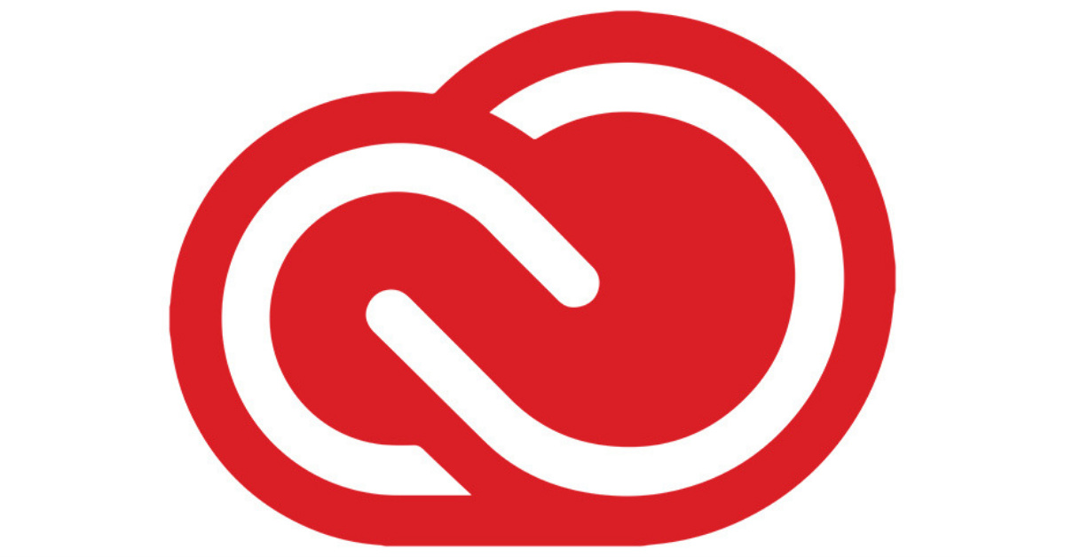
Adobe Creative Cloud provides applications for graphic designing, web development, video editing, photography, and more. Cloud-based services logos that stand out captivate a user’s attention at first glance.
Adobe has always used the color red, which represents energy and passion in the world of logos. Since Adobe Creative Cloud enables users to unleash their creative juices through design, nothing could be more fitting than a red cloud symbol. The white space is also the perfect element to rest the eyes from the fiery red color palette.
8. Verizon Cloud
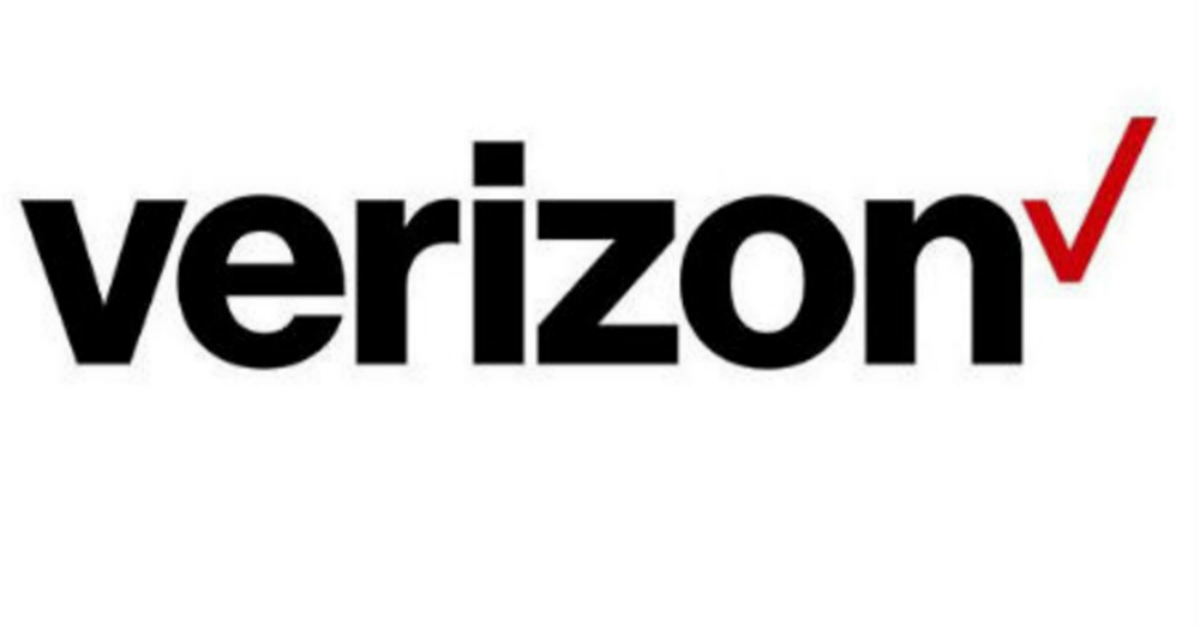
Verizon Cloud syncs all your pictures, contacts, music, videos, documents, text, and call logs. A logo design should have all the elements that communicate to their audience while still keeping the layout simple. Verizon Cloud’s logo, which has eye-catching typography, is now crisper and cleaner.
The checkmark at the end also signifies that Verizon indeed gets things done for you. Overall, the simple checkmark illustrates reliability which is how you want your essential data to be handled.
9. Apple iCloud

Like Verizon Cloud, Apple iCloud also allows users to sync and backup contacts, photos, messages, calendars, and more. Everything can also be synchronized with all your iOS gadgets, Mac OS, or Windows devices through the iCloud panel.
Apple relies on simple interfaces while integrating all the significant elements into the design. Case in point: The “bite mark” on the Apple logo, which means gigabyte. Apple wanted to emanate the same finesse on the Apple iCloud logo, epitomizing an elegant and professional brand built on trust, sophistication, and intelligence.
10. Amazon Drive
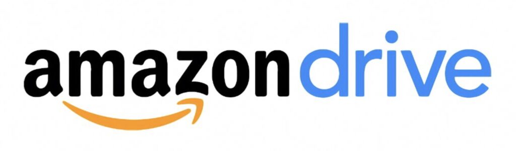
Aside from being one of the biggest e-commerce sites in the world, Amazon Drive is a platform that stores files from your mobile, desktop, and Fire devices. The Amazon Drive logo, which has an arrow starting from “A” to “Z,” indicates that Amazon can meet their customer’s every need. Excellent cloud-based services logos should reflect what the company is all about. The arrow here also resembles speed and progress, depicting Amazon’s other entities, like its eCommerce store.
11. Alibaba Cloud
China’s most popular brand Alibaba has now ventured into cloud-based services. Although unpopular within certain locations, Alibaba Cloud is still worth looking into. With 59% of companies in China being Alibaba Cloud customers, this one is huge. This cloud logo design is simple, with a bright orange color to make it pop. Alibaba also chose a light sans serif font to indicate a modern company.
12. IBM Red Hat
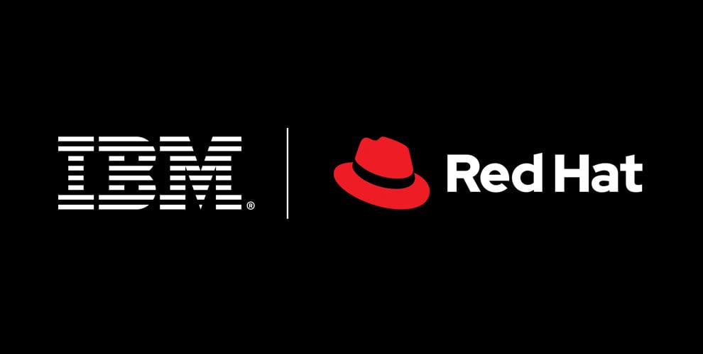
Founded in 1993, Red Hat has been an IBM subsidiary since July 2019. The famous cloud-based service has a logo that’s a great example of simplicity—a red hat alongside the recognizable IBM logo.
Apparently, there are no plans to create a new logo or merge the two. According to Red Hat’s website, they want each entity’s identity separate from each other. They want to have distinct and independent brand personalities. In some instances where their partnership with IBM is discussed, they advise that their logos be used alongside each other.
13. Oracle Cloud
Oracle Corporation’s cloud-based service logo speaks for itself. The brand used to feature the typical cloud icon you see in other cloud-based companies. But good thing they redesigned it into this modern typographical logo, which exudes an air of authority in the cloud-based industry.
14. Rackspace

Digital.com describes Rackspace as one of the very best public cloud facilities. It also has one of the most exciting logos in its category. Using red in a logo projects an image of professionalism. With the black included, it strengthens this characteristic even more.
Round shapes in logos are excellent for evoking positive messages. This one has it, and its slight tilt powerfully illustrates movement, more specifically, going forward. It also suggests stability and endurance, characteristics everyone looks for in a tech company. The white space in the shape of a person aptly suggests community, friendship, and unity. Overall, a well-crafted cloud-based logo design.
15. VMWare
Another excellent cloud-based service with an excellent-looking logo is VMWare. The overall design is perfect for the brand. While we have seen many cloud shapes in this article, VMWare is still noteworthy. The prism-like cloud with bursts of green and blue keeps visual interest.
A logo design rule is avoiding many color combinations as much as possible. VMWare’s logo may have violated that rule, but the brand still came up with a top-notch design. This proves that designing a logo shouldn’t be restrictive as long as it works.
Where to Get Quality Cloud-Based Services Logos
Creating a logo is a task that’s meant for more experienced graphic designers. You would want a team that understands how a logo works and knows the science behind it. Your logo is one of your strongest representations. If you fail to captivate the market with it, it will be more challenging to win new clients.
If you’re creating a cloud-based service, make your logo communicate with your target audience. You can rely on Penji for your logo design needs or marketing designs, for that matter. Requesting a logo from Penji requires three steps only:
1. Request a Logo
Log in to your account and type all the design details you need for the project. Once submitted, a designer will contact you for confirmation and clarification. Be clear and concise with your design brief to ensure a precise outcome.
2. Review the First Draft
Your designer will immediately work on your request and expect your first draft to be delivered within 24 – 48 hours.
Check the design and see if you’re satisfied—otherwise, request revisions. Click, point, and directly type your feedback on the areas that need improvement.
3. Get Your Design
Download the source file and organize projects in your library. Also, you may add up to 10 team members to Penji’s platform for easier project collaboration.
Ready to try Penji for 30 days risk-free? Sign up now or commit to a full month and cancel anytime. Grab this limited 15 percent discount.
About the author

Table of Contents
- What are Cloud-Based Services?
- 7 Key Elements in Excellent Cloud-Based Services Logos
- 10 Cloud-Based Services Logo Examples
- 1. Microsoft Office 365
- 2. Salesforce
- 3. G Suite
- 4. Dropbox
- 5. WordPress
- 6. Slack
- 7. Adobe Creative Cloud
- 8. Verizon Cloud
- 9. Apple iCloud
- 10. Amazon Drive
- 11. Alibaba Cloud
- 12. IBM Red Hat
- 13. Oracle Cloud
- 14. Rackspace
- 15. VMWare
- Where to Get Quality Cloud-Based Services Logos
- 1. Request a Logo
- 2. Review the First Draft
- 3. Get Your Design


