
Circles and spheres are some of the most common shapes we see in logo designs. It’s because they are packed with visual interest and are both high in symbolism that gives a sense of completion and symmetry. If you’re thinking of creating a logo for your brand, circles are great, but sphere logos provide that extra oomph.
Our designers made all 10 of the sphere designs below. So if you’re interested in getting a new logo design (or upgrading your old one), Penji has your back.
What Does a Sphere Symbolize in Logo Design?
Round shapes indicate community, completeness, and stability, which also applies to spheres. Additionally, round shapes are “inviting” and appealing because it suggests being approachable. And in some cases, spheres can also help achieve movement at certain angles.
Plus, companies with a global presence could show a sphere to indicate that they’re a multinational corporation. And instead of opting for the earth to show its impact globally, they use the sphere to represent the globe.
Companies that have sphere logos include:
- AT&T
- Pepsi
- Sony Ericsson
- Xerox
- Xbox
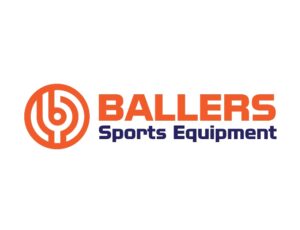
1. Ballers Sports Equipment
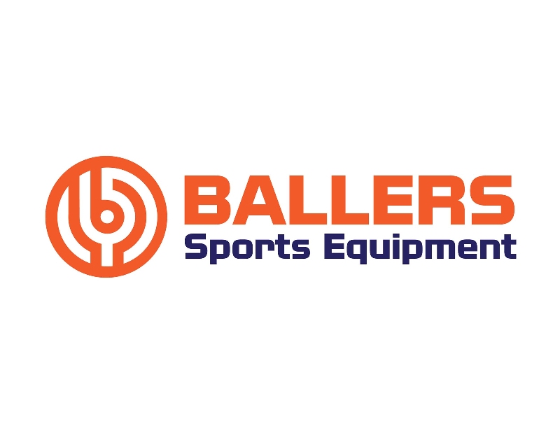
If your company sells sports equipment, and you want to have a relevant logo, sports balls, baseball bats, or bowling pins are common themes. But if you want to make an excellent first impression with your logo, you can show the sphere in a different manner like this one from Ballers Sports Equipment. It appears that the abstract or pictorial mark shows the top of a basketball. The orange motif helps in recognizing the basketball. And it also shows the overall vibe of the logo, which is energetic and enthusiastic.
Sphere logos to make your brand stand out
Design sphere logos in 1-2 days


2. Planet 88 Drinking Hole
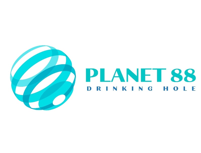
Services or businesses in the water industry would typically have a water drop as their sphere logo. But if you want something more unique, you can check out this logo from Planet 88 Drinking Hole. The spherical shape makes the logo look like it’s in motion. This is a great way to convey movement in a still logo without using arrows or waves.
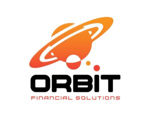
3. Orbit Financial Solutions

If you have a space-themed business name, it’s only apt to have a space-related element or icon to your logo. And that’s the case for Orbit Financial Solutions. Their logo shows Saturn and other planets or moons close to it. The moons or planets are shown orbiting Saturn, which symbolizes their business. Additionally, orange is a rare color in financial logos, but orange indicates taking risks, which is a trait you can easily associate with financial companies.
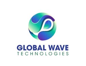
4. Global Wave Technologies
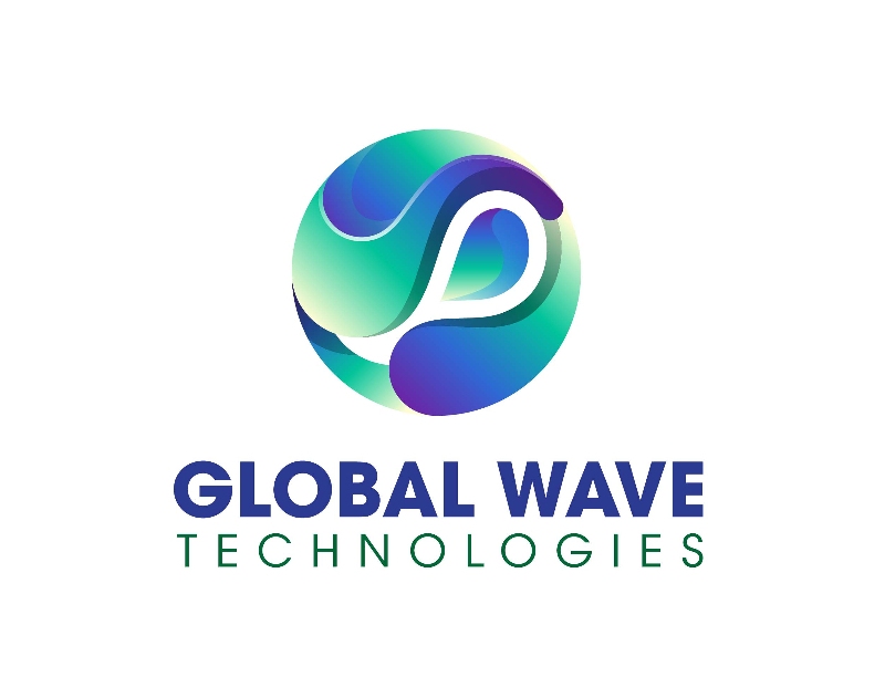
With a name like Global Wave, you’d imagine they would have a wave in their logo. However, they formed a wave like a globe instead of having a simple wave logo. It signifies their influence or impact globally. The green and blue motif could also symbolize the earth and the company’s global reach.
5. Global Logistics
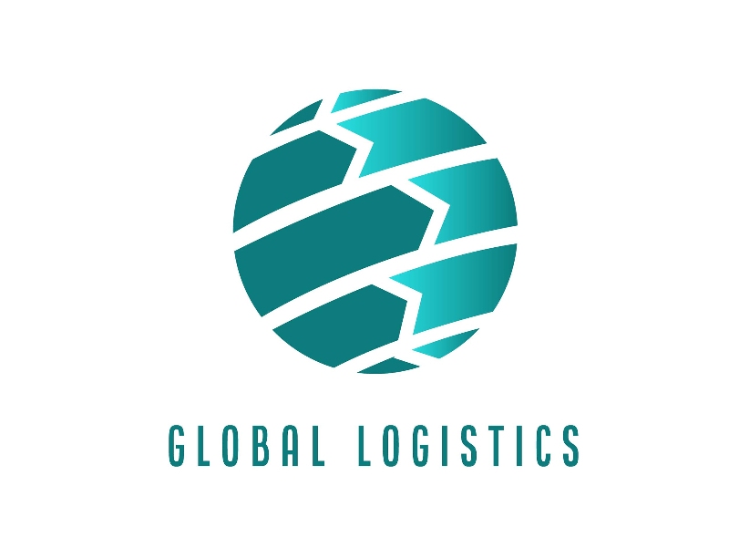
Most logistics logos would have a picture of a plane, showing the target audience they’re in the business of moving things. But Global Logistics is reimagining the logistics logo differently. The sphere logo represents the earth, and there are arrows on the planet indicating movement and shipments.
6. Bowling Buddies
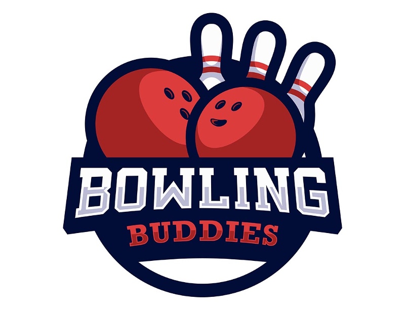
The spheres in your logo don’t have to appear as one big round shape, like this one for Bowling Buddies. The bowling balls serve as the spheres in the image. But what stands out most in this logo are the bowling balls and how the holes have happy facial expressions. It’s a great way to personify an object to represent either your bowling group or a bowling alley, making one feel welcomed or part of a group.
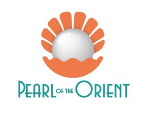
7. Pearl of the Orient

If you have a jewelry business and want to show you’re selling the best offerings in the industry, you can take a look at this sphere logo for the Pearl of the Orient. A significant feature of this logo is the pearl. It looks realistic. You rarely see realistic elements in any logo, and it can catch their target audience’s attention. The added shine and shadow give the logo some oomph. Although the orange shell catches your eye, too, you’ll fixate on the realistic pearl design.
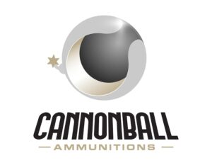
8. Cannonball Ammunitions

Here comes the boom with this logo for Cannonball Ammunitions. This sphere logo is relevant to their business name. Although cannonballs usually appear dark, adding a chrome-like motif to this gives it a flashy look. And having this logo will make Cannonball Ammunitions different from other companies. Plus, the color scheme gives it an “extravagant” look, which is rare for businesses in their industry.
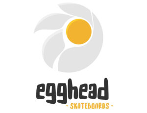
9. Egghead Skateboards
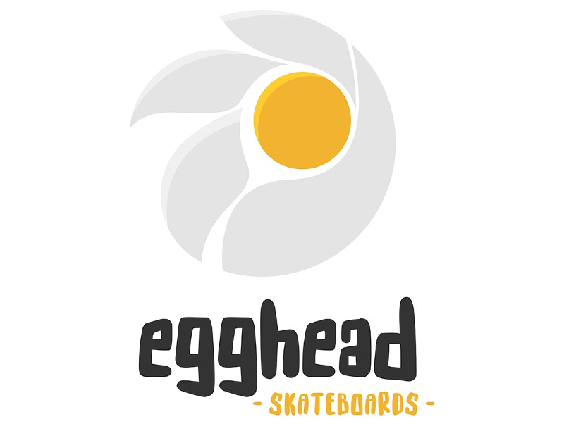
Get cracking and inspired by this sphere logo from Egghead Skateboards. The sphere in this logo is subtle, and it’s in the yolk. Like the yolk in the logo, you can even turn a circle into a sphere by adding shadows to it. It’s one easy trick to make your modern logo unique from others in your industry. But don’t stop with just the sphere, you can even create a character or mascot, and theirs looks like a chicken.
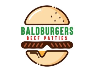
10. BaldBurgers Beef Patties
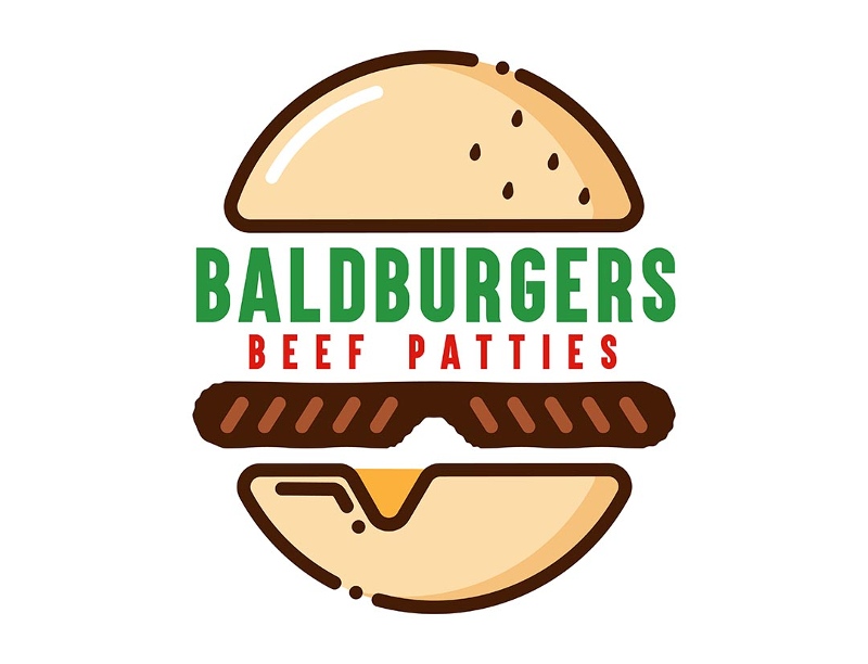
This is a clever and funny take on a sphere logo. The logo design for BaldBurgers Beef Patties may resemble a hamburger at first glance. However, once you read the company name, you’ll see a bald head and the burger patty as a mustache. It’s a creative way to transform your business name into its visual representation.
How Do You Make a Sphere Logo Using Canva?
If you want to try designing a logo from Canva, there are two ways to do so. The first step is to use an existing template and edit it. Meanwhile, the other way is to create one from scratch.
Using an Existing Template
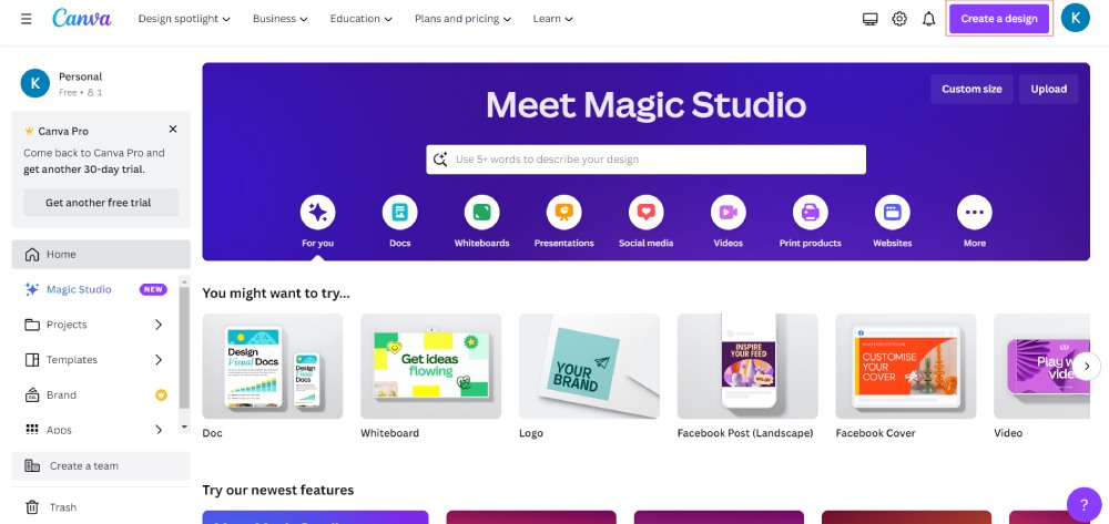
1. Go to the Canva dashboard. Then, click “Create a Design.”
You can click “Logo.”
From there, Canva will load a default logo canvas.
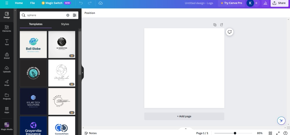
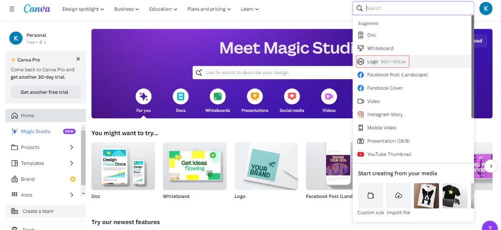
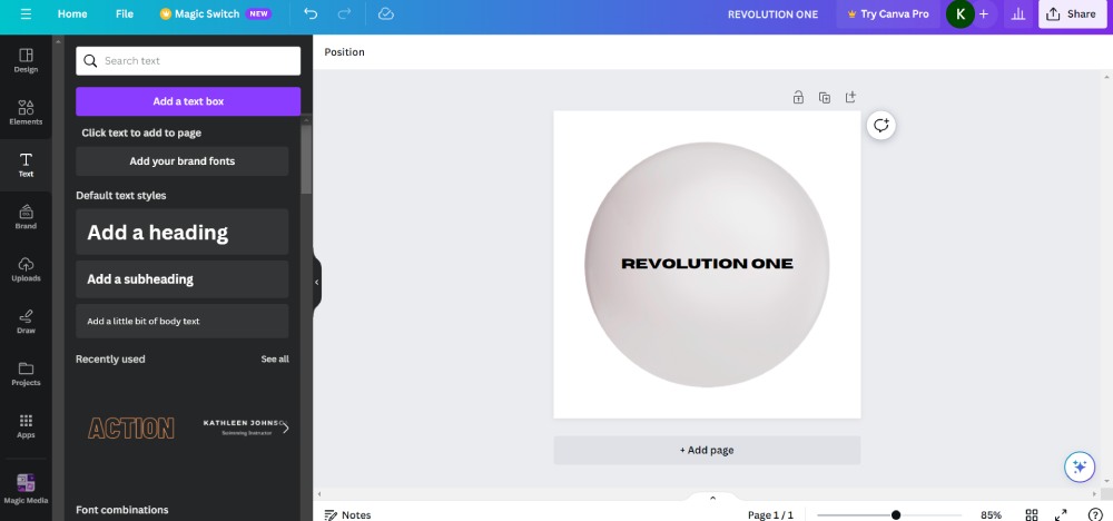
2. Once the logo canvas loads, search “Sphere” on the “Design” tab. From there, Canva suggests sphere logo designs.
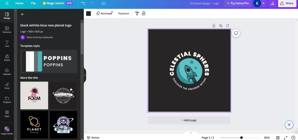
3. Select your preferred Sphere logo.
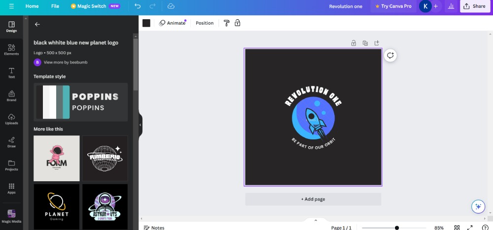
4. Make changes like font type and color, logo colors, and imagery.
5. Once done, click the “Share” button to save your logo.
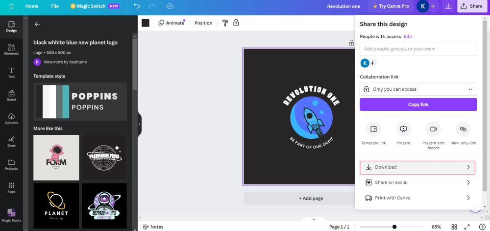
Then, choose “Download.”
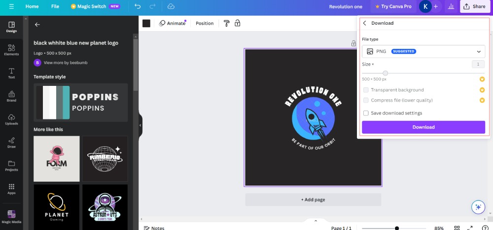
You can select your preferred file.
Creating One from Scratch
You can follow Step 1 from the previous procedure.
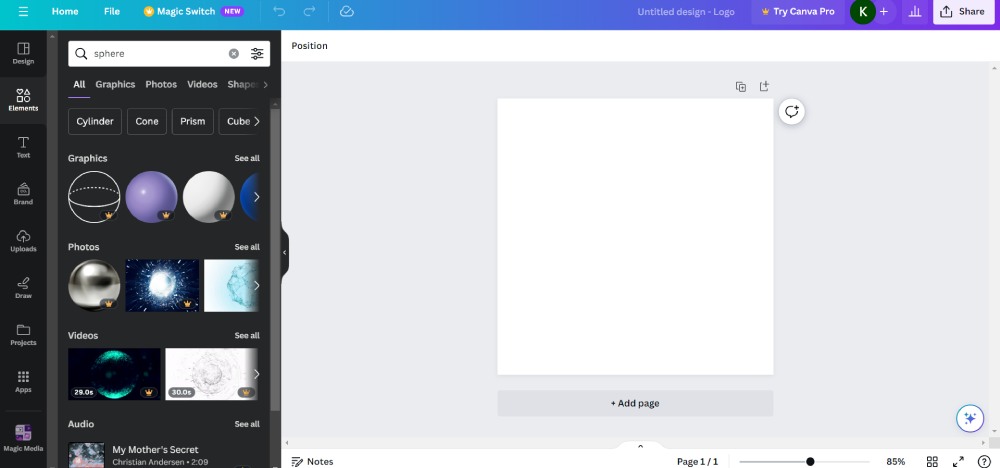
After that, you can use a “Sphere” from the Elements tab.
Or, build one using the “Draw” tool.
Once you’ve added a Sphere, add a background color, text, and imagery to complete the look! Then, follow the Download instructions above!
Where Can You Get a Sphere Logo Design?
Although it’s fulfilling to create your logo, it’s always good to outsource your logo design to skilled designers. This way, you get professional logo designs that would best fit your brand. And if you don’t know how or want to create a logo, here are the best services to get logo design!
1. Freelance Logo Designers
Freelance logo designers are the top option when getting a logo from a professional. It’s easy to browse freelance logo designers for your sphere logo design. For example, you can search Upwork or Fiverr for the best freelancer for your logo design. However, if searching on Upwork or Fiverr isn’t ideal, you can find expert logo designers on specialized graphic or logo design sites. Additionally, some websites would have design contests, allowing you to start a project and letting freelancers submit their designs. Some sites include:
- 99designs
- Behance
- Dribbbble
- DesignCrowd
- CrowdSpring
2. Agencies
Logo design agencies are a great option for a comprehensive branding design. Not only can they make a logo from scratch, but they will also add your logo to branding assets (e.g., business cards and stationery), merch, and so much more! Working with experts in an agency will help you understand your brand better. Agencies strive to create a detailed logo design with a purpose. Plus, they can make your brand come to life through print and digital assets.
3. Unlimited Graphic Design Services
Unlimited graphic design services are another excellent alternative to getting your sphere logo! You don’t need to hire anybody or wait for a quote. Unlimited graphic design services hire the cream of the crop in their elite designer team. Plus, they have upfront prices when you subscribe!
You can request a logo design once you start your free trial or subscription. But what’s great about this design service is you can request other designs, like web designs, social media designs, digital ads, and so much more!
And if you need logo designs from the best unlimited graphic design service, learn how to get one from Penji!
How to Get a Sphere Logo from Penji
At Penji our team of graphic designers are here to execute any design project you have. From sphere logos to social media posts to packaging designs and more – We’ll get your design draft back to you in 24-48 hours!
Try Penji out for 30 days and submit your first design request immediately. Our dashboard lets you:
- track the progress of multiple projects
- request point-and-click revisions
- manage multiple brands or clients
- send vital materials right to your designer
Sign up for a demo to see how it works. Or, if you’re ready to get your sphere logo now, subscribe to Penji here!
About the author

Katrina Pascual
Katrina is a content writer specializing in graphic design, marketing, social media, and technology. In her spare time, she writes monthly personal blogs to practice her craft.
Table of Contents
- What Does a Sphere Symbolize in Logo Design?
- 1. Ballers Sports Equipment
- 2. Planet 88 Drinking Hole
- 3. Orbit Financial Solutions
- 4. Global Wave Technologies
- 5. Global Logistics
- 6. Bowling Buddies
- 7. Pearl of the Orient
- 8. Cannonball Ammunitions
- 9. Egghead Skateboards
- 10. BaldBurgers Beef Patties
- How Do You Make a Sphere Logo Using Canva?
- Where Can You Get a Sphere Logo Design?
- 1. Freelance Logo Designers
- 2. Agencies
- 3. Unlimited Graphic Design Services
- How to Get a Sphere Logo from Penji


