
Your color scheme is one of the most critical components in building a successful website. While layout and functionality are probably top of mind, your design facilitates both. A well-designed site ties everything together seamlessly and creates an engaging atmosphere for visitors. In this blog, we’ll explore color in web design and how to brand your business with the right visuals.
Color Theory in Web Design
Color theory reveals how the shades of the color wheel interact with each other. It is best consulted in the early stages of designing your website, app, logo, or any other brand asset. When you’re deciding on a color palette for your website, you want to make sure nothing clashes. People generally know the term “complementary colors,” but there are several other color combos to consider.
Color wheels can be built in two different ways: Red Yellow Blue (RYB) or Red Green Blue (RGB). Each has a slight variation. For example, in RYB, purple and yellow are complementary, while in RGB, blue and yellow are complementary. Because you are designing a website (on a light-emitting computer screen), it’s best to consult the RGB color wheel.
Now let’s look at the different ways to choose colors in web design.
Monochromatic Colors
A monochromatic color palette uses multiple shades of the same color – or just one dominant color. It’s often used for interior decorating to give dimension and definition to a physical space. A monochrome color scheme can make your website look professional and polished. Without adding too many unnecessary colors, you can draw your visitor’s focus and avoid distractions.
A great example of a monochromatic website is that of Evolve Wealth. You can see several shades of blue used to create subtle dimensionality.

To achieve a monochromatic website, aim for something like this (below). You can use the free color palette generator Coolors to get started.

Image Credit: Coolors
Analogous Colors
An analogous color scheme consists of 3 colors that sit next to each other on the color wheel. An example might be blue, violet, and indigo, or yellow, green, and blue-green. Analogous color schemes can include the same color in different shades (just like monochromatic). But it can also include completely different colors, which gives you a wider selection to choose from.
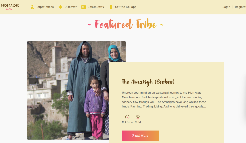
Analogous color schemes are popular in web design because they provide both contrast and similarity. Nomadic Tribe’s website makes beautiful use of analogous colors. The buttons and headings feature a gradient that moves from pinkish-red to vibrant orange. Meanwhile the menu and text box shown is light yellow. The mud-brown text along with stunning images and video clips of people living in nature complete the package. The brand presents as warm, vibrant, and earthy with a yellow-orange-red-brown color palette.
An analogous color palette might look something like this:
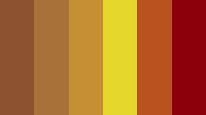
Image Credit: Coolors
Complimentary Colors
Finally, let’s look at complementary colors. Unlike monochromatic and analogous colors, these colors mesh well because of their contrast, not their similarity. Complimentary colors are opposite to one another on the color wheel. Classic examples include red and green, blue and yellow. Depending on the shade, there will be some overlap. For example, green may be complementary to violet, magenta, or red – it all depends on the tone.
Complimentary colors in web design create a flattering and stark contrast. A perfect example is this website by Flamingo. Complimentary blue-violet and yellow-orange create a satisfying dichotomy that isn’t too dull or too bold.

A complimentary color palette might look something like this:
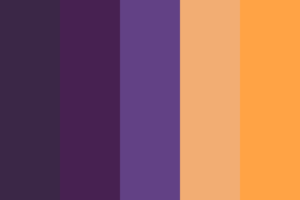
Image Credit: Coolors
Check out these small business website designs for more inspiration.
The Psychology of Color in Web Design
While color theory is about the colors themselves, color psychology is about what the colors evoke. Color psychology dictates how each color affects human emotion, perception, and behavior.
There’s no escaping certain color associations. Universally, we know that red typically means hot while blue means cold. On a more meaningful level, black is often associated with death while pink is associated with love. These cultural links between color and meaning don’t have to dictate your design strategy, but you should consider them. There’s nothing worse than giving the opposite of the desired impression (or confusing potential customers with random design choices).
Your brand personality should always dictate your color choices – not the other way around. The colors you choose should not be arbitrary, but should instead communicate key things about your company. If you work in an industry where dependability is highly desired, but rare, you might choose to position yourself as the most trustworthy brand among your competitors. In this case, it might make sense to choose blue, the most often associated with trust.
At the end of the day, color psychology is about what you want to communicate to your audience. Are you fun, daring, laid back, down-to-earth, confident? Color in web design is about bringing that message through visually. This psychology of color guide can help you get started.
Choosing Website Colors & Visuals
It goes without saying that your logo and web design colors should match or complement each other. Flux Design’s 60/30/10 rule is a good place to start if you’re unsure. This means choosing 3 colors: a main color (60), a secondary color (30), and an accent color (10). Black and white count. Experiment with different variations and don’t be afraid to break the rule of you stumble upon something that feels right.
Once you choose a color palette, spend some time considering other visual elements. Images, video clips, buttons, and icons all contribute to a well-coordinated website design. A graphic designer can help you bring your vision to life with custom website graphics.
In addition to visuals, selecting a typeface for headings and regular text will create consistency. You may want to use the same fonts for your social channels and website to stay recognizable across platforms. Test out your typeface color with your website background to ensure it’s easy to read and doesn’t strain the eyes.
About the author

Brianna Johnson
Brianna is a professional writer of 10+ years who specializes in branding, marketing, and technology content.


