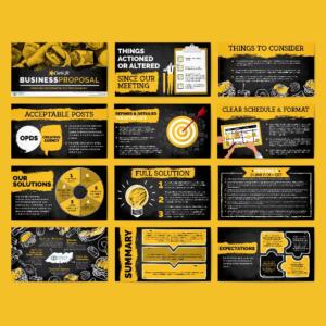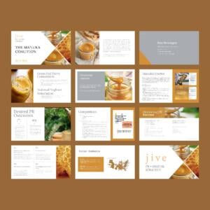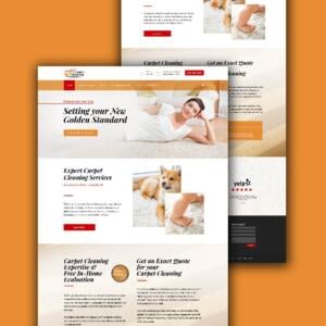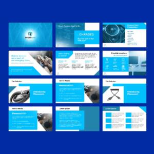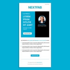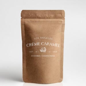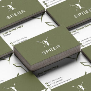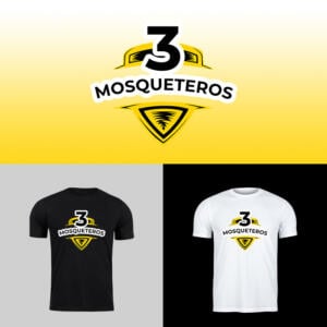
One of the biggest reasons startups and small businesses tend to shy away from getting great website designs is the budget constraints. This is the exact reason Penji was established: to make graphic and web design services accessible and affordable to these companies. All you need to do is look for inspiration for your designs. And so, here are 10 web designs for small businesses you can use as examples:
To add more inspiration to your website design, we’re giving away 15% off when you use the code INSPIRESB15 on any of our plans.
The Importance of Websites and Digital Presence for Small Businesses
A well-designed website is necessary nowadays, even for startups and small businesses. It’s no longer a luxury reserved for established brands. It acts as your digital storefront, lets potential customers discover your products and services, and easily projects your brand values. Brands with an effective online presence gain credibility, attract more customers, and build trust. Here’s how getting a web design carfted for small businesses can boost your brand:
- Enhances Credibility: Consumers trust businesses with professional quality websites and a polished online presence.
- Expands Customer Reach: A unique website lets you reach local, national, and even global audiences.
- Improves Customer Engagement: Interactive and responsive design elements improve user experience and keep visitors engaged.
- Boost Sales and Conversions: With optimized pages, clear calls-to-action, and easy navigation, your website can increase conversions.
- Strengthens Your Brand Identity: A well-crafted website helps differentiate you from your competition.
Why You Need a Web Design Service for Your Small Business
While there are plenty of website builders and DIY options available, investing in a professional web design service for small businesses offers advantages. Expert designers will give you the following:
- User-Friendly and Responsive: Your web design will be optimized for various devices. This ensures excellent browsing experiences, regardless of the device your audience is using.
- SEO-Optimized: Designed with best practices to have your website rank higher in search engines.
- Custom Features: You’ll get features and design elements tailored to your specific business’s needs and align with your goals and objectives.
- Secure and Scalable: Protecting customer data and allowing for future growth.
Hiring a web design service for your small business allows you to have visual appeal, functionality, and a website that’s results-driven.
As promised, here are the ten small website design inspirations compiled just for you:
1. KeyNest
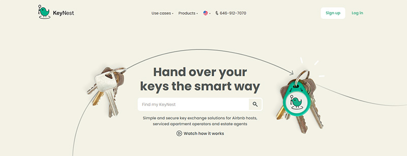
A startup that specializes in rental property services, KeyNest’s web design is clean and beautiful. At first glance, it may seem bare, but when you look closely, this was done intentionally. The layout points to the company’s message clearly and allows visitors to quickly do what they need to do on the site.
It has call-to-action buttons to make searching for information straightforward. It has a contact form, an area dedicated to customer reviews, and other vital information about the company. The design has minimal distractions but still has the correct elements to be informational and appealing.
2. bluboho
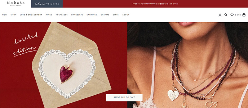
An online jewelry store, bluboho, has an elegance all over its web design. Its strong branding, exquisite products, and functional layout all contribute to its compelling design. The photographs show both the jewelry and some ways to wear them, which is enticing to visitors.
This small business web design‘s color scheme is subtle and subdued, emphasizing the real stars of the site. It has all the information you want, even if the design abounds with negative space. This makes for a web design that’s calming and enjoyable to browse through.
3. Millk
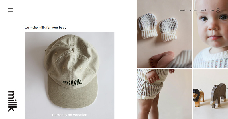
Australian kids’ clothing brand Millk has an easy-to-navigate website, aside from it being full of charm. The site is filled with its products using large and clear images. Visitors will feel the exhilarating experience of flipping through an actual catalog.
This website has a responsive design making it accessible to mobile devices. This allows visitors the convenience of shopping anywhere they are. Its soft colors make browsing uncomplicated and easy on the eyes, which matches the brand’s personality quite well.
4. Architecture In Formation
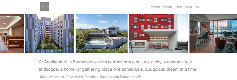
With a slideshow of their works as the landing page, Architecture In Formation is a small web design worthy of emulation. The overall design is minimalistic as they let their work speak for themselves and lure in the visitors. You must use high-resolution images for your website, as these are the products you’re selling. Your visitors should have a good look at them and be inspired to do business with you.
If you’ll notice this design, there isn’t much content, just a showcase of the company’s incredible talents. It has all the right elements enough for them to land on this list of the best small business web designs.
5. Allbirds
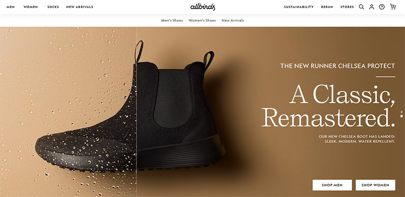
With sustainability as its primary advocacy, the Allbirds web design is noteworthy if you support the exact cause. The design beautifully blended colors that are close to nature and shades that are attention-grabbing. It has lots of greens, browns, beiges, and some grey undertones that make up for a refreshing look.
This small business web design captures the company’s message while providing a trendy and upbeat atmosphere. This approach is ideal for fashion and retail brands looking to push for their cause without being dull and boring.
6. Lola Pate
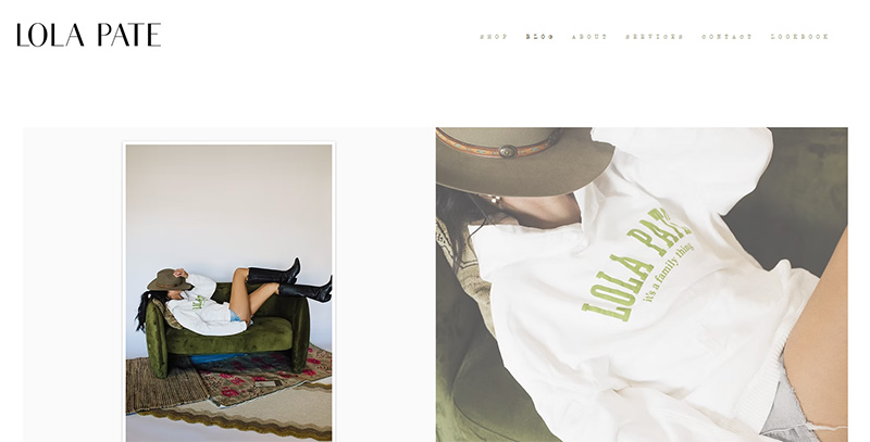
Storytelling is a big part of marketing, and that’s what Lola Pate did for their website. The landing page is gorgeously-designed with a model and their products that seem to weave a story and pull in the viewers. It has clear pictures, ample white space, and matching fonts that make scrolling down a feast for the eyes.
It also has some images that move while you scroll, adding to its appeal. The information on the site explains its mission and vision well without overwhelming the visitors. The CTAs are readily available, so potential customers know where to go and what to do.
7. Press London
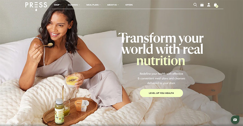
Plant-based grocery supplier Press London sells detox products, cold-pressed juices, and other grocery items. Just looking at their web design will give you a refreshed and rejuvenated feeling. Precisely what a website design should achieve and something you should aim for.
The bold letters, pastel colors, and stunning pictures give the brand a spirited and lively atmosphere. It has a clean layout, striking product packaging, and informative detox suggestions, complete with CTAs and price info. All the visitor needs to do is tap on them and start enjoying browsing through their product collection.
Product packaging is one of Penji’s favorite design requests. Check out our demo video here if you want to know more about what we do.
8. Bennett Tea
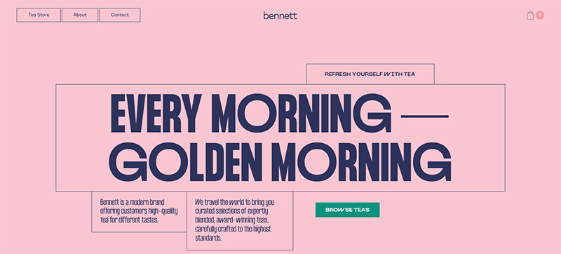
With scrolling effects, creative layouts, and animated page transitions, the Bennett Tea web design makes tea drinking look oh so special. When you think of a tea shop, you see flowery cups and dainty tablecloths in your head, but this company steered clear of the norm. Its website design is contemporary, colorful, and youthful, perfect if you want to introduce tea to a younger audience.
With their wonderful packaging designs, the products grab attention as you scroll through the collection. The site added details about each tea, so deciding on which to buy is easy for the viewers. Overall, it is a fun website to browse through yet informative and functional.
9. Wisr
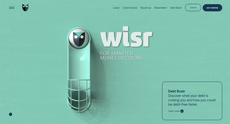
Financial services website designs are usually business-like, making them seem somber and stiff. This is why Wisr has a website that we consider one of the best. It is colorful, vibrant, fun, and genuinely entertaining. It doesn’t have a lot going on but works very well as a viewer would want to scroll right through the bottommost part of the site.
Not only does this website score high on the coolness metrics, but it also wins in the functionality department. It has a marble that you follow and tells you about what the company does. It also uses cookies to bring you back where you left off, which is helpful for conversions.
10. Music Audience Exchange (MAX)
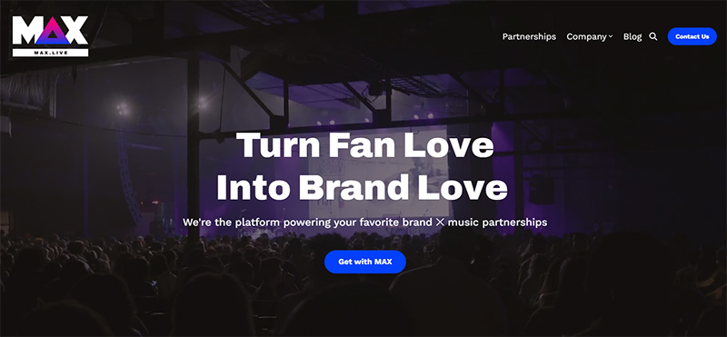
If you’re in the music industry, your website design should be dynamic and full of energy. The MAX web design is an excellent place to start if you want inspiration. It is a company that merges artists and brands, and the design perfectly shows professionalism, creativity, and class.
The background it uses is videos of different artists performing. It has a black monochromatic color scheme and very minimal text. The CTAs stand out as it is in shades of red, so whether you’re a musician or a producer, you’d quickly know what to do and where to go.
How Penji Does Small Business Web Designs
The great thing about having an online presence is that no one will know your business size. The competition isn’t all about how huge of a company you are. It’s about who stands out the most. Prove your value by having a web design that is professionally done and one that will get you noticed.
Our designers at Penji can come up with world-class small business web designs. Below are five website designs Penji created for small businesses. Take a look and get inspired. You can view more of our previous work here.
Our 30-day money-back guarantee will give you a full refund if you’re unsatisfied with our work.
1. smalltravelers
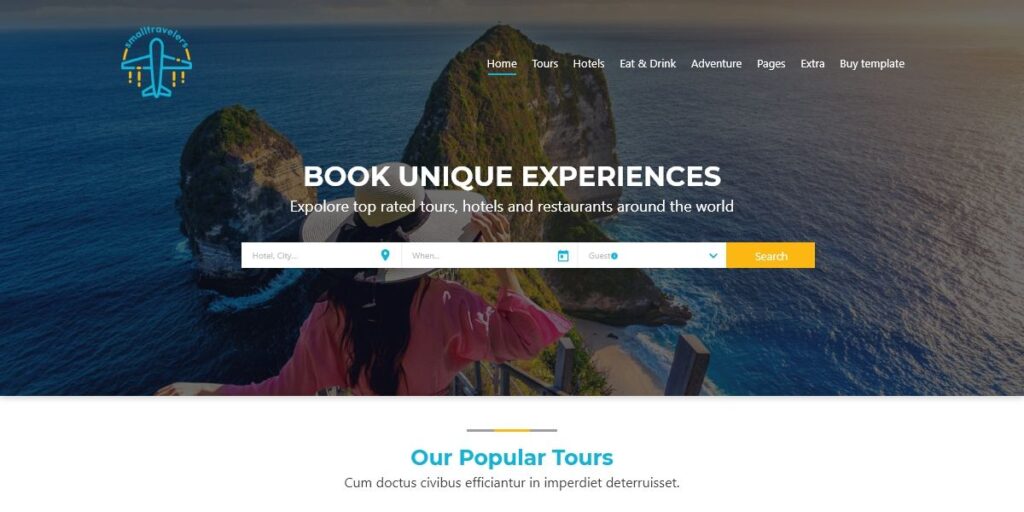
This website design is for a travel and ticketing company which we named smalltravelers. From its logo to the web design, our Penji designers worked hard to get this beautiful and functional site. It has a fantastic view as a background to lure in the prospects and the CTAs that are hard to miss.
2. Ephoria
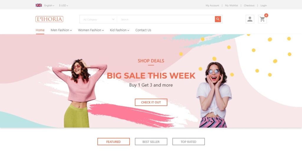
Some people consider retail shopping therapeutic, and this design for Ephoria just fits the bill quite nicely. It has all the bright colors, the models are in high spirits, and the overall ambiance of the page is fun and light. This proves that when you say “happy shopping,” you really mean it.
3. Zeeb
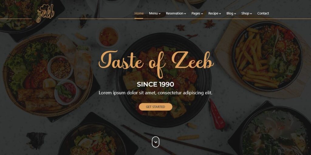
Right off the bat, this website design made for fusion restaurant Zeeb has made visitors’ mouths water. While the images of their food were placed in the background, they do an amazing job of enticing customers. The lighting was slightly dimmed for that added drama and sophistication.
The color scheme also fits the brand personality, using only a few colors. The font combination is also spot on as the pairing of an elaborate type with a san-serif one added class and elegance.
4. Crafty Biz
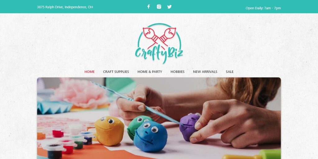
Hobbyists and crafting enthusiasts will love this small business web design made for Crafty Biz. It is light, airy, and gives off an aura of fun and enjoyment. And it is definitely an eye-catcher with its bright colors, crisp photographs, and clean layout.
It has all the information a visitor might need without filling the spaces with unnecessary elements. It evokes emotions that are heartwarming, friendly, and entertaining. If you’re in the same or related niche, this is a great design to take note of.
5. biz muffin
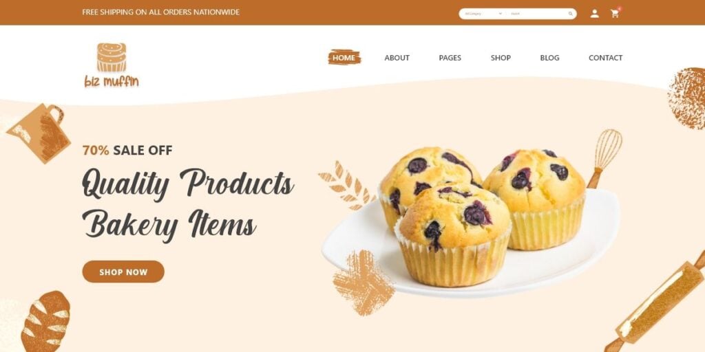
When in the food industry, cleanliness is paramount. This is exactly what small business biz muffin does for its website. It has a clean, crisp, and so delectable atmosphere. The imagery is so spotless that it makes you want to reach out and grab that muffin.
The color scheme is spot on, using varying shades of browns and oranges. It has additional illustrations thrown around as decorations without cluttering the page. The fonts used were classy, elegant, and heartwarming, ideal for a bakery business.
Final Thoughts
The best thing about having a great website design for small businesses is that it gets you on the same level as the big-named brands. You can get the attention of prospects as much as the established companies. The secret is a web design that makes you stand out.
As you can see from the small business web designs listed above, Penji designers are not to be outdone. They can create beautiful web designs that will place your business on par with everyone else. Even better.
Get our web design service for small business now by subscribing to any of our plans which you can find here. Don’t forget to add the code INSPIRESB15 to get more savings!
About the author

Celeste Zosimo
Celeste is a former traditional animator and now an SEO content writer specializing in graphic design and marketing topics. When she's not writing or ranking her articles, she's being bossed around by her cat and two dogs.
Table of Contents
- The Importance of Websites and Digital Presence for Small Businesses
- 1. KeyNest
- 2. bluboho
- 3. Millk
- 4. Architecture In Formation
- 5. Allbirds
- 6. Lola Pate
- 7. Press London
- 8. Bennett Tea
- 9. Wisr
- 10. Music Audience Exchange (MAX)
- How Penji Does Small Business Web Designs
- 1. smalltravelers
- 2. Ephoria
- 3. Zeeb
- 4. Crafty Biz
- 5. biz muffin
- Final Thoughts

