
Designing a finance logo can be a challenging one. You need to incorporate several traits into it, such as professionalism, trustworthiness, and authority, for it to be effective. If you want to see what an excellent finance logo looks like, here are the ten best from our talented designers at Penji. Additionally, watch this demo to get a preview of the Penji experience.
1. I-Finance
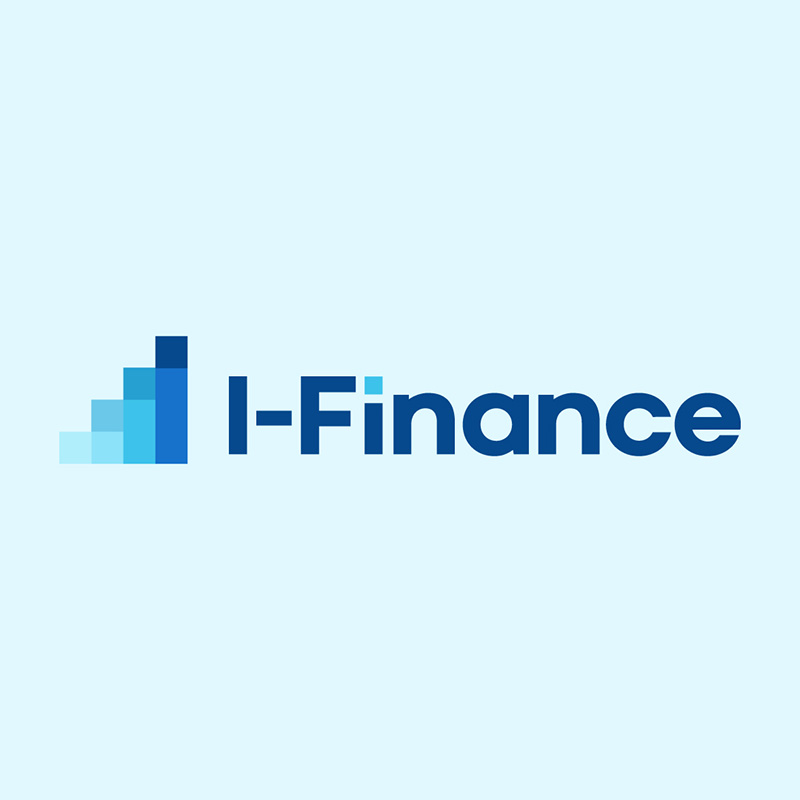
What’s striking about the logo design for I-Finance is its color scheme. Blue is a color that we commonly associate with calmness, serenity, and peace. This is why the color choice is superb, when it comes to money matters, we want to feel assured.
This finance logo design is simple yet would look good on letterheads, business cards, and many other marketing collaterals. It is highly scalable, which is one of the many essential requirements for designing a logo.
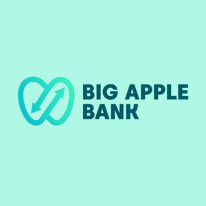
2. Big Apple Bank

With arrows inside a big apple, this logo design for Big Apple Bank is well-suited for the brand. The arrows project growth which is a characteristic we all want to find in a financial institution. The use of the color green is also fitting as it signifies new beginnings, renewal, and stability.
When you’re in the finance niche, it’s best to use as few details as possible. This will give you a more professional look while reducing the intimidating impression that most people have of banking and finance.
Impeccable logos that establish authority
Get a finance logo in 1 to 2 days


3. Chesterland Rural Bank
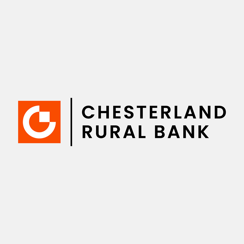
The Chesterland Rural Bank logo is a great example of class and elegance. It has very few details; the font used is uncomplicated and uses only one color. If you want inspiration for a clean, crisp, and beautiful logo, this is it.
While most banks and finance companies go for blues and greens, this bank chose orange. It helps them stand out while giving an air of dynamism, energy, and authority.
4. Maple Land Trading

While the Maple Land trading logo uses blue and white as its primary colors, the black background helps it stand out. It exudes an atmosphere of authority, professionalism, and elegance. Using colors to evoke emotions is crucial in design, especially in logos, as they can define your brand’s personality well.
The font choice is remarkable, the round icon is eye-catching, and the overall layout of the logo is commendable. It has enough white space, making it a great finance logo for inspiration.
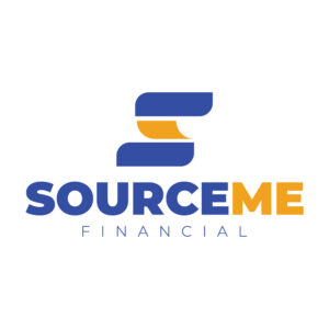
5. SourceMe Financial

This notable logo design created for SourceMe Financial uses bold letters for its brand name. This gives the logo a commanding and powerful touch. The icon above it adds interest quite well as it uses a figure similar to the letter S.
The use of yellow and blue is noteworthy as these two complement each other. They provide a contrast that makes the logo visually appealing.
6. Axe Capital
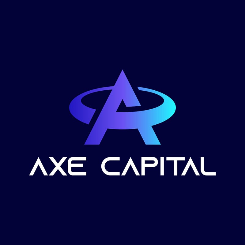
A darker shade of blue is a good choice for Axe Capital. Blue is a great color if you want to show stability, strength, and dedication. The varying colors on the letter A icon add a trendy flavor to it if you want to go out of the ordinary.
The font type the designer used gives that futuristic vibes if you want your brand to come across as forward-thinking. The clever choice of font, icon, and colors make up for the logo’s lack of details.
7. Western World Funding Corporation

Since blue and green are the most favored colors in the financial industry, the designer decided that the two would be better. Western World Funding Corporation uses both these colors and now enjoys all the positive connotations of them. The logo design looks fresh, energetic, and influential.
Again, the choice of basic font types is the best for financial companies. The more ornate ones just wouldn’t do and would make the logo look cluttered and inappropriate.
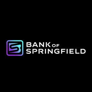
8. Bank of Springfield

The cleverly-designed icon uses the letters B and S to form this unique finance logo created for the Bank of Springfield. This type of logo would do well even if you only use the icon, foregoing the brand name altogether. It would still be recognizable, especially if you have already established your brand.
The font type the designer used is also simple, with a bit of tweaking that adds interest. Like the Axe Capital logo above, this too uses gradating shades of violet and light blue to make it stand out.
9. Hamilton Savings
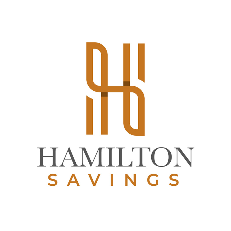
Looking great with its smooth lines and classy colors, this logo designed for Hamilton Savings is worth noting. The icon forms the letter H in quite a fascinating way. The addition of shadows adds a three-dimensional feel to it that adds excitement to the design.
The font pairing deserves notice as well. The combination of a serif font with a non-serif one always makes for good font choices. A brownish-orange brand color does it well, too, as it establishes itself as authoritative and dominant.
10. Mulctuary Money Management
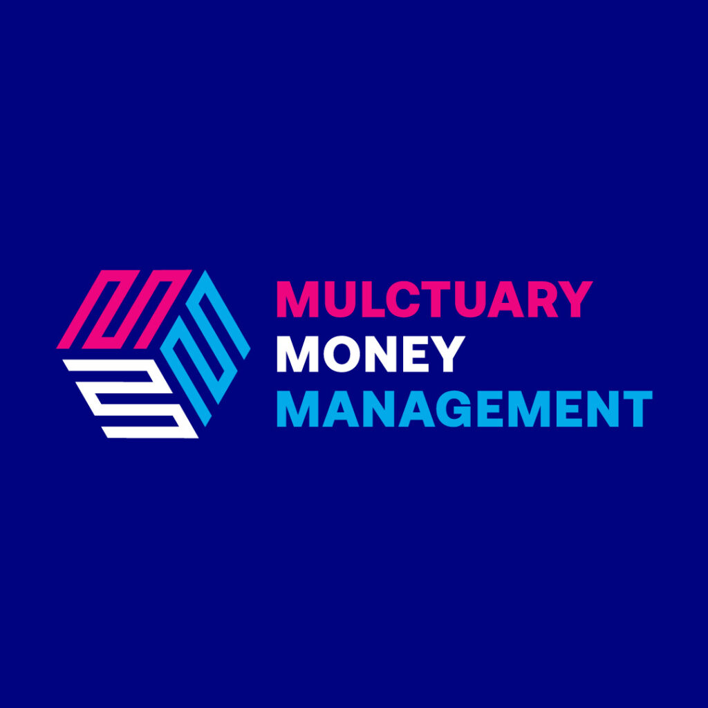
Designing the three M’s into a finance logo is a challenge that the designer did with aplomb in this one for Mulctuary Money Management. The cube icon with the letters is impressive and would work perfectly well with signages, business cards, email newsletters, or anywhere you place it.
The right balance of red and blue, with white as a separating color, is an excellent design element. This logo design gives the brand a professional, competent, and trustworthy appeal.
Famous Finance Logos
To see how crucial finance logos are to the companies they represent, here is a list of famous finance brands with amazing logo designs:
Citibank
An icon in the financial world, the Citibank logo is recognizable due to its simplicity, timelessness, and elegance. It is clean, uncomplicated, and has no additional elements that can make it look ornate or cluttered. Its straightforward image helps build trust in an industry with complex products and services.
The brand name is written in lowercase letters to help make the design friendlier and less intimidating. The red line that connects the two I’s symbolizes unity, collaboration, and the interrelation of global markets. The use of blue conveys authority, reliability, and stability.
Bank of America
The Bank of America logo is a visually intriguing design that packs a subtle punch in the finance branding landscape. It is a pattern with blue and red stripes reminiscent of the American flag. It connotes a sense of movement and progress that perfectly shows the bank’s dynamic nature and forward-thinking approach.
This finance logo is instantly recognizable and easily understood, even from afar or at a glance. A logo should have scalability, allowing you to place it on every marketing material and still look good. The color scheme inspires trust and confidence, which are vital to a financial institution.
MasterCard
Another iconic symbol that’s known all over the financial world is MasterCard’s logo. The two interlocking circles need no brand name to accompany it, whether large or small, it has instant recall and excellent memorability. These characteristics are the envy of many brands as it is timeless, sophisticated, and straightforward.
Even its choice of colors is spot on. Red gives off energetic vibes, passion, and action. Orange adds a special touch of warmth, optimism, and accessibility, ideal for an institution known to be stiff and competitive.
UBS
With a beautifully designed finance logo, UBS Bank effortlessly conveys its professionalism, stability, and global reach. The design has three interlocking keys that symbolize security, dynamism, and access to financial potential. The excellent combination of red and black evokes feelings of trust and dependability, traits that offer high value in the financial world.
The UBS Bank logo exudes timelessness as it has remained the same since its inception in 1998. This proves the company’s enduring relevance and classic appeal. It is also living proof that financial brands need not follow trends.
PayPal
A study in simplicity, effectiveness, and recognizability, the PayPal logo conveys many characteristics of a brand you can trust. The two stylized Ps, one in light blue and the other in dark, form the base of the logo. It gives the brand a sense of partnership and connection that mirrors PayPal’s main function of facilitating peer-to-peer transactions.
This finance logo has a universal appeal that transcends cultural and language barriers. It establishes the brand’s global standing that connects users all around the world. Blue and white instill trust, security, and ease of use that help users positively associate with the brand.
Bank of China
Steeped in history, culture, and meaning, the Bank of China has all the elements to be considered a top finance logo design. It features a stylized icon of an ancient Chinese coin called Ban Liang. This alone evokes China’s rich heritage and tradition, grounding the bank in its cultural roots. To add a touch of modernity, the coin was designed with sleek lines and a vibrant red shade, effectively bridging tradition and innovation.
The Chinese have high regard for the color red as it signifies prosperity, good fortune, luck, and many other positive attributes. The black is an excellent choice to give the design class and sophistication.
Chime
Effectively reflecting the brand’s mission to provide great financial services, Chime’s logo symbolizes accessibility and clarity. The loop on the letter M adds a touch of friendliness and an easygoing personality suitable to a brand that deals in a complex and sometimes standoffish industry.
The green color choice is a breath of fresh air in a field where brands tend to use blue or black. Green also evokes many positive emotions, which include growth, trust, and harmony. These emotions are crucial for a finance company and encourage users to feel comfortable using Chime.
How to Order Your First Finance Logo from Penji
When you work with Penji, you’ll have access to our dashboard, where you can send design requests. You will then need to do the following:
- Choose a category
- Type in a brief project description
- Add references if possible
- Wait for the first draft
You can then send the design back for revisions if there are any. It’s that simple! Remember, we offer unlimited graphic design AND unlimited revisions to make sure the design you’ll get is the design you need.
Final Thoughts
Instead of going around looking for finance logo inspirations, let Penji do the work for you. Our professional and experienced graphic designers take logo design seriously and will come up with the best one for your brand. Watch our demo video here to learn more about us.
Or, subscribe here for 30 days risk-free! Or, explore our new Marketplace to get one-off designs!
About the author

Celeste Zosimo
Celeste is a former traditional animator and now an SEO content writer specializing in graphic design and marketing topics. When she's not writing or ranking her articles, she's being bossed around by her cat and two dogs.
Table of Contents
- 1. I-Finance
- 2. Big Apple Bank
- 3. Chesterland Rural Bank
- 4. Maple Land Trading
- 5. SourceMe Financial
- 6. Axe Capital
- 7. Western World Funding Corporation
- 8. Bank of Springfield
- 9. Hamilton Savings
- 10. Mulctuary Money Management
- Famous Finance Logos
- Citibank
- Bank of America
- MasterCard
- UBS
- PayPal
- Bank of China
- Chime
- How to Order Your First Finance Logo from Penji
- Final Thoughts


