
Whether you’re launching a new venture or already established, having a distinctive logo is essential. Leave a lasting impression and make your mark with these captivating letter L logo designs, meticulously crafted by the talented designers at Penji.
1. Lex Leathers
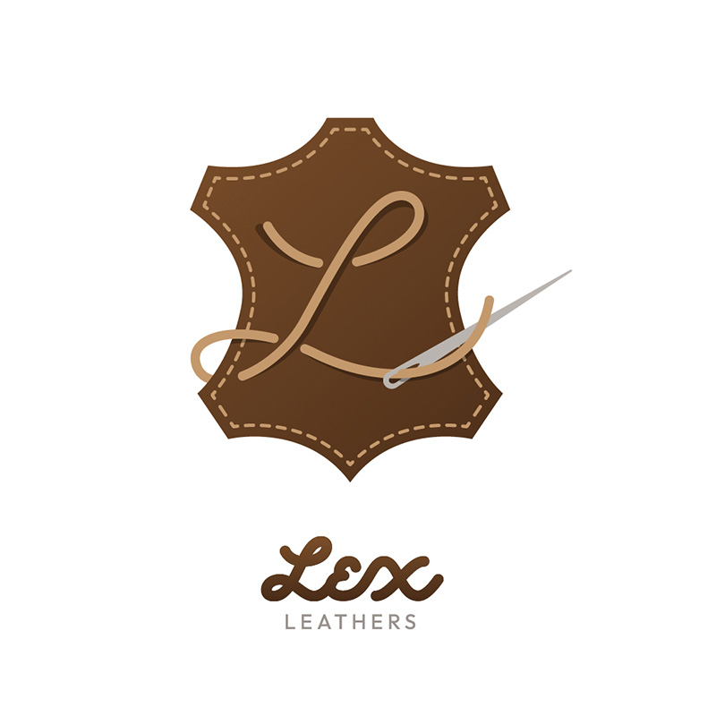
The leather industry can be a difficult one to design a logo for. You need to combine many attributes in a single icon to show its identity. In this logo design for Lex Leathers, variations of the color brown are used, and rightly so. Not only is it the color of leather, but it stands for dependability, nature, and material wealth.
The letter L is cleverly designed to be a piece of thread going through a needle. The tools and trade of the niche make it an appropriate choice for the icon. The font exudes the right image to give the brand a personal touch.
Fantastic L logos perfect for your brand
Get your L logos in 1 to 2 days from professional graphic designers


2. Letterbox Publishing
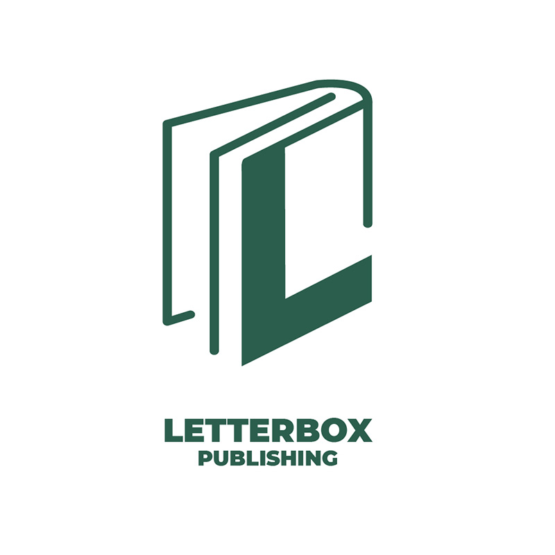
If you’re in the publishing business, you can get inspiration from this logo design from Letterbox Publishing. It uses a book illustration with the letter L on it. The book is in an open position to signify the company’s welcoming nature.
This letter L logo design uses green that suitably projects the image of growth. This is the ideal color representation as bookworms grow every time they read. The sans-serif font choice adds a modern appeal to the logo and makes it legibly clear anywhere you place it.
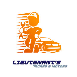
3. Lieutenant’s Cars & Motors

Mascots provide valuable help for a brand without the use of words. They convey your message clearly and can be great attention grabbers. In Lieutenant’s Cars & Motors case, this is true. Their logo has a mascot of a mechanic standing tall and proud while holding a wrench.
The orange color adds to its friendly and approachable appeal. Notice how the logo uses lines that show speed, a character trait you want to have when in the automotive industry. The blue and grey colors of the brand name add an excellent accent to the logo design.
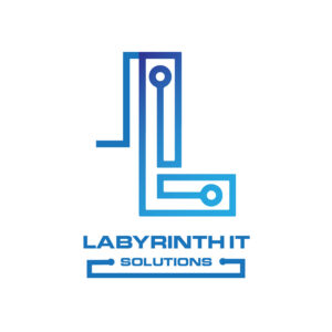
4. Labyrinth IT Solutions

Using a circuit board as inspiration for this letter L logo design, Labyrinth IT Solutions is one of the most unique on this list. The logo uses blue in gradating shades. We commonly associate blue with stability and reliability, which can be helpful if you’re in the information technology niche.
This logo design ranks high in scalability as it would look good no matter where you place it. This is an essential factor you must consider when designing your logo. It has to have the adaptability to be readable even in small spaces such as a business card.
5. Longitude Leisure and Travels
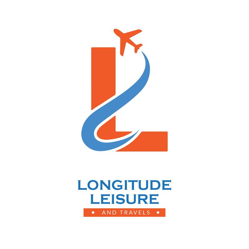
Directly opposite on the color wheel, this blue and orange color combination for travel companies fits the bill so well. These colors complement each other, making it a great choice. To get the best colors for your brand, a bit of research on the psychology of color goes a long way.
This Longitude Leisure and Travels logo depicts precisely what it is about. It has an airplane icon on it with a trail behind it going through the letter L. The font choice is applicable as it exudes sophistication that isn’t over the top.
6. Laureate Homes
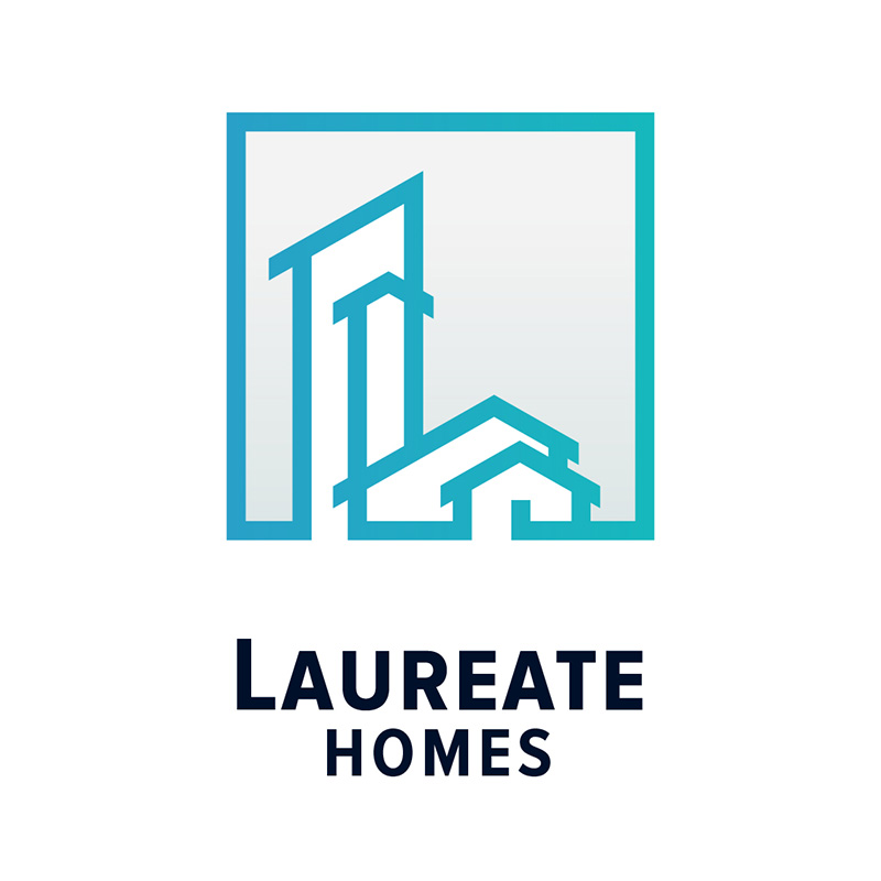
As mentioned above, blue connotes many positive characteristics that Laureate Homes is aware of. Their logo uses a blue shade with a tinge of green that has a refreshing appeal to it. It is the color we commonly associate with freedom, creativity, and trustworthiness.
The tall buildings shaped like the letter L are ideal for showing the company’s authoritativeness and flexibility. It offers variety as a business that handles real estate services from condominiums to family homes.
7. Logan Lux Casino
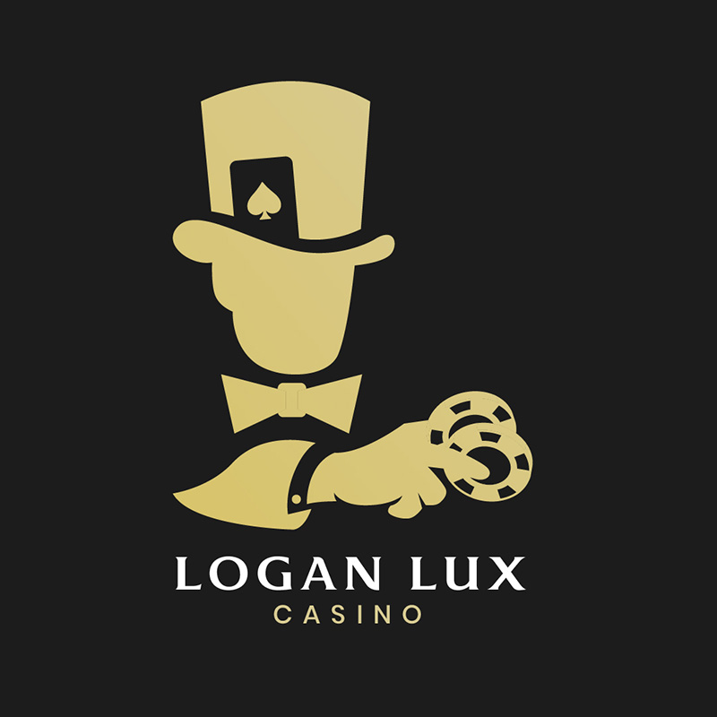
In the same way Lieutenant’s Cars & Motors uses a mascot for its logo, so does Logan Lux Casino. This one has a card dealer in it wearing a top hat with casino chips in hand. This describes the business quite well and is also great for scalability.
This letter L logo design uses gold which is usually associated with wealth, prosperity, and grandeur. The right colors for a casino company. The font choice fits it superbly as it projects style, class, and elegance.
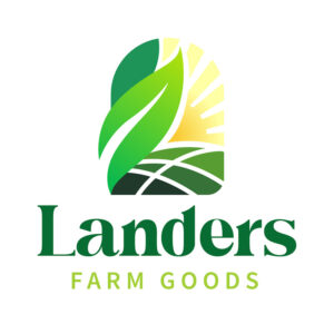
8. Landers Farm Goods

At first glance, you wouldn’t think that Landers Farm Goods isn’t using the letter L on its logo, just like every brand on this list. It was wittily designed as leaves, land, and the sun. A very eye-catching letter L logo, indeed.
Since green is the most used color when depicting nature, it is prevalent in the farm produce industry. The typeface it uses is also worth mentioning as it has a friendly and welcoming charm.
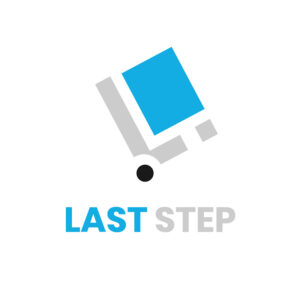
9. Last Step

This Last Step logo gets a high mark when it comes to following the principles of design. It has balance, ample white spaces, and contrast to make it a striking logo. This courier service logo has a trolley icon tilted backward to show forward movement.
The blue and grey color shows authority, trust, reliability, and dependability. The color choice is bright to add freshness and display the eagerness to serve. The font is simple and basic, but the color helps give it life and excitement.
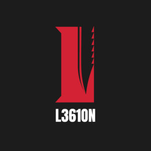
10. L3610N

Designed for a digital gaming company, L3610N will spell LEGION when translated into letters. This ingenious brand name definitely calls for a logo design that does it justice. It has the letter L in it but an unmistakable image of a survival hunting knife with its serrated edges clearly shown.
And as expected, the color red is the befitting choice as it connotes war, courage, vigor, anger, and many other traits usually found in war games. It has a black background that adds mystery and power.
11. Legacy Industries
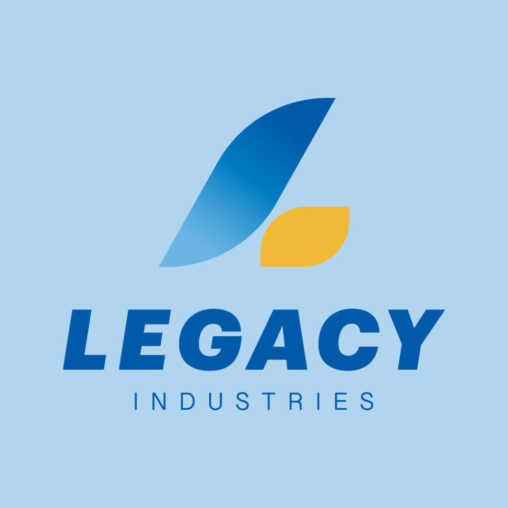
You can see a sense of balance in this logo design for an insurance company. The font choice is bold and steals the attention, while the icon subdues it complementarily. The icon’s soft curves resemble the letter L piques interest, especially with that bright yellow component that pops.
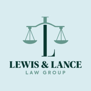
12. Lewis & Lance Law Group
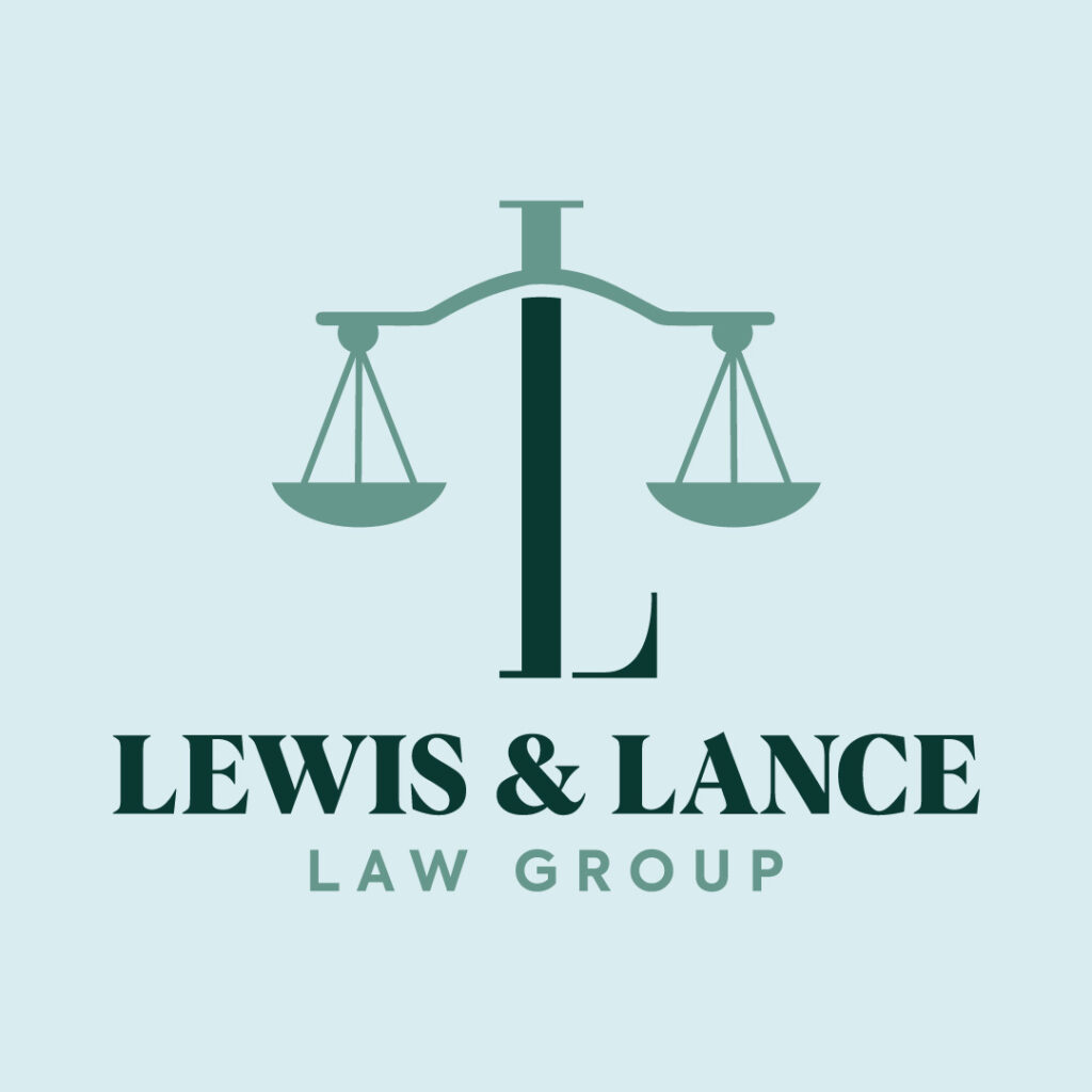
There is no better way to represent a law firm than the Scales of Justice symbol. Lewis & Lance Law Group’s logo does that and puts its twist. A traditional letter L carries the scale by standing firm in the middle, depicting the impartiality of this law firm. It also breaks the monotony by having a slightly darker color than the rest of the design.
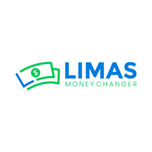
13. Limas Money Changer

Illustrations are fun and versatile methods that tell a story. And Limas Money Changer uses simple illustrations in money form. The paper bills complement the brand name in a non-overbearing way. While green is the color of money, the contrasting blue livens up the icon by giving it oomph.
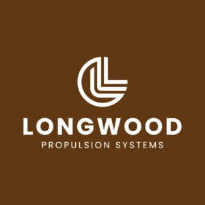
14. Longwood Propulsion Systems
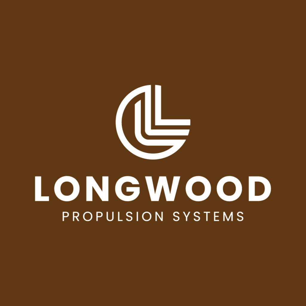
Longwood Propulsion Systems is a company that offers residential and commercial plumbing and electrical repairs. The logo’s overall vibe may seem standoff-ish at first glance, but you’ll gradually immerse in its welcoming appeal.
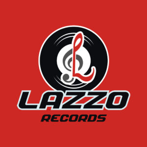
15. Lazzo Records
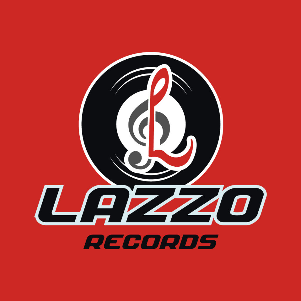
For a recording company like Lazzo Records, nothing is more fitting than a vinyl record to connect with target audiences. But what sticks out in this design is how Penji’s designer integrated a fun twist. The treble clef symbol, combined with the letter L, offers a different variety to represent the brand name.
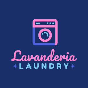
16. Lavanderia Laundry

The Lavanderia Laundry logo has everything you need in a cohesive and memorable design. For one, the tandem of the icon and text sits well with the overall composition. Also, the typography creates visual interest by pairing a script font with a thick sans-serif font. The washing machine also tells what the company is all about, even without the brand name.
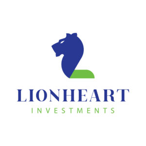
17. Lionheart Investments
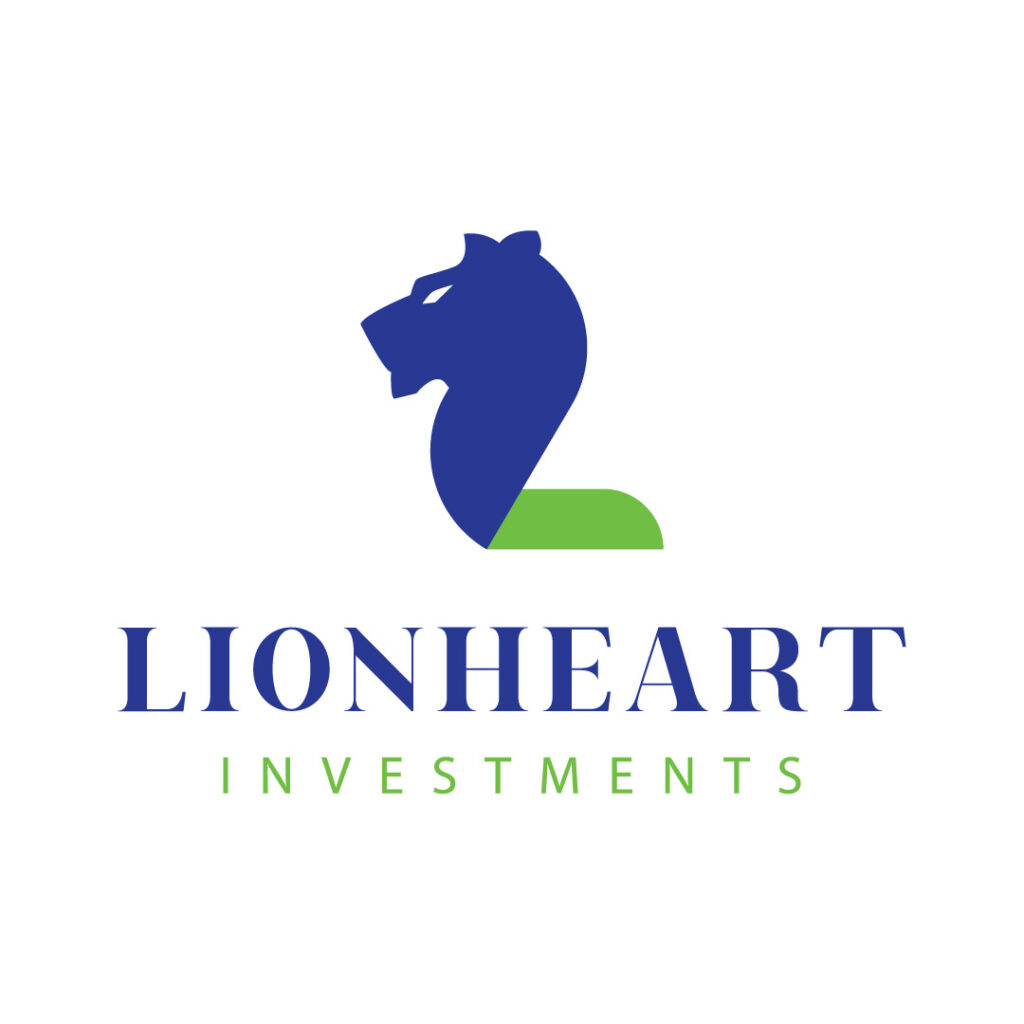
Financial companies sometimes get a bad rap for being too money-centric instead of customer-centric. If you’re running a financial company, it’s good to set a professional tone to seem more credible. Lionheart Investments achieves this by including a symbol of a lion standing loud and proud. The color choice is also apt and shows integrity, sincerity, and confidence.
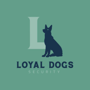
18. Loyal Dogs Security

This is a company that offers canine training services. Loyal Dogs Security has a more traditional look, which does the job of showing reliability. The logo design features a dog sitting patiently and a serif font and light sans-serif font. The letter L background is also a good variation if this logo were to be displayed on other branding and marketing materials.
19. Lynx Laboratory
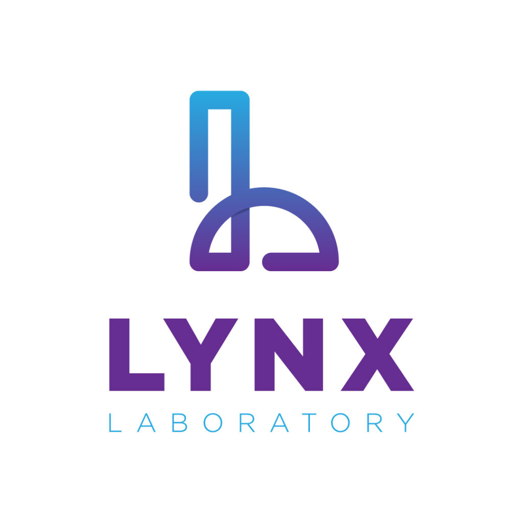
What better way to represent your laboratory company than a flask in captivating hues of purple and blue? Lynx Laboratory ensures they instill authority by keeping its logo design simple and coherent. The bold font with a light-faced font pairing is one example of eye-catching typography.
20. Landfords Hardware
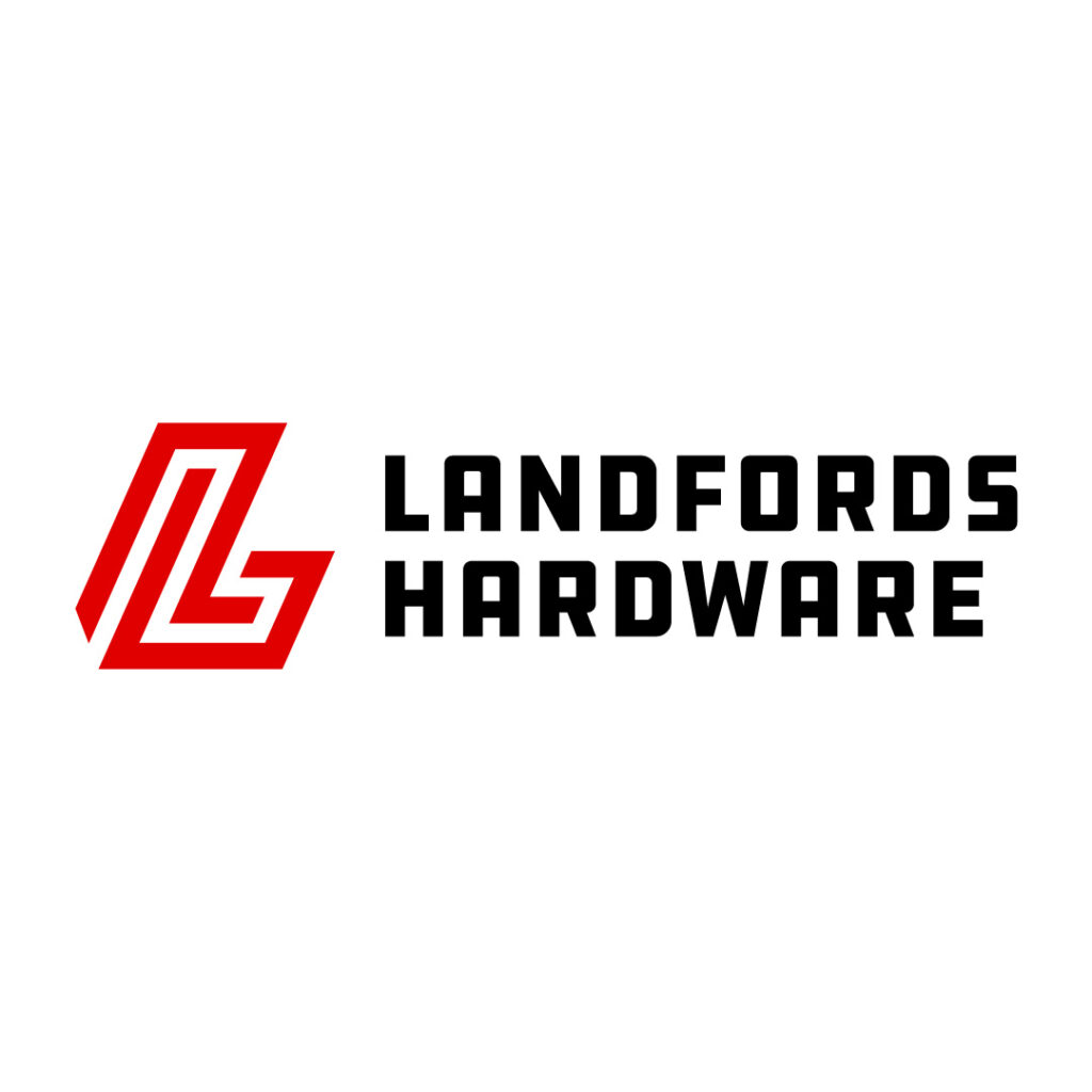
Landfords Hardware keeps its logo straightforward by implementing a simple yet memorable design. The abstract letter L would look good on small materials like business cards or websites and bigger canvases like billboards or flyers.
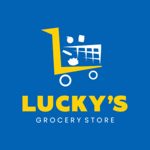
21. Lucky’s Grocery Store

This logo design screams nothing but a lively vibe from the get-go. You’ll instantly notice the pushcart with a bright yellow handle in the shape of the letter L. Lucky’s Grocery Store’s logo also implies movement through its unorthodox icon positioning: Uneven tires, haphazard items, and a slightly diagonal angle.
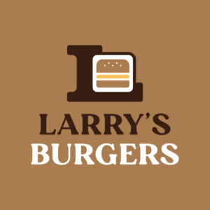
22. Larry’s Burgers
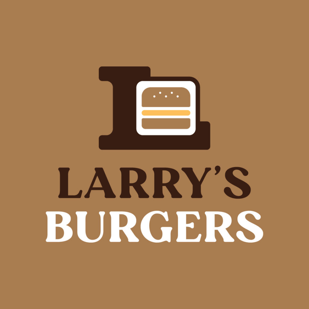
Larry’s Burgers takes the conventional burger logo designs off the window with its no-nonsense approach. While it still features a burger icon to communicate the brand’s offering, the comfort food we’re familiar with is boxed. It’s also surrounded by a massive letter L that encapsulates the entire icon design.
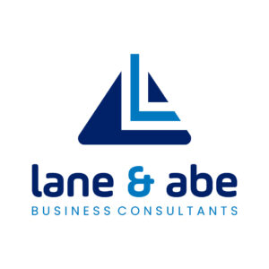
23. Lane & Abe Business Consultants
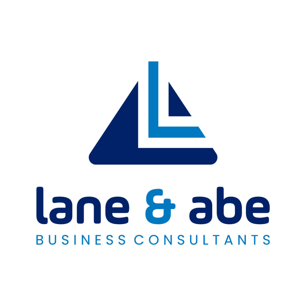
As a business consultation company, Lane & Abe Business Consultants’s logo emanates reliability and dependability. This is how you want to design a logo that propels your brand reputation. Showing you’re a credible business through a quality logo is crucial to get in people’s good graces.
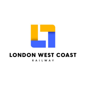
24. London West Coast Railway

London West Coast Railway’s logo is simple yet memorable, with suitable colors representing the brand. First, a box captures attention with two contrasting colors and sides shaped into the letter L. A box implies strength, professionalism, efficiency, and practicality, characteristics of a good railway or construction company.
25. Lia’s Cupcakes
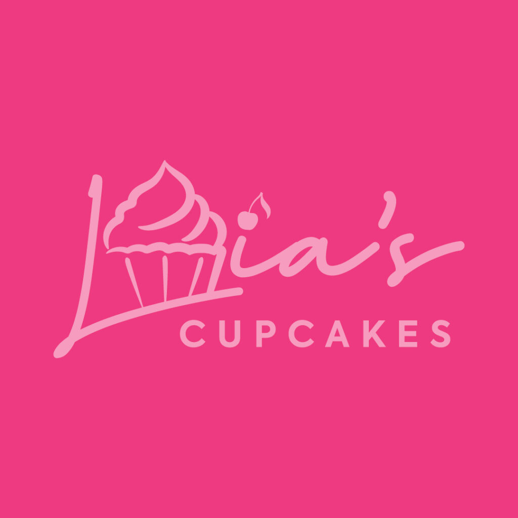
Lia’s Cupcakes logo design is something you want to keep at bay. Imagine this design on a die-cut sticker or big store signage! Everything about this logo is eye candy.
26. Lumos Research
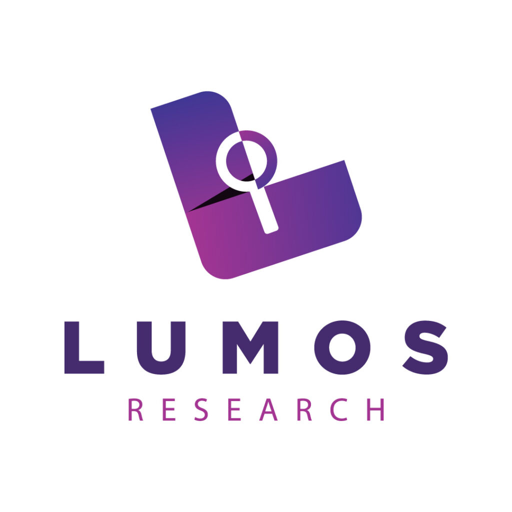
Lumos Research removes the guessing game by ensuring its logo conveys its offering. The thick letter L icon looks like a page from a document, complemented by a magnifying glass.
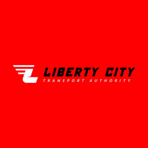
27. Liberty City Transport Authority

You want to show movement on your logo, especially if you’re a transport service company. This way, people will affix elements like speed and reliability when thinking of your brand. Liberty City Transport Authority’s logo shows action and trustworthiness, garnering trust within its target audience.
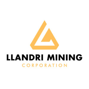
28. Llandri Mining Corporation
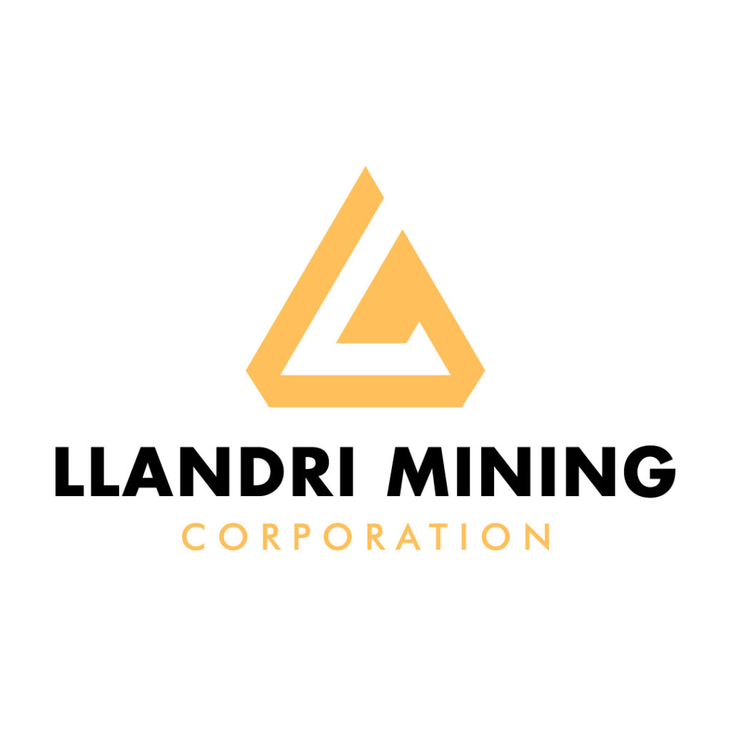
Llandri Mining Corporation’s logo designers chose a triangle icon to represent the brand. A triangle is an uncommon logo shape, which brands can play around with due to its versatility. Overall, this mining company’s logo exudes ingenuity and stability from those dramatic and harsh lines.
29. Lexycorp
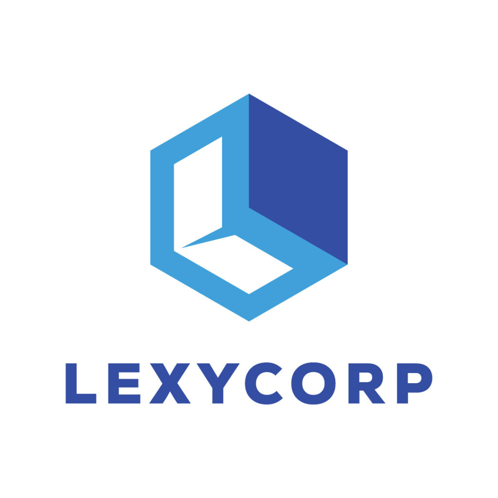
Lexycorp is an interior design firm that caters to residential and commercial clients. A 2D box icon steals the limelight using varying blue colors. The white space also doubles as the letter L, perfect for when the company uses the icon as a stand-alone logo without the brand name.
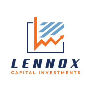
30. Lennox Capital Investments
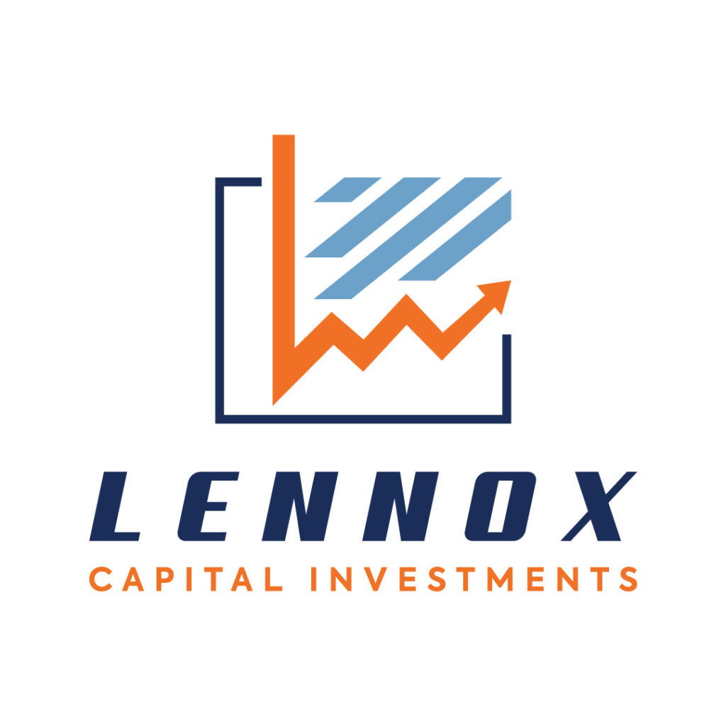
Nothing could get more literal than the Lennox Capital Investments logo. It features a diagram with an arrow that implies progress. The different colors in this logo, along with the unique typography, make this a timeless and scalable design.
Final Thoughts
This list of letter L logos perfectly showcases the varied talents of Penji’s design team. If you’re in the market for an impactful and eye-catching logo, we are the graphic design partner you’re looking for. Sign up today to get your unlimited logo designs and more.
About the author

Celeste Zosimo
Celeste is a former traditional animator and now an SEO content writer specializing in graphic design and marketing topics. When she's not writing or ranking her articles, she's being bossed around by her cat and two dogs.
Table of Contents
- 1. Lex Leathers
- 2. Letterbox Publishing
- 3. Lieutenant’s Cars & Motors
- 4. Labyrinth IT Solutions
- 5. Longitude Leisure and Travels
- 6. Laureate Homes
- 7. Logan Lux Casino
- 8. Landers Farm Goods
- 9. Last Step
- 10. L3610N
- 11. Legacy Industries
- 12. Lewis & Lance Law Group
- 13. Limas Money Changer
- 14. Longwood Propulsion Systems
- 15. Lazzo Records
- 16. Lavanderia Laundry
- 17. Lionheart Investments
- 18. Loyal Dogs Security
- 19. Lynx Laboratory
- 20. Landfords Hardware
- 21. Lucky’s Grocery Store
- 22. Larry’s Burgers
- 23. Lane & Abe Business Consultants
- 24. London West Coast Railway
- 25. Lia’s Cupcakes
- 26. Lumos Research
- 27. Liberty City Transport Authority
- 28. Llandri Mining Corporation
- 29. Lexycorp
- 30. Lennox Capital Investments
- Final Thoughts


