
One of the world’s greatest graphic designers, Paul Rand had this to say about logos: “a logo is a flag, a signature, an escutcheon, a street sign. A logo does not sell (directly), it identifies.” If you have a new business, designing a logo should be at the top of your priorities. To get you the inspiration you need, here are 32 of Penji’s best letter E logo designs.
1. EZI Financial Solutions
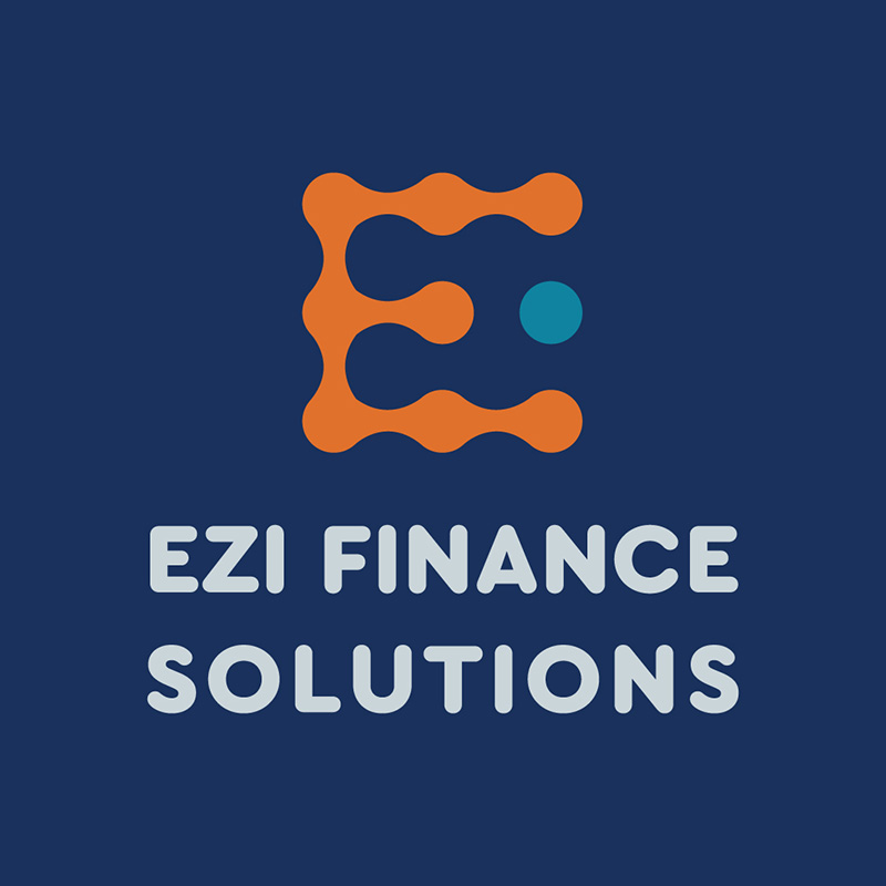
Finance companies need to exude that air of trustworthiness, authority, and stability, among many others. In EZI Financial Solution’s case, they went for the color combination of blue and orange. These are dominant colors that give the brand a powerful and commanding tone.
The overall logo design is simple without any complicated elements that can be distracting. This effectively shows credibility, which is a primary characteristic that people look for in a fintech.
Professional logo designs to level up your brand
Have your brand logos created by the best design team


2. Endura Trak
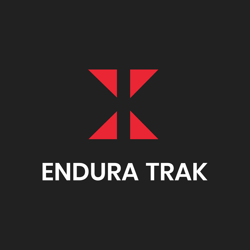
A leading name in fitness trackers, Endura Trak, has a logo worth its place in this list of letter E logos. It uses two intense colors, black and red, portraying what the brand is about: power, strength, formality, and authority. The triangles in the middle are made smaller to make them stand out against the black background.
When we think about fitness products, we commonly associate them with endurance. Endura Trak’s logo conveys this message of durability, reliability, and quality.
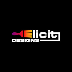
3. Elicit Designs

This design company also worked with Penji to get a logo for their brand. The main element of the logo is a brush that has the letter E for its bristles. The color combination is a beautiful mixture of pink, orange, and yellow to illustrate the brand’s multifaceted personality.
Again, it uses a black background, making the logo stand out even more. The font choice is spot-on as it is a straightforward type with no serifs. This makes the brand name easily readable even from afar.
4. El Macho
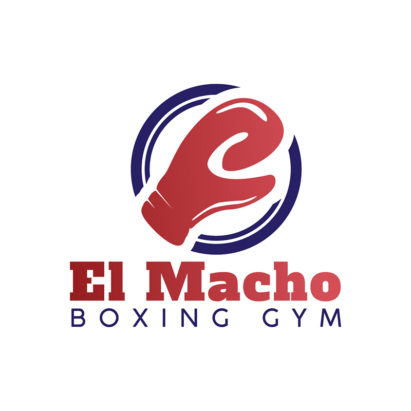
This logo Penji created for El Macho, the boxing gym, is highly scalable, easily recognizable, and fits the brand well. The colors blue, white, and red convey a competitive feel that’s easy on the eyes. The boxing glove icon in the middle gives it the right brand personality.
The fonts used are a superb combination of serif and sans serif types. If you need to place your brand name in your logo, make sure that it uses two different font types to make it easier to read.
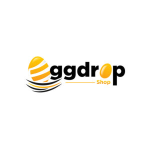
5. Eggdrop Shop

The Eggdrop Shop logo is a feast for the eyes. The colors it uses are vibrant, trendy, and very upbeat. The yellow perfectly projects joy, happiness, friendly vibes, and an overall sunny disposition. The black balances the design and adds sophistication.
The logo uses two illustrations of eggs, the first one as a substitute for the letter E, while the other is for the last O in the name. Both look equally cute and eyecatching.
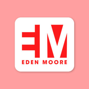
6. Eden Moore
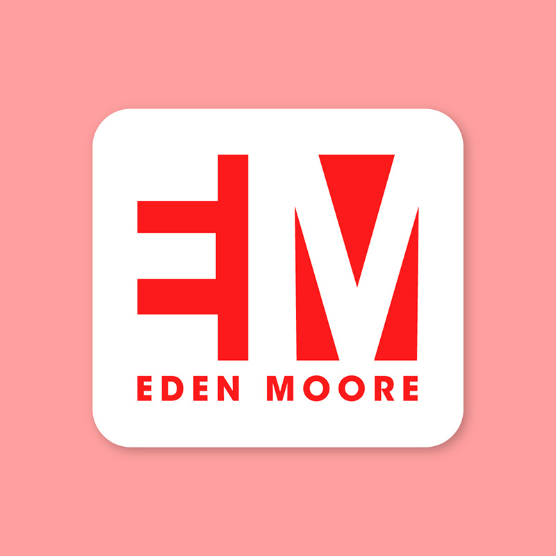
Monogram logos are a popular choice used by some well-known brands such as IBM, NASA, and HP (Hewlett-Packard). This may be because this type of logo exudes royalty, luxury, and professionalism. This Eden Moore logo is no exception, as it is well-designed to convey these exact characteristics.
The logo is made with blocks of white and red with the letters E and M prominently seen. The design is classy, the colors are bright, and the font used matches the brand identity suitably.
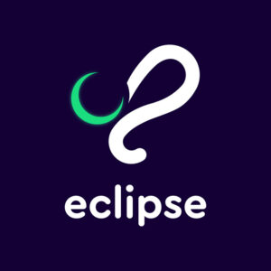
7. Eclipse
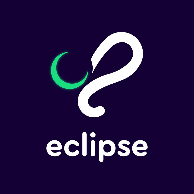
At first glance, you’ll instantly notice the purplish-blue background of this Eclipse logo. In this instance, instead of using black as the background, it uses this shade which is alternatively effective. It makes the logo stand out by using something bright and less somber.
Of course, it uses an icon representing an eclipse, as its brand name suggests. The white line and font emphasize the brand name so well. The splash of green adds interest to the design.
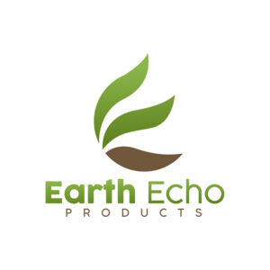
8. Earth Echo Products

The color green is universally associated with earth and nature. And so, for the Earth Echo Products logo, green and brown are the dominant colors used. The design is clean, crisp, and refreshing to the eyes. This is precisely what the brand wants to convey to its consumers.
The leaves icon is also highly suitable as it projects sustainability and an environmentally-friendly character. Its minimalistic approach to design perfectly conveys an image of cleanliness and purity.
9. Early Tech Networking

If you’re in the tech business, it pays to have high authoritativeness and trustworthiness. Technology can be an intimidating industry for many, and consumers are looking for brands they can trust. So, for the Early Tech Networking logo, different shades of blue were used.
The first E in the brand name was designed to be a block to represent the company’s robustness. The font types used are some of the simplest you can find, ideal for scaling.
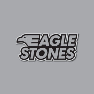
10. Eagle Stones
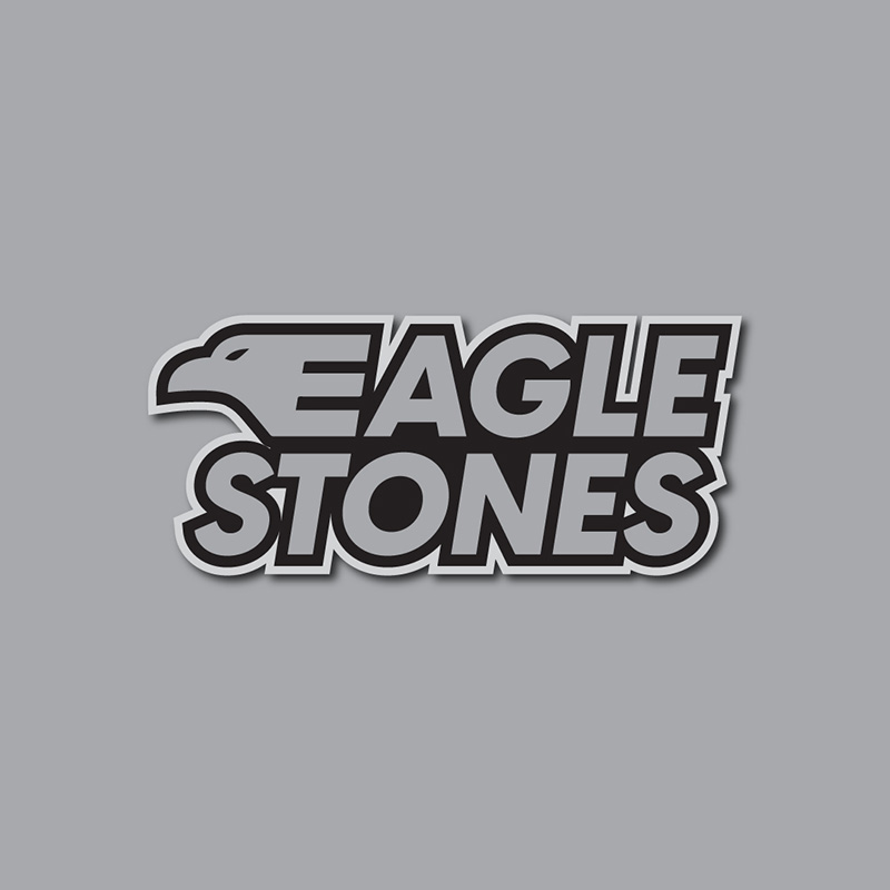
This Eagle Stones logo design wouldn’t be complete without the eagle’s head. Just like the El Macho logo, the eagle makes it easily recognizable, therefore, easier to remember. It uses gray as its primary color, if you want to project neutrality, balance, or intellect, this is the color you want.
The font is slightly slanted to suitably show speed, movement, and motion. The logo design is simplistic yet attention-grabbing.
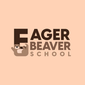
11. Eager Beaver School
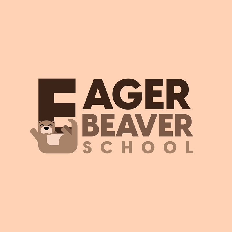
This Eager Beaver School logo is cute, fun, and outright charming. Thanks to its brown color that conveys dependability, safety, and security. Characteristics you want to find in a school for young kids.
The beaver cartoon fits the logo to a tee. It has a smiling face that adds to the appeal. The straightforward font choice makes this logo high scalable.
12. E-Security Group
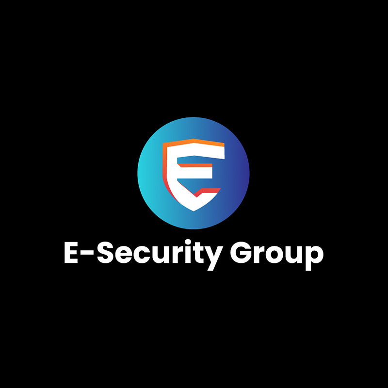
Online security and safety are significant concerns nowadays. This logo used by E-Security Group says it well with its shield icon that represents self-defense. It is placed inside a sphere to make it stand out.
The color scheme uses blue, violet, orange, and white against a black background.
The color blue projects peace of mind, and the orange balances it out by adding that element of happiness.
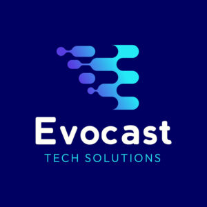
13. Evocast Tech Solutions
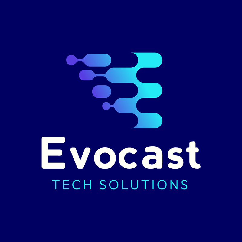
One look at Evocast Tech Solutions’ logo and you’ll know it’s for a technology and software company. It has an icon that is similar to pixels on a computer screen. Its color has neon shades that are trendy and adds a futuristic appeal to the design.
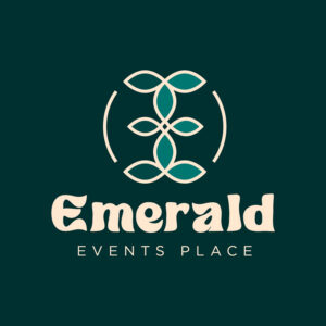
14. Emerald Events Place
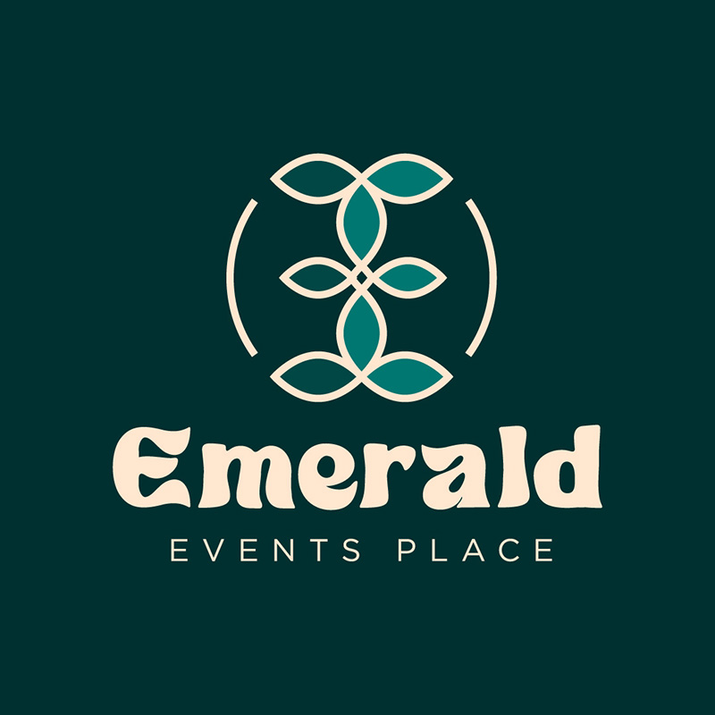
Whether it’s pertaining to the gem or the color, emerald is always a great choice for logo designs. It signifies abundance, wealth, renewal, and many other positive characteristics. The overall look of this letter E logo is festive, making it ideal for an event venue.
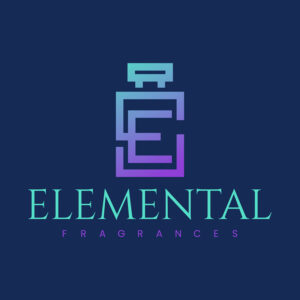
15. Elemental Fragrances
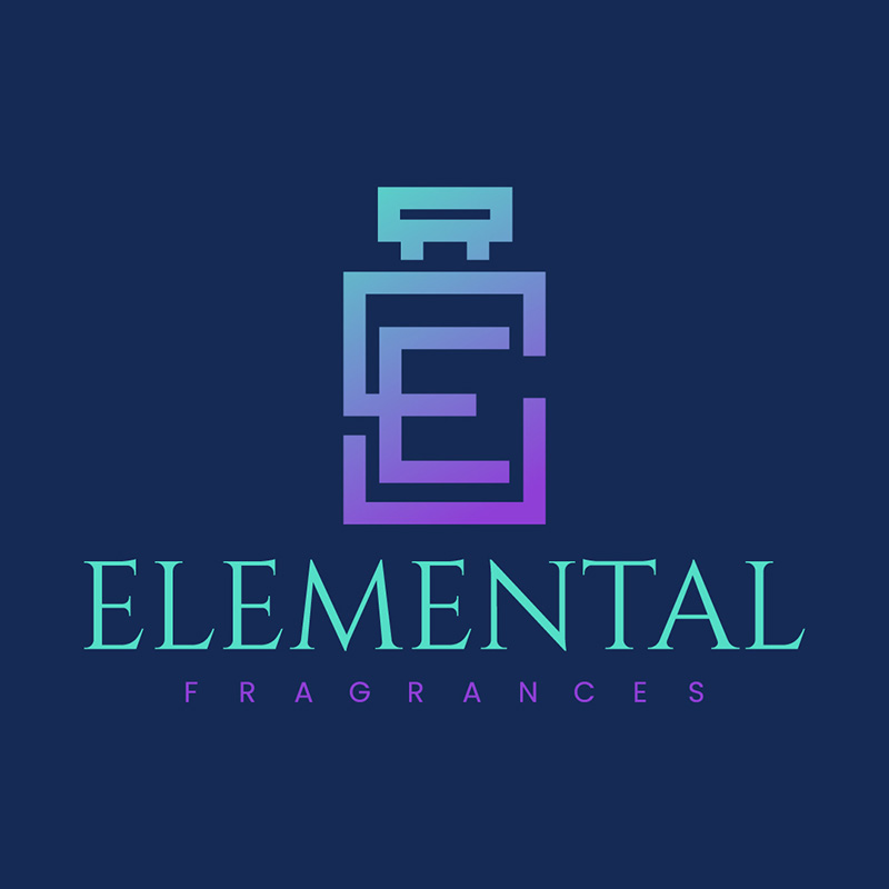
Using a bottle of perfume as its main design element, Elemental Fragrances is a great logo inspiration. It looks classy, sophisticated, and elegant, which makes it quite suitable for the brand it represents. Even the font choice is spot on as it is very minimal and simple.
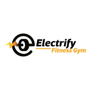
16. Electrify Fitness Gym
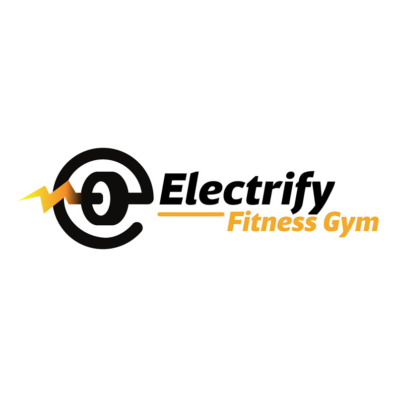
This letter E logo designed for Electrify Fitness Gym is truly electrifying. From the font to the icon, we can clearly see speed, power, and determination. The main color, which is black, is beautifully complemented by the yellow that cleverly represents electricity.
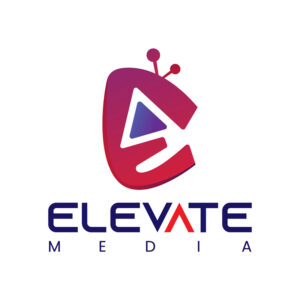
17. Elevate Media

What makes this logo design for Elevate Media unique is the illustration that was used. It has a TV, a video play icon, and the letter E in it. This is a logo example that you can emulate if you want a logo you can use even without the brand name.
18. Empire Development
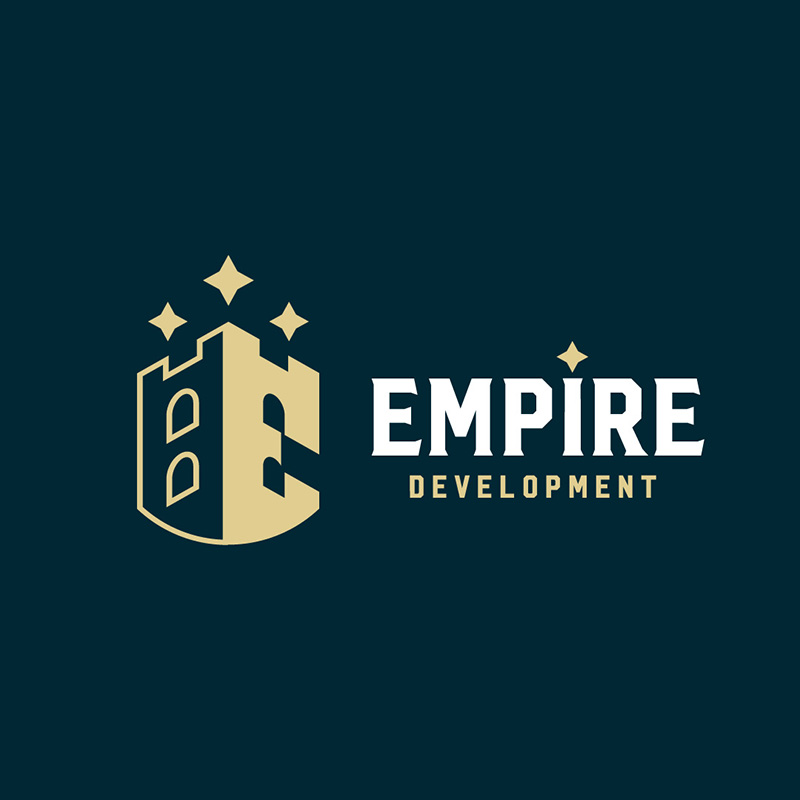
Real estate company Empire Development has an interesting logo. It has an icon of a castle that stands strong and proud. The concept is perfect as it projects the brand to be trustworthy, authoritative, and dependable. The colors used are dark and subtle, which shows professionalism and commitment.
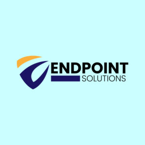
19. Endpoint Solutions

Fonts are a critical part of lettermark logos. If you decide to use fonts on your logo, make sure to use simple and easily readable typefaces such as this one from Endpoint Solutions. It uses sans-serif types that are straightforward and scalable to avoid distracting the viewers.
20. Euphoria Club
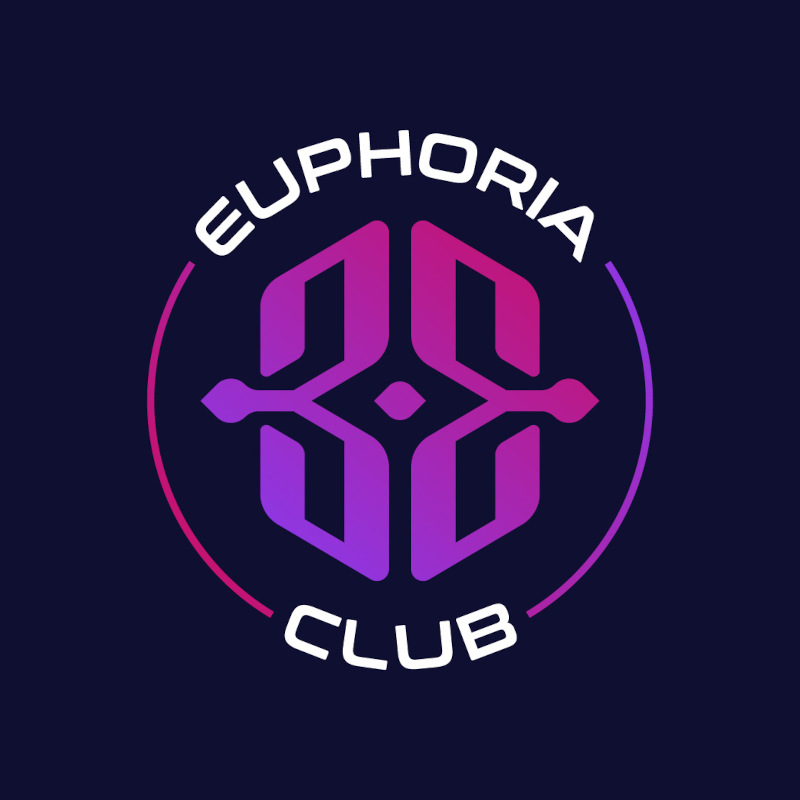
This letter E logo design for Euphoria Club is ideal for signages, business cards, and many other promotional and advertising materials. It is edgy, contemporary, and stylish. The dark color scheme gives it a mysterious, enigmatic, and exciting personality that goes well with the brand.
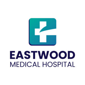
21. Eastwood Medical Hospital

When designing a logo for a medical facility, it’s important to think clean, clear, and professional. This letter E logo created for Eastwood Medical Hospital is one great example. It has very few elements in it aside from the standard cross in the middle.
22. Elite Properties
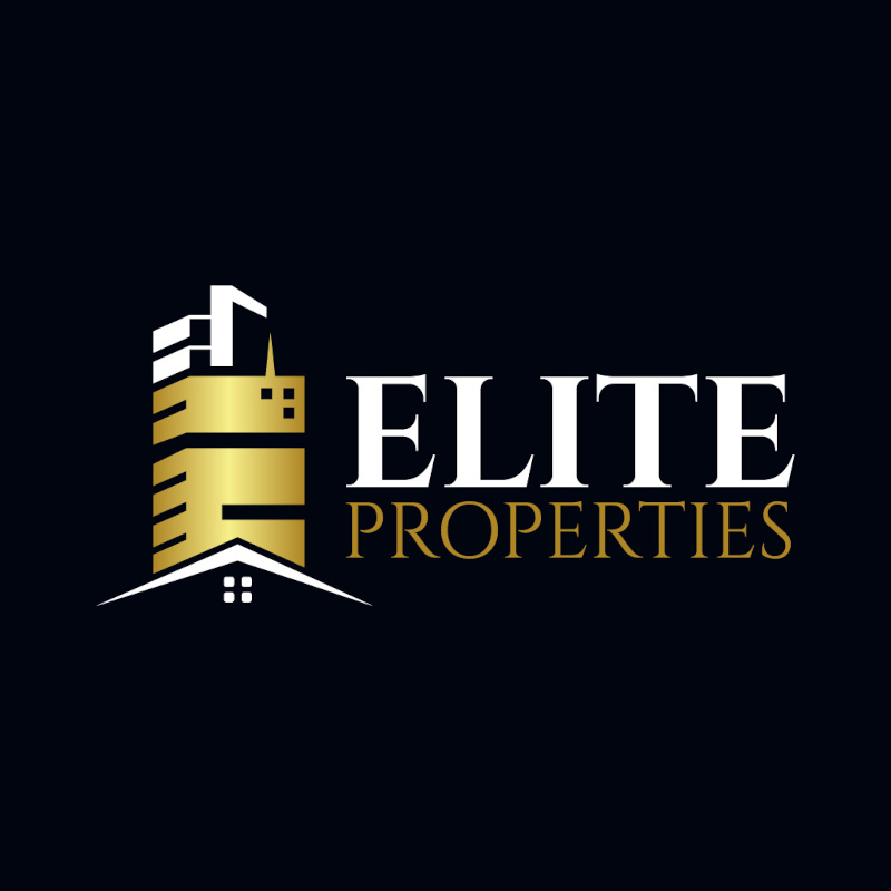
With the letter E turned into a building, this Elite Property logo is one of the most unique designs in this list. A quick glance will tell you that it is a real estate company that is perfect for brand recognition. The gold color suits it well, as it projects success, wealth, and achievement.
23. Export Experts

Fonts are great for showing brand personality. This logo design for Export Experts uses a slanting font to show speed, which is a crucial trait for exporting businesses. The arrow incorporated in the letter E is also noteworthy as it projects a forward personality.
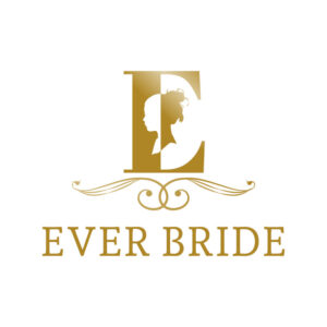
24. Ever Bride

Wedding planners also need to stand out from the competition. Ever Bride does it so well with this letter E logo design. It uses an icon of a bride placed over a large E. This logo uses a monochrome approach that adds to its dainty appeal.
25. Epic Beats
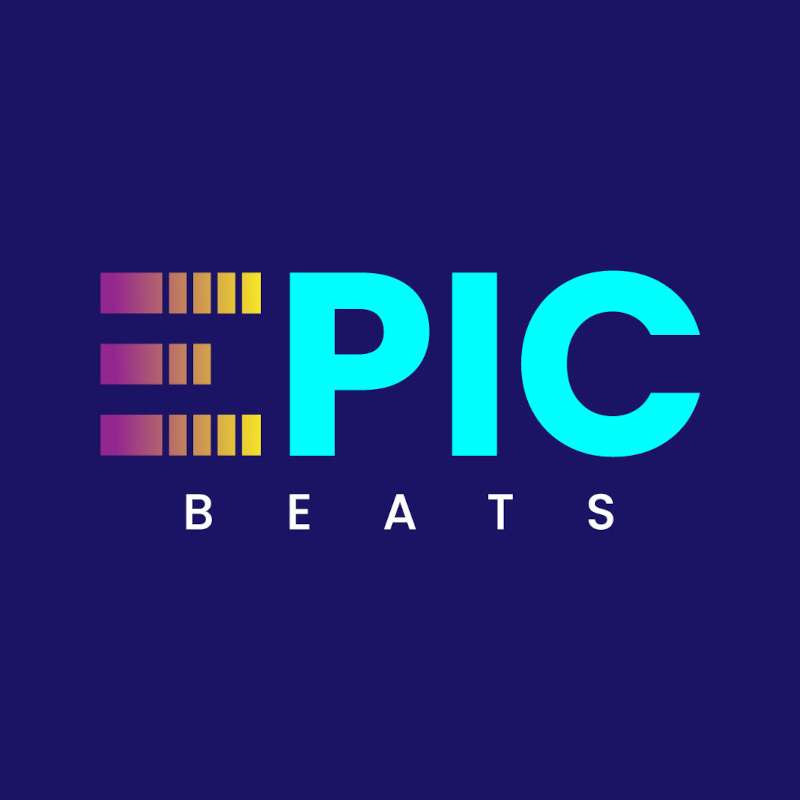
With the emphasis on the letter E, Epic Beats’ logo uses the lines that we commonly see on equalizers. We instantly know that this is a company in the music industry. The bright colors give the brand a youthful personality that’s also fashionable and stylish.
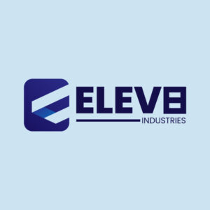
26. Elev8 Industries

Simple, yet impactful, this logo designed for Elev8 Industries is worth emulating. It doesn’t have too many design elements, which in itself makes a great statement. The subtle colors and basic fonts add to its minimalistic image. This is proof that less is definitely more.
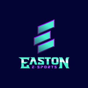
27. Easton E-Sports

The Easton E-Sports logo is what a sporting goods logo should look like. It is upbeat, stylish, and forward-looking. It signifies movement, speed, and a competitive nature so well. The use of vibrant colors, solid icons, and innovative fonts make this logo a sure winner.
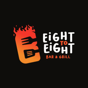
28. Eight to Eight Bar & Grill

Fiery, quirky, and an overall attractive letter E logo, Eight to Eight Bar & Grill has one of the best matching logos you can find. It is an excellent representation of the brand which is what a carefully-designed logo should be. From the colors, and illustrations, to the fonts, this is logo perfection.
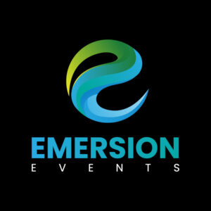
29. Emersion Events

A sphere logo that’s innovative and attention-grabbing, this one designed for Emersion Events is remarkably good. The icon uses various colors that add interest and project the brand’s flexibility so well. It has a festive appeal that a company in the events venue industry should possess. The plain font balances the multi-colored orb resulting in a well-composed logo design.
30. Extreme Adventures
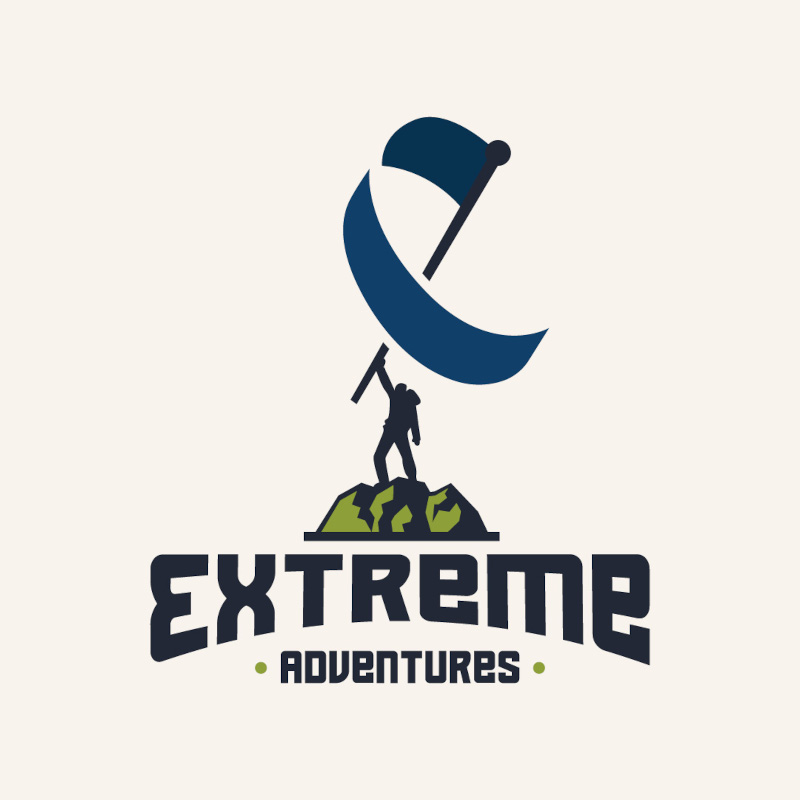
To show its winning personality, Extreme Adventures’ logo features a hiker waving a flag shaped like a letter E. Custom illustrations can transform a logo in ways that fonts and colors can’t. This letter E logo is the perfect example of this. It is unique and original, no online logo maker can ever match it.
31. Enfuel Gas Station
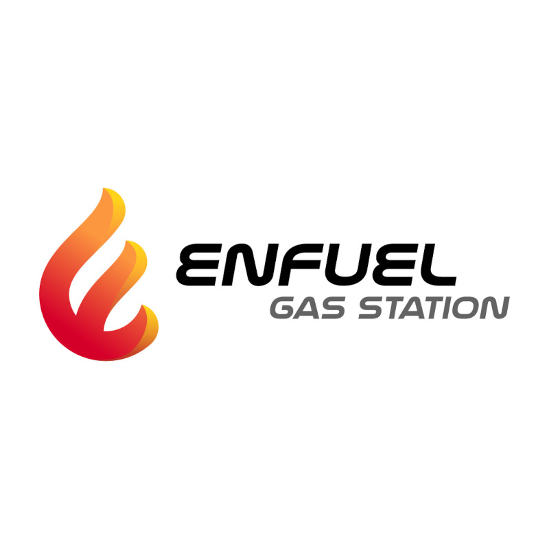
Incorporating the letter E into a fire icon is what makes Enfuel Gas Station’s logo appealing. This design would look great on a letterhead, signage, poster, and other marketing materials. The colors are well-chosen as they show professionalism, expertise, and authority.
32. Eatful Restaurant
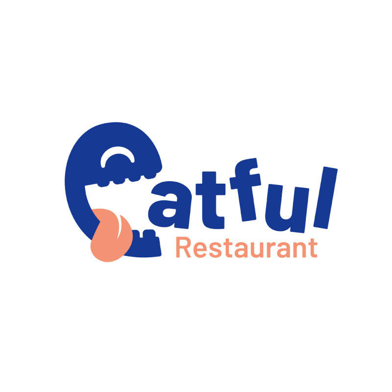
This cute and funny logo design for Eatful Restaurant features an E with its tongue hanging out. Humor in design always works when applicable as it engages your audience. The colors are light and the fonts are jumbled to create a fun atmosphere.
Get Your Logos From Penji
All these amazing logos you see on this list of letter E logos were created by the talented graphic designers from Penji. If you want to have a wide array of choices for your logos before deciding on one, work with us at Penji. Our unlimited graphic design subscription lets you submit as many requests for logo designs as possible. Sign up here today to get our designers working.
About the author

Celeste Zosimo
Celeste is a former traditional animator and now an SEO content writer specializing in graphic design and marketing topics. When she's not writing or ranking her articles, she's being bossed around by her cat and two dogs.
Table of Contents
- 1. EZI Financial Solutions
- 2. Endura Trak
- 3. Elicit Designs
- 4. El Macho
- 5. Eggdrop Shop
- 6. Eden Moore
- 7. Eclipse
- 8. Earth Echo Products
- 9. Early Tech Networking
- 10. Eagle Stones
- 11. Eager Beaver School
- 12. E-Security Group
- 13. Evocast Tech Solutions
- 14. Emerald Events Place
- 15. Elemental Fragrances
- 16. Electrify Fitness Gym
- 17. Elevate Media
- 18. Empire Development
- 19. Endpoint Solutions
- 20. Euphoria Club
- 21. Eastwood Medical Hospital
- 22. Elite Properties
- 23. Export Experts
- 24. Ever Bride
- 25. Epic Beats
- 26. Elev8 Industries
- 27. Easton E-Sports
- 28. Eight to Eight Bar & Grill
- 29. Emersion Events
- 30. Extreme Adventures
- 31. Enfuel Gas Station
- 32. Eatful Restaurant
- Get Your Logos From Penji


