


You might assume food is easy to advertise. Every loves food, right? But year after year, we see once-packed restaurants go out of business. What went wrong? Running a successful food business is harder than it looks. If one thing’s for sure, visuals help. Ads, menus social posts – whatever you’re employing for your food business, you need to incorporate visuals. So on that note, here are the strongest elements to include in a food poster design.
1. Use Color
Whatever the theme of your restaurant is, color is very effective in conveying your message to your target market. You can be elegant, groovy, bold, or romantic. Colors can elicit a mood, attract attention, and generate emotions.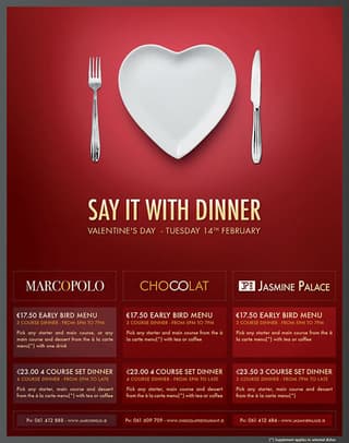
It’s also crucial to know that certain hues stimulate appetite. Take note of the following colors:
- Yellow. This sunshine hue elicits cheer, and most people are likely to have a good appetite when they’re happy.
- Green. The color of fresh salads, this hue reflects a feeling of being healthy.
- Orange. The color of carrots, butternut squash, and citrus fruits, this hue stirs up the sensation of hunger.
- Red. This fiery color pumps up the blood and makes the sensation of hunger more prevalent.
This food poster design for Jasmine Place, Marco Polo, and Chocolat by Loïc Seigland best illustrates this. Colors can spark interest but can also induce negativity, so it’s important to know how to use them wisely. Red can bring messages of love, but it can also mean bloodshed, this is the reason colors are powerful, and adding them to your poster-making requires careful planning.
You may also like: Food Ad Designs That Will Make You Hungry For More
2. Play with Fonts
Clean and simple fonts are the best but don’t be forced to live by that rule. Experiment with typography and find ones that would suit your needs and give out your information in the best possible way. As with the use of color, you can be as bold as you like or as classy as you want with the use of the right typography.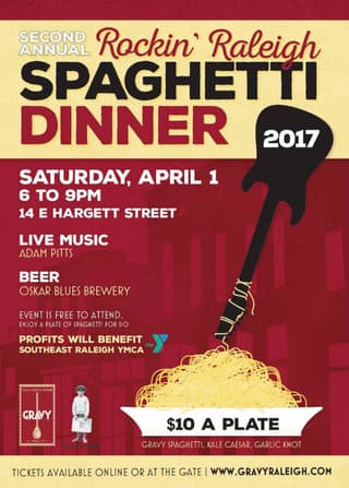
You can use several fonts in one food poster design and create a bigger impact than using just one. Serifs can project elegance, while italics can convey speed and urgency. The key here is not to overdo it, as shown in this poster from Gravy.
[convertkit form=3182836]
3. Information is the Key
Some restaurant owners may think that putting all the information on their posters is a must. Cramming text in your posters can actually cause people to get bored and prevent them to read further. Try to summarize the details and be as clear and concise as you can to avoid confusing your readers.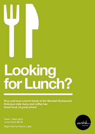
Create headlines that are sure to attract attention without overwhelming your readers. Always keep the poster’s objective in mind, so you’ll know which information to add and which to exclude. Highlight what needs to be focused on, such as contact details or locations, and keep the others at a minimum. A good example of this is Waratah Restaurant’s poster made by Ryan Thomas.
A non-professional graphic designer might not be aware of how to balance design elements in your food poster. This is why we urge you to hire the services of trusted and credible graphic designers. The Penji team carefully selects our pool of talents, and we can assure you of a well-thought-out design. Customers will surely start to pour in, and of course, that’s good for the business.
4. Use Clear Photography
The most effective element you can use for your restaurant’s poster are pictures of your food. Use professional quality photography that best illustrates your offerings. Create food porn that would make viewers come to your restaurant doors as soon as they take a peek at your posters like this one released by KFC.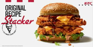
Vivid imagery has played an essential role in advertising, and using it in your posters can connect you with your audience and elicit that much-needed attention. Clear and crisp images of your food can impact your business by making people imagine themselves enjoying your entrees. They are effective in immersing the viewers enough to prompt them into trying out your restaurant.
But let’s face it – the juiciest cheeseburger slathered in a delicious sauce may not always look stunning in a photo. To boost the look of food in pictures, did you know that some food photographers do secret tricks? Here are a few examples:
- Colored mashed potato is usually used to stand in for ice cream. This allows the product to look great below warm studio lights without melting.
- Shaving cream is used instead of whipped cream for pies or desserts. Shaving cream creates a more consistent fluff, and it doesn’t lose its shape easily.
- Motor oil and shoe polish are used to give meat and poultry that shiny and perfectly-roasted look.
You may also like: Tasty Food Packaging Design Examples That Will Make You Lick the Screen
5. Add Creative Illustrations and Graphics
In some cases such as when you’re promoting an event, a photograph may not be the most appropriate choice for a poster. This is when the use of illustrations and graphics can help you get your message across. Better yet, a mixture of these can work quite well as long as they are properly executed.
Illustrations can inform, persuade, and even influence your audience in ways that photographs may not be able to. Not everyone is created with the ability to draw or make graphic designs that can grab people’s interest, in this situation, getting the assistance of graphic design professionals is crucial.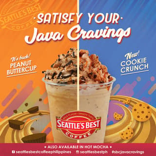
A good example is this poster from Seattle’s Best which has enticing photographs mixed with great graphics using colors and fonts that are eye-catching and evoke fun and playfulness.
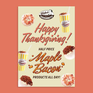
6. Create Offers and Discounts
Creating promos such as offers and discounts is a surefire way to get people’s attention. Who doesn’t love the occasional freebie? To get the most out of your offers, you must know your exact target market. For example, if your restaurant is near a corporate office, you can offer discounts on lunch hours.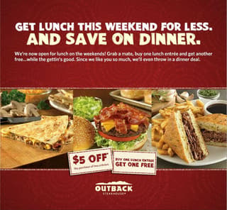
Outback Steakhouse offered discounts on their posters to announce that they’re now open for lunch. The poster used clear imagery while using very minimal text and still did a great job of communicating its message.
7. Include a Call-to-Action
The purpose of having a poster is for people to take action once they see what you have to offer. Motivate your viewers to go try your new appetizer or get your buy-one-entrée-get-a-free-drink promo. Or you can show them how easy it is to reserve a table, whatever tactic you use, always give them a reason to visit your restaurant.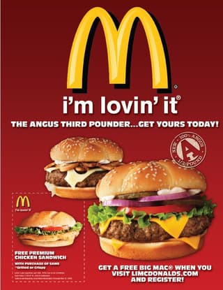
McDonald’s does it best when it comes to calling people to take action with this poster from their 2014 campaign. Not only does it show its burgers, but it also offers freebies when you register on its website.
Get Epic Food Poster Designs with Penji
Posters are very effective in informing people of what you have to offer- through both digital and physical channels. Their use is still essential in every restaurant marketing strategy, more so for restaurants that target customers locally. There are no hard rules in creating posters, but once you know what you need, you can now push the limits in marketing your restaurant business.
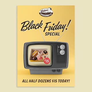
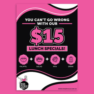
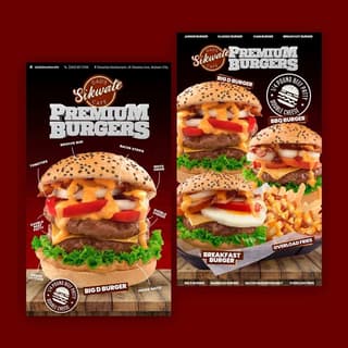
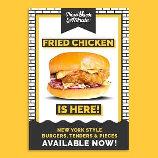
Not sure what a good food ad should look like? Check out some of the food poster designs we’ve done for our past clients:
Save a lot of time and effort by outsourcing your design needs to Penji. Our designers know how to effectively make use of all the techniques mentioned above to encourage customers to buy your food. Using an unlimited graphic design service for your food poster ensures that your marketing keeps up with all the promotions and changing menus you offer.
Sign up today and use the promo code FOODPOSTER for 25% off your first month.


