

Food packaging design has an unfair advantage over other products that require packaging. A bath soap box design can make it look effective in washing. But that won’t give an urgency quite as exciting as food package design. When done right, food packaging design has the power to make mouths water.
According to a WestRock study, 81% of consumers tried something new because the product packaging caught their eye. Drool-inducing packaging can get people’s attention superbly. However, designing food packaging can be quite complicated. It has to have a perfect blend of functionality, beauty, and branding. Penji is here to help you achieve this. Watch our demo video here to learn about it.
Related Post: How Do I Design My Own Box Packaging?
Below are some of the best food packaging designs we’ve come across on the World Wide Web. Get inspiration from them and learn how you can create your own:
Magnum Ice Cream
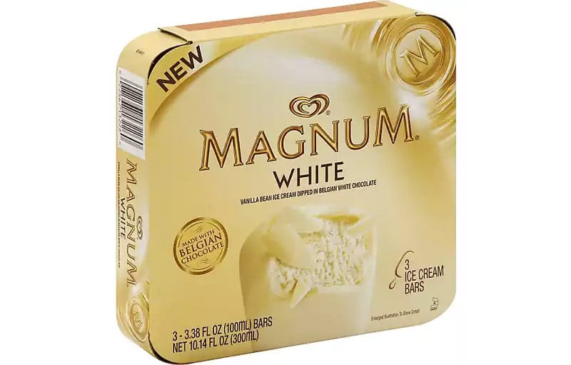
This Magnum White box package design looks clean, creamy, and oh so tasty. You already have a good idea how the product it holds would taste like. The color choice fits the product well as it gives an overall impression of creamy white goodness.
Notice how there is white space all around, giving the design a simple and uncluttered appearance. This also does wonders for visual hierarchy. The eyes will first land on the brand name then go down to the image of the ice cream. You now can’t help but imagine its taste. With its cracked Belgian chocolate giving us a glimpse of the soft ice cream inside, it’s irresistible.
Deep River
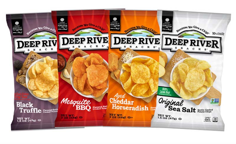
Using different colors for each chip variety, Deep River Snacks’ package design all look enticing. The chips are shown on a wooden platter with whatever spice they were made with. This gives them a homestyle look that adds to its appeal.
A little detail that’s worth mentioning is that the chips are arranged uniquely per package. It means they didn’t use a single image and digitally altered it to look its flavor. It shows that the designers made the extra effort to make the package seem exclusive and special.
Peet’s Coffee
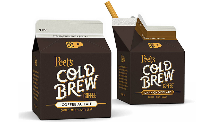
This packaging design is proof that even if you don’t have a photo of your product on the design, it will still look scrumptious. Peet’s ready-to-drink Cold Brew coffee package design promises refreshment for people on the go. The colors alone perfectly illustrate the bittersweet goodness of coffee, milk, sugar, and chocolate.
The font color choices are noteworthy, too, as they contrast the dark background, making them stand out. This gives easy readability even from afar. When designing food packaging, it’s essential to consider how the product will be stored and displayed. Peet’s Cold Brew wouldn’t have a problem sitting on a shelf among its competition.
Baker Maid
Artisanal baker, Baker Maid, offers these delicious cookies in cute and bright carton boxes. Each variety comes in a light color that looks so good when you place them side by side. You’d want to get them all in one go.
The package design comes with a window that shows us the delights that await us. If you want buyers to salivate over your products, use the real thing. Baker Maid is a family-owned baking company, and the package fits its image completely. It’s simple yet projects high-quality.
Godiva
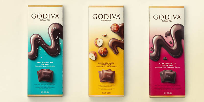
A chocolate maker since 1926, Godiva is an authority when it comes to sweet excellence. A company this renowned should know how vital food packaging design is. Take a look at an example of one of their product packaging designs, and you’ll agree.
This is one package design that will make you want to lick your screen. The swirl of melted chocolate, slivers of nuts, and chips of chocolate make it mouth-watering. The gradation of colors adds a decorative touch but keeps the attention on the brand name and images.
Knorr
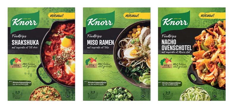
This food packaging design from Knorr uses a base color of green, which is an excellent choice. Green signifies health, well-being, and freshness, what people would want in their food. In this case, it also looks so good you’d like to grab the bowls for yourself.
The design includes patterns that correspond with the countries the pasta variety took inspiration from. This minute detail tells us the commitment of the brand in providing quality products to its consumers. One of the reasons food packaging design is crucial to branding.
Breyers
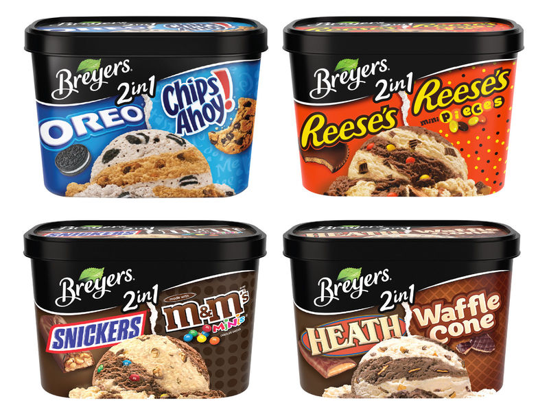
The packaging of Breyers’ 2-in-1 series of ice cream selections is so effective in tickling anybody’s sweet tooth. It offers not much text but fills the space with the product presentation. What better way to show what’s inside than padding the whole area with images of it. They left nothing to the imagination.
The brand names of the products are also unashamedly displayed. It seems that Breyers and the others have joined forces to make the product more potent in getting everyone’s attention. The tub uses black as the background so as not to lose Breyers’ identity. It cleverly shows dominance over the others’ colors that are beneath it.
Related Post: Creative Packaging That Caused Products to Sell Out
De Cecco
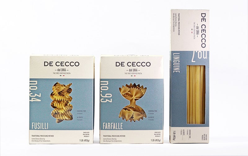
An Italian pasta maker, De Cecco, has been around since 1886. The example below shows how this company hit two birds with one stone. First, their packaging design is not the usual you’ll find on pasta boxes. Next is their way of showing the quality of their products by using a see-through window.
The food packaging design has a contemporary feel to it. But not quite, as it also has tons of vintage classic style in it. Through the package design, they have shown their traditional roots by mixing them with elegant modernism. This proves packaging does more than protect and hold the product. It can also be good in projecting professionalism.
Butlers Farmhouse Cheeses
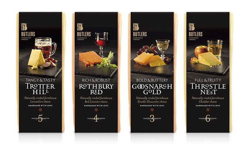
UK-based Butlers Farmhouse Cheeses included high-quality photos in their packaging design. And not just for decoration purposes. These examples below include serving suggestions that will inspire you to recreate them. The presentations have that rustic and calm stillness that’s ideal for a wine and cheese sampling session.
The dark setting has just the right amount of light to emphasize the cheeses and make them pop out. The cheeses, we heard, are award-winning. It deserves a distinct, elegant food packaging design that speaks volumes for the brand’s value and identity.
Duncan Hines
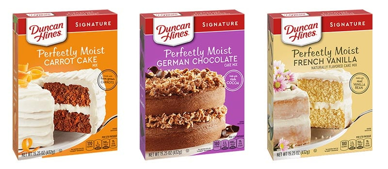
It’s a known fact that emotions influence how consumers buy. This is true for these food packaging designs from Duncan Hines. These designs use crisp and clear imagery to evoke warm feelings that we usually associate with home baking.
We often see these packages on shelves with similar designs. This makes standing out extremely difficult. Add to that the memories of what mom made or what brand she used. In this case, Duncan Hines hit the nail with designs that take us back to memory lane.
Farmers Market
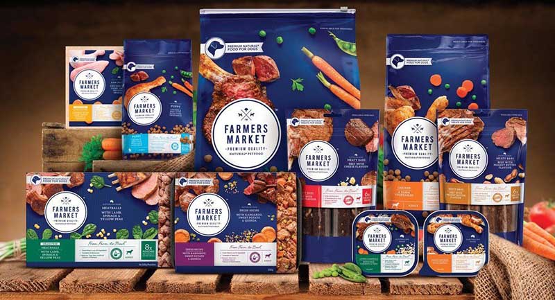
This pet food manufacturer from Australia may have outdone themselves with food packaging design. Farmers Market makes natural and high-quality food for pets, and it shows on their packages.
They believe that only the best will do for our fur buddies that they used images of food that look so similar to what we eat. And so, the designs look tasty and tempting even for us humans. If you want to give off the impression of wholesomeness, package design is the best way to do it.
Absolut
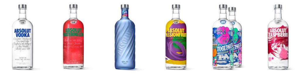
If there’s one thing we wouldn’t see in this lifetime, it’s a poorly-designed Absolut packaging. The below examples are just some of the many amazingly crafted bottle designs you’ll find anywhere on the web. Aside from the vodka itself, this company may owe its acclaim to its packaging designs.
Their limited edition designs go anywhere from smooth and clean to pompous and bombastic. The company uses its bottles to promote culture and art so well that it became an inspiration to not a few artists and designers. It has become the iconic bottle that it is and may have become more significant than its product.
Related Post: 25 Beverage Packaging Design Examples
Factors to Consider When Creating Food Packaging Design
The food industry is one of the most challenging industries to design packaging for. Aside from it being one of the largest and fastest-growing, there are many factors that you need to consider. Here is a shortlist that can help guide you in designing your own:
Compelling Design
When customers stand in front of a supermarket shelf or refrigerator, they are met with an abundance of choices. Decisions made at this point are quick and spontaneous. Your packaging has to lure them to choose you over the others. With the right design, colors, font, and overall presentation, it’s not at all impossible.
Structural Design
Your customers have to have peace of mind that what holds your product will do so until they open it. No spillage, no spoilage, easy handling, and long shelf life are a few factors you need to consider. Industry compliance is also an essential factor you need to look into.
Branding and Marketing
Food packaging design is often the first thing that consumers will notice when in a supermarket. It is also the initial element they’ll base their decisions on. It is your chance to impress and tell them how your brand is the solution to their problem. Finally, it is an excellent indicator of quality, so make sure to do it right.
Principles of Package Design Architecture
An excellent food packaging design has to adhere to these three principles:
- It has to have form
- It has to be functional
- And it has to look good
Your package design has to have a form that’s in the proper relation to its content. It has to protect and keep the product safe. And of course, it has to have beauty to appeal to customers.
Versatility
From single to multiple servings, your food package design needs to be versatile to accommodate future improvements. Make sure that your branding assets will fit in the design without looking awkward or out of place. The design must be ready for an immediate change of size, color, or font.
The Materials
You also need to consider the materials you are going to use. This goes beyond form and beauty as the packaging needs to protect the product. Consider transportation and storage and the package’s lifespan while in the buyers’ homes. Textured cardboard may look rustic, but it’s no use if it won’t hold the fruit or veggie inside for more extended periods.
The Cost
Food packaging design shouldn’t cost more than the actual product itself, that’s a given. If the appeal of flashy packaging lures you, make sure it’s cost-effective. This can pull you into a conflicting situation. The workaround here is to design creatively. Depending on your business nature, an excellent example of this would be using fabric instead of plastic or strong paper in place of cardboard.
What to Include in Your Food Packaging Design?
A study conducted by Globe News Wire found out the following data:
- 74% of the respondents said that labels should be honest and transparent about potentially harmful ingredients if any
- 76% said that brands should ensure trustworthiness with quality materials and ingredients
- 77% said that keeping their families and the environment safe should be a priority
- 68% said that if given a choice between plastic or paper, they would go for the latter
This is what consumers say, and this is what we should listen to.
Final Thoughts
Food packaging design is no small feat, but it doesn’t have to be unattainable. No longer is packaging about making your product look pretty. It’s also about marketing your brand and making it stay in the minds of consumers.
Let Penji help you get fantastic food packaging designs. Sign up for any of our plans to get the design started.
About the author

Celeste Zosimo
Celeste is a former traditional animator and now an SEO content writer specializing in graphic design and marketing topics. When she's not writing or ranking her articles, she's being bossed around by her cat and two dogs.


