
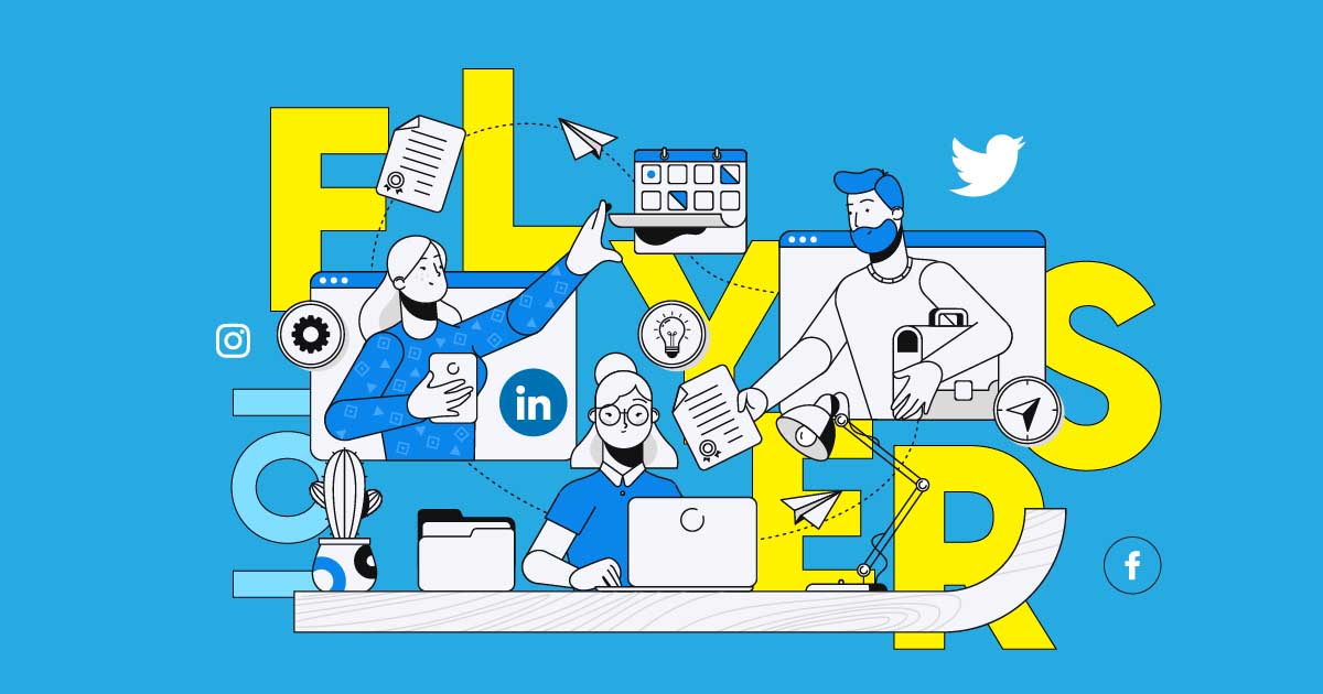
Renaissance Italy was the first to see flyers being used as promotional materials. Of course, that comes as no surprise as technology wasn’t a thing back then. The scenario is much different now, and flyers are still an effective marketing tool today, according to an article in Medium. Lucky for you, we have here some flyer tips to get you started.
Additionally, Penji’s years of design experience tell us that this is indeed true. Our unlimited graphic design service lets our clients ask for any design asset, flyers included, which is one of the most requested. You can watch our demo video here to learn more.
What Exactly Are Flyers?
A flyer is a form of advertisement printed on paper for distribution to public places. These are typically handed out to passersby or sent through the mail. Flyers can help you reach your audience in the following ways:
- Door drop
- Addressed mail
- Newspaper/magazine inserts
- Street distribution
- In-store distribution
Why Flyer Advertising Still Works
Statistics from DMA (Data & Marketing Association), 90% of direct mail gets opened compared to only 20-30% of emails. A study made by marketing agency Epsilon found out that 59% of respondents enjoy getting mail from brands about new products.
This could be because receiving mail has become such a novelty nowadays. You could say that we’ve become blind to online advertising that flyers are a welcome change. Or the many other reasons, a few of them are as follows:
It is Cost-Effective
Flyer distribution doesn’t require you to spend a massive amount of money. For startups and small businesses, this could be the marketing solution of choice.
Efficient Lead Generation
Distributing flyers doesn’t take too much time and effort. And once you get them to your target recipients, it stays with them longer. According to RetailWire, an email has a lifespan of about 17 seconds, while a flyer or direct mail has 17 days.
Gets Your Message Across Quickly
The same DMA study found out that 57.1% of people opened direct mail as soon as it arrived. 24% of them will put the flyer/direct mail aside for later reading. A USPS research tells us that 60% of the recipients will visit the website of the company that sent them the flyer/direct mail.
It Allows More Room for Creativity
Flyers come in all shapes and sizes. They allow more room for you to be creative. Getting a physical ad can be a breath of fresh air for people who are fatigued by online advertising. Flyers can be an excellent way to stand out and become recognizable.
It Appeals to Multiple Senses
Not only will you be seeing a work of art, feeling it in your hands can add to the experience. And as mentioned above, you can be creative in your flyer designs. You can add the sense of hearing, smell, and taste if necessary.
Related Post: Why We’re Not Giving Up On Flyers
Flyer Tips for Beginners
We made a compilation of the most effective and valuable flyer tips to help beginners start with this marketing tool. We included some examples as well as previous works of our talented Penji designers to inspire you.
Know Your Audience

You may have heard this countless times, but we can’t stress its importance enough. Knowing what catches your audience’s attention is the key to designing an effective flyer. Before going to the drawing board, do your market research first.
This ensures that what you design is what will catch your audience’s eyes. Otherwise, your flyer may end up in the trash, and all your efforts go to waste. A new market means you have to be enticing but not pushy. For existing customers, strike a friendly and caring tone.
Create a Brand Guideline
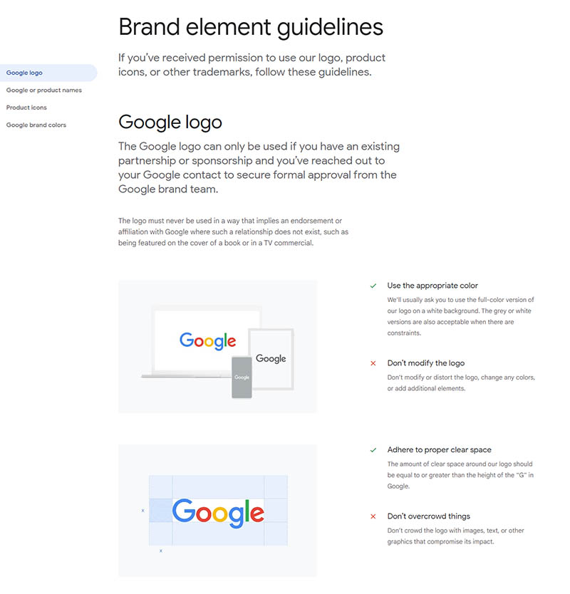
If you still haven’t done it, create a brand guideline before designing that flyer. This plays a significant role in communicating a consistent message to your audience. In addition, your brand guideline is what designers will use as a reference when designing all your graphic assets.
Your brand guideline, also known as brand book, consists of your logo, colors, and fonts that you want people to associate with. Having this makes for consistency, value, and integrity for your brand.
Go for Function, Then Form
For your flyer to be effective, it must be arresting and compelling for people to look at it. But before you design a masterpiece of a flyer, you need to know your priorities first. So ask yourself the following questions:
- What information must it have?
- What will resonate well with my target market?
- How can I make it stand out?
Graphic design is crucial in conversions. But know that there will be times that the most beautiful flyers aren’t always the ones that push the right buttons. A carefully thought-out design will do it. You’ll learn more about this as we go along.
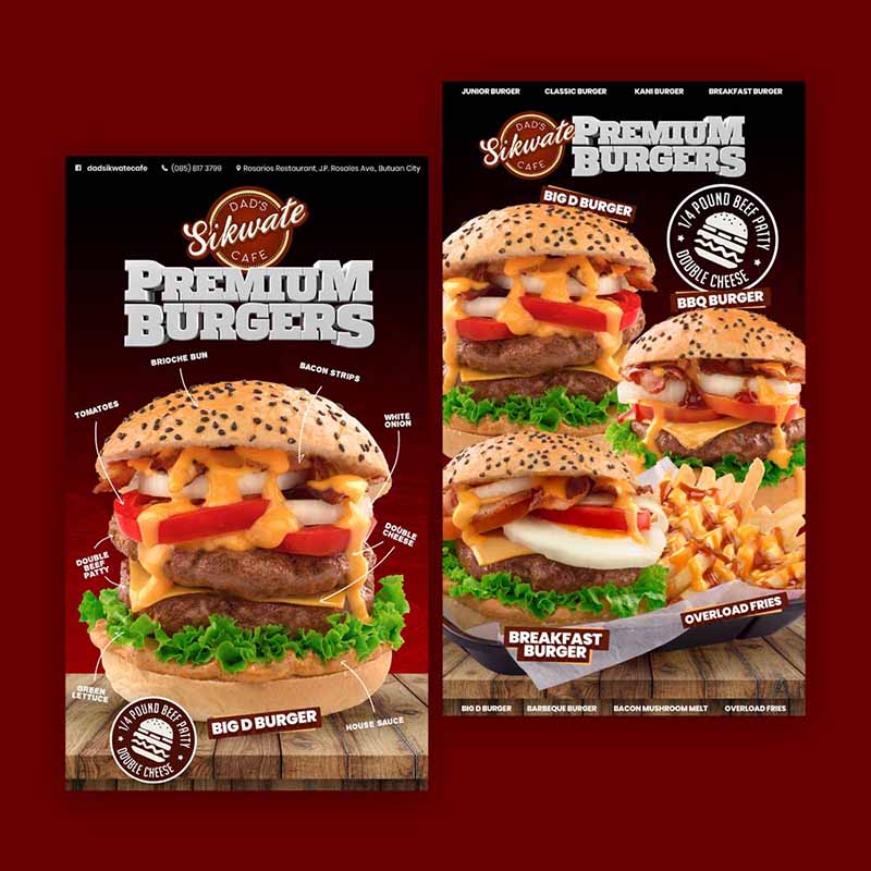
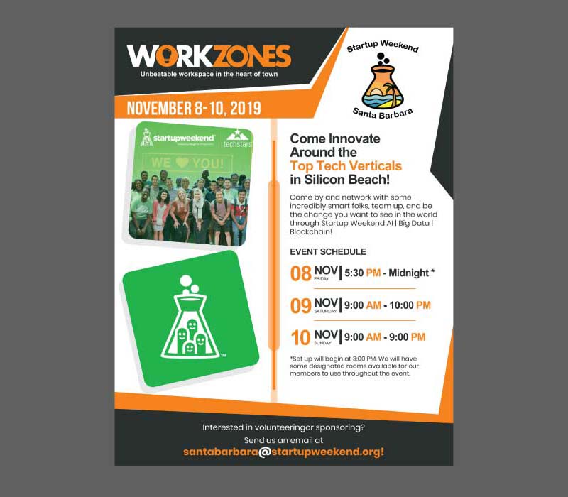
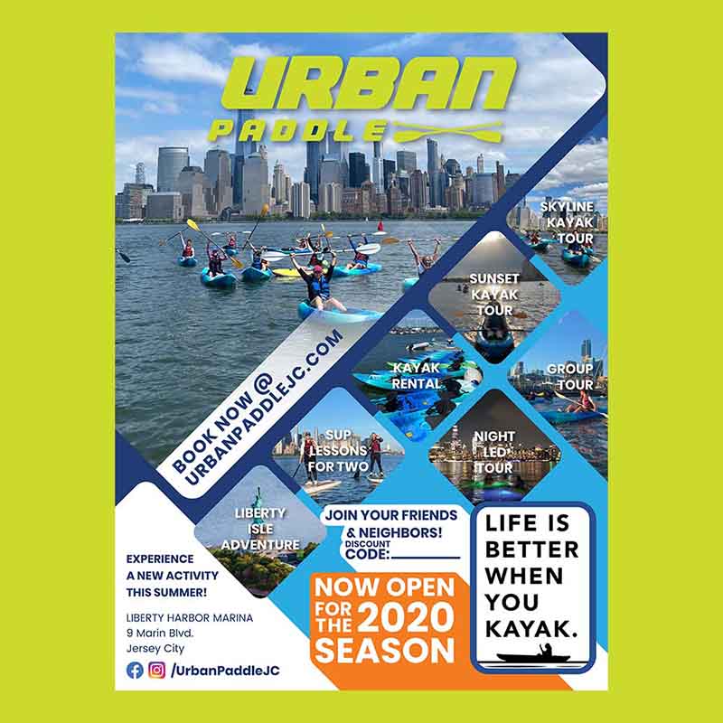
Use Space Efficiently
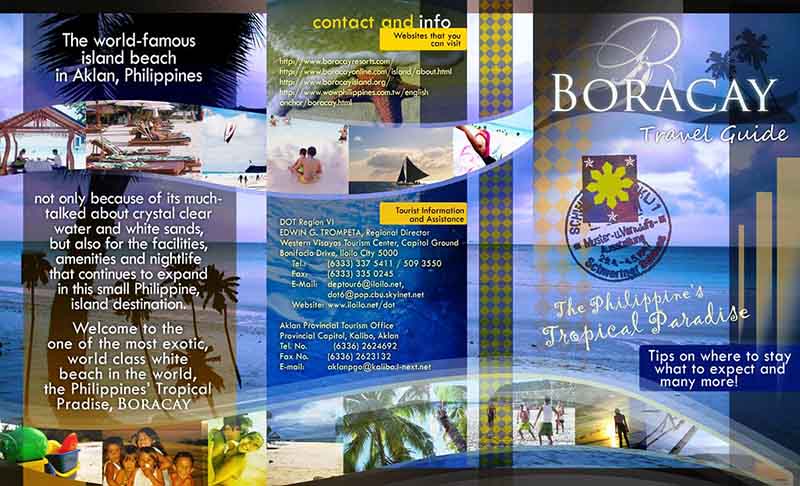
This is the one among all flyer tips that will pose the biggest challenge. Flyers have the smallest space among all advertising platforms available. You need to include all vital info and add images or graphics without making it look cluttered.
This two-paged flyer is a perfect example of using space effectively. It has all the details you’ll ever need without compromising aesthetics. An excellent way to do this is to use grids to separate content and make it stand out.
Use Grids
This brings us to this flyer tip. As mentioned above, you need to maximize the limited space flyers offer. By using grids, you can create digestible sections that can optimize your use of space. Grids can also be great in leading the eye to the most vital part of the flyer.
Using grids can also provide your flyer with a visual hierarchy to ensure that the reader will find what they need from it in an orderly manner. Divide your space into grids and place a different image or text in each. Play with the grid sizes to avoid making it look rigid and monotonous.
Mind Your Fonts and Colors
Choosing which fonts and colors to use can be exciting. However, hundreds, if not thousands, of selections to choose from can also be overwhelming. A general rule of thumb is to use one or two fonts, maybe three, but anything more than that can be too much.
For colors, refer to your brand guideline to keep your flyer design consistent with your brand. Additionally, learn about color theory and the psychology behind it. This will help you decide which colors work best.
Related Post: Color Theory 101 for Entrepreneurs
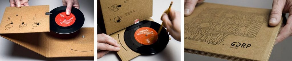
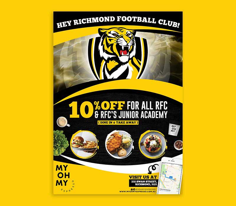
Be Striking
One of the best flyer tips you can ever get is to be eye-catching. We’ve all been there. Someone hands you a flyer, it offers nothing interesting, and you toss it away. Instead, make sure that your flyer has a design that is striking and visually creates impact.
Flyers like this are the ones that people bring home and keep as souvenirs. Although not every company can include breath-taking photos such as these, it pays to know what you need to do to give the same impact. In the case of the above, it grabs the attention first with its beautiful photos. The viewers would then want to know more. In effect, the design gave them an excuse to include more texts than usual.
Include Clear Messages
Flyers only give you a little window for people to read what you have to say. So, right off the bat, make your message as straightforward as possible. Here are a few ways to do this:
- Use visual cues such as a different color or size for a word you want to emphasize
- Keep your content short and brief
- Use bullet points
- Use infographics
There are many more ways to make your message clear, but if in doubt, get the help of a professional designer. Penji offers unlimited graphic design at flat monthly rates.
Related Post: The Foolproof Guide to Outsourcing Graphic Design (Updated for 2021)
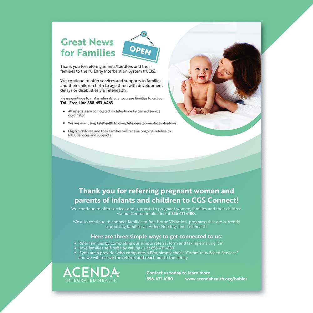
Add Compelling Calls-to-Action

The reason you’re sending out flyers is to get people to take action. This is why CTAs are essential. You want to get something in return for the flyers, and these are the ways to tell people what to do.
And since CTAs on flyers aren’t as simple as having people click on them, you need to be creative here. Ensure that your CTAs are easy to follow, readable, and compelling. Register for the event or Visit our website are good examples. Or, as the example above shows, have them call you.
Play to the Emotions
Use emotions to compel people to take action. Fear and greed are two emotions you can use to entice people to buy what you’re selling. The fear of missing out (FOMO) and the greed to get more value for their money can be great motivators.
According to the online magazine Inc.com, emotions are great drivers of purchasing behaviors. When designing flyers, give it a sense of urgency. Use terms such as For a limited time only or valid until.
Avoid Using Stock Photos

Startups and small businesses beware: the stock photo. However enticing it is to use free images, don’t! You wouldn’t want a staged picture of business people smiling their pretend smiles and looking uninterested. You want to convey a relaxed, friendly, and inviting personality for your brand.
In addition, you wouldn’t want your flyer to look like everyone else’s by using stock images. Being unique by using your own graphics and images can significantly help make you stand out from your competition.
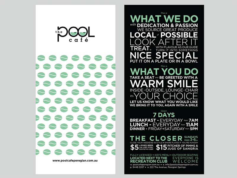
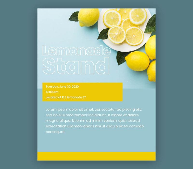
Play It Cool
Getting the attention of prospects doesn’t mean being too salesy or pushy. Leave something for the reader’s imagination by being simple and playing it cool. An overcrowded flyer design can lead it straight to the trash bin.
As the saying goes, less is more, as seen from the example here. If you’re targeting a professional, business, or mature audience, simplicity is the key. You don’t need flashy colors and fonts that seem to yell at the viewers.
Don’t Forget Your Contact Details
Again, flyers don’t have the luxury of giving the option of clicking for info. Your flyer has to include your contact information and how to find you online. You can even add directions on how to get to your physical store if you have one.
Include your website address or your brand name on social media to make it easy for them to find you. This may seem obvious, but it is quickly forgotten.
Go Digital
Distributing flyers doesn’t mean you can’t go online. You can send copies of your flyers via email or any of your social media platforms. An excellent marketing strategy is to combine traditional advertising with your online efforts.
These days, these two go hand in hand and would be a significant loss for your business if you don’t use them all. While some might think that doing this can cost you money, with Penji, it’s possible. Our flat monthly rates allow you to create flyers both for traditional or digital use.
Coordinate with Your Printer
When designing flyers, the terms bleed and trim, paper stocks, coatings, and many others will inevitably come up. You don’t need to know about them, but coordination with your printer is a must. They can help you ensure that your dimensions and design are printer-ready.
Work with Penji
One of the best flyer tips we can give you is to work with us at Penji. Let our pro designers help you create the most effective flyers for your business. You won’t have to pay a ton of money as our fixed rates let you request not only flyer design but everything else in between.
Sign up today to get us started.
Final Thoughts
Contrary to popular belief, using flyers as a marketing strategy is still relevant today. Let other businesses forego this practical tool and start reaping the benefits for yours. And the secret here is to have the professionals do them for you.
About the author

Celeste Zosimo
Celeste is a former traditional animator and now an SEO content writer specializing in graphic design and marketing topics. When she's not writing or ranking her articles, she's being bossed around by her cat and two dogs.
Table of Contents
- What Exactly Are Flyers?
- Why Flyer Advertising Still Works
- Flyer Tips for Beginners
- Know Your Audience
- Create a Brand Guideline
- Go for Function, Then Form
- Use Space Efficiently
- Use Grids
- Mind Your Fonts and Colors
- Be Striking
- Include Clear Messages
- Add Compelling Calls-to-Action
- Play to the Emotions
- Avoid Using Stock Photos
- Play It Cool
- Don’t Forget Your Contact Details
- Go Digital
- Coordinate with Your Printer
- Work with Penji
- Final Thoughts


