Email marketing is a powerful advertising strategy that can augment email lists, increase conversions, and foster client relationships. Ask any marketer and they would tell you the same thing — a well-designed email brings brands closer to their goals. Whether you create an email design from scratch or use an email template design, you’re undeniably on the right path.
As long as your email design conveys your message clearly, you’re good to go. However, designing emails can be a demanding task. Proper design elements must go into your email to convert your readers. And this is why entrusting this colossal task to experts like Penji is recommended. Penji makes email designs a breeze.
All you have to do is submit your request and Penji will provide the first draft after 24 hours. And more importantly, you can request unlimited email designs at affordable, fixed monthly rates. Before digging deeper into Penji’s services, let’s go through the basics of email design, its benefits, and some email template design examples.
General Email Marketing Statistics
If you haven’t included email marketing in your arsenal, these general statistics from HubSpot should persuade you to start:
- Statista says the number of email users is estimated to increase to 4.3 billion by 2023
- In 2019, there were over 5.6 billion email accounts as per a Statista study
- A HubSpot survey claims that 35 percent of marketers send up to five emails to customers weekly
- Statista states that email advertising spend went up to 350 million dollars in the U.S. in 2019
- Content Marketing Institute says that 87 percent of B2B marketers consider email a top priority
- A Content Marketing Institute study claims that 90 percent of marketers use email engagement as a metric to measure content performance
- Emarsys claims that 80 percent of businesspeople believe that email advertising retains customers
- A SaleCycle survey result shows that 59 percent of respondents claim that emails have impacted their purchasing decisions
- MailChimp says emails about hobbies have an open rate of 27.35 percent
Benefits of Email Marketing for Brands
If those figures don’t convince you to start your email marketing strategy, we don’t know what will. The advantage of using a unique and professional email template design knows no bounds. Here are the top benefits of integrating email marketing in your strategy:
- Personalization. Email allows you to personalize your message and piques the reader’s interest. This way, you can craft the visuals and copy the right way because you know the recipient well enough.
- Generates website traffic. Whatever your goal is, your email leads readers to your website. Whether you’re offering them a discount or free voucher, users would want to check out your site for more information.
- Collects audience data. Sending emails doesn’t only connect you with your target audience, but it also gathers user data. You can then use this data for your future advertising methods to make them more effective and impactful.
- Increases conversions. When you showcase your brand’s unique selling proposition, you’re bringing users further down the sales funnel. In turn, this increases your conversions and the company’s bottom line.
- Reaches the right audience. By using aggregated information on your recipients, you can send emails to reach the right people. This prevents your emails from ending up on the Trash folder, provided that you implement the proper design elements also.
- Provides value. Sending personalized emails to your audience makes them feel valued. Also, this ups your brand value for going the extra mile for your audience as well.
How to Create an Excellent Email Design
Designing an email newsletter should be left to the experts. Not only does this project require design experience and principles, but it also needs a proper email layout. Here’s how to create an email design or choose an email template design for your next campaign.
Catchy subject line
Always make the subject line compelling. No matter how irresistible your offer is, readers won’t click your email if the subject line doesn’t pique their interest. Stick to nine words and around 60 characters.
Bait readers with pre-header
Once they click on the email after reading the subject line, keep them interested with an attention-grabbing pre-header. Keep it short and sweet that summarizes what you offer in the entire content.
Stay on-brand
No matter the email content, always stay on-brand to instill brand recognition. There’s no better way to make readers remember your brand than integrating your brand colors, logo, icons, and whatnot.
Keep layout clean
Using white space, grids, color segregation, lines, and more can keep your layout clean and easy to digest. You want readers to easily browse through the entire email. That way, they can get to the call to action before abandoning the email due to a haphazard layout.
Make visuals unique
Whether you’re incorporating illustrations, animations, or videos in your email, make the visuals stand out. Entrusting the graphic design to Penji can take a huge burden off your shoulders. But if you do decide to DIY the email graphics, make sure to learn the ropes on graphic design.
Optimize with a call to action
A call to action will help you achieve your email marketing goals. Ensure that you make it distinct and compelling. Make the copy unique and make the call-to-action button stick out like a sore thumb by giving it a contrasting color.
Personalize as much as you can
Email marketers know how crucial email list segmentation is. This is so you can craft emails with a personal touch. Readers will appreciate personalized emails more than general ones.
A/B test your design
A good email marketer should conduct A/B testing when it comes to the email template design. A/B testing lets you determine what works and what doesn’t work with a set of audiences.
Related Post: 10 Tips That Will Make An Email Stand Out
12 Email Template Design Examples
Now that you know the basics of creating a killer email design that converts, check out some of these examples:
1. Skimmable

This email design from Starbucks is eye-candy. Although this email covers a lot of offers, it’s still easy to skim through. Starbucks categorized each information in grids. Then they used concise copy to describe each topic and paired it with captivating graphics.
2. Elegant black
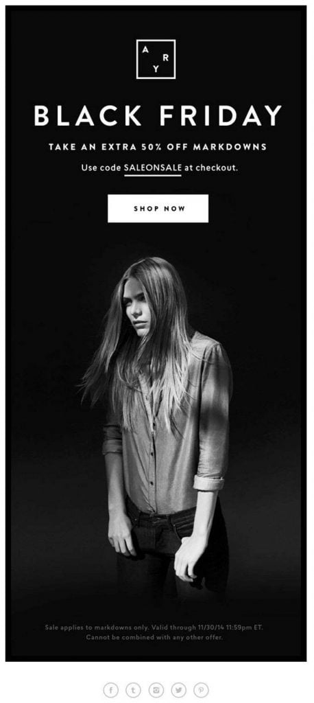
Who says you only need vivid colors to attract attention? If your branding is less playful and more formal, use black to display elegance. Here’s an example of a Black Friday email design from AYR that fits perfectly with the offers. First, the heading and color match. Then the call to action is placed perfectly in the middle of the woman and copy, enough to catch attention.
3. Bright colors

This email template design from Collaborative Fund is both energizing and powerful. The use of bright yellow and red colors is perfect for the content, which is somewhat motivational. Collaborative Fund also used clean divisions to separate each information, while using various textures like crumpled paper.
4. GIFs
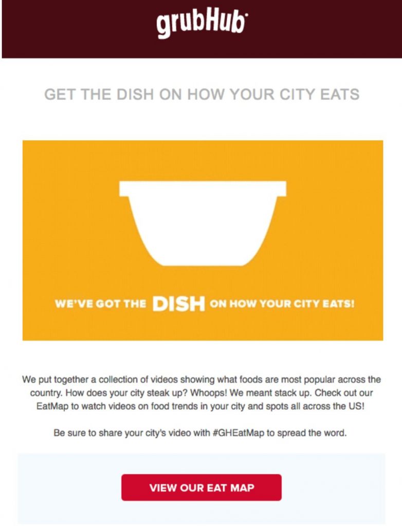
GIFs can elevate your email designs. It’s fun, playful, and it creatively conveys the message. Integrate GIFs just like how GrubHub did with their email newsletter offering their food delivery service. Plus, they also displayed a feature called “Eat Map,” so hungry customers can see which restaurants they can order via GrubHub.
5. Branding consistency
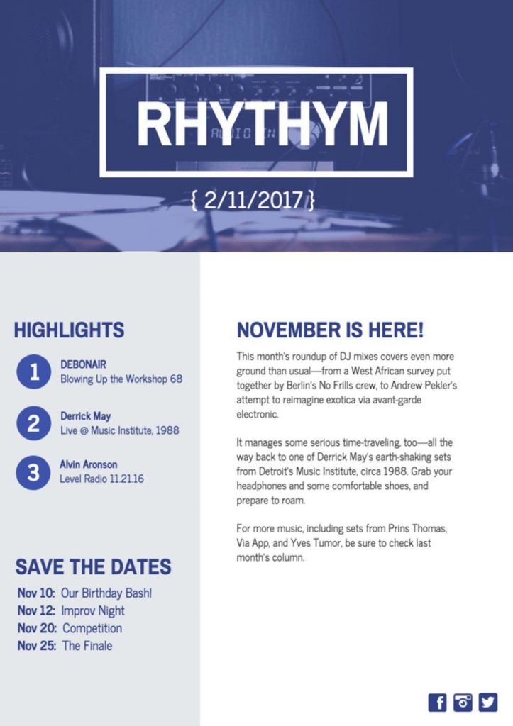
Whether you bank on visuals or lean more towards text-based emails, branding consistency is key to make readers remember your proposition. Always ensure that you use your brand’s colors. This Rhythym email design has a beautiful shade of blue throughout the email, showcasing their brand color. Always ensure that your email design aligns with your brand style guide.
6. Clean and stylish
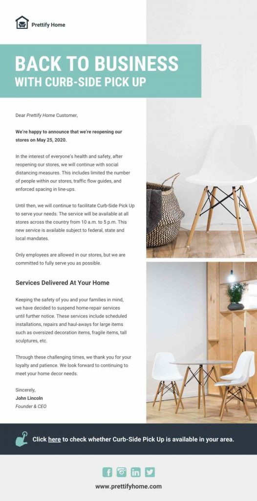
When choosing an email template design, visuals aren’t the only factor. A lot goes into an effective design that converts the reader. You may also opt for a clean and stylish email layout that speaks your branding. In this example, Prettify Home does a bang-up job of informing customers of their home store reopening. The white space is easy on the eyes. The heading with teal background color is eye-catching as well. Finally, the white furniture with splashes of wooden materials is a nice touch to the entire copy and layout.
7. Data visualization
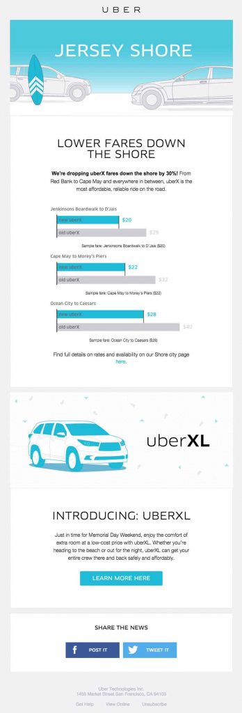
If your email content is a bit more complex, then visualize data through the use of infographics, charts, and graphs. Here’s an example from Uber and how they purposely used a simple graph to show the fare drops. These graphs make it easy for users to grasp how much they’re paying for the ride from point A to B.
Related Post: Are Infographics Overrated? Cool Infographics that Stand Out
8. Simplicity
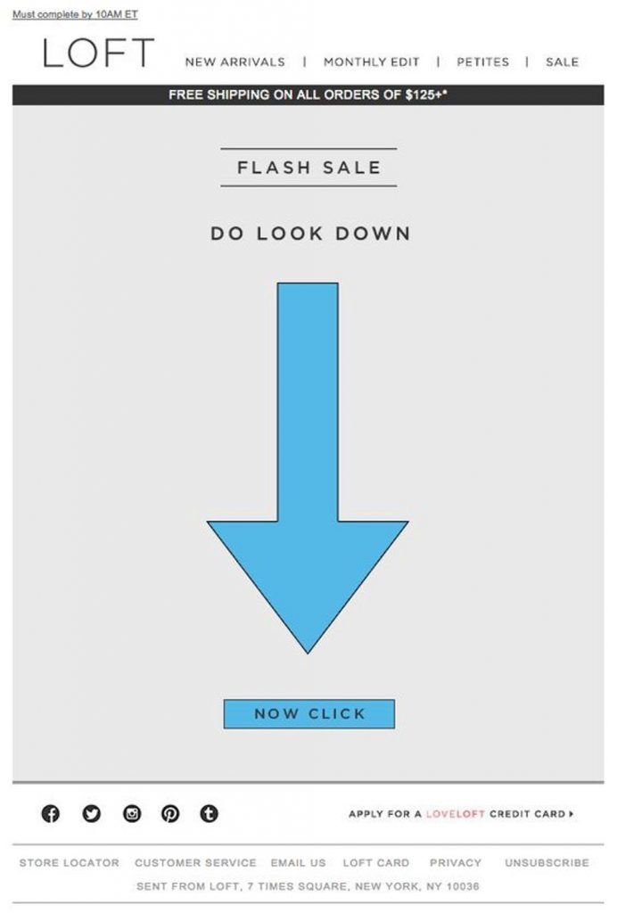
When it comes to email marketing, simplicity is also key to an uncluttered design. And nothing can get simpler than this Loft email. The big, blue arrow is an eye-catcher that leads users to the call to action. The heading “Flash Sale” and subheading “Do Look Down” are also short and sweet. Overall, this email might be simple, but it’s enough to make readers take action.
9. Playful copy and colors
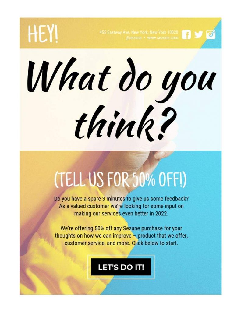
Sending emails to your customers is also excellent to gather feedback about your services. Unfortunately, not all recipients participate in giving feedback. But why not make it playful and attractive while at it? Here’s an example from Venngage with a captivating headline that says, “What do you think?” Then the subheading which offers 50 percent off is also the hook that lets users read further down. Also, the pastel colors are eye-candy and give off a lighthearted tone.
10. Visual positioning

Make readers check out more of your products by putting them on your email front and center. Ensure that you use high-quality images of your products to entice customers. Apple surely knows how to showcase its sophisticated branding through visual positioning. The creative layout is what makes this email work. The various colors are also captivating and fit well with the overall visual pattern.
11. Short and sweet
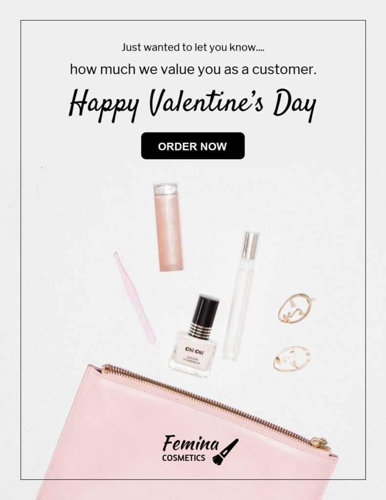
Always keep your copy short and sweet. No one wants to read long-form promotional content these days. Here’s one example from Femina Cosmetics with copy that goes straight to the point. It contains a Valentine greeting and the call-to-action button underneath. Also, when going for seasonal emails, use seasonal colors to get with the times.
12. Urgency
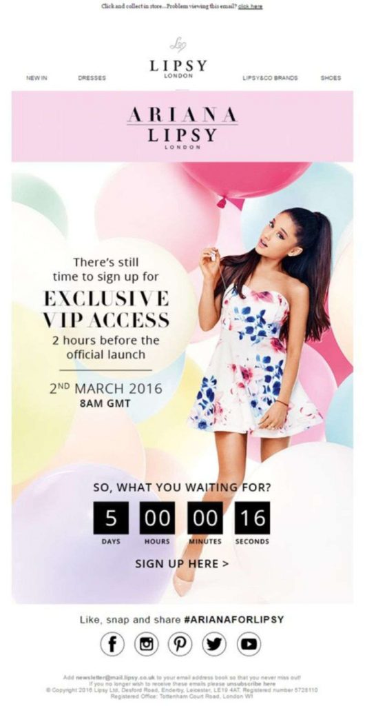
To make users act, create a sense of urgency in your emails. This will instill a “fear of missing out” feeling, especially when the offers are irresistibly enticing. Here’s an example from Lipsy with a countdown timer.
Penji Email Template Designs
If you’re looking into hiring the experts for your email design, here are some of Penji’s email portfolios:
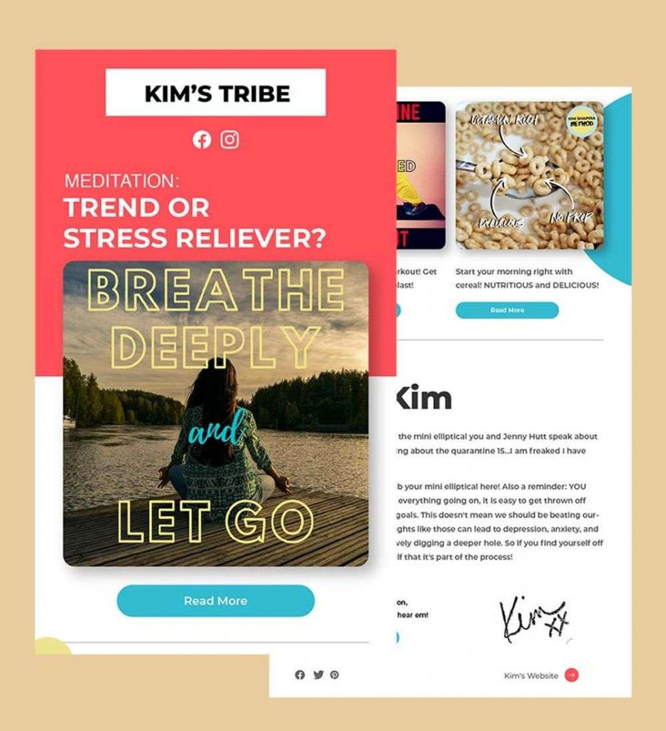
Contrast: This email template design contains contrasting colors that make the overall look visually appealing.
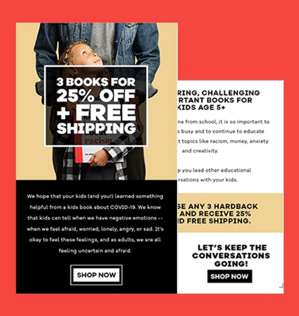
Typography: This email relies on typography to convey the message. The different fonts make it easy to skim as well.
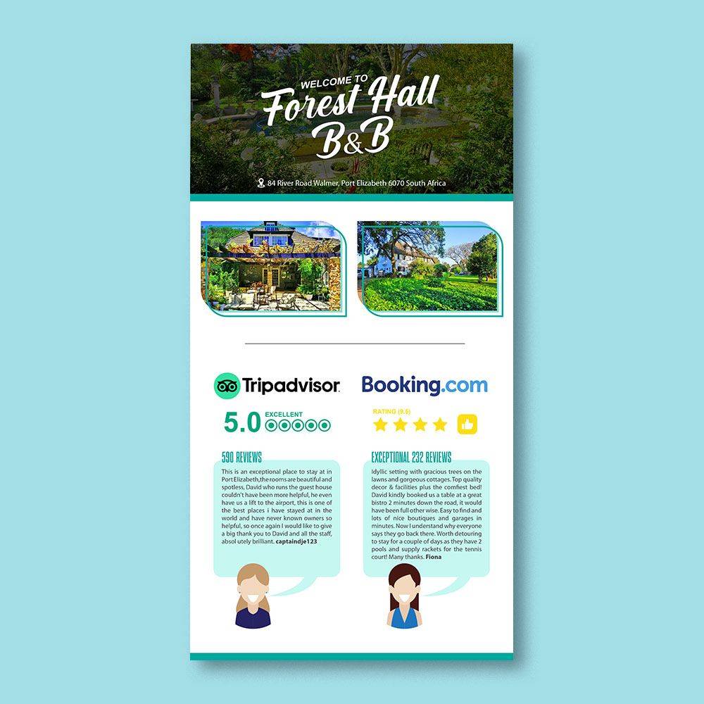
Social proof: Social proof can give more value to your emails. Moreover, social proof makes your brand more credible.
Conclusion
If you need help with your email design, but don’t have the time to do it yourself, then consult the professionals. Or if you don’t want to choose a ready-made email template design from online marketplaces, then subscribe to Penji.
Penji can create custom unique and convertible email designs that can increase sales, website traffic, email lists, app downloads, and more. Try the service for 15 days risk-free by signing up here.


