
When it comes to branding, people think of logos and colors. It helps them associate and remember brands, and a brand is successful when there’s retention. Brands, however, tap design agencies that give them recognition from their loyal customers or consumers.
Design firms are essential to the branding of any company. They make brands’ visions come to life and make them iconic and recognizable for its customers and users.
Design firms have also deviated from traditional design and integrated marketing and user experience to widen their reach and stay relevant in the game. Digital is here to stay since it’s the norm for people to view brands (i.e. websites, apps).
In this article, we examine 8 influential design agencies and their most notable projects in the last decade.
Wolff Olins
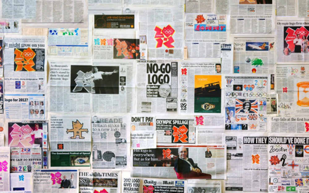
Wolff Olins is a London-based design consultancy firm that uses three approaches in their work: strategy, design, and change. By integrating these three values, they’re able to create top-notch projects that extend to more than branding. They have clients from all over the world, which is a testament to their impact through their designs.
One of their well-known yet controversial pieces is the London Olympics 2012 logo. It received backlash from the public and some designers. However, that didn’t stop the Olympic committee from using the design that deviated from most Olympics logos. They even created the logo for the Athens Olympics in 2004.
Their modern take on design can help them propel to the top as they continue to innovate and publish unconventional designs, which makes them one of the best design agencies in the world.
Google is also one of its notable clients. Wolff Olins states they’ve worked with the tech company for 9 years. They’ve worked for other brands like Microsoft (Skype), Grubhub, and Target.
Pentagram
Pentagram’s headquarters is in London, but the independently-owned design agency has offices in New York, Austin, and Berlin. They have 25 independent artists working with different clients.
Not only do they work on graphics, design, and branding, but they also work on architecture, packaging, and websites too.
One of Pentagram’s most notable works is revamping the Yahoo logo. It took a while for Yahoo to modernize its logo, and Pentagram made it possible. The design studio ensured to keep the purple branding that made the search engine recognizable.
Their other major projects include the Slack logo, Rotten Tomatoes logo, and the opening sequence for Saturday Night Live’s Season 44.
With Pentagram’s approach of using different designers, brands can expect more versatility and innovation in the coming years.
Huge
Huge is a Brooklyn-based digital agency but has offices in major states, London, Asia, and South America.
In creating their designs, their process is to use data to create impact and consistency in branding. Aside from branding and design, they also work on different marketing campaigns for the brand.
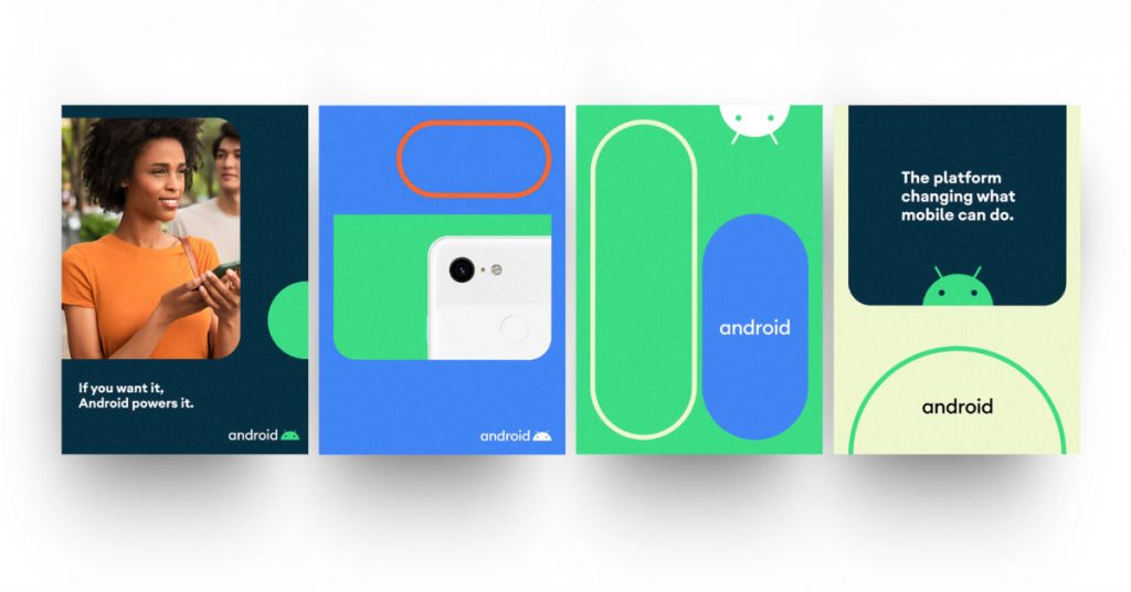
Thanks to Huge, Android got a successful makeover that kept up with the times. It gave Android an overhaul of the brand experience starting from its architecture to better user experience.
Huge utilized three colors to help identify Android, which is green, blue, and orange. They’ve also used rounded edges as part of Android’s rebrand which may signify the current and modern looks of smartphones and the back cameras.
They have designed and partnered with some of the biggest brands in the US such as Pantone (Color of the Year 2020), AMC Theatres, Hulu, and NBC Universal. LG and Gucci are some of their international clients.
As a digital agency, they’re most likely to follow the trends not only in marketing but in design while keeping branding at the heart of their work.
Chermayeff & Geismar & Haviv
Chermayeff & Geismar & Haviv is a design agency that specializes in logos, graphics, and art in architecture.
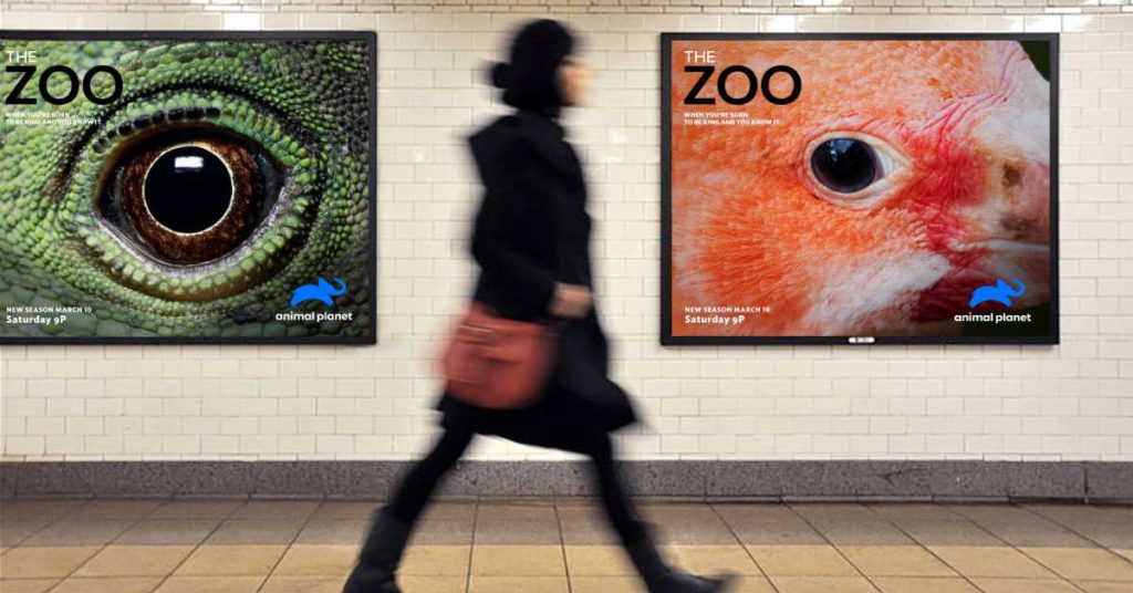
One of their most notable work in their portfolio is the redesign of Animal Planet’s logo. The previous Animal Planet logo wasn’t as well-received because it seemed to take out the animal in its branding. Chermayeff & Geismar & Haviv revived the elephant to make the logo stand out and elicit joy.
The logo evolved from a green text to a blue elephant seeming to leap (signifying the joy) with the text Animal Planet in white.
Aside from Animal Planet, other notable networks are NBC, National Geographic, and PBS. Other brands include Barneys New York, MoMA, and Chase Bank.
This design agency will continue to thrive due to their specialty in establishing a brand identity for big brands. Through their minimalist approach, more brands can make a shift towards it.
Studio Dumbar
Studio Dumbar hails from the Netherlands, and while their focus is more in Europe, their designs are eye-catching and eclectic.
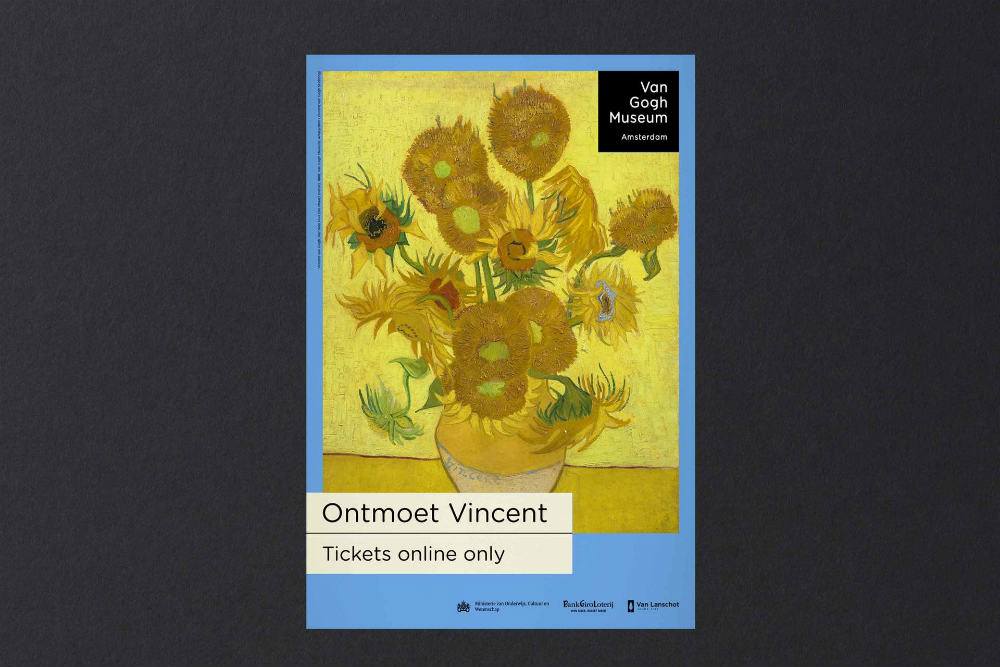
Their most notable project is the Van Gogh Museum in Amsterdam. The museum attracts millions of visitors each year, and Studio Dumbar was tasked to shape the brand identity of the Van Gogh museum.
Their process was simple. It was to take inspiration from Van Gogh’s paintings, which were complementing colors. By doing this, it can help recognize the artist based only on the marketing and branding of the museum. According to Studio Dumbar, the museum received more visibility than ever.
The studio has done work for Nike (Chelsea), the Dutch Government, and Transavia. Studio Dumbar may see more clients in the future due to their use of colors that can entice many.
Fantasy
Fantasy is a design agency that has been in the industry for 20 years and has offices in San Francisco, New York, London, and Miami. As with some design agencies, Fantasy also utilizes digital approaches such as web and mobile to stand out from the competition.
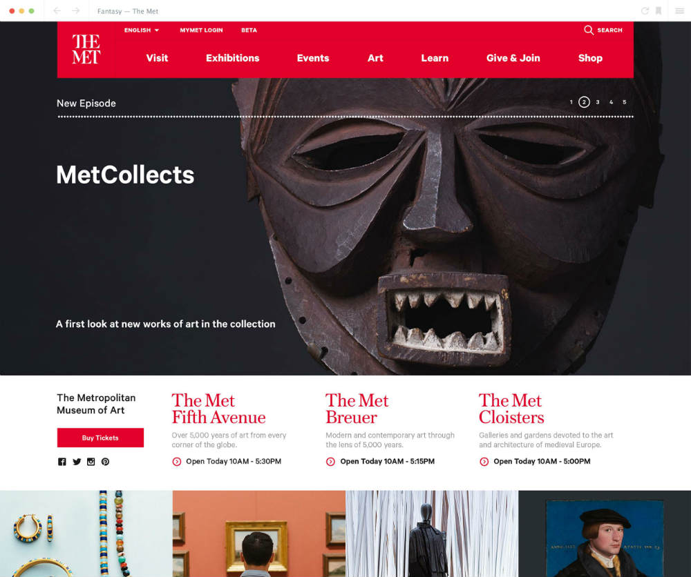
One of their many notable works is the redesign of The Met’s website. According to Fantasy, The Met wanted to redesign by introducing The Met Breuer and have a new identity online.
Mobile optimization was a priority for branding, so Fantasy organized their mobile website so visitors can learn more about the exhibitions, events, and collections. Visitors of the website can also know the opening times of The Met, as well as get more educational information through MetMedia.
Other notable clients include Mitsubishi, Masterclass, and UFC.
Fantasy seems to be on the right track through digital means. Brand identity is no longer just limited to packaging nor logos. The website and mobile app are also factors in establishing that identity, and Fantasy seems to continue that vision.
Landor
Landor is an award-winning design agency based in San Francisco. Their influence goes beyond the US as they have multiple offices around the world.
Their competitive advantage is through their brand community model, which allows them to connect with the key players of the brands and use expressions to create a brand identity.
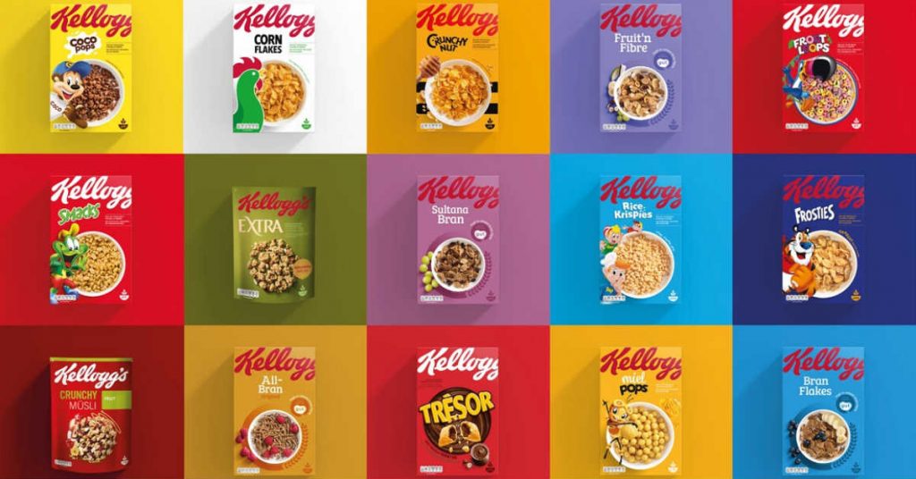
One of Landor’s biggest and most popular projects is the Kellogg’s rebranding in Europe. They aimed to make Kellogg’s the leading provider of natural grains through cereals in homes. What made them successful was to go for simplicity and healthiness in reestablishing the brand on the continent.
Due to the rebranding, 70% of people started to notice Kellogg’s on the shelves and had around 50% of purchase intent.
Other brands in their portfolio are Old Spice, Apple (iMac Pro), and Kraft (Macaroni & Cheese).
Landor will remain as one of the best design agencies even in the future due to their innovativeness and open-mindedness to try new things.
Meta Design

Meta Design is a global design consultancy that has been in the industry for 40 years. As one of the oldest design agencies in the list, they continue to modernize and use their expertise for brands all over the world.
One of the companies they worked with is 23andme. Meta Design used 23 different logos to signify the 23 pairs of chromosomes. Branding is consistent with 23andme’s website and products.
Their use of colors makes 23andme stand out from other brands. By using colors, they’re able to make the brand personable and audacious for its customers. The founder of 23andme, Anne Wojcicki was pleased with the branding because it makes the brand approachable too.
They’ve also done branding for Porsche, Lacoste, DHL, and Volkswagen.
Meta Design isn’t afraid to work with different brands in the world, and that’s how they can progress further in the future. Their versatility can enable them to become one of the leading design agencies in the world.
Final Thoughts
Design agencies are leaders in innovation by driving brands forward to modernization. It’s not enough to use traditional design approaches, or else they’ll get behind.
The 8 design or digital firms have demonstrated and presented their skills to give brands their identity. Their portfolios are proof they’re the best in the game and have no signs of slowing down. It’s a plus that these design agencies cater to a global audience, which can challenge them in making a brand significant everywhere.
As the new decade starts, design firms need to go a step beyond the competition to tap more clients. They should embrace new trends to produce results and satisfy clients.
If you want an unlimited graphic design service that meets your needs, find out how Penji can provide high-quality designs for your brand.
About the author

Katrina Pascual
Katrina is a content writer specializing in graphic design, marketing, social media, and technology. In her spare time, she writes monthly personal blogs to practice her craft.


