Dashboards have become integral in viewing information and analytics for users and managing operations. Primarily, it focuses more on function than aesthetics. But the trends for an app or website design should also reflect on the dashboard. The best dashboard design not only focuses on function or usability but aesthetics too. This way, it can be much more engaging to use over time.
If you’re looking for reliable designers to produce your dashboard, Penji has got you covered. As an on-demand design service, Penji can fulfill all your design projects. Save yourself the trouble of finding and hiring a graphic designer. You can sign up for a plan and submit your first request today! Watch a 10-minute demo video to get started.
For now, check out the dashboard designs in 2020. Plus, read on to get a special step-by-step tutorial on how to get a dashboard design from Penji.
1. Hours
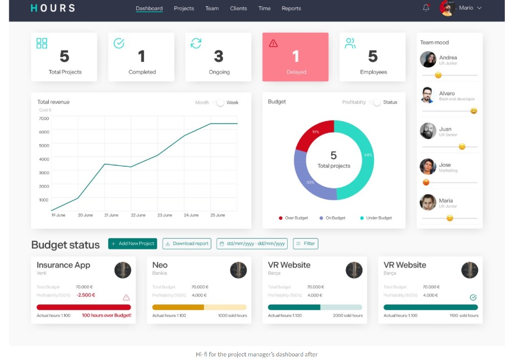
Olé Agency, alongside two other designers, worked on redesigning the agency’s internal time tracking system: Hours. They restructured the whole system on both the project manager and the employee side.
Here’s the new design for the Project Manager dashboard. They reorganized the content to make it easier for the project manager to view stats like the number of hours and budget. For the Total Revenue and Budget grids, they added toggles. It will help in making comparisons and view the project’s profitability. They used sliders for “Team Mood” with added emojis too, which is a nice touch.
As for the budget status, they added a button beside the header, where the project manager can add new tasks. Plus, they included progress bars to indicate the number of hours worked.
2. Parking Dashboard
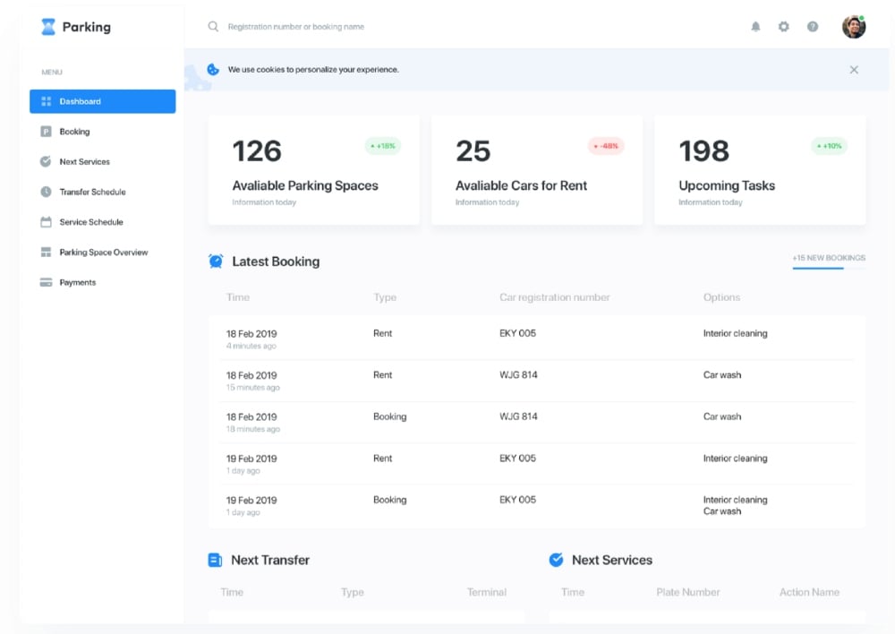
A digital parking system is unheard of, but Glow aimed to think ahead. They created an automated parking system to ease the problems of those in the sector.
As one of the best dashboard design examples, it observes hierarchy. Plus, they have a minimalistic design, allowing the user to focus on the essential information. The top grids look larger, and it uses drop shadow as well. It will make it pop and will guide the user to draw their attention to those grids. Besides, they used icons next to headings, which help in making a concept look visual.
3. Zignaly
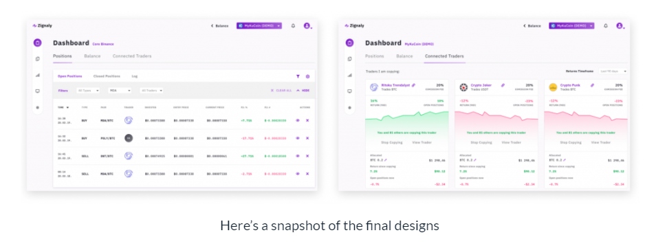
Finance apps may pose a challenge because of the data and information that a user may view daily. That’s why UX or UI designers need to design an app that encompasses all user needs and functions without overcomplicating it. The UX Studio Team redesigned Zignaly and made it easy for users to process information.
Firstly, they divided the dashboard into three tabs. This way, the UI isn’t cluttered. Since it’s also a finance app, they made great use of green and red to signify highs and lows during trading.
Secondly, they integrated icons effectively as a substitute for text buttons. The color of those icon buttons is purple too, to incorporate the branding in the dashboard.
4. Digitruck
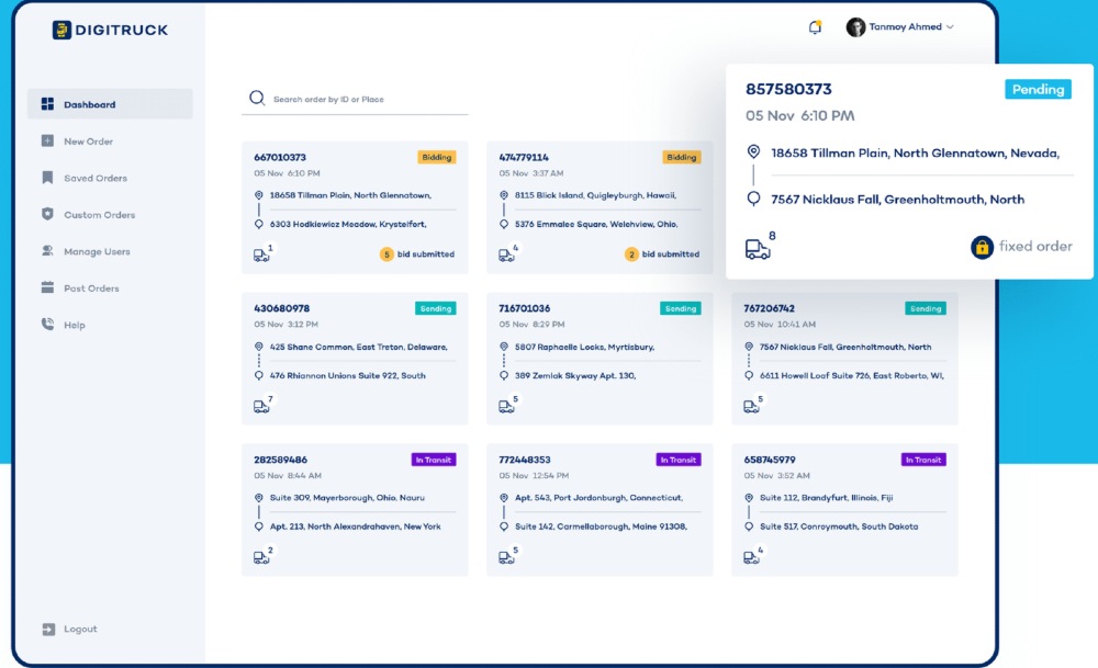
Tanvir Ahassan produced a desktop dashboard design for Digitruck. The dashboard uses only cards and a search bar. It’s one of the best dashboard design examples because of how simple it looks. Plus, there’s symmetry because of the spacing and alignments of the cards.
Users can track the status of their shipment through the colored labels. Other UI related elements that the designer added are icons and notifications.
5. Classmo
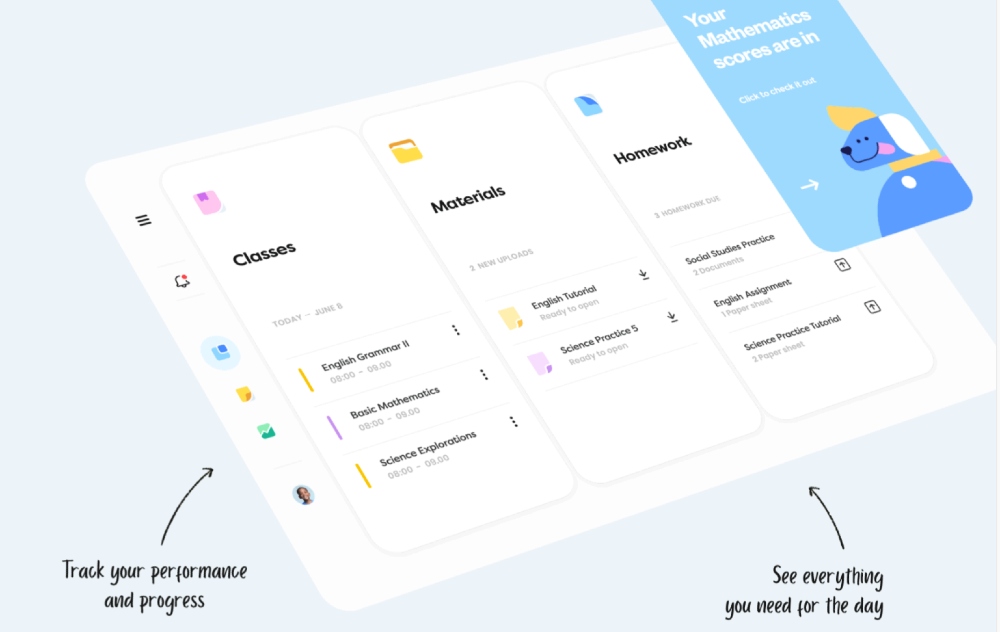
Classmo is one of the best dashboard design examples because of its functionality and visuals. It was created by Daniel Tan and Daphnie Loong. It uses icons for the cards that will visualize the themes. Plus, the typography is appropriate because users of the site are kids. It seems approachable. And they applied hierarchy as well as contrast on the typography.
Users can click on the hamburger menu to view the dashboard. From there, it expands like an accordion, which is also another feature they added to the cards. It provides a seamless user experience. Once they click on one of the topics, they can view more information about it by using a kebab menu and see students of the class and the schedule.
When the user downloads a material for the Materials card, they’ll see a checkmark to confirm they downloaded a file. As for the Homework card, it will show a progress bar indicating a file is uploading. Once uploaded, the upload button changes into a document icon, signifying that the user completed it.
6. Doctor’s Personal Account
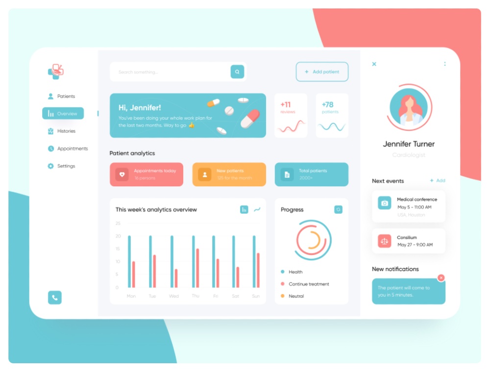
Tino Design created this bright and colorful physician dashboard: Doctor’s Personal Account. They used rounded edges for the grids. After all, as many experts would say, rounded edges are pleasing to the eyes.
The dashboard also has a sneak peek of the profile. It uses cards and includes notifications to alert the physician as well. It’s neat they added illustrations on the main card to make the design more attractive. It also helps that they use icons and graphs to make it more visual for the doctor.
7. Opencart
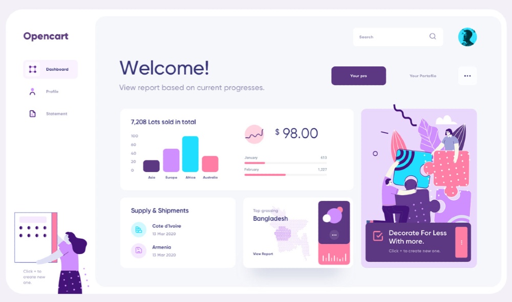
This sample Opencart dashboard design from Ali Sayed looks clean and minimalistic. The designer provided three different designs but followed the same elements as grids, cards, graphs, progress bars, and drop shadows. Users can switch between the “Your Pro” and “Your Portfolio” tabs as well. Furthermore, on most of the sample designs, illustrations are present. It’s much more captivating to add more cards thanks to it.
8. XWallet
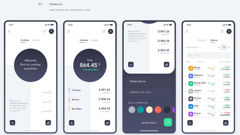
The XWallet App dashboard looks sleek and neat. It uses two tabs to separate the user’s portfolio and the market. It’s great that the designer, Stanislav Polivoda, used contrast in typography. Jaye Hannah from CareerFoundry says that contrast is essential because it will emphasize copy or content.
The user can also scroll down and view more information by clicking a button for a new wallet on the Portfolio tab. The designer separated information to achieve balance.
Meanwhile, for the Market tab, Polivoda separated the list of cryptocurrencies by using lines. Plus, he used a search bar and a drop-down menu. This way, users can sort through a ranking or search for a cryptocurrency easier.
9. IsItUp
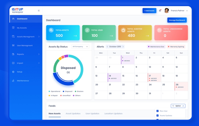
Designer Moinul Ahsan made the IsItUp dashboard customizable. However, on the sample dashboard in the case study it shows hierarchy and order. Plus, it seems users can change between tabs and use a drop-down and a checkbox, making it a functional and well-designed dashboard.
To make the dashboard pop with color, the designer added gradient colors on the top cards. Plus, the designer uses color-coded legends for the pie chart and the calendars.
10. COVID Information Dashboard
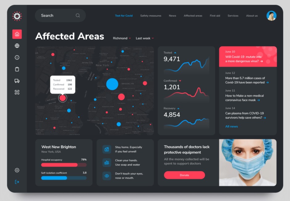
Ramotion produced a COVID Information Dashboard design that might never launch. It’s still one of the best dashboard design examples because of how functional and informational it is.
For one, the dashboard displays data that will help the user identify where cases are the highest. The line bar is a nice addition to show the fluctuation for testing, confirmed, and recoveries.
Secondly, to maximize the space, they added other cards like news, reminders, and donation. This way, users can glance at all of the information at once without needing to scroll or view other tabs.
11. Coinarea
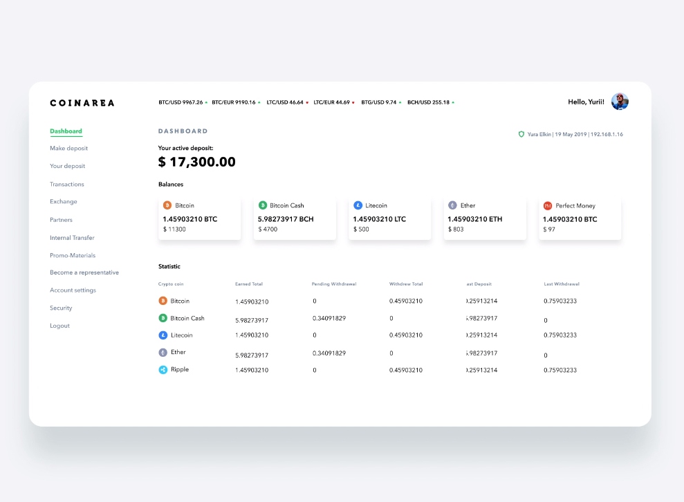
The Coinarea dashboard follows a flat design for both the desktop or app version. It has one of the best dashboard design examples because it looks minimalistic. The designer, Yurii, uses only cards with drop shadows to separate balances. Meanwhile, the designer organized the statistics in a table form without any lines. The use of typography and icons make it easy to view the data.
12. Language School
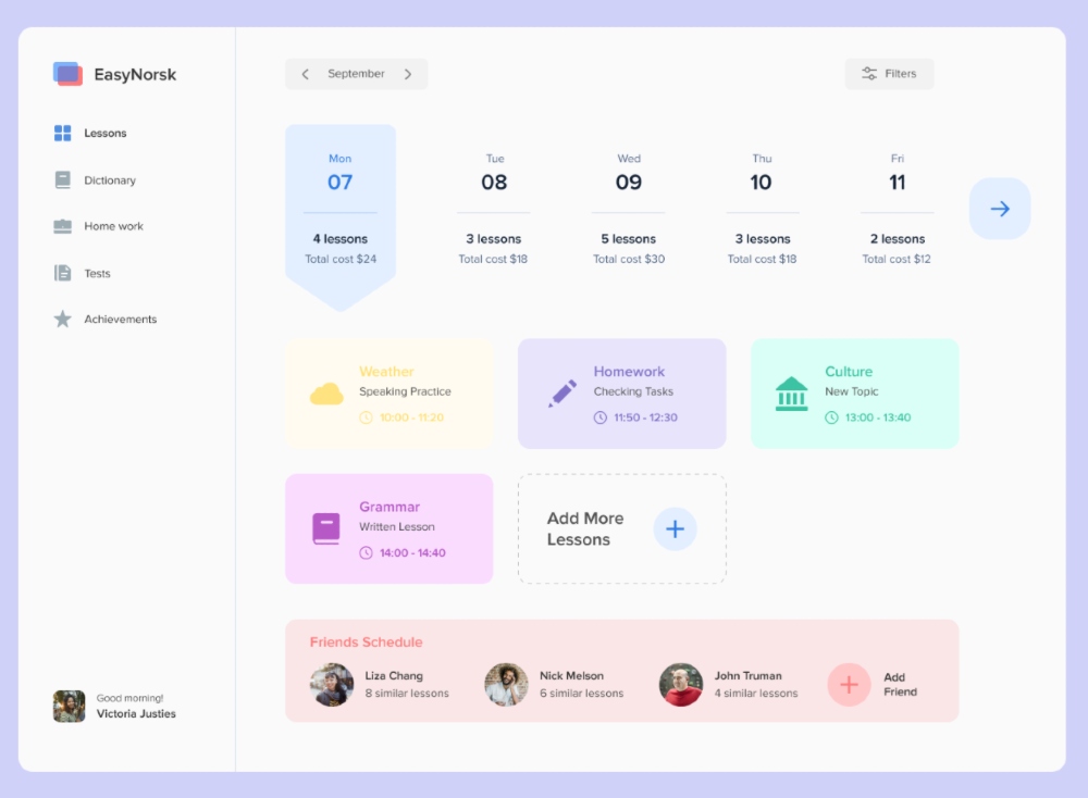
The Rhinoda Team designed one of the best dashboard design examples on the list. It uses a hierarchy where users can switch between dates by using arrow buttons. Then, they can view other tasks as cards. Bonus points for adding icons on the cards, too, since it helps in conveying words visually. The bottom grid shows the friends list. Photos help separate the friends from each other so that users can identify them properly.
13. Finance Dashboard
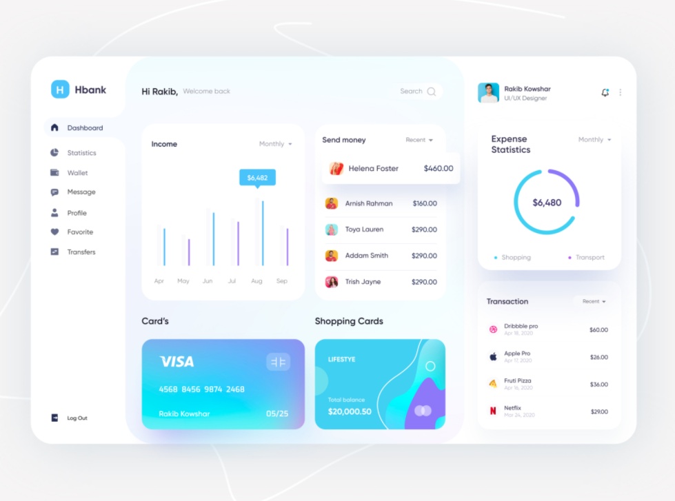
This finance dashboard by Rakib Kowshar looks modern. He uses rounded cards to divide different sections and organizes them well. The profile on the right side is also a nice touch, so the user won’t have to go back and forth a profile page. The cards also include drop-downs to show other options, which will help the user view previous data.
14. Order Management Dashboard
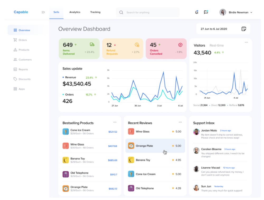
Designer Abdullah Norman created sample Order Management dashboard designs for a client. The two dashboard designs look the same but have some tweaks in font use and color. The dashboard has a structure because of the visual hierarchy. It’s also great that the numbers stick out. That way, users will draw their attention to those cards.
15. MediaHive
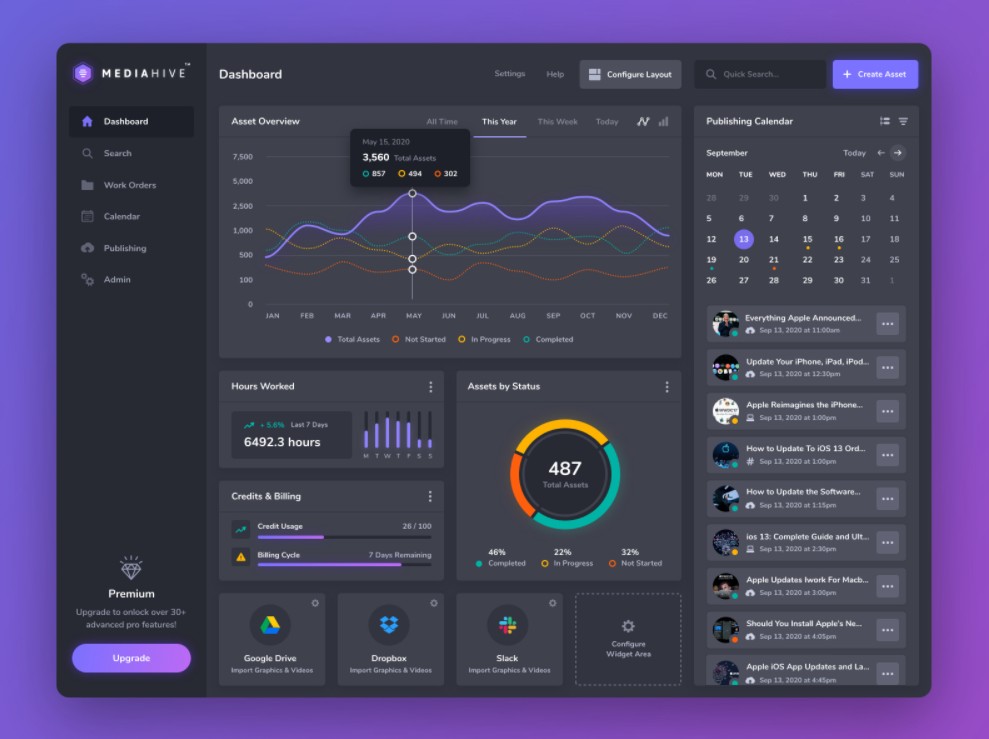
The MediaHive dashboard is one of the best dashboard design examples because even if it has many UI elements, it is organized. The charts are prominent on the designs, which will catch the attention of the users. On the calendar section, one will notice small cards with meatball buttons. It seems there might be other functions or tasks that users can do to edit the cards.
How to Request for the Best Dashboard Design on the Penji Platform
Once you subscribe to a Penji plan, you can make your first request. All we need is to hear from you. What would you like our Penji designers to create for you? When you submit your design project, you can sit back while the designers are hard at work creating something amazing for you.
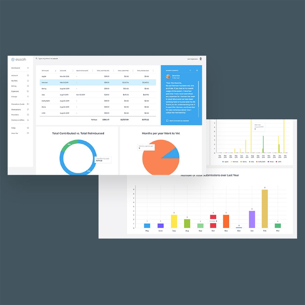
Here’s an example of a dashboard design by one of our designers.
For now, you can check out how to request a dashboard page on the all-in-one Penji platform.
Step 1: Create a Design Request
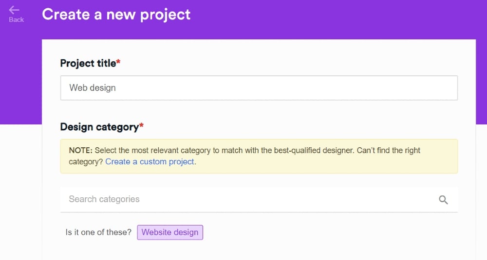
On the Penji platform, click on the New Project button. From there, you’ll fill out a form. This is where you’ll supply the details of your design.
Firstly, you need to provide a Project title and select a Design category. For example, you want to request a dashboard design for your app, type in website design. A category will pop-up, and you can click on Website design.
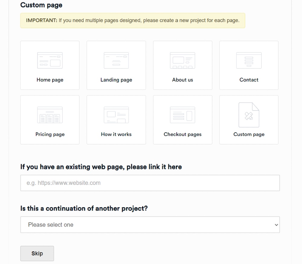
Then, you’ll choose which page you need on your website. Since you’re requesting a dashboard, click Custom Page. Then, make sure to indicate that you want a dashboard design on the description.
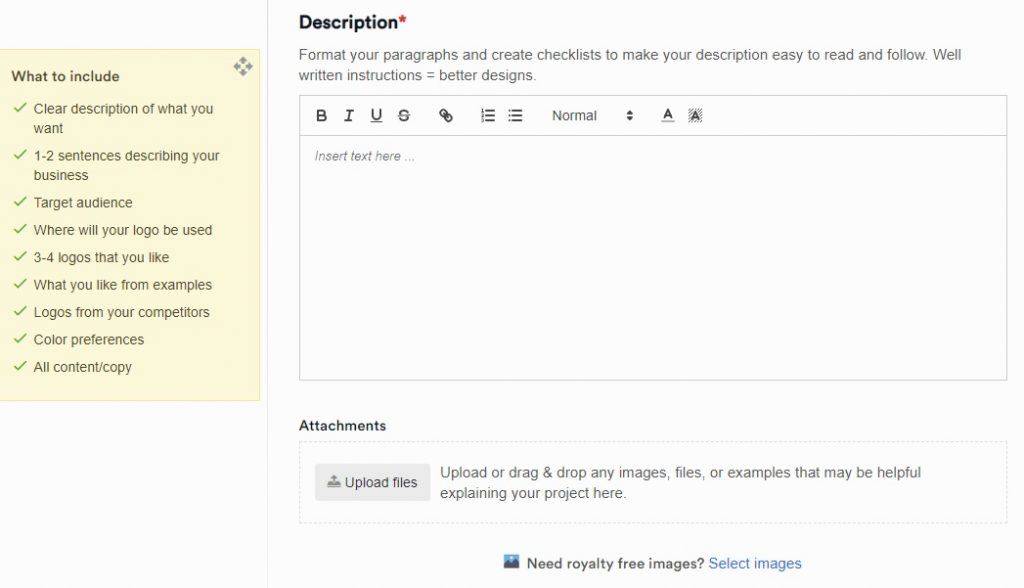
After this, write the details of your dashboard design on the Description field. Make sure to go into detail, so your designer can include all the specifics. Plus, this will reduce delays. You can always follow the What to Include guide, so that you could put other details you might have missed.
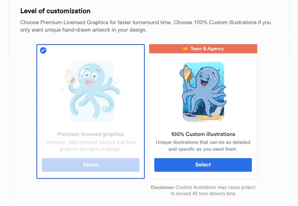
Once done, click Next, then choose the Level of Customization, File Deliverables, and Associated Brand. From there, press Create a Project, and you’re all set! You’ve completed your first design request.
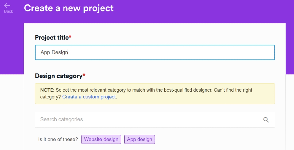
From there, Penji assigns a designer to your project. They’ll review your details and work on it ASAP.
Step 2: Review the Design
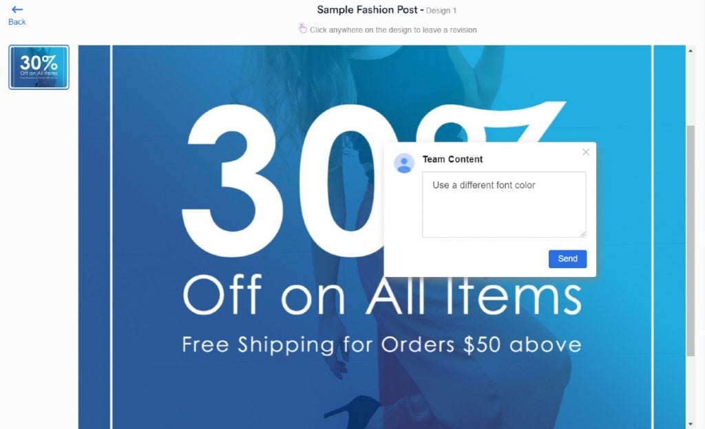
Your website designer will submit their first draft within 24 to 48 hours. From here, you can review the design. If you think it needs more improvement, use the handy revision tool! Point and click on the design and leave notes as to how the designer can enhance the design.
Plus, don’t worry about how many times you want to revise the design. In any Penji subscription, you have unlimited revisions! Revise until you’re satisfied.
Step 3: Download the Design
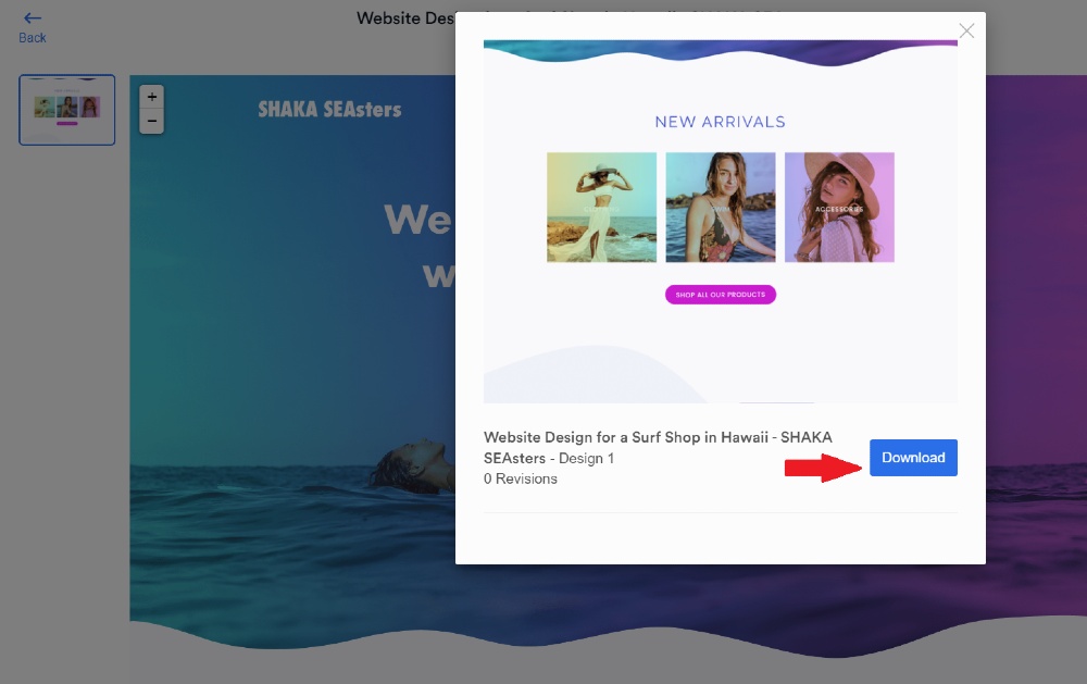
If your designer finally submits a design that you love, you can finally download it. Click on the blue download button, and the files are saved to your computer. It’s that easy! And there’s no fuss.
In case you want to access your files once more, log in again and download it. We save your files on a cloud, so don’t worry about losing your files.
Final Thoughts
Dashboard designs may seem overwhelming because of the information and analytics. But through better UI design and restructuring, it can be engaging for the user.
That’s why you need a trustworthy design service like Penji. Rest assured that you’ll always receive high-quality and professional designs. Plus, you can depend on Penji designers who won’t go MIA or delay your projects.
For only $499/mo, you get access to all design types. This means you won’t have to subscribe to another plan to get illustrations or other designs. It’s an inclusive and affordable plan! Subscribe today and try the Penji platform risk-free for 15 days.
About the author

Katrina Pascual
Katrina is a content writer specializing in graphic design, marketing, social media, and technology. In her spare time, she writes monthly personal blogs to practice her craft.
Table of Contents
- 1. Hours
- 2. Parking Dashboard
- 3. Zignaly
- 4. Digitruck
- 5. Classmo
- 6. Doctor’s Personal Account
- 7. Opencart
- 8. XWallet
- 9. IsItUp
- 10. COVID Information Dashboard
- 11. Coinarea
- 12. Language School
- 13. Finance Dashboard
- 14. Order Management Dashboard
- 15. MediaHive
- How to Request for the Best Dashboard Design on the Penji Platform
- Final Thoughts


