A night out with friends will almost always mean that you’re all heading to a bar. And you won’t be disappointed as bars and pubs are abundant. If you’re a bar owner or thinking of starting one, make sure that your logo has what it takes to reel in the tipplers. Here are 15 of the best bar logo ideas to inspire you:
1. Fadensonnen
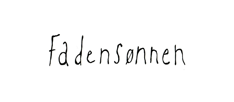
One look at the logo below, you’d think it was for a classy restaurant. Fadensonnen is a beer garden and tavern that has a logo that doesn’t look like the stereotypical bar logo design. It is edgy and trendy and very suitable for the bar it represents.
The place has elegant, artsy, and rustic vibes, with an airy and sophisticated atmosphere, which is evident in the logo. The design uses a handwritten font that shows a free-spirited yet, contemporary nature. It is void of any color aside from the black letters, which adds mystery to the design.
2. Hunky Dory
Located in Brooklyn, Hunky Dory is a bustling bar with an eclectic mix of designs, whether it be its food or its interiors. The bar takes pride in incorporating a sustainable mindset by having an evolving culture in place. They got rid of tipping by adding it to the item costs and changing how the hierarchy works in its kitchen.
The logo is straightforward, with only the letters H and D encircled in light orange with dots all over. The place has a bright and inviting appeal that can be clearly felt in this bar logo idea. The logo has no other distracting elements, making it suitable for scaling.
3. Bryant’s
Serving drinks since 1938, Bryant’s is located on a residential street in Milwaukee. Its unpretentious lounge gives patrons a feeling of stepping back in time. Its dimly-lit interiors earned them the title “America’s darkest bar.”
Looking at its logo, Bryant’s is as cliche as can be, with a wine glass in the middle of the brand name. It uses a semi-cursive font with an old-school appeal that matches the bar quite well. For its “dark” personality, only its black logo background seems to show this. Overall, the logo design is positively upbeat.
4. Ministry of Brewing
When you step inside the Ministry of Brewing in Baltimore, you’ll feel like you are in a church or library instead of a bar. Upon checking its website, sure enough, it was a former church-turned-brewing place replete with paintings of saints and tables arranged as if they were church pews. Its Romanesque architecture and design were incorporated yet modernized in its logo.
The logo has a round icon with the letter M in various colors to simulate the stained glass window we usually find in churches. On its website, the Ministry of Brewing claims to revitalize history and community, which we can feel in its logo design: colorful, and stylish, yet has that historical feel.
5. Valkyrie
Taking its name from Norse mythology, Valkyrie claims to be “playfully serving serious drinks.” And judging from its logo to its website, they seem to mean it. This bar in downtown Tulsa takes pride in having one of the best whiskey lists, expert service, and crafty drinks. The interiors are also worth noting as they are impressive, to say the least.
The logo perfectly reflects the image the bar wants to project. With its Valkyrie helmet in the middle and the words “serious drinks” below it, you instantly know they could never have chosen a more suitable logo.
6. Cafe La Trova
With its tropical and art deco feel, Cafe La Trova is what you expect a bar in Miami would look like. Its atmosphere is lively, fun, and entertaining, much like its logo design. If you’re looking for bar logo ideas in this genre, this is the one to inspire you.
The logo has a rooster on top and uses bright shades of orange and red with blue typefaces. This is a typical design associated with anything from Havana, Cuba. It signifies feelings of enjoyment, good times, and great food and drinks.
7. Lazy Bird
Tucked inside a hotel in Chicago, Lazy Bird Bar has an overall jazzy ambiance and an impressive cocktail list. This bar has the works: live bands, VIP booths, and a drink selection of up to 52 varieties. In short, this bar promises great times and seems to live up to the patron’s expectations.
However, its logo may look like it’s just a scribble of the bar’s name. The description of laid-back may be an understatement, but it represents the bar superbly well. It is eye-catching with its yellow font against a black background. The handwriting may very well describe the name, which is lazy, as in lazily scratched down.
8. The Fiddler’s Inn
An even older bar than Bryant’s is The Fiddler’s Inn which started brewing in 1930. This bar boasts a welcoming staff, a great tap list, and creaking floorboards that add to its vintage appeal. It even has a neon sign that has stood the test of time, making it more beloved by its loyal patrons.
Despite the earthy and old charm, this bar has a timeless logo with quite the character and depth. It uses a wood-etching design that makes it look fashionably old, feisty, and full of fun. If you’re in the design business, you’d know that the color red is suitable for food and beverages. It signifies a good appetite and a boost in energy, among many others.
9. Happy Dog
Cleveland’s neighborhood corner bar, Happy Dog, has every right to be on the best bar logo ideas list. It is famous for its offbeat atmosphere, abundant hotdog choices, and its assortment of live music. Its interiors are cozy, warm, and inviting, perfect for your hotdogs and beer.
This bar’s logo perfectly sums up what Happy Dog is, lively, entertaining, and a source of pure enjoyment. It is straightforward, with just the brand name and a group of stars to add that all-American vibe. Although it is in black and white, you can feel that the logo simply spells fun and good times.
10. Tender Mercy
Describing itself as “part grunge, part glamour with a pinch of groovy,” Tender Mercy promises a dark and sultry underground bar experience. The place offers fun music, good food, and a fantastic array of booze in its dimly-lit interiors, the reason many call it a speakeasy. If you’re looking for inspiration for a hip, young, and vibrant bar, this is it.
Its logo does its job well, as it gives the bar the unique image it needs. Not only is it dark, but it’s also stylish and projects a sort of badassery rarely found in bar logo ideas. The inclusion of the snake in the logo may be a mystery but it definitely adds oomph to it.
11. Platform 18
Taking its cue from the Prohibition era, Platform 18 is a bar fashioned out of a Presidential Pullman-inspired train car. It sells not only vintage drinks but a ride through the mountains in the Valley of the Sun: Phoenix, Arizona. Getting on this train means drinking cocktails while stepping back in time.
Its logo is as simple as it can be but beautifully designed, getting its inspiration from train windows with textures and embossing. It has its brand name in the middle, using a pale yellow color against a black background. It exudes a vintage appeal that’s also classy and sophisticated.
12. Noble Riot
Wine bar Noble Riot offers more than just a wide selection of wines and good food. It also has a wine school with Sommeliers and other professionals as your mentors. As its name suggests, it is indeed a noble riot with its wild blends of food and wine pairings. Its renovated warehouse vibes give it a cozy and warm atmosphere that extends to its logo.
The design uses a simple serif font to illustrate its nobleness, while the jagged edges of the rectangle show the riot side. The bunch of grapes has splatters around it to ease the seriousness of the design and add punch to it.
13. Deck.
Another bar and restaurant located inside a hotel, Deck. offers a panoramic view of Diamond Head in Hawaii. It has an open-air setting that’s laid-back and relaxed, ideal for people looking to unwind. The atmosphere in the bar is bright, natural, and ultra-casual.
Its logo depicts Deck’s personality precisely: light, carefree, and refreshing. The design uses a simple and quirky font with only a black background that highlights the brand name quite well. It also seems that the dot after the name acts as a sign that your search for a great time is over when you come to this bar.
14. Adair’s Saloon
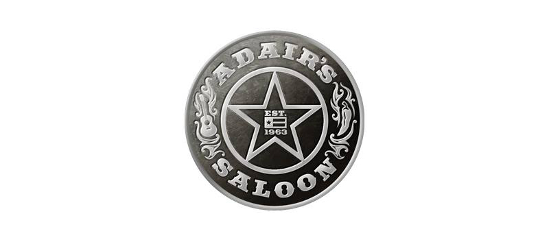
This watering hole in Texas is just too good to pass up. Adair’s Saloon has a logo worthy of its place in this best bar logo ideas list. It was opened in the 1960s, and not much has changed since. The bar still has its jukebox belting out country songs one after another.
Reminiscent of the saloons of yore, its logo is similar to a sheriff’s badge with a star on it. It has a guitar on its side to represent its live music, while the pepper icon shows the spiciness of its food that’s very Texan. The font type it uses also reminds us of cattle branding.
15. B Side
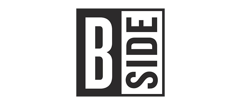
Your friendly neighborhood bar, B Side, offers excellent blends of food, booze, and music. It is a no-nonsense bar that’s a haven for music buffs and crazy cocktail fanatics. If you’re looking for a place to be cool and enjoy awesomeness, this is the bar for you.
Its logo is also commendable as it ranks high in the good looks department. It is simple, almost bare but sets a tone of chill-out feels. It uses a basic sans serif font but impacts viewers with its minimalism and simplicity.
Work with Penji for Your Bar Logo Ideas
If you’re opening your bar or thinking about a redesign, these bar logo ideas can help you. But if you still don’t have any concept brewing, you can always work with Penji. Let our team of graphic designers take care of your bar logo design for you.
Subscribe to any of our plans to get the most suitable logo for your bar, restaurant, or just about any business you have. And we don’t do logos alone. We can create many other graphics for you. Watch our demo video here or sign up through this link to get us started.
About the author

Celeste Zosimo
Celeste is a former traditional animator and now an SEO content writer specializing in graphic design and marketing topics. When she's not writing or ranking her articles, she's being bossed around by her cat and two dogs.

