
Whether you’re a seasoned business owner or a newbie, you must know the basic logo design tips so you can have one that’s not only creative but also backed by strategy and insight.
No wonder many turn to professional logo design services or full-scale graphic design services to gain that edge, and the typical logo pricing rates can attest to that.
In fact, the average logo design costs around $800, with some custom logos going up to around $1,500 from high-end designers or services.

Still, even with expert help, there will be times when ideas feel limited, and setting yourself apart from the noise becomes a challenge.
Why is a Logo Important for a Brand?
Before we discuss the tips for creating a logo, let’s tackle why it’s important in the first place.
When you invest in logo design services, you’re not just paying for an image; you’re building recognition and trust. A strong logo helps your brand stand out in crowded markets, creating a sense of familiarity that keeps customers coming back.
Here are a few reasons why your logo matters so much:
- First impressions count. A polished logo signals professionalism and credibility.
- Brand recognition. Data tells sus that three in four consumers recognize a brand by its logo. That said, consistent use of your logo across platforms makes your business instantly recognizable.
- Competitive edge. A logo can evoke feelings that align with your brand story, from excitement to reliability. And with the right logo tips, you can create a design that sets you apart from competitors.
Solve Your Design Dilemma for Good
Try Penji risk-free for 30 days and get all your logo designs done


Over time, businesses evolve, and so should their logos. That’s why many brands turn to a logo redesign when they expand offerings, refresh their image, or modernize their identity. In fact, many of our clients here at Penji ask us not only for custom-designed logos but also to update their current logo.
Get your logo right and you’re laying the foundation for a strong, memorable presence that lasts. And to help you break through, here are ten tips for creating a brand logo you need to try today.
1. Make Your Letters Work Double-Duty
A unique approach to designing your logo is to have your letters work double time. This means you will integrate hidden meanings or functionalities in the design. It allows you to craft a logo that’s memorable and visually engaging.
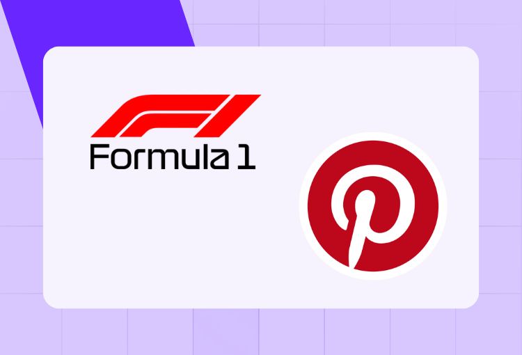
A prime example is the old Formula 1 logo, where “1” emerges from the negative space between the “F” and the speed marks. Likewise, Pinterest’s logo cleverly incorporates a pin shape into the letter “P,” creating a dual representation of the brand’s name and core function. These design choices convey the brands’ purpose at a glance, making them easier to recall.
2. Use Subtle Industry References
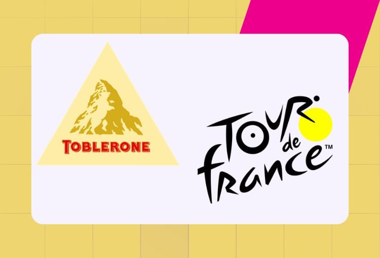
Your logo can be the bridge to connect you to your audience on a deeper level. To do this, one of the most crucial tips for creating a logo is to incorporate subtle industry references that add meaning to your brand. To illustrate this better, look at the chocolate brand Toblerone. It features a hidden bear within the mountain in its design. Not only does it represent its city of origin, Bern, but it also pays homage to its heritage.
In the same vein, the Tour de France logo ingeniously transforms the letter “R” and a dot into a cyclist. This subtle reference to the event and sport creates an instant visual connection for fans, especially those who love trivia such as these.
3. Play with Scale and Proportion
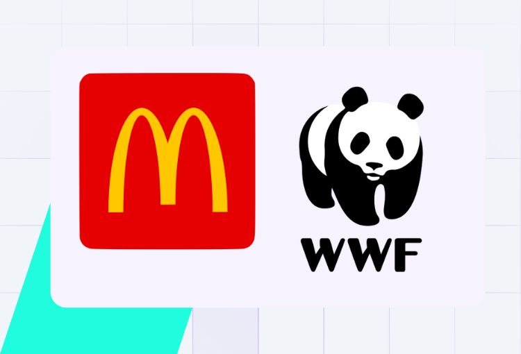
Another fresh and unique tip for creating your logo is to play with scale and proportion. This helps maintain impact and legibility, regardless of its size. An excellent example would be the WWF logo, which features the iconic panda. Its scalability allows it to be placed on whatever platform and remain robust and impactful, from business cards to posters.
In the same way, the McDonald’s Golden Arches logo retains its impact, whether it is on a tiny app icon or on a massive billboard. This shows the importance of designing logos that work across a wide array of applications.
4. Use Color Psychology Strategically

Choosing your brand colors wisely is sound advice you’d hear from many seasoned entrepreneurs. It’s because they can influence how consumers perceive your brand. You need to have a basic understanding of how color psychology works to make your logo design evoke your desired emotions.
Take Facebook, for example. Its dominant blue color is easily recognizable by its users. It promotes trust, communication, and a sense of belonging that fits the brand well. Another great example of this tip for creating a logo is Spotify. Its vibrant green is a standout choice usually associated with growth, energy, and harmony.
5. Incorporate Clever Typography
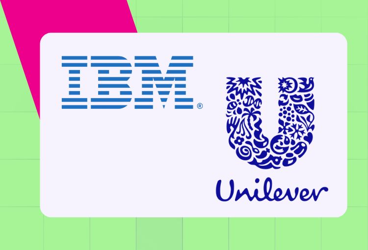
Turn your ordinary logo into something extraordinary with the clever use of typography. You can embed deep meanings and symbolism within the text, just like what IBM did in its design. Created by famous graphic designer Paul Rand, it features horizontal stripes within the letters. This gives it a sense of speed and dynamism. It perfectly conveys the brand’s forward-thinking and innovative spirit.
The same concept is also used in Unilever’s logo, where the “U” contains icons representing different aspects of its business. Its multifaceted design tells a comprehensive story about the brand’s diverse offerings. These examples show that typography offers the versatility of carrying rich and layered meanings, making it more memorable to your audience.
6. Design for Motion
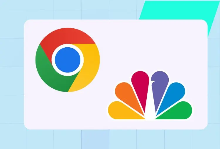
One of the best ways to stay relevant in this fast-paced digital age is to incorporate motion into your logo design. This gives your brand identity the dynamism it needs to stand out. An excellent example of this is Google Chrome’s logo, which can be visually appealing in static and dynamic forms. You can sometimes see it animating with a rotating effect that’s perfect for symbolizing browser speed and efficiency.
Similarly, NBC’s peacock logo was designed with motion in mind. It features colorful feathers that spread out to create a vibrant display that adds life, especially on television. This tip for creating a logo helps enhance your brand recall and engagement.
7. Create Adaptive Versions
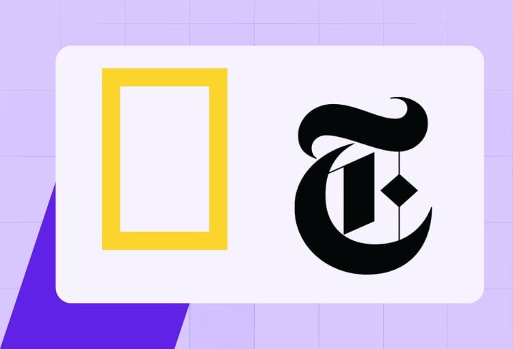
Today’s media includes diverse landscapes that require your logo to have adaptive versions to stay impactful. Let’s look at National Geographic’s iconic rectangle logo to show you how this works. It is strikingly beautiful and adaptable, able to stand with or without the accompanying text.
Having the same concept is The New York Times’ iconic logo that looks great wherever it is placed. Whether it is used as a favicon or a social media profile pic, the “T” element remains distinctive and demands immediate recognition. This is precisely what logo design is made for.
8. Use Optical Illusions

An excellent tip when creating your logo is to create a visually intriguing design that grabs attention and boosts instant recognition. This involves adding optical illusions such as the LG and The Guild of Food Writers logos. The first has a face that uses the letters “L” and “G,” which adds a friendly, human element to the design.
The latter uses a spoon cleverly hidden from the negative space within a pen nib. It perfectly captures the essence of writing and food in a single, elegant image. These techniques allow for a more engaging and memorable logo design.
9. Use Geometric Precision
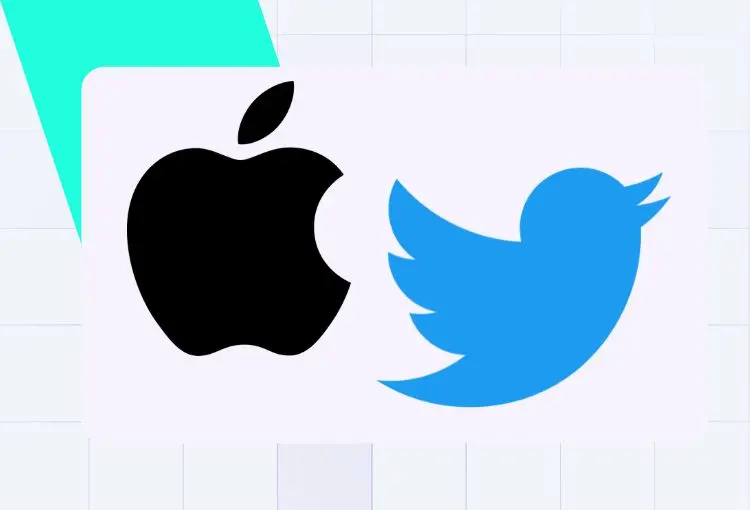
Using geometric precision means creating a logo design that’s clean, balanced, and aesthetically pleasing. The precise proportions and clean lines help maintain the logo’s integrity across various sizes and applications. Take the Apple logo as an example. It has a bite taken that’s positioned meticulously to match the curves of the fruit. Its attention to geometric details gives it a sense of harmony and symmetry, making it easily identifiable and visually satisfying.
In the same manner, Twitter’s (now X) bird logo is designed from circles and mathematical proportions that give it balance and harmony. Geometric shapes ensure scalability and versatility while keeping their visual impact regardless of size.
10. Incorporate Cultural Elements
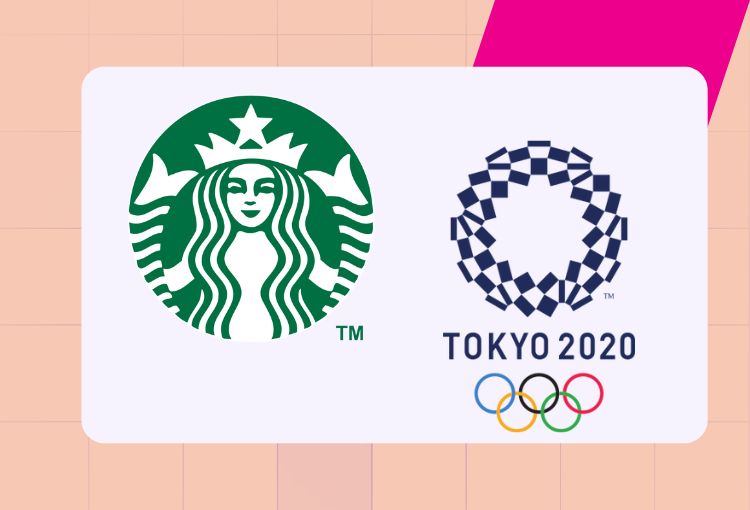
Last but not least on our list of tips for creating a logo: consider integrating cultural elements into your logo design to create a deep connection with your audience. You can do this by reflecting on the heritage and values that resonate with them. A perfect example is the Starbucks logo, inspired by Seattle’s maritime history. It is a nod to the city’s seafaring past, giving it a sense of tradition and authenticity.
The Tokyo Olympics’ masterfully crafted design also uses this tip to create a logo. It incorporates a traditional Japanese pattern known as “ichimatsu moyo” that dates back to the Edo period. It represents unity and diversity, which fits the sporting event quite well.
Final Thoughts
These logo ideas can help you craft a design that’s not only memorable but also adaptable across platforms and time.
But before you jump into working with any service provider, keep these last-minute logo design tips in mind when working with a pro designer:
- Communicate your vision clearly. Share your brand story, audience, and goals to guide the creative process.
- Provide examples you admire. Show reference logos or styles that inspire you; this gives designers a starting point.
- Ask for adaptability. Make sure your logo works on everything from social media icons to billboards.
- Be open to exploration. Trust your design team to offer unique perspectives you may not have considered.
- Think long-term. Choose a logo that can grow with your business, not just what looks trendy now.
Looking for more logo design tips and inspiration? You can browse Penji’s portfolio to see how diverse industries have benefited from professional designs that go beyond aesthetics.
If you’re still wondering why Penji stands out, it’s because we don’t just deliver one option and call it a day. We provide unlimited revisions so you can refine your logo until it perfectly captures your brand’s essence—without hidden fees or rushed compromises. Leave your logo design to the pros at Penji. Watch our demo video here to see how we do it, or better yet, click here to send your request for your first logo design.
Get a Design Team for a Fraction of the Cost
Try Penji risk-free for 30 days & get all the custom designs you need


About the author

Celeste Zosimo
Celeste is a former traditional animator and now an SEO content writer specializing in graphic design and marketing topics. When she's not writing or ranking her articles, she's being bossed around by her cat and two dogs.
Table of Contents
- Why is a Logo Important for a Brand?
- 1. Make Your Letters Work Double-Duty
- 2. Use Subtle Industry References
- 3. Play with Scale and Proportion
- 4. Use Color Psychology Strategically
- 5. Incorporate Clever Typography
- 6. Design for Motion
- 7. Create Adaptive Versions
- 8. Use Optical Illusions
- 9. Use Geometric Precision
- 10. Incorporate Cultural Elements
- Final Thoughts


