Are you about to embark on the exciting journey of starting your own restaurant but feeling a bit lost? Well, worry not, because the first step is simpler than you might think: start with a concept and then create a killer restaurant logo design.
Now, let’s talk about the real power of a logo. It’s not just a mere image; it’s a powerful tool that conveys your company’s branding and identity. A well-crafted logo sets the stage for your restaurant’s personality and promises, leaving a lasting impression on your customers.
Need an awesome logo for your brand? Check out Penji for unlimited graphic design services or one-off logo designs. Our talented designers have a knack for capturing the essence of ventures and translating them into stunning visuals. Just ask our satisfied clients!
To get those creative juices flowing, we’ve gathered 17 eye-catching restaurant logo design examples that will give your company that extra edge. Get ready to be inspired and create a logo that will make your restaurant shine!
1. Wendy’s
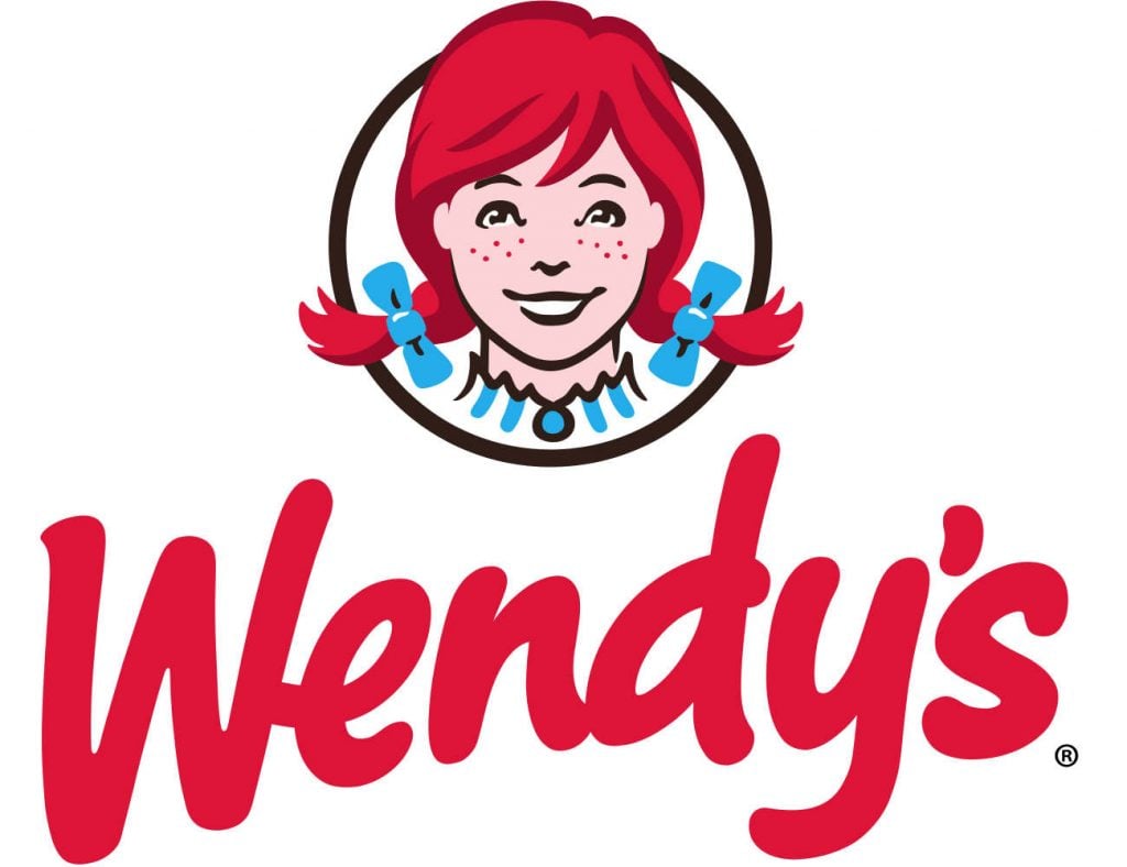
We love the Wendy’s logo because there’s history in it. Dave Thomas opened this restaurant in 1969. He wanted to serve quick, hearty meals in a family setting, so he put his daughter on the logo. Putting some heart and history into your logo can attract diners who are also on the same page.
2. IHOP
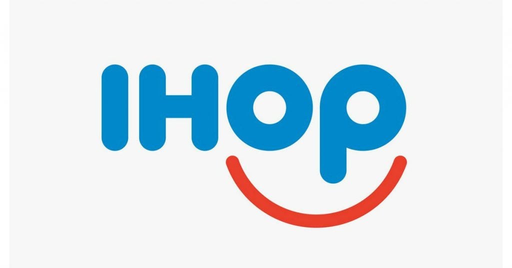
From a long “International House of Pancakes” logo to the simple IHOP typeface, the new logo gave off this very subtle casual vibe. Symbols aren’t really necessary in restaurant logos. Integration of simple and eye-popping typeface will leave a lasting impression just like this distinctive IHOP font. A lively “smiling face” touch also speaks a lot about the company’s branding.
3. In-N-Out Burger
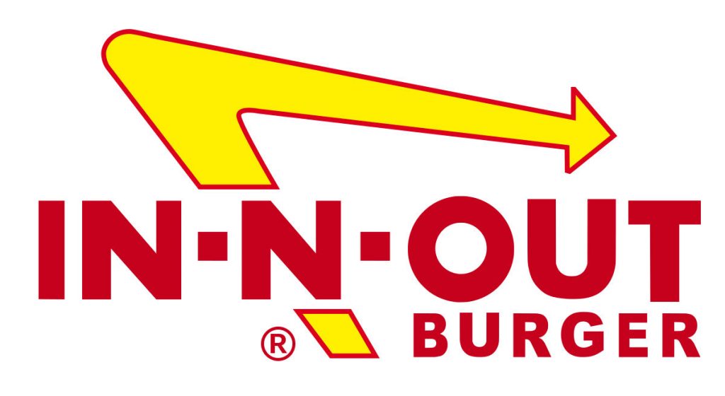
Make sure that your logo also reflects the kind of restaurant right off the bat. In-N-Out Burger logo design has an evident arrow which signifies you’ll never have to wait when ordering a meal. They are known for their fresh ingredients and fast service.
4. Subway
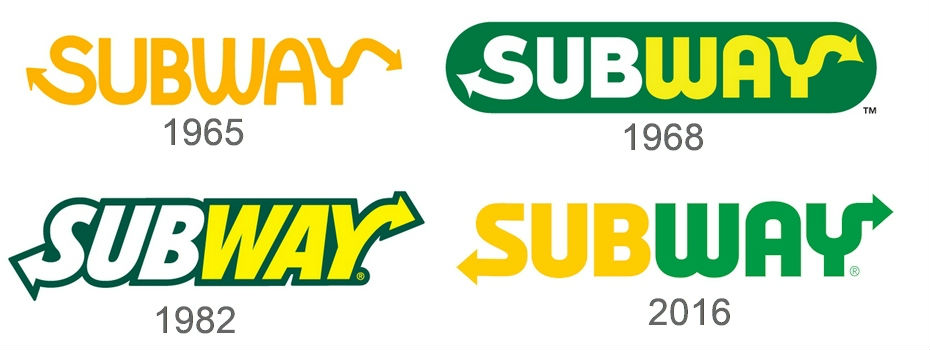
The Subway logo might seem simple, but everything about it emulates what this fast food restaurant is all about. They wanted a healthier take on fast food, so the green color on the logo implies fresh ingredients.
5. Cracker Barrel
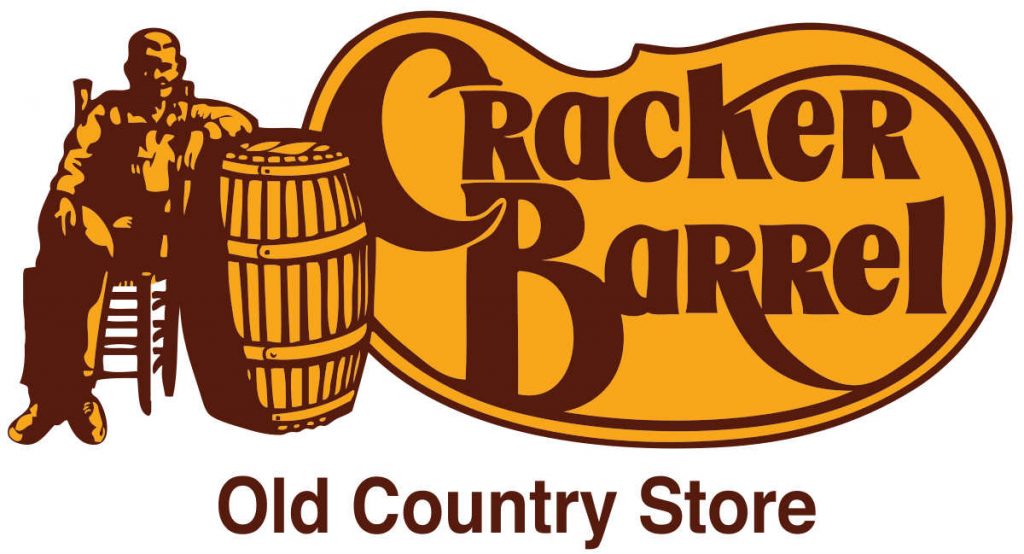
Restaurant logo designs aren’t just about the aesthetics. Storytelling on your branding should be as essential as the dishes on your menu. Take for example Cracker Barrel’s imagery. Originally a country store in Tennessee, Cracker Barrel depicted Southern hospitality through the man and a barrel on the logo.
6. Moe’s Grill
When choosing a typeface, ensure that it’s something other restaurants can’t copy. Check out Moe’s Grill’s logo. You can’t find that font in any writing document application. It’s simple, but it has a customized logo which makes it stand out.
7. Pakpao Thai Food
Going overboard with your logo is not enticing at all. While you want to throw in all the different elements that represent your branding, the outcome might somehow confuse diners. Make sure the shapes are balanced and go together instead of fighting against each other. Pakpao means “kite” in Thai and kite flying was considered an ancient tradition in Thailand. The different lines and symbols on this logo scream nothing but “Thailand.”
8. Sonic Drive-In
Sonic Drive-In is a fast food restaurant company which has a symmetrical logo design. While there’s nothing wrong with mixing circles and squares, ensure that the logo has a clean symmetry wherein a dull space isn’t evident. The Sonic Drive-In logo has two triangles which are neatly interwoven.
9. Sbarro
When it comes to logo colors, associations are significant. You can’t just pick out the colors because they’re you’re favorite. The colors on your logo should be relevant and should represent your restaurant. Italian restaurants usually have a red and green color associated with their logos like Sbarro. Red, green, and white are the primary colors on Italy’s flag.
10. Pizza Hut
Fast food restaurants resonate feelings of pleasure, comfort, and speed. Bright red and orange are extremely common in fast food restaurant logos as they are very eye-catching especially when driving down looking for a quick bite. One example is Pizza Hut.
11. TGI Fridays
Incorporating negative spaces are also appealing as long as it’s properly organized. Negative space is a white space surrounding the words, images, and symbols on your logo. It’s sometimes used to play tricks on the onlooker’s mind. TGI Fridays’ logo has negative spaces in between the red stripes, creating a crisper look.
12. Sushi Today
A restaurant logo should reverberate positivity. As a business owner, you don’t want to send off negative vibes to your diners. We specifically chose the Sushi Today logo because it’s bright and attractive. The cartoony fish symbol with unsymmetrical rays resembling a sun is also a fun way to tell your diners that they’re going to enjoy fresh sushi.
13. Better Burger
Restaurant logo designs aren’t decided in a snap of a finger. Continuous editing and refining should be made so the final design will wow consumers. As the adage “Less is More” goes, simplicity is indeed a factor to consider when designing your restaurant logo. Better Burger’s branding is simple yet sends the exact message – to serve simple and delicious burgers wrapped in compostable packaging.
14. Oodles Noodle Bar
Thinking out of the box with your restaurant logo will have a significant factor in your business’s success. Be creative when incorporating images, fonts, and symbols. Oodles Noodle Bar depicts creativity in their logo in all aspects. The overall design stimulates a fun atmosphere for consumers.
15. Melty Way
When you want a straightforward concept, icons are a great way to depict your branding. Melty way is all about mouthwatering sandwiches with melted cheese on bread. Their icon is a clear-cut message of what food to expect when dining in their restaurant. Even when you visit their website’s homepage, you get all the salivating sandwich images with cheese oozing out on the sides.
16. Délice Perlé
Délice Perlé is a pastry restaurant based in France. The restaurant serves delicacies their customers can bite, break, or crunch on. And the logo conveys how a delectable treat will make you feel. The happy waffle with white frosting or cream and a cherry on top is the perfect enthusiastic symbol that represents the brand.
17. High Tide Poke
Whether you want smoothies, poke bowls or any cold brew, High Tide Poke has it. This is one of the restaurant logo design examples that rely on typography to attract consumers. However, the typography used is unique and resonates with the restaurant’s audience. The colors are also soft, embracing the colors of nature — apt for the healthy poke bowls they serve.
Requesting a Restaurant Logo Design from Penji
Setting up a restaurant business is fun, but it can also be tiring, tedious, and stressful. Let Penji take care of your design needs so you can focus on other crucial aspects of your venture!
We really aim to offer convenience and time-efficiency to our clients, and even our graphic request system was designed to be fast, easy, and high-quality. Here are three steps to requesting a logo design from us:
1. Create a Project
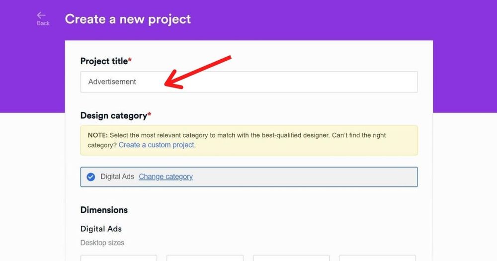
In the dashboard, click New Project. Type the title of the project and choose the category and size. Type in the description of the project and click Create Project once you’re done. It will be lined up in the queue and will be assigned to a designer who specializes in that field.
2. Review and Revise
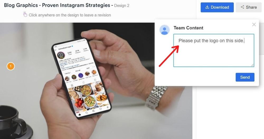
Within 24 to 48 hours, the designer will submit a design draft. To review the design, simply click on the file within the thread. If it fits your requirements, proceed to step 3. If you want to revise anything, point the clicker on the part you want to be changed and type in your comments or recommendations. The design will be returned to the designer for changes. We offer unlimited revisions, so type away!
3. Download
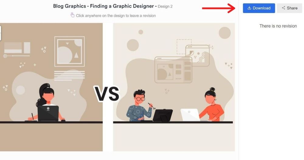
Once you’re happy with the design, click the “Download” button and it will automatically be saved to your computer.
Sign up now, and get unlimited graphic design services or one-off logo designs.
About the author
Table of Contents
- 1. Wendy’s
- 2. IHOP
- 3. In-N-Out Burger
- 4. Subway
- 5. Cracker Barrel
- 6. Moe’s Grill
- 7. Pakpao Thai Food
- 8. Sonic Drive-In
- 9. Sbarro
- 10. Pizza Hut
- 11. TGI Fridays
- 12. Sushi Today
- 13. Better Burger
- 14. Oodles Noodle Bar
- 15. Melty Way
- 16. Délice Perlé
- 17. High Tide Poke
- Requesting a Restaurant Logo Design from Penji

