
TLDR: For your logo to be effective, it has to have a strategy alongside aesthetics. This article breaks down how different shapes and colors influence perception, emotion, and brand recall.
Effective logo design involves the clever combination of colors, shapes, and psychological cues. It aims to help a brand influence perception and recall. Beyond aesthetics, your logo is a psychological tool that can shape how your audience sees and connects with your brand. Thus, you need to craft it with intention. Doing so turns it into a silent ambassador that conveys your brand values and personality at a glance. Read on to know more about the psychology behind designing your logo.
Below are a few logo shapes that communicate your brand identity and influence perception:
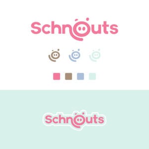
1. Circle Logos: Unity, Wholeness, Approachability

Circles symbolize stability and collaboration, even though they are not famous logo shapes. Logos that use rings exude positive and welcoming emotions. For example, Pfizer’s logo resembles a medicine tablet or pill, symbolizing wellness and healing.
The circle logo shows continuity and perseverance because the imagery is mainly linked with time, planets, and more. In addition, they can help convey a sense of femininity and give a mysterious vibe. Since they tend to be less common, using a circular logo is also a great way to attract attention.
You’ll see circle logos across industries, from ICT companies to clothing brands.
Solve Your Logo Design Dilemma for Good
Outsource all your design needs to the pros
2. Rectangle and Square: Stability, Trust, Professionalism
Squares and rectangles deliver a combination of balance and determination. Meanwhile, rectangles demonstrate robustness and reliability. Rectangles and squares are often seen as valuable objects around us. Similarly, the straight lines and angles show orderliness and professionalism, making them perfect for invoking strength and stability.
Companies like Microsoft and BBC use square logos to impart trust in their brands. Microsoft’s logo illustrates the company’s approach to a more dynamic and “edgy” design. The BBC square logo is a fantastic example of how simplifying branding can leave you with the most impactful core elements. It’s also easier to recognize and print merchandise.
These shapes are excellent logo elements for finance, security, technology, and news. Organizations may also choose square/rectangle for their custom logo designs to help them communicate their advocacy to their target audience.
3. Triangle Logos: Direction, Energy, Innovation

Just like squares, triangles captivate with their clean lines and sharp angles. They even share some of the emotional weight squares carry. However, squares embody order and stability, while triangles project a more dynamic image. They convey power, strength, and a sense of energy. This edginess makes triangles popular choices for logos of “alternative” products and adventurous brands.
The meaning of a triangle logo isn’t set in stone – it can shift depending on its orientation. Upward-pointing triangles, like those of CAT and Qantas, evoke stability with a hint of forward motion. In contrast, downward-pointing triangles can suggest a more feminine energy. Finally, triangles placed on their side, like YouTube’s, symbolize movement and action.
4. Vertical and Horizontal Lines: Balance, Strength, Structure
Custom logo designs that emphasize vertical lines exude confidence. They convey a sense of strength, stability, and even a touch of boldness. This makes them ideal for showcasing efficiency and reliability, as seen in the Adidas logo.
But vertical lines are more than just sturdy pillars. They offer incredible versatility. They can evoke towering skyscrapers and sleek rockets or even combine them to create intricate designs.
This logo element promotes innovation and creativity. It allows you to think outside the box! Companies seeking to project an innovative and bold image, like SoundCloud and Cisco, often leverage vertical lines. These lines act as a frame, providing a foundation for their creative logos.
Tech companies and disruptors can benefit significantly from vertical lines. They signal a willingness to challenge the status quo and push boundaries. However, moderation is key. An overabundance of vertical lines can come across as domineering or overly aggressive.
Forget the outdated fashion advice! In logo design, horizontal lines have the opposite effect. Think of a vast horizon or the comforting sight of land. Horizontal lines create a sense of stability and tranquility, just like the calming effect of IBM’s logo with its horizontal bars.
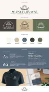
5. Organic/Spiral Shapes: Warmth, Creativity, Natural Flow

Organic logos embrace the natural world as their blueprint, unlike their geometric counterparts with sharp edges and transparent rules. They ditch the rigidity of squares and circles, opting for flowing lines and shapes reminiscent of nature.
This flexibility makes organic logos highly adaptable, conveying a more comprehensive range of emotions and ideas than basic geometric shapes. They foster a sense of comfort and familiarity, creating a more personal connection with the brand. Think of iconic logos like Shell (a seashell), Puma (a leaping cat), and Dove (a bird). These instantly recognizable designs are powerful examples of organic shapes in action.
Spiral logo shapes combine a circular or rounded base with a flowing, hand-drawn aesthetic. They often evoke a whimsical and creative personality.
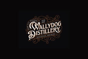
6. Abstract Forms: Emotion, Modern Identity, Uniqueness
Abstract logos bring a playful spirit to logo design by defying expectations. Unlike their geometric or organic counterparts, abstract logos twist familiar shapes into something entirely new, creating a symbol rich with meaning.
These logos often represent concepts or emotions rather than literal objects. Think of the iconic Nike swoosh, a symbol of motivation and speed. With its inverted Us, the Under Armor logo conveys a sense of strength and determination. While the Nike swoosh could be interpreted as a checkmark, its abstract nature allows for deeper meaning.
This versatility makes abstract logos popular across industries, from tech and finance to music, clothing, and retail. They spark curiosity and elicit emotions without demanding excessive decoding from the audience.
Understanding shape psychology is just the start—working with expert logo design services ensures your ideas are executed with precision and strategy.
What is the Psychology of Colors in Logo Design?
Like shapes, colors carry emotional weight and can influence how consumers see your brand. This is why your brand’s color palette matters. It isn’t just about aesthetics, but it’s also about aligning your brand’s personality with the emotions you want it to evoke. Below is a quick guide to colors and what they typically communicate:
| Color | Meaning | Common Brand Associations |
| Red | Passion, energy, urgency, excitement | Coca-Cola, Netflix, YouTube |
| Blue | Trust, calm, professionalism, reliability | PayPal, Facebook, LinkedIn |
| Yellow | Optimism, warmth, friendliness | McDonald’s, Snapchat, IKEA |
| Green | Growth, health, nature, balance | Starbucks, Spotify, Whole Foods |
| Orange | Creativity, enthusiasm, affordability | Fanta, Amazon, Nickelodeon |
| Violet | Luxury, imagination, wisdom | Hallmark, Yahoo, Cadbury |
| White | Simplicity, cleanliness, clarity | Apple, Tesla, Nike |
| Black | Sophistication, power, elegance | Nike, Chanel, Adidas |
| Pink | Femininity, compassion, youthfulness | Barbie, Baskin-Robbins, T-Mobile |
| Brown | Earthiness, reliability, ruggedness | UPS, M&M’s, Hershey’s |
| Multicolor | Diversity, playfulness, inclusivity | Google, eBay, Microsoft |
Pro tip: Consider your target audience’s cultural context and emotional triggers when choosing colors for your logo. For instance, red can mean different things in the Western markets. It can mean excitement or love, but in others, it can convey war or luck. Working with a reputable design-as-a-service platform like Penji can help you in this regard.
The Psychology Behind Logo Design
With this analysis of popular logo shapes, you’ll be more equipped to prepare your marketing and advertising materials. This guide provides adequate options and picks the best that resonates with your brand identity. Consider working with a professional graphic design service to unlock the full potential of your project.
Conclusion
Logo design is more than just creating doodles with your favorite shapes and colors. It’s about strategically integrating these elements to blend psychology and influence how consumers see your brand. The information shared is vital, but working with a reliable logo design service can take the hard work out of your hands.
Watch this quick demo video to show you how Penji can help you achieve the best logo identity for your business. You can also choose to send your first logo design request today through this link.
FAQs
- Why do I need to know about the psychology behind my logo?
Logo psychology will help you design with purpose. It enables you to use shapes and colors that will significantly help your brand in influencing how your audience feels, remembers, and connects with you.
- What’s more important, shape or color?
Both are necessary parts of an effective logo design. Shapes are what set the tone for your brand’s personality, while colors trigger emotional responses.
- Can I use multiple shapes and colors in my logo?
Yes, but they should be carefully crafted to work together in reinforcing your brand’s message. Avoid overcomplicating your design as it can dilute impact.
About the author

Rowena Zaballa
With a background as a former government employee specializing in urban planning, Rowena transitioned into the world of blogging and SEO content writing. As a passionate storyteller, she uses her expertise to craft engaging and informative content for various audiences.
Table of Contents
- 1. Circle Logos: Unity, Wholeness, Approachability
- 2. Rectangle and Square: Stability, Trust, Professionalism
- 3. Triangle Logos: Direction, Energy, Innovation
- 4. Vertical and Horizontal Lines: Balance, Strength, Structure
- 5. Organic/Spiral Shapes: Warmth, Creativity, Natural Flow
- 6. Abstract Forms: Emotion, Modern Identity, Uniqueness
- What is the Psychology of Colors in Logo Design?
- The Psychology Behind Logo Design
- Conclusion
- FAQs


