
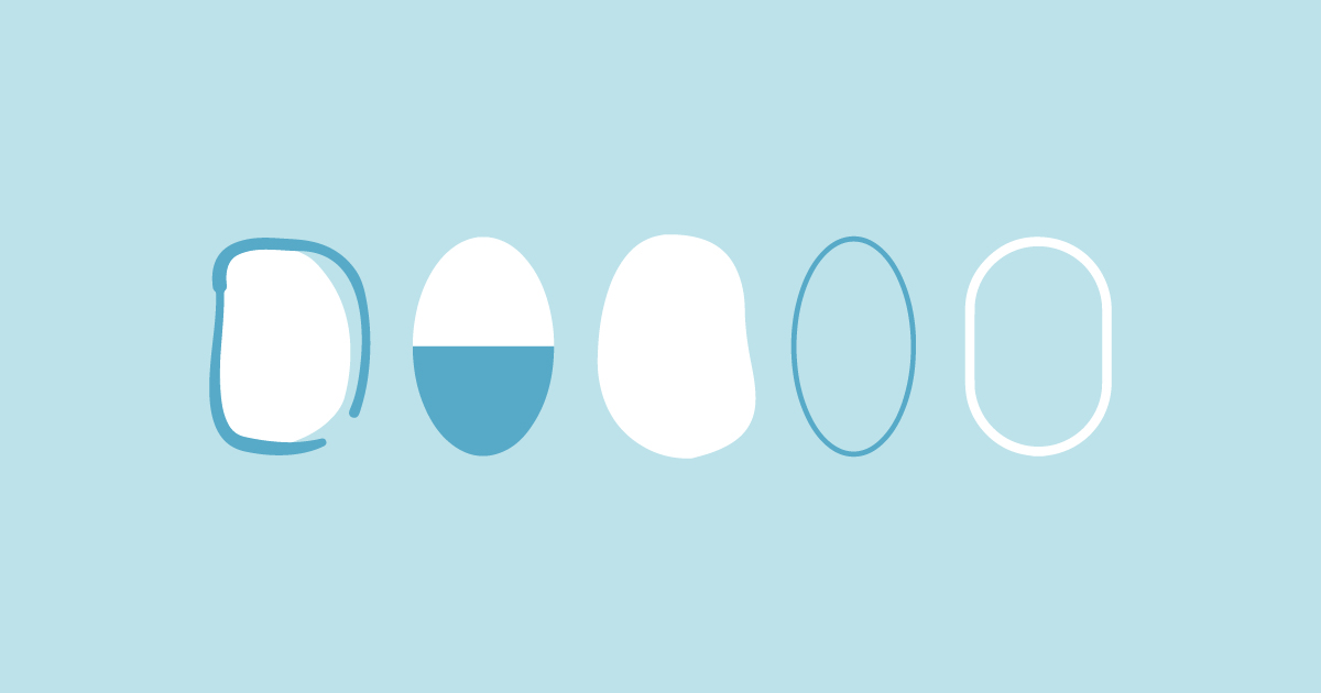
To prove your brand’s value, you need to avoid looking like an amateur. This is the reason you need to take logo design for your brand seriously. If you’re looking to get a new one or a redesign, here are oval logos from Penji’s talented designers you can consider:
1. Haute Cuisine Oval Logo
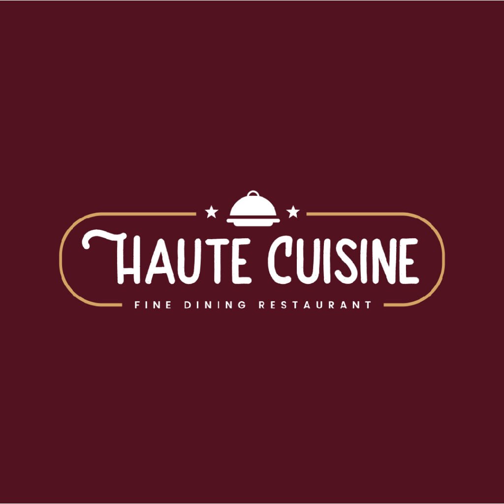
Restaurant logos like Haute Cuisine’s hint at what they offer. This logo design uses an oval that fits all its design elements. It consists of a discrete food tray with a rounded cover and stars. It has the colors maroon and orange colors that give out a classy appeal. The font is a simple, handwritten type with a bit of flair to make the brand name unique.
Make your brand stand out with unique oval logos
Create oval logos in 1-2 days
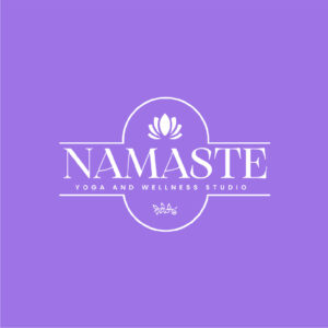


2. Namaste Yoga and Wellness Studio
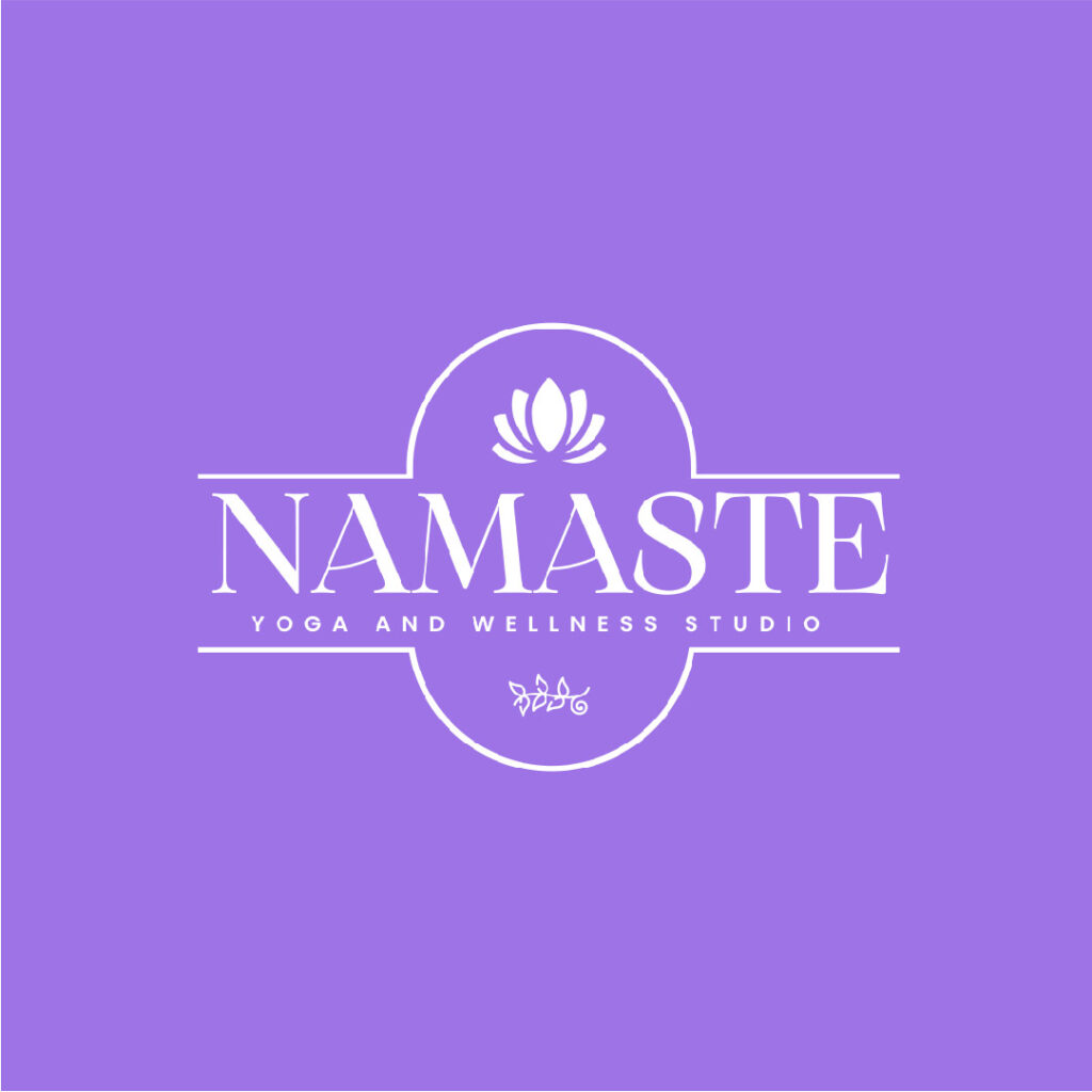
With a water lily flower on its logo, Namaste Yoga and Wellness Studio perfectly captures the spirit of peace and pleasure commonly associated with yoga. The violet color has a calming effect, making it a suitable choice for the brand. The oval is right in its middle, emphasizing the brand name very well. The combination of serif and sans serif typefaces makes an excellent font pairing.
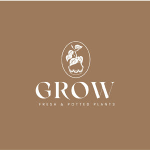
3. Grow Fresh and Potted Plants
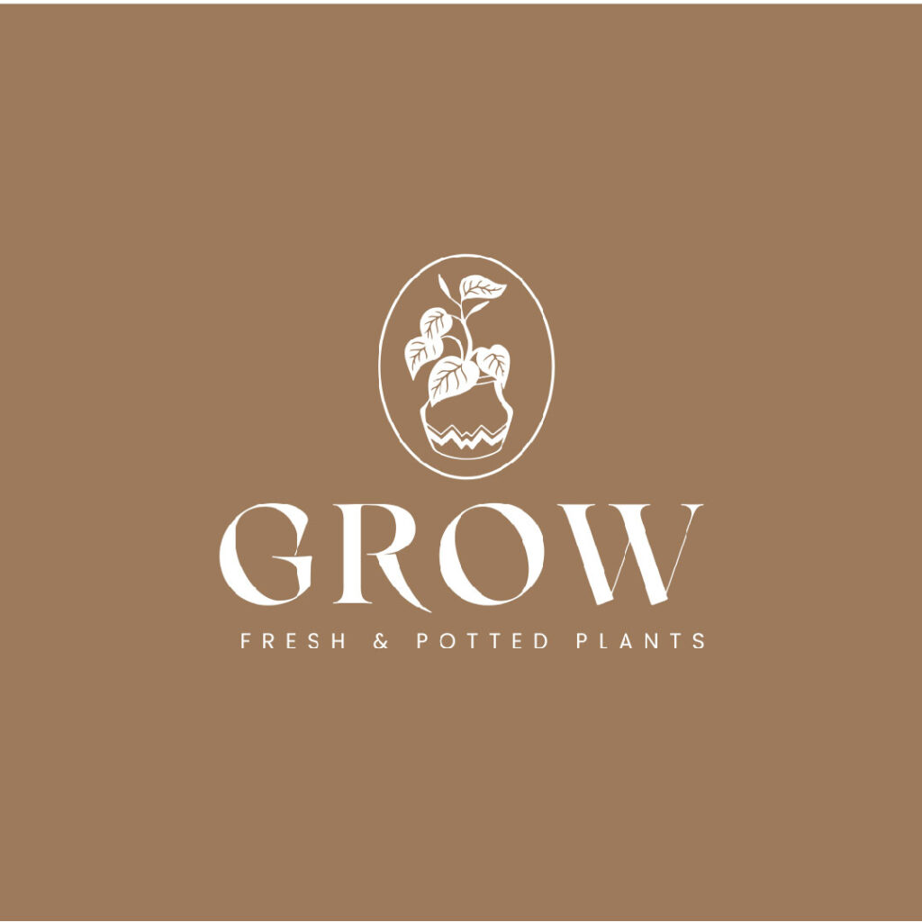
When we think of fresh produce, the colors green and brown come to mind. This is what Grow Fresh and Potted Plants has for its modern logo design. It uses a light shade of brown made more beautiful with the addition of a plant image encased in an oval. The font choice is commendable as it has thick and thin lines that add sophistication and class to the oval logo design.
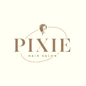
4. Pixie Hair Salon Oval Logo

Adding a slant to the oval, the Pixie Hair Salon logo is simple yet stylish. This is what a salon and spa logo design should be like. From the illustration to the font choice, it oozes fashionable appeal. It uses colors that aren’t too bright or flashy, giving the brand a touch of class. People aim to look good after a visit to your salon, your logo should say this exactly.
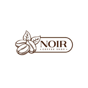
5. Noir Coffee Shop
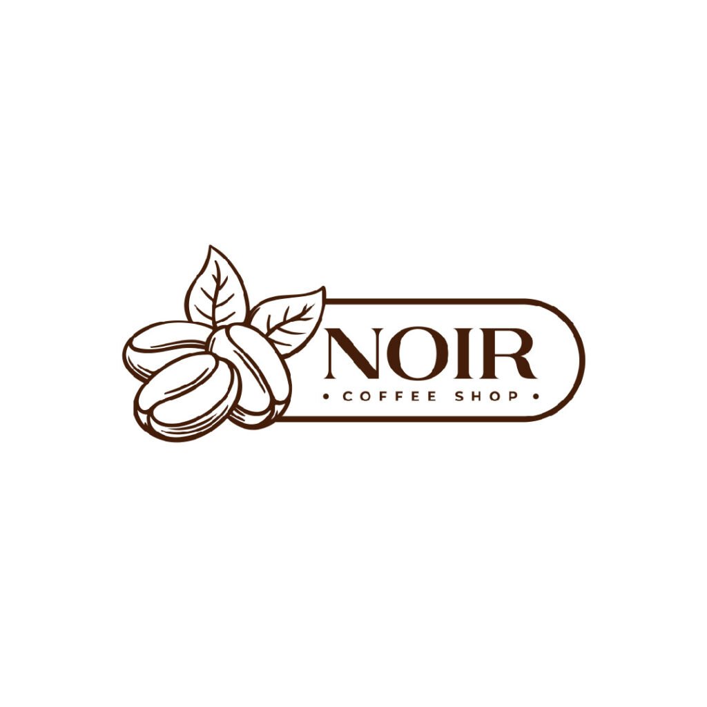
With coffee beans overlapping the oval shape, this logo created for Noir Coffee Shop is worth noting. Custom illustrations such as those in this logo can give it the potential to be vibrant, recognizable, and memorable. If you’re looking for a way to get a one-of-a-kind logo, have an illustrator craft one for you. Watch our demo video here to learn more about our work.
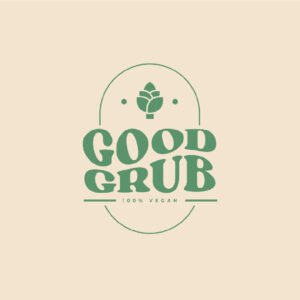
6. Good Grub
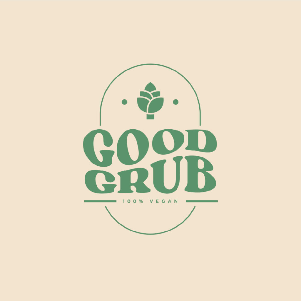
This oval logo for a vegan company, Good Grub, is a great example of one that uses a customized font type. Not only does it make it unique, but in this case, it adds lightheartedness and humor to the design. As mentioned earlier, green is a good color choice if you want to convey freshness and cleanliness. As you can see from this logo, the designer made it clear that this is for a 100% vegan business.
7. Pencil & Co.
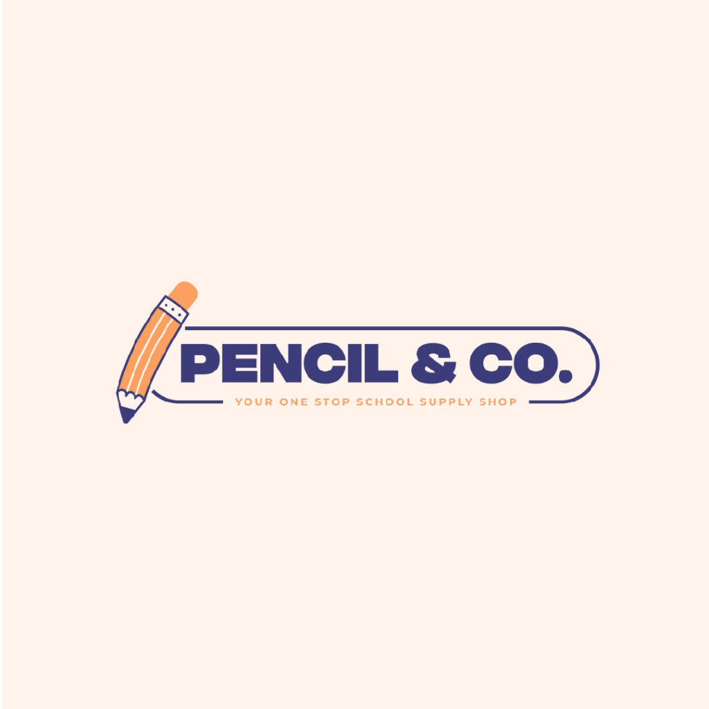
This cute oval logo for Pencil & Co. is an excellent example of a perfectly fitting design. A school supply store caters to kids and teens, so a cartoony illustration for the logo is suitable. It uses a combination of blue and orange, which is ideal if you understand color psychology. The font used is big, bold, and totally readable, making it a highly scalable design.
8. Wool & Silk Women’s Apparel
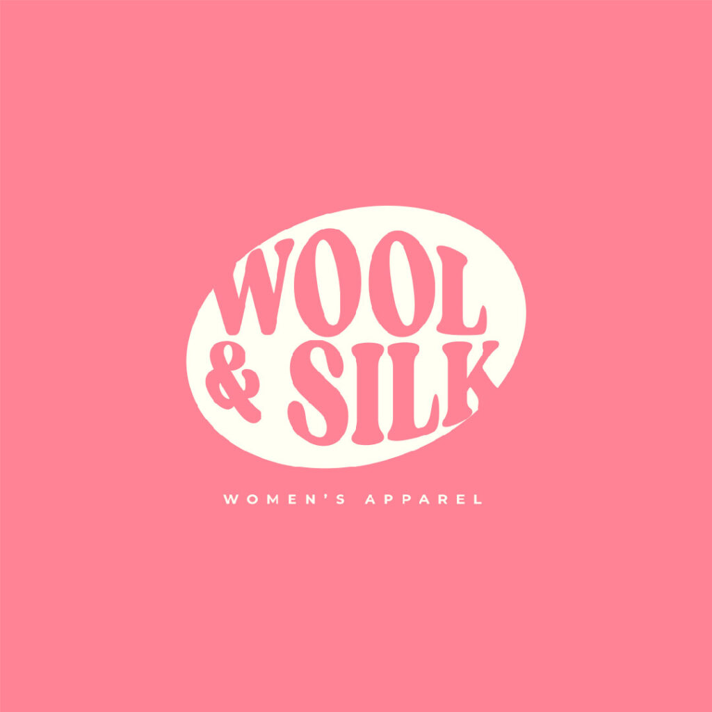
Another slanted oval logo design, this Wool & Silk example, is highly suitable if you’re looking for women’s apparel inspirations. For this, pink would be the first choice as it is often used to convey femininity. This logo does not have other details that make it uncluttered and naturally fun. The font pairing is also remarkable as a serif font goes well with a sans-serif type.
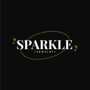
9. Sparkle Jewelry Oval Logo
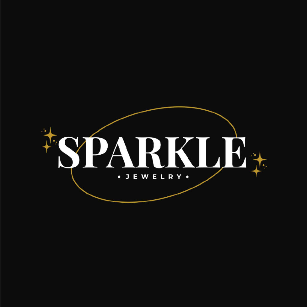
Black as a color choice for jewelry projects an elegant and sophisticated look as this logo for Sparkle Jewelry. Its gold, white, and black color scheme matches the brand’s personality well. The oval serves as an accent along with the stars and sparks around the brand name. A simple serif font completes the classy look of this jewelry store logo.
10. Happy Camp
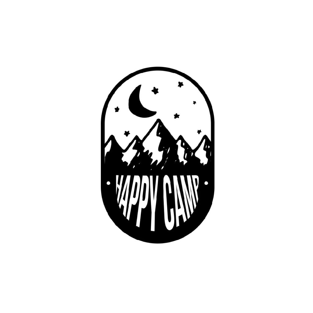
As its name suggests, this Happy Camp logo packs a truly cheerful punch. It is done in black and white, but you can still feel the happiness spilling over. This oval logo was made to look like a window that gives the viewers a peek at what’s in store for them from the brand. Again, illustrations add a certain charm to any design that fonts and colors cannot.
Circle Logos vs. Oval Logos: What to Choose?
Circles and ovals are two of the most used shapes in logo design. They are excellent at making a design attractive by providing emphasis and accent or simply decorating and beautifying. First, let’s define what these two are before we find out which would be a better choice.
A circle is a geometric figure with all its points in a plane equally distant from each other. On the other hand, an oval is an ellipse or an egg-like shape, sometimes considered a variation of a circle. When we think of circles, the first few things we have in our minds are wheels or rings.
If you take a more profound look at a circle, it conveys community, friendship, and unity, among many other positive characteristics. An excellent example is the Wikipedia logo which beautifully expresses a great sense of community.
An oval, on the other hand, conveys growth, beginnings, and even immortality, thanks to its resemblance to the egg. So, it depends solely on you to answer the question of what shape would be better for your logo, a circle or an oval. If you want flow and movement in your designs, a circle can represent perfection, but an oval can convey flexibility and diversity.
What Makes a Great Oval Logo Design?
Before we understand what makes a great logo, we have to know its purpose. A logo is basically a tool for identifying the brand it represents. It is a way for you to communicate your vision and mission to your prospects and customers.
An effective oval logo, or any shape of a logo, for that matter, possesses the following characteristics:
Simplicity

Target, Nike, McDonald’s, and Mastercard have something in common. Their logos are some of the simplest you’ll find but are the most recognizable the world over. A great logo is one that’s easy on the eyes and even easier to recognize and remember.
To craft a simple logo, you need to focus on your brand’s personality. Emphasize color and fonts as well as convey your brand’s message in the simplest way possible. You can choose to use letters and wordmarks that directly communicate your brand’s personality.
Industry Relevance
Again, a logo is a tool to represent your brand. This means it has to be relevant to your specific industry. We typically see a rolling pin as an icon for a bake shop logo or a car for a taxi service company. While these may be relevant, they aren’t recommended if you’re planning to broaden your service and offer more in the future.
What you can do is focus on your brand values rather than a literal icon of a product or service. You can use abstract symbolism like the Nike swoosh and the logos of Amazon, Mercedes-Benz, Apple, Audi, and IBM, to name a few.
Memorability
An excellent logo is one that sticks in the minds of your existing and potential customers. It should remind them of your brand should a need for your product arises. When they can easily recall your logo and, ultimately, your brand, the chances of them connecting with you are higher.
To create a memorable logo, avoid using complex shapes and fonts. You must also avoid cliches and common design elements. This is the part where an online logo template may not work. Thus, you need to get a professional logo designer to design one for you.
Timelessness

While it can be tempting to follow trends when designing your oval logo, it would be better if you go for timelessness instead. Take the Coca-Cola logo, for example. It has undergone several redesigns but still retained its classic look, which makes it as timeless and effective as ever.
A timeless logo has limited design elements in it. Avoid adding any unnecessary features that can only clutter the design. Use simple colors and basic fonts to achieve this.
Versatility

Your logo will live on all the platforms you’re going to put your brand on. Make sure that you design it with versatility in mind. It should look great in a variety of sizes and mediums. It should maintain its personality, whether in a colored version or black and white.
Design your logo in a vector format to ensure it can be resized without losing quality. Create color variations of your logo and design in both horizontal and vertical versions. Don’t forget to use negative space to add impact to the design.
Uniqueness
Creating a unique look for your brand should be your top priority. Your logo should not look like it was copied from an existing design as it beats the purpose of it being your identifying mark. It shouldn’t even remind consumers of other brands, which is what online logo templates or $5 logos do.
In this instance, you need to research your competition and your target audience. Also, dig deeper into your brand’s values and determine its unique qualities. Use your color palette, and if possible, use custom typography and illustrations. Avoid cliches and always test your design.
Aside from these characteristics, you also need to make it aesthetically appealing. It has to capture your brand’s identity. This means plenty of research, careful planning, and experimentation.
Team up with Penji for unlimited graphic design
These oval logos are a wonderful testament to what Penji designers can create for you. If you want an oval logo for your business, our designers are a tap away. Go to this link to start your logo design journey.
About the author

Celeste Zosimo
Celeste is a former traditional animator and now an SEO content writer specializing in graphic design and marketing topics. When she's not writing or ranking her articles, she's being bossed around by her cat and two dogs.
Table of Contents
- 1. Haute Cuisine Oval Logo
- 2. Namaste Yoga and Wellness Studio
- 3. Grow Fresh and Potted Plants
- 4. Pixie Hair Salon Oval Logo
- 5. Noir Coffee Shop
- 6. Good Grub
- 7. Pencil & Co.
- 8. Wool & Silk Women’s Apparel
- 9. Sparkle Jewelry Oval Logo
- 10. Happy Camp
- Circle Logos vs. Oval Logos: What to Choose?
- What Makes a Great Oval Logo Design?
- Simplicity
- Industry Relevance
- Memorability
- Timelessness
- Versatility
- Uniqueness
- Team up with Penji for unlimited graphic design


