From shopping to entertainment to banking, mobile apps now dominate how we live our lives. But did you know that among the millions of apps on the market, there are those that nobody uses? According to Adobe, 60% of apps in the Google Play app store have never been downloaded.
How do you avoid this from happening to your app? The secret is to get your mobile menu design right. Penji has professional graphic designers that can give you the best mobile menu design at an affordable price. Check out our demo video here to learn more.
One of the Most Important Parts of an App Design
Mobile menu design is one of the most crucial areas of your app. This is because usability matters more than aesthetics. Security solutions provider, MacAfee, saved 90% in expenses after integrating usability testing to learn more about its customers and their needs.
Imagine yourself downloading an eCommerce app with a menu that seems hard to navigate through. It’s supposed to help you pay bills, but it isn’t clear to you how to begin. The chances are high that you’ll try to find a different app that offers a better user experience.
Why Penji?
An on-demand graphic design service, Penji offers unlimited graphic design with unlimited revisions. Our affordable plans allow you to submit as many design requests, such as mobile menu designs. For as little as $399 per month, you can have all the mobile menu designs, logos, social media graphics, and many more.
You can use mobile app makers or hire freelance graphic designers to do the job, but it’s not as simple as you think it is. Going straight to an app developer may not produce the good looks that a dedicated app designer can give you. Developers don’t understand colors and typography, you can’t expect them to design with aesthetics in mind. If you want your app to look good, count on Penji to do it.
Requesting a Mobile Menu Design on Penji
Penji has made it easy for business owners, marketers, and agencies to get a mobile menu design. Here are the steps you need to take:
Create
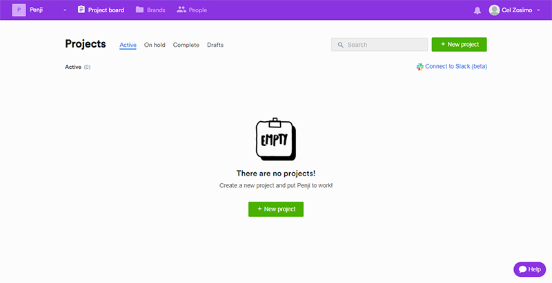
When you sign up for any of Penji’s plans, you’ll get access to our dashboard. Click on the +New project button, as seen in the image below.
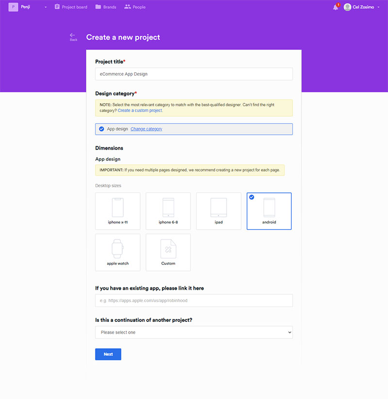
Give your project a suitable title and select the design category from the drop-down list. Choose the dimensions of your app from the list provided. Click Next.
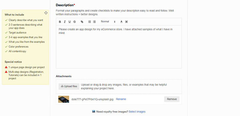
Type in your description of the app. Refer to the yellow box on the left for tips on how to make better descriptions. If you have links or files that you want your designer to use as references, click on the attachments to include them.
Click Next.
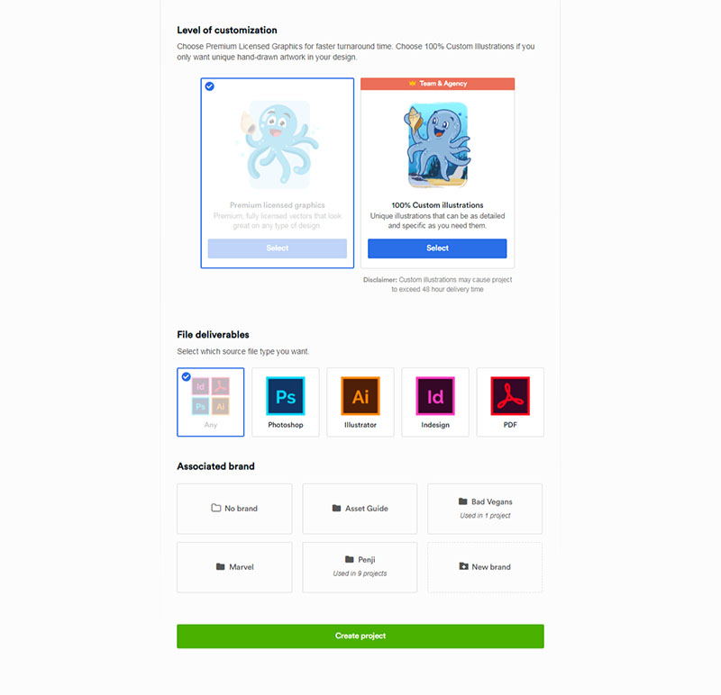
Choose the level of customization. If you’re on our Team or Agency plans, you can submit requests for custom illustrations. Then select the file deliverables in which you want your design to be made.
You can create a folder where you can upload all your brand assets such as logo and fonts. When you want to add them to your next project, you only have to click on that folder. You won’t have to upload them again.
Click Create project.
Your mobile menu design request is now automatically assigned to the best designer for the job. Wait 24 to 48 hours before receiving your first draft.
Review
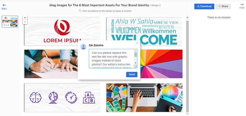
Once you receive your initial draft, review and check for any revisions you want done. If there are none, you can proceed to the next step and leave feedback for your designer. On the other hand, if you want to have changes made, just click on the design. Point to the area where you want to revise and type in your comments. Click Send.
Our designers will work on your revisions within 12 to 24 hours.
Download
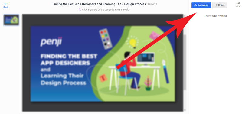
When you’re satisfied with the design, you can now download it directly from the dashboard to your computer. It will be stored on our system and can be accessed any time you need to.
Mobile Menu Design Inspirations
To help you get an idea for your mobile menu design, here is a list that can help you get inspired to request your own.
Eusoh
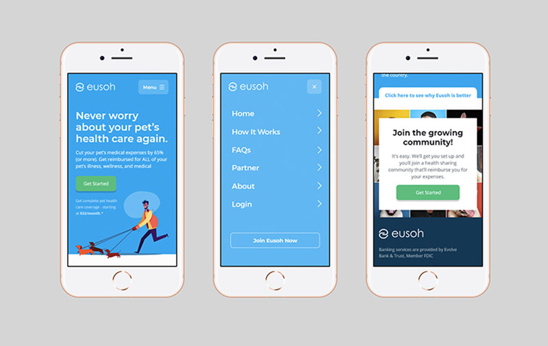
From the get-go, Eusoh has made it clear what they’re all about and how to get around the app. There is enough white space around that makes navigation a breeze. The design is superb, which only means that functionality and beauty can go together in your app.
Samurai
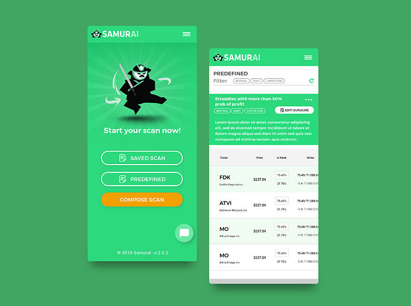
The first page of this Samurai mobile menu design shows the choices you have when using the app. The options trading business is a vague concept for the untrained eye, but its app and mobile menu design made it seem simple and straightforward. The use of their mascot also adds to its user-friendliness.
Stubs
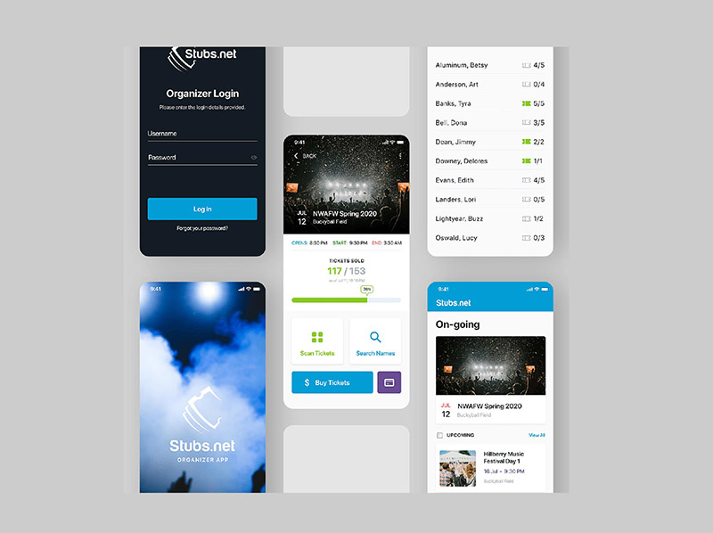
On their website, Stubs claim to make ticketing easy. And this they have done through their app. Their mobile menu design is easy to follow and navigate through. You can see the login page instantly, and the lists of events and tickets available are placed upfront for easy viewing.
Meditation+
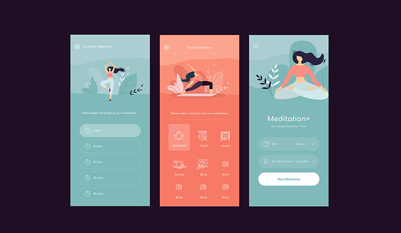
This Meditation+ mobile app design exudes calmness and peace, precisely what the app aims to achieve. The minimalist mobile menu design is so visually appealing that you feel relaxed just by looking at it. Meditating hasn’t been this easy with this app design.
US Bank
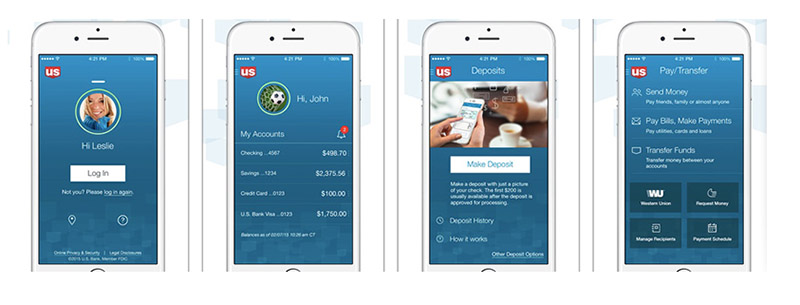
When you think of financial institutions, you’d see dull colors or images for their apps. US Bank has done an excellent job of blending good looks and functionality in their app. It has navigational consistency that’s apparent on every page, most especially the mobile menu design.
Evernote
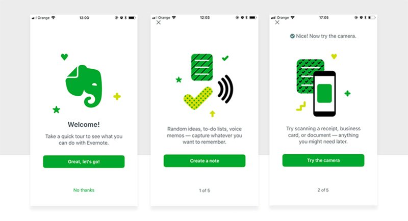
This note-taking app has built a name for itself because of how efficient it is in doing its job. The Evernote mobile menu design provides convenience and ease of use. The design is simplistic, yet has included design elements to make it attractive and appealing.
Hopper
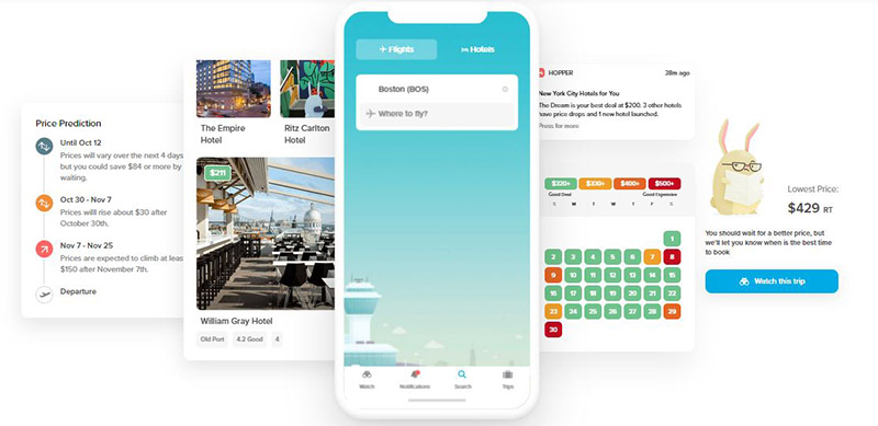
A travel booking app, Hopper makes searching for flights quick and easy. The mobile menu design allows users to choose the cheapest way to their destinations without a hitch. You can even customize their bunny mascot for your account.
Human
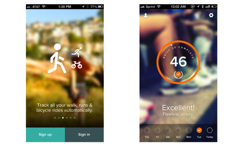
Providing fitness stats daily to more than 900 cities worldwide, the Human app isn’t lacking in good looks. They made every aspect of the app user-friendly, even signing up is fast and uncomplicated. It uses photos on the background that adds that human touch to the app.
Artsy
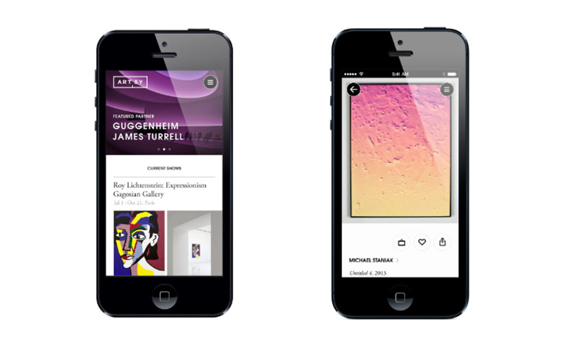
Helping artists reach a global audience, Artsy has a mobile menu design that’s great at showcasing the artworks. Browsing through the app is like having a tour of your favorite museums or galleries. It has successfully brought art to patrons at a tap of a button.
ESPN
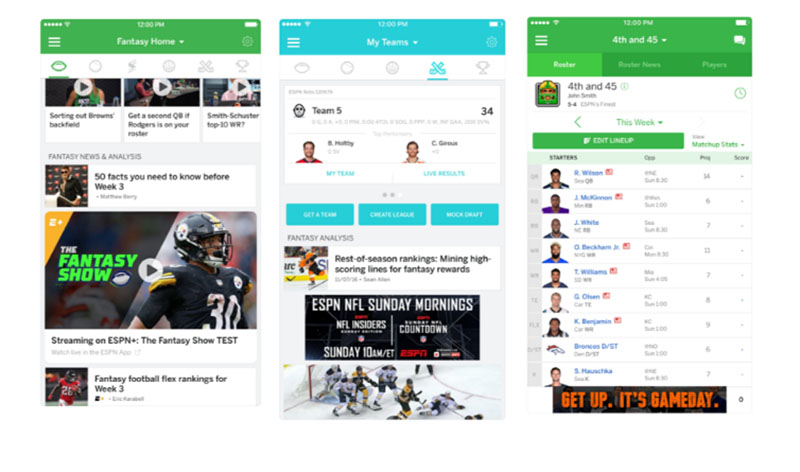
This is a mobile app design that’s action-packed, yet navigable that you won’t get lost in the pages. ESPN Fantasy Sports mobile menu design shows you where you need to go to find what you need. Amidst the images, videos, and texts, sports fans will love to download this app.
Calm
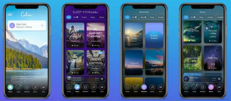
Using breathtaking photos as a backdrop for every page, Calm is another meditation app that’s soothing on the eyes and soul. The overall design is a sight to behold, and using the app is easy thanks to its effective menu design. Navigation is never a problem with this app, making it one of the top apps for meditating.
Zyra Talk
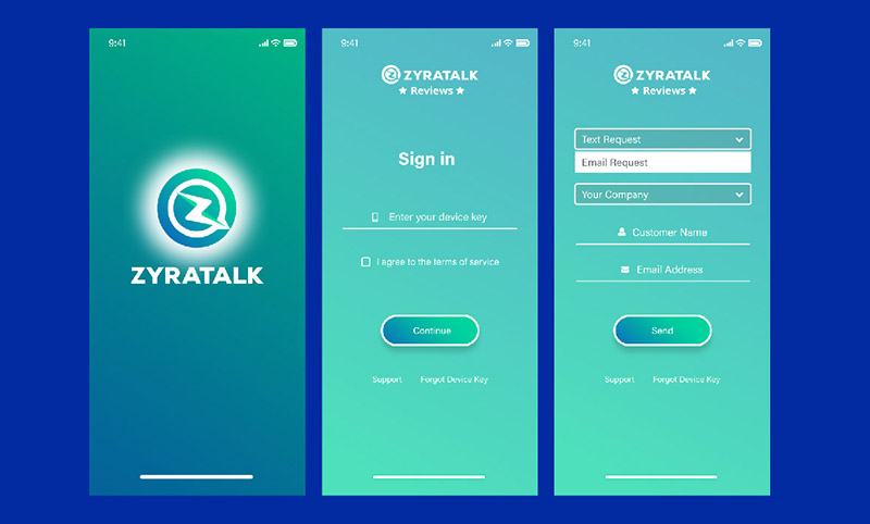
Customer experience management company, Zyra Talk, has a mobile menu design that’s consistent with the brand. Having a responsive design is essential, as this will give customers the flexibility of using your services whatever device they use. A consistent design allows for the excellent impression of a solidly built company.
Fire
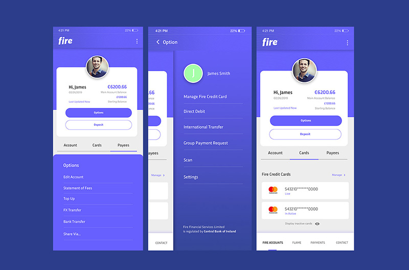
Fintech company Fire has a mobile menu design that’s worthy of emulation. Everything you need to do on the app is placed right in front of you. From the statement of fees to doing bank transfers, the options are laid out neatly. Money matters is a sensitive subject, and you have to have a layout that allows for little to no errors.
NuTick Loyalty
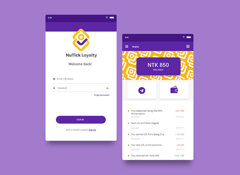
Using contrasting colors and vast negative space, the NuTick Loyalty mobile app design is noteworthy. Getting rewards and loyalty points is clear and understandable. The mobile menu has fewer elements to distract you from the app but doesn’t sacrifice good design.
Core
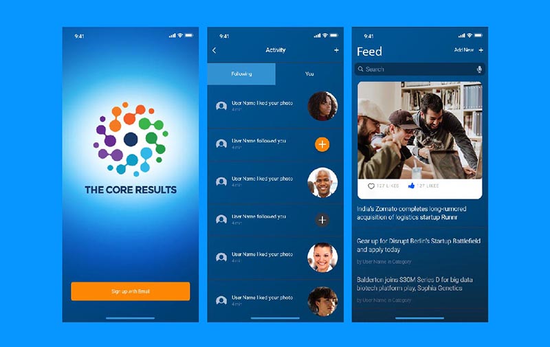
A mobile app for sales managers, Core has an app that’s free from complicated graphics and unnecessary elements. When designing an app, reducing clutter is imperative. Too many details can divert the users’ attention and add confusion. This one uses a monochromatic approach, plus the use of clear photos add to the appeal.
Waze
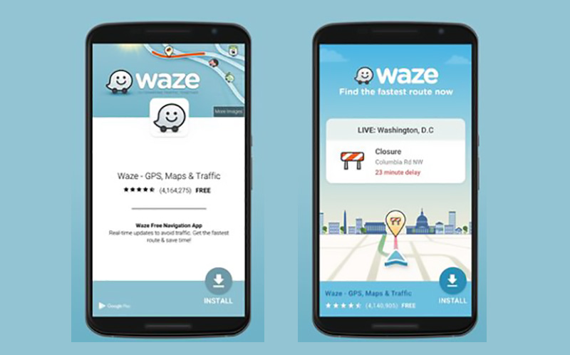
A driving app shouldn’t have any room for mistakes. Thus, Waze is an excellent example of an efficient and beautiful app at the same time. The design is clean, clear, with cute illustrations. The fact that it’s one of the top apps for its category means it is doing its purpose really well.
Monday
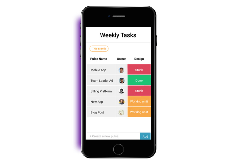
An app for team management, Monday‘s mobile menu design is sleek and brightly colored amid a white background. The design and layout help with an accessible overview of tasks, deadlines, and projects. It even won a Webby Award, proof of its efficiency in design and function.
Stoic
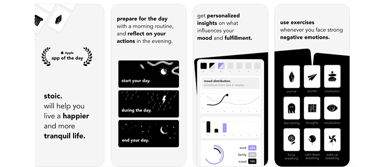
Taking care of your mental health is now made simple with the Stoic app. With a simple black and white color theme, the app design has a soothing effect. A splash of color appears once in a while to emphasize a point the app is trying to make.
Netflix
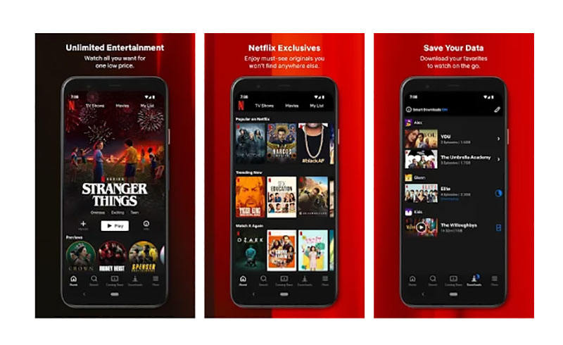
This app offers smooth controls, reliable performance, and a clear display of the movies and shows. Netflix made choosing what to watch a breeze with its dynamic mobile menu design. The black background and red undertones are consistent with their brand identity.
BBC News
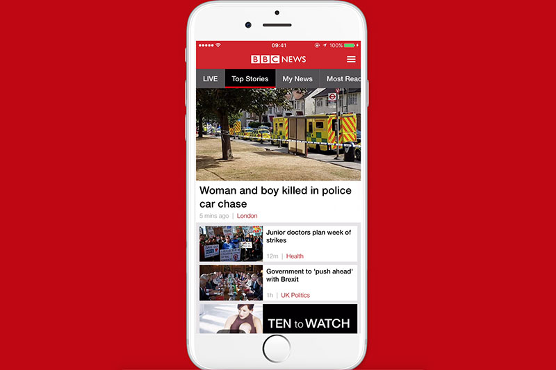
A well-known brand won’t take their app design for granted. BBC News has a mobile menu design that shows excellence in providing you with the latest news. The tabs are on the top of the page, so you’ll know where to get what you need. There is no room to add any more design elements as the news itself is more than enough.
The Pattern
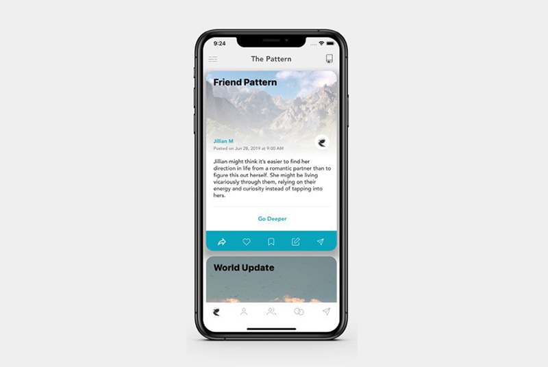
Gaining popularity with some celebrities, The Pattern was touted as one of the most accurate personality apps. Reviews call the app a breath of fresh air, and it comes as no surprise with its use of beautiful imagery. The app also allows users to chat with friends with just a tap of a button and many other actions.
Spotify
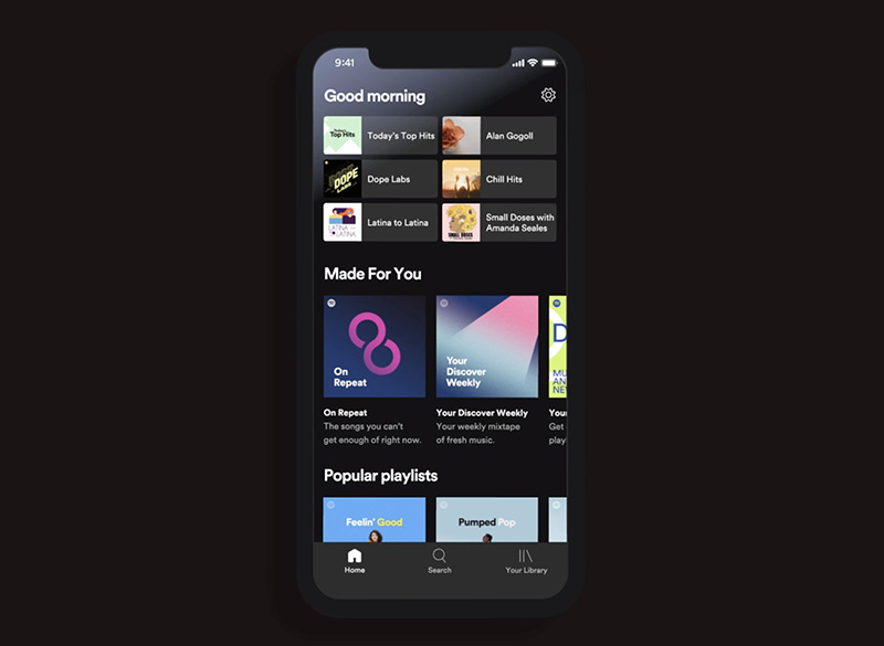
With the Spotify app, you can listen to millions of songs with ease. The app is easy to navigate, finding your fave songs is simple, especially if you’re on premium. The music is categorized using a layout that’s neatly arranged and organized.
Realtor.com
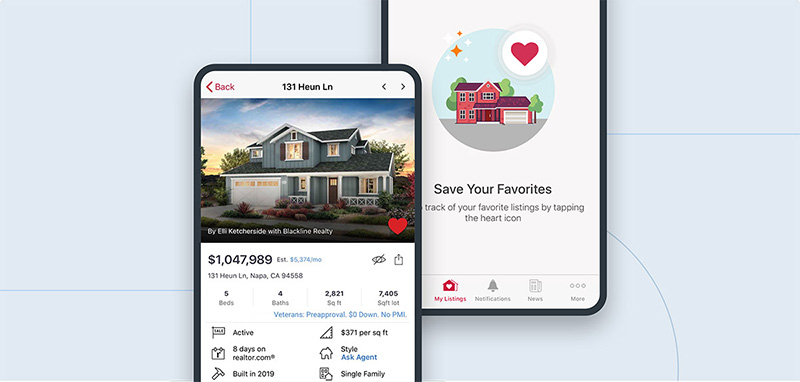
Another award-winning app, Realtor.com‘s app design, is geared towards helping users find the best homes or properties. In this case, mobile menu design is crucial. The app’s menu is up to par and lets you navigate through with ease.
Grab
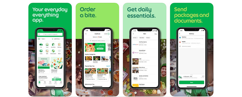
The Grab app does so much for its users from getting around town to ordering a bite of food. The app is very well structured, so good user experience is guaranteed. You will notice how the entries are surrounded by white space, making it easy to go around the site. There isn’t much to distract the users as everything is laid out well.
Quizzitive
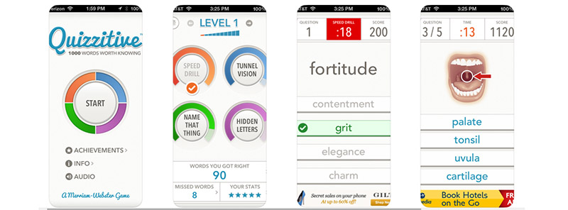
From Merriam-Webster, Quizzitive is a game app that features quizzes and many other engaging games. It uses the most straightforward fonts, which makes the text easy to read and follow. Getting mostly positive reviews, this is mainly because of its use of large fonts and images. There isn’t a way you’d lose your way in the app.
Final Thoughts
Some people think that designing an app is a hit or miss undertaking. It’s hard for many to combine aesthetics in a fully functional app design. This is evident in the mobile menu design of your app. It needs thoughtful planning, as it is the most crucial part.
This is why getting the help of professional graphic designers can do wonders for your app. They understand what colors or fonts to use better than developers can. If you want a mobile menu design that encourages people to use your app, go to Penji. Sign up today to start the design process of your app.
About the author

Celeste Zosimo
Celeste is a former traditional animator and now an SEO content writer specializing in graphic design and marketing topics. When she's not writing or ranking her articles, she's being bossed around by her cat and two dogs.


