
There are plenty of ways to get a logo, but none is more effective than getting it from a professional logo designer. If your business name starts with the letter O, here are professionally-made O logos that are sure to elevate your brand.
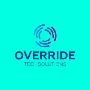
1. Override Tech Solutions
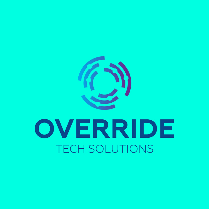
Using the letter O as its main character, this Override Tech Solutions logo is unique and ideal for differentiation. It gets inspiration from a circuit board with lines and tiny dots shaped like an O. The color choice is also spot on, as blue projects trustworthiness and reliability, among other positive traits.
The font combination is also worth mentioning, as the pairing is well-suited to the brand name. It is simple, readable, and definitely scalable.
Fantastic logos perfect for your brand
Get your logos in 1 to 2 days from professional graphic designers
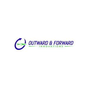


2. Outward & Forward Innovations
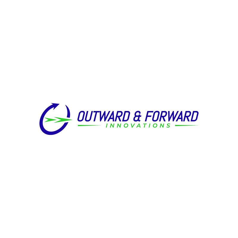
Fonts in logos can deliver a company’s message clearly without the need for any distracting elements. This Outward & Forward Innovations logo is an excellent example of this. The letter O with arrows around it is but a small part of the logo, with the brand name dominating the design.
It uses two colors, blue and green, in bright and eye-catching shades. The fonts are slanted to show movement and speed, which is ideal for businesses that offer these services.
3. Ourian Plastic Surgery
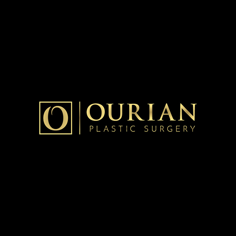
When your business is in industries that require formality and authority, the Ourian Plastic Surgery logo is an excellent source of inspiration. It has a subdued personality but exudes class, elegance, and sophistication. The colors black and gold are responsible for this, deeming the logo a great representation of the brand.
The mixture of serif and sans serif fonts adds more character to the design and gives it a charming appeal.
4. Osteo Experts
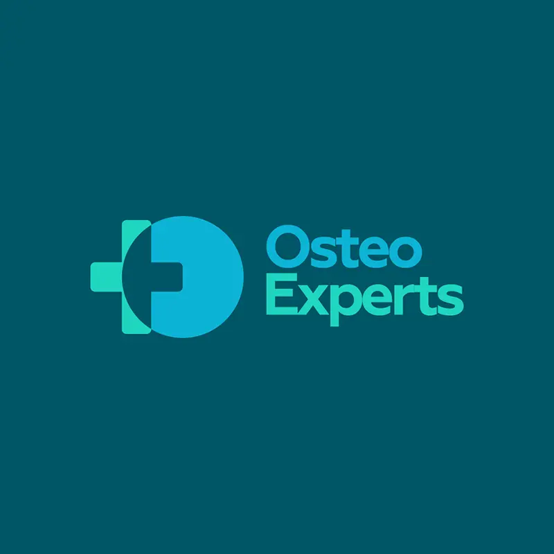
The medical and health niches are some of the most challenging to design a logo for. It’s because you need to make them look professional, qualified, and competent. This logo for Osteo Experts capably shows all these qualities and more.
Green is the standard choice for these industries as it represents growth and renewal. This logo uses the cross and the letter O in it quite well.
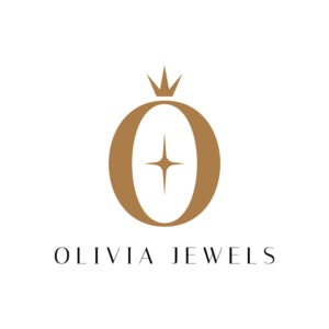
5. Olivia Jewels
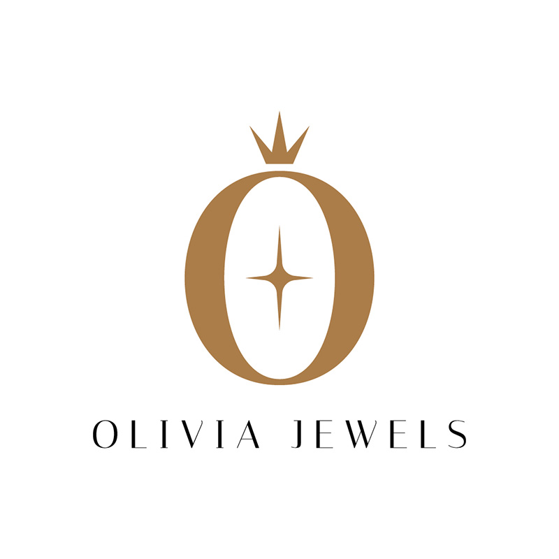
With the letter O shaped like a ring, the Olivia Jewels logo is well-designed and perfect for the brand. In addition, the star icon in the middle looks like the inside of the velvet box a ring usually comes in. Overall, this is a cleverly-designed logo worthy of its place in this letter O logo list.
And, as it is a jewelry company, the brownish-gold color is a fitting choice. Even the font it uses projects elegance, luxury, and grandeur.
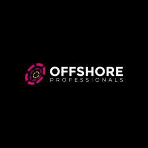
6. Offshore Professionals
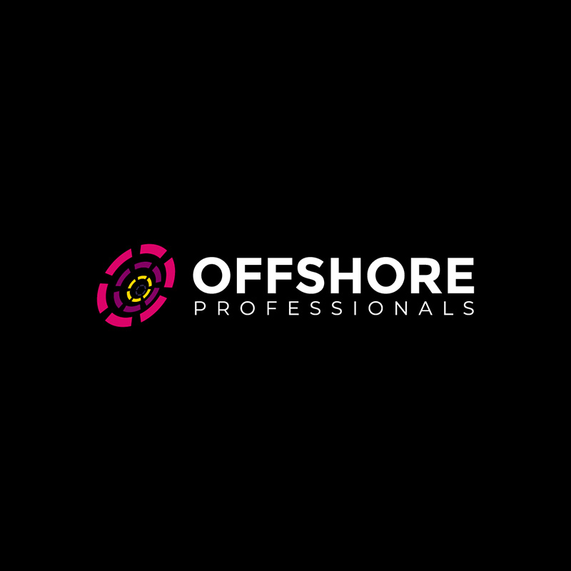
While the general rule in logo design is to use a maximum of three colors, Offshore Professionals’ logo has more than that. But the effect is impactful and gives the brand name the emphasis it needs. The white letters against a black background do it superbly well.
The no-fuss font choice suits the brand quite well, as it oozes professionalism and expertise. Traits you want to incorporate when you’re in the human resources industry.
7. Octagon Planners
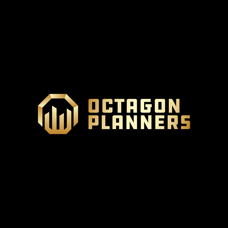
This logo designed for Octagon Planners also uses gold like Olivia Jewels. But in this context, it is different as in this case, for it depicts courage, passion, wisdom, and achievement. Gold is a versatile choice. However, it isn’t for every brand, and Octagon Planners pulled it off beautifully.
The designer also went for a simplistic font type but with a touch of uniqueness to make it stand out from the competition.
8. Oceanscope Aquarium
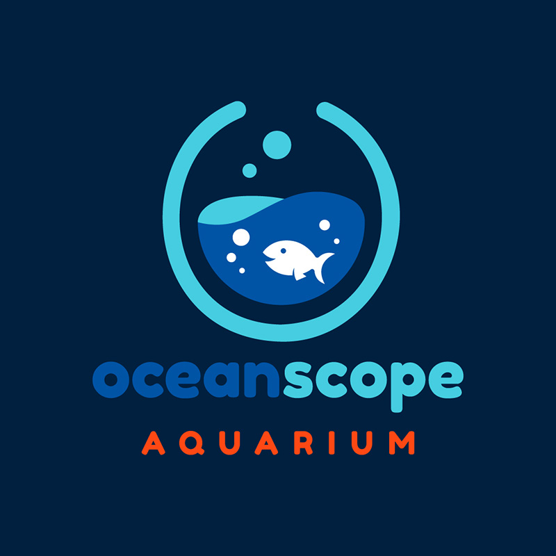
As this is a business that deals with water and the animals in it, it’s only natural to use the color blue. While it is the most used color in logos, Oceanscope Aquarium has made it its own. They made the letter O to look like a bowl with a fish inside and some bubbles to add to its cuteness level.
Using lowercase fonts shows a friendly and lighthearted nature. This is the brand image they want to project, and they have succeeded in doing so.
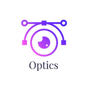
9. Optics

This logo designed for Optics is one of the most creative on this letter O logo list. It has an eye icon and a few lines and dots to show measurement. This is a great example of a scalable logo that would look beautiful whether it’s on a billboard or a business card.
Like the color blue, violet can also denote wisdom, enlightenment, creativity, and many others. It uses a thin font in black to add that elegant and sophisticated touch.
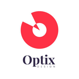
10. Optix Design
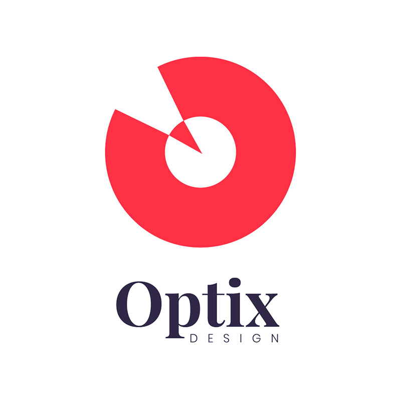
If you want to show innovation in your logo, Optix Design has a design that shows precisely this. The logo is edgy yet simple and striking. It uses red to project life, vigor, passion, and other traits that show its cutting-edge personality.
This logo is another example of one that uses a wonderful combination of serif and sans serif fonts. The pairing on this one is an excellent choice and can be a good reference if you need one.
11. Orchard Heights Properties Incorporated
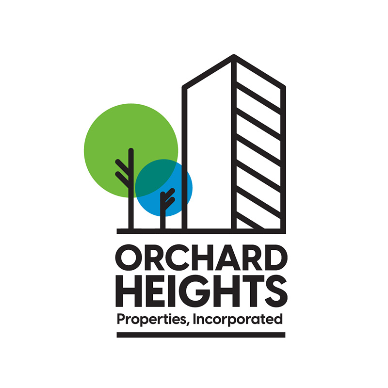
The best word to describe this logo designed for Orchard Heights is refreshing. The tree icons, plus the use of the colors blue and green, make it so. This is very suitable as we all want to live in a place with balance in nature and all the comforts of commercialism within easy reach.
The lines used to illustrate the properties add a minimalistic touch to give the logo that clean and clear look. The font choice is a solid one that’s good for making a powerful message.
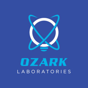
12. Ozark Laboratories
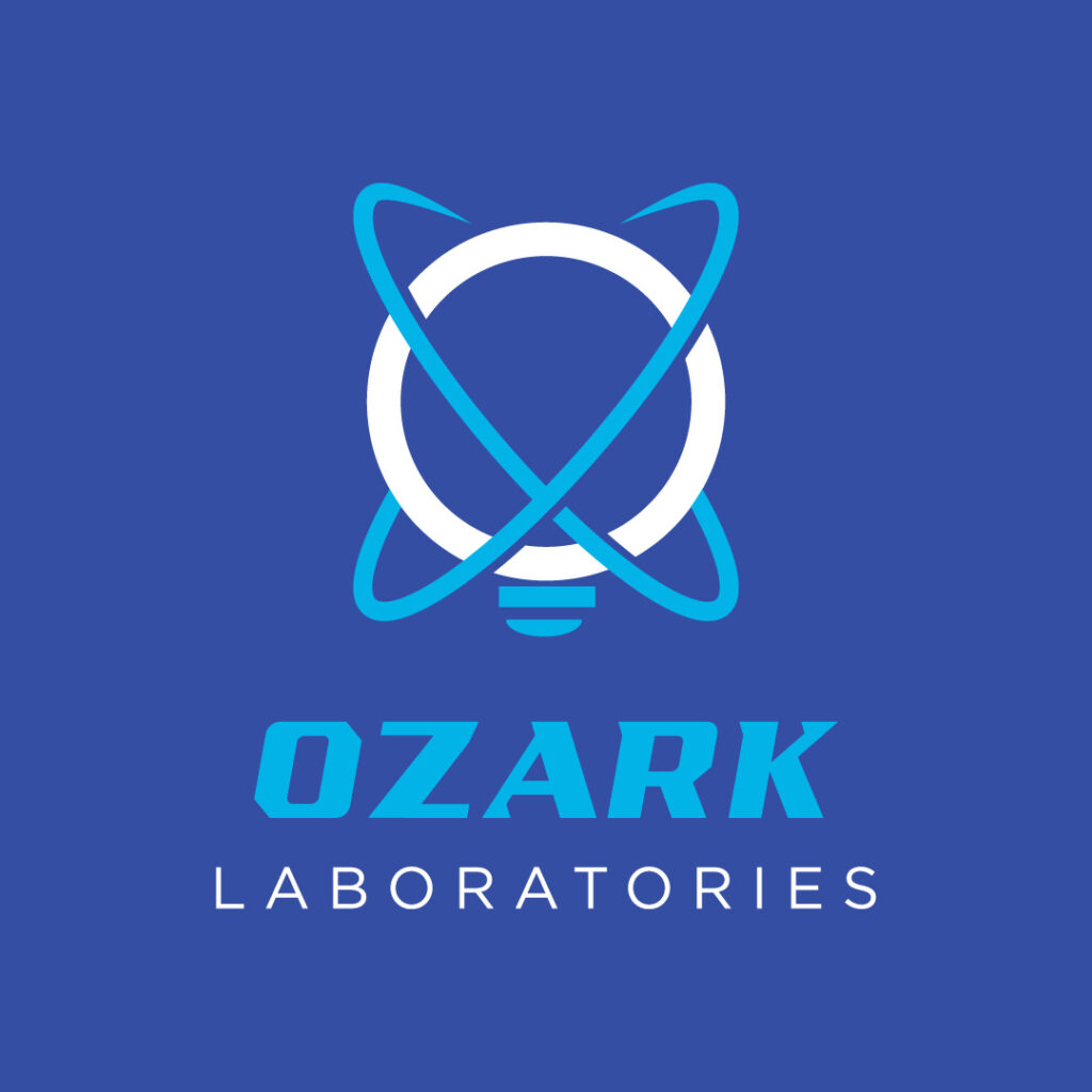
Ozark Laboratories is a research and testing facility for new and modern medicine. The symbol looks like an oversized lightbulb, which depicts enlightenment and discovery. This is complemented by two intertwined, slightly slanted circles that give it a much more exciting appeal. The font choice is a unique, bold typography paired with a lighter and thinner sans serif typeface.
13. Oolala Sweets & Ice Creams
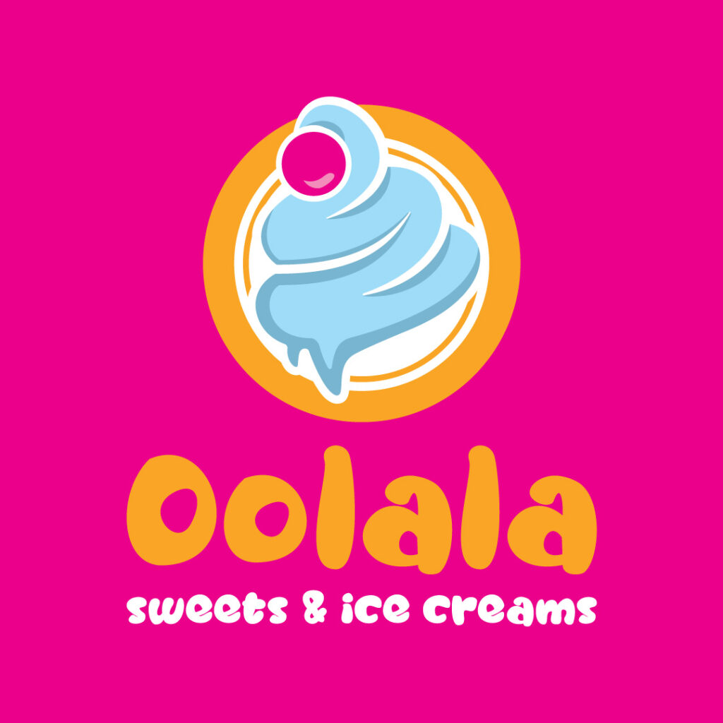
The overall logo design of Oolala Sweets & Ice Creams is compact and highly versatile. This can be plastered on almost any branding and marketing material, from business cards and landing pages to billboards and flyers, and it will still look good. You instantly want to take a bite out of that tempting ice cream illustration with a pretty pastel blue color.
14. Optican
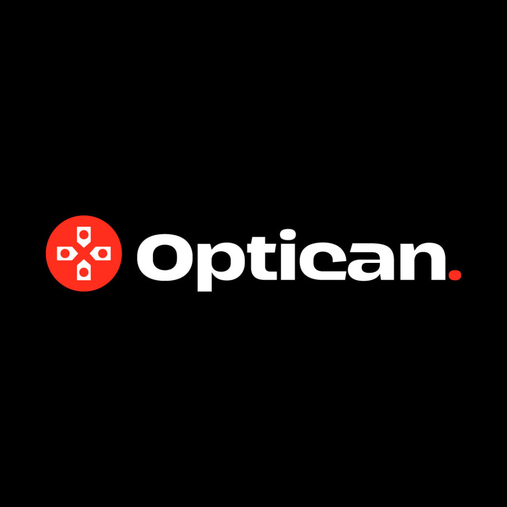
Optican banks on wordplay to present its offerings. It’s a business that advises customers on what type of eyewear they need to use based on optometrists’ and opthalmogists’ recommendations. The icon with a red circle and four dots on white background look like an eye exam test of sorts.
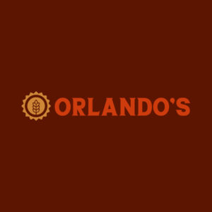
15. Orlando’s
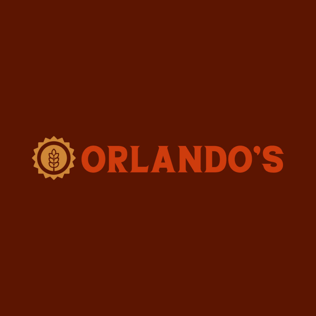
Orlando’s is a vegan restaurant located on a beautiful suburban hill with an overlooking view. The place also offers some wellness programs for that holistic healing. The icon shows a stem illustration encompassed in a simple sun icon. Both images represent cheerfulness, growth, nature, optimism, and all things natural.
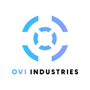
16. Ovi Industries
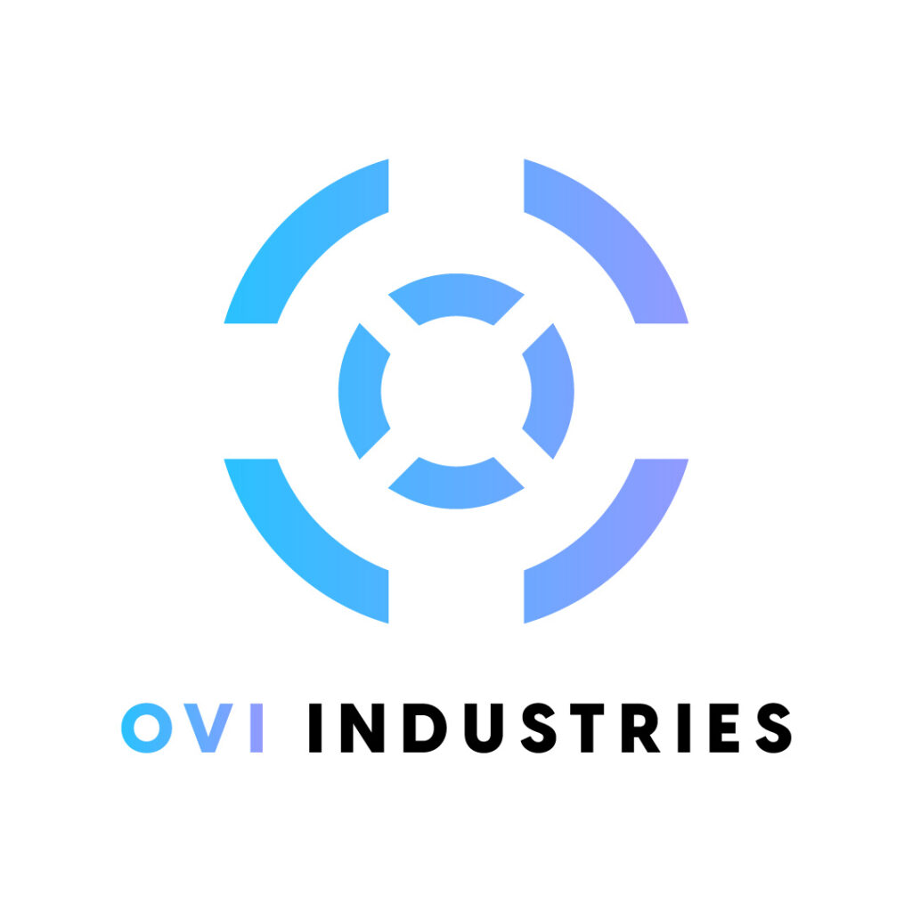
Ovi Industries is a company that sells guns to licensed gun owners. The soft gradients of teal and purple make this O logo design a sight to behold. The target icon tells its story from the get-go without revealing anything cliche.
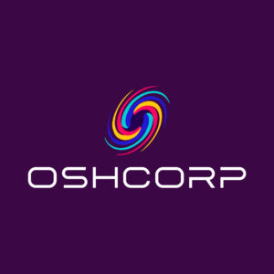
17. Oshcorp
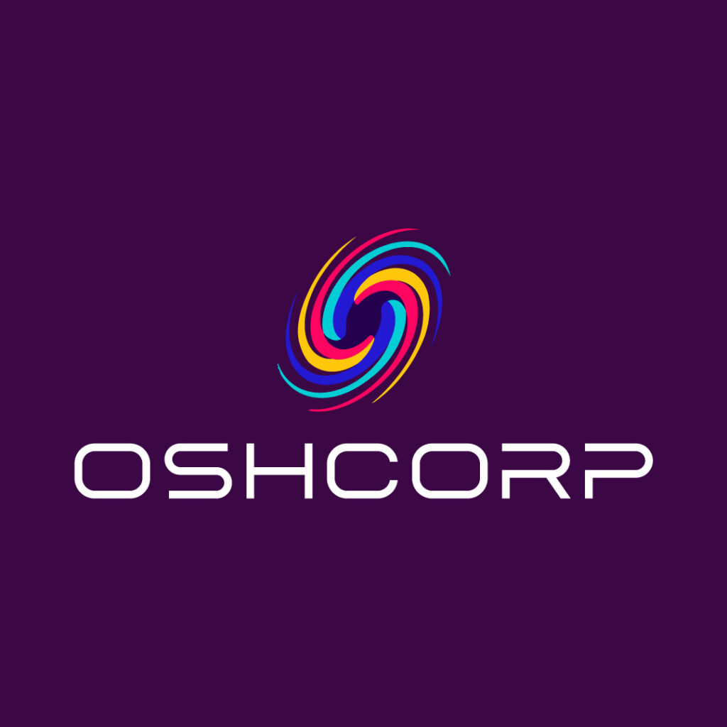
Oshcorp is an angel investor company that helps startups kickstart their early development stages. The logo showcases vibrant colors to emanate versatility and inclusion, two of the company’s principles. The whirlwind-like icon symbolizes quick movement, fit for fast-paced ventures during the initial phases. Finally, the overall drawing weaves well into the modern, light-faced font style.
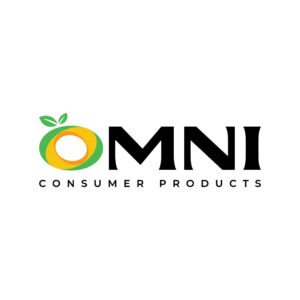
18. Omni Consumer Products
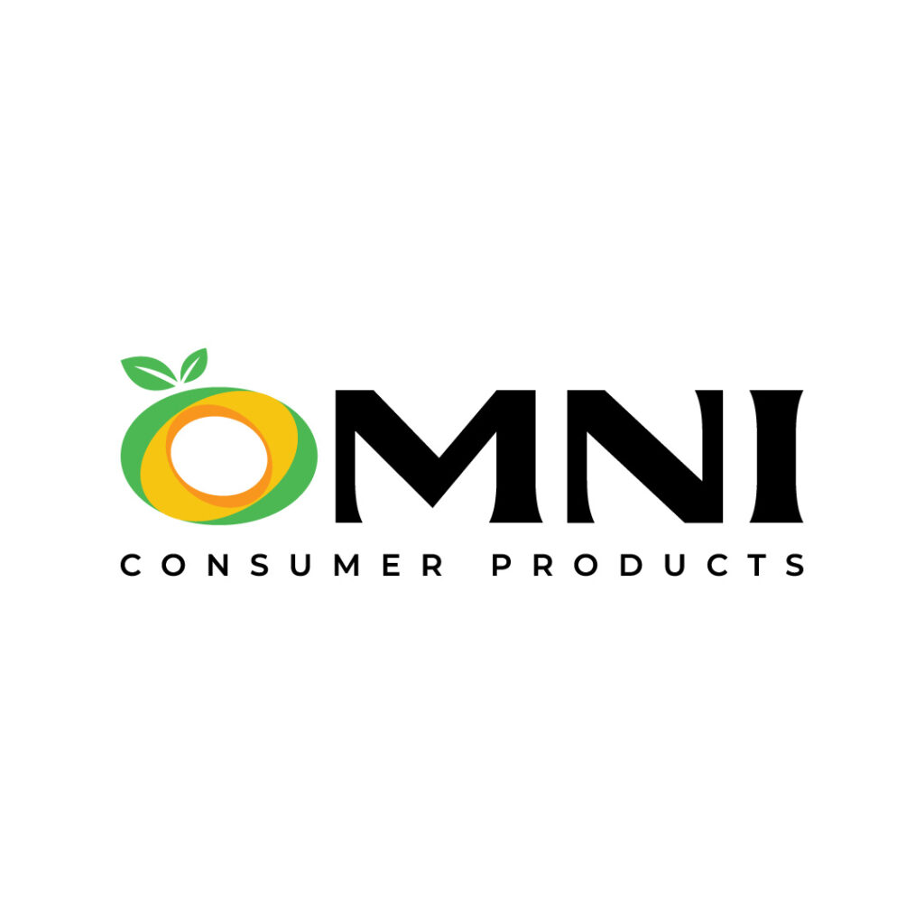
When selling perishable items, it’s best to indicate this on your logo so consumers can quickly identify your brand. This goes for all logos in their specific industries as well. The Omni Consumers Products logo shows just that. It features a fruit that looks like an apple and doubles as an orange. Plus, it also gives the brand name an exciting twist!
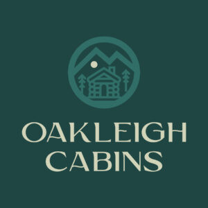
19. Oakleigh Cabins

The Oakleigh Cabins logo is a well-thought-out logo that other hospitality niches must emulate. It’s simple yet makes an impact due to its creative composition. It features a cabin illustration protected by a circle and a bright moon that pops from the overall design. This logo is perfect for a business that offers vacation cabin rentals in the middle of the woods.
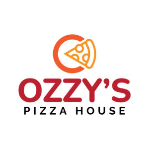
20. Ozzy’s Pizza House

The letter O logo icon shows off a pizza illustration in yellow color, contrasting the orange semi-circle background. It also completes the letter O icon that could be the company’s standalone logo without the brand name. Plus, the fiery red text underneath adds color diversity, making this logo fun and vibrant.
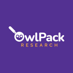
21. OwlPack Research

OwlPack Research integrates playful elements in its logo icon. Showing a magnifying glass, the company establishes a connection with audiences, letting them know what experts do. But they also didn’t shy away from keeping it light-hearted by including two bulging owl eyes in the middle of the magnifying glass.
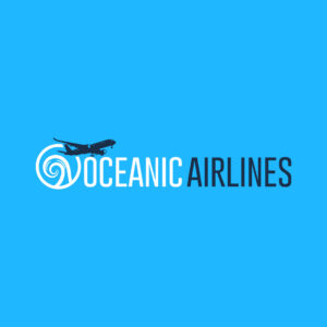
22. Oceanic Airlines

For an airline company like Oceanic Airlines, the brand didn’t fail to include history in its logo. The company is located on a beautiful coast and would want nothing but to emanate sunshine and beach vibes from its airline logo. The text is complemented by an icon with a simple wave drawing and an airplane tying all elements together.
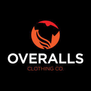
23. Overalls Clothing Co.

The clothing company Overalls Clothing Co. puts a fun twist on its logo design. Although it uses a cliche symbol, like a t-shirt, the beautiful curves at the bottom of the shirt make it visually attractive. The red background is also apt and makes the black shirt stick out like a sore thumb. Finally, the typography is one of the best font combinations on this list, uniting white and red color combinations.
24. Orwell Express
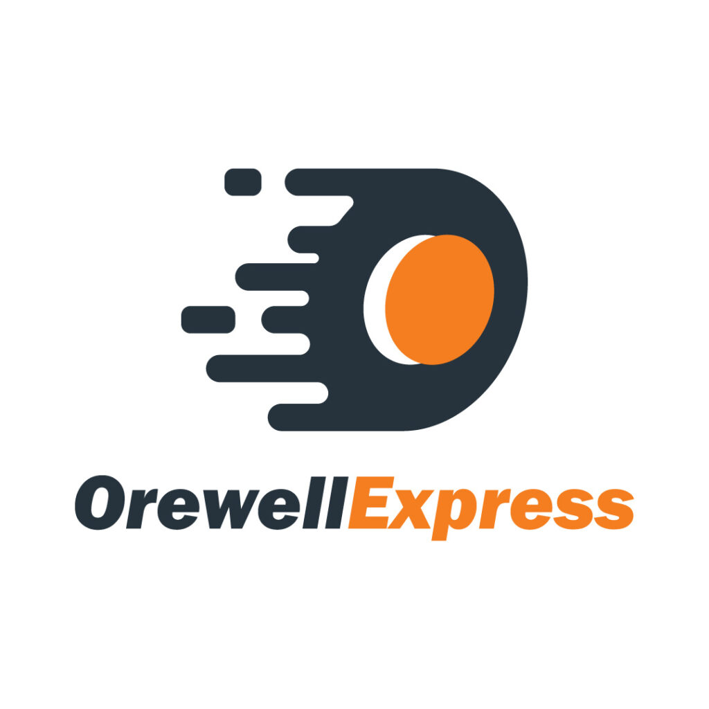
Orewell Express is a laundromat business with a unique take on its logo design. The orange and black color combinations make each design element shine and have its moment. The brand name is separated through color contrast, making it clear and legible. Also, the icon seemingly looks like dripping water without gravity, which is turned to its side.
25. Oberin City Sewer Authority
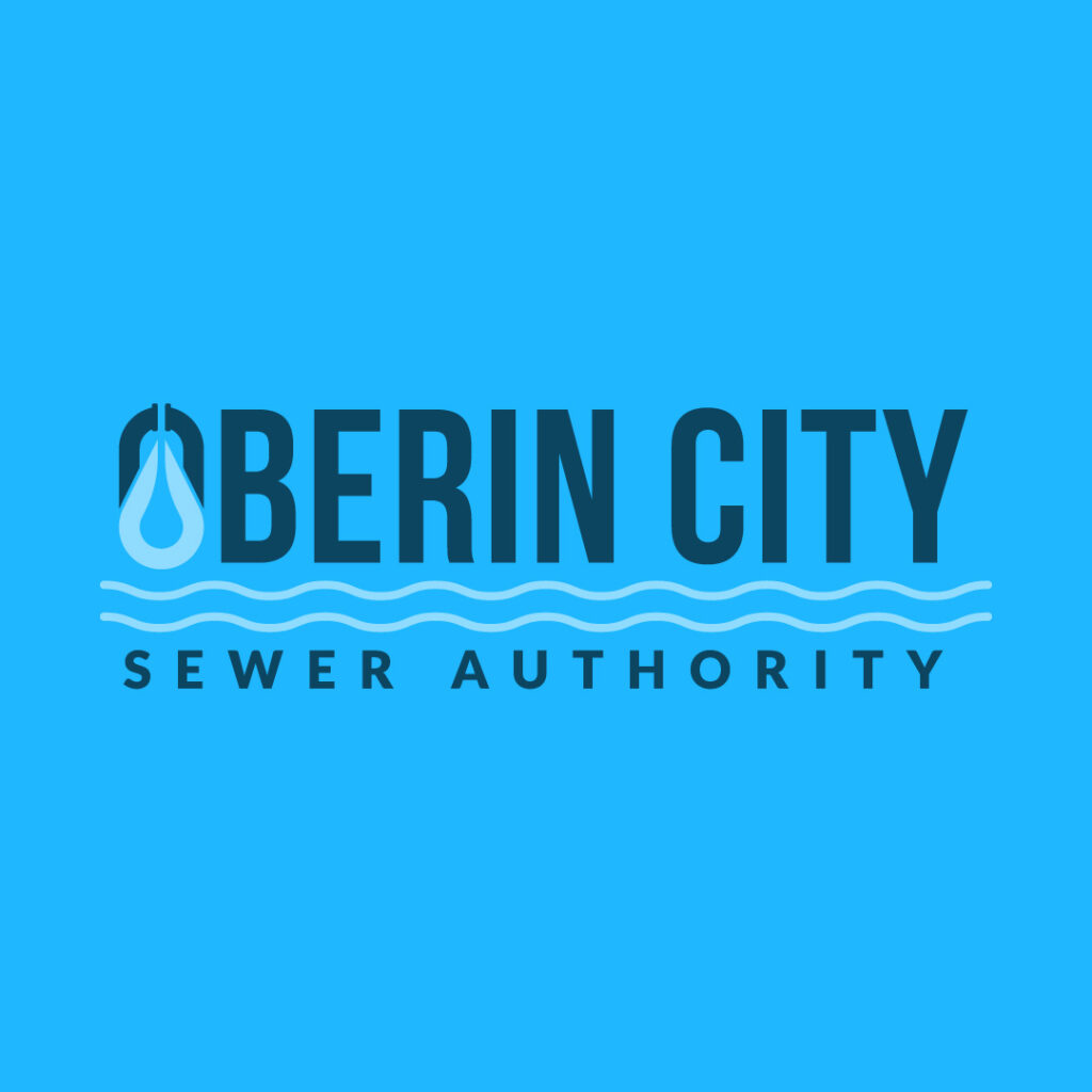
The overall logo composition of Oberin City Sewer Authority is one you must emulate. It dons different design components that all work together to form a cohesive unit. You see a somewhat manhole cover, which also looks like a droplet representing liquid.
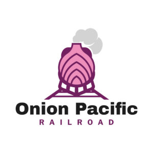
26. Onion Pacific Railroad
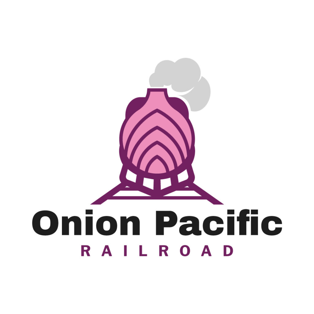
Although it’s an interesting name for a railroad company, Onion Pacific Railroad made its logo work through out-of-the-box thinking. The onion sits loud and proud on top of the train, signifying the company’s prowess in its industry.
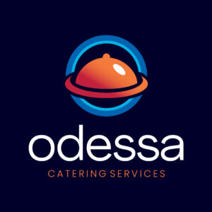
27. Odessa Catering Services

Odessa Catering Services sticks with a familiar icon to represent its company. It features a chafing dish with stunning red and orange gradients and a blue circle.
28. Oricon Oil & Gas
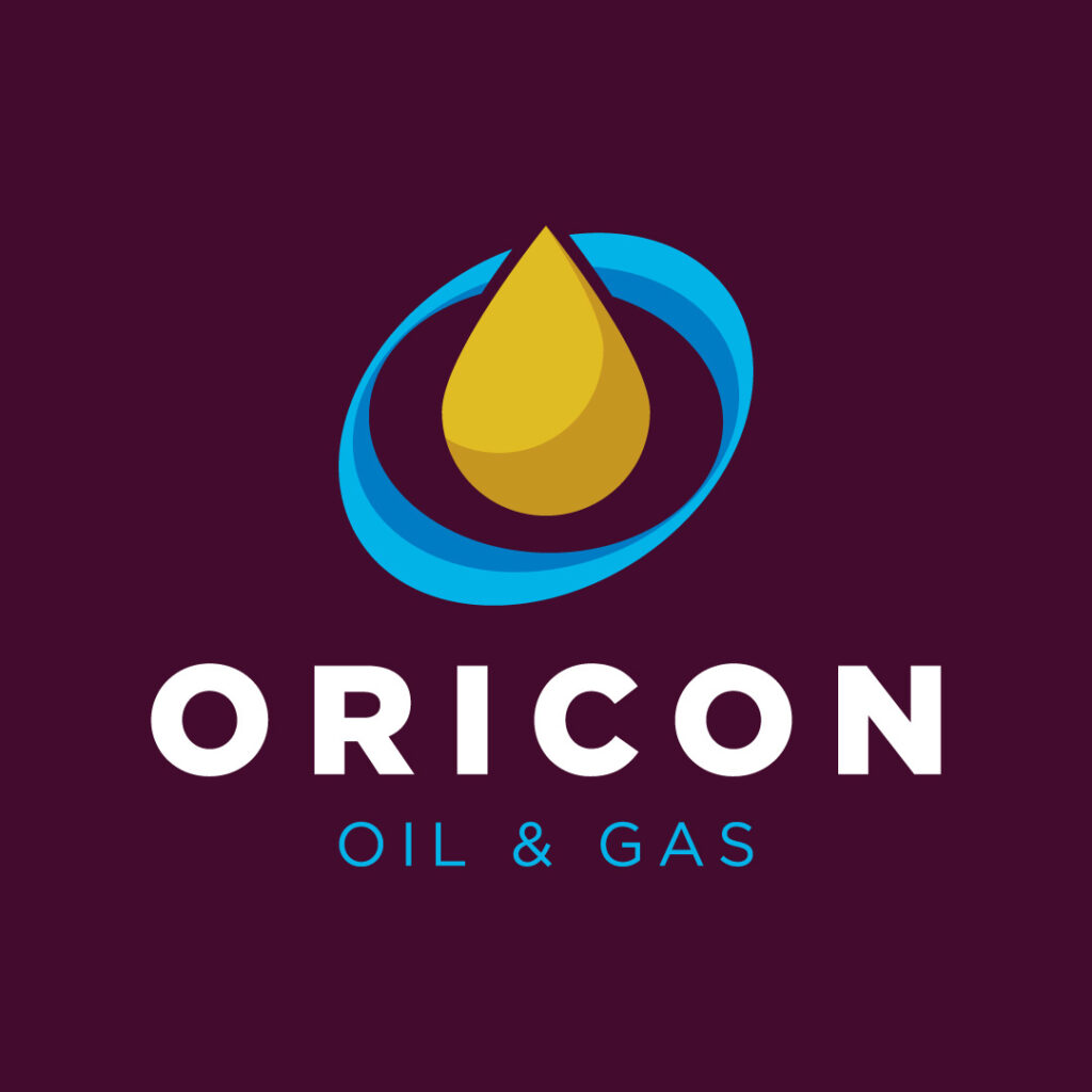
A gas station logo could rely on a droplet or fuel pump to instill recognition. Oricon Oil & Gas chooses the former to best signify what they do, and it works due to its attractive yellow color on a blue background.
29. Oxycon Chemicals
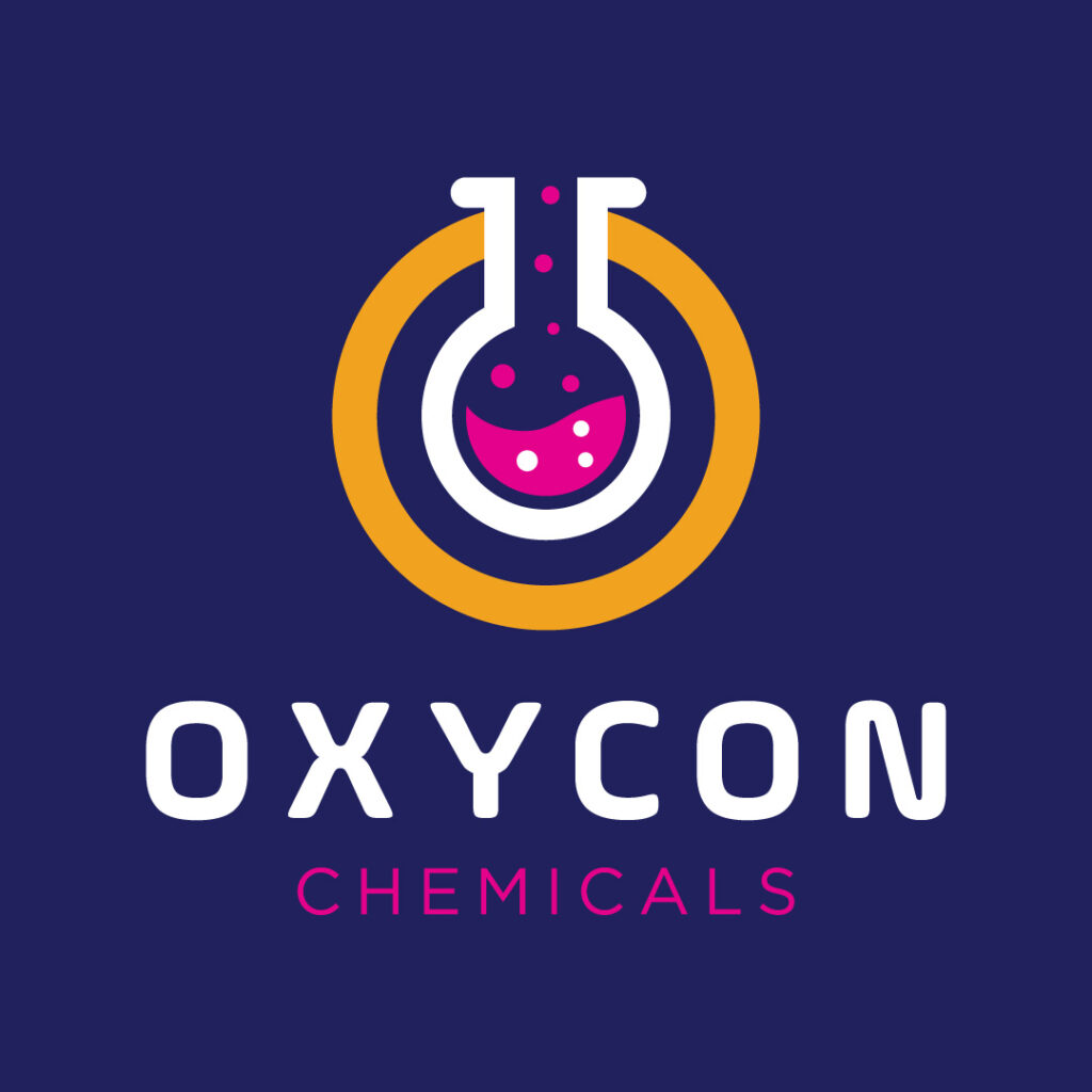
The best way for a laboratory and research facility to communicate their wares is to choose one of the many lab apparatuses. In this case, Oxycon Chemicals brilliantly chose a volumetric flask with pink liquid inside.
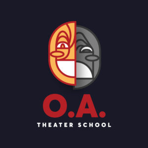
30. O.A. Theater School
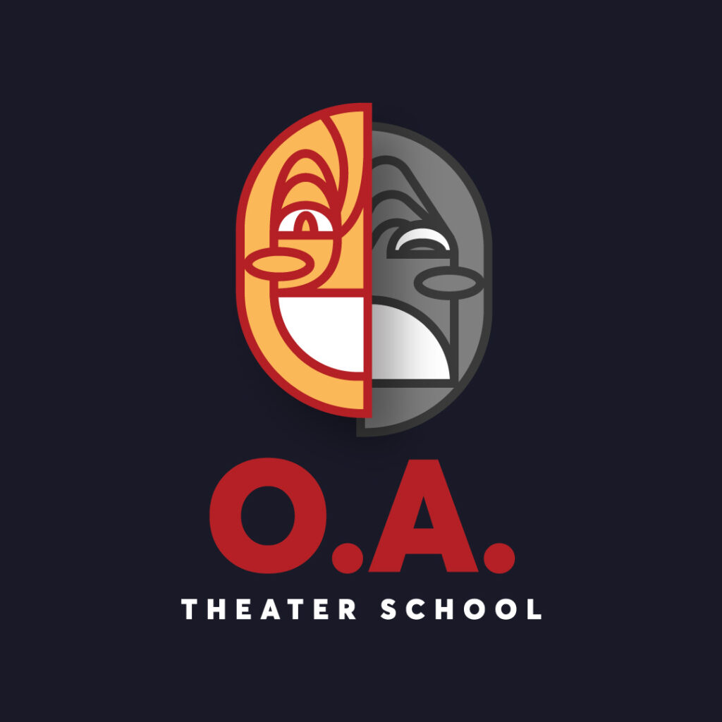
Nothing depicts a theater school business quite well than two mask images. O.A. Theater School’s mission is to bring art, music, and theater to kids and adults in a fun way. Its logo shows just that.
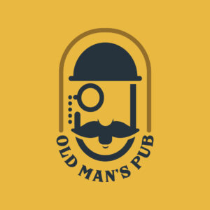
31. Old Man’s Pub

The drawing might seem like an explorer with a monocle, but it also suggests an old tippler with blurry vision after having one too many! The capsule-shaped logo consists of a face illustration of a bearded man and the brand name sealing the bottom.
A few useful tips when designing an O logo:
Less is more: Simplicity is key to a memorable logo design. Avoid creating complex logos that can look cluttered or overwhelming.
Aim for positivity: Consider using design elements that have positive associations. From colors to shapes, make sure they represent success, trust, or happiness, among many other positive characteristics.
Be memorable: Being memorable means being unique. Create a logo that really separates you from the competition. Avoid cliches, and instead, go for a timeless design that leaves a lasting impression.
Use colors wisely: Color psychology can help your brand evoke different emotions, such as blue for trust, red for energy, and yellow for happiness.
Always go for professionalism: A professionally designed logo is always better than one that came from a template or a $5 designer. Never compromise quality for affordability. Go with a logo designer that gives you both.
Final Thoughts
While these letters O logos are a great way to get ideas for your design, having a team of pro graphic designers is still your best option. Penji’s unlimited graphic design business model allows you to get logos and a wide array of design assets.
If you want to know more about what we do, watch our demo video here. Or you can start submitting requests for logo designs today. Click on this link to begin the process.
About the author

Celeste Zosimo
Celeste is a former traditional animator and now an SEO content writer specializing in graphic design and marketing topics. When she's not writing or ranking her articles, she's being bossed around by her cat and two dogs.
Table of Contents
- 1. Override Tech Solutions
- 2. Outward & Forward Innovations
- 3. Ourian Plastic Surgery
- 4. Osteo Experts
- 5. Olivia Jewels
- 6. Offshore Professionals
- 7. Octagon Planners
- 8. Oceanscope Aquarium
- 9. Optics
- 10. Optix Design
- 11. Orchard Heights Properties Incorporated
- 12. Ozark Laboratories
- 13. Oolala Sweets & Ice Creams
- 14. Optican
- 15. Orlando’s
- 16. Ovi Industries
- 17. Oshcorp
- 18. Omni Consumer Products
- 19. Oakleigh Cabins
- 20. Ozzy’s Pizza House
- 21. OwlPack Research
- 22. Oceanic Airlines
- 23. Overalls Clothing Co.
- 24. Orwell Express
- 25. Oberin City Sewer Authority
- 26. Onion Pacific Railroad
- 27. Odessa Catering Services
- 28. Oricon Oil & Gas
- 29. Oxycon Chemicals
- 30. O.A. Theater School
- 31. Old Man’s Pub
- A few useful tips when designing an O logo:
- Final Thoughts


