


One of the components of any logo design is versatility. It refers to the sizes and styles you will need to implement for various uses, such as business cards, websites, flyers, etc. And you need to save your logo as a vector. And if you’re not sure what a vector is, learn more about it below. To illustrate, here are some examples of letter J logo ideas to know what a vector logo looks like.
By the way, our amazing and experienced Penji designers created the letter J logos you see below. And if you want to get a logo for your business, scroll down below to learn how to get a logo from Penji!
What Are Vector Images?

Vector images use lines, shapes, and curves based on mathematical formulas. These images are now commonly used in graphic design. And businesses can use vector images for their logos, marketing materials, advertisements, and more!
Why Vector Images Are Better Than Other Formats

- Scalability – According to Penji designer Prince, if images are scalable, they won’t lose their quality. This means when you expand or reduce an image, the quality will stay the same no matter what.
- Versatility – Another reason why most designers love using vector images is their versatility. You can save the vector images in different file formats, such as .ai, .svg, and .eps. That said, you don’t need to have Adobe Photoshop or Illustrator installed on your computer to open these images. Instead, you can use a free online vector editor to create or edit these files. The vector image is also versatile because you can save it as a raster file when you need it, and it won’t lose quality. On the other hand, you may need to use an online raster to vector converters or the Adobe Creative Cloud Suite.
- Smaller storage – Hundreds or thousands of images saved to your computer can stack up and take up storage space. Vector images eliminate that problem because these images are smaller in storage. According to PsPrint, the reason vector files have smaller file sizes is that the only info on the image is mathematical formulas.
Fantastic J logos perfect for your brand
Get your J logos in 1 to 2 days from professional graphic designers
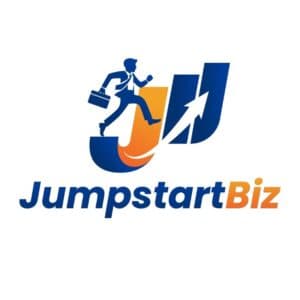
1. Jumpstart Biz
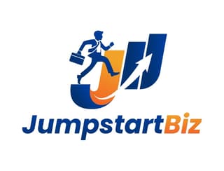
Jump right in with this letter J logo for Jumpstart Biz. You’ll see a businessperson jumping on the J on the graph to the right. Movement in logos could indicate a business or entrepreneur moving forward, which is relevant to the business name. Also, if you want to show energy or excitement in a business, add bright colors like red, yellow, or orange. The businessperson jumping from one bar to another could indicate success and move forward.
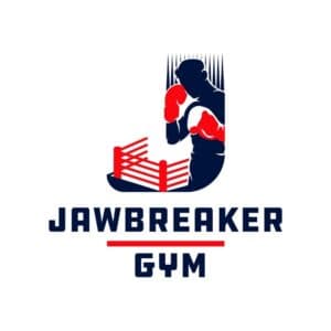
2. Jawbreaker Gym
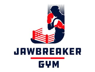
Beat your competitors with a letter J logo idea like this one for Jawbreaker Gym. It uses the silhouette of a boxer. Plus, it uses spikes to help form the letter J. Also, the silhouette extends to the bottom of the boxing ring, serving as the platform. The ropes around the ring complete the end of the J. In addition, this logo is different from most gym or fitness logos because it uses a black and red motif, which may indicate power.
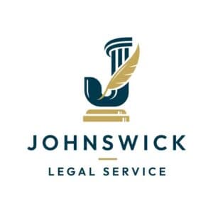
3. Johnswick Legal Service
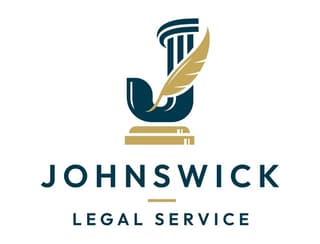
If you want to combine common elements of a lawyer or legal logo for your firm, check this logo for Johnswick Legal Service. It uses the sound block for the gavel and a column, which you’ll see in most lawyer logos. But there’s one part of the logo that stands out, which is the feather. This could be a quill, symbolizing custom and tradition in the court.
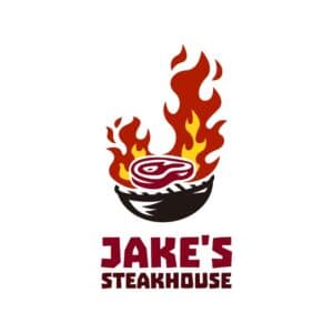
4. Jake’s Steakhouse
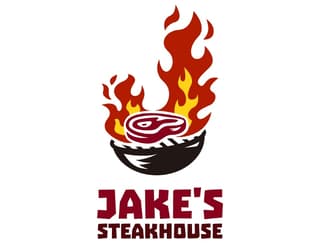
Whet your customers’ appetites with a restaurant logo similar to this one for Jake’s Steakhouse. The grill and steak make sense as part of the imagery for their logo. Not only that, but they also used a J-shaped fire on the grill. With this kind of logo, you can surely entice customers to come into your restaurant and try your delicious food.
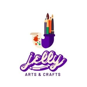
5. Jelly Arts and Crafts
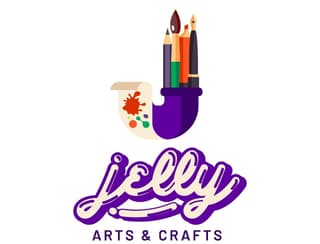
For arts and crafts businesses, you can look at the Jelly Arts and Crafts logo for inspiration. As you can see here, the pen and brush holder takes the form of a J, and at the end is a canvas. Meanwhile, the typography looks jelly-like, which is a nod to their name. Plus, their logo follows design elements such as memorability, simplicity, relevancy, and uniqueness.
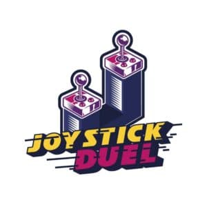
6. Joystick Duel
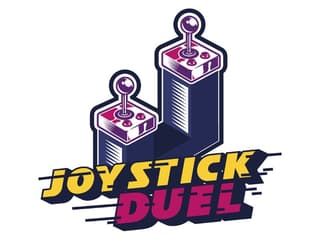
Establish your gaming brand or arcade like this logo for Joystick Duel. The two joysticks form the letter J in their logo. It’s reminiscent of old arcade versus games. One thing that stands out in this logo is the lines added to the Joystick Duel wordmark. This could indicate the movement that arcade-goers do when playing their favorite games.
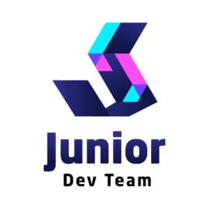
7. Junior Dev Team
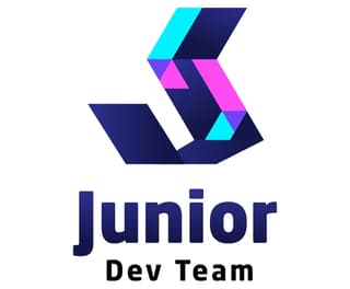
If you want a modern business logo, why not take a look at this logo for Junior Dev Team. In most web developer logos, you would see the less than/greater than signs, which are used for coding. But this logo will catch one’s attention because of the abstract shape, but it still forms the letter J.
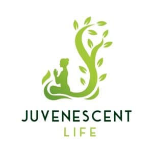
8. Juvenescent Life
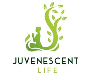
Evoke a sense of calm and peace like this letter J logo for Juvenescent Life. Spas or meditation practices can get inspiration from this logo. You want to ensure that your target audience will associate your service with relaxation, calm, and serenity. Plus, green is the most used color for peacefulness and relaxation. That’s why this is an effective logo.
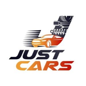
9. Just Cars
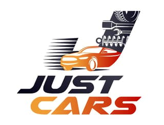
Keep your logo simple like this one for Just Cars. One look at this logo, and you’ll know that it might be a car repair service since there are tools aside from a car. This is how you can remind your target audience what you do in just a glance.
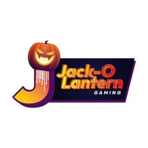
10. Jack-O Lantern Gaming
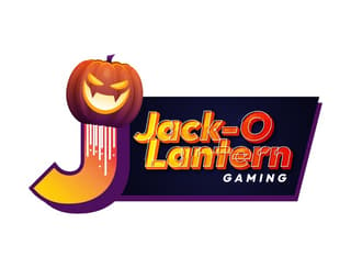
When it comes to gaming logos, one of our first thoughts would be the joystick or a controller, similar to the letter J logo above. However, this one’s different, as it uses a Jack-O-Lantern mascot to represent its business name. Plus, the logo for Jack-O Lantern Gaming mixes a Halloween motif with modern-looking typography.
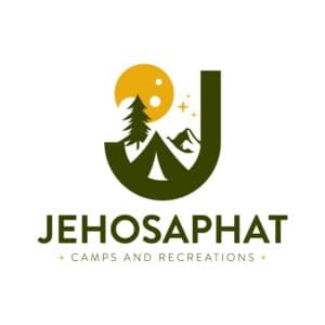
11. Jehosaphat Camps and Recreations
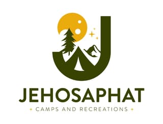
Take your letter J logo to the next level, like this one from Jehosaphat Camps and Recreations. You can integrate the letter J into your logo with mountains and campsites without it being too out of place. Plus, to strengthen their branding, they used earthy tones with a splash of color like yellow or red.
12. Jupiter Builders and Co.
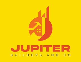
If you want to add the letter J subtly to your logo, here’s the logo for Jupiter Builders and Co. The descender from the letter J was added to some of the buildings. And the hammer and windows help us recognize that they are a construction company. You can also stand out from the crowd with colors. Choose colors that work well with orange, such as yellow and red.
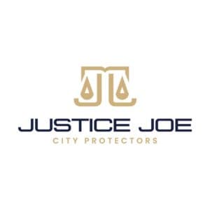
13. Justice Joe City Protectors
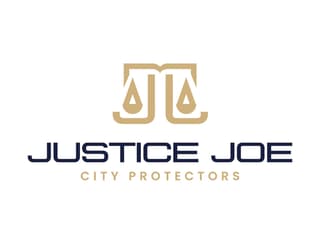
Any business in the legal industry will use a scale to signify justice. And if you want to make your law firm or organization logo to be unique, here’s the logo design for Justice Joe City Protectors. Instead of using the scales as is, the added Js give it a personal touch to the business. Plus, the two Js could also represent the business name.
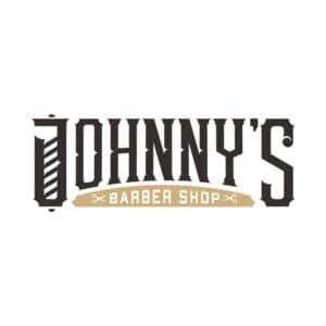
14. Johnny’s Barber Shop
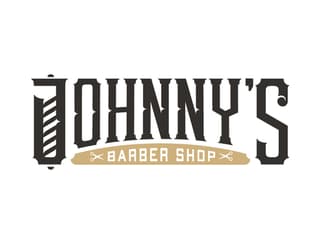
One notable element in most barbershop logos is the barber pole. And if you want to add it even though most of your competitors are doing the same, you can check out this letter J logo design for Johnny’s Barber Shop. Instead of having the barber pole as a separate element in the logo, the designers have integrated it into the J. Plus, they made sure it was readable.
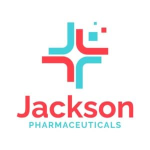
15. Jackson Pharmaceuticals
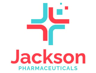
Pharmaceutical or health logos would usually show crosses or have a green or blue motif. But Jackson Pharmaceuticals has a cross logo with a blue and red motif, and the designers formed the cross with the letter Js to turn the imagery into a letter J logo. It’s not common to see red in any health logo, but red can also symbolize warmth and physical needs.
16. Jubilee Fireworks
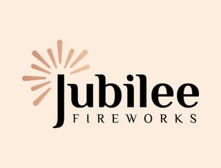
Do you want a simple but modern logo for your business? Here’s an example from Jubilee Fireworks. Neutrals and earthy tones are still trending in logo design. Even if Jubilee Fireworks doesn’t have a separate J imagery, like most of the logos here, you can still emphasize the letter J in your logo by adding some embellishments. As such, they added fireworks to the letter J.
17. Jaguar Technologies
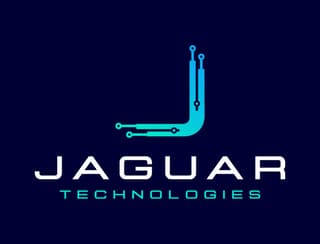
Here’s another logo design inspiration for your company, but this time it’s for a tech company called Jaguar Technologies. Most modern logos would have a blue, purple, or green motif and mix those to achieve a modern style. Aside from that, make sure to use modern or futuristic fonts to make your tech company stand out from the rest.
18. Jambalaya Food and Beverages
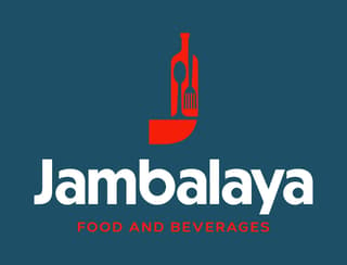
If you want a simple restaurant logo, check out this example from Jambalaya Food and Beverages. The letter J in this logo uses a bottle, spoon, and fork. You rarely see spoon and fork on restaurant logos since you’ll see mascots or characters. But that’s how you can make your logo unique from the others.
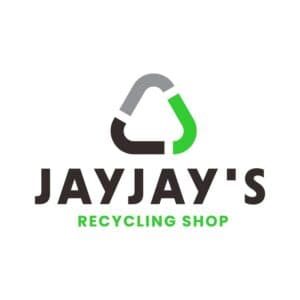
19. Jayjay’s Recycling Shop
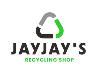
Keep your letter J logo simple, like this one for Jayjay’s Recycling Shop. Simplicity is one principle that designers adhere to when making logos. Don’t hesitate to use a recognized symbol and tweak it to your brand, like the Js as arrows. Plus, with motifs, you can pair green with neutral colors like gray and black to balance the colors.
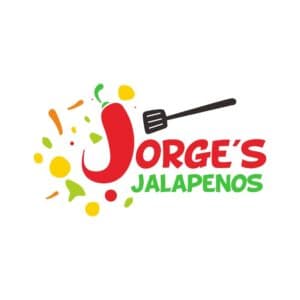
20. Jorge’s Jalapenos
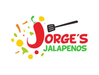
Make your logo sizzle like this one for Jorge’s Jalapenos. They used red chili pepper to serve as the letter J logo. Aside from that, you’ll also see the other colors for peppers, further solidifying their brand as a restaurant serving Jalapeno dishes.
21. JJ Morrisson
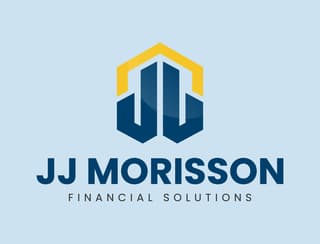
JJ Morrisson Financial Solutions logo exudes authority and stability. The colors are apt for a financial company since these colors evoke feelings of security.
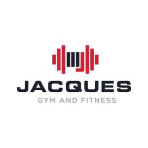
22. Jacques Gym and Fitness
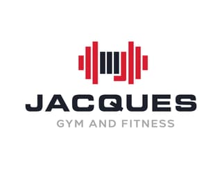
Here’s one gym logo that uses a dumbbell, but you can make it unique by tweaking the imagery. The Jacques Gym and Fitness logo uses quadrilateral shapes to form the dumbbell, and you’ll see the letter J to form the J logo. Aside from that, you can also use bold letters to stand out from the crowd, as the logo shows us.
23. Jumphouse Bouncy House
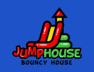
Here’s another fun J logo from Jumphouse Bouncy House. Make your logo look more exciting with fun-looking or playful fonts. Don’t be afraid to sprinkle some fun or playfulness in your logo. After all, your logo can also be a great way to show your brand’s personality visually.
24. Jackrabbit Sneakers
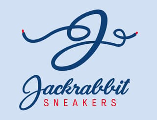
Stand out from the crowd with the Jackrabbit Sneakers logo. Most sneaker seller logos may use sneakers or abstract logos for the imagery. But you can use other elements like shoelaces that can still be an effective way to show what your brand is all about.
25. Jawbreakers Fighting Arts
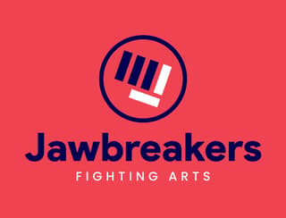
Gym or fitness logos would use dumbbells or show a muscular person. Make yours different by using a knuckle like the Jawbreakers Fighting Arts logo. It’s a great way to show the letter J in a subtle way through color combination. Plus, the logo looks modern, thanks to the sans serif font.
26. Jazzy Music Studio
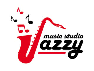
Instruments and notes are commonly used in music-related logos, and this one for the Jazzy Music Studio is no exception. They use a saxophone as the letter J logo. Plus, you can also give your look a playful look with a font like a script type. Make sure that the script is readable enough, even from afar.
27. Jumbo Juice
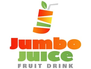
Make your logo colorful like this logo for Jumbo Juice. When it comes to color, it’s best to stick to two or use a color palette. Jumbo Juice uses a palette that reminds you of fruits, such as oranges and mangoes. Plus, they further enhanced their branding by using a smoothie cup or an orange leaf.
28. Jackal Security Agency
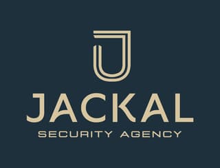
Have a professional-looking logo like this one from Jackal Security Agency. Linear logo designs help achieve a professional and simple look. Plus, you can give your logo some flare by using modern fonts.
29. Joshua Town Public Library
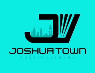
Here’s a library logo that doesn’t use a book as its primary imagery. The Joshua Town Public Library uses a skyline silhouette paired with a slightly open book. You will definitely turn heads with this logo since you won’t see imagery like this in other logos.
30. Jackhammer Jabs and Jocks
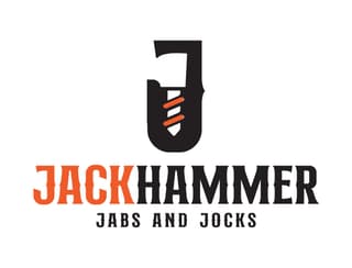
Stick to the basics with this J logo for Jackhammer Jabs and Jocks. This is a great logo example if you want to have a retro or vintage vibe, and you could have that look by using vintage fonts. Plus, if you want to show energy or activity without using a person, you can do that by color, and orange is the best to represent that.
Hire Penji for Logo Design
Now that you’ve reached the end, you can stop your search in finding the right designer who will fulfill your logo needs. In fact, you’ve come to the right place to get logos and other designs! Here at Penji, once subscribed, you can request a logo for your business and let the pros at Penji handle your design project. That’s the great thing about hiring Penji for all your design needs. You can relax on designing as you focus on your business. Subscribe now and try Penji today!


