


A powerful logo is a critical component of a successful business strategy. Forbes says a well-designed logo not only represents your brand but also communicates your commitment to delivering a high-quality experience to your customers. Elevate your business image and make a lasting impression by investing in a customized logo. The following are thirty of Penji’s best letter F logo designs. Check them out to get some inspiration:
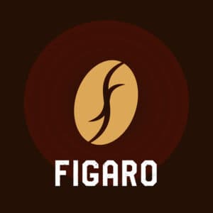
1. Figaro
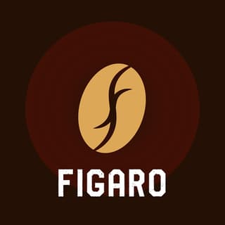
Do as Figaro has done if you want mystery, warmth, force, and relaxation in one logo color. They used the color maroon in various shades with a small portion of the logo using a bit of yellow to add as an accent. Colors are compelling elements to use in a logo design to highlight an area or make something stand out.
The designers placed a stylized F in the middle to symbolize the brand’s name in this logo. Then they used white for the font to make it the prominent detail of the design. To add character to the design, speckles of maroon were scattered on the brand name.
Unique F logos perfect for your brand
Hire a professional designer to create your logo


2. Fulltank
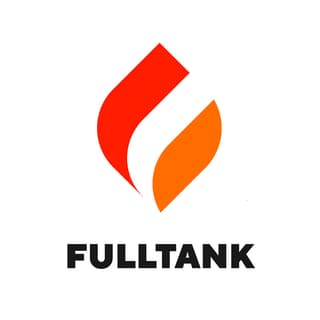
It’s crucial that your logo design conveys what your brand is about. This logo design for Fulltank uses red and orange, both bright and vibrant colors. These are the colors commonly used to denote energy, health, and vitality.
The minimalist design makes the logo highly scalable. This means that it will look good wherever you place it. Whether it’s on a giant billboard or a small business card, you’d still get the same effect. To add to its simplicity is the font type used in black. Its lack of other distracting elements is very suitable, especially if you’re going for professionalism.
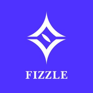
3. Fizzle
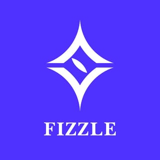
This Fizzle logo is another example of a straightforward logo design. It uses what seems to be a rhombus with a pointed oval in the middle. The primary color of the logo is purplish-blue which gives the design a fresh and trendy appeal.
While we see many logos using sans serif fonts, in Fizzle’s case, the serif font added pizazz to it. It is in white to make the overall design as clean as possible. This is crucial if you want a logo that’s easy to remember.
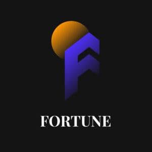
4. Fortune
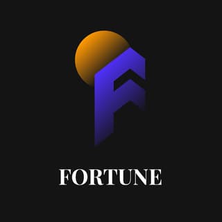
Another logo design that uses a purple-blue shade is this one from Fortune. This time, it is paired with an orange circle that effectively serves as an accent. It is laid out against a black background that makes it stand out.
The letter F in the logo is somewhat similar to a tall building that effectively conveys stability and strength. The sphere above it projects an image of vital energy and a bright future ahead. If you’re in the finance industry, this logo is a good one to get inspiration from.
5. Farmcare

When designing for nature-related companies, it’s common to find green, brown, and yellow colors. In Farmcare’s case, they used green against a yellow background. This makes it look clean, fresh, and natural.
The logo design uses a leaf icon that’s beautifully designed and suited to the company’s nature of business. The font they used is a very basic one in all uppercase letters. This makes the design scalable, flexible, and versatile.
6. Fast Track

As its name suggests, Fast Track uses a logo and font slanted to the right to show speed and movement. Using Italics for fonts can be an excellent way to convey swiftness, agility, and acumen. If you’re in the delivery services, this is something to take note of.
As red can be used to express various messages such as love, hate, vigor, and war, it can also be used to denote life, vitality, and energy. In this case, there is no color more appropriate for this letter F logo other than red.
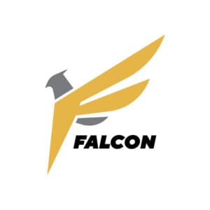
7. Falcon
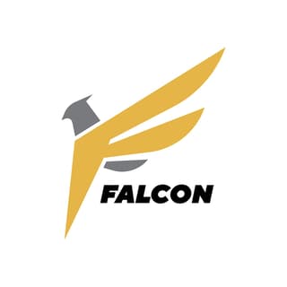
Pictorial marks, typically known as symbol logos, are popular because they’re easy to remember. Think of Nike’s swoosh and McDonald’s golden arches. Falcon does exactly this with their logo with a symbol of a falcon’s head in it.
This logo is cleverly designed as the falcon’s wing is made out to depict the letter F. It uses yellow as its main color to convey optimism and enlightenment. This makes it the perfect inclusion to add a splash of color to the grey parts of the falcon.
8. Forward

Blue is one of the most used colors in logo designs. This is because it can convey a multitude of emotions, attitudes, and characteristics. In this Forward logo, a blue shade leaning towards the violet spectrum was used. For a forwarding company, this is a suitable choice as blue can project bravery, dedication, and commitment.
And as mentioned above, the brand name uses a slightly tilted font to connote speed and movement. The icon is that of the letter F, which is an appropriate choice as it can be good for recall.
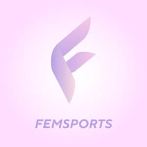
9. Femsports

Learning about color psychology is vital if you want to know which color would be the best for your brand. In this Femsports logo, the color pink is an obvious choice. We all know that this is the color that is usually associated with femininity, love, and passion. Since the company is about feminine sports, this logo is highly suitable.
As with Forward and Falcon, the letter F is made to be the main character of the logo design. But unlike the two logos mentioned, this one is done in a fluttery, delicate, and feathery way. A few shades of purple were also incorporated to add interest to the design.
10. Fast Light
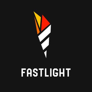
Using a torch as its symbol, Fast Light has a very attractive logo worthy of its place in this list of letter F logo examples. It uses white for the torch handle, while the fire uses red, orange, and yellow. The black background adds mystery yet is very good in making the design stand out.
The logo uses various shapes, primarily triangles, that add to the logo’s character. Again, this is an excellent way to make a scalable and versatile logo.
11. Freshlight Production
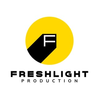
This film production company has a relevant logo with a spotlight focused on the letter F. The color scheme suits it well, too, as yellow is the color of light. The fonts are also fitting, as they are easily readable and scalable. This letter F logo proves that simplicity is the key to a good design.
12.Fincey Concepts

If you’re looking for a trendy yet highly professional logo, this one designed for Fincey Concepts is a great example. It has an icon with multiple colors that give it an innovative persona. The straightforward font gives the brand a professional air that projects authority and trustworthiness.
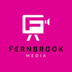
13.Fernbrook Media

Being in the media, the designer decided to use an icon of a camera with the letter F incorporated inside it. This logo designed for Fernbrook Media uses pink, which is suitable as it gives the brand a bit of shock value. In a world of media companies using blues and greens, this is sure to stand out.
14. Foxtrot Security
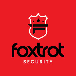
Red signifies many emotions, but it is more commonly used to show courage, anger, love, and a strong fighting spirit. Foxtrot Security uses it to deliver exactly these characteristics. It also uses an icon of a shield to give the brand a protective image.
15. Facepalm Advertising
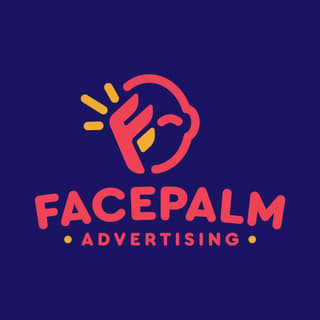
As its name suggests, Facepalm Advertising uses a comic icon with its palm on the face. The overall design of this letter F logo tells us that it is a fun and humor-filled brand. Doing so makes for robust graphic design as it engages viewers and gets their attention.
16. Fanatics, Inc.
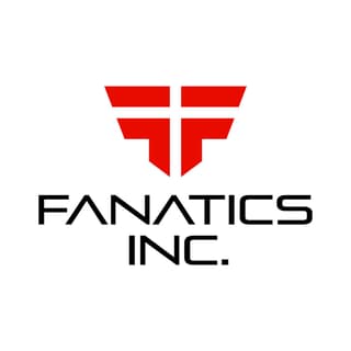
If you’re in the technology and software industry, having a cutting-edge image is a must. This logo design created for Fanatics, Inc. is an excellent example. It uses simple yet very modern icons and fonts. The colors are also bright and vibrant, which suggests a youthful and forward brand personality.
17. Fairview Health Services

A cross is a universally known icon for health and medical services. For the Fairview Health Services logo, a cross was used with the lower right part of the icon highlighted to show the letter F. It uses bright colors to veer away from the industry’s dull colors and stiff designs.
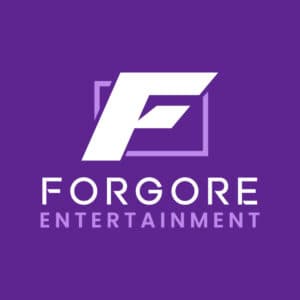
18. Forgore Entertainment

You can use fonts to tell people something about your brand. This letter F logo from Forgore Entertainment uses a unique font that helps it make a statement. It isn’t overly ornate, which makes it ideal for placing on any advertising and marketing material. The color choice also fits the brand as it projects power and ambition.
19. Fareportal Studios
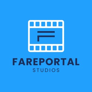
Blue is the world’s most used color when it comes to branding. It may be because it is the preference of many consumers. The designer for Fareportal Studios capitalized on this and created the logo to use various shades of it. The result isn’t bad, as it has a cohesive and professional look relevant to the niche.
20. Finance Business Holdings
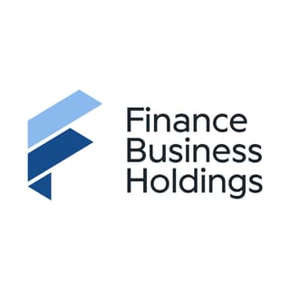
The finance industry is hard to design a logo for. You must consider many factors, such as authority, trust, and dependability. This is why the Finance Business Holdings logo uses a minimalistic approach to its logo. From the font and icons to the colors, everything is subtly-designed.
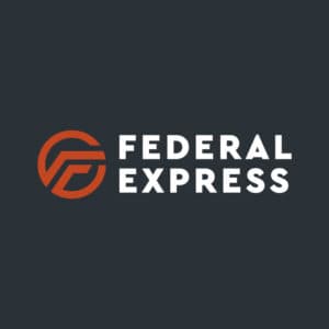
21. Federal Express
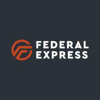
Sometimes, the simpler the logo, the better. Take a look at this logo designed for Federal Express. It has very minimal design elements but still commands attention so well. The font is very basic, yet they are big and bold and does great in introducing the brand.
22. Forever Living Funerals
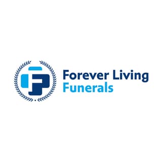
Losing a loved one is hard, the main reason Forever Living Funerals used light colors for its logo. When you’re in a particular niche, you shouldn’t always follow trends in logo designs. This is an excellent example of a logo that is from thinking outside the box. You can break free from the norm and still be respectful.
23. Fortune Travels

This charming logo design for Fortune Travels uses a location pin on top of the letter F. The F is converted into roads, making it a genuinely relevant logo for a travel agency. Since the icon takes up most of the logo design, the designer opted for a simple font. This is to provide balance to the design.
24. Future Sense Spa
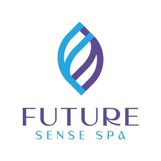
Blending chic with futuristic feels, this letter F logo for Future Sense Spa is noteworthy. It is oozing with style and personality, ideal for a wellness and luxury brand. The font has a flare that helps it depict a striking and elegant image. This logo is ideal for signage, newsletter, or any marketing material.
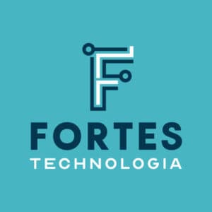
25. Fortes Technologia
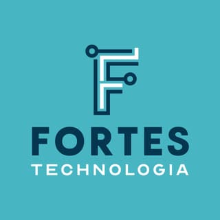
As mentioned above, the tech industry needs a modern and contemporary design to show innovation. This one from Fortes Technologia is one such example. It uses a bright green background accentuating the brand name and the icon. The font choice is spot on as it expresses the brand’s innovativeness quite well.
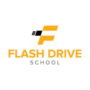
26. Flash Drive School

Using the letter F as the central part of the logo, this Flash Drive School also added a thumb drive to the icon. The font pairing is worth mentioning, as its combination of thick and thin fonts adds character to the design.
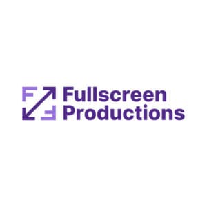
27. Fullscreen Productions
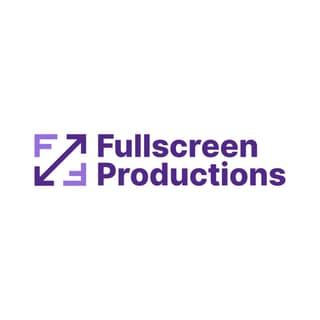
One of the best-designed in this list of letter F logos, Fullscreen Productions’ logo is truly worth emulating. It uses arrows we typically see on video screens while incorporating the letter F superbly. It is an excellent example of a good logo design.
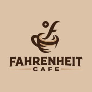
28. Fahrenheit Cafe
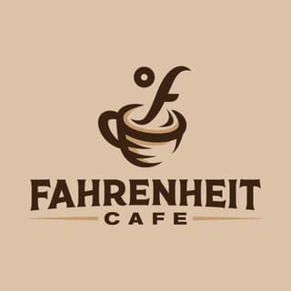
This cute and beautiful logo for Fahrenheit Cafe uses a coffee cup with smoke shaped like the letter F. The brown color scheme is typical of any business that deals with coffee, but the illustration made the logo unique.
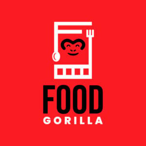
29. Food Gorilla
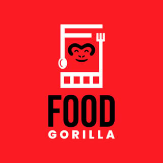
Another cleverly-designed logo is this one from Food Gorilla. It includes a gorilla face, a spoon, a fork, and the letter F. The combination of red and black is very suitable as these are said to be appetite triggers.
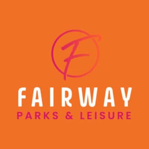
30. Fairway Parks & Leisure
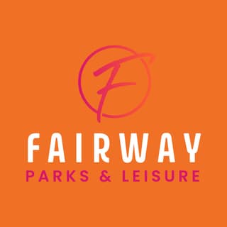
With only the letter F as the main star of the logo, this one from Fairway Parks & Leisure is simple yet impactful. It uses pink and orange, both colors signify warmth, laughter, and friendliness. These are emotions and characteristics that a park should have.
Final Thoughts
Logos can be tricky to design. If you go for a quick and easy fix, online logo templates can do the job. However, nothing beats a professional graphic designer if you want uniqueness and originality. If you want affordable and accessible logos and other visual design assets, Penji is the design partner you need.
Sign up today to get your logo designs created by Penji’s pro designers.


