
The aesthetics of a company logo must have these three elements: uniqueness, creativity, and comprehensibility. Every entrepreneur wants their company logo to bank on brand awareness, which means consumers must be able to recall even the smallest details of the logo. While creating logos entails a standard process, letter logos might need more particular attention to detail. This is because it can be easy to complicate letter logos.
If you’re looking for letter B logo design inspiration, Penji’s top designers have curated these 30 letter B logos for you.
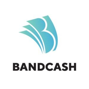
1. Bandcash

This letter B logo example has a different take on a financial-related logo. While paper bills might be the most appropriate symbols to convey the brand’s value proposition, Bandcash gives its logo a unique twist. They used three abstract paper bills stacked on top of each other while slightly curved to imply real money when it’s used. They integrated the letter B by using negative space on the first paper bill. Negative space is also used by separating the three paper bills to signify abundance, which the brand might be aiming for.
Professionally-made logos to promote your brand
Create your logo project today and get your concepts tomorrow


2. Beard Care Brand
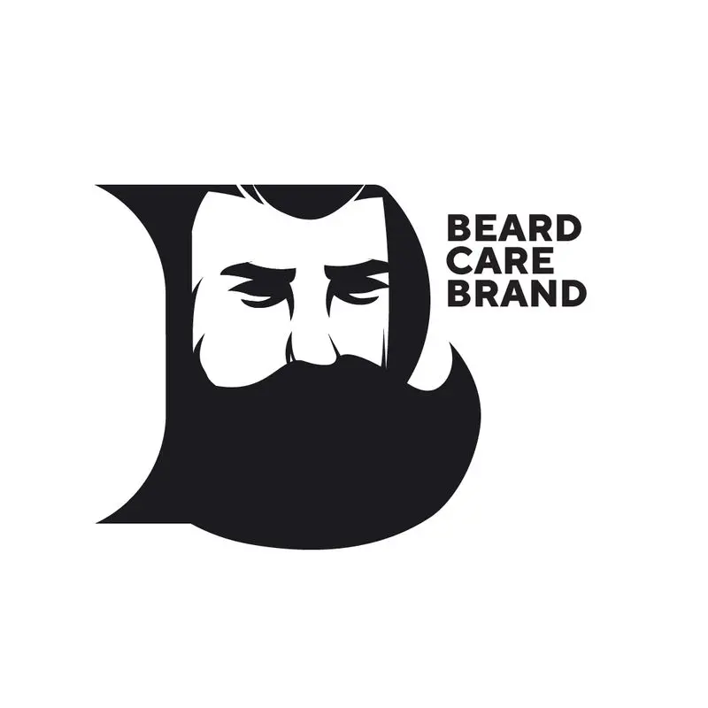
At first glance, the black color might seem too overwhelming since it dominates the entire design. However, the smart combination of white space and creativity makes this letter B logo unique. You’ll notice that the whole symbol is a letter B, with a man’s face on the top empty part of the letter. The bottom space of the letter is then replaced with the man’s beard shaped in the form of the letter. Finally, the two extra lines on the left side of the letter show us that this is classified as a serif font.
3. Bray Bull
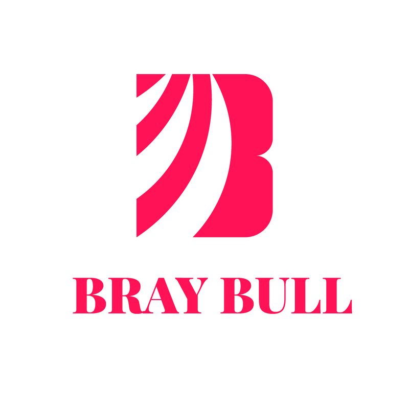
This Bray Bull logo utilizes white space to give depth and visual interest to the entire design. You’ll instantly notice the rays of negative space that occupy most of the symbol. However, the solid and bold letter B on the opposite side gives it a good balance. The bright color also makes this logo design stand out. Overall, this letter logo design exudes power and authority with a touch of friendliness.
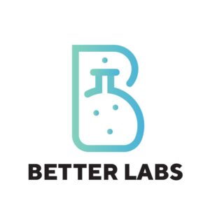
4. Better Labs

What better way to represent a lab-related brand than to use cylinders. We all know about logo design cliches that aren’t too appealing to target audiences. Since relevance is crucial in logo design, brands consider relevant icons and symbols to convey their offers. Better Labs does this through the use of a cylinder. However, they integrated style and uniqueness that dwell on top-of-mind-awareness by merging the cylinder icon with the letter B design. They also included some dots to indicate cylinder usage in a laboratory.
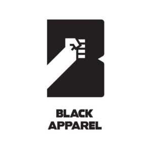
5. Black Apparel
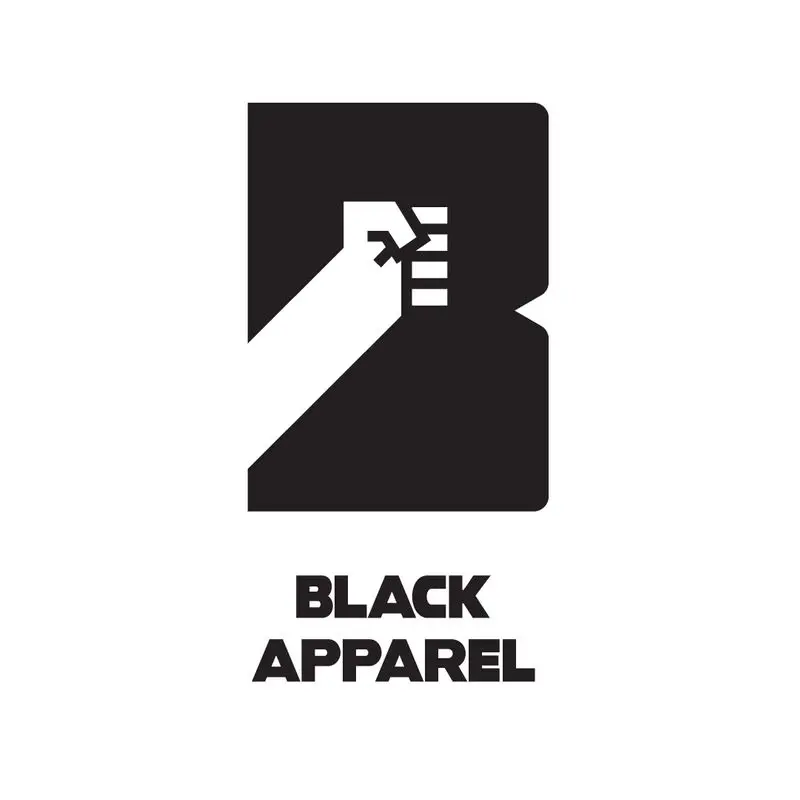
Black Apparel is a visually captivating shirt logo design idea. This company logo is well-suited to apparel brands that promote streetwear, hip-hop fashion, or urban clothing. The fist symbol is a good depiction of rebelliousness and minority voice in this department. Black Apparel also breaks the monotony of the domineering black color by including negative space through the fist icon. And this makes up the entire letter B logo. Overall, this cool logo is fitting, relevant, and versatile for any branding and marketing asset.
6. Build Buy Learn
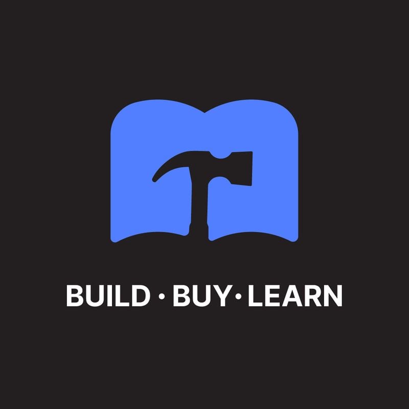
Brands can go as literal as they want by depicting their unique offers through relevant drawings, symbols, or icons — even the most famous logos. In this case, Build Buy Learn does so by including the top icons that convey their message. You’ll see a hammer displayed in the middle of the logo, which looks like an open book that signifies learning. However, if you flip the symbol upright, you’ll notice that the entire composition is a letter B logo.
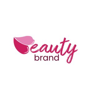
7. Beauty Brand
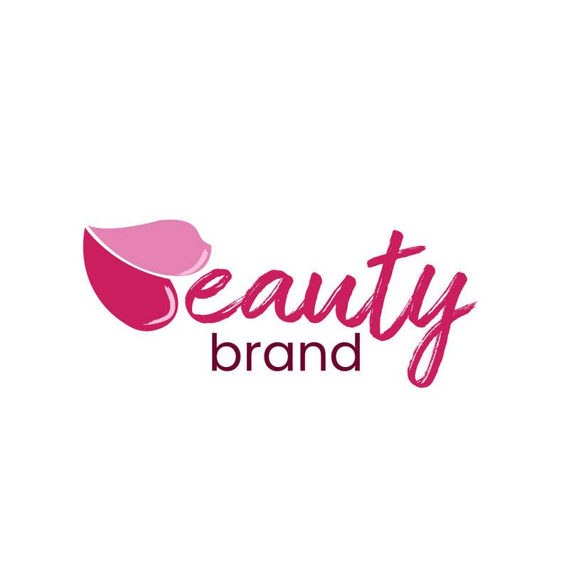
One of the most feminine letter B logos on this list, Beauty Brand’s logo has these crucial elements — cohesion, creativity, memorability, and timelessness. The beautiful script and sans serif font pairing is a good style that instills femininity. However, the most interesting design element is the puckered lips that replace the letter “B” in Beauty. Also, the lipstick-smothered lips display two different colors of pink, which give the logo a visual interest. This logo is an excellent example of memorability in logo design.
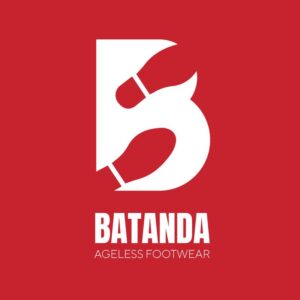
8. Batanda

The clever use of white space and relevance in this logo is commendable. Batanda banks on cliche icons which we can refer to as the shoes that show the brand’s unique selling proposition. The shoe marks aren’t in line but are placed on top of the other to indicate movement. This shows this shoewear brand’s “ageless” offer, which means the person with the shoes will probably “walk forever.” However, the most exciting part is how the shoe marks complement the design and transform it into a letter B logo symbol. This can be a standalone icon, even without the brand name.
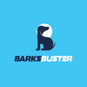
9. BarksBuster
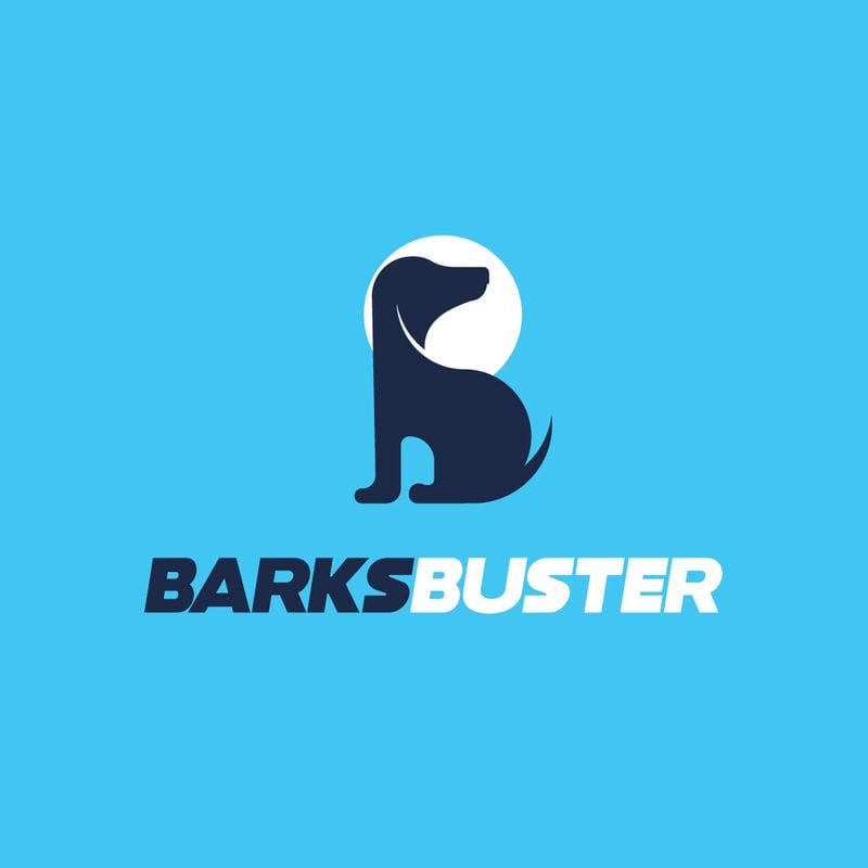
Another innovative logo that doesn’t take creativity half-heartedly, BarksBuster leverages a dog illustration to communicate its branding. The dog is sitting with its butt on the floor, forming the bottom part of the letter B. The dog’s snout is also facing the other way around to occupy the top position of the letter B. However, this is accentuated by the white circle around the dog’s head.
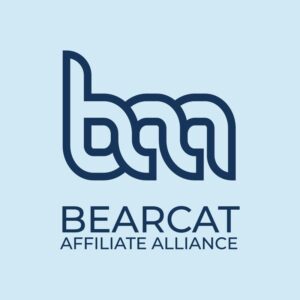
10. Bearcat Affiliate Alliance
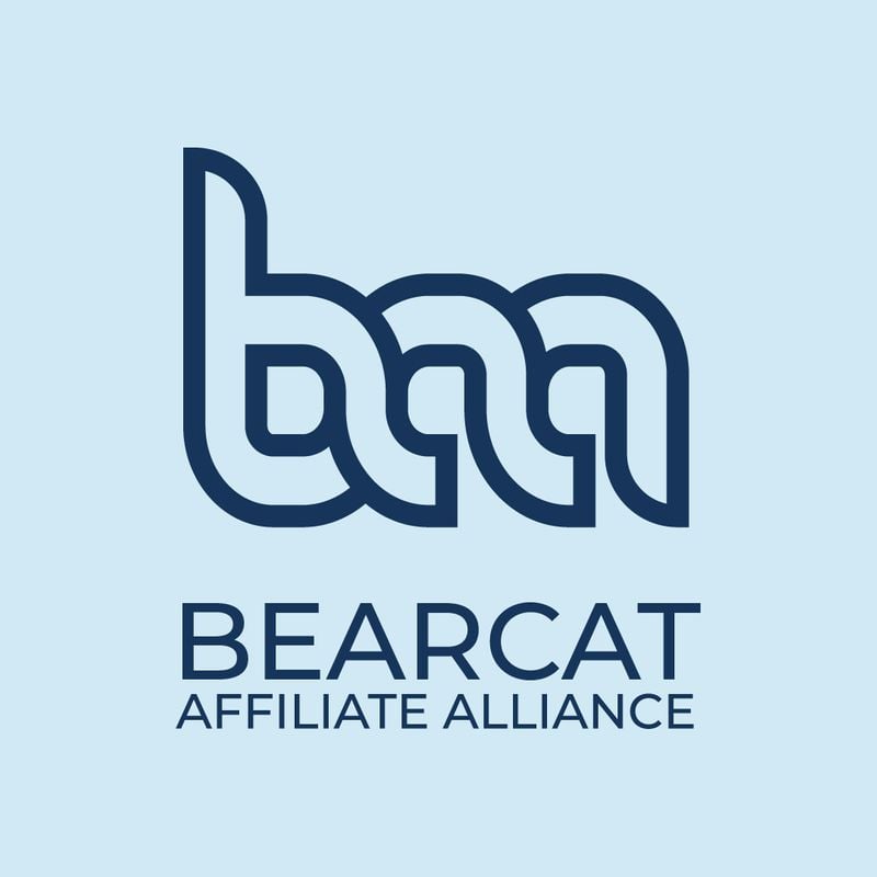
The Bearcat Affiliate Alliance has continuity in its monogram logo. The initials of the brand name are beautifully merged to form a cohesive logo design. The font fits the brand’s personality, and the color also emanates stability and authority, which is what you want from an affiliate alliance company.
11. Big Bad Bass
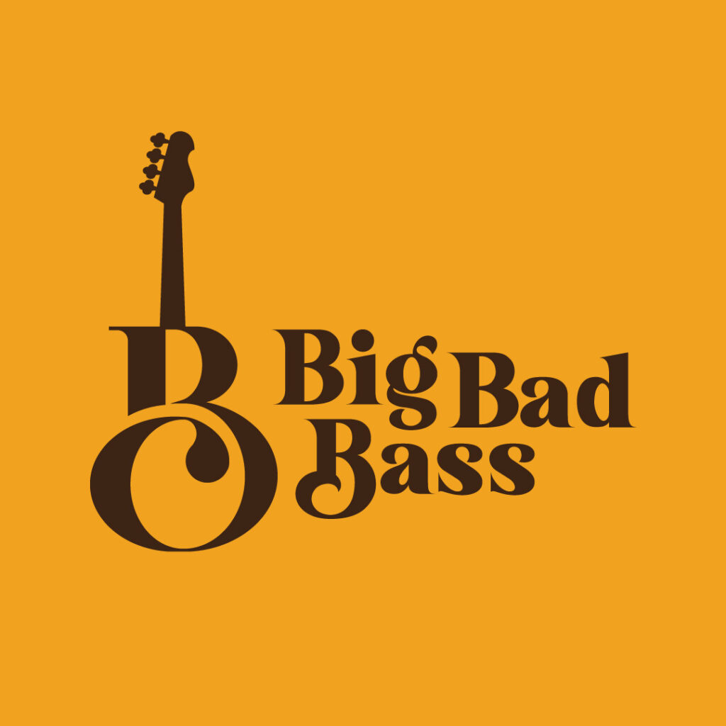
Getting creative with your company logo will ensure that your prospects will remember it the first time they see it. The Big Bad Bass logo is one such example. The unique incorporation of the bass guitar and the letter B is worth copying. The icon is scalable enough for any branding and marketing material.
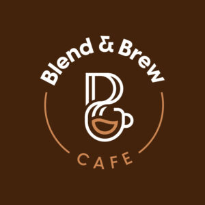
12. Blend & Brew Cafe
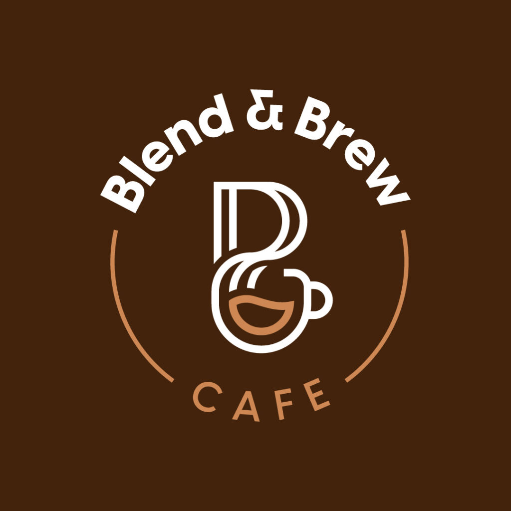
Creating a food-related logo that stands out could be as simple as this example from Blend & Brew Cafe. The stunning structure from top to bottom leads the eyes in the correct order. You’ll instantly see the most prominent information, the company name, the abstract icon of a coffee maker and mug, and finally, the word ‘Cafe.’
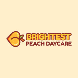
13. Brightest Peach Daycare

The design elements of your logo should reflect your brand identity. So if you’re catering to the younger demographic, vibrant colors make your logo playful and eye-catching. Brightest Peach Daycare is an example of a welcoming logo design, especially the unique B logo icon, which looks like a peach.
14. Bishop Consulting Services

Bishop Consulting Services’ logo exudes authority and trustworthiness. If you’re a neophyte in your niche, establishing credibility is crucial to make prospects choose your brand. This example is well-thought-out, with the letter mark symbol that can also be a standalone logo. Also, the simple font combination doesn’t complicate the overall logo design.
15. Buddy’s Bar
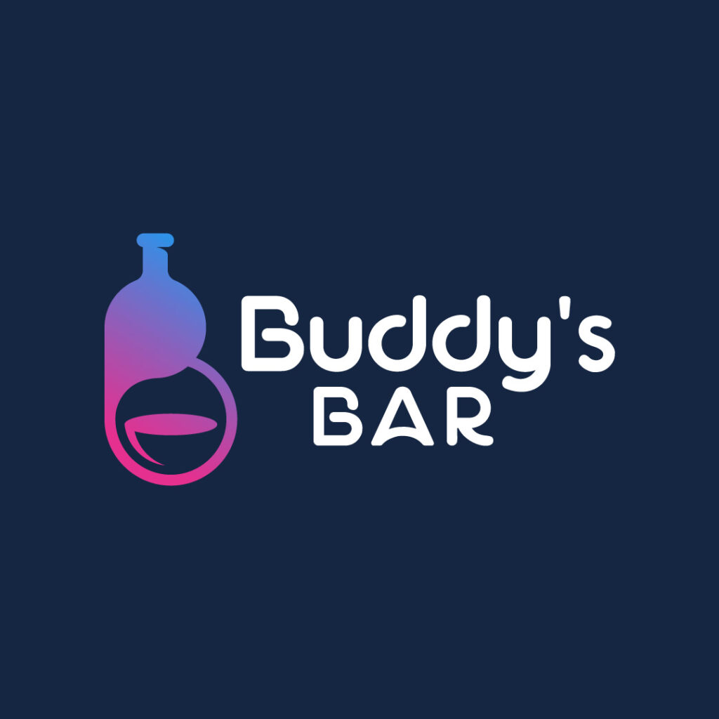
Integrating various design trends will make your logo a cut above the rest. In this example, the impressive combination of a bottle of alcohol and a cup at the bottom is worth noting. But the most interesting part is how it also doubles as a letter B representing the company name Buddy’s Bar.
16. Biofit Gym
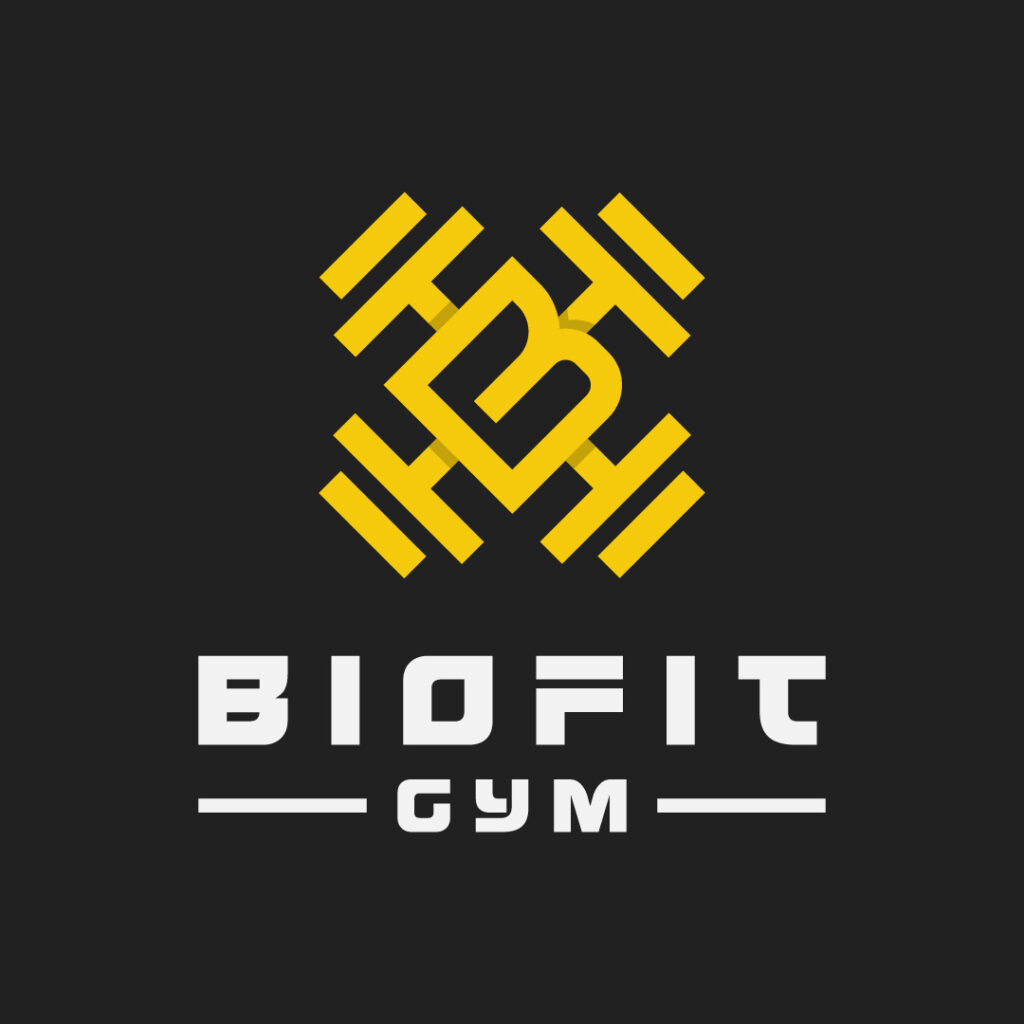
A company logo must tell prospects what the brand is all about and what products and services it offers. Biofit Gym’s logo does just that by displaying dumbbells sprawled across the letter B in the middle. The stylized font style is also a way to make this overall gym logo interesting.
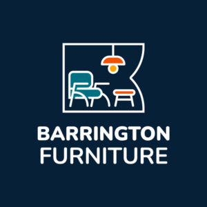
17. Barrington Furniture

For a furniture business, Barrington Furniture’s logo dons playful illustrations of furniture pieces. Although there are various design components, the overall image isn’t overwhelming. This symbol is also complemented by the sans-serif font style that shines in its own way.
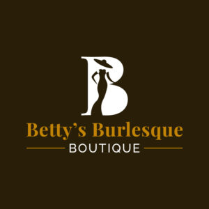
18. Betty’s Burlesque Boutique
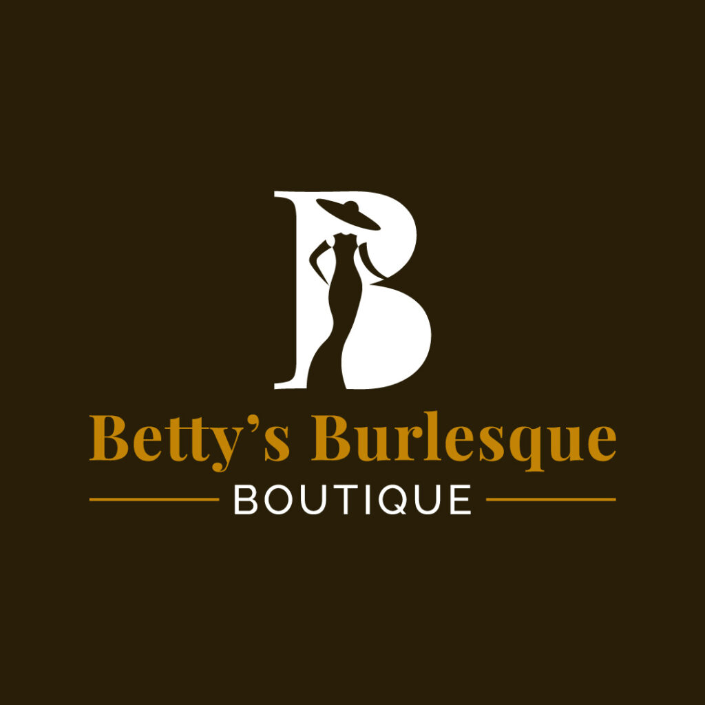
A brand that caters to the female demographic should also integrate feminine design elements. Betty’s Burlesque Boutique’s logo showcases a few, such as the silhouette of a lady in a long gown and hat, the elegant white letter B that serves as the background, and a more classic typeface.
19. Bytes IT Solutions
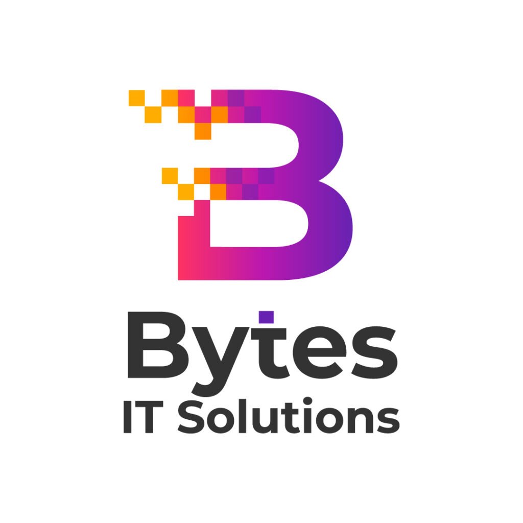
Bytes IT Solutions is a company that sells gadgets and offers repair services. The logo features the letter B logo design that looks somewhat pixelated. The overall design looks modern and apt for a tech-related company.
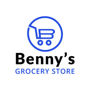
20. Benny’s Grocery Store

Incorporating appropriate and relevant icons will keep your design consistent when creating your company logo. Benny’s Grocery Store’s logo features a grocery cart that looks like the letter B. A circle encompasses the icon, making it versatile enough for any branding collateral, like business cards, websites, and catalogs.
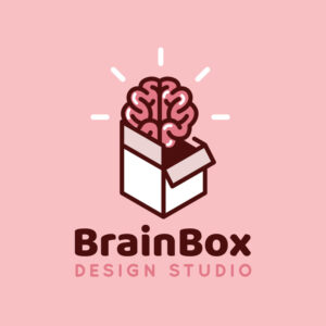
21. BrainBox Design Studio
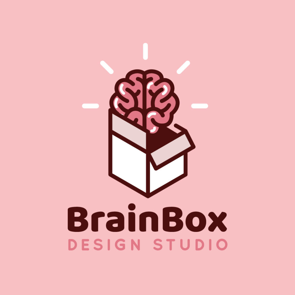
The illustration in this logo design is a representation of the brand name. A brain comes out of a box, apt for BrainBox Design Studio. The bold text combined with the light-faced typeface is also the most evident component of this design. Overall, the logo is simple yet impactful.
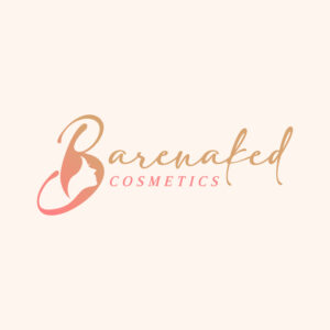
22. Barenaked Costmetics

Barenaked Cosmetics exudes nothing but sophistication and elegance. This logo design will undeniably make an impact, especially for a brand that sells cosmetic products. The letter B includes white space that looks like a woman’s face. The beautiful script font style is combined with a traditional serif font, making this design tasty and exquisite.
23. Boone Enterprise
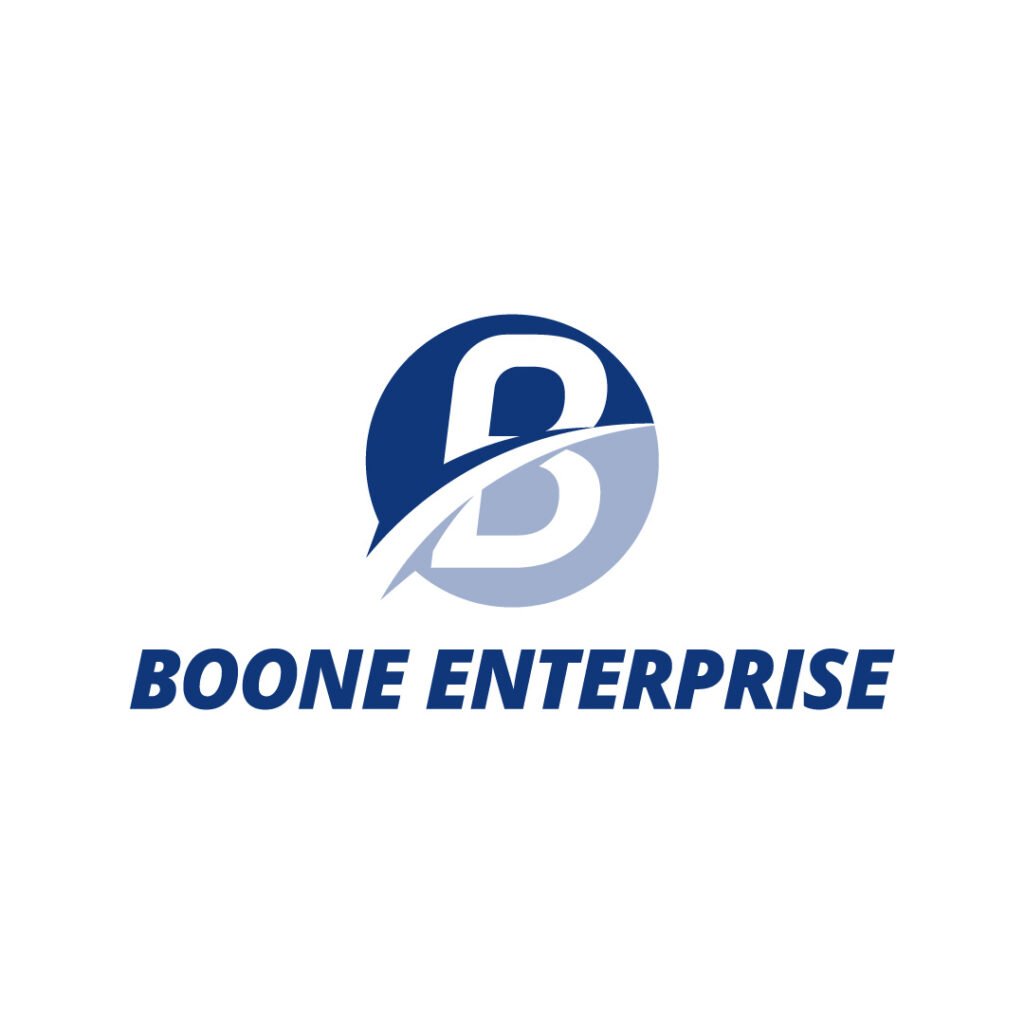
Boone Enterprise dons a simple and unique logo that will stand out from its competitors. Both the icon and text are excellent pairings that look good and legible on any branding and marketing materials.
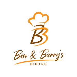
24. Ben and Barry’s Bistro

The Ben and Barry’s Bistro logo emanates a certain welcoming atmosphere that can potentially lead more customers through the door. The stunning overlapping B logo design is one that you must emulate. The script font combined with the simple light-faced sans serif font also takes center stage when you look at the logo design for the first time.
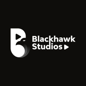
25. Blackhawk Studios
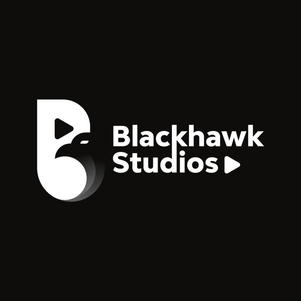
Blackhawk Studios is a recording company, and it shows in the logo. This logo design is commendable for a creative company that deals with music. The integration of negative space is worth noting as the “play” button pops out of the letter B icon. Another “play” button is displayed after the brand name to indicate branding consistency.
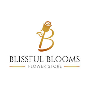
26. Blissful Blooms Flower Store
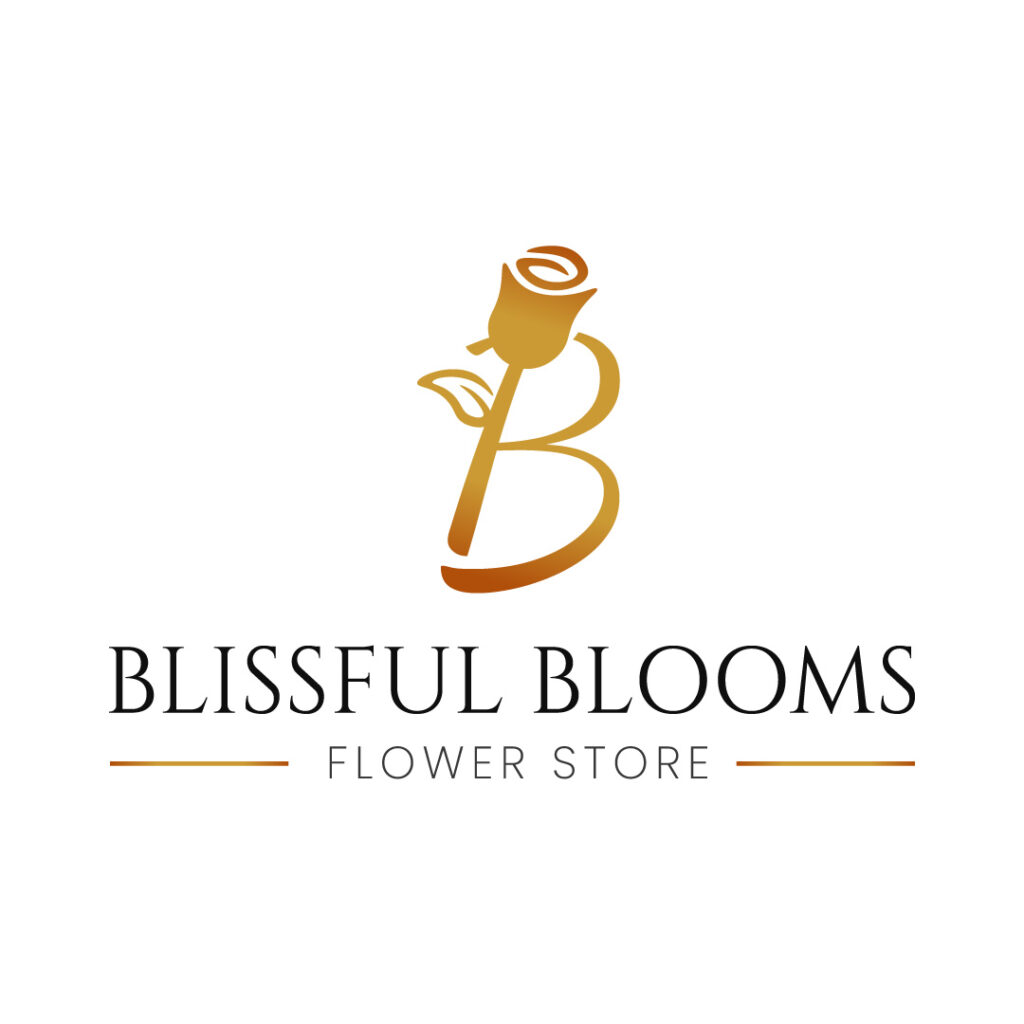
The unique symbol of the letter B and a rose serving as the letter’s spine is one that you must emulate. It’s a beautiful and innovative combination of the brand name’s initial letter and what the company offers.
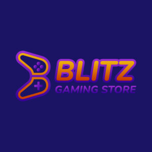
27. Blitz Gaming Store
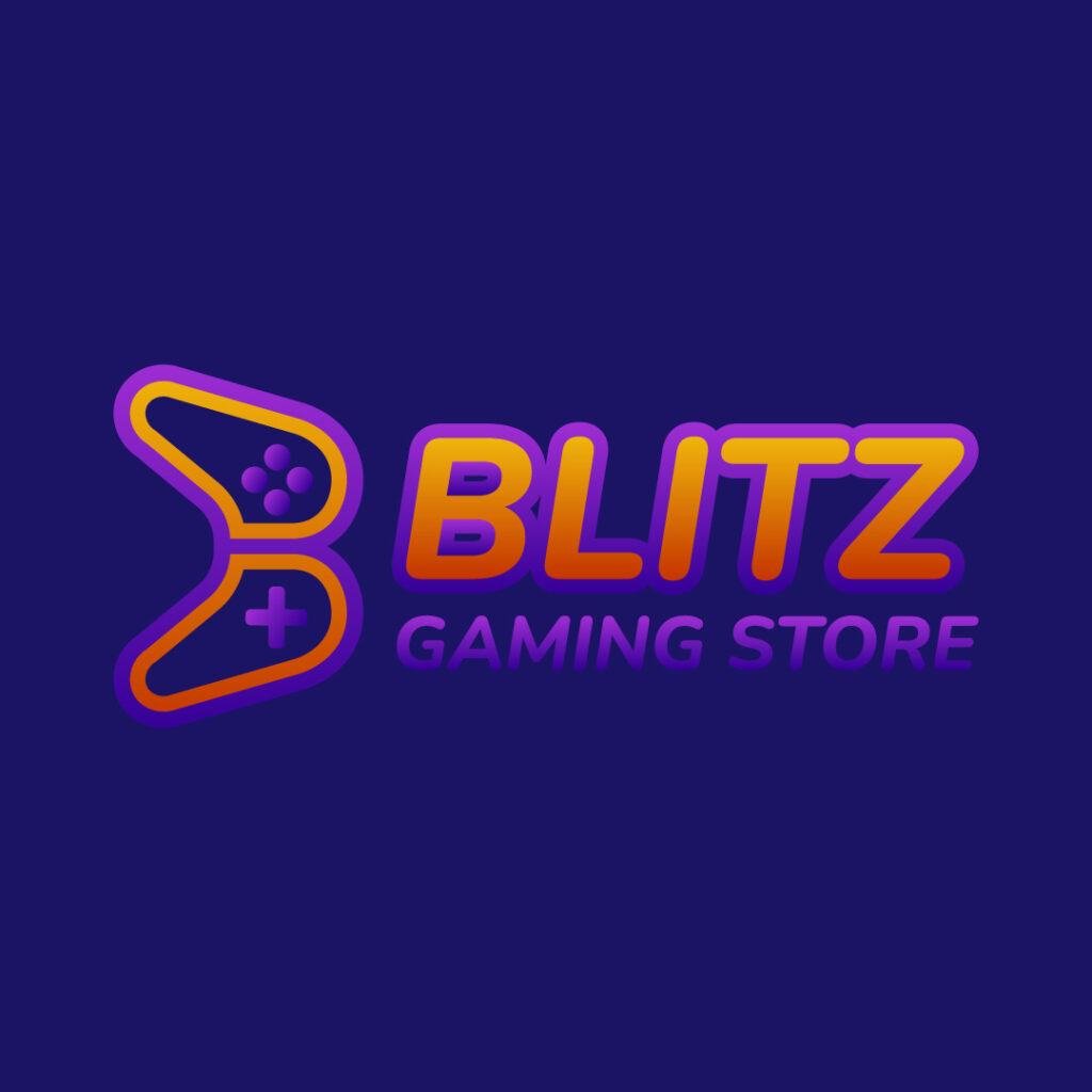
Nothing beats a gaming store logo than showcasing a gaming console front and center. The icon signifies what the company offers. Plus, the bold and bright font and the purple light-faced font are commendable.
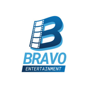
28. Bravo Entertainment

This is a film company that caters to film directors, project managers, photographers, bloggers, and individuals. The image of a film incorporated into the letter B is a smart way to tell prospects what the company offers. The hierarchy from top to bottom also keeps this logo design in cohesion with various design elements.
29. Blackstone Construction
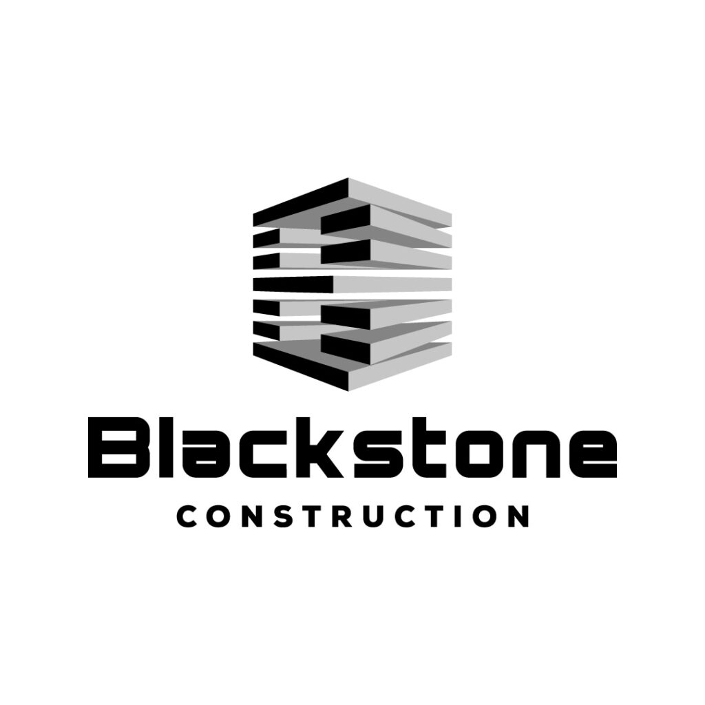
This construction company sets the bar in making logos visually attractive. The abstract design of a commercial building hooks the viewers’ eyes instantly. The grey and black colors on this logo design are also apt for a construction company.
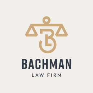
30. Bachman Law Firm
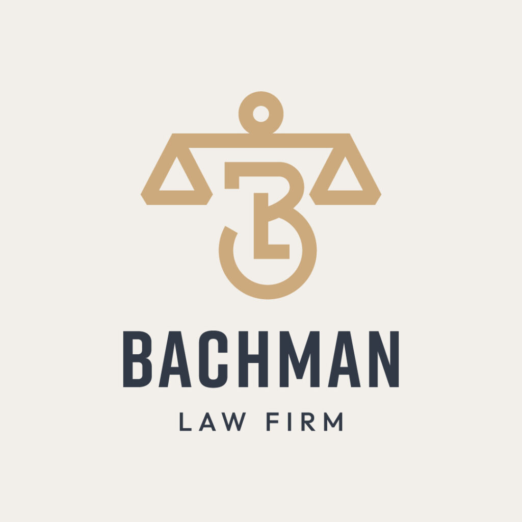
What better way to represent a law firm than featuring the scales of justice front and center? The gold symbol also creates contrast against the black text. Overall, this B logo design is timeless and creates top-of-mind awareness.
Conclusion
Now that you have ideas on how to craft your letter B logos, it’s time to create one that will cut across all audience demographics and psychographics. However, ensure that your letter B logo is a cut above the rest. Entrust the logo design process to professional logo designers who will give you a quality outcome. Work with Penji to experience hassle-free logo design using our bespoke design platform. Submit a design brief, and we’ll take care of the rest! Sign up here to get a 15-percent discount from your first month.
About the author

Table of Contents
- 1. Bandcash
- 2. Beard Care Brand
- 3. Bray Bull
- 4. Better Labs
- 5. Black Apparel
- 6. Build Buy Learn
- 7. Beauty Brand
- 8. Batanda
- 9. BarksBuster
- 10. Bearcat Affiliate Alliance
- 11. Big Bad Bass
- 12. Blend & Brew Cafe
- 13. Brightest Peach Daycare
- 14. Bishop Consulting Services
- 15. Buddy’s Bar
- 16. Biofit Gym
- 17. Barrington Furniture
- 18. Betty’s Burlesque Boutique
- 19. Bytes IT Solutions
- 20. Benny’s Grocery Store
- 21. BrainBox Design Studio
- 22. Barenaked Costmetics
- 23. Boone Enterprise
- 24. Ben and Barry’s Bistro
- 25. Blackhawk Studios
- 26. Blissful Blooms Flower Store
- 27. Blitz Gaming Store
- 28. Bravo Entertainment
- 29. Blackstone Construction
- 30. Bachman Law Firm
- Conclusion


