
A well-presented pitch deck can get you funding. But how can you make sure your startup is getting every dollar it deserves?
We have a full list of startups that got millions in funding. This could be you. WOW your investors with a well-designed investor pitch deck.
Need one of your own? Subscribe to Penji and you only need to worry about how to present your pitch deck.
Meanwhile, here’s our list of the 16 startup pitch decks that helped get startup funding.
1. Poshmark
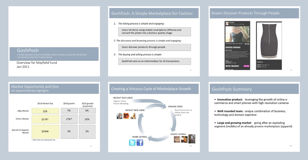
Before Poshmark became known as one of the leading marketplaces of all time, it was known as GoshPosh. And that’s what you’ll see in their investor pitch deck. Like most 2000s to early 2010s pitch decks, Poshmark’s version heavily used text boxes. It may appear dull because of the color scheme. But Poshmark was able to sway investors to invest in them and help them become one of the largest marketplaces.
The Result: Poshmark raised $3.5 million with this investor pitch deck.
2. Coinbase
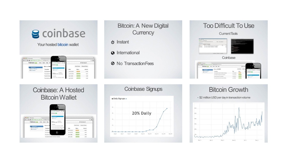
You don’t need to have an overcomplicated pitch deck design to woo investors. Coinbase went for a minimalist approach, relying only on images and graphs. Plus, they used text sparingly. But even without an explanation, you’ll have an idea of what Coinbase offers to its target audience and user base. With that said, Coinbase underwent six funding rounds and earned up to $100 million in Series D.
The Result: Coinbase raised $600,000 for their seed round.
3. Dropbox
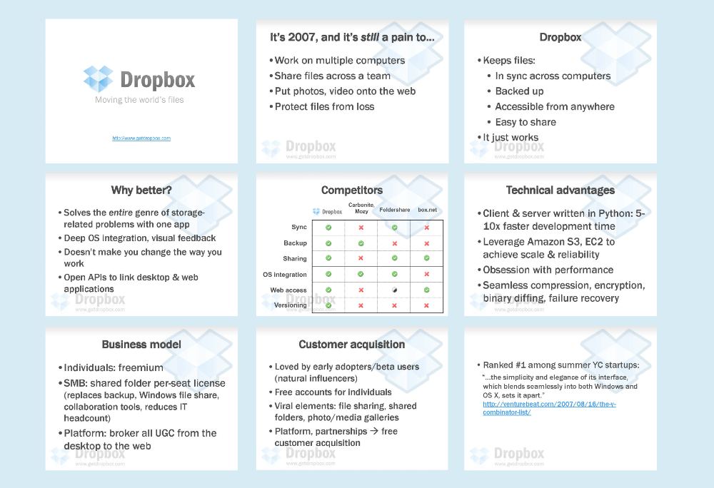
Dropbox, one of the largest cloud-based companies, received millions of dollars from investment company, Sequoia. Although their design may look outdated, they still kept it simple and straight to the point. This made it easy for investors to understand their business model and concept.
Result: Dropbox raised $1.2 million with this investor pitch deck, with Sequoia funding it.
4. Gusto
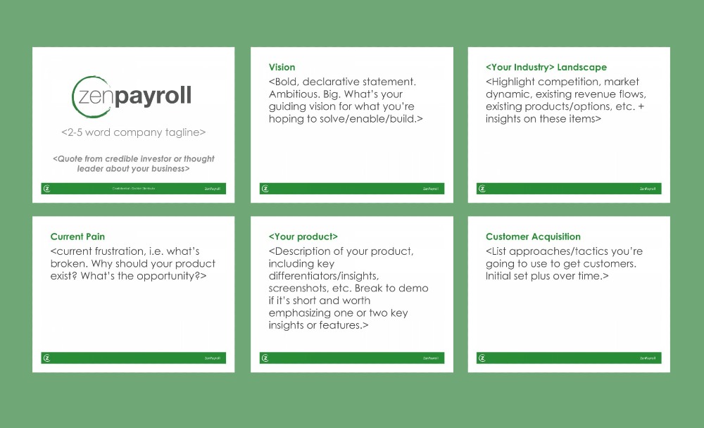
Even though Gusto (formerly Zenpayroll) posted the pitch deck template, they gave us a sneak peek of the pitch deck that got them funded. It looks like they weren’t big on photos, but their template indicates what the slides should contain. Thus, you get an idea of what they may have presented and know how they followed pitch deck standards.
Result: While we don’t get to see the actual pitch deck, they raised $6 million in funding.
5. Intercom
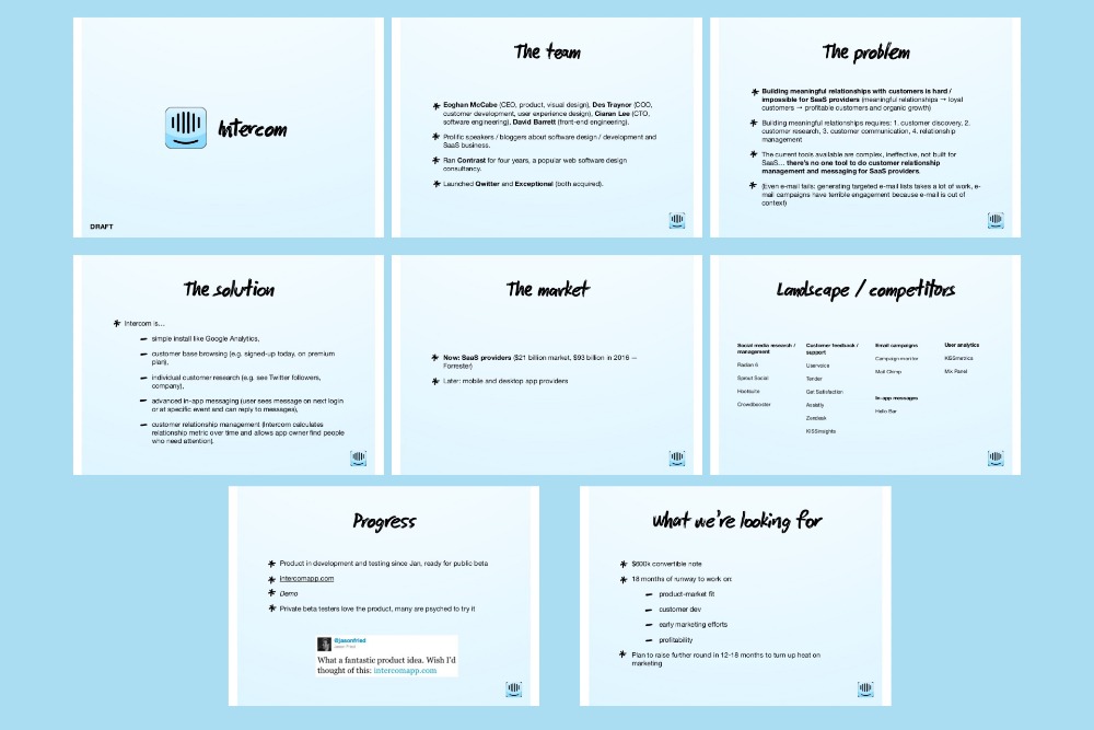
Here’s the short but sweet pitch deck from Intercom. They demonstrate you don’t need more than ten pages to get the funding you need for your startup. Though there’s no hard limit to the number of pages, it’s best to stick to the basics and get straight to the point. After all, you only get a few minutes in front of investors, so make it count with a few slides.
The Result: Intercom asked for a $600,000 investment which they received from that pitch deck.
6. Contently
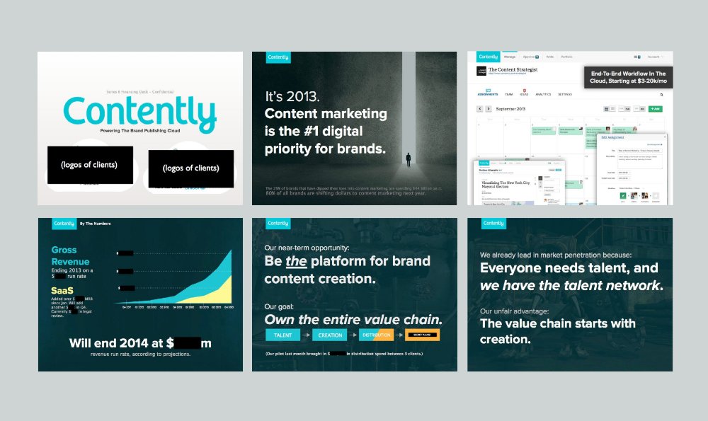
Let’s take a look at Contently’s pitch deck. While you want to personalize your pitch deck to different investors and clients, changing the logos on the title slide is the easiest way to do it. Plus, they could even use current client logos, which they could personalize depending on the investor or client they’re presenting to.
Shane Snow, Contently’s co-founder, shared with Business Insider that they created a pitch deck with a narrative in mind. And that’s one way you can organize your pitch deck to secure that meeting with investors.
The Result: Contently raised $9 million using this pitch deck.
7. Divvy
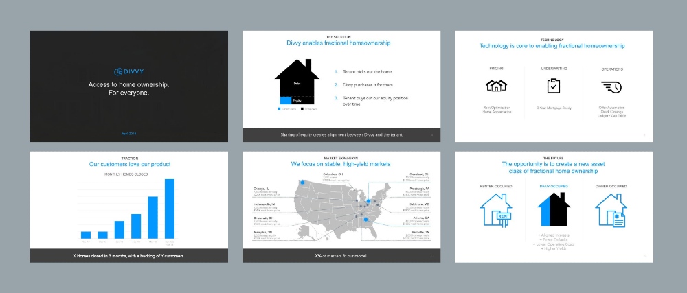
If you need a modern pitch deck design example, take a look at what Divvy presented that helped them raise millions. Professionals know that minimalism in website design is vital. However, the minimalist approach is also applicable to both content and pitch deck design. They made the pitch deck visual using icons and graphs, guiding investors to visualize some concepts. It’s one of the best pitch deck design examples on this list for its overall clean and minimalist design.
The Result: Divvy amassed a whopping $30 million for their Series A round of funding.
8. MySQL
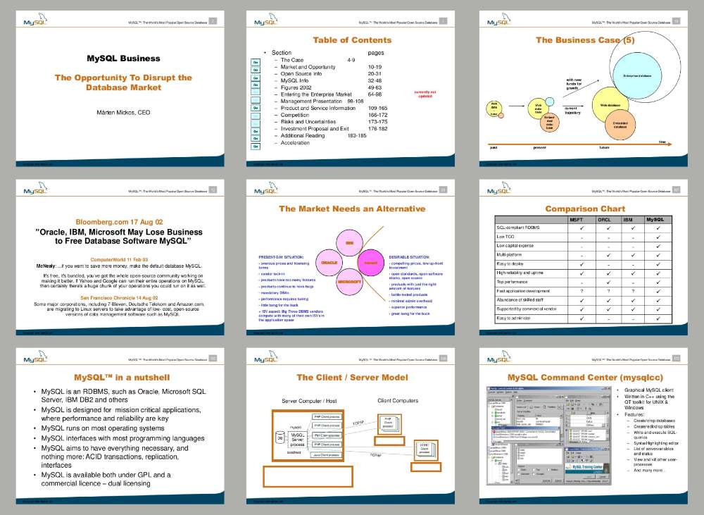
Even with the disclaimer at the start, MySQL’s pitch deck contains 186 pages. They’re very comprehensive, discussing every bit of MySQL to give investors an idea of this cloud-based software. You can learn from this pitch deck what details are important to add and details to omit.
The Result: This “condensed” pitch deck helped them raise $16 million for their Series B round in 2003.
9. Oscar
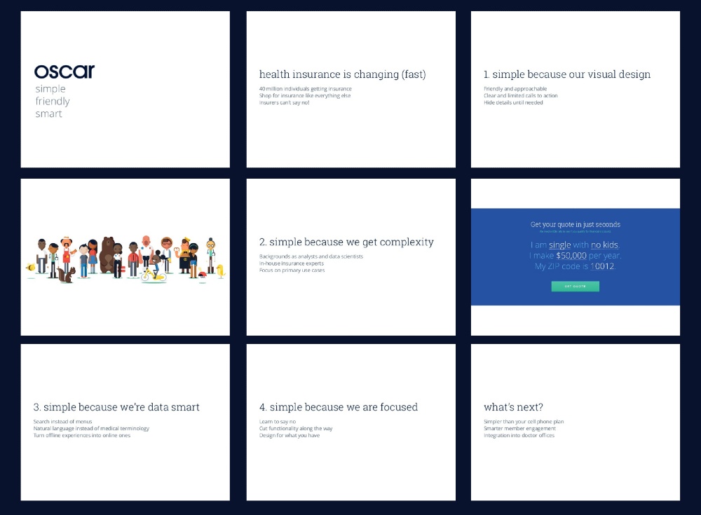
Here’s another modern minimalist pitch deck design to copy. While this may not have been the pitch deck that raised millions, its design and content are still worth noting. They exhibited the importance of showing website screenshots to present their solution, allowing investors to get a preview of what their site looks like. Plus, for slides with text, they made it consistent, from alignment to the headings and content.
The Result: Oscar eventually raised $225 million on their Series E round.
10. Brex
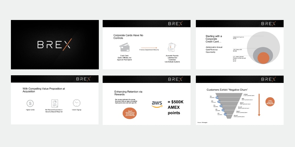
The Brex pitch deck design needs more polishing. Even Dubugras, Brex co-founder, admits they didn’t mind if they didn’t have the best pitch deck design. What matters is your messaging and how you present that to investors. It’s good that they tried to keep the slides simple. Plus, they ensured to add graphs and charts to emphasize their points, which was a contributing factor to their funding.
The Result: Brex raised more than $50 million from Y Combinator and Peter Thiel.
11. Transferwise
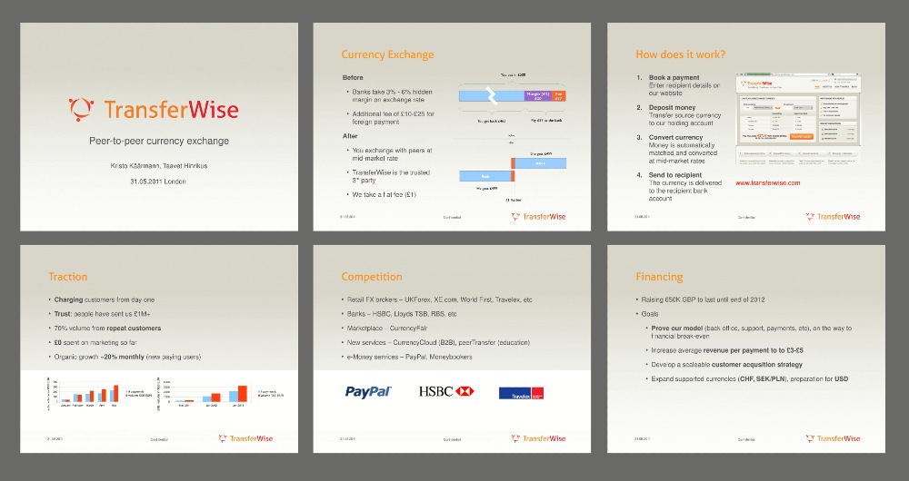
Finance startups are numbers-focused and may have to be technical. And when you see the Transferwise investor pitch deck, you’ll see that. Even so, they backed their information with graphs. Not only that, they presented a “How it Works” section, which is something you usually see in websites. Plus, the information won’t overwhelm you because the slides look structured and organized.
The Result: The pitch deck helped them raise $1.3 million on their seed round.
12. Sendgrid
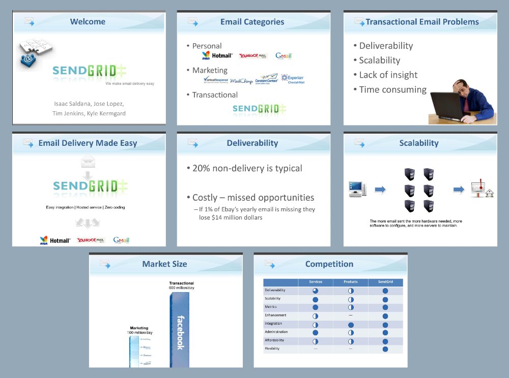
Here’s another startup pitch deck that would look outdated by today’s standards. But, Sendgrid’s pitch deck is easy to understand and follows the standard pitch deck. They went over the 10-slide rule, but it was necessary to go over the limit to explain what makes their software worth investing in.
The Result: Sendgrid raised $750,000 on their seed round.
13. Revolut
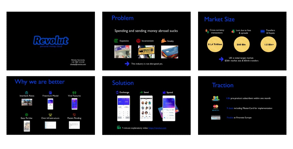
Revolut follows the standard 10-slide pitch deck to convince investors to fund their startup. Since it’s also a financial service, Revolut puts numbers at the forefront. The design is not the best out there. However, it’s organized, and it doesn’t confuse the reader.
The Result: Revolut secured a £1.5 million funding on their seed round.
14. TalkDesk
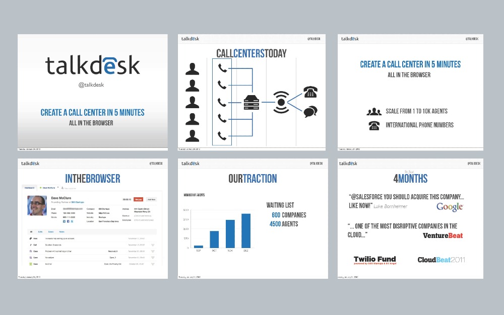
TalkDesk’s pitch deck isn’t heavy on text, making you wonder what the icons represent in the first seven or eight slides. This could intrigue investors and might get you a slot for a meeting. Plus, they used screenshots of their site with added text bubbles to identify several elements of their website. If you plan to use this as inspiration, you could add more context to the slides by providing further explanation on some concepts.
The Result: Even if they limited the use of text, TalkDesk managed to raise $3.15 million on their seed round.
15. Mint
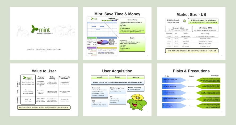
Here’s another investor pitch deck that shows their age in terms of design. It may not be eye-catching, but Mint’s pitch deck squeezes all the essential details in a few slides. Plus, it’s also a no-frills pitch deck, which you can copy and improve further.
The Result: With the help of VC funding, Mint raised over $30 million.
16. Nuvia
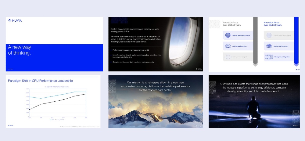
Nuvia went for a technical approach, considering they’re a chip design startup. However, they didn’t overload investors with too much information and kept it simple. Overall, the pitch deck is clean and easy on the eyes.
The Result: Nuvia raised $240 million in funding with this investor pitch deck.
Need a pitch deck?
Stop wasting time and effort pitching to investors with a lousy pitch deck. Make the big day count by showcasing an impressive investor pitch deck done by professional graphic designers.
Your search for a quality and inexpensive design service ends here. Penji offers unlimited designs for a flat, monthly rate. Subscribe to Penji today and get 15% off your first month.
About the author

Katrina Pascual
Katrina is a content writer specializing in graphic design, marketing, social media, and technology. In her spare time, she writes monthly personal blogs to practice her craft.


