
Illustrations have the uncanny power to reimagine reality in such a way that it becomes more charming and extraordinary. If bringing life into your product is your ultimate goal, stock images won’t help you achieve this. Penji has an on-demand team of artists that can create and knows how to use illustrations to convey your brand message. Meanwhile, here’s how to use illustration in your design projects and some principles to consider during the process.
Companies that Successfully Used Illustrations
See for yourself how cool illustrations can liven up any brand or product. Learn from these companies that knew precisely when and how to use illustrations:
99u
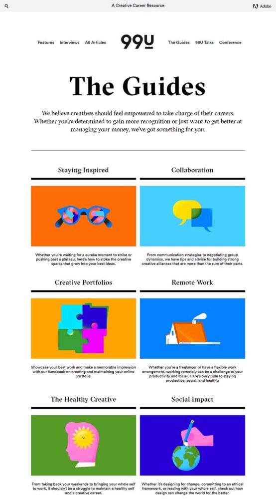
Adobe’s 99u, a resource for creative careers, uses eye-catching yet straightforward illustrations on its website. Unfortunately, illustrations won’t work for every single product out there. It has to fit the specifications and nature of the product. A government agency or a hospital may not be the most appropriate place to use them. However, for Adobe’s 99u, it’s more than suitable.
Dropbox

Illustrations are a great way to capture a brand’s values and traits. This is exactly what Dropbox did. The image above of a page from their website shows how dynamic and upbeat the brand is. The colors are perfect for making an impact, mainly since the page describes what Dropbox is about.
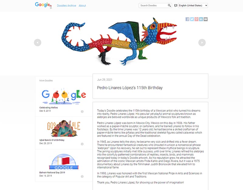
Google features Doodles as part of its efforts to celebrate significant events around the world. These illustrations are sometimes interactive and animated, but all in all, they are engaging, appealing, and enjoyable. The trend started in 1998 with Larry Page and Sergey Brin (Google founders) designing the first-ever Google Doodle. It was the catalyst that made Google Doodles possible.
WeTransfer
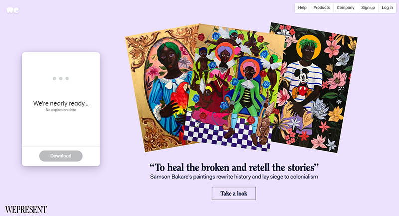
When sending large files through WeTransfer, you’ll be entertained with beautiful illustrations on the download page. Their product is a complex idea, and using illustrations is an effective way to convey something intangible. Not only does it enhance the user experience, but the illustrations also make the website all the more memorable.
Headspace
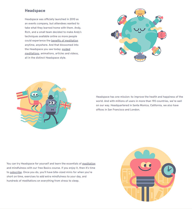
Impressive, consistent, and delightful are the words that come up when you look at Headspace’s website. The simple blue and orange color scheme gives the illustrations contrast, while the smiles on the characters’ faces give it that human touch. This gives users the impression that the app is ideal for anyone and everyone who wants to achieve a high level of mindfulness.
Illustrations That Breathe Life to a Product
Now that we got you convinced of the power of illustrations, here’s how you can use them to bring life into your product:
Convey an Abstract Idea
When your product is complex and can’t easily be explained in text, illustrations are just what you need. If photographs or any other visuals can’t sufficiently describe an abstract idea or concept, an illustrative treatment is the trick. The WeTransfer example above best demonstrates this.
What you can do is use metaphors. This can connect an intangible thought to something concrete. A good case in point is when you need to describe the word productive. To illustrate it, you need to think about something tangible, such as ticking items off a to-do list. Take a look at what Slack did to show how “Working Transparently” looks like:

Image Credit: The Design Genome Project
Another scenario is when you’re offering website customizations. You can get a photograph of someone painting a computer screen, but illustrating it will be more appealing. Illustrations can evoke strong emotions to your product’s success which photographs, much less stock images, can never rival.

Aside from scenes like that from the above example, illustrations are also excellent in depicting characters and processes. Intangible concepts such as that of a company’s advocacy, such as sustainability or women empowerment, can be challenging to portray. Thus, another reason to use illustrations. Here’s how Etsy illustrated sustainability in one image, without making it too complicated.
An Idea That’s Too Grandiose for Photographs
For startups and small businesses, illustrations can level the playing field. If you want your imagination to run wild in your product designs, illustrations can help you do it. And this you can do without breaking the bank. As you know, hiring photographers means paying steep professional fees.
Take a look at an image photographed for Hermes Air de Paris. The high-end fashion industry almost always comes up with unconventional photography. This is an artwork from a collaboration of high-caliber agencies, art directors, and photographers. Needless to say, this is a costly endeavor.

Image Credit: Hermes
Illustrations let you depict anything that comes to your mind. Surrealism, sci-fi, futuristic, and many others are genres that can’t possibly be created with a camera. This illustration from Jeep is minimalistic in its approach yet so big on impact. Unlike the example above, this requires no models, animals, and exotic backgrounds to be effective.

Image Credit: Jeep
Tell Your Story
We all heard how storytelling could be the key to promoting a product or brand effectively. It’s no longer a buzzword but rather the norm if you want engagement and get your message across. Because of this, a compelling narrative using custom illustrations is the best route to take.
“Discover the Full Story” was a campaign designed by Saatchi & Saatchi Russia for the Shchusev State Museum of Architecture. The objective was to show people that there’s more to the museum than what meets the eye. The illustration takes viewers on a journey by opening their imagination to something that has yet to be seen.

Image Credit: Saatchi & Saatchi Russia
Data Visualization
To explain a complex set of information, an infographic is what you need. Not only do they make data easily digestible, but they’re engaging as well. This is especially helpful if you have a product that needs visualization for consumers to understand its use or features fully. Better yet, use illustrations to show company milestones such as sales figures or growth percentage. It’s also a great strategy if you want your brand to be more memorable to consumers.
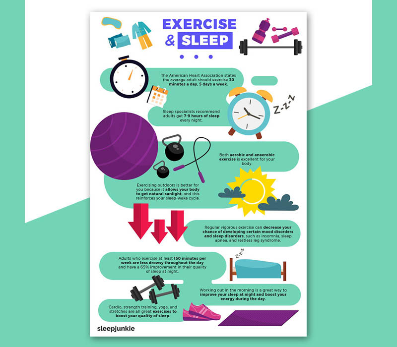
Illustrations can help discuss an intricate idea that a block of text won’t do by itself. The above example is taken from Penji’s portfolio of previous works. Infographics have taken center stage in recent years because of their ability to get the point across efficiently. And from experience, one of Penji’s most requested designs is infographics.
You’re Creating a Unique Look for Your Product
Creating a trademark look for your product is a great way to differentiate yourself from the competition. While photographs can give you the specific style you’re gunning for, they can never be as expressive as an illustration. In addition, a photoshoot with pro photographers, art directors, and other artists can be quite draining financially. Besides, illustrations give you more flexibility and don’t have limitations.

Image Credit: Audiobooks
In the illustration above, Audiobooks perfectly summed up their image and their purpose in one eye-catching artwork. This is the exact scenario where a photographer won’t be able to do what illustrators can.
Illustration Principles to Follow
When illustrating for products, there are some principles that you can live by to get the best for your brand. These are:
Form Follows Function
Function is deemed more valuable than form in most cases. As with any business, a good user experience is what you should be aiming for. So, favoring purpose over aesthetics should be the order of the day.
Illustrations can beautify your product, website, or social media platforms, but make sure that they are there for a reason. Make sure the illustrations guide the users to what they’re looking for, if they’re browsing your app. Keep it general and self-explanatory. Don’t use illustrations purely for decorations only. Otherwise, they’ll distract people from the main star of the show: your product.
Aim to Delight
User experience is paramount to any business owner. Most of your efforts should aim to delight your customers and make them come back for more. Make sure that your illustrations provide a positive one for them. After all, illustrations are naturally lighthearted and cheerful.
Knowing how to use illustrations can help you help them. Positivity in your imagery can help them understand your product better. A great user experience will lead to business growth and, ultimately, success for your brand.
Be Mindful
When creating illustrations for your product, be mindful. A thorough understanding of your target market can help you do this, but having an overall consideration for all is ideal. Being respectful of all races, genders, religions, and many other factors shows that you’re a brand people can trust.
Asking yourself questions such as does this promote diversity? can help you determine the correct route to take. For instance, if you’re catering to a vegan audience, displaying illustrations of meat products surely wouldn’t appeal to them.
Always Be Consistent
Once you use illustrations for your product, make sure they’re consistent. Your illustrations will represent your brand, and inconsistencies can diminish credibility and trust. If your illustrations are lacking in quality, consumers may perceive this as definitive of your product.
Choose a style and use it across the board. If you opt for a surrealistic approach, ensure that you use it everywhere you need to. You can add a unifying concept that will tie it all down to make every aspect work as one.
Don’t Forget the Technicalities
Creating illustrations can be an immersing task. However, don’t forget that there are technicalities involved in the process. Consider where you’ll place the illustrations and how people will view them.
Think about screen sizes, orientation, colors, and many other minute details that are easy to overlook. It’s even recommended to take care of these before starting on any illustration project. This way, you’ll avoid making mistakes before they even happen.
Don’t Overdo It
Illustrations are great aesthetic pieces, but only when done in moderation. Use careful planning and strategies to ensure that you’re not stuffing your website or app with too many illustrations. Doing this can clutter your users’ views and can get them to turn away.
In times like this, white spaces are a tasteful addition to your website or app. It creates balance and is more visually satisfying. At the same time, be mindful of your illustration’s placement. Think of how you can lead your consumers visually.
Learn to discern between critical moments and situations when to use illustrations. This will help avoid oversaturating everything with them. Remember, the objective is to bring life and not the opposite. So remember to create a focal point, and add subtle background elements to liven up the subject and freshen up the overall concept.
Final Thoughts
Custom illustrations are a great way to shape how your customers see your brand. Knowing how to use illustrations and the right situations to do so can be beneficial to a business. While they aren’t the end-all-be-all of business success, they can help you get there.
When in need of a reliable and affordable illustrator, look to Penji for help. Our team of professional illustrators can create a wide variety of genres for your brand. Watch our demo video here to learn more about it.
Better yet, sign up today to start giving life to your product through Penji’s custom illustrations.
About the author

Celeste Zosimo
Celeste is a former traditional animator and now an SEO content writer specializing in graphic design and marketing topics. When she's not writing or ranking her articles, she's being bossed around by her cat and two dogs.


