Your website’s homepage is the gateway to more information about your products and services. That’s why it’s important to spruce up your homepage so visitors can browse your website and end up being customers or leads. Unfortunately, Hubspot found that 90% of visitors will leave if you have a poorly-designed website. One way to avoid that? You can find a designer to produce a beautiful homepage design that you and your website visitors will love.
But, if you don’t have a vision of what you want your website’s homepage to look like, here are 25 homepage design examples to inspire yours.
1. Faune-Bijouterie
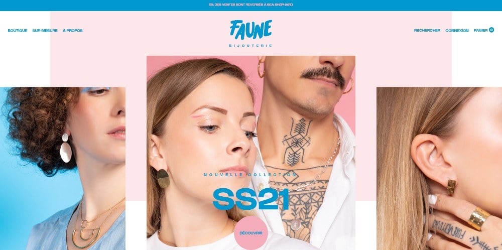
This homepage design not only uses one, or two but three hero images. It’s a great way to showcase your products. Apart from that, the call-to-action (CTA) and headline appear in the middle part of the hero image. Plus, the CTA button is a circle, which can become more memorable for visitors than the standard rectangle or rounded one.
2. Immi
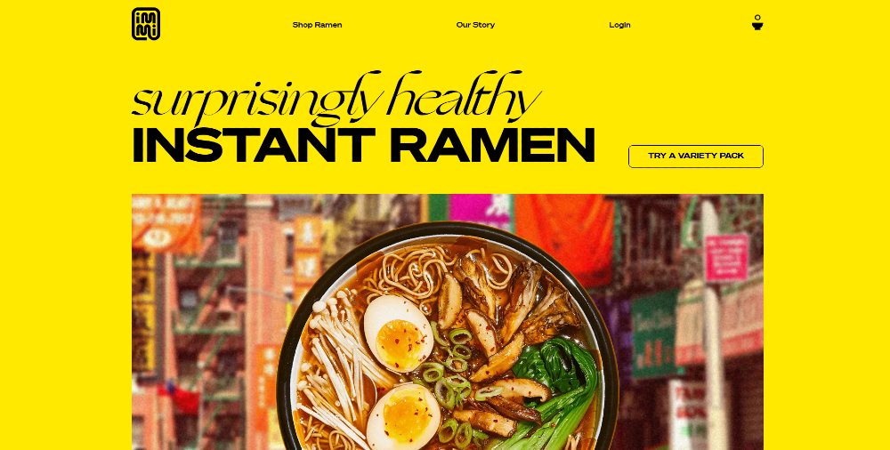
This one from Immi reshuffles what a usual homepage or landing page would look like. The headline and CTA appear on top of the delicious-looking bowl of ramen. But the whole bowl isn’t shown above the fold, making the visitor scroll down. This will enable them to learn more about the product.
3. Forge
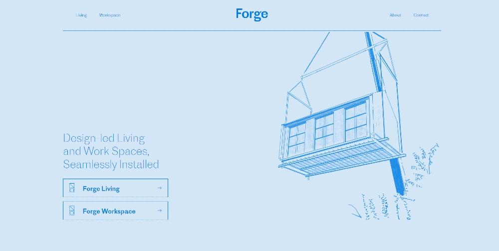
This one-page homepage design takes a minimalist approach. The motif is similar to a blueprint, which relates to the services offered by Forge. Other than that, a visitor that stumbles upon this can choose between living or workspaces, depending on their needs. Plus, if you click on the illustrations, you get an idea of how they set up the property.
4. Oui by Jean Dousset
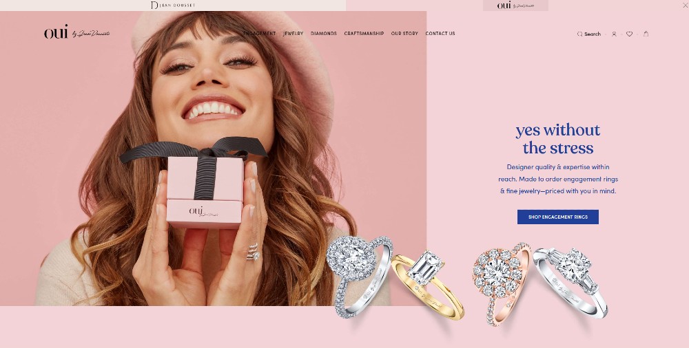
Since asymmetry is still a graphic design trend, this site makes asymmetry pleasing to the eyes. One, they used a high-quality hero image that will put a smile on your face. Two, the rings at the bottom right look so realistic; you want to get one for yourself. With the rings in mind, you can finally browse for more engagement rings to look at.
5. Karst
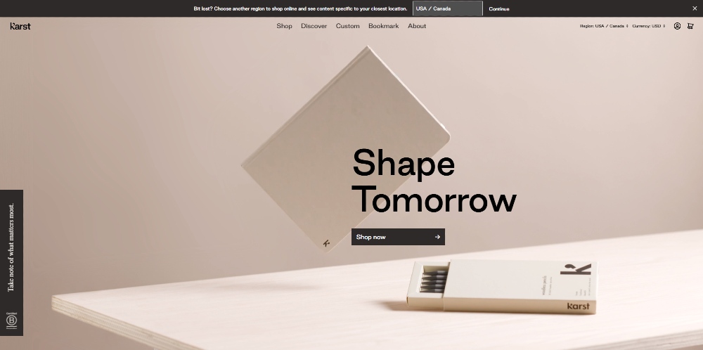
You can keep your homepage design as simple as this one from Karst. A floating version of their journal will hypnotize you, leading your eyes to the headline and CTA. And if you want to pique visitor interest, you can apply the click-and-slide button on the lower left of the screen. They add more information about their product, and you can click on the CTA button inside it.
6. Lucid Motors
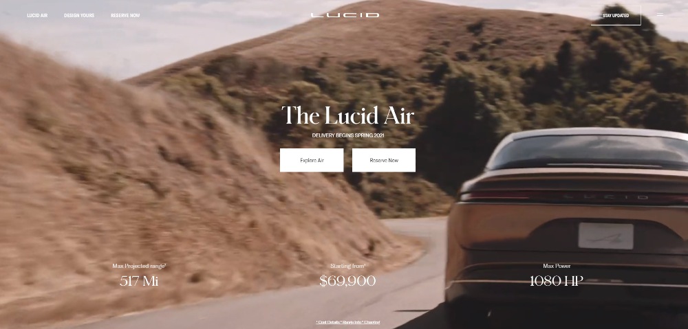
The Lucid Motors homepage design demonstrates the power of video. Once the visitor gets a preview of the car being driven, they can learn more about the vehicle or immediately reserve one if they’re convinced. Apart from that, Lucid Motors also provides information about its horsepower and price before potential buyers can purchase one for themselves.
7. Overpass
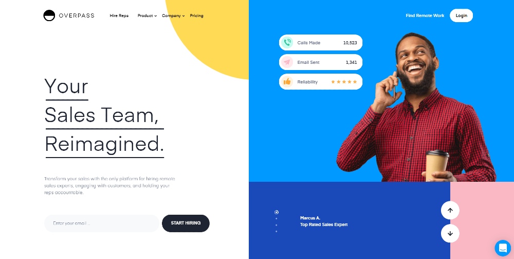
The design above the fold will intrigue you because of its website structure. It’s like two different websites in one, but that’s the point because it caters to two target audiences. One is for employers, while the other is for remote workers. You can expect the target audience to interact because of the signup option for employers. Plus, remote workers can browse other sales employees before finding employment as well.
8. Mox
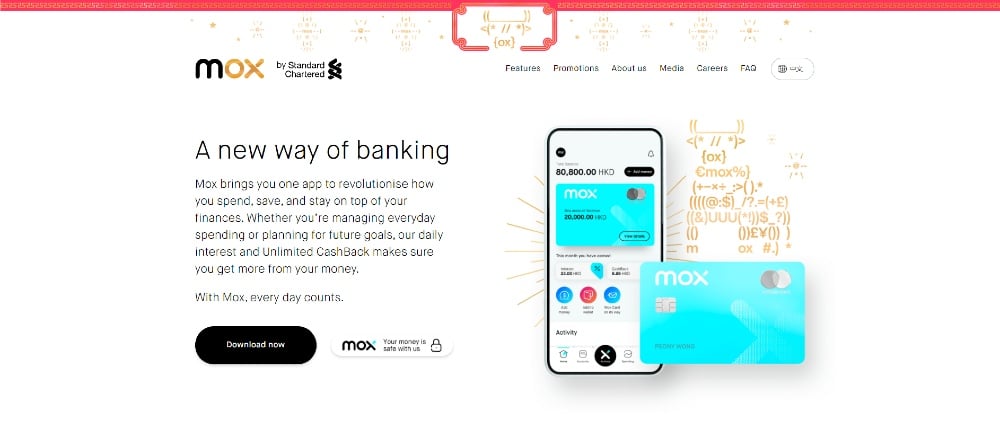
Possibly celebrating the Year of the Ox, the Mox homepage design integrates an ox on the hero image. There’s also an ox image in special characters at the top middle part of the page. Aside from that, visitors get a preview of what the app looks like. It’s great to have that so potential users can decide if they want to download the app or not.
9. Clearwater Agency
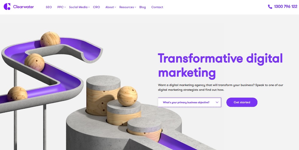
Web design experts would say to get straight to the point. This means you want a straightforward homepage or landing page. But the Clearwater Agency utilizes a dropdown box above the fold, which is a rare occurrence. It’s an excellent way for visitors to choose what they need from the agency and fill out a form to talk to one of their experts. You can convert visitors into leads in two clicks without leaving the homepage.
10. Persoo
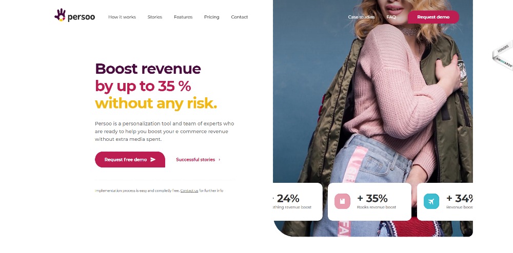
The Persoo homepage design uses a split-screen and double option CTA. Plus, it has a twist on the carousel. Instead of using arrows to show a new image and headline, this one uses button cards. Once clicked, the image will change, but according to the background of the icon.
11. Marqeta
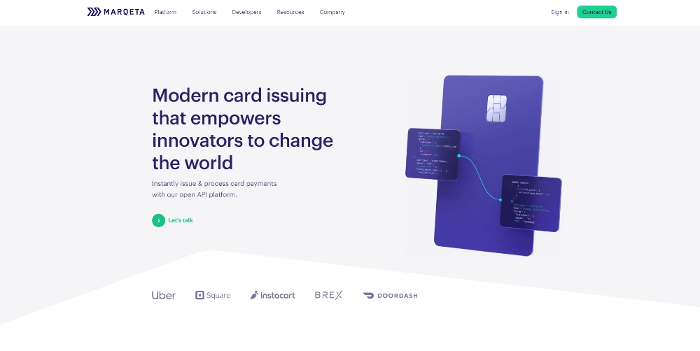
In one hero image, Marqeta summarizes what their company is all about. It aims to target developers that may have to start a card program for a company. Another thing to note is the CTA, which is a color in contrast to the hero image.
12. Victrola
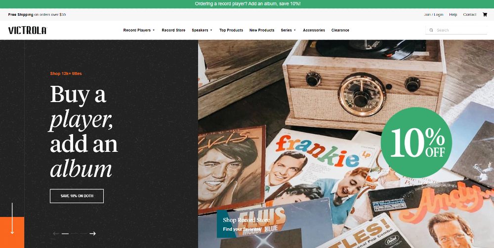
The Victrola homepage design combines both split-screen and carousel. By combining them, it may allow the visitor to get an idea of their bestseller items. Plus, they could avail of promos too.
Another key point to notice is the navigational cue. Usually, it’s placed in the middle of the screen. However, this one’s on the lower left, with an orange rectangle. It can be useful when a visitor wants to browse more rather than click on any of the CTA buttons above the fold.
13. Body by Simone
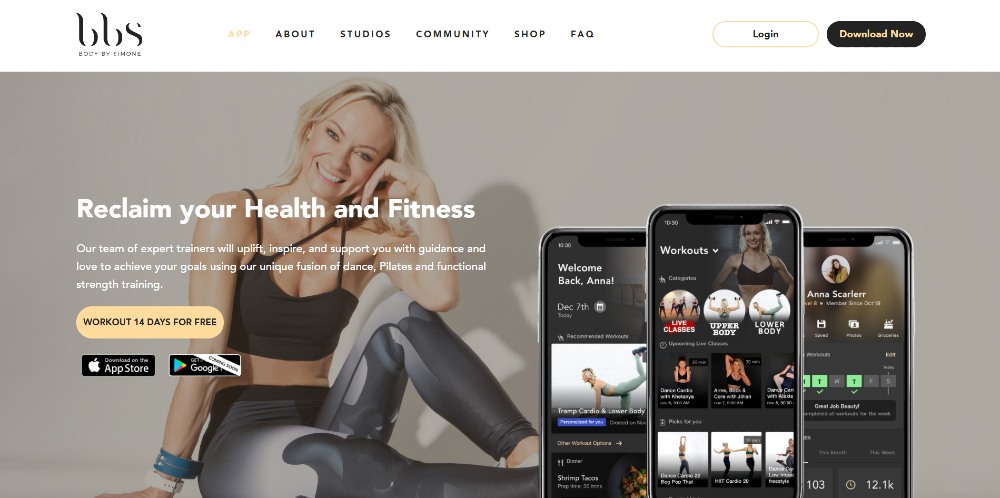
One of the best practices in landing page or homepage design is to use high-quality hero images. It’s much better if you use your company’s photos or videos, and this one from Body by Simone uses the founder as the hero image. Aside from that, there’s a preview of what the app looks like before you decide on downloading it. Plus, the “coming soon” ribbon on the Google Play store button is a nice touch because Android users will know that the app isn’t available for download yet.
14. Sweet Mae’s Cookies
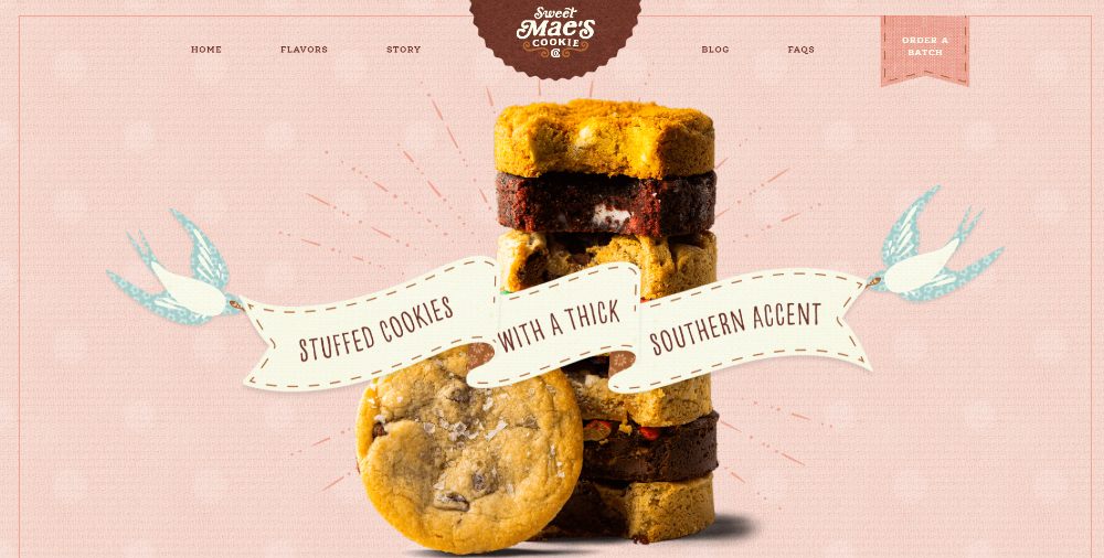
This homepage design will make you crave cookies, and consider ordering a batch of cookies to try at home. Their mouth-watering cookies take center stage, making you drool and hungry. Not only that, the CTA button is at the upper-right hand side, allowing the cookies to get the spotlight all on their own.
15. Frederick Benjamin
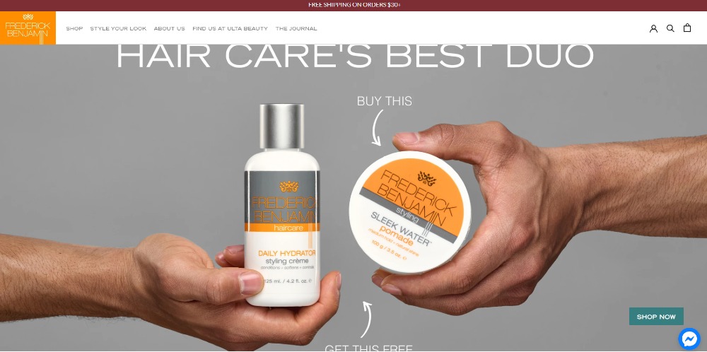
You’ll rarely see arrows pointing to the products as it’s implied you’re promoting them. This one from Frederick Benjamin clarifies that you get a different item for free if you buy one of the products. The arrows then make sense in the homepage design. Apart from that, as the visitor processes the hero image, the Shop Now CTA is located at the lower right, which isn’t a typical placement. However, it still works because of the contrasting color.
16. Hungryroot
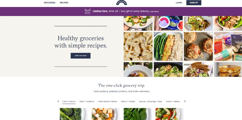
This website’s split-screen design will make you hungry and get you to take a quiz. By showing various products, visitors will know what recipes they can conjure up based on ingredients they sell. On the other hand, if visitors click “Take the Quiz,” they will get a gift. It can become an effective way of converting a visitor into a customer or lead.
17. Estrid
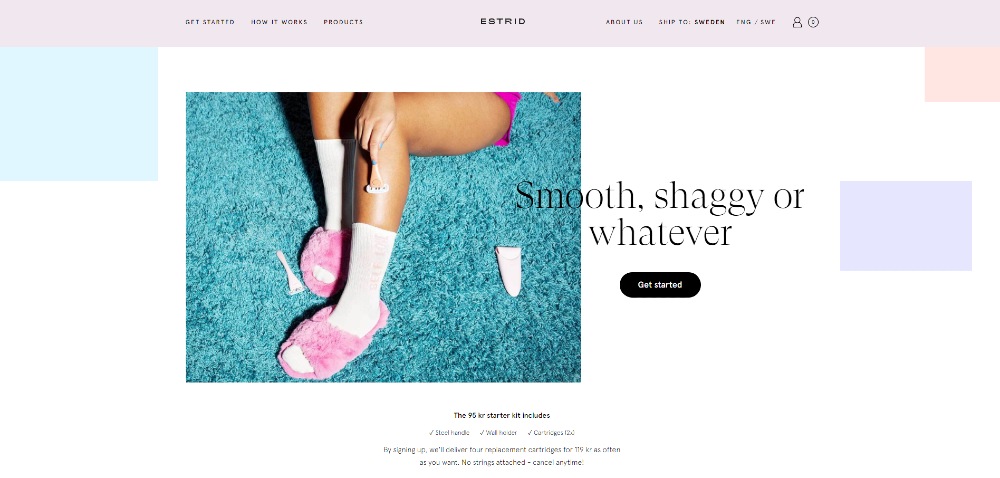
Once again, asymmetry continues to dominate in website design. Estrid follows the graphic design trend and even uses rectangles to add color to the homepage. It’s a plus they added a copy of the starter kit and the cancellation guarantee, which may entice the visitor to click Get Started.
18. Keeps
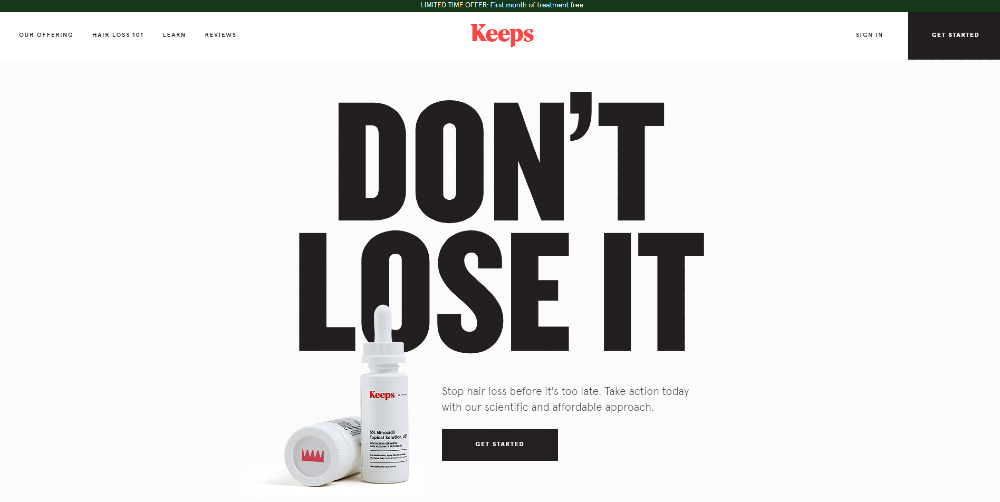
Big fonts can help glue your visitor’s eyes to the screen, like this one from Keeps. The headline is a play on the branding too. Plus, it uses whitespace effectively, directing your focus only on that part of the homepage.
19. Goodmylk
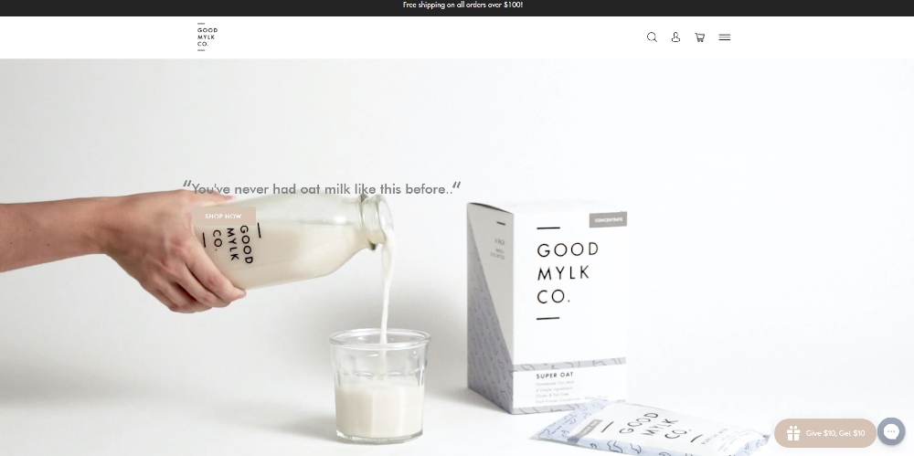
Instead of opting for sales-related headlines, they used customer’s words to try and entice the visitor to Shop Now and try the product themselves. Plus, the pouring of milk in the glass is a nice touch. It makes you want to grab the glass and drink oat milk.
20. Geologie
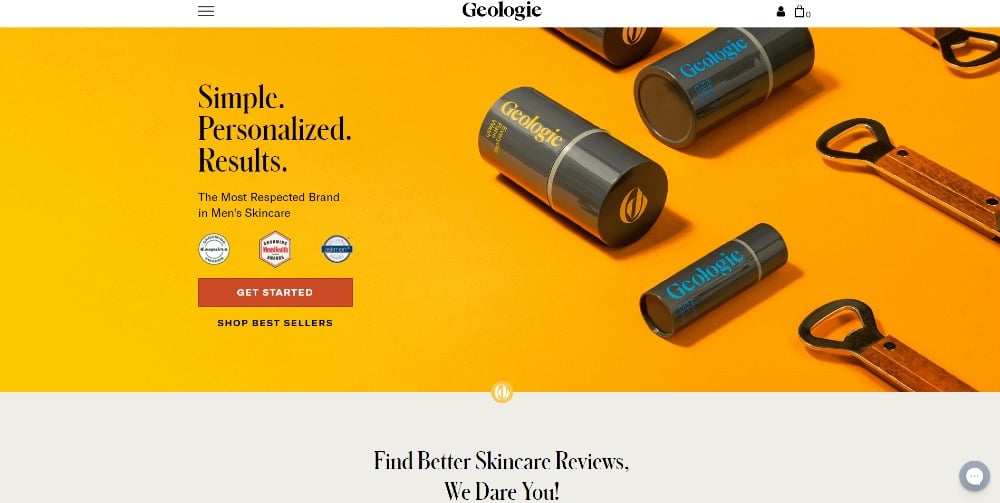
If you want to raise your company’s legitimacy, you need social proof. Usually, companies would add social proof below the fold of their homepage or landing page. This one from Geologie posts badges below the headline to show they are a respected skin care brand. They also draw attention to the red CTA button and have visitors try a diagnostic quiz.
21. Cheers Health
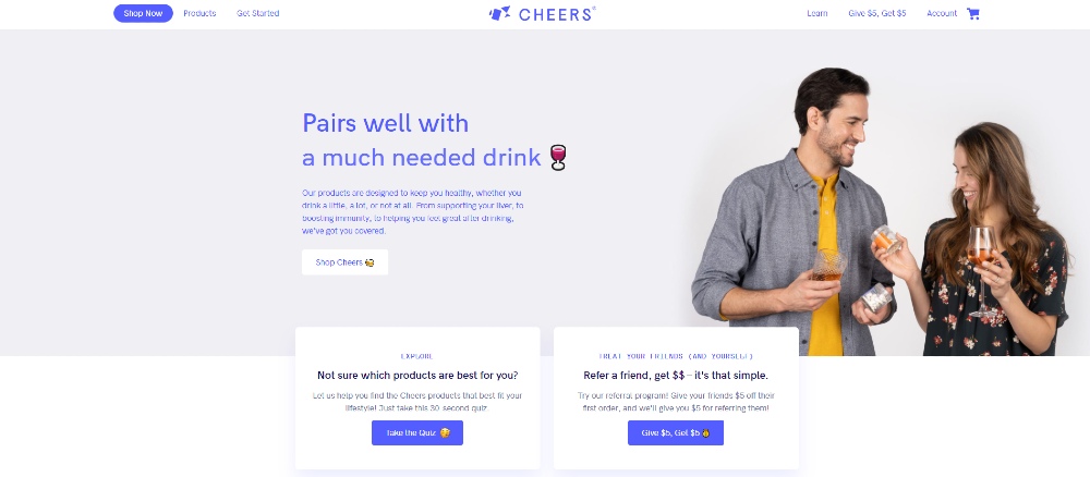
Here’s another homepage design example where you can provide visitors options. Instead of it being a dropdown or split-screen, they added two cards below the fold. If you notice, on the upper left of the screen, they added a rounded background on the Shop Now link. That’s another way to capture the attention of those visitors who wonder on the homepage.
22. Cinder Grill
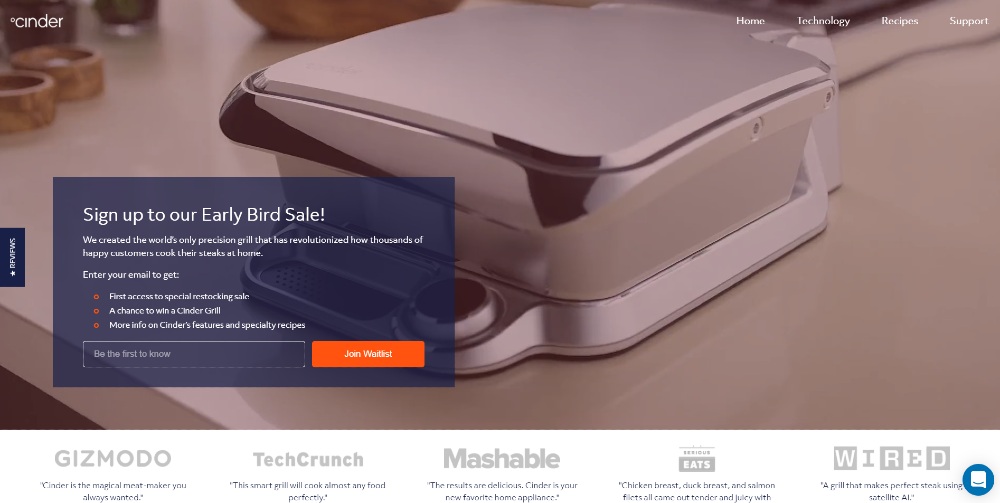
In some landing pages, you will see a block with a solid color. That’s where designers might put text in so the hero image or video would still stand out. This one by Cinder Grill uses a transparent block. This way, it doesn’t distract visitors from watching the hero video while they sign up for the waitlist.
23. Benni

Most home pages would utilize a split-screen to present different products. Sometimes, it would be only one image on one side and the headline on the other. Benni takes it a step further by using a toggle. You can switch between two different looks based on the function.
24. Starface
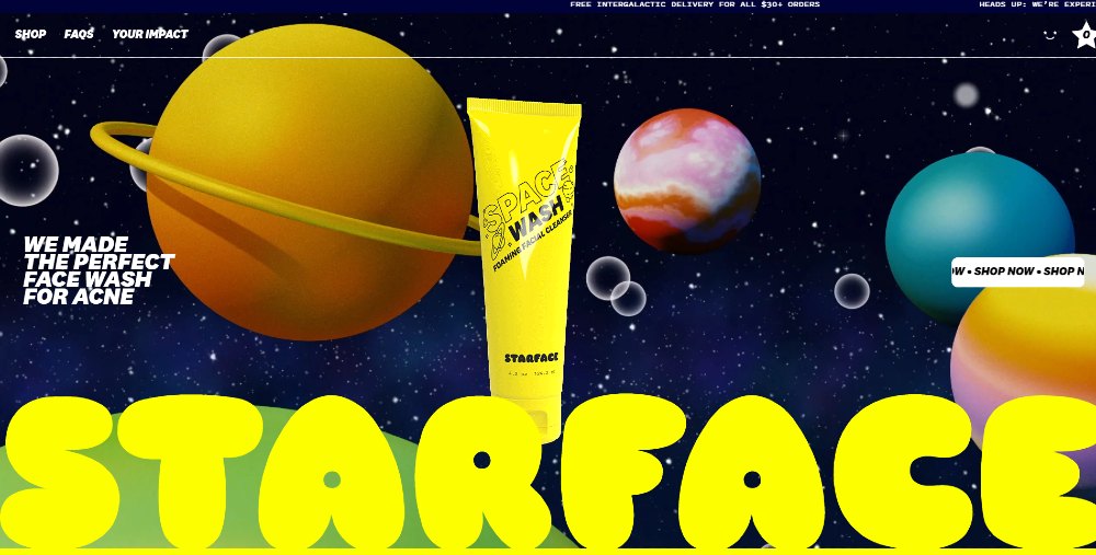
Here’s the homepage design from Starface. It follows graphic design trends like:
- Big fonts
- Moving text
- Bright colors
It’s an eye-catching and interesting website design because it’s so bright and colorful. Plus, thanks to the moving text, the website is dynamic. It makes you want to browse more and click on the CTA buttons.
25. BarkShop
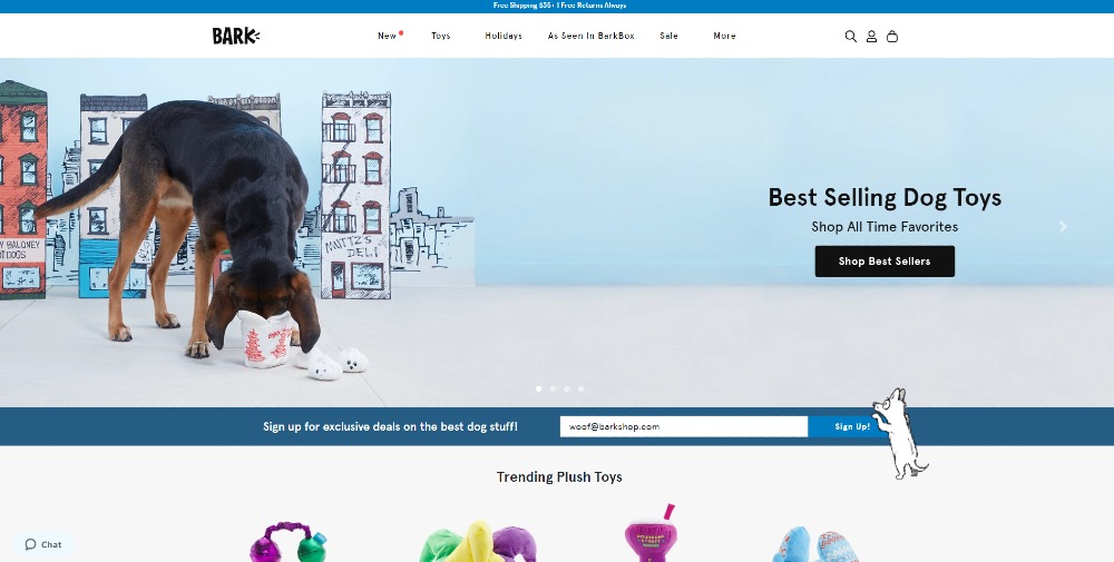
The homepage design for BarkShop follows the carousel format, where you can find different headlines, hero images, and CTA phrases to persuade users to shop. Those who have yet to decide if they’re buying from BarkShop can sign up for promos below. There’s even a dog perched on top of the “Sign Up” button.
Subscribe to Penji to Request for Homepage Design
If you want a homepage design similar to any one of those websites above, you can sign up for Penji. When you subscribe to Penji, you no longer have to find freelancers to work on your website design. Penji has a team ready to work on your design requests.
And if you want to receive a compelling website design, subscribe to the Professional plan for only $499/mo. You can maximize your plan by requesting illustrations, app designs, and so much more! Sign up now and try Penji risk-free for 15 days!
About the author

Katrina Pascual
Katrina is a content writer specializing in graphic design, marketing, social media, and technology. In her spare time, she writes monthly personal blogs to practice her craft.
Table of Contents
- 1. Faune-Bijouterie
- 2. Immi
- 3. Forge
- 4. Oui by Jean Dousset
- 5. Karst
- 6. Lucid Motors
- 7. Overpass
- 8. Mox
- 9. Clearwater Agency
- 10. Persoo
- 11. Marqeta
- 12. Victrola
- 13. Body by Simone
- 14. Sweet Mae’s Cookies
- 15. Frederick Benjamin
- 16. Hungryroot
- 17. Estrid
- 18. Keeps
- 19. Goodmylk
- 20. Geologie
- 21. Cheers Health
- 22. Cinder Grill
- 23. Benni
- 24. Starface
- 25. BarkShop
- Subscribe to Penji to Request for Homepage Design


