Everywhere you go, you see posters. But what makes posters better than others? It’s a clear-cut answer, and we’ll show you the best of the best. Many of these posters are used to promote products, events, and more. It’s one of the oldest methods of advertising. But there’s something about them that also constantly makes them one of the most useful methods. No poster will (or should) look the same. There are so many ways to get your message out there in a creative manner. For inspiration on your next poster, here are our top event design posters, each with its own unique quirks and characteristics.
1. The Night Market
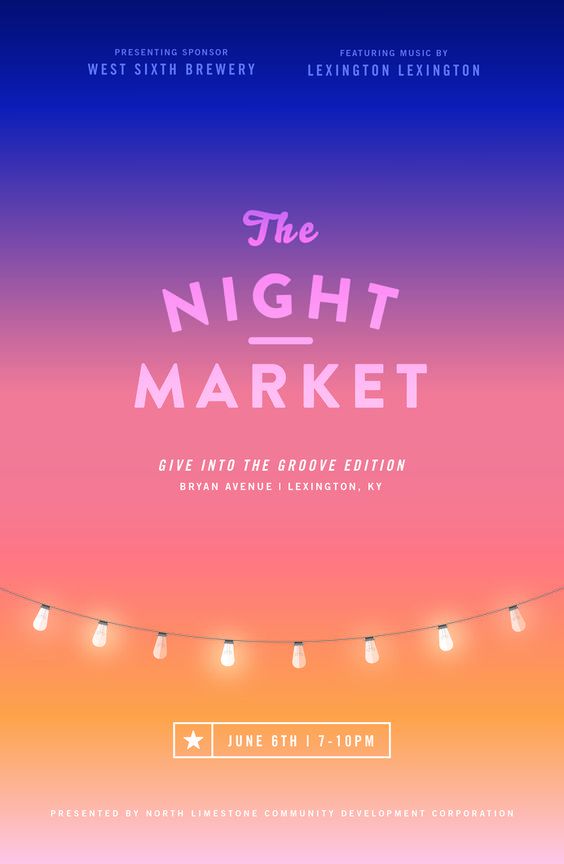
What stands out for this event poster design for me is the use of the gradients. It gives off a nice warm feel, while at the same time showcasing the fact that the event is a nightly one. It starts off with blue at the top, and slowly becomes brighter going down, just like the night sky and that compliments the event premise very well.
2. Healthy Cooking Retreat
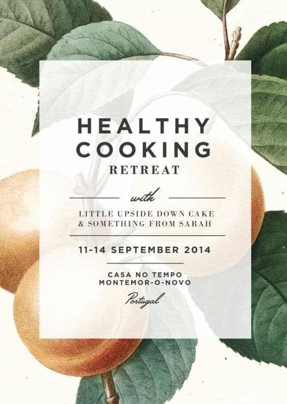
What really sets this event poster design apart is the fact that it encompasses an image overlay – the event details themselves are superimposed on an image of peaches. This gives the sense that not only are the peaches related to the event, but that the event itself may be a health-conscious one. Food posters are generally very effective, likely because they’re appealing to everyone.
3. The Escape Artist
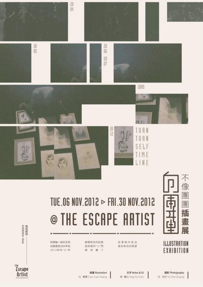
If you’re unsure of what to do for a great event poster design, using a collage of images is always a solid tactic to employ. Like in this poster, the contrast of the images against the white background draws my attention and makes me want to check it out.
4. Conflicts of Interest
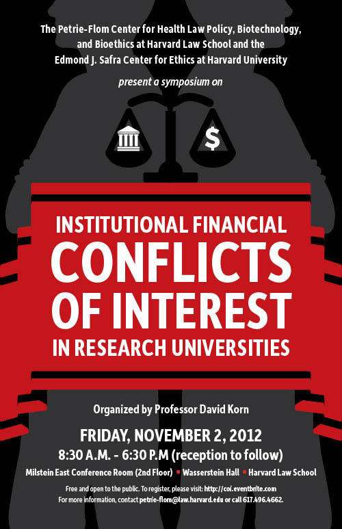
This poster tells you everything you need to know about this event. Everything on this event poster design is very clear and concise. Besides the straightforward content, there’s a hidden double image in the background. There are two people back to back to each other. In the space between them, there’s a scale.
5. Yale School of Architecture
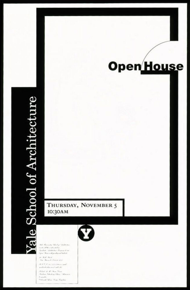
Sometimes going simple is best when it comes to design. In this event poster design from Yale University’s School of Architecture, having a floor plan while displaying event details gets the point across directly. No unnecessary fluff, no distracting elements. I also found the open door at the top quite charming, as it’s an open house event.
6. YODEX Event Poster Design
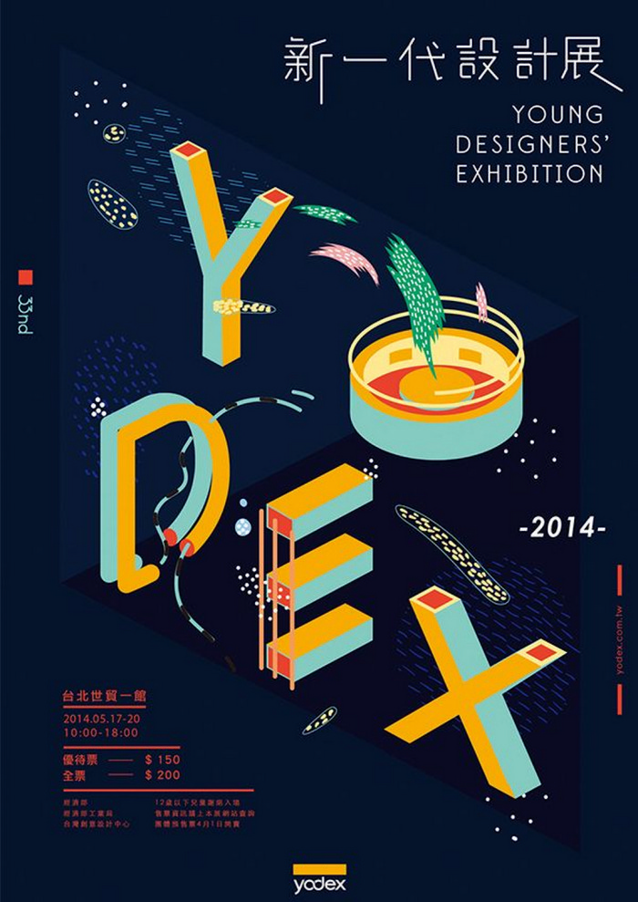
This event poster design is something that I found pretty cool. It’s the name of the event, but in an isometric style to signify the tech development nature of it. Anyone with an interest in technology and modernistic styles, this design will appeal to you as well. Tech posters like this can be difficult to make without planning, and this designer nails it.
7. Greystone Mansion
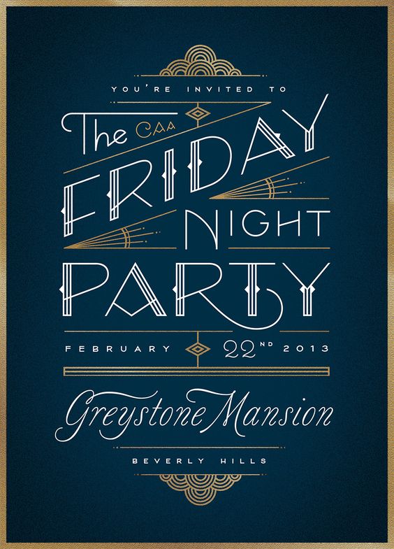
I love the overall style on this event poster design – it gives off a real vintage feel to it. Plus, the contrasting colours really make this poster pop, and that to me, is a major positive. I can’t help but feel that this particular poster is being targeted to a more mature audience, given the poster’s premise.
8. Turnstyle
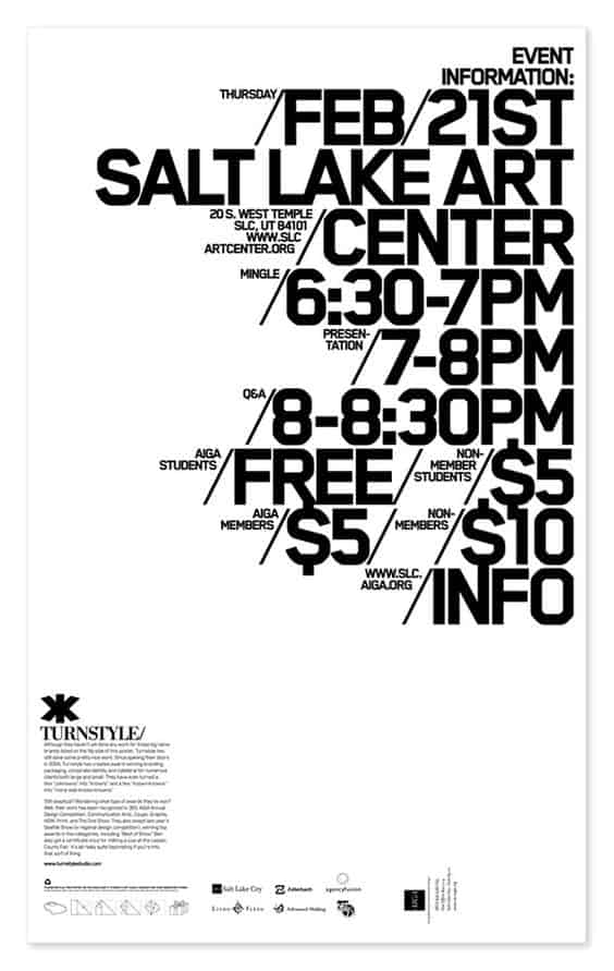
Just because an event poster design solely as text, doesn’t mean that it can’t have any impact at all. Take this poster from Turnstyle, for example. Text only, but the most important details such as location, time and cost are clearly visible. Plus, I love how clean the overall structure is.
9. Leaders Are Us
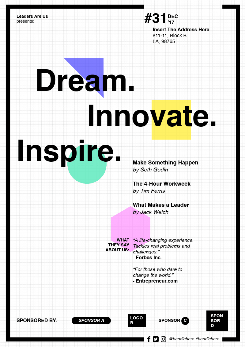
Another simple event poster design, but with creative use of color and shapes (in a very conservative way, I might add) just begs my attention. I also love the fact that shapes appear random but were actually planned to be mixed in with the major word themes of the event. The sponsorships and social media at the bottom add a nice touch too.
10. Strings Bar
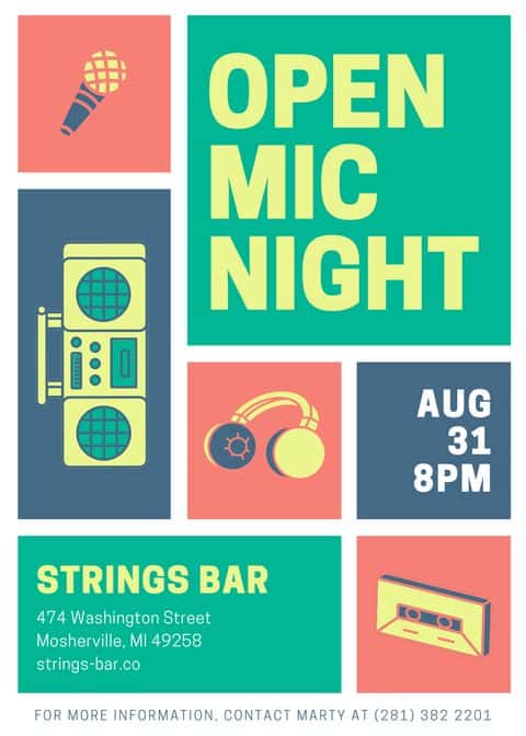
Isolating the major elements in blocks is a great way to ensure that my attention covers the entire ad, and not just certain sections. I also love how the colors contrast with one another. It shows contrast, but adds to the charm of the poster. Not to mention great use of the icons.
11. Flatstock 12
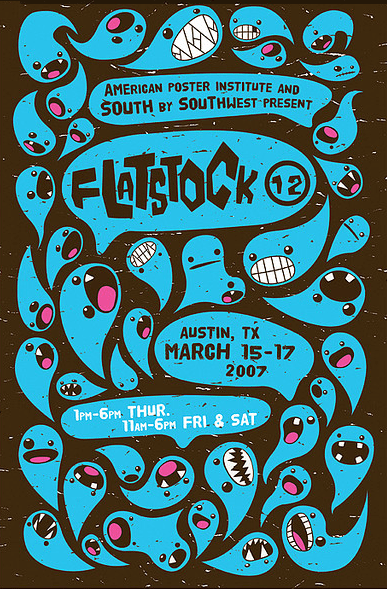
I love cartoons, and I’m pretty sure you do too, right? Well, this event poster design is just absolutely whimsical with the cartoonish nature of it all, while bringing my attention to the event at hand. The different expressions that are present just add an extra layer of personality that I think anyone can appreciate.
12. Something Nice
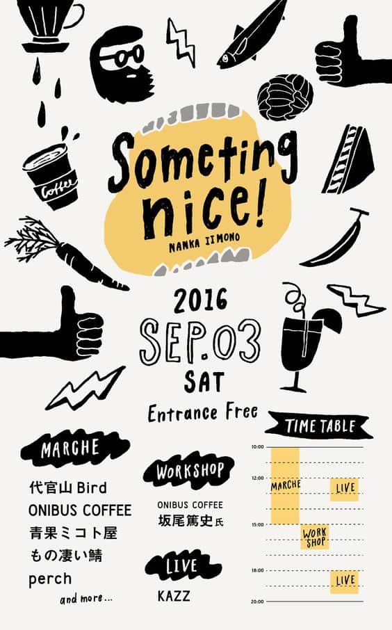
Now, this is a lot of stuff to put in one poster! But I do love this event poster design for a multitude of reasons. Firstly, the use of icons that appear almost hand-drawn makes this feel really casual and easy-going. Secondly, I can appreciate that they even included a schedule of events as a small graphic in the corner. And lastly, the typography just completes it all.
13. The Annual Woodruff P.S. Science Fair
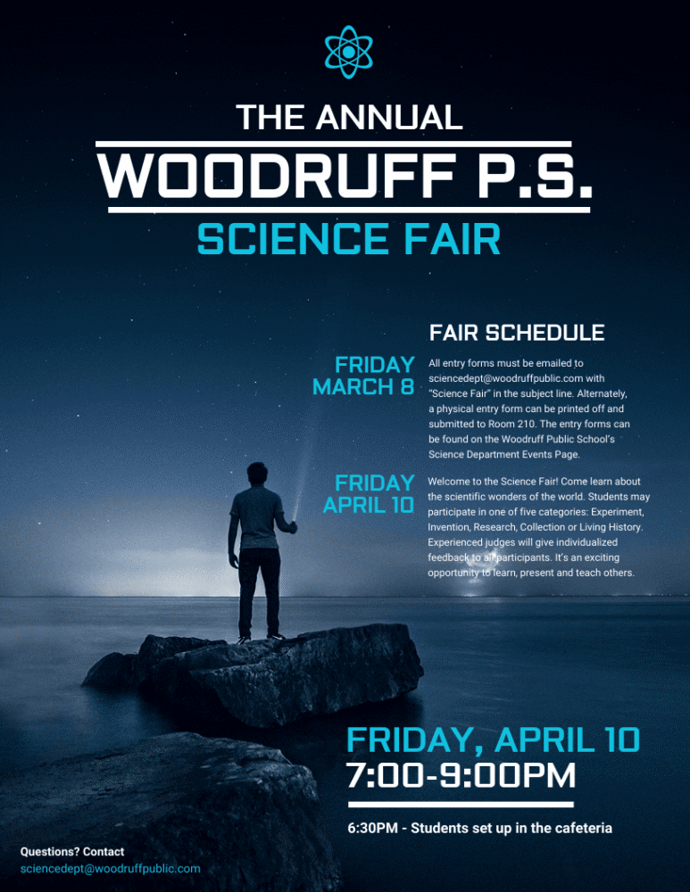
Not only does this event poster design give a lot of useful info, it doesn’t take away from the stunning image in the background that really catches my interest in science. Another thing I like about the image is just how well the font color goes with the actual background – perfect harmony if I ever saw it.
14. New Release: Bright Lights Hurt My Eyes
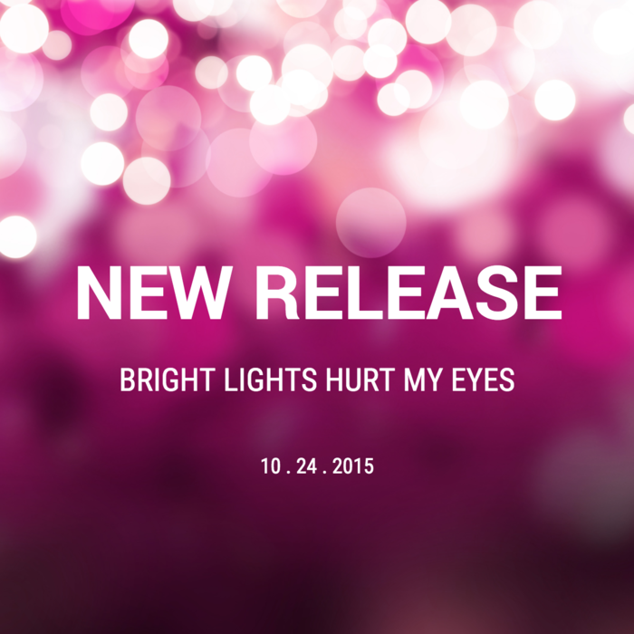
This event poster design may not have a lot of details, but in this case, it doesn’t have to. The background is vibrant – it’s designed to get people excited. And the fact that there’s only a date present here serves to only increase that hype. Plus, I love the irony in this poster, with the subtitle clearly contrasting the background image of bright lights.
15. San Bernardino Nocturnal Wonderland
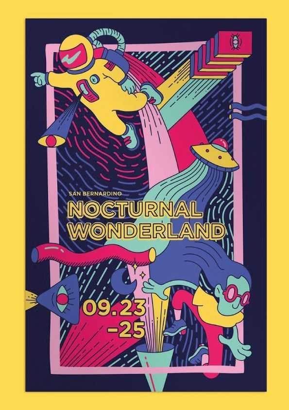
This may just be the most abstract and out-there event poster design that I’ve ever seen, but it definitely has me interested to learn more about said event. The wacky colors and bizarre premise with this artwork just intrigues me, and I want to learn more. But man, this is such a trippy, yet well-executed poster!
16. Summer Love Pool Party
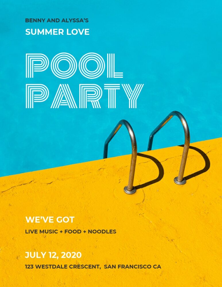
Devoid of much detail? Yes. Simple premise? Yes. Highly effective, regardless? Yes. Benny and Alyssa’s event poster design proves that you don’t need to crowd a poster with a lot of content to get the point across while turning heads at the same time. Love the font for the words ‘Pool Party’ as well. I know I’d want to go.
17. Poetry Slam Night
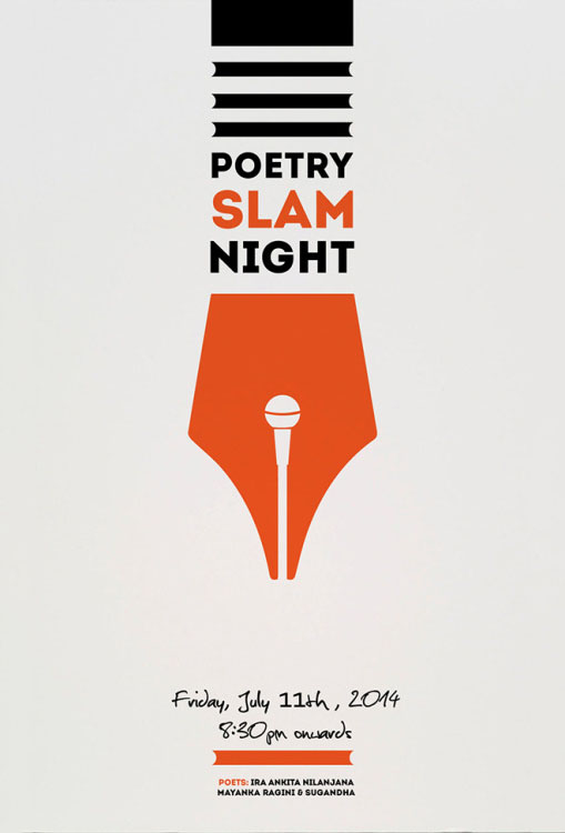
Now, if this isn’t a creative way of merging your premise with your event poster design, I don’t know what is. I definitely appreciate the way that the pen was incorporated into the overall design – not too invasive, but not too barren either. Another thing I like is the color usage – orange works surprisingly well for this. If you’re not sure if you can do something like this yourself, consider getting an on-demand graphic designer to help you.
18. Wonderland
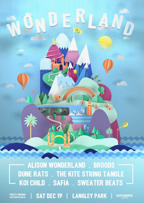
Wonderland created an incredible and creative flyer. The mountain looks almost three-dimensional with its multiple layers. They could have stopped there, but they make sure each section has its own shadows and textures. It brings your attention to the middle, but you’re also drawn to the simplicity of the band names.
19. Discover San Francisco
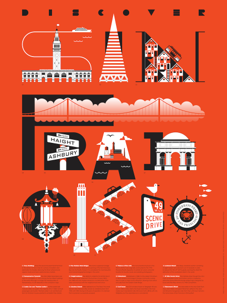
This is a pretty awesome event poster design – it’s talking about the city of San Francisco while actually using various city attractions and areas to spell out the name! Great way of combining the message with actual pictures to give a sense of variety and to be a visual treat.
20. Longines Masters
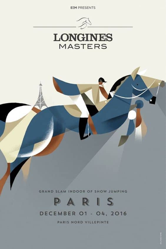
Now, I may not be a great painter or an art buff, but I can appreciate the visual flair that went into this event poster design. Great contrast in color of the pieces that make up the horse and the jockey. And all in all, I’m actually impressed that they managed to build something so detailed with simple shapes. I’m getting real Picasso vibes from this poster!
21. Tedx
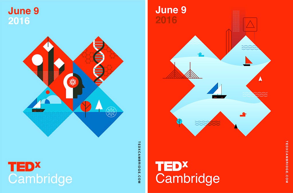
TEDx is well known for their speeches and talks, so it’s no surprise their posters would look amazing. The left blue poster covers a few examples of what could happen at a TEDx, such as science, genetics, nature, and more. The right red flyer is best for a specific market looking for talks based on the ocean, boats, or architecture.
22. ARTheism
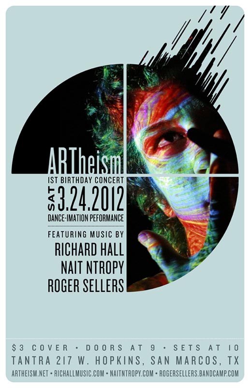
ARTheism makes their event poster design feel the vibe of the concert. It’s mysterious and allusive. An effective poster should make you feel emotions, as this one does. It makes you want to go and see exactly what a Dance-imation performance is. The designer was very effective in getting their point and message across, something you need anytime you make a poster for an event.
23. Oktoberfest
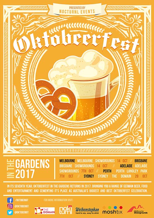
Oktoberfest is always quick to create unique and interesting food poster designs. With all its locations listed clearly on the bottom, it can give full attention to what you can expect from the event: pretzels and beer! This type of event is already known for these two food staples, but it’s nice to see them front and center in an elaborate design.
24. Avett Brothers

The Avett Brothers have an incredible concert at the beach in Mexico, and what better what to do it than with matching flyers? They’re similar but still different enough to stand out. The color scheme is simple but attracts your attention immediately. The font as well adds to the underwater vibe as well.
25. International Game Day
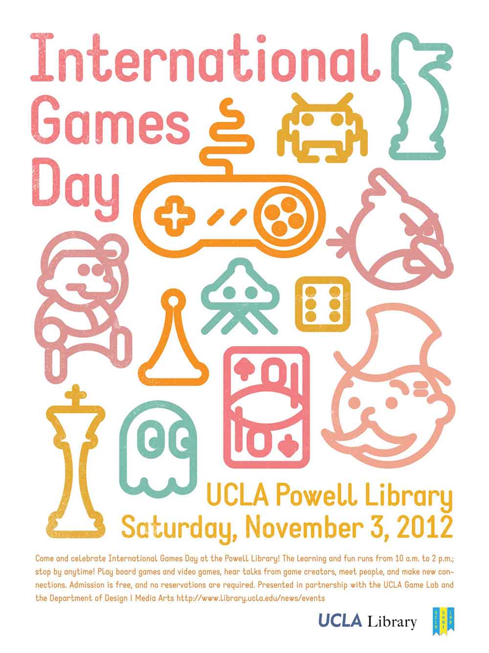
This event poster has nailed the idea of video games. By using well-known characters and game pieces, it attracts all types of gamer. The design is sleek and down to earth without overwhelming you with information. It makes sure you see the important details, like location and date, clearly while the other information is smaller.