

How many times have you checked your email today? If you’re like most Americans, you probably spend two to five hours a day reading stuff in your inbox or writing messages yourself. At least that’s what data from the 2019 Adobe Email Usage Study tells us. It’s therefore not surprising that most companies put a lot of effort into email marketing, specifically email header design.
For instance, many of our clients here at Penji ask us to make an email header that best reflects their brand. They know just how good design can affect their brand reputation, and since we have the top 2 percent of graphic designers, we surely know what we’re doing. If you’re looking for email header design inspiration, read right on! We’ll also teach you how you can have the best email design to generate leads and boost sales, so stick until the end.
What’s an Email Header?
When marketers need fresh email marketing ideas, most usually look for ways to power up the copy. After all, email is all about messaging and it’s vital to craft an effective copy to persuade readers to opt-in.
However, there’s another secret weapon you shouldn’t leave untouched in your arsenal – excellent design. And that’s where email headers come in.
At its most basic, the email header is the top part of the email design. This part usually contains any or a combination of the following elements:
- Brand identity
- Date of newsletter issue
- Sender
- Navigation tab
- Other additional options
So, just how crucial is this part when it comes to capturing your audience’s interest? A study by the Visual Teaching Alliance says the brain processes visuals 60,000 times faster than text. That said, it certainly pays to put a premium on email visuals if you want to make an impact.
In addition to that, the header is the first thing that the reader sees upon opening the email. So, most marketers make the most out of this element to capture readers’ attention.
The great news is, there are countless ways to make this element interesting. It’s all about learning the best practices and having the creative chops to properly execute them.
Related Post: 10 Tips That Will Make An Email Stand Out
Email Header Examples that Display Best Practices
There’s no one-size-fits-all template when it comes to email header design. However, it pays to know the best practices to be able to hook your audience in while staying true to what your brand stands for.
Here are a few header examples to inspire your next email campaign.
1. The Brand is the Star
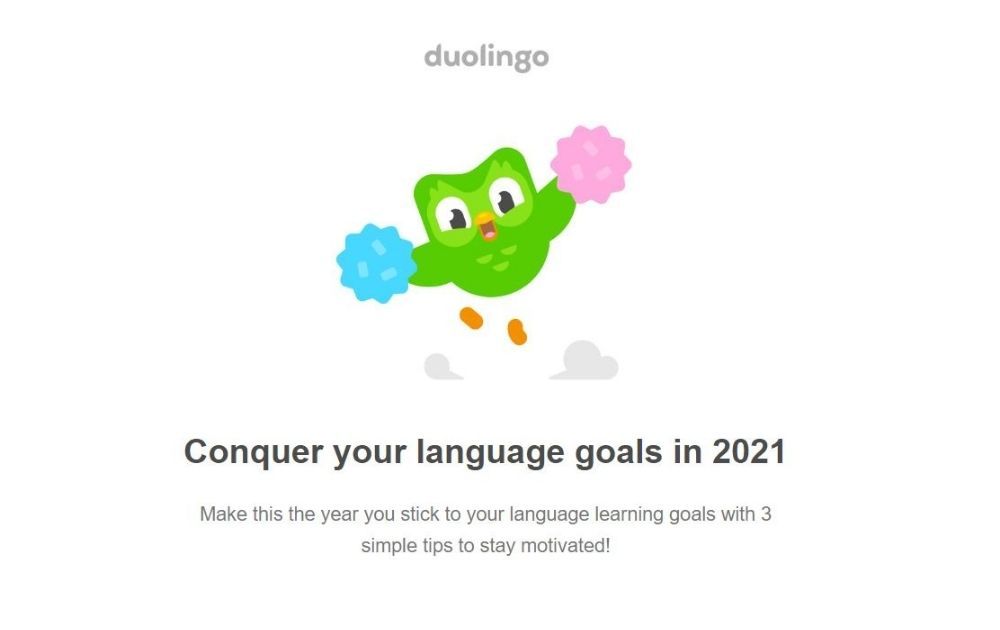
Image Credit: Duolingo
Let’s look at this header design for an email campaign for a language-learning website and mobile app, Duolingo. The header is pretty straightforward. It only shows the brand logo and Duo (the brand’s green owl mascot) holding pom-poms as if cheering the reader on.
The headline says “Conquer your language goals in 2021.” The image complements the message all while reiterating the brand.
PRO TIP: When it comes to building a sustainable business, brand identity is everything. In fact, 2019 stats released by Edelman says 8 out of 10 consumers buy products or services based on trust.
That said, you should never let the brand fade away in the background in any marketing tactics you’re doing. Highlight the promo in the email but always leave room on stage for the brand to bask in the spotlight.
2. Introduce the Offer
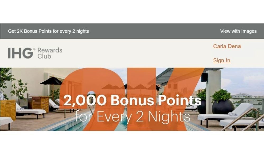
Image Credit: Intercontinental Hotels Group
This email from the Intercontinental Hotels Group Rewards Club works well for busy readers. Instead of using the header for the sole purpose of brand recall, it acted as a teaser.
Above the logo and member name is a banner that says, “Get 2k bonus points for every 2 nights.” Now, if you’re a rewards club member who collects points, you’ll be hooked right away and read the whole email or even click through to the landing page.
PRO TIP: Many readers won’t think twice before deleting an email they deem to be irrelevant. That said, every millisecond counts when it comes to email marketing. By introducing the offer right on the header, you spark your audience’s interest even before they hit the trash button.
3. Include “View in Web Browser” Option
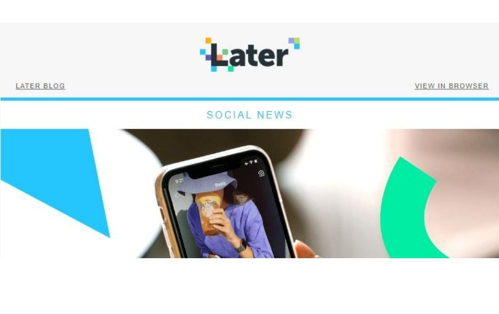
Image Credit: Later
Later’s email header looks simple and professional. The logo nestles in the center, and the header and the body are divided by a light blue line that complements the brand palette.
The header features links to the blog and an option to view the content in a web browser. It may not seem like much at first glance, but it immensely improves how readers consume content and engage with the brand.
PRO TIP: Giving the readers an option to view the email in a web browser offers several benefits, including the following:
- Viewing in the browser helps eliminate image-loading issues. This is especially crucial if the email is image-heavy or interactive.
- Readers get more inclined to share the content.
- Depending on the recipient, it could simply enhance their browsing experience.
4. Don’t Overwhelm the Viewer
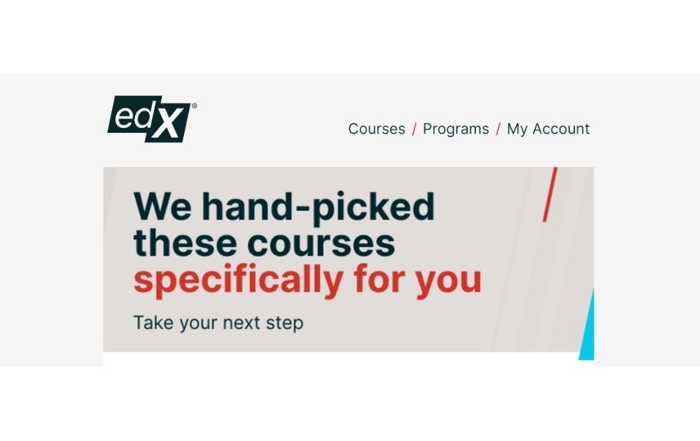
Image Credit: edX
Let’s take a look at this header for edX, for instance. Now the massic open online course provider’s logo is edgy in itself. The diagonal and misaligned shapes surely give it a dynamic and energetic look.
To complement the bold logo, their email header design features a simple, three-option menu on the other side of the screen. It’s prominent enough to perceive but plain enough so as not to steal the logo’s thunder.
PRO TIP: When it comes to email header design, make sure all the parts come together well without clashing. But that doesn’t mean you need to hold off on elements that reflect your brand identity. If your logo is already striking, simplify the other header elements so that you won’t overwhelm the viewer.
5. Have a Cohesive Color Palette
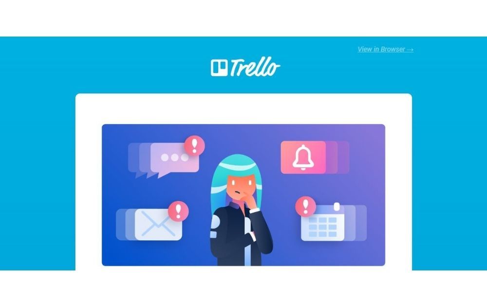
Image Credit: Trello
Speaking of not overwhelming the email recipient, here’s a newsletter header design that does very well in color coordination.
Trello’s blue brand color may look too saturated if viewed against warm colors like red, orange, or yellow. That said, their design decision to use a purple-palette helps make the brand color shine its best.
PRO TIP: When designing your header, consider the colors you’re using for the headline or body. For instance, if you typically use colorful photos for the banner headline, then taming the hues on the header is ideal.
On the other hand, if you prefer a vibrant color on your header, build your newsletter palette to coordinate with the header. This way, you won’t have a hodge-podge of noisy colors fighting one another.
6. Offer Options

Image Credit: Accor Hotels
This newsletter header from Accor Hotels presents an interesting feature. Instead of jumping straight to the branding color, it offers a few options on the topmost banner. These are options to access the online version, add the email address to the contacts list, and unsubscribe.
As a bonus, the header also features a search option where viewers can find their hotel, assuming that they have an active booking.
PRO TIP: Here’s a basic principle taught in Marketing 101 – people don’t like being sold to. By giving your audience options, you make them feel in control. By giving them choices, no longer are they helpless prey cornered by a marketing predator to purchase something.
7. Treat Viewers to an Eye Candy
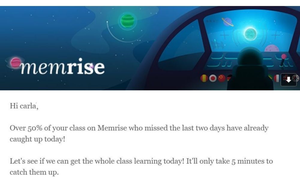
Image Credit: Memrise
Take a moment to admire this gorgeous header for Memrise. This learning language platform uses spaced flashcards to increase users’ learning rate, the cute and whimsical digital illustrations work well to reflect the brand identity.
PRO TIP: A research published by Science Daily says visual events have only 100 milliseconds to hit the brain target or they will go unnoticed.
That said, you need to make sure that the image you use is catchy enough to spark interest. For instance, some publishers take their book illustrations and adjust them to email header size to secure readers’ attention right away.
Related Post: What Does an Illustrator Do?
8. Add a Menu
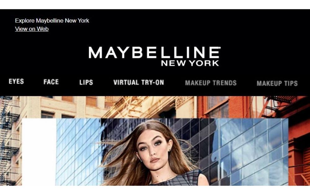
Image Credit: Maybelline
This example from Maybelline creates a mini-version of the website right inside the viewers’ inbox. Aside from the “View on web” option, the header includes a menu with links to eyes, face, and lip products, as well as their virtual try-on app and related content.
PRO TIP: Use your newsletter to create a seamless link between your audience’s inbox and your website. By incorporating menu elements into the header, recipients can easily explore the website, therefore boosting your traffic and pumping your sales rate through the roof.
9. Incorporate the Headline
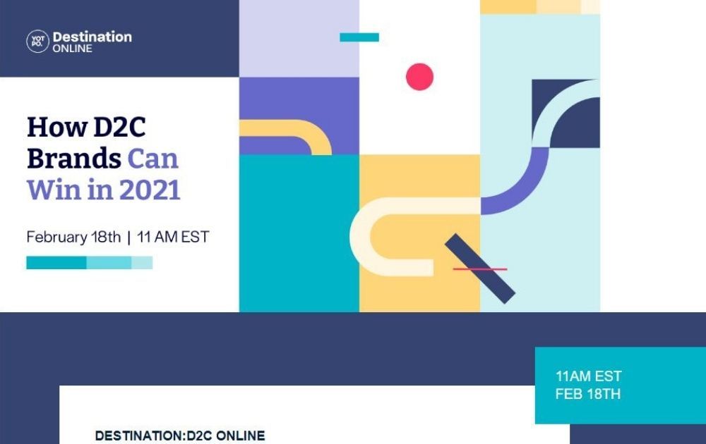
Image Credit: Yotpo
Though most newsletters place the header on the topmost strip of the email, you don’t have to be limited by that. Take this design from Yotpo, for example. The email promotes Destination: D2C, a series of online events targeted at direct-to-customer eCommerce players.
The design incorporates the header right into the email’s headline, giving the email a unique look that makes it look current, creative, and relevant. In addition to that, the header text is contained in the left part, with its right part dedicated to geometrical design.
PRO TIP: Don’t be afraid to experiment with email header design size and approach. Explore various designs to find new ways to keep your audience interested.
10. Personalize It
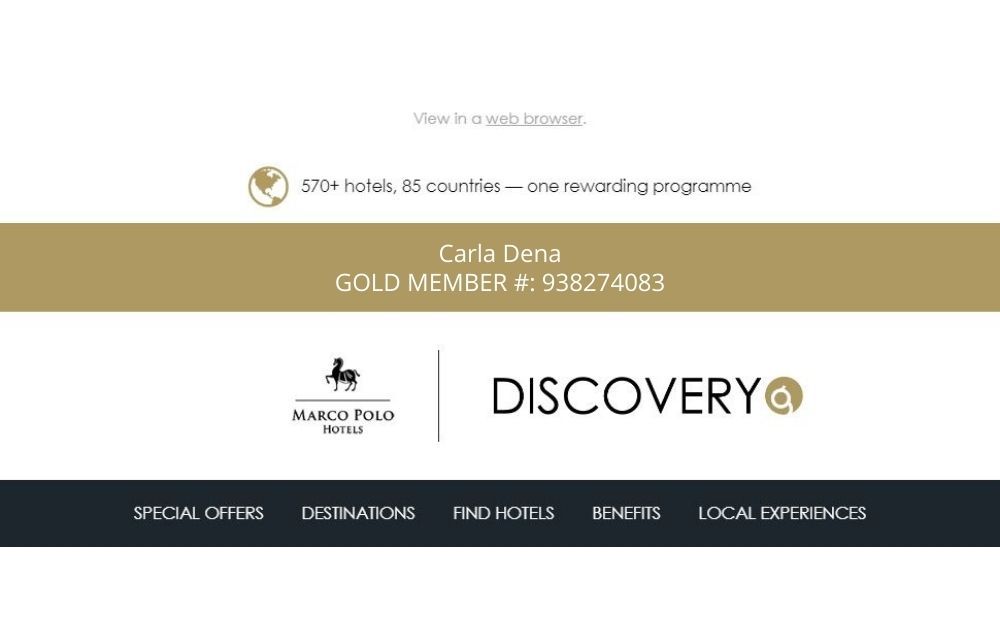
Image Credit: Marco Polo Hotels
If you find a random sales letter or flyer in your mailbox without your name on it, will you open it? If you’ve got a whole load of mail that is addressed to you, probably not.
This email from Marco Polo Hotels’ Discovery Program hit the spot when it comes to header personalization. The design included a spot for the recipient’s name and membership number, making each email customized for the recipient.
PRO TIP: Personalize your email as much as you possibly can. By doing so, you’ll make the recipient feel like you’re sending the email especially to them instead of churning out send-to-all generic emails.
Key Takeaways
As seen from the examples above, it pays to know the email header design best practices to make the most out of your campaign. Here are a few key takeaways to keep in mind as you brainstorm for your email marketing strategy:
- Attention-grabbing graphics is always a great way to complement your copy. And when we say “attention-grabbing,” it doesn’t always need to be noisy outlines or screaming colors. Instead, it must be a design that resonates with your niche and target market.
- In every marketing tactic that you do, always, always direct focus on your brand. Yes, you may be announcing a special promo or offer. And while you’ll want your audience to know about it, don’t let your brand take the back seat.
- There are times when a simple header works well. However, don’t shy away from using header add-ons, such as menu and website links. Doing so provides quick access to your website, thereby increasing traffic and conversion opportunities.
- Options such as “View link in browser” or “Manage subscription” make the email more effective. Why? These options give your viewers the feeling of control. As a result, they don’t feel like they’re pressured into reading your content. And often, that makes them more receptive to info.
- Gearing your emails to sound more personal is always a good thing as it gives your audience a feeling that they belong to a community.
Related Post: Infographic: Best Practices For Great Email Design
Conclusion
An email header design can turn a simple message into beautiful pieces that recipients would want to read. That said, it’s certainly worth the time and effort to put a lot of thought into this element.
If you want a wonderful email design but don’t have the time or technical skills to do it, don’t fret! Our skilled designers here at Penji will be ready to help. Here are a few email designs we’ve done for our clients in the past:
We offer unlimited designs and revisions at a flat monthly rate. That means you won’t have to spend an arm and a leg to add a stash of beautiful creatives to power up your campaigns. But don’t take our word for it! Try any of our packages risk-free for 15 days and see for yourself.
About the author

Carla Deña
Carla is a journalist and content writer who produces stories for both digital and legacy media. She is passionate about creativity, innovation, and helping small businesses explore solutions that drive growth and social impact.


