If you think you don’t need email marketing to grow your brand, here’s a number that might change your mind: 3.9 billion. That’s the number of global email users in 2019, according to Statista. Moreover, this number is only expected to swell up to 4.3 billion users in 2023. Numbers don’t lie, and if there’s anything these numbers are subtly telling you, it’s this: focusing on your email campaign design can make a huge difference in growing your brand.
For instance, many of our clients here at Penji ask us to craft the best email design to run their campaign. They know just how crucial email marketing is to nurture a community and excellent design is imperative. If you’re looking to amp up your email campaigns, read up! In this article, we’ll go over high-performing email campaign design examples and look at the lessons we can learn from them. So sit somewhere comfy, get a generous cup of coffee, and get ready to learn.
Email Campaign Design Checklist
Before we look at email marketing campaign examples, let’s review the basics. Email marketing pertains to a sequence of emails directed at an audience or multiple recipients.
First and foremost, you need to clarify the type of email campaign you’re running. By having a clear goal from the get-go, there’s less chance of straying from what the project needs to achieve.
Here are common types of email campaigns ventures send their audiences:
- Welcome emails. This is typically sent to prospects who just joined the mailing list.
- Announcement emails. Ventures send this email when they need to announce a promo, an event, a new product, or other related developments.
- Seasonal and Holiday emails. This is the type of email you send to announce seasonal collections or to greet recipients during holidays.
- Abandoned cart emails. When someone leaves the website with unpurchased items on their cart, you send them an email to give them that final nudge to proceed to checkout.
- Cross-selling or upselling emails. This is the type of email you send when someone purchases a product, and you want to offer them a related product that could be used alongside their first purchase.
- Newsletters. Usually sent weekly, bi-weekly, monthly, or quarterly, newsletters offer relevant updates about your brand. And in doing so, it helps foster the feeling of community within your niche.
These days, you can find a handful of email marketing strategy templates online. Though these templates could surely help you as you build a campaign, it’s best to develop a strategy unique to your brand’s qualities.
In addition to that, it surely pays to learn what goes into designing an email campaign for maximum effectiveness. Here are the boxes you need to tick before you hit the send button:
Subject Line
If there’s any part of the email that could make or break your campaign, it’s this element. Why? Simple – recipients base their decision to open the email on the subject part.
That said, it’s crucial to ensure that your subject line excites the reader and is free from typos. Moreover, it must be able to summarize your offer in one succinct, punchy line.
Preview Text
If the subject line is Batman, then think of the preview text as Robin. Yes, the subject line is vital on its own, but it can always use a little boost to enhance its capabilities.
Also called preheaders and message previews, the preview text is usually 100 characters long displayed beside or below the subject line. If this text doesn’t work to persuade your audience to click the email, then you’re not using it to its full capacity.
Related Post: Email Template Design Guide that Fits Your Brand
Copy
The copy is the meat of your email – it expresses what you want to tell your audience. Do you want them to check out your latest product? Or, perhaps, read a blog post?
Tell your readers the best way possible. Here are a few pointers to keep in mind when crafting your email copy:
- An email is a web copy, so keep your paragraphs short.
- Try to avoid all caps as it insinuates that you’re shouting at your audience.
- In the same vein, avoid multiple exclamation points as it makes the copy look spammy.
- Paint a picture with words by using sensory words that describe how we see, smell, hear, taste or feel.
- Triple-check your copy to avoid typo and grammar errors. Nothing makes an email look amateur and hastily-made than a basic error.
Visual Design
A study by MIT neuroscientists found that the brain can absorb images as fast as 13 milliseconds. For marketers, the lesson here is simple – make the most out of visual design to convey your message effectively and in less time.
Here are the most crucial design elements to double-check:
- Color psychology. Various hues evoke certain feelings and emotions. For instance, red may signal passion, while blue is associated with calm.
- Images or photos. Make sure that the imagery you’re using is in-line with your message and brand identity. Otherwise, it might lead to confusion and weak communication.
- Typography. Making sure that your copy is impeccable is one thing. But besides that, it’s also crucial to ensure that the typography style complements the message and doesn’t distract from it.
- Layout. You might have the best design elements in your email but if they’re not arranged correctly, all your effort might go straight down the drain. A professional layout design entails emphasizing the right parts and having the proper amount of negative space to allow the image to breathe.
Related Post: 10 Tips That Will Make An Email Stand Out
Call-to-Action
Every email you send your audiences should persuade them to take action. Whether it’s to check out a product page, sign in for a program, or check out your content, you need a call-to-action button to make it possible.
Links
You may have the best email marketing ideas, but your work will be in vain if the links aren’t working! Don’t waste that sought-after click-through by sending out the email before double-checking the links.
And don’t just focus on the email content. Check other clickable parts of the email, such as the email header design menu or footer social media buttons, to make sure that everything is in working order.
Personalization
Yes Lifecycle Marketing’s 2019 data says emails with a personalized subject line get 50 percent higher open rates. With so much at stake, why not go through the small effort of personalizing your email campaign design?
Timing
Timing is everything, and this adage could also apply to email campaigns. Here are a few guidelines marketers usually apply when it comes to sending out email campaigns:
- Avoid Mondays. Most people will be nursing a weekend hangover at the start of the week and might not be receptive to offers.
- Also, avoid weekends. Many consumers use the weekend for errands. This means they might not have the time to check their inbox, much less open promotional emails.
- Go mid-week, mid-day. According to Mailchimp, the most optimum time of the week to send out emails is Tuesdays to Thursdays, typically during coffee breaks (9 to 11 a.m. or 1 to 3 p.m.).
Email Test
Here’s the last box you need to tick before you can truly say that your email campaign design is perfect. Send out an email test to yourself to see if anything needs to be adjusted before sending it out to your email list.
To recap, here’s a checklist to consult to ensure that your emails are in tip-top shape. Feel free to download this checklist to use every time you need to send an email:
Email Campaign Examples to Emulate
Here are a few high-performing email campaign design examples that you can emulate. Take the time to examine each design and see how you can apply the concept to your marketing tactics.
1. The Message at a Glance
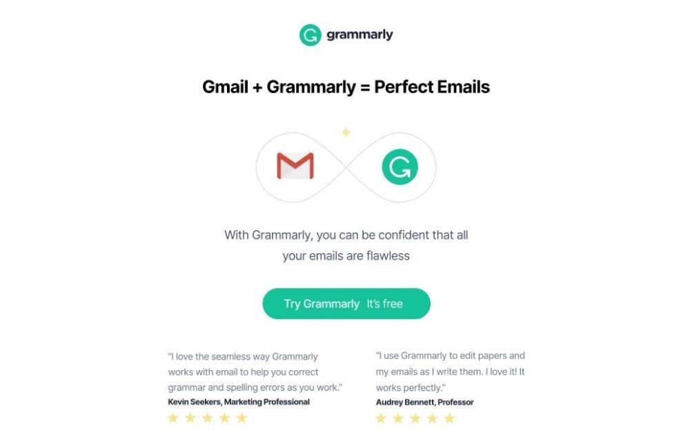
Image Credit: Grammarly
It doesn’t take a lot of words and imagery to get your message across. For instance, this email from Grammarly perfectly expresses how well their product pairs with Gmail using an equation and a minimalist image showing logos.
2. Use the Inverted Pyramid Model
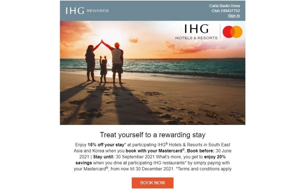
Image Credit: IHG Hotels
This email from IHG Hotels utilizes a scientific trick to catch its viewers’ interest. Studies show that the brain scans a material from top to bottom in an inverted pyramid pattern. That said, it’s best to structure design elements to follow this rule.
3. Keep it Short and Sweet
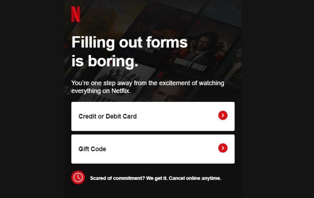
Image Credit: Netflix
One of the email design trends gaining popularity these days is keeping the copy short and letting the offer speak for itself. For instance, this email from Netflix instantly recognizes readers’ dilemma that filling out forms is boring. In addition to that, the layout looks very simple – with the large bars for payment just waiting to get clicked.
4. Consider Your Audience’s Device
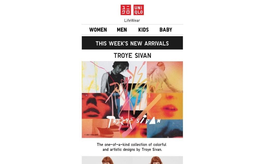
Image Credit: Uniqlo
When sending out emails, you’ll always want to consider the device your audience is using to view your message. For example, this email from Uniqlo is clearly designed with mobile phone users in mind. However, it still looks great even on a desktop, so no harm done.
5. Add Urgency
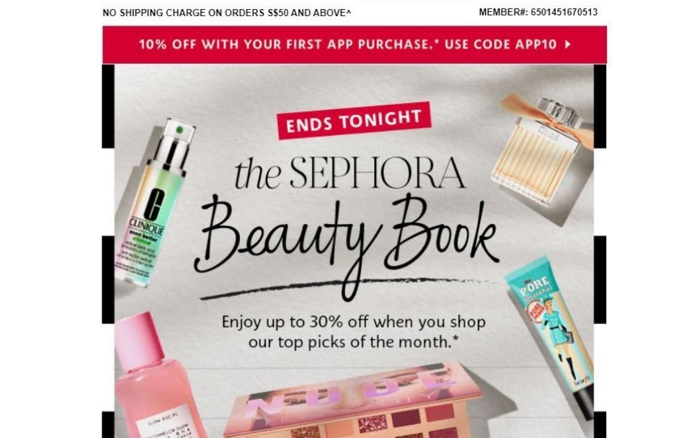
Image Credit: Sephora
Any beauty and cosmetics shopper would feel the urgency to at least check out the selection when they read this email from Sephora. The image shows the promo title, The Sephora Beauty Book but above it is a red ribbon that says, “ends tonight.”
6. Involve the Reader
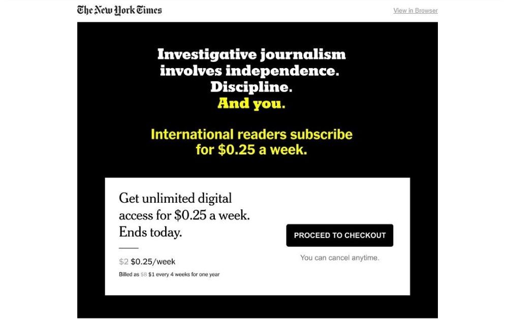
Image Credit: The New York Times
One line instantly jumps when you look at this email from The New York Times. The line “And you,” written in yellow, makes the reader feel involved. As a result, they instantly feel like the message is directed at them, and they have to heed the call.
7. Provide an In-Store Experience
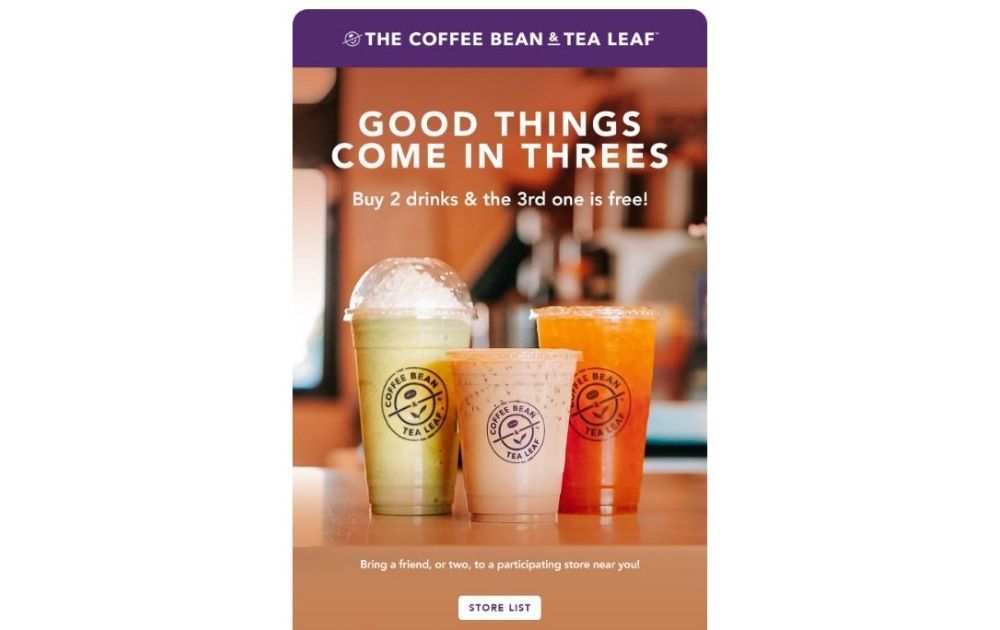
Image Credit: Coffee Bean and Tea Leaf
Email campaign designs are meant to invite readers in, and this email from Coffee Bean and Tea Leaf is a great example. The image offers a teaser of what it’s like to buy a refreshing drink at the store, so it’s an excellent way to lure customers in.
8. Highlight the Offer
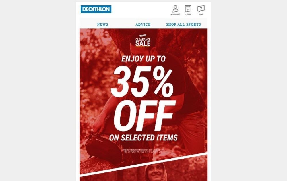
Image Credit: Decathlon
Even the most beautiful email design templates can’t beat a tried and tested way of selling – highlighting the offer. For example, this email from Decathlon goes straight to the point.
9. Make it Relevant
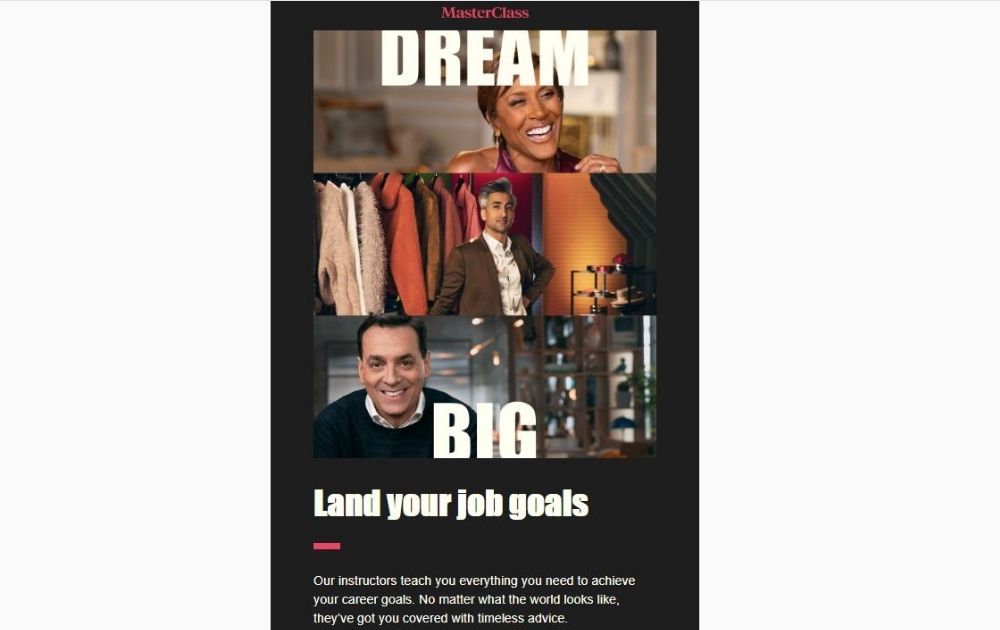
Image Credit: Masterclass
There’s one common theme among really good emails – they’re relevant. Take this email from Masterclass, for example. The design and the copy work together to target people who would want to hone their craft.
10. Stay True to the Brand
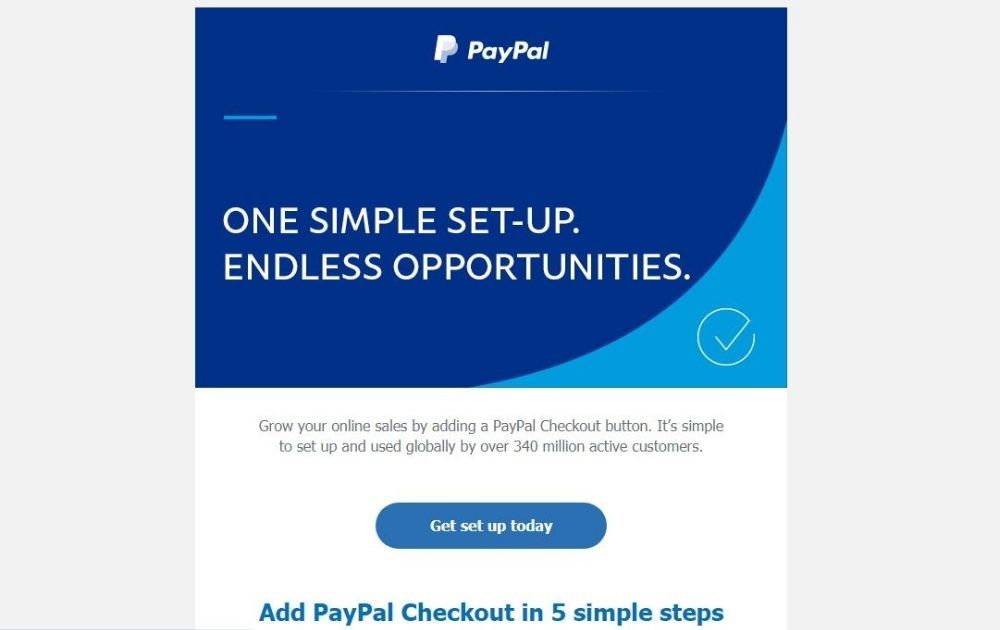
Image Credit: PayPal
Last but not least is this email from PayPal. The email stays true to the brand by reflecting its brand visual identity through colors, lines, shapes, and typography. Taking a cue from this example, it’s surely a great tactic to incorporate brand elements into the email. For instance, if you’re a publishing house known for children’s book illustrations, then use that in your email marketing by all means.
Related Post: What Does an Illustrator Do?
Why Boost Your Email Marketing
Some marketers think that email campaigns aren’t necessary, especially if they’re running other types of marketing strategies. Though other efforts like blog marketing and ad marketing work, email campaigns surely bring benefits uniquely their own.
Here are some of the most common benefits of an email campaign:
- Maximum engagement. With an email campaign, you’re delivering the content straight to your audience’s inbox. And because it’s the same place where they read updates from family, friends, and work, it’s one of the most effective ways to get your offer right in front of them.
- Audience segmentation. Although email campaigns are directed at multiple recipients, that doesn’t mean your messages would be too generic. In fact, many ventures use specialized campaigns designed to guide each audience segment through their sales funnel journey.
- Improved sales rates. Effective campaigns establish trust and brand loyalty. And when this happens, sales rates shoot up the roof.
- Hassle-free analytics. There are various platforms that offer instant email campaign analytics sans the hassle. From open rates to click-throughs and checkouts, these numbers can guide you to further hone your campaign design.
- Great ROI. According to Data and Marketing Association’s 2019 data, every $1 spent on email marketing returns an average of $42. That only goes to show how email campaigns allow you to get the most value for your every buck.
The Lowdown
To get the most out of email marketing, you need to be clear with your goals and carefully piece the right elements together to gear your campaign for success. Most of all, never underestimate the power of visual communication – it might be that missing link that could empower your brand towards more leads and better sales.
If you need help with creative heavy-lifting, we, at Penji, are here to help. We offer unlimited graphic design and revisions at a flat monthly rate. That means you can have all the email templates you need without breaking the bank.
Best of all, we hire the top 2 percent of graphic designers who’ll make sure that yours will be the best-designed emails in your recipients’ inboxes. Try any of our packages today risk-free for 15 days and see for yourself what our clients are raving about.
About the author

Carla Deña
Carla is a journalist and content writer who produces stories for both digital and legacy media. She is passionate about creativity, innovation, and helping small businesses explore solutions that drive growth and social impact.


