If you’re new to Facebook advertising, you’re probably wondering what effective Facebook ads look like. Scroll through the platform, and you’ll see a myriad of ads, a crazy blend of the good and the bad. We made a list of the good to inspire and teach us what we should do to get the most from our ad budget.
You can add in your own ideas or create a pattern after the successful brands. Whatever you do, keep in mind that great graphic design is part and parcel of every effective Facebook ad. And Penji, an unlimited graphic design service, can help you. Watch our demo video here to learn more.
Best Practices For Effective Facebook Ads
Effective Facebook ads aren’t all about looking good, though. You’ll find ads that look amazing but notice how very few likes and shares these get. Then there are those that are plain and basic but are riddled with the thumbs up.
Here are the most vital practices that you should keep in mind when creating Facebook ads:
Audience Quality
The right audience can make or break your ad campaigns on Facebook. Imagine talking to a person who doesn’t have an idea what you’re saying. Don’t make the mistake of putting an ad out there and hoping for someone to take notice.
Luckily, the platform offers excellent targeting capabilities. You can target based on location, demographics, interests, and even behaviors. You can be as specific as you want. This means that you’ll get out those that aren’t your target market. Your ads will only be shown to those who are most likely to convert.
Relevance
For your Facebook ads to be profitable, they have to be relevant to your target market. Don’t let your money go down the drain with ads that people can’t appreciate. Facebook for Business tells us:
“On Facebook, we try to show people the ads that are most pertinent to them. That’s why we’ve always used relevance as a factor in determining how we deliver ads.”
The platform uses a relevance score much like how Ad Rank in Google Ads works. Facebook will rate your ads based on your ad images, copy, and destination page. The higher the relevance score is, the better for your brand’s success.
Visual Content
Facebook’s algorithm favors quality visual content. This means it really pays to get great graphics. Using stock photos won’t cut it anymore, especially if you see many businesses using them. This will create ad fatigue, so make sure that yours are unique and eye-catching.
While it is understandable to cut a few corners now and then, graphic design isn’t something you should scrimp on. Penji offers professional graphic design at affordable prices. Check out our plans and pricing here.
Compelling Copy
A profitable Facebook ad has the perfect combination of great graphics and compelling copy. This example from Adobe Photoshop is worthy of emulation. It is a good combination of beauty and powerful copy.
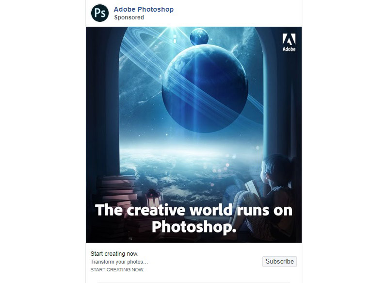
Your images will grab the attention, while copy will persuade them to do what you want them to. Making your copy and design work together gives a feeling of personalized communication. This will pave the way for an increase in engagement and conversions.
Unique Value Proposition
Your brand’s value proposition is what makes you attractive to customers. This is what will tell your viewers why they should click on your ad. Also, your unique value proposition will say to them why they should choose you over the competitors.
Instead of saying that you’re the best company in the world, give them 20% off on their first order. You can also add social proof such as an expert’s stamp of approval or a celebrity endorsement. The bottom line is, ensure that your prop is believable and that you can deliver your promises.
Calls-to-Action
To complete the picture of an effective Facebook ad, include clear calls to action. This will tell people what they should do next after convincing them to consider you. Learn More, Sign Up, or Subscribe are some excellent examples.
You may also want to add a bit of urgency in there, such as Offer Ends Soon or Limited Time Only.
Related Post: Create Facebook Ad Designs Like a Pro
Effective Facebook Ad Examples
And now, here is our collection of effective Facebook ads that you can use to spark your creativity. Let these gems inspire you to start building ads on this very versatile platform, Facebook.
Trello
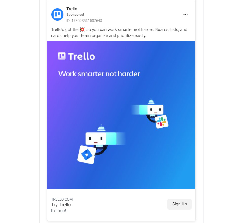
This ad from Trello has a compelling slogan: Work smarter not harder. Who doesn’t want that? Coming from a company that offers project management software, this is what a believable value proposition is. The graphic image is so simple but very cute and appealing.
Even the call-to-action is well-crafted. The phrase Try Trello, It’s free! poses no obligation to the readers. This ad is from a series that was published as early as February 2021 and has similar colors and images. This is a good example of creating consistency in your ad campaigns as it’s very recognizable.
Toonly
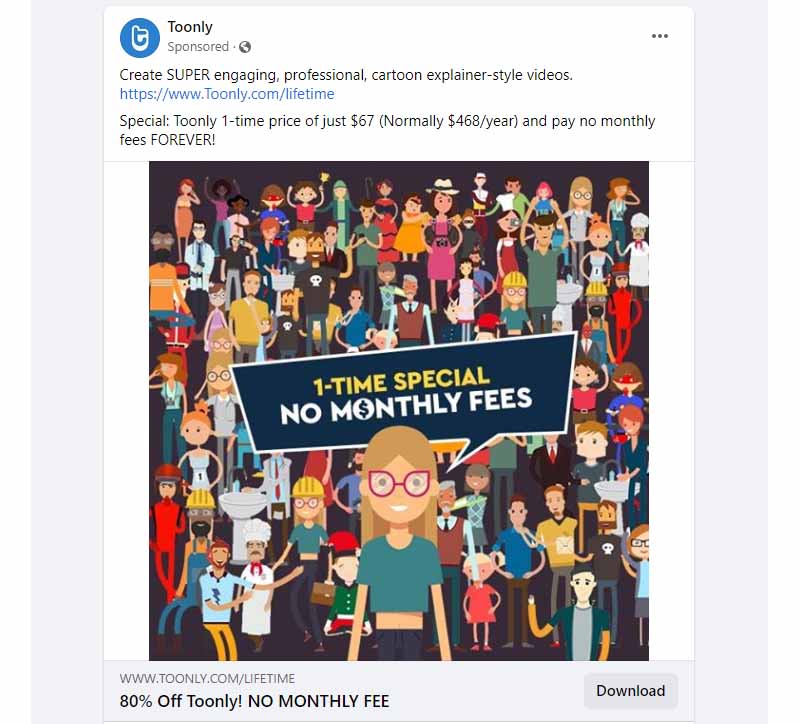
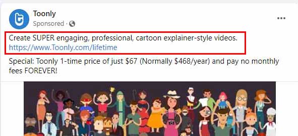
Creator of explainer videos, Toonly superbly showcases their wares in this Facebook ad. Its collage of cartoon characters you can use for your videos makes for a colorful ad. The promise of a forever no monthly fee and the one-time special price is enough to convince customers.
Trello’s ad is so simple you’d think that Toonly’s will look cluttered when placed beside it. But it doesn’t. Toonly’s is so well organized, with the main character in the center, the ad seems visually delightful.
Calm

An app that aims to help users with mental fitness, Calm helps people even through their ads. The example below uses a video that shows the six signs that you need meditation in your life. It includes different images that are the pictures of serenity and peace.
The ad demonstrates how to build a connection with customers, which they did by offering help. It gives prospects the promise of what the app can do for their mental health and overall well-being.
Bloomberg
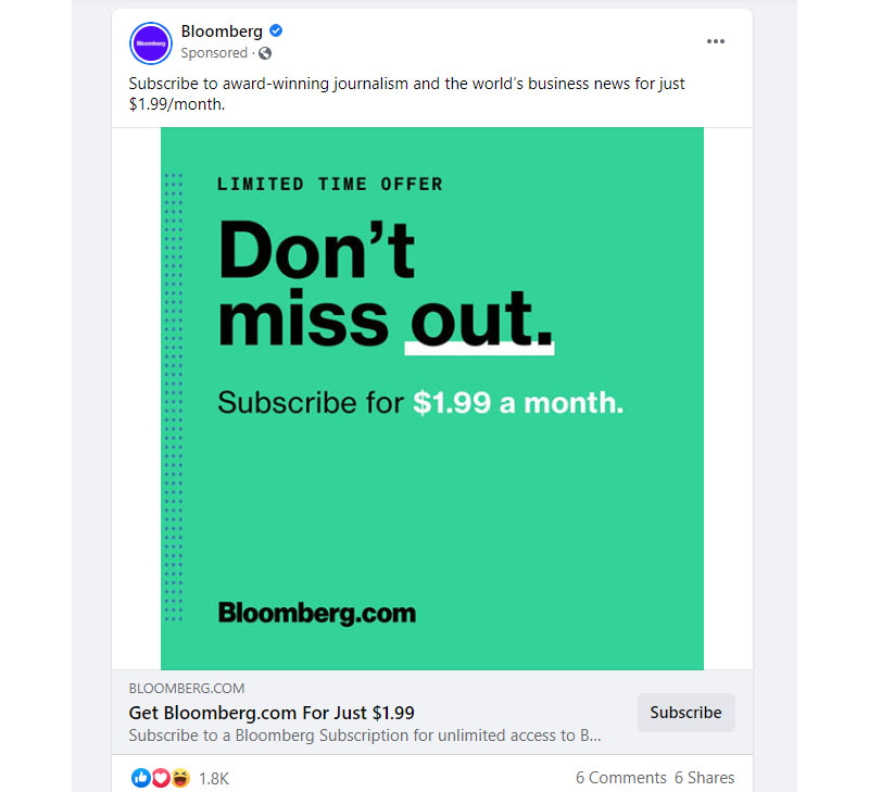
Everything in this Facebook ad was made crystal clear. Bloomberg’s award-winning journalism was mentioned in the description. It plays on FOMO by adding the attractive offer of a $1.99 subscription fee. As big as their name already is, they still don’t have qualms about offering a discount.
In this instance, you’ll see how plain the ad design is. This only shows how confident the brand is about its identity. With just the Bloomberg.com line at the lower-left corner, this is undoubtedly a contextual ad.
Nike
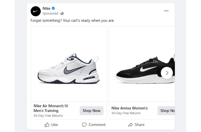
Facebook’s carousel ads are ideal for showcasing one or more of your products. This is what Nike commonly does, and we usually see a slew of their footwear. The ad below is one good example as it shows a variety of shoes. It’s like running multiple ads in a single go.
The copy is short and straightforward, no need for fuss as we all know what Nike is. The ad may lack color, but the brand identity can carry it through the sales funnel.
HubSpot
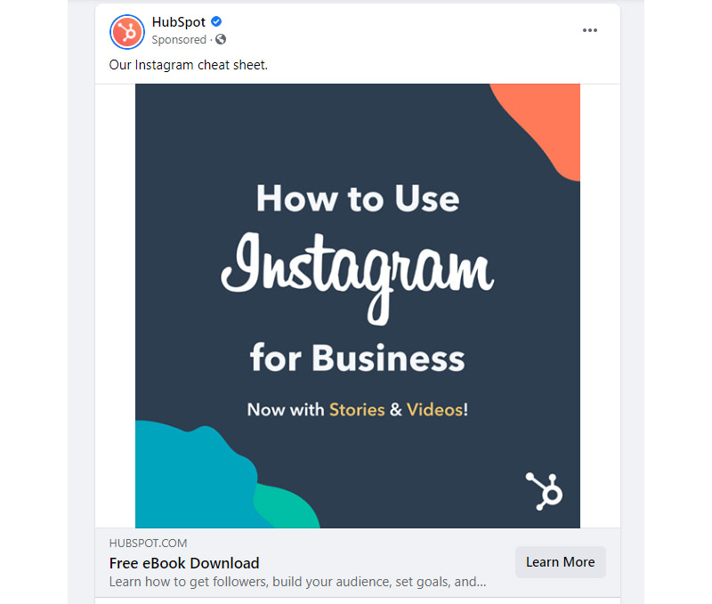
Some of the most effective Facebook ads are those that offer no hidden agenda. This HubSpot ad is doing just that. It is offering valuable help and shows that they are invested in your business’s future.
Offering something for free can get you the attention you need. With HubSpot saying that this is their cheat sheet, you know that they’re using their techniques themselves. And that’s good for building a connection with customers.
Soylent
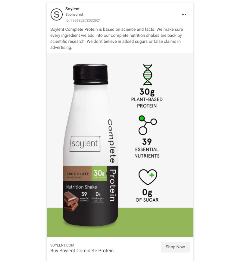
This plant-based drink from Soylent has a visually appealing package design. They took advantage of this and used it on their Facebook ads. They included some scientific facts for good measure. So, in essence, the bottle design shows their drink’s deliciousness while the ad states why it’s the better choice.
This ad is truly compelling as it combines great photography and design with a cleverly written copy. Letting people know that they don’t believe in added sugars or false advertising claims shows transparency.
Forbes
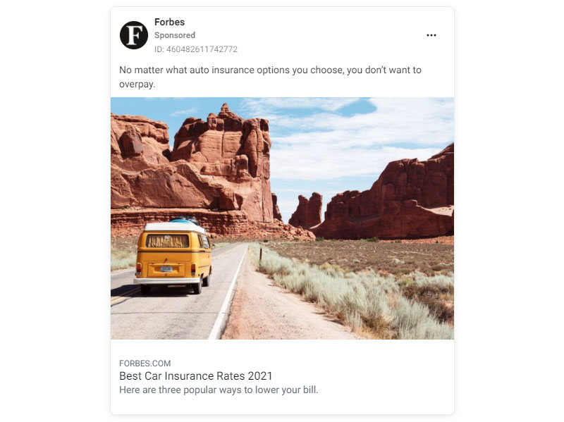
One of the most trusted resources in business news, Forbes capitalizes on its authority in its Facebook ads. The example below shows their list of the best car insurance for 2021. Choosing one can be a complicated and expensive endeavor, and this ad offers help.
The ad is effective as it is relevant with the year included in the description. The image they used is beautiful, crisp, and perfectly composed. It shows how vital insurance is, especially for long travels amid desolate areas.
Winc
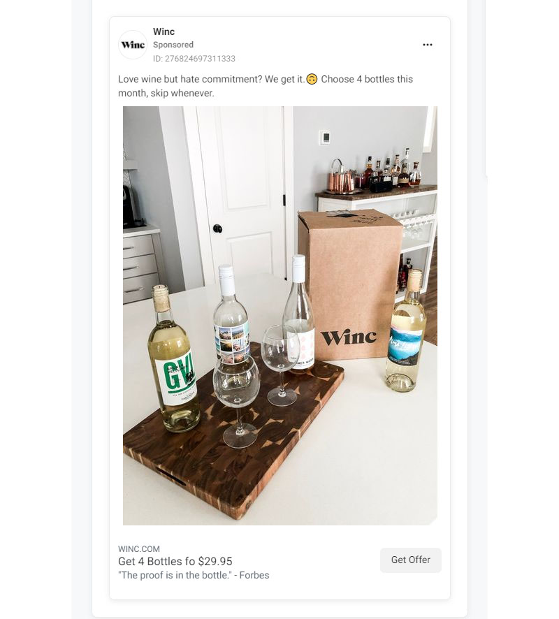
Modeling their wine bottles in a home setting is a great attention grabber, especially for wine lovers. The four bottles for $29.95 promo is also a steal! It is a good example of a quality value proposition. The caption about making a commitment is also well-thought of.
It uses a quote from Forbes as social proof, which is excellent for creating trust. Even the CTA Get Offer is a strong one, and if you add a time limit, it would be perfect.
Curiosity Stream
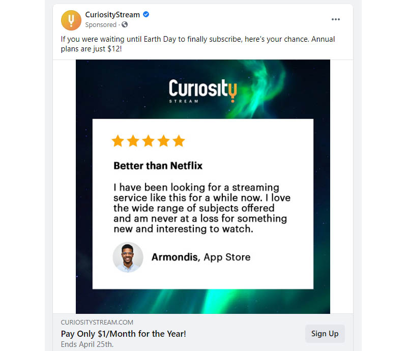
Most of the brands in this have discounts to offer, including Curiosity Stream. What makes this Facebook ad different is that it included a five-star user feedback. It tells about how their service is better than their competition.
The limited offer is only up to April 25th, which is a few days after Earth Day. This is a perfect example of a brand understanding its target audience so well. They mentioned the event knowing that curious minds who are their target would know when Earth Day is.
Tiffany & Co.
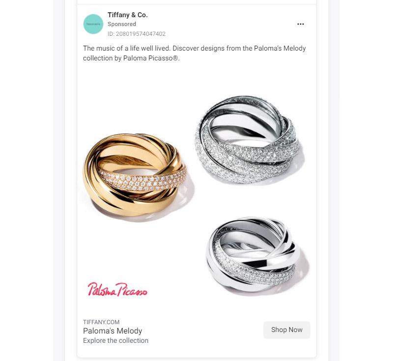
Using striking imagery can get you the boost you need for your Facebook ads. Take a look at what Tiffany & Co. did in theirs. The photographs are clear, and the up-close shot highlights the beauty of the featured jewelry.
Adding the name Paloma Picasso, with whom they collaborated, is also a great add-on. This puts two influential brand names in one ad, making it impossible not to get views. The phrase “The music of a life well lived.” is beautifully crafted.
Lemonade
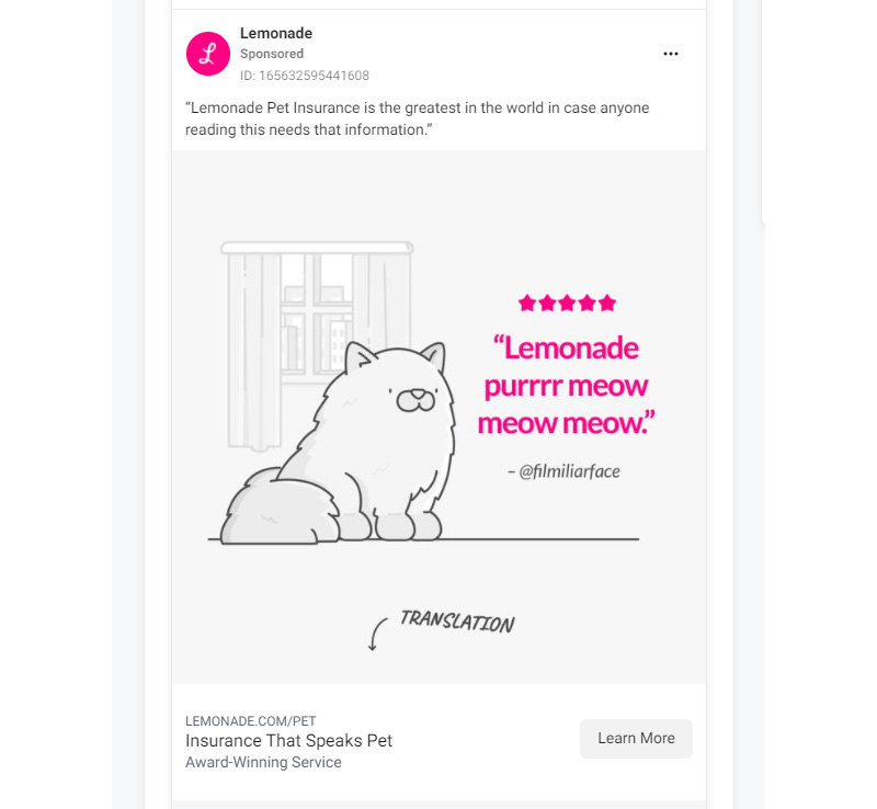
A pet insurance company, Lemonade’s objective is to make insurance “honest, instant, and delightful.” It shows through their Facebook ads, as can be seen from the image below. It’s cute, simple, and lightheartedly funny.
The illustration is of a cat that has its words quoted against a background of a window. Then there is a translation in the form of the description. The overall feel of the ad is witty, homey, and full of love, a proper understanding of the company’s target audience.
Samsung
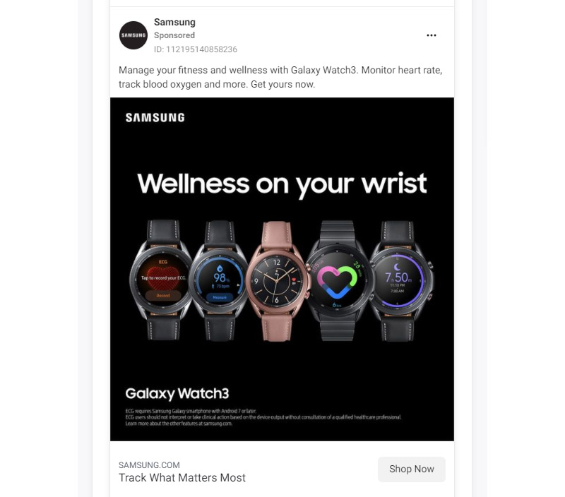
This Facebook ad of Samsung’s GalaxyWatch3 is a true eye-catcher. The smartwatches are pictured against a dark background, making them stand out. When this comes up in your newsfeed, you can’t help but stop scrolling.
The post text includes the benefits of owning one. It also uses a strong CTA, Get yours now and the description, Track What Matters Most, both well-written. Creating ads for Facebook means you need to be straight to the point and avoid using fluff, which Samsung does so well.
IKEA
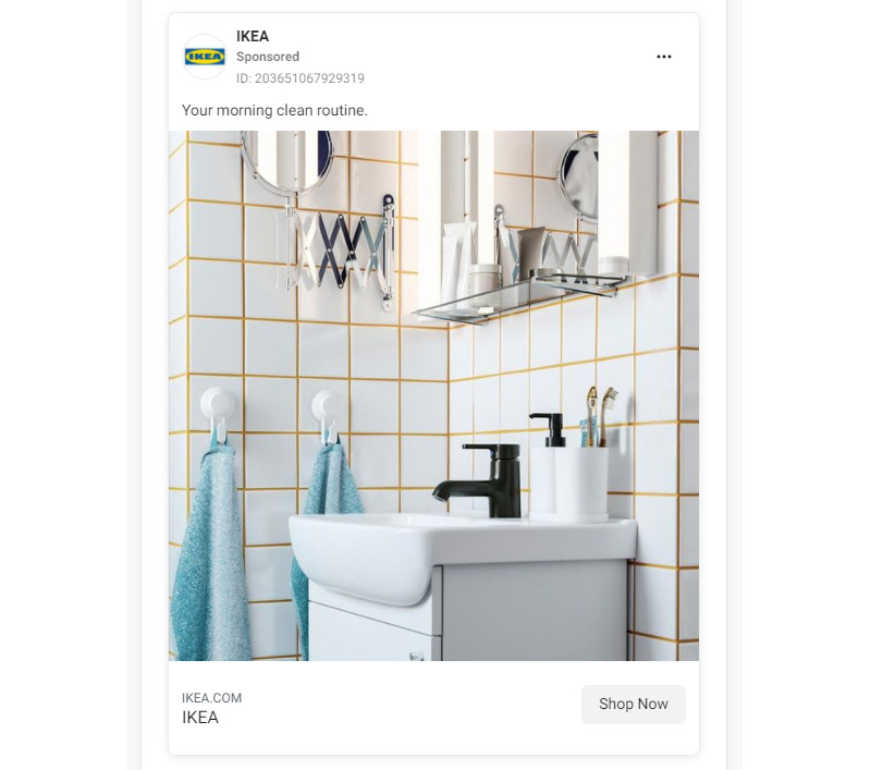
If you need inspiration for simple, easy, or tasteful ads, this IKEA Facebook ad hits the nail on the head. The phrase Your morning clean routine describes everything in this ad. The furniture and its setup are pleasing to the eyes as it’s fresh, bright, and relaxing.
There isn’t much text on the ad, and that’s because there is no need. The image alone speaks a thousand words about the brand. In addition, IKEA has a brand identity that surpasses any catchy call-to-action.
Related Post: Effective Facebook Ads: What Actually Worked (With Examples)
Final Thoughts
These effective Facebook ads are a testimony that using the platform to advertise is a wise business move. It may seem that designing the perfect ad can be demanding. But if you get help from the pros, it’s actually a breeze. Work with Penji to create your Facebook ad designs and leave the graphic design to us.
About the author

Celeste Zosimo
Celeste is a former traditional animator and now an SEO content writer specializing in graphic design and marketing topics. When she's not writing or ranking her articles, she's being bossed around by her cat and two dogs.


