Creating dancing logos could be fun for entrepreneurs, marketers, and professionals. You can have so much freedom in designing a dancing logo that lets people groove to the beat. Design elements, such as dancer silhouettes, shoes, dance poses, and musical notes, are some of the things you must consider. Here are 10 dancing logo examples that should inspire you to create one that grabs attention.
1. Move Ensemble
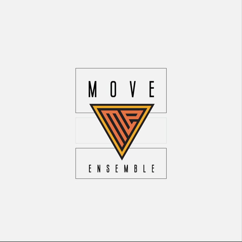
Placing the initial letters of Move Ensemble in an inverted triangle logo is an ingenious way to show movement. Its lines are excellent indicators of an active brand persona. The colors orange and yellow project warmth and welcoming nature.
In design, contrast is an essential element. This dancing logo has plenty of it, making it an attractive design for the company. The font is an elongated type that’s thin and very basic, a good choice if you want to show elegance and sophistication.
2. Dance Fever Studios

Having the psychedelic vibes of the 70s TV show it was named after, Dance Fever Studios is simply eye-catching. It is an image of a rainbow-turned dance enthusiast with large, googly eyes and sparks all around it. Dancing is a fun and enjoyable activity that this logo perfectly shows us.
Brand colors and font types are great for giving your logos personality. In this case, the bright colors and the funky font choice all contribute to an exciting and upbeat logo design.
3. Vortex Dance Company
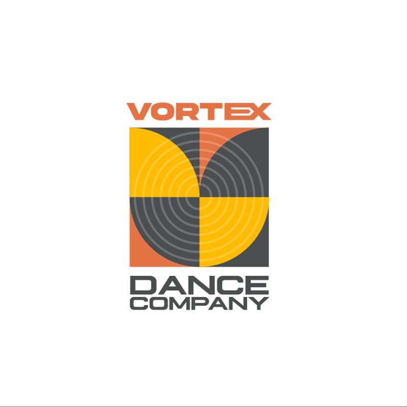
This Vortex Dance Company logo is a robust design with circular lines that remind us of a whirlpool. It has movement, force, and strength in it that befits the company’s brand personality so well. To balance off that strong persona, the designer chose to use warm colors for it.
The font choice is also spot on as it is plain, simple, and very straightforward. This is an excellent example of a logo that would look great whether placed in small or large spaces.
4. Hot Shoes Dance Station
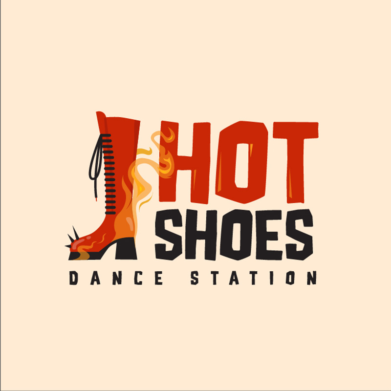
As its name suggests, the Hot Shoes Design Station has a hot shoe in it. This dancing logo design is quirky, fun, and very stylish. It has flames and smoke coming out of the shoe, which perfectly projects an exciting and lively brand identity.
And when we speak of something hot, the color red is the first to come to mind. The red font paired with black using an equally stylish font completes this dancing logo.
5. Musical Kicks Studios

Another quirky dancing logo design is this one created for Musical Kicks Studios. The great thing about designing logos for this industry is that you usually don’t have to be severe and stiff. You can be colorful, vibrant, or cartoony like this one.
From the shoe image, the fonts, and the colors to the hand-drawn illustrations of musical notes, this is a suitable design. It speaks about the brand identity so that you’d instantly know what they are and what they offer.
6. Motionz Dance Dimension
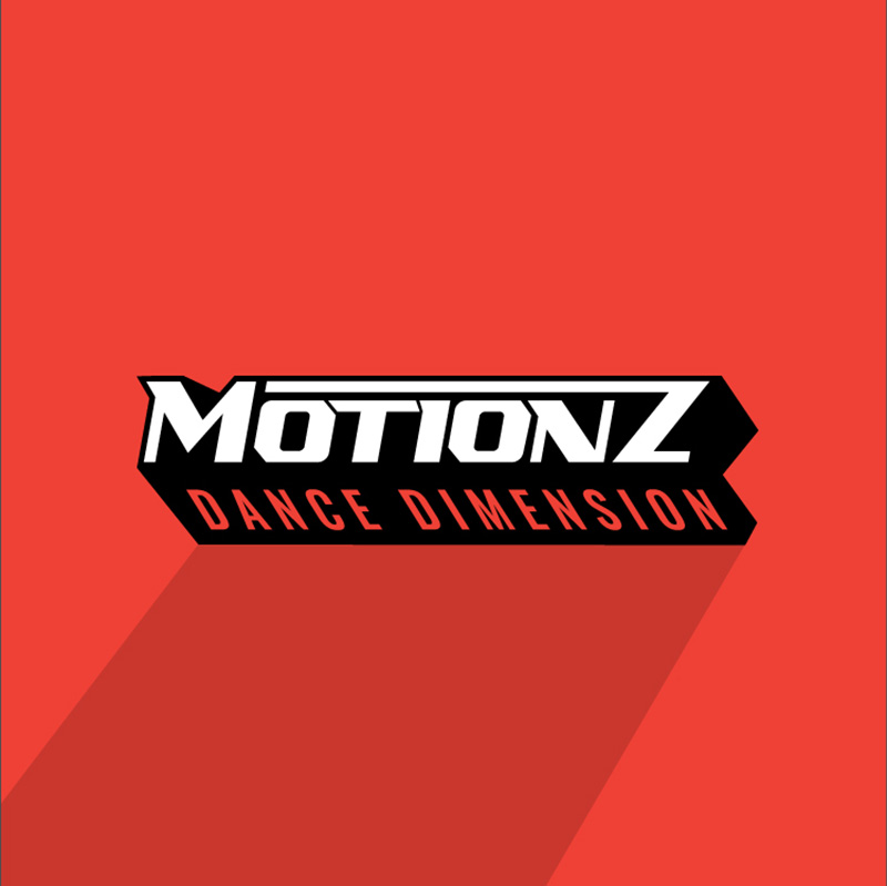
Dancing is all about moving your body, in this logo, this is very evident. The forward and backward tilt of the brand name is ideal in showing movement, activity, and dynamism. The logo has a three-dimensional feel, which is perfect for its name.
Red is a common choice for logo colors for several reasons. It is a primary color that connotes many emotions and characteristics. In Motionz’ case, it projects excitement, passion, strength, and power.
7. Little Step Ballet Academy
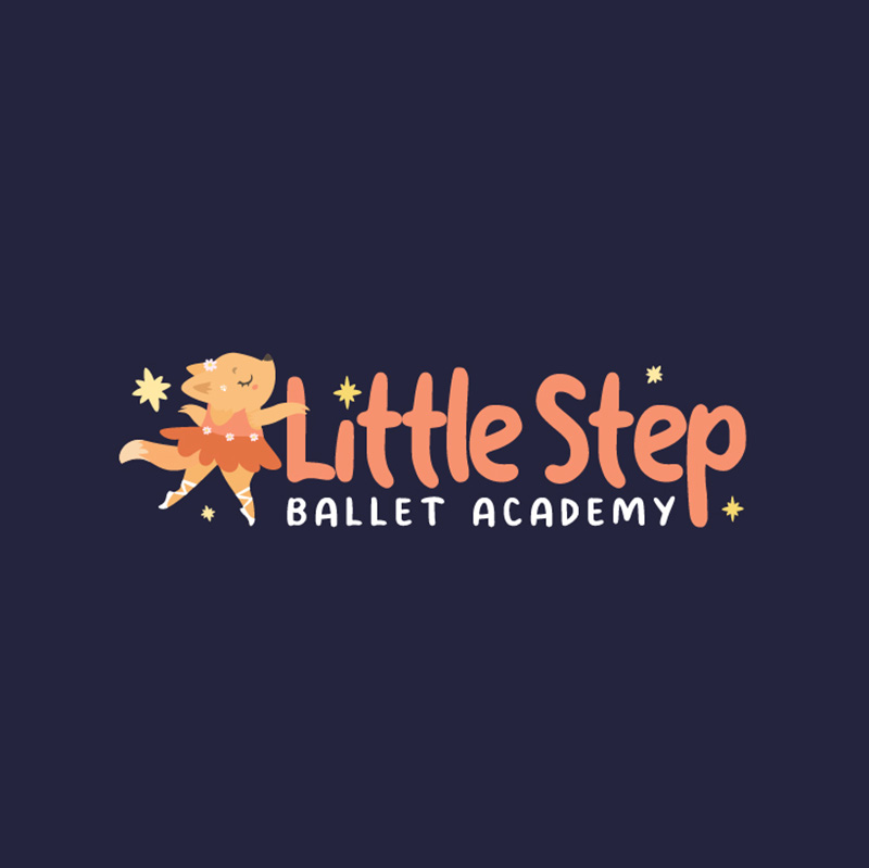
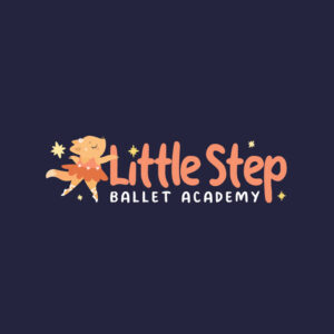
This dancing logo for kid’s ballet is cute, adorable, and oozes with charm. The Little Step Ballet Academy logo depicts a baby fox dressed in a tutu, dancing her heart out. This is perfect for attracting kids to join a dance class.
Even the cartoon-type font caters to young dancers. The colors are soft, light, and subtle. The stars around the whole design add emphasis and provide a decorating element.
8. Hot Legz Dance Center

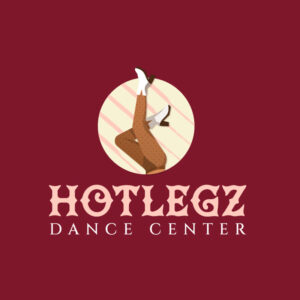
With a beautiful combination of vintage and contemporary, this logo created for Hot Legz Dance Center is an attention grabber. The red background emphasizes the illustration of a pair of legs up in the air. Custom illustrations are an excellent logo differentiator and can transform almost every type of design asset you’ll need in business.
9. Sway Ballroom Club

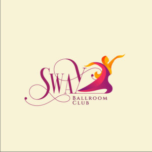
Most dancing logos in this list is designed to be informal and casual. This one created for Sway Ballroom Club is quite the opposite. It is classy, elegant, and looks very fluid. Although the color scheme is bright, it still exudes elegance, grandeur, and grace.
The designer chose to use a swirly font type that suits the brand suitably. The illustration of a woman gliding forward in a smooth dance step is also befitting.
10. Breakers Bboy Studioz

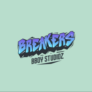
Like graffiti on a wall, this dancing logo created for Breakers Bboy Studioz is hip, trendy, and upbeat. When you’re specializing in a single type of dance, it’s always a good idea to incorporate that ambiance and personality in the logo. In this one, the fonts used are accurate and becoming.
The color combination of blue, violet, and green gives the design a multifaceted appeal. Any hip-hop dancer would love to wear this dancing logo on a shirt or hoodie.
What makes a good dancing logo?
As mentioned above, dance is about moving your body. A good dancing logo design has to show this. If you need to include a character in it, it has to be in an active pose, just like the Sawy Ballroom Club logo. Choose dynamic angles, colors, and fonts that show your company’s true personality.
There is no strict rule in dance logo designs, but keep in mind that it has to capture your dedication and love for your craft.
Get unlimited logos + graphic designs
Get your logo finished in 24-48 hours. With Penji’s unlimited graphic design service, you get:
- Affordable fixed, monthly rates
- Unlimited designs and revisions
- Team collaboration
- Fast turnaround
- 24/7 customer support
- Vetted designers and illustrators
- Brand folders
- 30-day Money-back guarantee
Ready to learn more? Watch our demo video here. Or you may request your dancing logo by visiting our website now!
About the author

Celeste Zosimo
Celeste is a former traditional animator and now an SEO content writer specializing in graphic design and marketing topics. When she's not writing or ranking her articles, she's being bossed around by her cat and two dogs.
Table of Contents
- 1. Move Ensemble
- 2. Dance Fever Studios
- 3. Vortex Dance Company
- 4. Hot Shoes Dance Station
- 5. Musical Kicks Studios
- 6. Motionz Dance Dimension
- 7. Little Step Ballet Academy
- 8. Hot Legz Dance Center
- 9. Sway Ballroom Club
- 10. Breakers Bboy Studioz
- What makes a good dancing logo?
- Get unlimited logos + graphic designs


