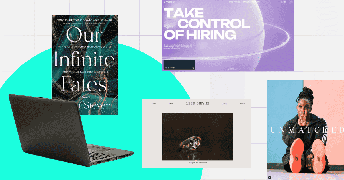
The design of your ads or marketing materials will make or break your campaigns. Cool graphic designs back up your campaign’s messaging and are the key to raking in millions of views, shares, and engagement.
Whether it’s for brochures, logos, websites, or any media medium, having a design assistant to help you with advertising visuals is key to success. Work with Penji for your branding and marketing graphics and experience hassle-free graphic design.
Meanwhile, we’ve curated 10 cool designs from businesses to inspire you.
1. Intricate Book for Our Infinite Fates
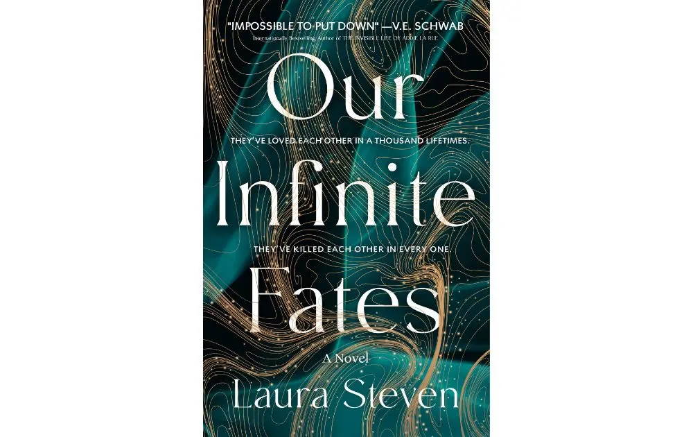
This cover for the book Our Infinite Fates by Laura Steven uses fluid typography, swirling golden lines, and deep teal hues to create a sense of mystery and depth. The intricate background elements give the book an ethereal quality, making it stand out in the crowded world of book covers.
2. Playful Blog Thumbnails by Help Scout
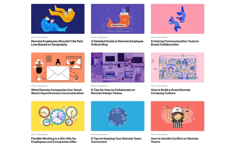
Help Scout’s blog thumbnails embrace flat illustrations and vibrant colors, showing how professional graphic design services can really make a difference. The consistent style across different topics creates a strong brand identity while keeping each article instantly recognizable. This design approach proves thumbnails don’t just preview content—they enhance brand storytelling and create a seamless user experience.
3. Futuristic Minimalism by J-Vers
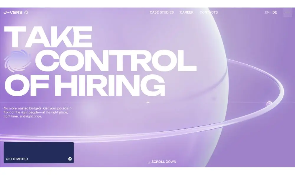
J-Vers’ hiring page showcases a futuristic take on minimalism, using a soft purple gradient and oversized text. The orbital elements, meanwhile, create a sense of motion and reflect an interactive graphic design.
4. Simple Luxury by Leen Heyn
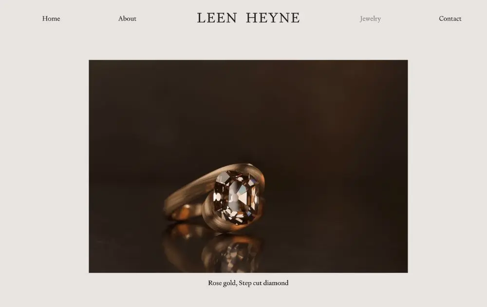
This luxurious product photography design by Leen Heyn highlights the beauty of craftsmanship with warm lighting, soft shadows, and a sophisticated serif font. The minimalist approach keeps the focus on the product, emphasizing its elegance. It’s a perfect reminder that sometimes, the most cool graphic designs rely on subtlety and simplicity.
5. Edgy Music Blueprint by Dorothy

This cool graphic design transforms a music history lesson into an interactive art piece. Rock and Roll Love Blueprint by Dorothy uses intricate typography, interconnected lines, and high-contrast colors to create a visually striking infographic that appeals to music lovers and design enthusiasts alike. The blueprint-style layout makes complex details digestible while maintaining an artsy edge.
6. Cool Campaign by IKEA
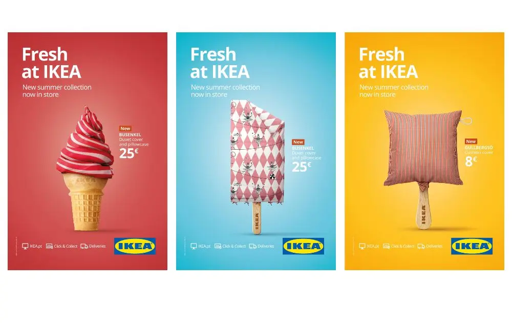
IKEA’s ad campaign called Fresh at Ikea is a brilliant example of a visual metaphor in marketing. By transforming household items into frozen treats, this campaign creates a playful yet effective visual hook that stops viewers in their tracks. The bright, high-contrast backgrounds make the products pop.
7. Unconventional Images by Adidas
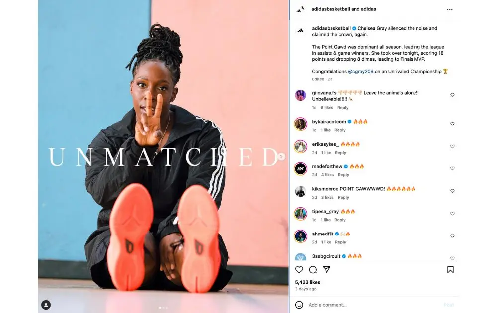
Adidas’ social media marketing campaigns are a masterclass in simplicity and power, as illustrated by the example above. The bold typography perfectly aligns with the subject’s confident pose, making the message feel both inspiring and authentic. Also, the minimal color palette keeps the focus on the athlete, while the negative space allows the brand’s message to breathe.
8. Colorful Travel Posters by Penji
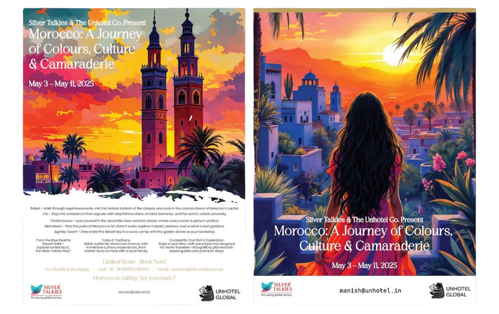
These vibrant, illustrated posters by Penji capture the spirit of Moroccan travel with bold colors, intricate details, and atmospheric lighting. The painterly style gives the ads a timeless appeal, making them feel like works of art rather than traditional travel posters.
9. Striking Images by Time Magazine
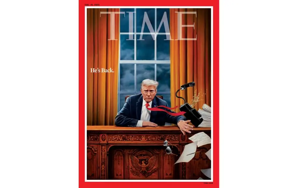
Time Magazine’s cover art remains a benchmark for cool graphic designs in editorial illustration. This particular cover employs surreal storytelling, bold contrast, and strategic composition to convey a powerful message. The use of symbolism—such as flying documents, a telephone, and a drink—turns political commentary into a visual masterpiece.
10. Clean Layout by Apple
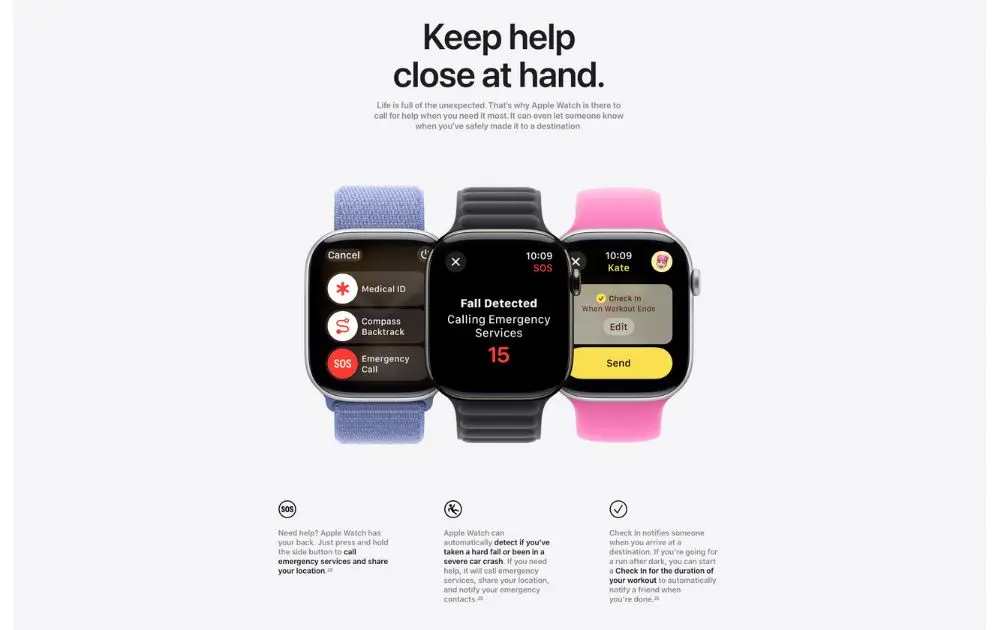
Gone are the days when designers have to fill the entire medium with images — white space is in, and for a good reason. Negative or white space allows the eyes to relax and process information efficiently. It also makes the design clean and crisp, which can be suitable for brands that bet their bottom dollar on reliability, respectability, and elegance. Take a cue from the product page of Apple Watch Series 10.
How Cool Graphic Designs Can Help Your Business
Investing in cool graphic designs isn’t just about aesthetics—it directly impacts your brand’s success. Here’s how:
- Boosts Brand Recognition – A strong visual identity helps customers instantly recognize your brand, whether it’s through graphic design packaging or digital content.
- Enhances Marketing Impact – Eye-catching designs improve engagement across ads, websites, and social media, driving higher conversion rates.
- Builds Credibility and Trust – Professional graphic design in business makes your brand look polished and credible, increasing customer confidence
- Improves Customer Experience – Whether it’s a sleek website layout or intuitive infographics, great design enhances usability and retention.
These benefits indeed allow a business to step up its brand value and conversions. And if you want a better ROI for your marketing efforts, switching to unlimited graphic design can be a cost-effective way to scale your branding.
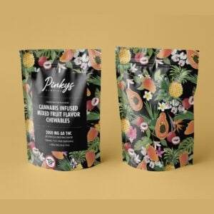
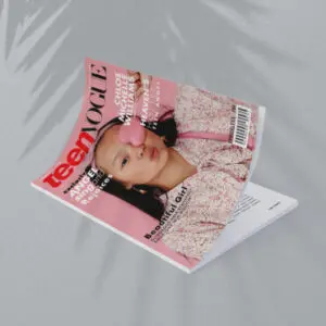
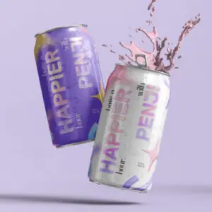
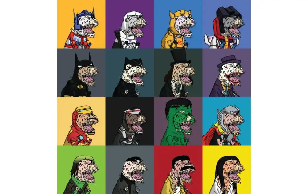
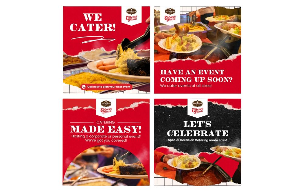
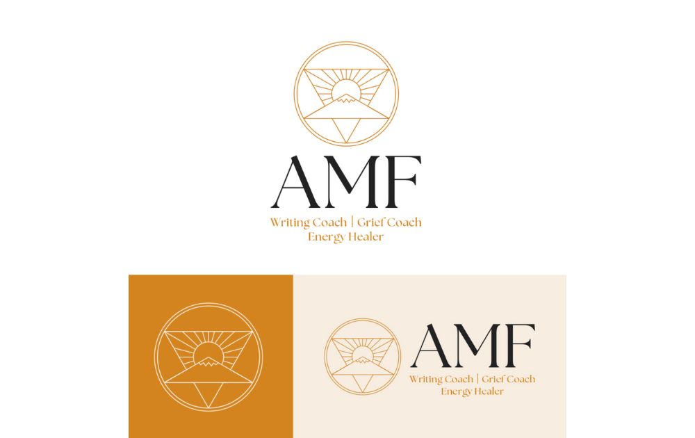
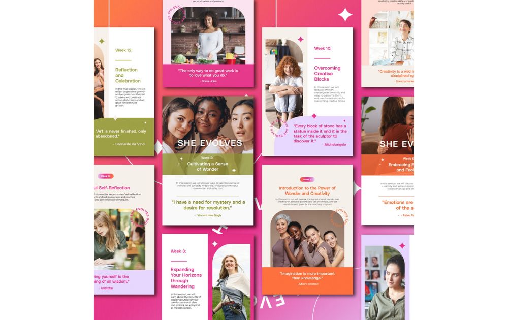
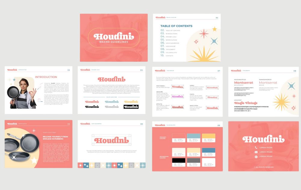
Here are a few examples of business visual assets by Penji’s professional graphic design services:
 |  |  |
 |  |  |
Why Brands Need To Invest In Cool Graphic Design
Graphic design trends are evolving. The use of asymmetric layouts, abstract images, gradient colors, flowing shapes, isometric designs, and customized illustrations are just a few that marketers should meddle with.
Run-of-the-mill designs keep your brand in the backseat, trailing behind brands that use cool designs. Additionally, audiences are also changing their preferences on how they want to view marketing collaterals. That said, brands must cater to their audience’s needs to stand out in a cut-throat industry. And only the experts know how visual communication allows brands to connect with their target audiences.
If you want cool graphic designs that don’t break the bank, subscribe to Penji. Watch a short demo today and learn how professional graphic design can boost your brand.
About the author
Table of Contents
- 1. Intricate Book for Our Infinite Fates
- 2. Playful Blog Thumbnails by Help Scout
- 3. Futuristic Minimalism by J-Vers
- 4. Simple Luxury by Leen Heyn
- 5. Edgy Music Blueprint by Dorothy
- 6. Cool Campaign by IKEA
- 7. Unconventional Images by Adidas
- 8. Colorful Travel Posters by Penji
- 9. Striking Images by Time Magazine
- 10. Clean Layout by Apple
- How Cool Graphic Designs Can Help Your Business
- Why Brands Need To Invest In Cool Graphic Design

