Several elements can be considered when designing a clothing brand logo to create an impactful and memorable design. Go for a simple logo that is versatile and memorable. Your clothing brand logo must have an uncluttered appeal so it’s easily understandable at a glance. If you don’t know where to begin, here’s our guide on creating a clothing brand logo that sells.
Clothing Brand Logos: Do you need a better one?
Some apparel newbies tend to think that producing fabulous clothes is all it takes to make it big in the industry. Though product quality is surely a crucial factor, that alone wouldn’t pave the way to growing your business.
To prove this point, let’s take a look at these little black dresses:
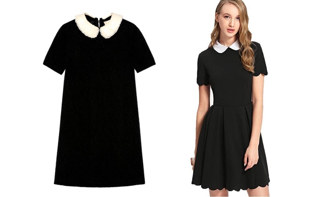
The one on the left is made of wool and has an embroidered collar, while the one on the right has a decorative lining. Other than that, both have white collars, black bodice, short sleeves, and above-the-knee length.
Can you guess which one is more expensive? Most folks who love shopping would probably say the left dress is pricier, given its finer materials. If that’s your pick, you’re correct.
But here’s the real question: can you guess how much more it costs than the right dress?
Get ready for this – the price difference is a whopping $1,050.
Yup, that’s not a typo. The one on the left is from Gucci and costs $1,350. The one on the right is from a boutique called Floerns and sells on Amazon for $29.99.
Raw materials and craftsmanship aside, Gucci can really ramp up its pricing. After all, it’s a brand associated with opulence and luxury – the type of clothes celebrities don on the red carpet.
In fact, you’re probably familiar with the logo of the Florence-based fashion house. Its newest logo revision was released in 2019 (the one on the right).
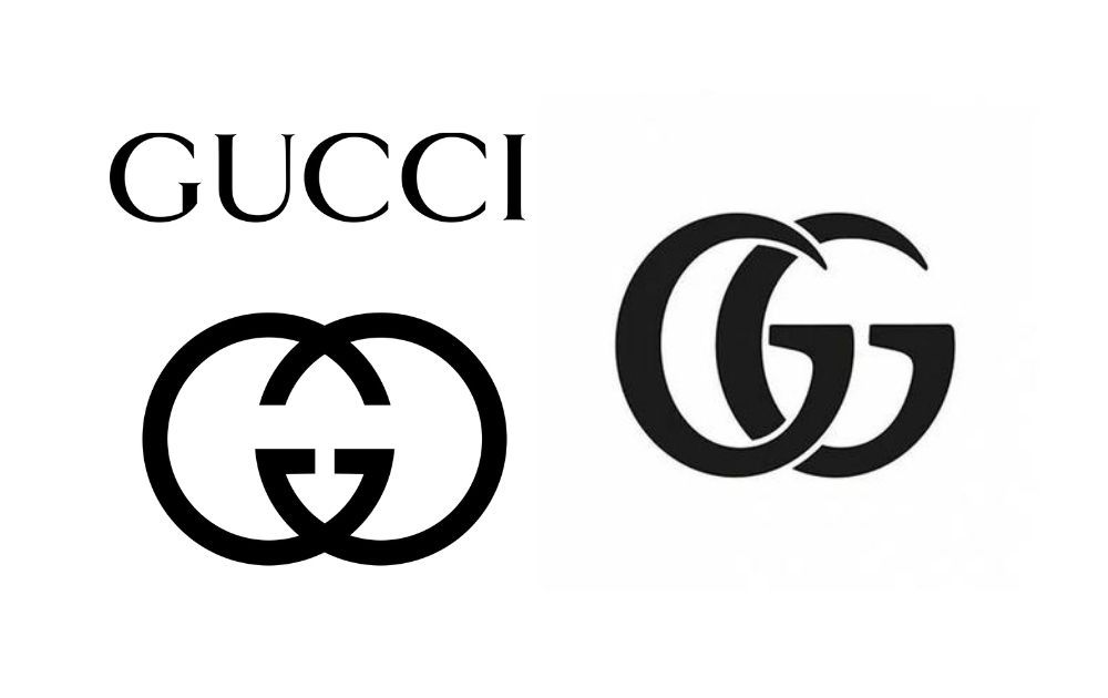
To answer the question above, of course, a clothing brand needs a logo. But not just any type of logo – it should be a visual that captures the brand.
Related Post: Graphic Design And Marketing: 7 Things You NEED Designed Right
What Type of Logo is Best for a Clothing Brand?
The example above shows us how crucial marketing is to creating a sustainable apparel business. After all, an apparel brand centers around how the consumer feels when they’re wearing the item. And you have the power to shape that with the help of marketing.
Shoppers should want to pay extra for your product because your logo is on the tag or label.
Now, let’s test your branding prowess and try to name these clothing brand logos:
If you answered Nike, Louis Vuitton, Adidas, and Chanel, you’re correct – and it’s not surprising. According to data from Statista, these are among the top 10 apparel brands worldwide in 2020, along with Gucci, Cartier, Zara, H&M, Uniqlo, and Hermes.
Yes, marketing efforts are vital. But above all, it’s crucial to pay attention to the single visual that encapsulates the brand – your logo.
What are the Rules of a Good Logo?
Here are some of the principles marketers consider when brainstorming clothing brand logo ideas. Since we’re in the business of looking at the top apparel companies, let’s see how each principle applies to brands that made the list.
1. Originality
Originality is key for clothing brand logos. After all, you’d want shoppers to appreciate the uniqueness of the value you’re providing as a business.
In relation to that, you wouldn’t want to appear as a knock-off of any other brand. And like it or not, your logo is your brand’s number one ambassador. No matter how awesome our creations are, a logo that looks like a weak copy of another brand can sabotage your business. How? Simple – it will make it easy for consumers to think you’re offering cheap and substandard products.
Uniqlo’s logo is a good case study for originality.
Here are some of the factors that make the brand’s logos original and unique:
- The logo uses the colors red and white. According to their design team, they chose a palette with the same hues as the Japanese flag. As fans of the brand would know, the brand hails from the Land of the Rising Sun.
- The brand has two logos – one in katakana (one of Japan’s writing systems) and one in English. According to Uniqlo’s lead designer, Kawashi Sato, the katakana logo is meant to give the visual an international flavor. Sato says the dual language logo reflects how the brand embodies Japanese pop culture.
2. Unique Identity
Another objective to consider when creating clothing brand logos is to let the brand’s unique identity shine through. Needless to say, having an original logo can be futile if it doesn’t show what your brand stands for.
This is why brainstorming for a logo requires a lot of brand introspection. What makes you different from your competitors, and what unique value can you offer?
As seen from the example above, Uniqlo hit the mark in this department. Their design team searched within, found their unique identity as a brand that represents Japanese pop culture, and worked with that. As a result, they came up with a logo that’s true to itself but also progressive enough not to alienate the international market.
In the same vein, Zara’s logo shows us how to reflect a brand’s unique identity through its insignia.
The brand, headquartered in Galicia, Spain, had its old logo revamped in 2019. The logo shows a serif typeface, slightly more exaggerated, printed in block capital letters.
In contrast to the previous logo with large spacing in between, French agency Baron & Baron changed the visual to have overlapping letters. Though some design enthusiasts say the new logo looks “claustrophobic,” insiders say it might be an indication of Zara’s identity shift to re-establish itself as a luxury clothing brand.
Related Post: Revolutionary Modern Logo Design Examples
3. Simplicity
A simple logo definitely has its perks. Not only is it easier to understand and absorb, but it’s also easier to remember. For instance, try to picture the logos of the following brands:
- Mac
- McDonald’s
- Target
- Mercedes Benz
Did you picture an apple with a bite, double arches, red and white circles, and a three-pointed star within a circle?
That only goes to show the power of simple logos. The strength of simplicity doesn’t only apply to automotive, retail, electronics, and food. It also applies to basically all other industries, including apparel.
When it comes to simplicity, Cartier surely hits the mark.
Though the brand has a monogram logo with intertwining C letters, its wordmark logo is arguably more popular. The wordmark features an italicized serif typeface that reflects classic elegance. Its monochrome palette adds further to its luxuriant air.
4. Timelessness
Though many brands revamp their logo now and then, it’s best to have one that will last you a long time. If your brand stands the test of time, you should be revising your logo in a decade, not a couple of years.
Here are a few tips to keep in mind to make a timeless logo:
- Keep your fonts simple. Would you ever trust a brand donning a logo with a Comic Sans font? Probably not. Stay away from dated typefaces; the simpler, the better.
- Avoid trendy palettes. Just as with fonts, try not to incorporate trendy color palettes into your logo. It may look good right now, but it could look passe in just a few years.
- Consider how it would look in monochrome. You wouldn’t know how your business will evolve in the next years. You may be printing your colored logo on labels now. But what if there comes a time when you need to have it embossed on products, such as belts or footwear? That said, try to come up with a logo that would look great, even in monochrome.
It’s hard to miss Hermès’s logo when talking about timelessness.
If you want a logo like this, you’d probably need to hire an illustrator to do the job well. But it will be all worth it. After all, this logo for Hermès is the same insignia representing the brand since the 1950s. And just like any designer clothes logo, the visual looks expensive and affluent – fitting for their products’ price tags.
5. Memorability
Not only should the logo be easily understood, but it should also make a lasting impression. Before you scroll up, try to picture H&M’s logo in your head. Do you clearly remember how it looks?
H&M’s logo is an example of how memorable a logo can be if you sew together originality, unique identity, simplicity, and timeliness. A good logo with all these qualities will sear into people’s minds without much effort.
Of course, a bad logo can just be as memorable, but you wouldn’t want to be unforgettable for the wrong reasons.
Related Post: Custom Logo Design Using a Graphic Design Service
How Do I Create a Clothing Brand Logo? (Free and Paid Options)
Given the tips above, you probably understand how you want your logo to come together. The next question is, how do you actually materialize the visual? Here are a few free and paid options to get the job done.
Online Logo Makers
Free online logo maker platforms have multiplied from a handful to a few dozens over the past couple of years. And if you’re a small business starting from scratch, this could be a practical option. All you need to do is choose from a variety of pre-designed templates, tweak the elements (fonts, colors, images), and export.
PROS
- Most platforms are easy to use, and they don’t charge anything.
CONS
- Because they’re free, you’d probably end up with a logo that looks like a billion other brands around the globe.
- You wouldn’t have guidance from a design professional as you create your brand’s most important visual.
Freelance Graphic Artists
Whether you’re looking for a signature brand or a streetwear logo maker, the online job marketplace offers a wide array of freelance graphic artists up for the task. However, the challenge lies in filtering through the applicants. Also, most online job marketplaces are open to everyone – even those with minimal to no skills and experience.
PROS
- Many freelance graphic artists offer an affordable rate for designing logos.
CONS
- Some online job marketplaces aren’t very strict in accepting vendors. That said, trying to hire a designer with the cheapest rates will probably give you the least favorable results.
- There’s always a risk of the freelance designer going M.I.A. on you in the middle of a project.
Unlimited Graphic Design Subscription
Many companies, from small businesses to mega-corporations, choose to outsource their graphic design needs to unlimited graphic design service providers like Penji.
Here are some of the apparel logos we’ve done in the past:

PROS
- Penji has the top 2 percent of graphic designers, so you can rest assured that your project will be handled by a pro.
- We offer a 24 to 24-hour turnaround time. So you can stay on top of your campaign schedule.
- Because we offer unlimited graphic design, you can have all the graphic designs you need – from logos to email marketing design – all from one reliable partner.
CONS
- You might not make the most out of our monthly packages if you only need one or two graphic designs.
Related Post: What to Expect From Penji Illustrators
Nailing Your Visual Graphics with Penji
Logos represent the brand at a glance. So, if there’s any graphic you need to nail from the start, it’s definitely this visual.
When brainstorming for your logo, make sure that it reflects who you are as a business and your unique value proposition. Only by doing so can you come up with a logo that will set you apart from your competitors.
If you’re looking for a partner in creating visuals that appeal to your audience, check out our services here at Penji. We offer unlimited graphic design at a flat monthly rate. So, you can have all the graphic designs you need – from logos to ad designs – without breaking the bank. However, if you need one logo request, Penji offers a one-off logo design service at an affordable rate.
Because we have the top 2 percent of designers, you know you’ll be in good hands. Sign up now and get a money-back guarantee.
About the author

Carla Deña
Carla is a journalist and content writer who produces stories for both digital and legacy media. She is passionate about creativity, innovation, and helping small businesses explore solutions that drive growth and social impact.
Table of Contents
- Clothing Brand Logos: Do you need a better one?
- What Type of Logo is Best for a Clothing Brand?
- What are the Rules of a Good Logo?
- 1. Originality
- 2. Unique Identity
- 3. Simplicity
- 4. Timelessness
- 5. Memorability
- How Do I Create a Clothing Brand Logo? (Free and Paid Options)
- Online Logo Makers
- Freelance Graphic Artists
- Unlimited Graphic Design Subscription
- Nailing Your Visual Graphics with Penji

