
A creative brand logo establishes the brand’s identity. Big brands like Nike, Apple, and Google won’t be household names without this. However, when you invest in a memorable and unique logo, your business can make a name for itself and be a recognizable brand.
And if you want to get inspiration for your new logo before you meet your graphic design services provider or make one yourself, check out our list of creative brand logo examples from hidden gem brands!
1. Oura Ring
Check out this brand logo example from the wearable ring company Oura Ring. It looks sleek and simple at first glance. However, you’ll notice a horizontal line on top of the O in the wordmark. Based on the imagery, it could look like a ring with a head. Plus, the logo seems minimalist, which reflects the brand’s product.
2. Nothing

Here’s one unique brand logo design. The Nothing phone company uses dotted text to mold its wordmark. According to Seventy Agency, the logo design was inspired by IBM’s iconic mainframe. Most graphic design experts believe that retro is in again, and you can find inspiration from the past like Nothing did when creating its logo.
3. Crumbl

Turner Duckworth redesigned the Crumbl Cookies logo. Before the redesign, it had a bite mark and a sans-serif wordmark of “Crumbl.” The agency says it gets inspiration from the old logo and goes for a combination of sweet and distinctive. You can use this logo as inspiration to understand why some logos have a “softer” look. This could indicate friendliness or approachability.
4. Allbirds
The Allbirds logo is one of the few cursive logos on this list. Cursive isn’t a choice of font for MANY brands. However, like some that use this logo font style, theirs uses a readable and legible cursive style. The brand uses a lettermark as an icon when loading its website or a pin on the map. When looking at it, it looks like a wing, which matches the brand’s name.
5. goodr
If you want a hip and trendy logo design, check out this logo from goodr. It uses a mint green motif, which is pleasing to the eyes. Regarding logo design, it’s similar to Crumbl, which uses rounded edges to establish a friendly identity. The lowercase logo further underscores its more modern look and casual style.
6. Hipcamp

Do you want to go for a subtle nature-aesthetic look? Check out this logo from Hipcamp. What’s great about this logo is that it replaces the letter A with the tent, making it a creative logo design. Additionally, when you examine the logo in further detail, the font and color are earthy, which matches the brand’s identity.
7. Peet’s Coffee
Here’s a cool brand logo example from Peet’s Coffee. What’s great about this logo is that it’s shaped like a mug. The logo uses geometric patterns that are used in some coffee shop graphics or designs. The brand uses its combination logo on the website, but sometimes it uses the combination wordmark, which is used on the storefront or packaging.
8. Oars + Alps
Here’s a unique brand logo example to see when creating your logo. Oars + Alps combines the imagery of oars and alps to establish its branding identity. Additionally, it omits the horizontal line on the letter A, which resembles mountains. You can take inspiration from this logo if you want a literal translation of your name to imagery and how you can make it work for your brand.
9. Pipcorn
If you want an emblem-style logo, here’s the logo for Pipcorn. Rarely do we see emblem logos as more preferred modern wordmark logos. However, Pipcorn’s logo is relevant to the brand. The circle logo could indicate that the brand promotes wholesome products and everyone can benefit from consuming their products. Additionally, you will see a corn kernel to show what its products are made of, even in the logo!
10. Function of Beauty

The Function of Beauty logo gets inspiration from the “function” expression or rule. Aside from that, it uses a long horizontal line to separate function from of beauty. It’s unique because you don’t see this logo style. However, that’s what will distinguish this brand from other haircare and skincare products on the market! You can use this logo design as inspiration if you want to achieve a distinct style.
11. Thinx
The Thinx logo represents its brand identity well. As a brand that promotes underwear for periods and bladder issues, the logo reflects this by showing water droplets. It uses a combination logo mark, a wordmark, and an abstract image to represent the brand.
12. Olipop
If you want a logo that doesn’t adhere to conventional wordmark styles, you should consider Olipop as your inspiration. The wordmark is shaped like a rainbow, which gives the brand a fun vibe. Additionally, as seen in the packaging on cans, the Olipop logo is color-versatile; adapting to different colors, depending on the flavor.
13. Faherty
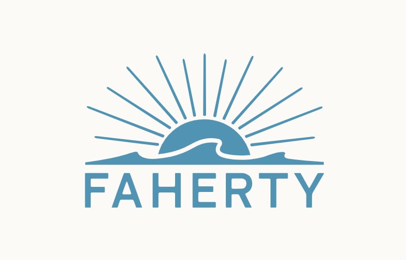
Check out this logo inspired by the brand’s background. Faherty is a family-owned business hoping to make a big social and environmental impact. The business background stems from surfing sessions, bonfires, and road trips, which inspired the brand’s logo. The sun and waves are the main imagery of the logo, establishing the brand’s identity and background in one photo. Aside from that, the logo follows design principles since it’s versatile in color and use.
14. Paris Baguette
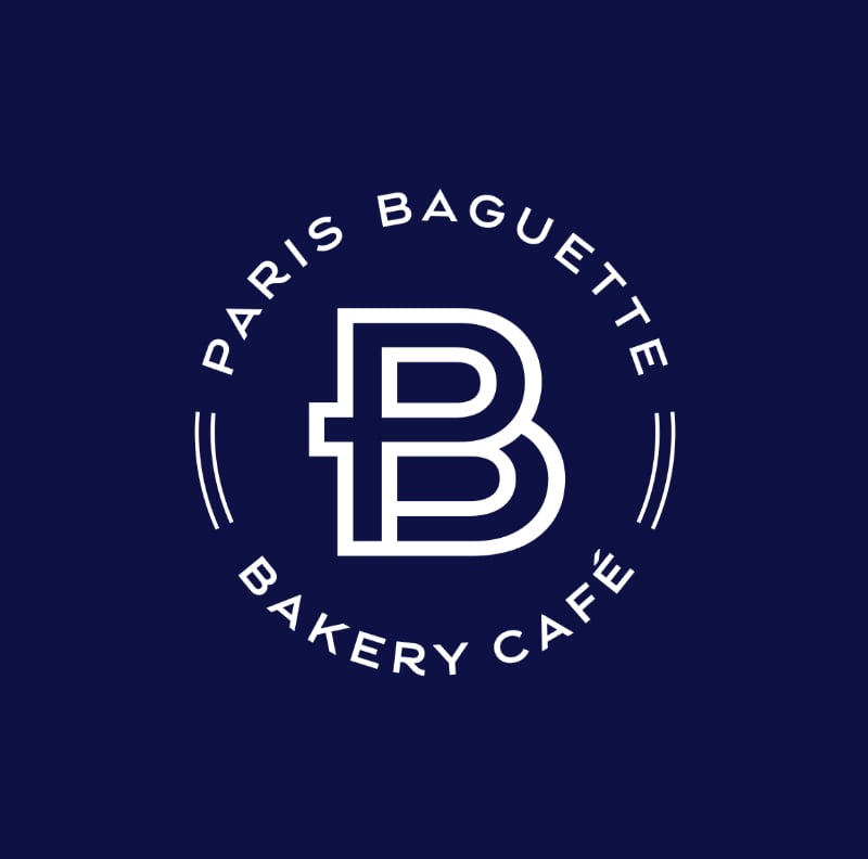
Our final logo comes from Paris Baguette. Although a well-known brand, the bakery’s logo is creative and unique. It combines the P and B in the monogram. Plus, it uses an emblem style to showcase its full name!
Why a Logo Is Essential for Your Brand (Bonus: More Creative Logo Examples)
Your logo is more than a decorative element; it’s a powerful branding tool. Here’s why every business, big or small, needs a standout logo, along with custom logo designs from Penji:
First Impressions Count
Your logo is often the first visual touchpoint for potential customers. A strong logo creates instant recognition and builds trust.
For instance, Mavka’s custom designed logo instantly conveys professionalism and credibility, making a strong first impression that builds trust across its financial services branches.
Brand Consistency
A consistent logo across your website, packaging, and marketing materials reinforces your identity and professionalism.
Let’s take Wilbr’s cool logo, for example. It maintains a consistent shape, color usage, and iconography across different contexts—reinforcing brand recognition and presenting a unified identity in both digital and print environments.
Emotional Connection
Whether you’re building app logos or food logos, thoughtfully designed logo can help create brand loyalty and recall. That said, here’s one of the most crucial graphic design logo tips to learn: make sure that your colors, typography, and imagery can trigger emotions.
With its refined typeface and muted color palette, the logo above evokes trust, elegance, and professionalism. That said, it creates an emotional connection that resonates with clients seeking image consulting services and leaving a memorable impression.
Competitive Edge
In saturated markets, an eye-catching logo can be the difference between being remembered or ignored.
By using bold visuals and literal imagery that stand out in a niche market, the logo above gives the podcast a sharp competitive edge. It grabs attention, conveys relevance, and makes the brand instantly memorable.
Scalability & Versatility
A great logo adapts across platforms, from social media icons to print assets, without losing impact. Let’s take a look at the example above made with Penji’s logo design services:
By maintaining visual impact in full wordmarks, app icons, and alternate color schemes, the TRYST logo proves its scalability and versatility. If your present logo doesn’t translate well across various formats, you might need logo redesign services to help ensure brand recognition whether on a business card or a billboard.
Final Thoughts: Start Strong With a Unique Logo
As you’ve seen in these creative brand logo examples, there’s no one-size-fits-all approach to logo design. From abstract icons to clever type treatments, each logo tells a story that reflects the brand’s values, audience, and personality.
Now that you’ve seen various brand logo examples, it’s time for your business to get your unique brand logo design with a professional logo design service.
Fortunately, Penji‘s logo designers are masters at their craft and will help your brand stand out from the crowd with a memorable and creative logo design!

You can request a logo and get as many designs as you need until our logo designers get it right! Plus, you can request other graphic design projects to get your business up and running from Day 1. No wonder why Penji is the top graphic design service provider of brands worldwide.
And if you want to see how to request your logo and other graphic designs, watch a demo video and check out our portfolio.
About the author

Katrina Pascual
Katrina is a content writer specializing in graphic design, marketing, social media, and technology. In her spare time, she writes monthly personal blogs to practice her craft.
Table of Contents
- 1. Oura Ring
- 2. Nothing
- 3. Crumbl
- 4. Allbirds
- 5. goodr
- 6. Hipcamp
- 7. Peet’s Coffee
- 8. Oars + Alps
- 9. Pipcorn
- 10. Function of Beauty
- 11. Thinx
- 12. Olipop
- 13. Faherty
- 14. Paris Baguette
- Why a Logo Is Essential for Your Brand (Bonus: More Creative Logo Examples)
- Final Thoughts: Start Strong With a Unique Logo


