

If you want to generate new customers, widen brand awareness, and boost your business, a new logo should be your priority. Here are ten accounting logos made especially by our talented Penji logo designers to help you design yours.
To know more about what we do, click on this link to watch our demo video.
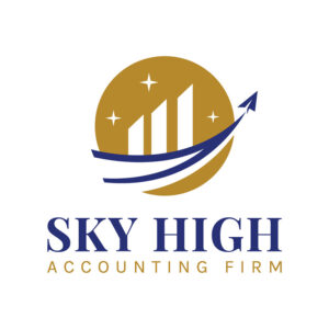
1. Sky High Accounting Firm

With an arrow icon pointing toward the sky, this logo design created for Sky High Accounting firm tops our list. It creatively shows the company’s commitment to high-quality standards of service. This is proof that a logo carries so much power.
You’d be missing out on many opportunities if you don’t pay enough attention to its creation. The use of the colors blue and gold is also indicative of the company’s mission. Blue and gold are commonly associated with dependability, trust, and authority.
Get your clients' attention with these amazing accounting logos
Create unique logos today and get them tomorrow
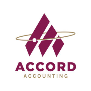


2. Accord Accounting
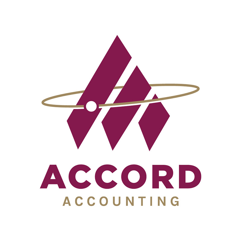
Using three stripes to form the letter A, this logo designed for Accord Accounting is an excellent example of an A logo. This logo has a tiny planet orbiting the letter A. It represents the idea that Accord is the only company you’ll need for all your accounting requirements.
We all know that the color gold is typically associated with top class. Paired with maroon, which exudes warmth and passion, it is a combination that suitably shows expert yet friendly services.
3. The Platinum Label Finance Group

Silvery-white is the color of platinum, which fits this accounting logo created for The Platinum Label Finance Group. An effective logo is one that tells everyone who you are. This one does just that by including an icon that is reminiscent of a pillar.
The simplicity of this logo’s design adds a classy and elegant touch. It isn’t loud and crowded, making the company exude a professional persona. Even the font choice is at the minimal level and one of the most basic typefaces.
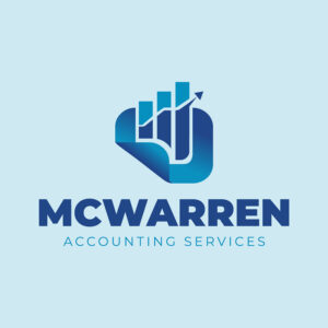
4. McWarren Accounting Services

Accounting is mostly about numbers, and businesses want theirs to go up. In this logo design created for McWarren Accounting Services, an arrow pointing upwards is a great sign that business is booming. Its monochromatic design uses blue to show loyalty, trustworthiness, and dependability.
If you need to know the right colors to use for your accounting business, it’s highly recommended to research color psychology. You’ll find out there is more to color than choosing your favorite ones.
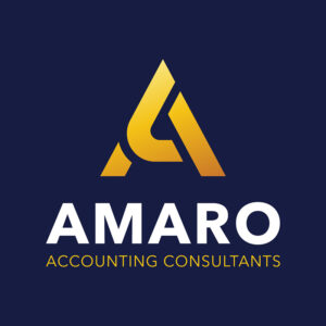
5. Amaro Accounting Consultants
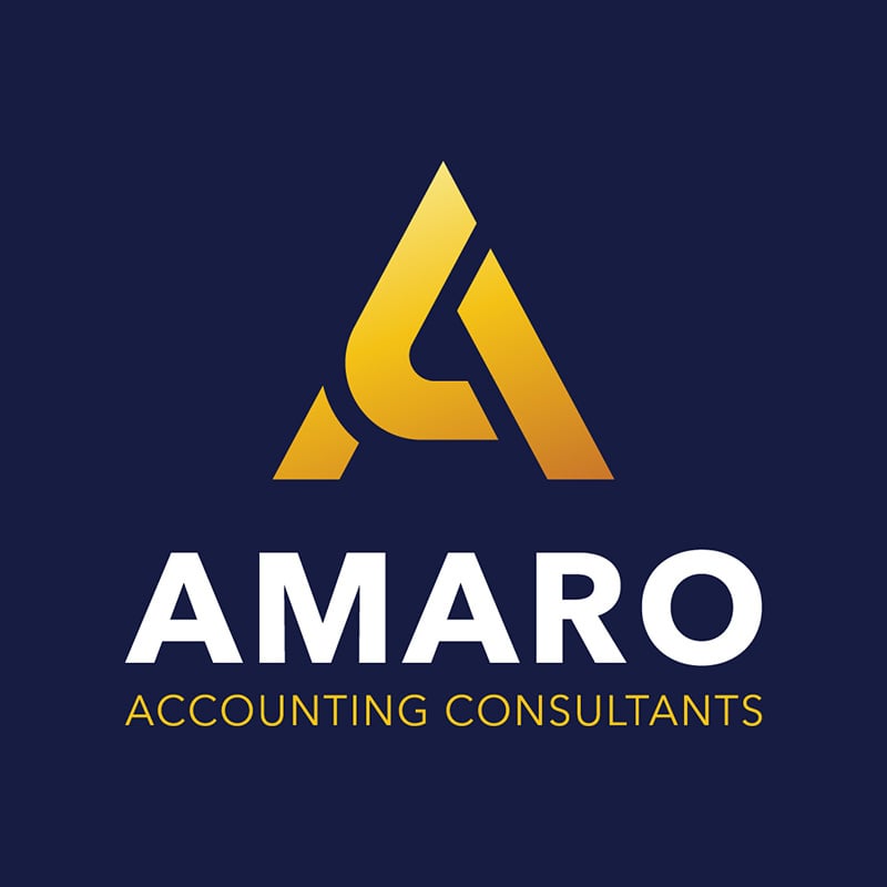
When creating a brand identity for your business, it’s essential to consider all the print and digital assets you’re going to need. This logo design for Amaro Accounting Consultants is a great example. This design is simple but can be used on a wide array of marketing collaterals.
You can place a design like this on any printing material, social media platform, or website without any issues. It is scalable and flexible, plus its sheer simplicity will make it easy to recall.
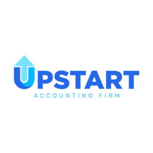
6. Upstart Accounting Firm

This unique logo designed for Upstart Accounting Firm can be used with or without the brand name. The execution of the letter U with the arrow makes it an exciting and appealing brandmark. Imagine it in your newsletters, business cards, letterheads, and other marketing peripherals.
While we may associate accounting with bland and dull, it doesn’t have to be. You can show it in your logo the way this accounting firm did. The use of light colors gave the brand a friendly and approachable persona.
7. The Gold Standard
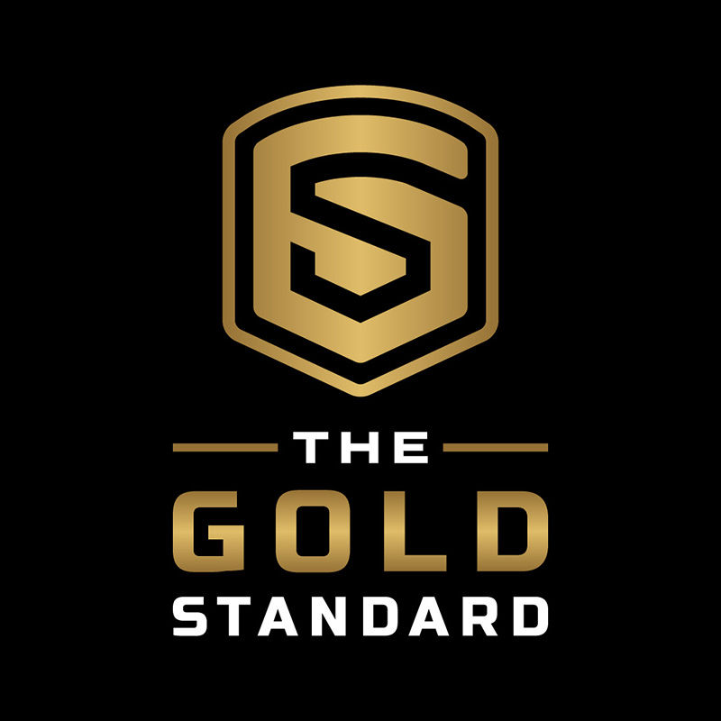
We know the color gold as the symbol of wealth and prosperity. Not only did The Gold Standard take advantage of the name, but it also incorporated it into its logo. The choice of a black background is wise as it brings out the brand name even more.
The overall design is simple, with ample negative space around it. This way, the icon is emphasized, making it clear whatever size you use. The fonts are very basic, nothing fancy, which is ideal for logo use.
8. Ozark Finances

The letter O is an excellent letter for logo design thanks to its versatility. This Ozark Finances accounting logo has a straightforward design but can still command attention. The look is professional, competent, and authoritative.
An accounting logo should show your brand’s personality and the traits that make you distinguishable from the competition. This one does it so well despite its simplicity. The color scheme and the font choice all work together to give the brand a harmonious look.
9. Cosmic Accounting
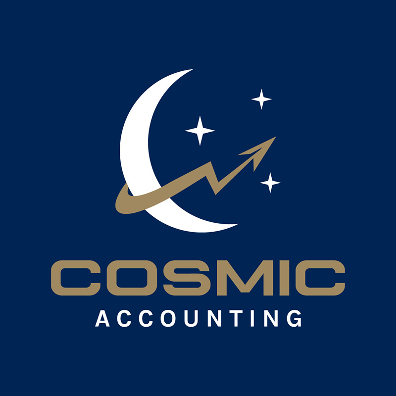
As its name suggests, this logo design for Cosmic Accounting has elements from the cosmos. The moon and the stars give it an enigmatic ambiance that we can consider showing top-quality service. The blue background gives it a professional feel amidst a design that’s out of the ordinary.
The font choice for the logo is plain and simple. It does not need serifs as the design already has many elements. A logo such as this one only requires a primary typeface to balance off the details on the icons.
10. Good Money, Inc.

Many people associate money with the color green. It is steeped in history, but the bottom line is green is a good choice for accounting firm logos. In this logo designed for Good Money, Inc., an illustration of a paper bill is included.
This cleverly designed logo can stand on its own. You can use it even without the brand name attached. It is easy to remember and would go well with whatever marketing material you place it on.
A few tips to remember when designing your accounting logo:
- Use colors that evoke emotions suitable for your business. Blues and greens are popular choices for accounting as they convey trust and growth. However, no hard and fast rules tell you not to use other colors. This is where having a great designer is most valuable: they can create accounting logos that are relevant to the industry using whatever color you decide on.
- Avoid using cliche icons such as calculators, graphs, or scales. Explore other symbols that you can use, like a rising line to signify financial growth or a book to convey knowledge. Again, do not follow trends or what’s popular, instead, think outside the box to differentiate your brand and make it stand out.
- Ensure that your logo is scalable. This means that the design should look good on any platform or advertising paraphernalia you put it on. Test how it will look in black and white to ensure maximum usability.
Work with Penji for Your Accounting Logos
If you find that designing a logo for your accounting firm is complicated, leave it up to us at Penji. Our designers have the tools, expertise, and skills to create accounting logos that help you get clients’ attention. In addition, you’ll get all the visual assets you’ll need for your business.
From logo design to packaging design, we’ve got you covered. Click on this link to submit your first design request. Our team of talented logo designers will start working on your project.
About the author

Celeste Zosimo
Celeste is a former traditional animator and now an SEO content writer specializing in graphic design and marketing topics. When she's not writing or ranking her articles, she's being bossed around by her cat and two dogs.
Table of Contents
- 1. Sky High Accounting Firm
- 2. Accord Accounting
- 3. The Platinum Label Finance Group
- 4. McWarren Accounting Services
- 5. Amaro Accounting Consultants
- 6. Upstart Accounting Firm
- 7. The Gold Standard
- 8. Ozark Finances
- 9. Cosmic Accounting
- 10. Good Money, Inc.
- A few tips to remember when designing your accounting logo:
- Work with Penji for Your Accounting Logos


