
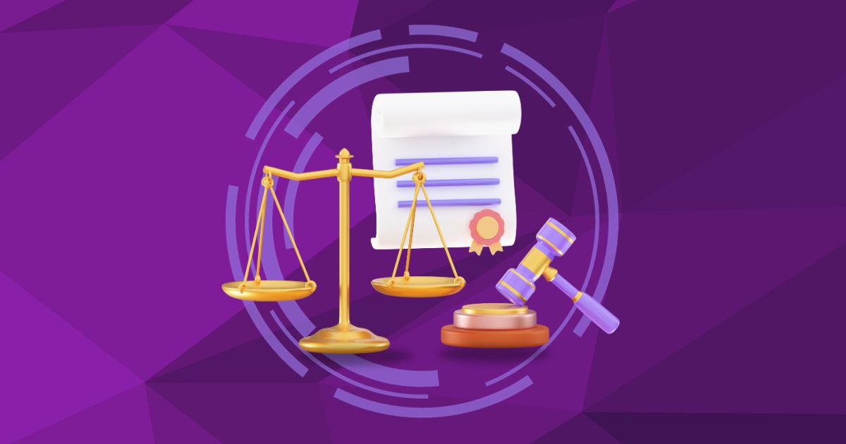
Justice can be summed up with the words fairness, equality, and order, among many others. If your brand deals with the business of providing justice, here are Penji’s best justice logos for your inspiration.
1. Book and Column
First in our list of justice logos is this simple but elegant image that uses some of the simplest justice symbols. The book represents knowledge and wisdom, and the column signifies the strength and stability of the justice system. This type of justice logo design would be perfect for a law firm or even a brand with a social justice mission. This logo design works well with any light or dark monochrome color scheme.
Justice logos that attract attention
Create your justice logo in 1-2 days
2. Scales of Justice
This blue and gold sword and scales of justice logo is also a classic, and it is perfect for your law firm or related business. The scales are balanced against each other, representing the equality of justice. The sword element, on the other hand, symbolizes power. The blue and gold hues make for a classic color combo, giving the brand a powerful look. This image would work best for a law firm, a legal organization, or an NGO. Similarly, you can also apply the same approach to a coach logo.
3. Pen Justice Logo
Next on our list of justice logos is this classic design that uses a pen image. The green-hued logo has a slight gradient effect that adds interest to the logo. The pen, on the other hand, represents the use of the law to bring justice to people. This justice logo design is perfect for a law firm or organization as it gives a sense of authority and importance.
4. Green and Gold Column with Initials
This justice logo design uses a sword and a column to represent the concept of justice. As mentioned earlier, the pillar represents the justice system’s strength to stand steadfast against any outside influences. The sword, on the other hand, symbolizes power. This combination and the initials make the logo simple yet memorable.
5. Pillar Design with Clean Lines
This two-toned justice logo design uses the image of a scale of justice. What makes the logo unique is the use of clean yet dynamic chunky lines. The horizontal lines are minimalist, and the vertical lines form a puzzle-like image. As a result, the logo looks straightforward yet remarkable.
6. Azure and Gold Scales of Justice
While most justice logos use dark hues, this image takes a less common path – using a lighter color, specifically azure. The column uses minimalist lines and a blue hue that matches the business name. The scales, on the other hand, have a gold hue, matching the small text at the bottom.
7. Pillar Design with Initials
If you’re torn between a column symbol and the initials of the business name, why not use both? This image, for instance, is one of those justice logos that incorporate both elements. The column acts as a line that forms the letter D and F, which stands for Davis Family Law.
8. Water Waves
This logo for East Coast Lawyers uses the scales of justice image but pairs it with an unusual element – water waves. The waves work well with the brand name, as the term “coast” is often associated with the sea. At the same time, the waves represent calmness and peace, which balances well with the strength embodied by the justice scales and the fist.
9. Gavel and Stars
Next on our list of justice logos is this image that uses a hexagon with a gavel inside, paired with laurels and stars. The gavel represents the settling of disputes and other legal proceedings, making it an awesome logo for a legal firm. If you want a more dynamic image, you can also ask your designer to transform it into a cube logo.
10. Gradient Initials
If you want a simple yet striking logo, try using clean lines with gradient colors. This image, for example, combines geometric initials with a black and gold gradient. As a result, the logo looks elegant yet straightforward.
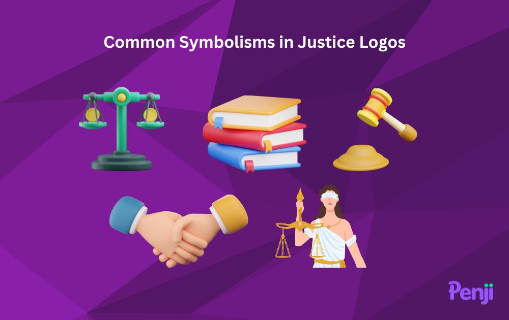
Common Symbolisms Used in Justice Logos
As seen from the examples above, certain design elements are typically used in justice logos to symbolize meaning. These are:
- Balance. Symbols of balance are usually used in visual communication to represent justice. That said, the scales of justice are one of the most common symbols in law. However, justice scales are not the only way to show balance. You can also represent balance by using symmetrical lines that are equal on both sides.
- Book. The book is a common symbol of enlightenment and wisdom. In the context of justice, a book could be reminiscent of the constitution and laws.
- Gavel. A gavel or a small wooden hammer is often used as a symbol of justice. It represents that justice is achieved through hard work and effort. In addition, the gavel is also a symbol of the authority of law.
- Hand. The hand is a symbol of giving, but when used to represent justice, it could either represent the giving of justice or the taking of justice.
- Blindfolds. Justice is meant to be without biases. In relation to that, blindfolds are used to represent justice because it’s a way to symbolize that justice is blind to the identity or position of the persons involved.
Tips for Designing A Justice Logo
Whether you’re designing a justice logo yourself or getting professional graphic design, here are a few expert design tips to keep in mind:
- Symbolism is Key. When creating justice logos, it’s essential to use symbols that resonate with the theme of justice. Feel free to use justice symbols in logos, as mentioned in the previous section, to immediately convey the idea of law, fairness, and balance.
- Choose the Right Colors. In legal logo colors, it’s best to opt for shades that evoke trust, reliability, and professionalism. In color psychology, blues, blacks, and deep greens are often associated with legal fields and can be a great starting point for your justice logo aesthetics.
- Keep It Modern. While it’s essential to convey tradition and trustworthiness, modern justice logos can help a law firm or legal service stand out in a competitive market. Consider incorporating modern justice logo designs with clean lines, minimalist symbols, and contemporary color palettes.
- Typography Matters. The font used in lawyer logo concepts should be clear, readable, and sophisticated. Avoid overly decorative styles that people would perceive as coffee shop fonts or text for a beauty brand. Instead, lean towards classic and bold typefaces that convey authority and stability, reflecting the essence of legal branding.
Remember, the key to a successful justice logo is a balance between tradition and modernity, ensuring it resonates with the target audience while standing out in the legal market.
Get a new logo or a logo revamped
Are you looking to create a new justice logo or update your existing one? Our team of experienced designers can help you create the perfect designs for your business.
With our expertise and creative vision, we will work with you to develop a logo that is visually appealing, reflects your brand values, and stands out from the crowd. We understand how important it is for your logo to be unique and memorable, so we strive to deliver a design that captures the essence of your company.
For a flat monthly fee, you can get 120+ different types of designs on a rolling basis – social posts, book covers, packaging designs, illustrations, and so much more!
Sign up now and get a 30-day money-back guarantee. Plus, here’s an offer for you – enter voucher code LOGODESIGN15 at checkout to enjoy 15 percent off on your first month.
About the author

Carla Deña
Carla is a journalist and content writer who produces stories for both digital and legacy media. She is passionate about creativity, innovation, and helping small businesses explore solutions that drive growth and social impact.
Table of Contents
- 1. Book and Column
- 2. Scales of Justice
- 3. Pen Justice Logo
- 4. Green and Gold Column with Initials
- 5. Pillar Design with Clean Lines
- 6. Azure and Gold Scales of Justice
- 7. Pillar Design with Initials
- 8. Water Waves
- 9. Gavel and Stars
- 10. Gradient Initials
- Common Symbolisms Used in Justice Logos
- Tips for Designing A Justice Logo
- Get a new logo or a logo revamped


