Visual design elements and principles aren’t just terms that designers throw around; they’re premium ingredients to designs that make an impact – whether they’re magazine ads, branding kits, packaging design, or anything else in between.
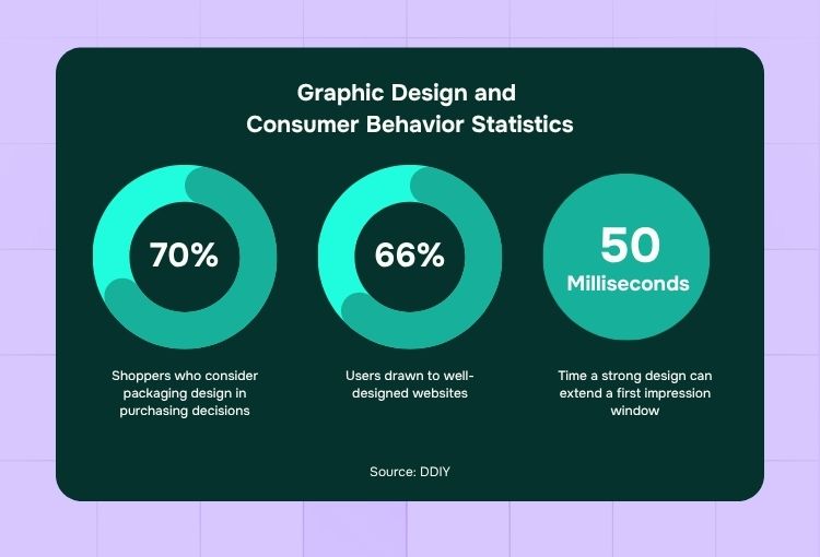
Here are a few statistics that illustrate just how important design elements and principles are to making a strong impression:
- Up to 70% of shoppers consider packaging design to be a key factor in their purchasing choices.
- 66% of users are drawn to well-designed websites.
- It takes just 6.8 seconds for a consumer to form a first impression, but a strong design can extend that impression window by an extra 50 milliseconds.
In this article, we’ll discuss the basics of applying visual design elements and principles. We’ll also throw in visual design elements and principles examples from a portfolio crafted by the world’s top 2% designers (yup, they’re here at Penji).
Visual Design Elements
Visual design elements are the foundational building blocks that shape every piece of visual content. Here are a few components, along with visual design elements examples that illustrate how they work in design:
1. Line
Lines are used to guide the viewer’s eye, create structure, emphasize text, or define shapes. That said, they can convey various emotions or messages based on their thickness, style, and orientation.
Image licensed by Penji
In this example, lines are used to create intricate, doodle-like patterns surrounding bold, hand-lettered text.
2. Shape
Shapes are defined areas in a design that are enclosed by lines or filled with colors, textures, or patterns. They can fall under these categories:
- Geometric (like squares, circles, or triangles)
- Organic (freeform and fluid shapes)
Image licensed by Penji
In the professional graphic design services asset above, clean lines create shapes that outline the cowboy, horse, and nature background.
3. Color
Color is, without a doubt, one of the most powerful visual design elements, capable of evoking emotions. That said, reputable visual design services that know how to use the color wheel can harmonize color palettes to convey the right message.
Image licensed by Penji
In this example, the design showcases the bold shades of teal, orange, and pink help the central character and text stand out against the dark background.
4. Texture
Texture refers to the surface quality of a design. Professional graphic design services use this to add depth, dimension, and realism to visual content, and, at the same time, help convey a specific atmosphere or setting.
Image licensed by Penji
In the example, the visual design services professional used layered shading in the sky and water to mimic the ripples of waves and the soft gradient of clouds. As a result, the varied tones and depth capture the feeling of the sea’s surface and the hazy glow of the sky at dusk.
5. Form
Form refers to the three-dimensional quality of an object in a visual composition. That said, it gives it depth and volume. Form is often achieved through the use of:
- Shading
- Perspective
- Highlights
Image licensed by Penji
As seen in the example above, the design features bold highlights and shadows, the elements pop out, giving the artwork a sense of depth and volume.
6. Space
Space in design refers to the area between and around elements in a composition. It can be:
- Positive (filled with content)
- Negative (empty areas, also known as white space).
Image licensed by Penji
The sample website design above makes excellent use of white space to create a modern, sophisticated feel.
7. Value
Value in design refers to the lightness or darkness of a color, which helps create contrast and depth.
Image licensed by Penji
This book cover design example by Penji uses value effectively to convey a sense of depth and atmosphere. By manipulating value, the design draws attention to the central elements.
Visual Design Principles
Visual design principles serve as the guiding rules that help designers arrange and organize elements effectively, ensuring a cohesive and impactful composition.
These principles of design are the backbone of every great visual:
1. Balance
Balance in design refers to the distribution of visual weight across a composition. There are different types of balance, such as:
- Symmetrical
- Asymmetrical
- Radial
Image licensed by Penji
This digital design contact page, for instance, shows an asymmetrical balance.
2. Contrast
Contrast, meanwhile, is the use of opposing elements, such as colors, shapes, or textures, to make certain elements stand out.
Image licensed by Penji
For example, this design shows a bright red background that sharply contrasts with the green wave patterns, creating a vibrant effect.
3. Emphasis
Emphasis, on the other hand, refers to making certain elements stand out to grab the viewer’s attention. Often used as a crucial element in email graphics, it can be achieved through color, size, shape, or placement.
Image licensed by Penji
For example, emphasis was achieved in this web design through the use of bold typography and vibrant colors.
4. Movement
Movement in design refers to the path the viewer’s eye follows when looking at a composition. It can be created through lines, shapes, color contrasts, or dynamic elements.
Image licensed by Penji
For example, the design above uses dynamic lines and bold colors to create a sense of speed and movement. In addition, the diagonal brush strokes and the tilted angle of the scooter give the impression that the rider is zipping through the scene.
5. Pattern
Pattern, meanwhile, is one of the strongest visual storytelling tools. It involves the repetition of elements such as shapes, colors, or lines to create a cohesive visual rhythm.
Image licensed by Penji
For instance, the event poster above uses grid lines in the background combined with glowing, vibrant colors. As a result, it sets the tone for a fun and lively atmosphere.
6. Rhythm
Rhythm, on the other hand, is the repetition or alternation of elements to create a sense of flow and movement. Much like music, rhythm guides the viewer’s eye across the composition in a structured way. Whether you’re using graphic design as a service, through subscription services, or as a freelance service, your designer should know how to invoke rhythm through patterns, shapes, colors, or spacing.
Image licensed by Penji
For instance, this example achieves rhythm through its repeated geometric shapes and bold colors, as well as musical icons and abstract forms.
7. Unity
Unity refers to the harmony among all elements in a composition, making them feel cohesive and interconnected.
Image licensed by Penji
For instance, this website design shows unity through its consistent use of warm, beach-inspired colors, playful illustrations, and flowing shapes.
8. Proportion
Last but not least in our visual design principles is proportion, which refers to the size relationship between elements in a composition.
Image licensed by Penji
Take the illustration above, for instance. The varying sizes of the adult birds and chicks help establish a clear sense of scale. The background elements, meanwhile, are scaled down to create depth and perspective and offer a visual metaphor.
Wrap-Up
In mastering the visual design elements and principles, you gain the power to transform ordinary concepts into captivating visuals that leave a lasting impact.
However, if all this seems overwhelming or you need a hand turning your ideas into stunning designs, let Penji take care of it for you by providing professional visual design services.
View a demo today and let our team of expert designers bring your vision to life.
About the author

Carla Deña
Carla is a journalist and content writer who produces stories for both digital and legacy media. She is passionate about creativity, innovation, and helping small businesses explore solutions that drive growth and social impact.

