The best social media graphic design ideas catch attention, spark interest, and build brand trust. And with social media as the main channel of dissemination for many businesses, well-thought-out social media graphic design can go viral in a matter of minutes.
If you’re looking for brilliant social media graphic design ideas, you’re in the right place! We’ll take a look at 14 social media designs used by actual brands to see why they work. We’ll also tackle the key factors that make an image stand out from all the noise within the digital sphere.
Whenever startups need professional graphic design for their website or social media, they turn to Penji. Offering unlimited graphic design at a fixed monthly rate, the investment is all worth it. The best thing about it? You’ll always have a team of experts ready to assist you with your design needs.
The Importance of Social Media Graphic Design
Why is designing creative images for social media a crucial part of digital marketing? There are several reasons:
- First and foremost, visuals create impact and drive focus on the product or service. Furthermore, with a lot going on in social media, it takes a lot to make netizens stop scrolling and pay attention.
- Secondly, creative visuals drive a brand’s creative strategy forward. Moreover, just like responsive web design, social media posts improve clients’ experience with the brand and can turn them from mere followers to active supporters.
- And last but not least, images tell the story of the brand one post at a time. Thus, it strengthens the brand identity and builds a strong foundation its niche can rely on.
Ready to be inspired? Here are 14 posts that best exemplify strategic social media design services:
1. Pepsi
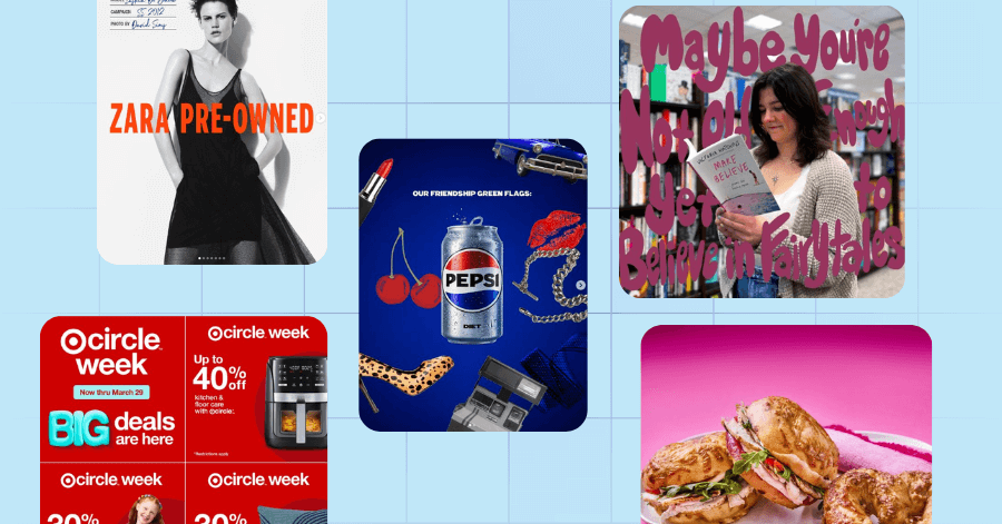
This punchy collage-style graphic from Pepsi embraces bold femininity and nostalgia, celebrating friendship through a retro lens. As seen in the image, the post is playful, maximalist, and full of personality—perfect for Gen Z and millennial audiences.
2. Zara
This black-and-white fashion-forward post leans into Zara’s sleek aesthetic while promoting sustainability. As a result, the image mimics the look of a high-fashion magazine cover with striking model imagery and a bold callout – a visual that professional custom social media design services could create.
3. Fendi
Next on our list of stellar examples of social media design services output is Fendi’s post, which captures architectural luxury and sophistication. The storefront shot is not only clean and symmetrical but also conveys high-end branding without the need for heavy editing or text.
4. Target
Target’s vibrant carousel ad uses bold, high-contrast text and product cutouts to highlight various discounts. Because the modular design helps with clear segmentation, the design makes it easy for viewers to absorb offers at a glance. Without a doubt, carousel is one of the best ways to boost your social media presence.
5. Barnes & Noble
This dreamy visual for Barnes & Noble places poetic text directly over a photo of a young woman reading. The font appears handwritten, echoing the nostalgic, emotional tone of the book being promoted. These are the types of stunning visuals you can get from reputable graphic design services.
6. Panera Bread
Panera Bread uses a romantic, food-centric theme to capture attention around Valentine’s Day. The pink background and close-up food photography create an inviting, appetizing visual. Simple and product-forward are two of the most strategic social media design tips you can apply to any brand.
7. Kate Spade
Kate Spade’s visual, meanwhile, tells a story of youthful elegance and shared moments. The clean typography and crisp handbag imagery frame the brand as aspirational and vibrant.
8. Tiffany & Co.
Though minimal in text, this bold, fashion-forward visual for Tiffany & Co. mirrors a magazine cover layout. For one, the mint green “V” instantly catches the eye and represents the intersection of editorial and luxury branding. The typography, on the other hand, offes a high-fashion vertical text alignment.
9. DRMTLGY
Which SPF should you choose? This post by DRMTLGY is a grid-based visual that makes selection intuitive. The chart helps customers self-segment, offering a perfect blend of education and promotion.
10. Audi
Reflecting effective social media marketing strategies is Audi’s post, whichh exudes sleek luxury and cultural awareness. The vibrant red lanterns contrast with the glossy black finish of the Audi SQ6 e-tron, celebrating Lunar New Year in a modern, premium light.
11. Häagen-Dazs
This vibrant product showcase highlights Häagen-Dazs‘ new non-dairy sorbet lineup. With bold flavor cues and a gradient backdrop, the image is both colorful and clean—perfect for stopping the scroll. Now, the ice cream brand is one of the most popular in the world, but this style can also be applied to social media marketing for small businesses.
12. Godiva
This top-down flat lay celebrates the elegance of Godiva’s Gold Collection, styled like a luxurious spring table setting. The post evokes celebration and indulgence through color, texture, and symmetry.
13. Reese’s
Reese’s turns a chocolate cup into a volcanic spectacle in this playful product visual. The exaggerated lava metaphor captures attention and adds a layer of storytelling to a simple product post, creating engaging graphics for social media.
14. Ubereats
This zodiac-inspired post by Ubereats assigns a coffee drink to each astrological sign, turning a relatable meme format into a shareable, lifestyle-aligned piece. The vector illustrations give the post a clean, unified look – one of the cornerstones of high-converting social media landing pages.
The Bottom Line
The best social media graphic design ideas don’t just look good—they spark conversation, drive clicks, and build brand love. Whether you’re launching a campaign or maintaining an online presence, compelling visuals are key to standing out in a crowded feed.
If you’re ready to take your content to the next level, check out Penji’s graphic design solutions. Our expert team offers social media design services that are not only creative but also strategic—designed to convert, engage, and grow your brand.
Visit our portfolio to see how we take professional graphic design services seriously and why Penji is a top design partner.
Watch a short demo to learn more.
About the author

Carla Deña
Carla is a journalist and content writer who produces stories for both digital and legacy media. She is passionate about creativity, innovation, and helping small businesses explore solutions that drive growth and social impact.

