
TL;DR: Simple and clean logos beat complex ones in every metric that matters: recognition, scalability, and staying power. This guide covers what minimal logo design actually means, how to build one that lasts, and why Penji’s logo design services give businesses the smartest path forward.
Simple and clean logos use minimal elements, limited color palettes, and readable typography to communicate a brand’s identity at a glance.
They scale across every format, hold recognition over time, and age far better than designs built on trends. A clean logo strips away the unnecessary and keeps only what a brand needs people to remember.
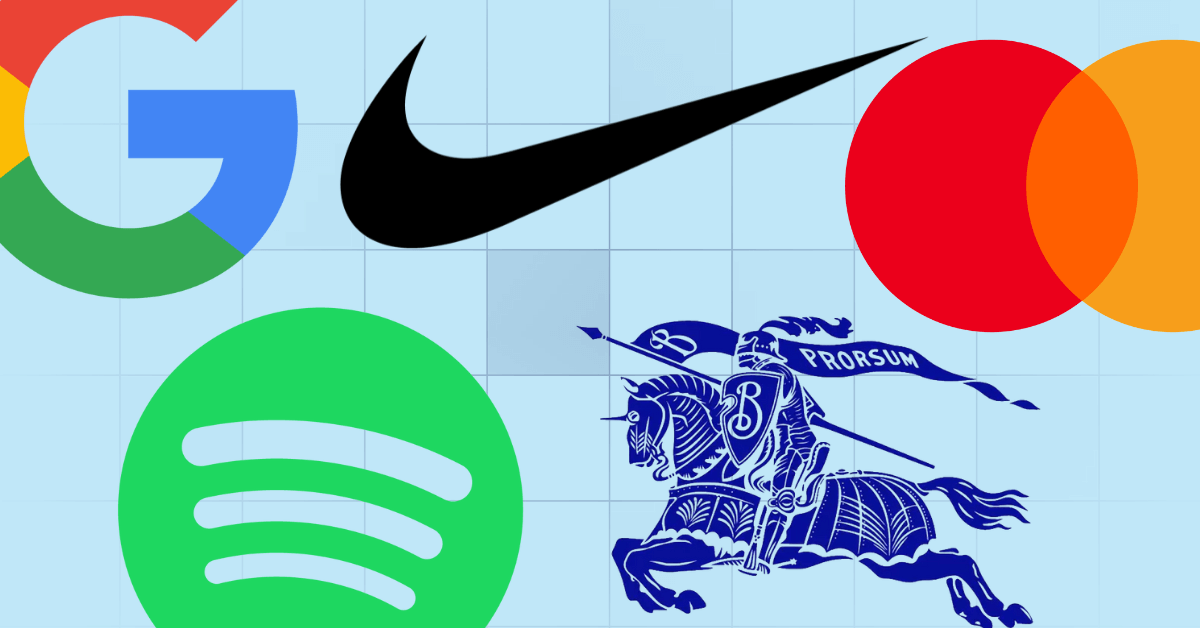
Think about the logos you recognized before you even read the name. That’s not coincidence. It’s deliberate simplicity at work. Simple and clean logos cut through visual noise fast and hold recognition for decades in ways complex designs rarely manage.
This guide covers what makes a logo clean, how to design one from the ground up, the mistakes most businesses make, and why professional logo design services are often the fastest route to getting it right.
What Makes a Logo Simple and Clean?
Definition of Minimal Logo Design
A minimal logo uses the fewest visual elements needed to communicate a brand’s identity clearly. No ornamental details, no competing shapes, no decoration that doesn’t earn its place. What survives the reduction process is the mark itself.
The psychology of logo design explains why restraint works: when every element is necessary, every element carries weight.
Why Simplicity Matters in Branding
Simple logos are faster to process and easier to retain. According to a 2024 HubSpot report, consistent brand presentation can increase revenue by up to 33%. A minimal logo makes that consistency easier to achieve because it translates to every surface without adjustment or variation.
Characteristics of Effective Clean Logos
Clean logos share predictable traits: two to three colors at most, one typeface or none, geometric or organic shapes without clutter, and full legibility in black and white. If stripping the color kills the design’s impact, the underlying mark needs more work.
Why Simple Logos Are More Effective
Easier Brand Recognition
The simpler the mark, the faster the brain locks it in. Repetition builds recognition, and clarity accelerates it. Complex logos ask viewers to process too many elements at once, and most of that detail disappears on second exposure.
Better Scalability Across Platforms
A logo lives on business cards, browser tabs, billboard surfaces, and mobile app icons. Intricate details break down at small sizes, and gradients fail in single-color print. A clean mark holds together at 16 pixels and 16 feet. Penji’s logo design tutorial covers scalability as a fundamental design requirement, not an afterthought.
Timeless Appeal Compared to Trendy Designs
Logos built on design trends have a shelf life. Logos built on strong fundamentals don’t. The brands that have gone decades without a major redesign kept it simple from the start. Timelessness isn’t an accident; it’s the result of choosing clarity over what was fashionable.
Improved Versatility for Marketing Materials
A clean logo integrates into any layout without fighting for visual territory. It supports surrounding design rather than competing with it, which makes marketing production faster and keeps the brand looking coherent across every asset.
Key Principles of Creating Simple and Clean Logos
Focus on Minimal Design Elements
Start with one idea, then resist adding to it. Each element added to a logo splits the viewer’s attention. Each element removed sharpens the message. The discipline of subtraction is where most logos improve the most.
Choose Readable Typography
Any type included in the logo must be legible at every size. Script fonts that look striking at display size often collapse when reduced. Readability isn’t a stylistic preference. It’s a baseline requirement.
Use a Limited Color Palette
Two colors is a reliable target. Three is workable with clear intention. Anything beyond that adds production cost and complexity without strategic benefit. Graphic design services that specialize in brand identity consistently push clients toward fewer colors. Understanding color psychology in logo design makes those choices purposeful rather than arbitrary.
Prioritize Balance and Spacing
A logo should feel visually stable. Weight distributes evenly, spacing is intentional, and nothing feels crowded. Good balance is invisible when done correctly and immediately obvious when it isn’t.
Design With Scalability in Mind
Every decision in the design needs to pass the scale test. Test at icon size, in black and white, and on dark backgrounds before finalizing. Problems that aren’t visible at full size become glaring at thumbnail scale.
How to Start Designing a Simple Logo
Understand the Brand Identity
A logo is visual shorthand for a brand’s values, personality, and promise. Without a clear understanding of what the brand stands for, the design has no anchor. Strategy comes before software.
Research Competitors and Industry Trends
Know what the category looks like, then decide how to stand apart without disappearing into the background. Competitor research defines the visual language of the space so the new logo can operate within it or break from it deliberately. Browsing Penji’s logo designs gallery shows how professional differentiation works across industries.
Define the Logo Style and Message
Is the brand modern or classic? Technical or human? Playful or authoritative? These decisions shape every element from typeface to icon style to color palette. Get them settled before any visual work begins.
Sketch Initial Logo Concepts
Paper first. Digital tools create attachment to early ideas too quickly. Sketching generates volume, and volume creates real options. The strongest concepts often start as rough ideas that would’ve been abandoned if they’d been built in software from the start.
Choosing the Right Typography for Clean Logos
Sans-Serif vs Serif Fonts
Sans-serif fonts read as clean, modern, and direct. Serif fonts carry tradition and authority. Neither is universally better. Most minimal logos lean toward sans-serif because the absence of decorative strokes keeps the overall mark cleaner.
Custom Typography for Unique Branding
A custom wordmark turns letterforms into owned brand assets rather than borrowed resources. When the type is built specifically for the brand, the logo becomes harder to imitate and easier to own visually over time.
Avoiding Overly Decorative Fonts
Decorative fonts fail the scale test. They’re also harder to reproduce consistently across formats. If a font requires the right size and generous spacing to read well, it’s the wrong choice for a mark that has to work everywhere from embroidery to email signatures.
Best Color Practices for Simple Logo Design
Using Minimal Color Combinations
Fewer colors mean simpler, more consistent reproduction across print and digital. On-demand design services that handle ongoing brand work design for reproducibility from the start, because a logo requiring four-color printing gets expensive fast.
Understanding Color Psychology
Color communicates before a viewer reads a single word. Blue signals trust, green communicates growth, red reads as energy, and yellow projects optimism. Choosing colors that reinforce the brand’s message rather than contradict it is a strategic decision, not a stylistic one.
Designing Effective Black-and-White Logos
Every professional logo ships with a black-and-white version. It appears in fax documents, embroidered merchandise, newspaper ads, and engraved signage. If the design can’t hold up without color, the structure of the underlying mark needs revisiting before the logo is finalized.
Common Mistakes to Avoid When Creating Simple Logos
Adding Too Many Design Elements
A logo is a mark, not a visual summary of everything associated with the brand. One well-executed idea is always stronger than five ideas competing for attention. Including every visual concept connected to the brand produces logos that communicate nothing clearly.
Following Short-Term Design Trends
Gradients, neon palettes, and highly specific illustration styles all have a moment, then date quickly. A logo built on timeless fundamentals doesn’t need a redesign because a trend expired.
Ignoring Logo Scalability
Testing only at large sizes is how scalability problems slip through to final approval. Every logo should be reviewed at icon size before sign-off. Problems invisible at full scale are very visible on a mobile app or business card.
Using Complex Fonts or Icons
Intricate lettering becomes unreadable at small sizes. Highly detailed icons lose their definition when reduced. Simplify until the mark communicates clearly at thumbnail scale. If it doesn’t, the design isn’t finished.
Tools and Resources for Designing Simple Logos
Professional Logo Design Software
Adobe Illustrator is the industry standard for professional logo work, producing vector files that scale without quality loss. Affinity Designer is a capable alternative at a lower price point. Both tools reward skill and experience over familiarity alone.
AI Logo Design Tools
AI-powered tools like Looka and Wix Logo Maker generate starting points quickly. They’re useful for exploring visual directions but lack the strategic thinking that makes a logo genuinely effective. An AI tool produces something that looks like a logo. It can’t decide what the brand needs to communicate.
Working With Professional Designers
Professional designers solve logo problems from accumulated experience. They recognize what tends to fail in application before the first concept is presented. For businesses ready to hire a logo designer, that judgment is what separates a mark that works from one that needs a redesign in two years.
Why Businesses Choose Professional Logo Design Services
Access to Experienced Designers
Experience produces pattern recognition that tools can’t replicate. A designer who has built hundreds of logos knows what succeeds in the real world and where clever ideas break down in application.
Faster Design Turnaround
A professional with a clear brief delivers polished concepts faster than most in-house first attempts. Speed matters on a launch timeline, and a delayed logo holds up every other branded asset.
Consistent Branding Across Assets
A logo is the start of a brand identity system. Graphic design subscription services ensure the mark translates consistently across business cards, packaging, social graphics, and digital ads. That consistency is what builds lasting recognition.
Unlimited Revisions and Creative Flexibility
Professional logo design services on a subscription model offer unlimited revisions. The logo gets refined until it’s right, not until a fixed-revision budget runs dry.
How Penji Helps Businesses Create Simple and Clean Logos
Penji is a design as a service platform built for businesses that need professional creative output without the overhead of an in-house team. From initial brief through final file delivery, Penji handles the entire logo design process.
Custom Logo Design Support
Penji designers work from a brand brief, not a template library. Every logo is built for the specific business, audience, and message. See the custom logo design services Penji has delivered across industries for a sense of what that looks like in practice.
Dedicated Designers for Brand Consistency
Clients work with dedicated designers who develop real understanding of the brand over time. That continuity keeps the visual identity coherent across every asset. Browse Penji’s work to see what long-term brand consistency actually looks like.
Fast Turnaround Times
Logo concepts arrive within 24 to 48 business hours after receiving a brief. Revisions follow the same pace. From brief to approved final file, the process moves in days. See why Penji outpaces traditional design options on both speed and output quality.
Unlimited Design Requests and Revisions
Penji’s unlimited graphic design services model means no revision caps and no penalty for exploring directions. That freedom produces better outcomes than fixed-revision engagements consistently will. For businesses ready to get started, Penji’s creative logo design services and the full logo design services guide are the right places to begin.
Conclusion
Focus on Clarity and Brand Identity
Every decision in the logo design process should serve one clear question: what does this brand need people to feel when they see this mark? A logo that requires explanation isn’t finished yet.
Keep Designs Timeless and Versatile
The best simple and clean logos are still doing their job 20 years after they were created. That longevity comes from building on fundamentals rather than trends, and from choosing clarity over cleverness every time those two things are in tension.
Invest in Professional Design for Long-Term Branding Success
A logo appears on every piece of branded material a business produces for years. The investment in getting it right from the start pays off across every campaign, product launch, and partnership that follows.
Penji’s graphic design services make that investment accessible for businesses of any size.
Simple and clean logos aren’t lesser logos. They’re more disciplined ones. The brands that got simplicity right early spent less time rebranding, built recognition faster, and created visual identities that aged better than anything trend-driven could have.
Getting that foundation right is easier when experienced designers have solved that problem hundreds of times before.
See what Penji can do for your brand’s visual identity. Explore plans and get started at penji.co.
Frequently Asked Questions
Simple and clean logos rely on minimal visual elements, a tight color palette of one to three colors, readable typography, and intentional balance and spacing. They communicate a brand’s identity clearly without decoration, and they hold their impact in black and white as well as in color. A clean logo works on a business card, a billboard, and a mobile app icon without any modification.
Most effective minimal logos use one or two colors. Three is workable when the combination is deliberate and consistent. Going beyond three increases production cost, complicates print reproduction, and makes brand consistency harder to maintain. A black-and-white version should always be part of the logo system from the very start of the design process.
A minimal logo is strategically reduced to its most essential elements while remaining distinctive and brand-specific. A generic logo uses simple elements without the underlying brand strategy that makes a design own-able. Minimalism without purpose produces marks that are clean but forgettable. The goal is clarity with character, not just simplicity for its own sake.
Yes. The simplicity of a clean logo is deceptive. Reducing a brand identity to a single effective mark requires strategic thinking, technical skill, and real understanding of how the logo will function across applications. Professional designers produce work that holds up over time in ways that template-based or AI-generated logos rarely match. Penji’s logo design services deliver professional results at a flat monthly rate, with unlimited revisions until the design is right.
About the author

Katrina Pascual
Katrina is a content writer specializing in graphic design, marketing, social media, and technology. In her spare time, she writes monthly personal blogs to practice her craft.
Table of Contents
- What Makes a Logo Simple and Clean?
- Why Simple Logos Are More Effective
- Key Principles of Creating Simple and Clean Logos
- How to Start Designing a Simple Logo
- Choosing the Right Typography for Clean Logos
- Best Color Practices for Simple Logo Design
- Common Mistakes to Avoid When Creating Simple Logos
- Tools and Resources for Designing Simple Logos
- Why Businesses Choose Professional Logo Design Services
- How Penji Helps Businesses Create Simple and Clean Logos
- Conclusion
- Frequently Asked Questions


