Logos are more than just shapes and letters created as a brand symbol. It is what identifies who you are as a brand. It gives consumers the impression of the quality you provide and how you can make their lives better with your products and services. If you’re starting a ramen restaurant and looking for logo ideas for it, you’re in luck. We have here a list of Penji’s top ramen logos to soothe your soul.
How to Create a Ramen Logo
1. Why do you need a logo?
Your logo will have a significant impact on the first impression of your business. It will give your customers information about your brand to help them decide if it’s right for them. Since your logo is a crucial part of your brand, you want to ensure it’s done correctly. Your branding package will include your logo. It should attract your customers from your website, packaging, and even business cards. A professional logo design has the power to communicate your brand and help you stand out from the competition.
2. Where can you find ramen logo inspiration?
The hardest step of the design process can be searching for logo inspiration. Fortunately, we’ve got some tips for you to make it hassle-free. Brainstorming is the first step in coming up with an idea for your ramen logo design. Perhaps you are visionary and willing to start by gathering verbal ideas. A good brainstorming session can be about what to pin down the look and feel you’re trying to achieve.
Once you’re done with brainstorming, you can start making a mood board. As a visual person, a mood board may be the best motivational tool. You can create it by cutting out and pinning printed images or making a digital one. Pinterest would be a great choice for a digital mood board.
Simply collect all the images you like. Those can be other logos, colors, illustrations, or graphics. Don’t be afraid to play with the designs.
Need a good place to start? We suggest looking at Penji’s design portfolio.
3. Conceptualize and sketch your logo
Now that you have grasped your brand and feel inspired, it’s time to transform that into the design. There are many elements to consider, from colors and shapes to typography design. Separating each component and what it helps you for your logo will take things step by step instead of getting overwhelmed with the whole design all at once.
When conceptualizing your logo, the first thing you want to do is choose
the right design aesthetic for your brand. Pick the elements that would match your brand identity.
4. Pick your logo type
In addition to the overall look, here are seven main types of logos you can select from when you are designing your ramen logo. You can pick the one that fits your business name or overall aesthetic best or combine them to create something unique.
- Letter marks
- Wordmarks
- Pictorial marks
- Mascots
- Abstract logo marks
- Combination mark
- Emblem
5. Strike a balance with color
Colors can have thousands of different meanings. But to keep it simple, colors have specific emotions and ideas connected to them. It’s better to research in-depth guides on logo colors and their meanings and fully understand color theory.
Of course, you don’t need to focus on a monochrome design. You can combine several logos colors to tell a complete brand color story.
6. Pick the right font
You want to pick a font that complements and completes your logo. You can work with these four basic types of logo fonts to give you a unique look. It includes serif fonts, sans serif fonts, display fonts, and script fonts.
7. Bring your design elements together
Now that you have an idea of all the different elements your logo consists of, you must ensure they work together. You want to pair them harmoniously to create the vibe you are targeting. Or create something that looks wild and eye-catching by integrating a modern font with colorful and abstract shapes for a fresh look.
8. Communicate with your designer
Now that you have collected all of the required style points, you’re all set for the designing phase! There are many ways to get a logo, so you should consider which one fits you best. You can tap a design agency, host a logo contest, use a logo maker, or go for an unlimited design subscription. Different prices come with other qualities, and, take note, all options have their pros and cons. Check out a comparison of the best ways for logo design methods. Then, study how much your logo design should cost for every option you have gathered.
We might be biased, but we think subscribing to an unlimited design service is the best way to get a logo. To make sure your design comes out great, the first rule of working with your designer is to communicate clearly. Writing a clear creative description is your opportunity to make your designer understand your brand and your needs. That way, you can get the best ramen logo design that stands out from your competitors.
Sometimes you have to build trust with your designer and try to stay open to comments and inputs. Remember, your designer is a professional and has an excellent idea of what makes a good logo. Giving detailed and precise feedback provides designers with an idea of what exactly they want. It may sound cheesy, but it’s true – the perfect design happens when you and your designer or design team click together.
15 Ramen Logo Designs
1. Jinya Ramen Bar
Most ramen logos are straightforward, like this one from Jinya Ramen Bar. It uses an all-black font and simple typography. That makes it easier for target customers to recognize the logo and the brand it carries.
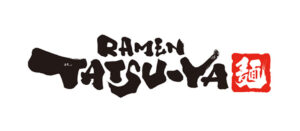
2. Ramen Tatsu-Ya

The name of this ramen restaurant might be based on the names of the chef/owners, Tatsu Aikawa, and Takuya Matsumoto. But the word itself could mean several things using different kanji characters – master, to be accomplished, or dragon. The unique fonts used in their logo make it more special and exciting.
3. Ippudo

Ippudo’s logo shows a bowl and noodles in black font and white background, another easily-recognizable design. This Japanese ramen restaurant chain is popular, with 60 stores worldwide. Ippudo is indeed the driving force of global ramen fever. So, why not put this design inspiration on top of your list?
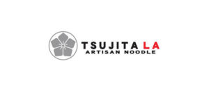
4. Tsujita LA Artisan Noodle
To stand out from the competition, Tsujita LA integrated a flower design into its logo. It resembles a slice of lotus root, which gives life to a visually plain noodle dish. This vegetable is a regular in Asian dishes that connect to the origin of ramen, Japan. Again, the design uses a common color combination for a ramen logo – red, black, and white.
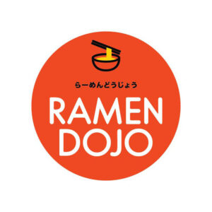
5. Ramen Dojo
Black is not the dominant color this time. Ramen Dojo’s logo features a bowl of ramen with chopsticks and a company name. They added some Japanese characters in between the image and the text. And the background of the logo is red-orange.
6. Ajisen
Ajisen Ramen is a fast food restaurant chain in Japan selling ramen noodle soup dishes. If you look at the company’s logo, it features the artwork of a little girl who they call Chii-chan. The girl’s happy face reminds us that a bowl of ramen soothes our bodies and soul.
7. Toki Underground

Its unique name matches a unique ramen logo. Toki Underground, a renowned Taiwanese-style ramen shop, has been hailed as DC’s own “ramen wonderland.” Its logo exudes a sense of vibrancy because of the bright blue color used. Using only Japanese characters written inside the flower design makes the logo neat and minimalist.
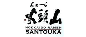
8. Santouka Hokkaido Ramen
Santouka prides itself as the home of Hokkaido ramen with simple and deep umami flavor. While their logo uses the dominant color for a ramen logo, it uses a font that compliments and completes the logo. It is not cluttered, and the font size is just right.
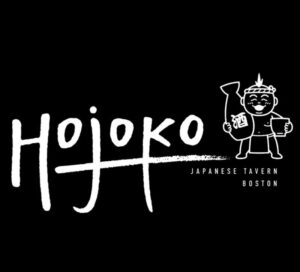
9. Hojoko Ramen

This logo could be considered a counterpart of Ajisen’s design. This time the artwork featured is a boy. Trendy and colorful logos can be fun and exciting, but they quickly become outdated. With that said, this ramen logo may give you a better-staying power. It can also help you reach a wider audience.
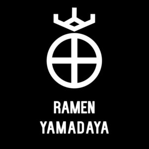
10. Ramen Yamadaya

Here’s another classic ramen logo idea on our list. This design keeps it simple and doesn’t attempt to go into crazy color palettes or fonts. Simply, a classic style tells people that their product offering is traditional and authentic as well. In fact, this ramen haven is famous for tonkatsu broth, a richly flavored soup cooked with pork bones after many hours of boiling.
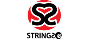
11. Strings Ramen Shop
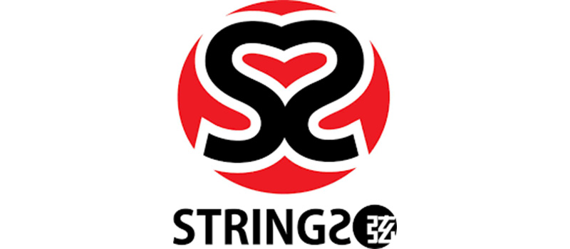
Strings Ramen Shop logo is on the creative side. It features two “S” facing each other, forming a heart between them. It communicates a message that their food lifts the spirit of every customer. The press even loves Strings, including leading newspapers and websites in Chicago,
12. Ramen Kuroda
Ramen Kuroda’s design is one of our design ideas’ most straightforward logo designs. It relays a message of hassle-free service. The restaurant reviews say Ramen Kuroda noodles are perfect, and the staff is reliable and attentive.
13. Sapporo Ramen
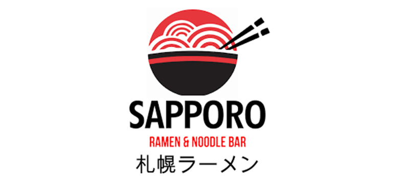
The Sapporo ramen logo gives you an idea of how to make your design inclusive. The image and texts are strategically integrated with the logo. Putting both English and Japanese translations makes it easier for the customers to identify the brand.
14. Hanabi Ramen
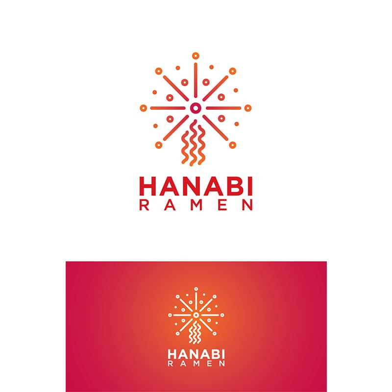
Hanabi has two logos, one has a light background, and the other one is with an orange background. Hanabi means fireworks in Japanese. That explains the firework image on top of the brand name.
15. Kamisama Ramen

This ramen logo has a bright and balanced color combination. It shows a man holding a bowl of ramen. Based on the design, the brand wants to convey passion, happiness, and hard work devoted to offering the best food to its customers.
Get Your New Ramen Logo in as Little as 24 Hours
With the growing popularity of ramen shops, it is more important to build your branding and increase your customers in the coming years. While you conceptualize your logo, you should get the necessary help. Penji is here to help you create an awesome ramen logo. Let Penji handle the design work for you. For the logo, flyers, website design, social media graphics, business cards, and merchandise, Penji is here to help.
Now, you need not worry about your logo design needs. Start by subscribing to a plan with us. Check the pricing here. There’s no risk and you may cancel anytime.
About the author

Rowena Zaballa
With a background as a former government employee specializing in urban planning, Rowena transitioned into the world of blogging and SEO content writing. As a passionate storyteller, she uses her expertise to craft engaging and informative content for various audiences.
Table of Contents
- How to Create a Ramen Logo
- 1. Why do you need a logo?
- 2. Where can you find ramen logo inspiration?
- 3. Conceptualize and sketch your logo
- 4. Pick your logo type
- 5. Strike a balance with color
- 6. Pick the right font
- 7. Bring your design elements together
- 8. Communicate with your designer
- 15 Ramen Logo Designs
- Get Your New Ramen Logo in as Little as 24 Hours


