While bright, garish color schemes are making big waves in design, there’s a much subtler trend on the horizon: monochromatic design.
If you’re reading this, you’re probably interested in pursuing a monochromatic design for your branding, marketing materials, or some other design.
Not sure where to start? We’ve compiled some of the most important monochromatic design tips and tricks, as well as some examples by our expert design team.
Definition of monochromatic design
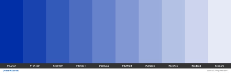
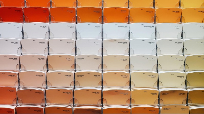
The word “monochromatic” literally means “having one color,” but monochromatic design isn’t that simple. A monochrome color palette emphasizes different shades, tones, and tints of a single color. For instance, the above palette includes 10 different tints of International Klein Blue.
How to make a monochromatic color palette
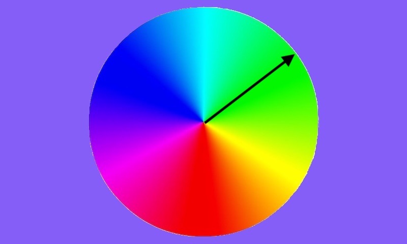
One way to pick out monochromatic colors for your design is to use the color wheel. If you start from the center and move out to the edge, every color on that line is a different shade of the same hue.
If you start with a base color (e.g. blue, purple), you can use practically any variant of that color as part of your monochromatic color scheme. You’ll just want to make sure you’re employing color theory.
[in_content_ads gallery=”logos” logo=”on” title=”Need graphic design help?” subtitle=”Try Penji’s Unlimited Graphic Design and get all your branding, digital, print, and UXUI designs done in one place.” btntext=”Learn More” btnlink=”https://penji.co”]
The basics of monochromatic design

Choosing the best color scheme for your design is a difficult task. Admittedly, monochromatic designs are a little easier—just choose one color and you’re done, right?
While this is true to an extent, you’ll still want to have a firm grasp on color psychology. Look into the meanings of different colors, which ones are associated with your industry or medium. What’s the primary color you’re using, and why?
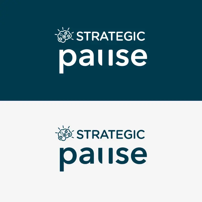
Beyond that, specific tones, tints, and shades can make a big difference for what your design seems to say. The above art mostly uses grayish tones of blue for a realistic effect, with dark shades at the bottom and light tints at the top for depth.
A grayish color palette can have a vintage feel. A pastel color scheme is soothing, while a neon one is playful. These same principles apply when using a monochrome color scheme.
7 tips and tricks for monochromatic design
Picking the right color
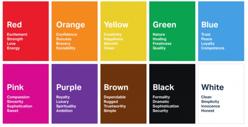
Many brand packages include a single color that’s associated with the company. Target is red, John Deere is green, Penji is purple. This can do wonders for your brand identity, but you’ll want to consider the color psychology of your choice.
For instance, McDonald’s’ iconic golden arches offer an inviting warmth that brings in billions of customers. If they were green arches instead, they would imply something more natural, earthy, healing. For McDonald’s, that would be a tough sell.
Shades, tones, and tints
I’ve brought up these terms a few times, so let’s break them down.
- When you mix a color with black, you create a shade.
- Tones are mixed with gray, creating more faded hues.
- Tints are created by mixing a color with white.
When creating a monochromatic design, you definitely want to use variations on your principal color. You can use tints to make the overall design lighter, shades to make it deeper, or tones to give it a realistic feel. You can also employ all three to create depth and texture.
Add overlays to photography

Pulling off a monochromatic color scheme takes confidence, especially for an extensive design like a website, magazine, or presentation. Random splashes of other colors can upset the whole balance of your design.
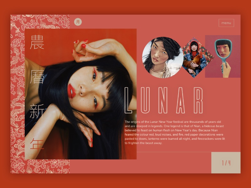
So, how do you liven it up while keeping the design monochromatic? Color overlays on photos are a great place to start. You can use quality photos in your design without losing your bold color scheme.
Even in monochrome, photos offer depth and realism that many illustrations don’t—although you can also add a color overlay to your illustrations.
Use colors to tell a story
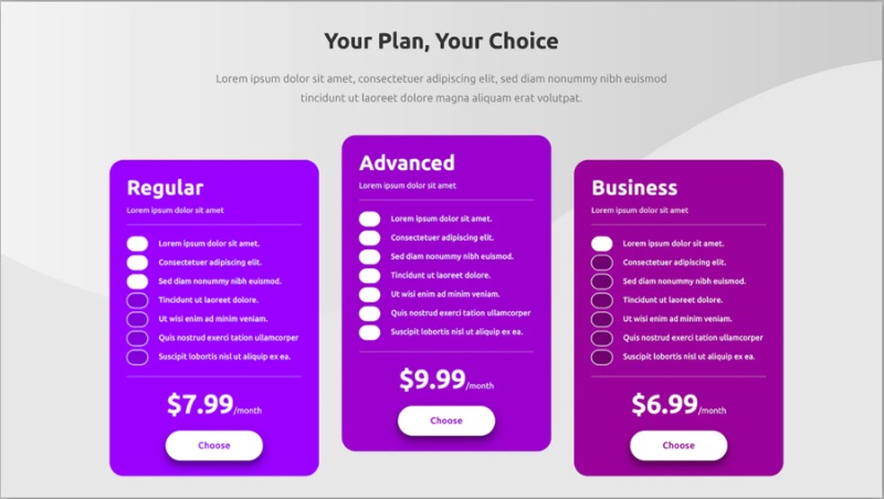
Even with a monochromatic graphic design, shades, tones, and tints can help make your visuals dynamic. You can play with different positioning, drawing your viewers’ eyes along a guided path.
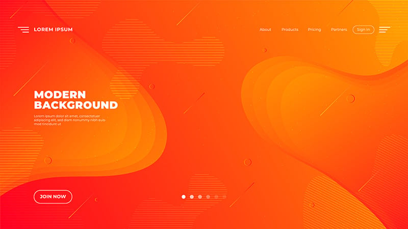
For example, a pricing page design can benefit from a gradient of lighter and darker shades. Gradients can also be used for storytelling as your viewer scrolls through a web page. More jarring tone shifts can help keep your viewer’s attention as you switch to a new subject.
Divide your design into sections
Dividing into sections is a solid tip for graphic design in general, but it’s especially important for monochromatic design. Without clear lines and sections, a design based on a single color can make your audience feel lost.
You don’t want everything to blend together, so make sure you’re creating a hierarchy of information. Don’t clutter the design with frivolous details. Consider what your viewer needs to see, and put it in the first place they’ll look.
Make it pop with typography
Another way to make your monochromatic design pop is with bold use of text. Good typography is a key piece of the design puzzle, not just an afterthought.
If you really want the text to stand out, you can use white, black, or a color outside your monochromatic color scheme. If you want to truly stick to one color, make sure you create a strong contrast between the text and background hues.
Know the rules… so you can break them

Now you know some of the definition of monochromatic design, as well as some of the key things you need to know when making one of your own. Now, here’s the fun part: throw it all away.
Like in any creative form, understanding the rules gives you the knowledge you need to subvert them. How do you make your monochromatic design pop? Throw another color in there. Better yet, palette swap the whole design and release it in two different colors.
In art, the rules are made to be broken. A skilled graphic designer can play with the very concept of monochromatic design to help yours stand out from the crowd.
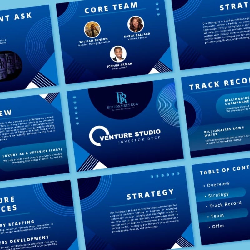
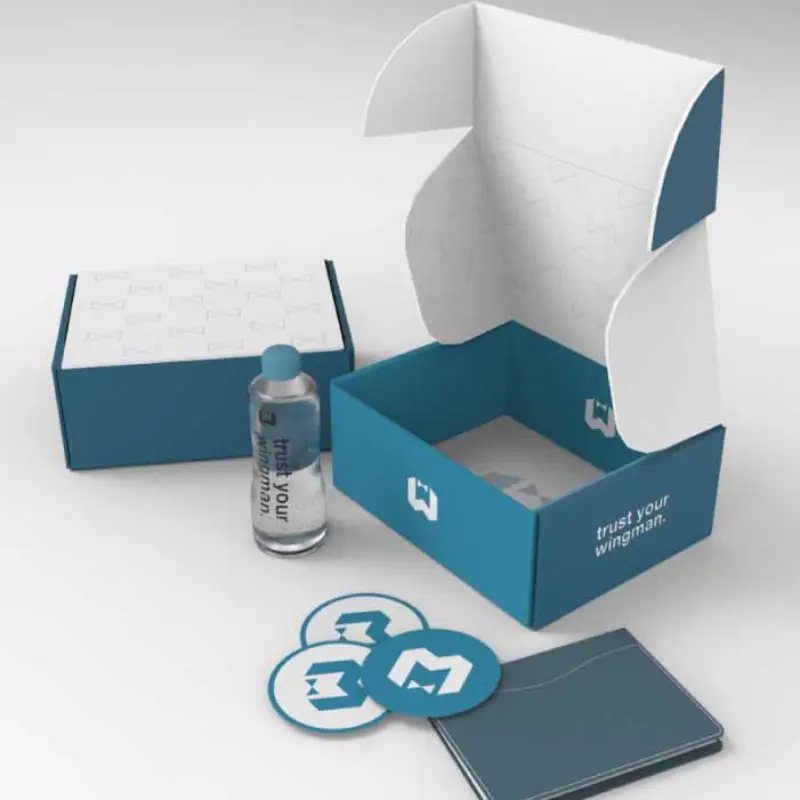
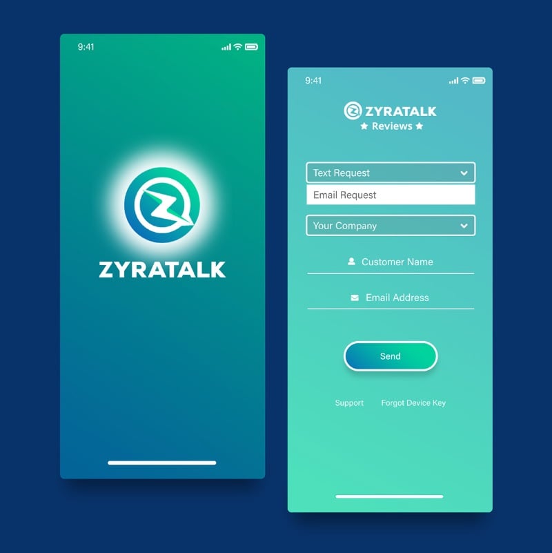
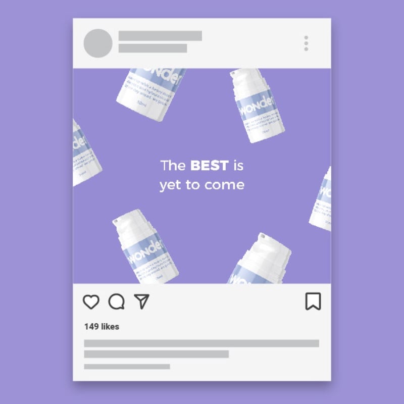
Monochromatic design examples by Penji pro designers
Penji is an unlimited graphic design service. For a monthly fee, you can get access to as many designs as you please from world-class graphic designers.
Want to see what Penji can do for you? Here are some examples of monochromatic design created by the Penji team.