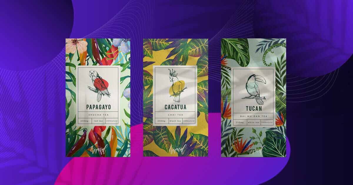
Have you ever swapped a regular item on your cart just because you saw a better-looking brand on the shelf? Take that as a lesson in product packaging design. What was the secret sauce behind the brand packaging that convinced you to buy it in a few seconds’ time?
As proven by our regular shopping experiences, there is art and science to persuading people to purchase products using visuals. In fact, many of our clients here at Penji ask us to create the best packaging design to make their products stand out from the rest. So, if you feel like your brand needs a boost, paying more attention to your packaging might just do the trick.
The Psychology Behind Product Packaging Design
You don’t need hypnotism or sorcery to get your audience to choose your product among others sitting beside it. All it takes is a good grasp of product packaging design and the psychology behind it.
Let’s put our learning hats on and review Ian Pavlov’s classical conditioning theory. The Russian physiologist theorized about the relationship between the subject, a stimulus, and the subject’s response.
In the case of marketing, the subject is your audience, the stimulus is the product packaging, and the subject’s response will be whether they purchase the product or not.
That said, it’s vital to make the packaging as stimulating as possible in order to attain the desired consumer behavior (to purchase). And how exactly do we do that?
There are various ways to make packaging stimulating, including the following:
Color
You’ve probably heard about color psychology or how hues evoke certain feelings or perceptions. For instance, red may signal passion and intensity while blue may channel peace and calm.
For instance, take a look at this packaging for Refaire by Deuce Studio:
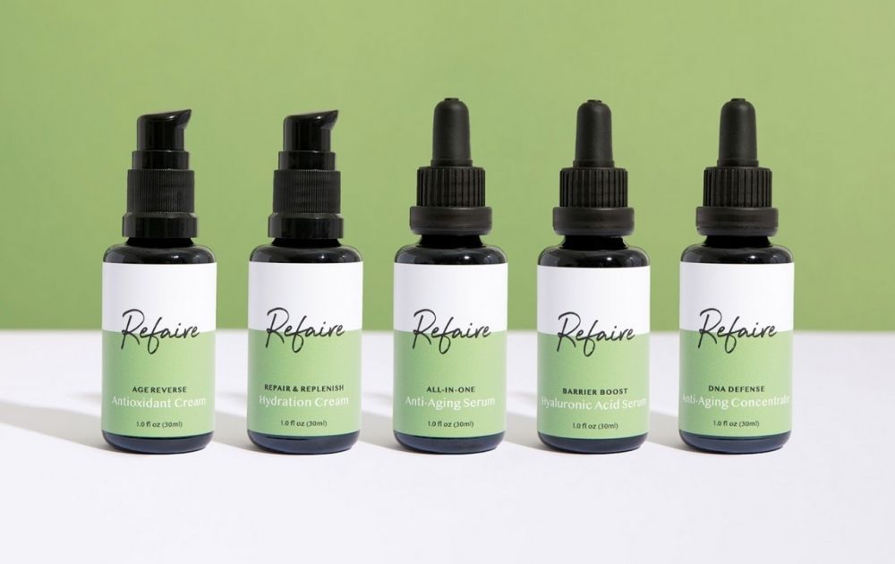
Image Credit: Refaire by Deuce Studio
Green is associated with health and tranquility, making it a good hue for a skincare line.
Texture
Aside from visual stimulation, the product should also appeal to the tactile sense. For instance, a face cream packaged in an elegant glass jar might make the user feel more pampered compared to a product in a plastic sachet.
The same principle applies to these beautiful body oil bottles by Alexandra Necula for skincare brand Moujan Lusso:
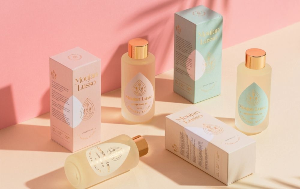
Image Credit: Moujan Lusso
The delicate bottle and elegant label make the moisturizing time a spa-like self-care routine.
Shape
The packaging form can also add subtle meaning to the product. For instance, there was a time when digital devices came in block angular shapes. Nowadays, electronics have sleeker and more curved shapes. In a way, this development makes devices feel less robotic and more personalized.
Take a look at this packaging example for Zizzi Italian restaurant chain by Pearlfisher creative agency:
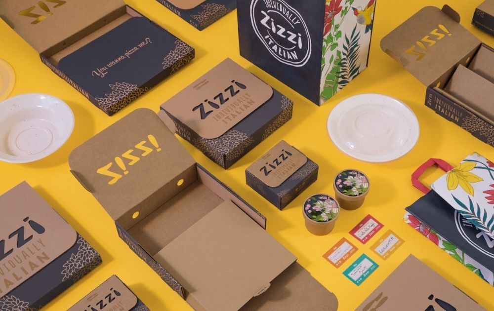
Image Credit: Zizzi
The curved edges of the box transform the product from a regular takeaway to a gastronomic experience, fit for a party at home.
Factors to Consider in Creative Packaging
Indeed, there are more than a million ways to approach product packaging and make it stimulating. And it could be overwhelming to think of all the possibilities.
To help you deduce your ideas to create beautiful but functional designs, here are a few factors you need to consider:
- Product and packaging material. There are various packaging materials you can use to hold your product (see the section below for a detailed discussion of packaging materials). But one thing’s for certain – the material you choose should be appropriate for the product you’re offering in terms of protection and preservation.
- Audience. Knowing your audience allows you to better tailor-fit your box or packet so that they’ll choose your product over other brands.
- Industry Practices. Know your competitors’ approach to packaging. What material are they using and why? Also, in specific industries like healthcare, products need to go by specific state-required labels and info. So, if your products fall under this category, be sure to be in-the-know.
- Market trends. Tech and social innovations play a huge part in market trends. For instance, more and more brands are now turning to sustainable packaging due to calls advocating the environment.
Related Post: Creative Packaging That Caused Products to Sell Out
Packaging Materials
To gain an understanding of the various types of packaging design, it’s crucial to be familiar with the different materials used in packaging. After all, a study by Ipsos found that 67 percent of Americans consider materials used in the packaging when choosing which products to buy.
In addition to that, your choice of materials can also affect the range of options for printing as well as the cost of production.
1. Box
When it comes to product packaging, the box is one of the most versatile types. It can work for a wide range of products, from apparel and electronics to food and personal care. Boxes can be made of various materials, including:
- Cardboard
- Corrugated board
- Hardboard
Using cardboard packaging doesn’t mean having to stay within the bounds of the safe rectangular box. For instance, this snack box for ÖLOBOX created by Olkas Voron is anything but boring:
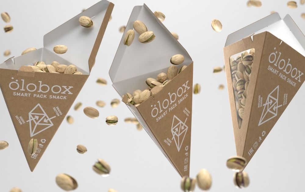
Image Credit: ÖLOBOX
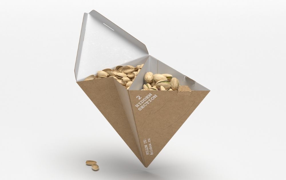
Image Credit: ÖLOBOX
Not only does it come in an unusual pyramid shape, but it also features a hidden section where you can place nut shells. Now, that’s pretty and functional!
PRO TIP: For small businesses with a limited budget for packaging, boxes offer practicality. All it takes is printing the design on sticker paper and sticking it on the box. It’s crucial to note, though, that the quality of digital graphics can be the line that separates A-grade boxes and cheap-looking parcels.
For instance, the design for The Thought Box (The Thought Co.) designed by Ibrahim Attarwala features a sticker on a regular box:
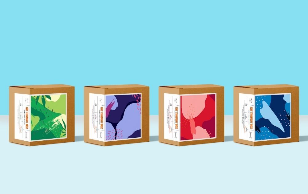
Image Credit: The Thought Box
The mental health kits contain items like cue cards, activity cards, journal prompts, and certain toys that would help ease issues like anxiety, depression, a toxic break-up, or lack of self-love. Thus, each box was designed for the issue it addresses.
This example only goes to show how a simple material, when paired with a brilliant design concept, can bring in astounding results.
2. Plastic
Plastics, particularly the single-use ones, skyrocketed into popularity in the 1970s. It offered affordable, light, and convenient protection for almost all types of products.
Today, though, many people are trying to stay away from plastic packaging due to its impact on the environment. That said, if you’re choosing this material for your product, you may want to go for a recyclable or reusable option to be kinder to Mother Nature.
Whether you’re using tubs, bags, or bottles, you can easily use sticker labels on this material and there are many packaging design examples to turn to for inspiration.
In the same vein, you may also opt to go with minimalist design just like Sophia Georgopoulou did for the juice line of Yo! Green Premium Deli:
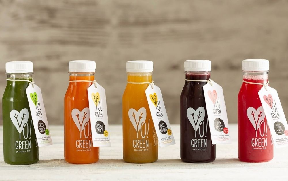
Image Credit: Yo! Green Premium Deli
The minimalist white labels look stunning amid the background of the juice’s natural color.
Related Post: 15 Amazing Tea Packaging Designs From All Over the World
PRO TIP: Want to break away from your competitors who use sticker labels? Try cardboard sleeves over plastic instead. This way, there will be no disheveled sticker left on the container after washing, thus encouraging more clients to reuse it.
Here’s an example from Fit Bakes created by Hills Design for packaging design inspiration:
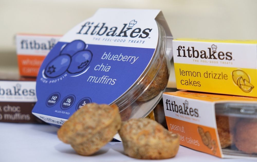
Image Credit: Fit Bakes
3. Glass
Glass bottles and jars are a great option for edible and self-care products with chemical components that may react with other materials. These include alcoholic drinks, preserved food like jam and jellies, and fermented products like kimchi or pickles.
Make sure to factor in the color of the bottle when creating your label. For example, a design created for a transparent bottle with a clear liquid (e.g. sparkling water) may not necessarily look great on a dark green bottle typically used for wine.
If you’re looking for glass bottle product packaging ideas, here’s a design created by Juan Castillo for Montano Brewing:
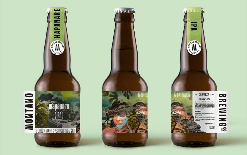
Image Credit: Montano Brewing
The amber color of the bottle adds a bit of warmth to the green color of the label.
PRO TIP: Customize your labels according to the shape of the bottle or jar. You can also put branding labels to cover the cap or lid, just like the example above.
Similarly, these designs for Gina & Tony created by Sign use both the body and the neck of the bottle to bear its branding labels.
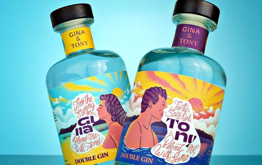
Image Credit: Gina & Tony
Related Post: Top Product Packaging Designs That Push The Envelope
4. Aluminum
Aluminum is not only resistant to rust and corrosion but is also strong enough to support the carbonation pressure of its content. As a result, it’s the choice material for products like sodas and beer.
Unlike transparent plastic and glass that shows the color of the product inside, aluminum doesn’t. That said, you can be as creative as you want with the product design. Take a cue from these colorful cans created by Thirst Craft for Meier’s Creek Brewing Company:
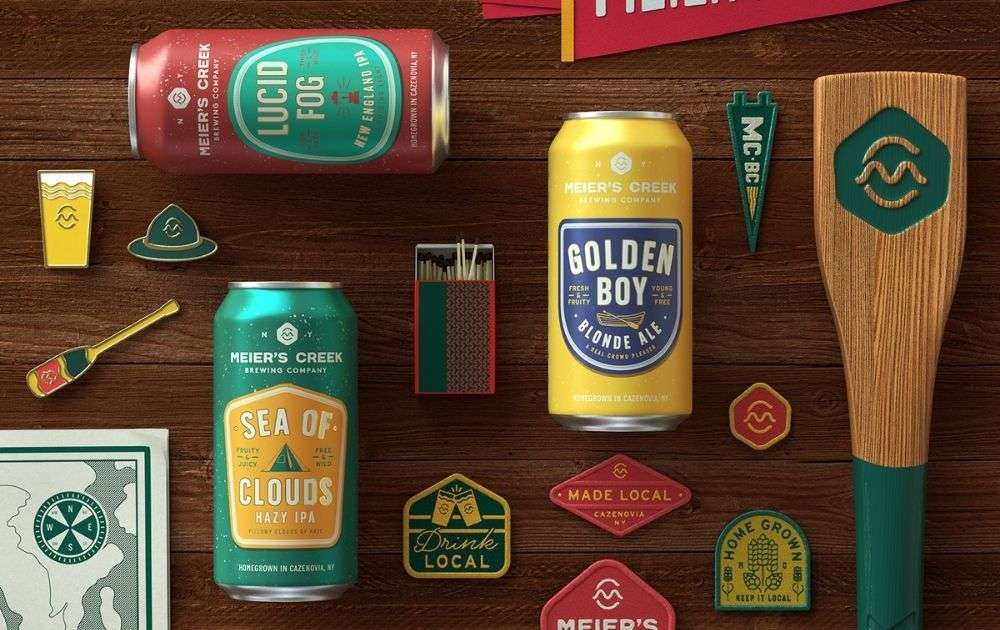
Image Credit: Meier’s Creek
If you’re looking for a more subdued and simple packaging design, these cocktail cans by Affinity Creative Group for Sabé Beverages packs a punch:
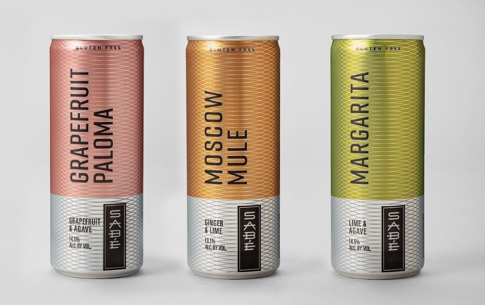
Image Credit: Sabé Beverages
5. Sustainable Alternatives
As mentioned above, many brands have turned to sustainable alternatives as part of efforts to protect the environment. These materials include tubs, bottles, and other receptacles made of bamboo, cornstarch, cassava, mushroom, seaweed, and recycled paper and cardboard.
Check out this array of home-delivery food packaging created by Archana Kotian for Om Made Cafe (photo by Seemal Karthik):
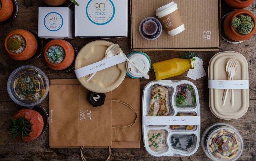
Image Credit: Om Made Cafe
The containers use zero-plastic bamboo fiber boxes for the dry and semi-dry dishes.
Some brands use product packaging design that takes caring for the environment a notch higher. These cups for rhoeco tea created by wedesign serves a double purpose:
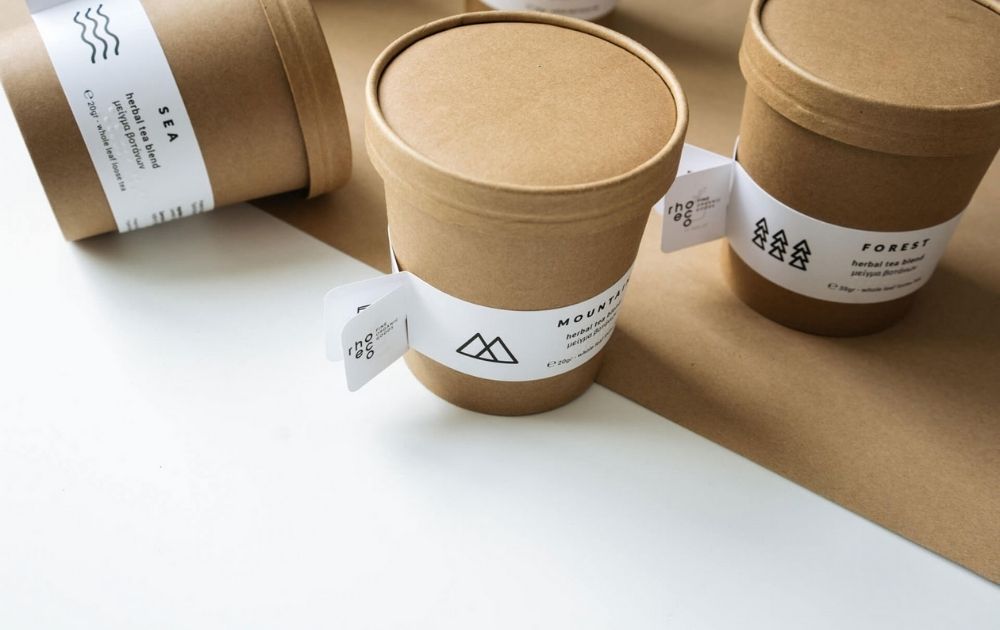
Image Credit: rhoeco tea
Once the tub is empty, the customer can use it as a plant pot. There’s an organic herb seed stick glued to the underside of the lid.
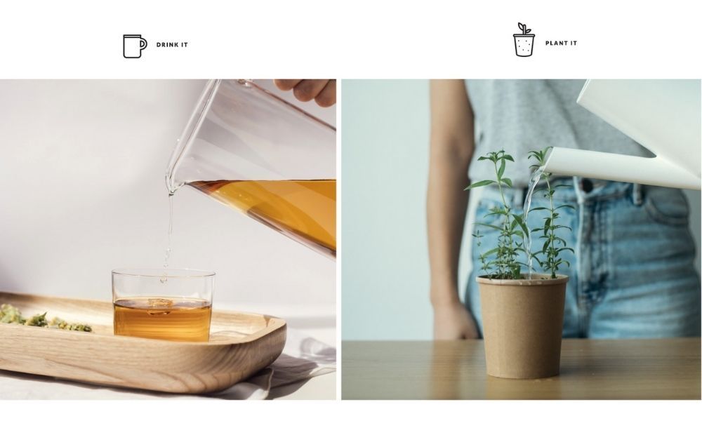
Image Credit: rhoeco tea
Related Post: Here’s How Packaging Design Can Increase Your Sales
Product Packaging Design Checklist
Now, before you run wild with your creative ideas, it’s crucial to go over the essentials. Make sure to tick all the boxes on this checklist before giving the bulk printing a green light.
- Brand Identity. The design must show your brand’s visual assets, including:
- Logo
- Color Palette
- Typography
- Copy. Your label copy should be clear on what the product actually is. For instance, anyone could easily mistake a tub of coffee body scrub for something edible if all it says is, “Coffee Butter.”
- Required marks. Some industries require certain marks such as state administration approvals. Food and personal care products may also need to be marked with a best before date, so take that into account.
- Imagery. Whether you’re using illustrations or a simple layout for your label, it’s best to have it designed by a pro. Though product packaging design templates are a dime a dozen these days, you wouldn’t want your product to look like a thousand other brands on the market (scroll down below to get 15% off our unlimited graphic design service). Here are a few packaging design samples we’ve done for our clients:
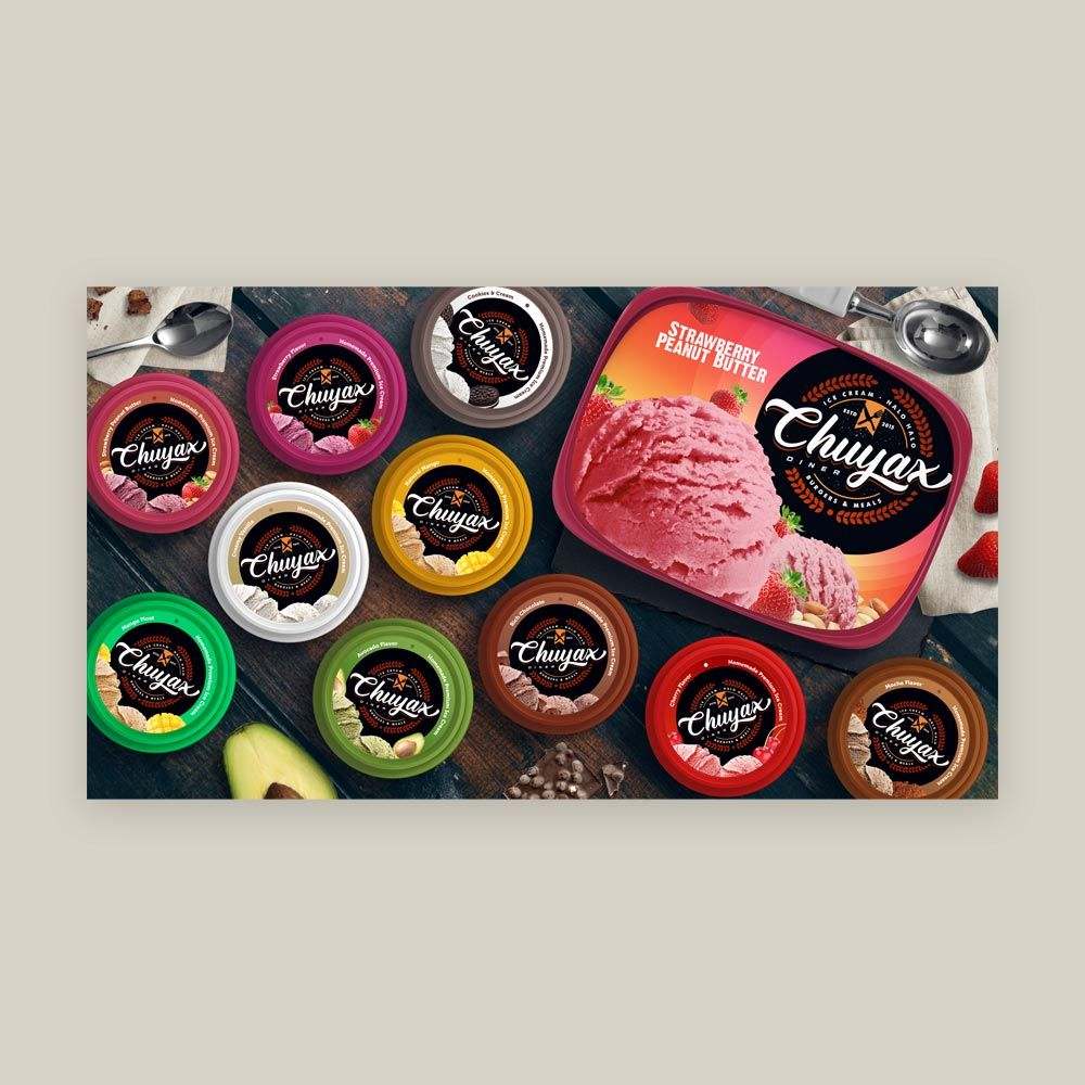
Image Licensed by Penji
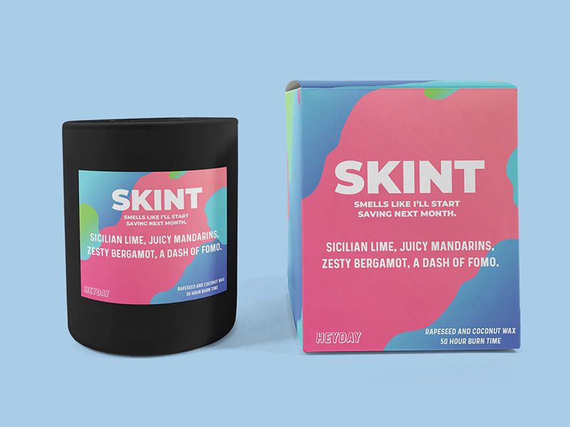
Image Licensed by Penji
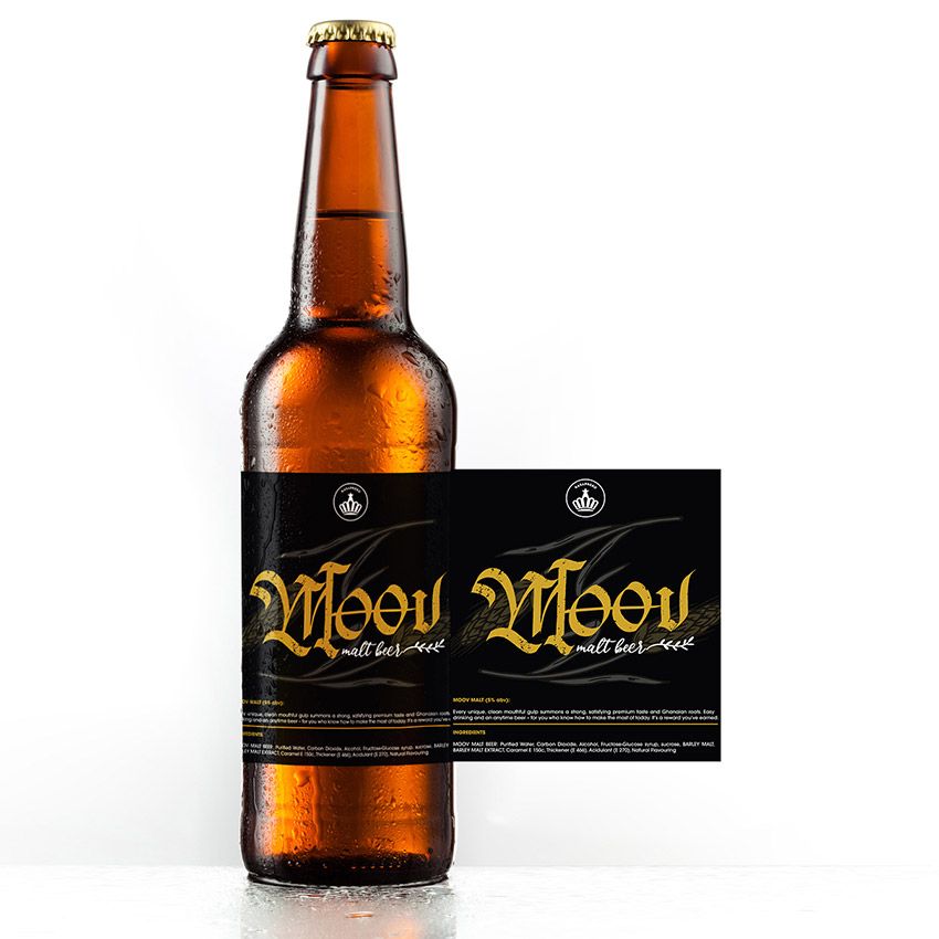
Image Licensed by Penji
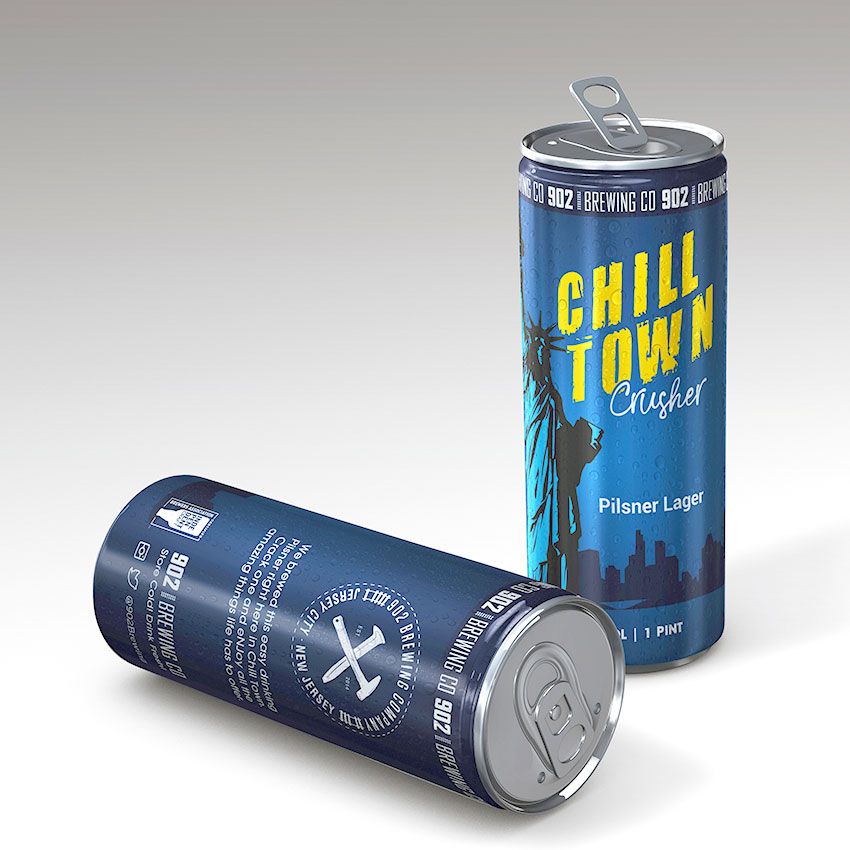
Image Licensed by Penji
Related Post: 10 Coffee Packaging Designs That Would Make You Crave for a Cup
Final Thoughts
Product packaging is more than just the bottle or box that holds your product. It’s a visual representation of your brand. It reflects your unique story and the value you have to offer your clients. That said, you need to make sure that your product packaging design will do a great job at being the ambassador for your brand.
If you need a partner with the skills and experience to create packaging designs that turn heads,
we at Penji can be of service! We offer unlimited graphic design at a flat monthly rate. That means you can have all the graphic designs you need – from logo designs to digital illustrations – without spending a small fortune
We have the top 2 percent of designers, so you know you’ll be in good hands. Sign up now by clicking this link to enjoy 15% off the first month of any plan. You can try any of our packages risk-free for 15 days, so there’s nothing to lose and everything to gain.
Note: Product packaging images were grabbed from Packaging of the World unless otherwise noted.
About the author

Carla Deña
Carla is a journalist and content writer who produces stories for both digital and legacy media. She is passionate about creativity, innovation, and helping small businesses explore solutions that drive growth and social impact.


