
Many business owners think that the advent of digital advertising has placed print ad designs on the backburner. There may be some truth to that. Statista tells us that newspaper and magazine ad spending went down from $63 million to $55 million in 2019.
But if you’ll notice, print advertising is still a million-dollar industry. It isn’t dying and will be with us for a longer time than most people believe. Here are a few reasons why print advertising is still effective and relevant:
- Tangible. Except for billboards and banners, most print ads are capable of playing on tactile contact.
- Longer life span. A beautiful* mailer can stay on a tabletop longer than a digital ad on social media.
- Experiential. Print ads are real. You can create them to give out the experience of touch and smell.
- Better response rates. Research from the Direct Marketing Association (DMA) found that 79% of customers act on direct mail than 45% of those with email.
- More trustworthy. Consumers trust print ads more than any other form of advertising, as can be seen from this chart from Marketing Sherpa:
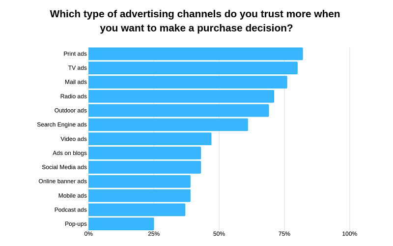
Take note that the word beautiful is emphasized. According to the United States Postal Service, an average American receives around 16.8 pieces of mail every week. There is a high chance that when not done right, your direct mailer will be ignored or worse, get thrown away immediately.
For your direct mail or any type of print advertising to be effective, you’ll need Penji. We are an on-demand graphic design service that can create great print ads for your business. Watch our demo video to learn more.
The Different Types of Print Advertising
Print media is an excellent platform to showcase your products or services. It allows you flexibility as you can choose from a wide variety of channels. At Penji, our extensive experience has taught us what the most popular is. Here are the most commonly requested types of print ad designs:
Newspaper Advertising
One of the longest in use forms of advertising, newspaper print ad designs can reach a mix of demographics. It’s also one of the ways that your ad can combat the 8-second attention span that most of us have when on the internet. Newspaper reading is usually done at a leisurely pace as opposed to its digital counterparts.
This example from the Sea Shepherd Conservation Society (SSCS) is a great one. You need to look at it closely to catch its meaningful intent. The image is somewhat perplexing at first, and you need to look for the details to get the entire message. Once you read the small text (which seems to have been done intentionally), the impact leaves you astounded.

A Nielsen Scarborough study has shown that 69% of the U.S. population is still reading newspapers. This may be good news to newspaper publications, but not so for advertisers. This makes fighting for consumer attention really hard.
Here are some newspaper print ad designs that did a superb job of catching their readers’ eyes:
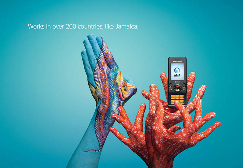
This print ad from AT&T is designed to make you look twice. The telecom company’s campaign series featured different countries where they offer their services. This ad is about AT&T in Jamaica. What looks like a seascape turns out to be more than that. They are hands painted on to look like a fish and coral holding a mobile phone.
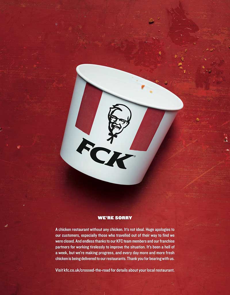
KFC added some sort of shock value to their print ad design when their restaurants ran out of chicken. They issued an apology, and the result is the newspaper ad you see above. They also used the same ad across different platforms—proof that newspaper ads don’t have to be an added expense. When you have a design ready, you can do them for print, too.
Related Post: How Visuals Can Level Up Your Marketing Game
Magazine Advertising
Creating print ad designs for magazines include national and regional magazines. We all know how magazines, especially the fashion-oriented ones, require visually appealing print ad designs. This is to go with the overall look of magazines that mostly appeals to the eyes.
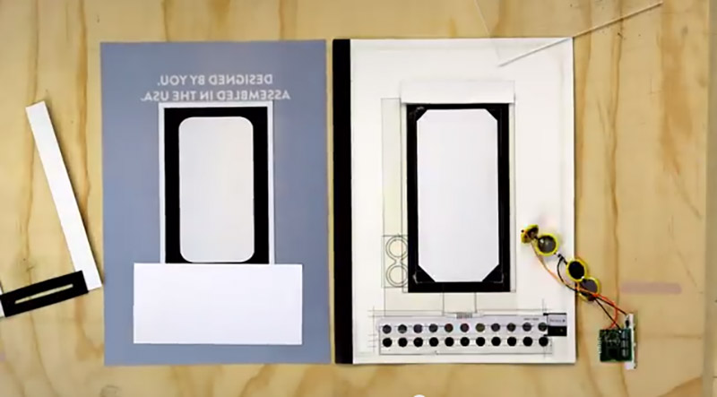
This Motorola ad is what we mean when we said print ad designs have the tactical contact advantage over digital ads. The consumer electronics company partnered with Wired to create this one-of-a-kind, interactive magazine ad.
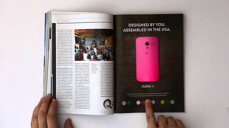
In their January 2014 issue, the tech magazine featured Motorola’s campaign for their flagship Android smartphone, Moto X. The print ad design featured a phone with 12 small colored dots at the bottom. You can activate the ad by pulling on a tab. You can then change the colors of the tab at each press.
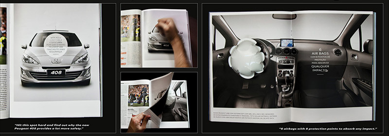
Another excellent example of an interactive print ad is this one from the automotive giant, Peugeot. You can give the ad a hard press to have the airbag inside inflate. The company wanted to show this safety feature in a print ad design, and they hit the nail on this one.
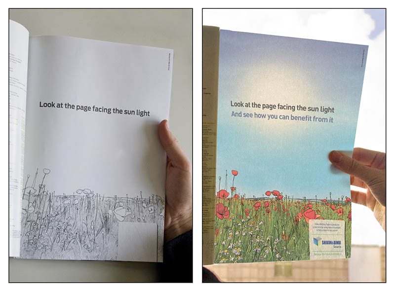
Shikun & Binui Solaria is an energy company based in Israel. They came up with this ad that is rendered in black and white. If you place it against the sunlight, it will brighten up with color.
Magazine print ad designs remain in the readers’ minds long after they closed the pages. With ads such as this one from Nivea Sun Kids, they’re sure to stick to consumers’ memories.
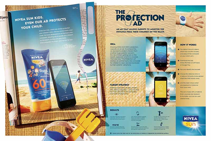
The print ad design has an insert that parents can use to track their kids while on the beach. It’s a strip that you tear out of the page and turn into a wristwatch for your kid. You synchronize it with an app to monitor your child on busy beaches.
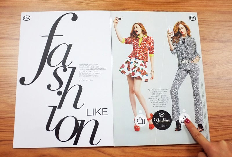
European fashion retailer, C&A, designed this interactive print ad design that recreates the behavior of the “Like” button on Facebook. Readers can press a button on a look they like on the magazine. The stored chip will transmit the data to the social media platform.
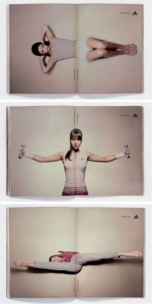
Although interactive print ads definitely turn heads, static ads can do the job as well. This example from Adidas gets the high scores. It takes advantage of the magazine fold to make it look like the models are moving.
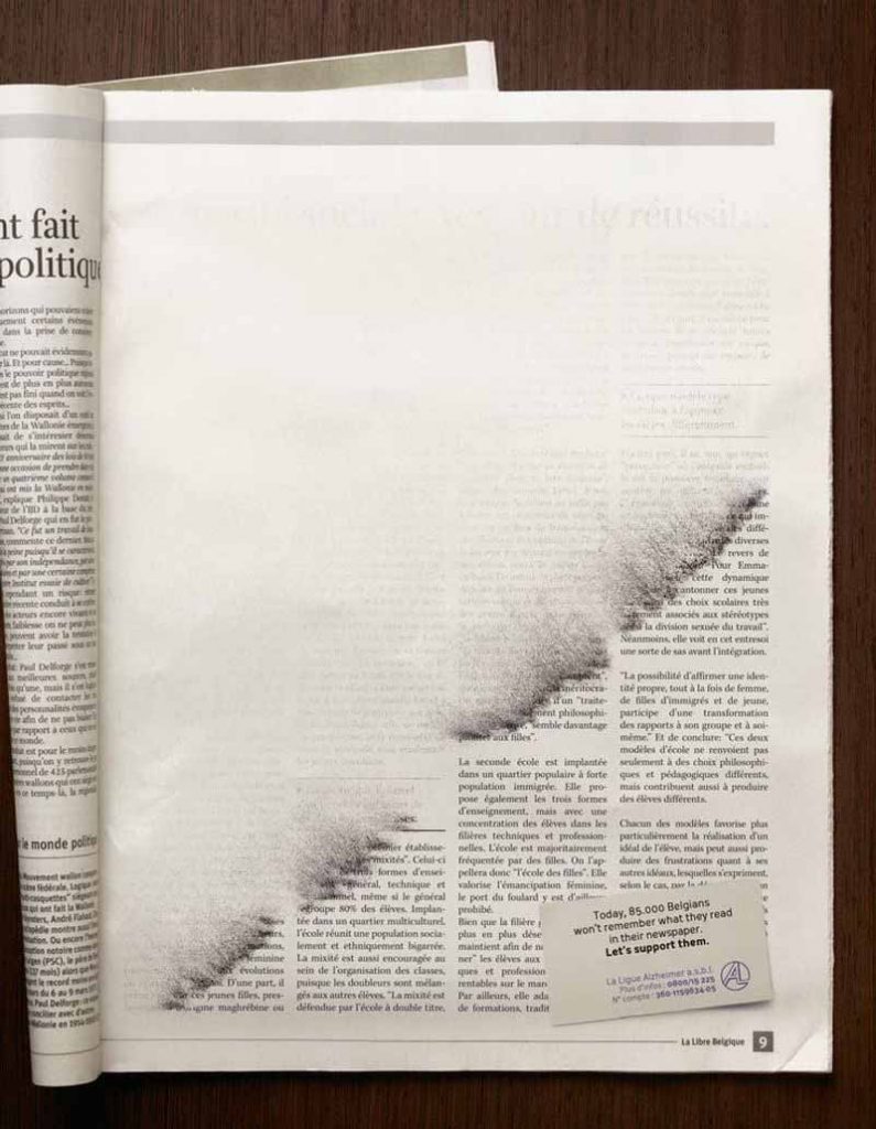
The Belgian League of Alzheimer depicted memory loss so perfectly in this magazine print ad design. The text was either brushed off or blown by the wind and was rendered unreadable. Much like how a person diagnosed with Alzheimer’s experiences.
Related Post: Why On-Demand Ad Design is an Agency’s Secret Weapon
Direct Mail Advertising
The statistics mentioned at the beginning of this article is enough to get you to have one. Direct mail advertising such as letters, leaflets, or postcards is great in targeting a specific demographic. You can create highly personalized mail that is great for building strong connections with your customers.
One of the reasons business owners are skeptical of direct mailers is the fact that most of them get thrown out. This is why getting the help of professional graphic designers can help. They can design direct mail advertising that has a high chance of getting read.
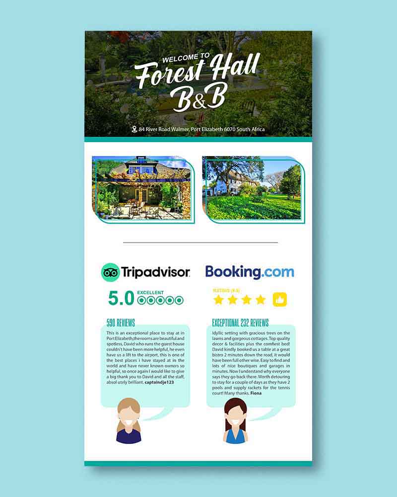
Take a look at these direct mail ad designs that our professional designers at Penji created:

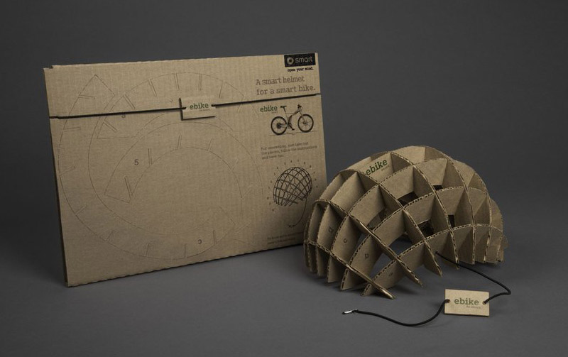
For Mercedes Benz, advertising agency BBDO Mexico created this direct mail print ad design. It was designed exclusively for the luxury car manufacturer’s smart ebike edition. The direct mail is made of recycled cardboard that recipients can assemble into a bike helmet.
Another cleverly designed direct mailer is this one from Greenpeace. In its “Fashion Duel” campaign, the environmental organization pushed the fashion industry to go eco friendly. They sent out this direct mail with a green glove inside. They were sent to a number of fashion houses that included Gucci, Prada, Chanel, to name a few.

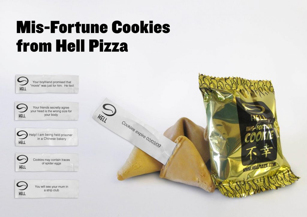
The idea of reading your fortune after a meal is quite appealing. The reason they became popular with restaurants that took advantage of it. Hell Pizza in New Zealand got the idea but made it better. They sent “mis-fortune cookies” as unique direct mail advertising. Instead of good fortune, it read dark, foreboding messages. The concept was a big success that the restaurant is now selling them in their stores.
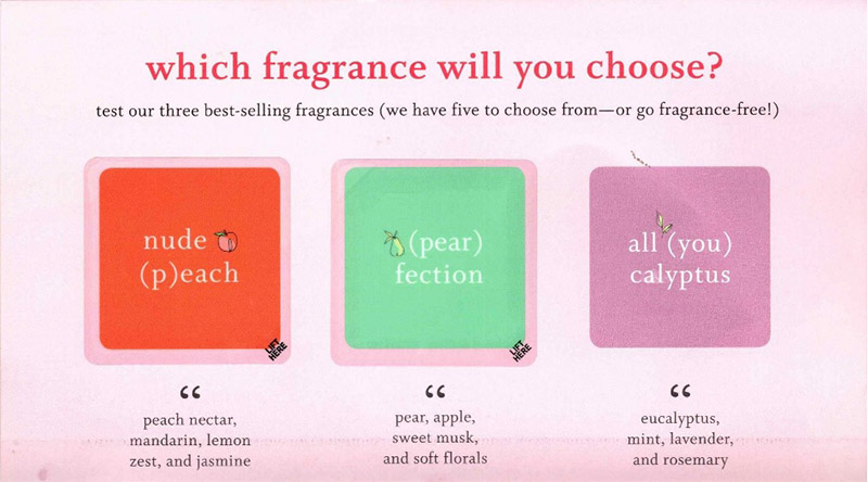
Beauty retailer, Function of Beauty wanted customers to try out their new shampoo offering. They sent direct mail containing strips of scents.
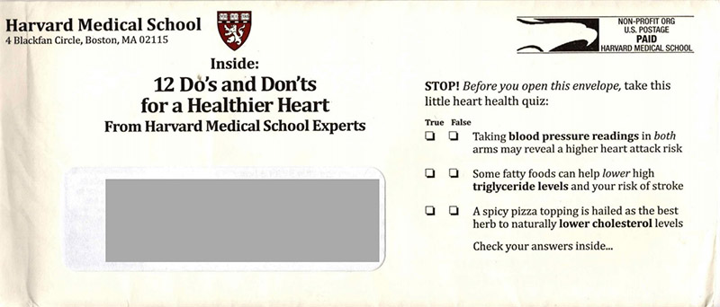
To make your direct mail advertising more intriguing, you can add a quiz like what Harvard Medical School did. On the outer part of the envelope, they included a quiz about heart health. The recipient has to open the mail to get the result of the quiz.
Nothing gets the attention of direct mail recipients better than the word FREE. In this direct mail advertising example, Estee Lauder did just that. The brand name alone can sell itself, but the offer of a freebie is something that’s hard to resist.

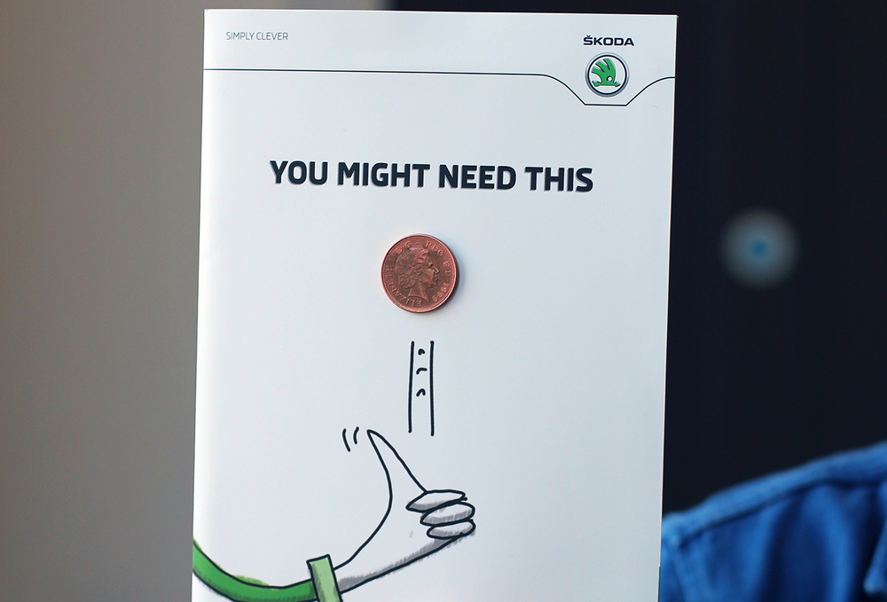
A good idea to get your direct mail recipient’s attention is by sending them money. Czech automobile manufacturer Skoda attached a coin on their direct mail advertising. This is something we rarely see and is effective in gaining the attention of the recipients.
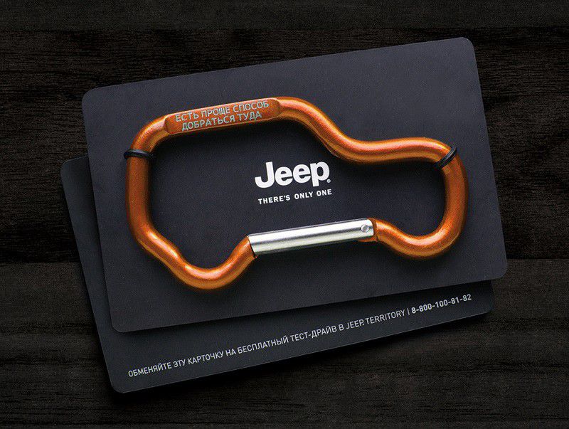
Jeep created carabiners in the shape of, you guessed it, a jeep. They handed out thousands of them to potential customers. The prospects can use the cards as a key to a Jeep test drive. The campaign resulted in hundreds of test drives and sales.
Billboards and Posters
To reach prospects that aren’t online, billboards and posters are the way to go. Research on billboard advertising conducted by the Arbitron National In-Car Study states that billboards are quite effective on drivers. About 71% of Americans consciously look at billboard messages while driving. Of this, 58% learned about an event or restaurant they later attended.
Get inspired by these billboard and poster examples to convince you that these forms of print ad designs are still relevant:
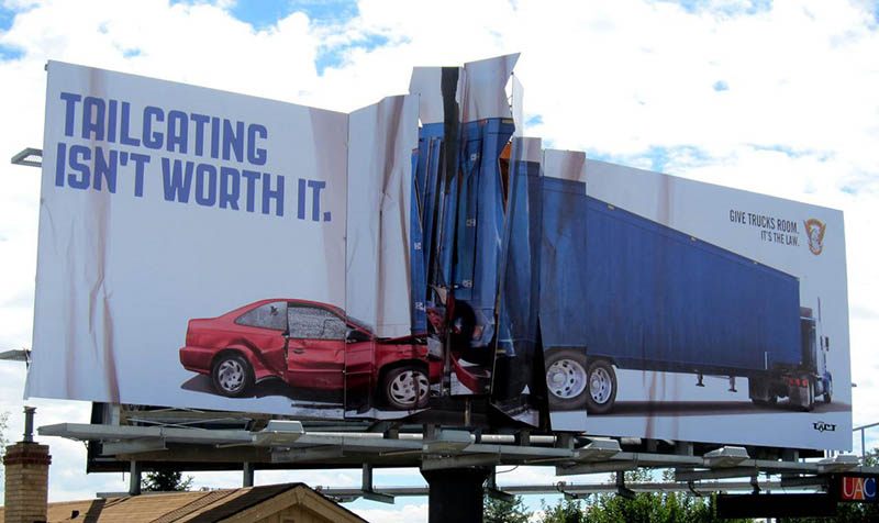
Billboards are great in telling a story at a glance. This one from Colorado State Patrol aptly hits a nerve. The ad clearly tells us that giving trucks room is not only an option but the law.
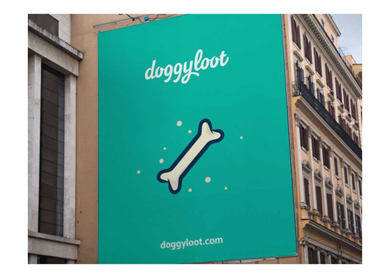
Effective billboards are those that pique our interest. Take this straightforward example from Doggyloot. It only has a cartoon bone and the company’s website URL. It’s cute, and if you’re a dog lover, you’d want to know what it is about.

On the other hand, posters are excellent teasers, such as this one from the movie It. It almost has no text in it, but you can feel that it’s something that’ll keep you awake at night.
Related Post: 8 Outdoor Marketing Strategies the Biggest Brands Are Using
Penji and Print Ad Designs
Other forms of print ad designs include flyers, brochures, and catalogs, among many others. Penji has a team of professional designers that have the experience and expertise in designing them. For as low as $399 a month, you can request as many print ad designs as you can.
Sure, there are hundreds of templates you can find online to help you create your own. But there is no guarantee that they can be as polished and as high-quality as when a pro does them. Here are a few of Penji’s previous print ad designs to get you inspired:
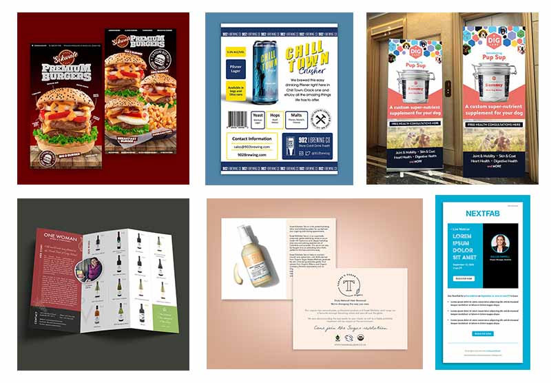
Start the design process now by signing up for any of Penji’s affordable and flexible plans.
[convertkit form=3285107]
About the author

Celeste Zosimo
Celeste is a former traditional animator and now an SEO content writer specializing in graphic design and marketing topics. When she's not writing or ranking her articles, she's being bossed around by her cat and two dogs.


