Are you considering the idea of launching your own Italian pizza place but don’t know where to begin? Aside from your incredibly impressive recipes, you need to think about how to reel in customers. First on your list should be your branding identity, so it’s time to start looking for pizza logo ideas.
To get people to notice your business, an attractive logo will help give them a taste of what you’re offering. It is the one visual asset that will make them remember your place in the future. And so, without further ado, here are 15 pizza logo ideas that can inspire you and create one that is sure to beat the competition:
1. Apogeo

This pizza restaurant in Italy caught our attention because of its logo’s appeal and uniqueness. When you think about anything Italian, you see green, red, and white as the primary colors. Italians are known to be proud of their heritage, that they use the colors of their flag on most branding identities.
This pizza place did a complete about-face as their logo has neither green nor white. They used red, though, but only as dots that acted as accents to the overall design. Although some may argue that it does not fit a restaurant, it is an excellent example of thinking out of the box.
2. Una Pizza Napoletana

You don’t have to go to Italy to find pizza logo ideas. There are plenty of pizza places in the US where you’ll never run out of inspiration. This one from Una Pizza Napoletana in New Jersey is eye-catching, even without the Italian tricolors or any other colors for that matter.
It is black and white, using a handwritten font in lowercase letters for added style. It is edgy and jazzy, ideal if you’re looking to have that upscale ambiance. Again, it does not go with the flow of using the cliche pizza slice as a logo, which is a good call.
3. Del Popolo
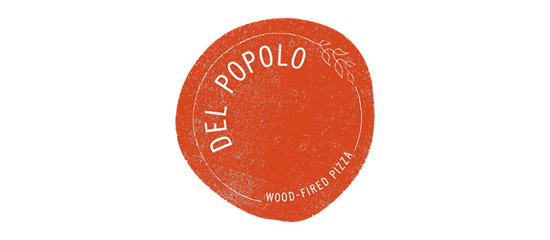
According to their Facebook Page, Del Popolo means “of the people.” It says that their name comes from their belief that the nature of pizza should be simple and egalitarian. And true to their name, it shows in the logo below. It is composed of a circle shaped like pizza dough with the brand name in a clear and simple font.
It has a thin line surrounding the name and what seems like leaves used as decoration. Plus, it uses a shade of red that’s similar to tomato sauce. Finally, it is randomly spread over the logo, not solidly blocked, adding a vintage appeal.
4. Pequod’s Pizza
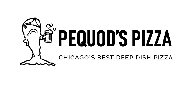
Having been named one of the top five pizza restaurants in the US, Pequod’s Pizza also has a striking logo to boot. Named after the whaling ship in Moby Dick, the logo features a whale seemingly having the time of its life. With a beer bottle in hand and a thong wrapped around its head, it signifies the good times ahead for the pizza place’s customers.
The logo instills fun and enjoyment with added humor. One of their website’s pages also features the same whale riding a motorcycle, still donning that lady’s underwear. The logo design is one for the books as it is eye-catching, engaging, and easy to remember.
5. Paizanos Italian Bistro

This Italian restaurant from Historic Norcross, GA, tells us that pizza didn’t originate from Italy. Paizanos Italian Bistro alleges that the gastronomical delight had its foundations in Greece. Thus, their logo has an olive branch, replete with fruit, which we know as what the Greeks are famous for.
The logo’s color choice is very suitable as green signifies the earth and freshness, while violet connotes royalty and wealth. The font is a topsy-turvy type to balance off the seriousness of the colors and add charm to the design.
6. Sbarro
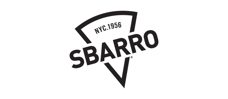
A popular pizza restaurant the world over, Sbarro used to have one of the most unattractive logos. It was a flag with its name emblazoned across it using red, green, and white. It was so cliche until they changed it into a triangular one simulating a pizza slice. They still retained the tricolor but now ditched it all in one of the best revisions of its logo.
The current logo is the one you see below, a black and white version that’s classy, modern, and very appealing. The tilted pizza slice added a brilliant twist that made the logo even more attractive and charismatic.
7. Flour House
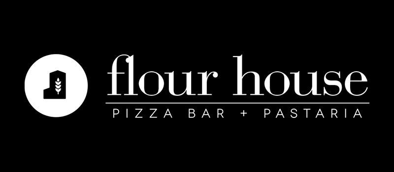
This pizza bar and pastaria in California has a cleverly designed logo. The Flour House uses a minimalistic design that’s sophisticated, elegant, and stylish. It has an icon of a house with a wheat stem inside, the perfect representation of the restaurant’s brand name.
Although the name and logo do not fit the general idea of what an Italian restaurant logo should be, it’s still an excellent design. Looking at their website, it comes in different variations, which means it is scalable—it can be placed anywhere and would still look great.
8. Pizzicletta
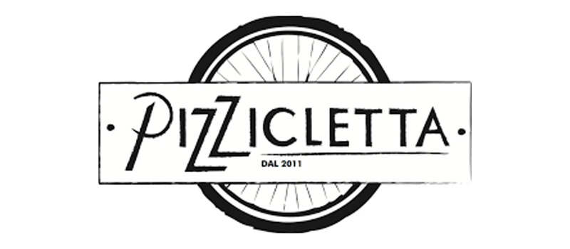
Owned and operated by avid cyclists and runners, Pizzicletta uses a bicycle wheel for its logo. The name itself is a play on the Italian word for bicycle: bicicletta. The logo is beautifully executed as it gives a feeling of community, free spirit, and an easy and laid-back atmosphere.
The logo comes with a white version, but both designs have that chalky effect as if written on a blackboard. It may be lacking in colors, but the effects are enough to give it the charm it needs. Its simplicity alone makes for good pizza logo ideas
9. La Rosa Pizzeria
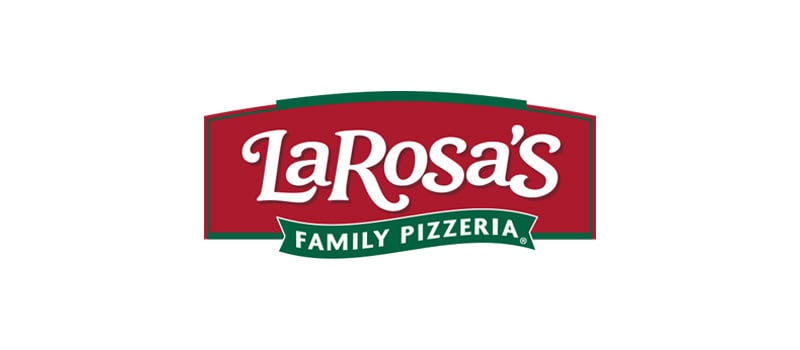
An Italian pizza restaurant that caters mainly to families and groups, the La Rosa Pizzeria logo is worth its place on this list. It has a modern and upbeat feel to it with a design that’s simple yet eye-catching. It has no frills and ornate elements that can be distracting.
In addition, this type of logo design is ideal as it can be placed in large and small spaces and still look its best. You can easily have this logo on a business card or billboard, desktop computer, or mobile phone, and it would still serve its purpose beautifully.
10. Taglio
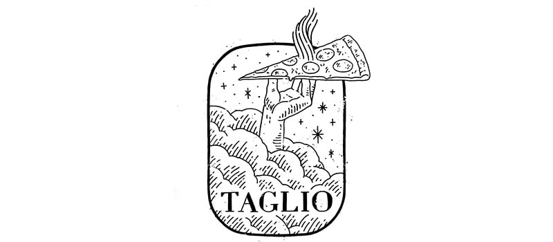
Making waves in the pizza sphere in Michigan, Taglio has a logo that’s as good as its food. It is unique and not commonly seen in Italian restaurant logo designs. Thus, it is great for differentiation and cutting through the noise.
It was done in black and white, also departing from the usual greens and reds. It does have an illustration of a pizza slice which may seem cliche, but the execution is extraordinary. Plus, it is lifted by a hand that pops out of clouds with glittery stars around to give the logo a feeling of pizza bliss.
11. Noto Italian Restaurant

While the colors red, green, and white are pretty standard in Italian restaurant logo designs, it doesn’t mean you can’t use them. Take this example from Noto Italian Restaurant’s logo that uses these colors. The overall layout is what makes it uniquely suitable.
This pizza logo idea is stylish, straightforward, and fully scalable. It doesn’t have distracting elements and would look great in a wide range of advertising materials. It also projects a stylish vibe to it that helps give it a modern and trendy appeal.
12. In Bocca al Lupo
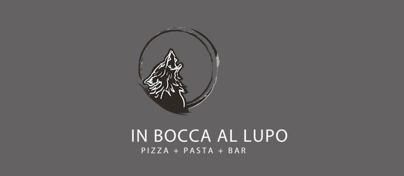
In English, In Bocca al Lupo means “in the mouth of the wolf,” the non-traditional way for Italians to say “good luck.” And so the restaurant In Bocca al Lupo has an image of a howling wolf in its logo. The restaurant has a rustic appeal which is clearly shown in its logo.
The font type of choice is simple, with no serifs, which gives the design a sophisticated and classy air. It is ideal for the restaurant that it represents. It is one of Juneau, Alaska’s pride, and the logo fits even the restaurant’s location quite well.
13. Pizzeria Lui
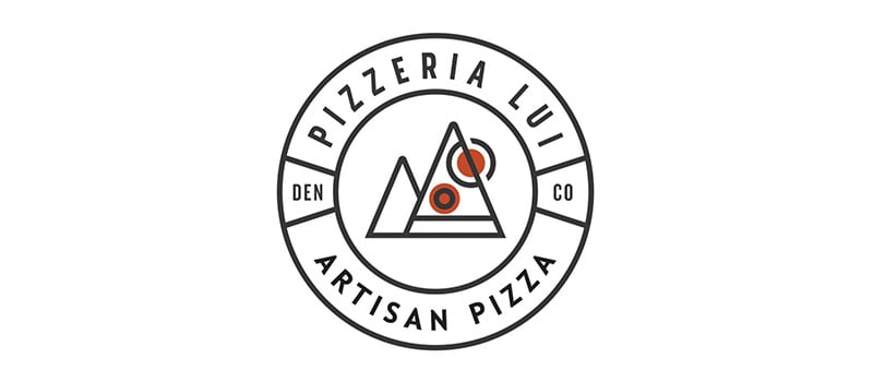
Located in Denver, Colorado, Pizzeria Lui has a very interesting logo. It has an image of two pizzas placed to look like two mountain peaks. It perfectly describes its location while blatantly saying that they are a place to get this gastronomic delight.
The logo includes two circles seemingly representative of the sun and pizza toppings. The logo is done in black and white with two spots of red, again, to illustrate the red of pepperonis. This splash of color is an excellent way to add accents and make the logo more visually appealing.
14. Pizzeria Lola
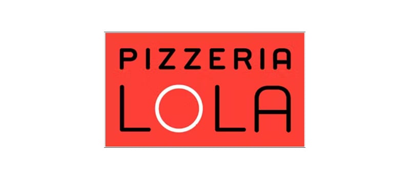
Named after the owner’s pet dog, Pizzeria Lola has what it takes to be on this list of the best pizza logo ideas. The rectangular logo uses red, black, and a white O to emphasize the name, Lola. Like most logos on this list, it is straightforward, having very minimal features.
As you can see from this list, most logos opt for minimalism, as this approach is best if you want instant recognition. A logo with too many going on can be distracting, while the minimalist way can be a powerful message conveyor. This is something that excessive details won’t be able to match.
15. Settebello Pizzeria Napoletana

With a laidback logo design, Settebello Pizzeria Napoletana ends this list of the best pizza logo ideas. The logo seems to be inspired by Neapolitan architecture, that’s very common in Italy. On both sides of this restaurant’s name are two circles with Baroque architecture’s essential characteristics: curved lines and complex motifs.
While it is not as opulent as the architecture, the logo does quite an excellent job of illustrating a Neapolitan pizza. The color combination is also spot-on as the orangey-brown shade against a black background gives an air of vintage and, at the same time, modern and trendy.
Work With Penji For All Your Logo Needs
Whether it’s a pizza logo design or one in a different niche, Penji can help you. We have a team of pro designers that have the experience and expertise to create a wide selection of logos from various industries. When you subscribe to any of our plans, not only will you be getting your logos but a vast array of graphic design assets, too.
Watch our demo video to learn more by tapping on this link. Or you can start having your designs by signing up here through this link.
About the author

Celeste Zosimo
Celeste is a former traditional animator and now an SEO content writer specializing in graphic design and marketing topics. When she's not writing or ranking her articles, she's being bossed around by her cat and two dogs.
Table of Contents
- 1. Apogeo
- 2. Una Pizza Napoletana
- 3. Del Popolo
- 4. Pequod’s Pizza
- 5. Paizanos Italian Bistro
- 6. Sbarro
- 7. Flour House
- 8. Pizzicletta
- 9. La Rosa Pizzeria
- 10. Taglio
- 11. Noto Italian Restaurant
- 12. In Bocca al Lupo
- 13. Pizzeria Lui
- 14. Pizzeria Lola
- 15. Settebello Pizzeria Napoletana
- Work With Penji For All Your Logo Needs


